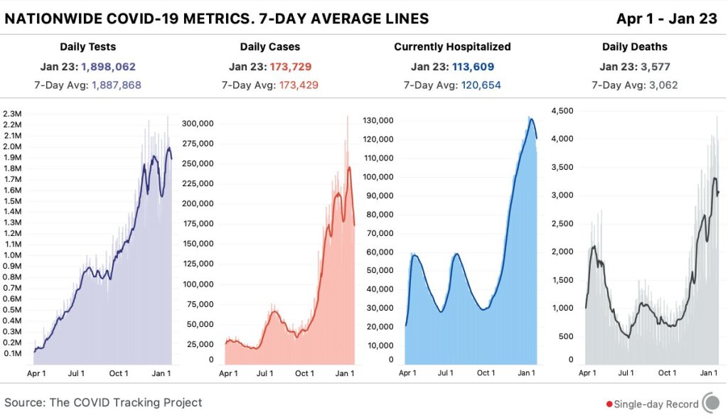
In the past week (January 17 through 23), the U.S. reported about 1.2 million new cases, according to the COVID Tracking Project. This amounts to:
An average of 173,000 new cases each day
370 total new cases for every 100,000 Americans
1 in 270 Americans getting diagnosed with COVID-19 in the past week
Nationwide COVID-19 metrics published in the COVID Tracking Project’s daily update on January 23. New daily cases and current hospitalizations are steadily dropping, but deaths are still over 3,000 each day.
Last week, America also saw:
113,600 people now hospitalized with COVID-19 (35 for every 100,000 people)
21,400 new COVID-19 deaths (6.5 for every 100,000 people)
Two major metrics, new cases and current hospitalizations, are down for the second week in a row. (See the numbers trending down on the COVID Tracking Project chart, above.) The number of new cases reported this week is the lowest it’s been since Thanksgiving. And, while well over 100,000 Americans are in the hospital with COVID-19, we are seeing about 17,000 fewer patients nationwide than we did two weeks ago.
A decline in COVID-19 cases sweeping the nation, backed by concurrent declines in COVID-19 hospitalizations. We may already be beyond the peak of this virus. https://t.co/vtUWyKSVTz
6-month consequences of COVID-19 in patients discharged from hospital (Huang et al., The Lancet): I don’t usually feature scientific papers here, but this new study is important. It’s the biggest paper so far on COVID-19 long haulers, those patients who struggle with the disease for months after their diagnosis (or after not getting a diagnosis at all). This study followed about 1,700 patients over 6 months.
Global.health COVID-19 dataset: Global.health describes itself as a “global data repository and visualization platform that enables open access to real-time epidemiological anonymized line list data.” Its COVID-19 dataset—which promises information on 5 million anonymized cases—is not yet published, but is definitely a source to look out for.
COVID-19 survey of Medicare beneficiaries: This week, the Centers for Medicare & Medicaid Services published results of a survey of Medicare beneficiaries, focused on their experiences with COVID-19. The data include American seniors’ perceptions of vaccines, perceptions of COVID-19 safety, care experiences, and more.
The COVID-19 Data Dispatch largely focuses on U.S. news. This country’s response to the pandemic has been so chaotic and confusing that it is a full-time job just to keep up with major developments. But sometimes, to truly understand COVID-19 in America, we need a global perspective. More specifically: seeing how other nations have succeeded in mounting a robust public health response—with actual support from the public—can show us how we have failed.
I got the opportunity to gain that perspective this week, by attending the (virtual) Futures Forum on Preparedness, hosted by tech nonprofit Schmidt Futures. At the forum, a diverse group of health, science, and policy leaders presented research on the global COVID-19 response and discussed how to better prepare for future public health crises.
One cornerstone of the forum was a comprehensive comparison of how 23 countries responded to COVID-19. Researchers at the Harvard Kennedy School, Cornell University, and other partners—including teams in each of the 23 countries—analyzed politics, policies, and social conditions in order to figure out what actually constitutes success in protecting a nation’s citizens from a public health threat.
The researchers classified countries into three major categories: control, consensus, and chaos. A nation in control exhibits public health authority—uncontested by political leaders or the general public—to actually contain the coronavirus (with border controls, contact tracing, etc.) without needing to disrupt daily life. A nation in consensus exhibits cooperation between the political system and the public health system, with citizens agreeing to some disruptions in their lives in order to more broadly keep people safe and keep the economy working. A nation in chaos fails to heed public health advice, fails to find agreement between political parties, and fails to preserve overall public safety at the expense of individual freedoms.
Speakers at the Forum provided examples for each category: Taiwan is a nation in control, Germany is a nation in consensus, and as for chaos… of course it’s the U.S. (Brazil, India, Italy, and the U.K. also fall into the chaos category.)
Now, some particularly nerdy readers might remember an index touted last winter, when we were just beginning to recognize the gravity of the threat posed by COVID-19. The 2019 Global Health Security Index bills itself as “the first comprehensive assessment of global health security capabilities in 195 countries.” It rates nations based on their ability to prevent public health threats, set up epidemiological surveillance, communicate risk, give citizens access to healthcare, and other similar metrics.
The U.S. is ranked number one. It seems laughable now, right? All the measures that were supposed to help us deal with these crises—our monitoring systems, our highly trained scientific workforce, our massive national GDP—have completely failed in the face of partisan fighting and a broad lack of trust in public health measures.
I remember hearing about this index at the American Association for the Advancement of Science last February, what seems like a million years ago. I pitched a story on the index to my colleagues at Stacker—we could rank countries on how prepared they are for this new coronavirus, I thought. My boss questioned the pitch, saying that the index was entirely prospective and couldn’t predict how countries would actually respond. Plus, the U.S. had already started to fuck up, via the complete lack of testing and the Trump administration downplaying how severe a threat COVID-19 might pose. We did not produce the story. (Sam, if you’re reading this: thank you.)
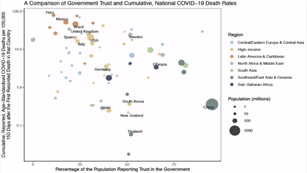
America was supposed to be great at this, but we failed. That’s not really news. I like the Comparative Covid Response report, though, because it highlights this failure in stark, neon lighting—and tells us exactly what we need to improve on, systematically, before the next crisis hits. At their Futures Forum on Preparedness talk, the researchers behind this report showed that a nation’s score on the Global Health Security index doesn’t correlate at all to the nation’s COVID-19 death rate. But then, they showed one property that does correlate: trust in the government.
Figure from presentation at the Futures Forum on Preparedness.
Countries where people actually trusted their governments to provide public health guidance, such as Thailand, New Zealand, and Germany, were able to institute those control or consensus measures I mentioned earlier and prevent widespread tragedy while keeping the basic functions of the country going. The U.S. needs to get to this point if we are to actually take advantage of all our money and resources in response to future public health crises.
One last note: I have to give credit to the Global Health Security index where credit is due. They did get one ranking right—the U.S. scored only 25 (of 100) points for healthcare access, ranking at 175 of 195 nations.
Every week, I come into your inbox and I say, the vaccine rollout is going badly. And you’re probably like, yeah, Betsy, I know, it’s on the news every single day.
You probably don’t need me to tell you about the announcement this past Tuesday, from Health and Human Services Secretary Alex Azar, telling states to stop saving their second doses and start prioritizing all adults over the age of 65… or the Washington Post scoop this past Friday, revealing that states couldn’t actually vaccinate more people because the federal vaccine reserve was already used up. (I salute all the policy reporters following this madness. Seriously.)
So instead, today, I’m focusing on a vaccination issue that hasn’t gotten as much press: who is actually getting vaccinated? On the national level, we largely can’t answer this question, thanks to a lack of demographic data.
While the CDC’s vaccination tracker has seen some upgrades recently (such as the inclusion of people receiving two doses and downloadable data), it does not report any information on the race, ethnicity, age, gender, or occupation of those Americans who have gotten shots. And the data aren’t much better at the state level, according to recent analysis from the COVID Tracking Project.
The COVID Tracking Project analysis discusses 17 states which report race and/or ethnicity data for vaccine recipients. Since the post was published, two more states—Missouri and West Virginia—have started reporting such data. Still, just reporting these data isn’t sufficient. Alice Goldfarb, Kara Schechtman, Charlotte Minsky, and other Project volunteers who compiled detailed annotations on the vaccine metrics reported by each state found that, even when states do report demographic data, each state uses vastly different categories, making it difficult to compare or combine this state-level information into a useful national dataset.
Using the limited data that are available, though, we can still see that the vaccination effort thus far is incredibly inequitable—despite government promises to prioritize vulnerable populations.
White Americans are getting vaccinated at much higher rates than Black Americans, according to a Kaiser Health News analysis of state data published yesterday. Reporters Hannah Recht and Lauren Weber discuss access issues and mistrust of the healthcare system—tied to systematic racism against Black Americans seeking healthcare—as reasons why Black Americans may be left behind.
But the disparities so far, at a stage of the vaccine rollout that has largely prioritized healthcare workers, means that both national and local public health agencies have a lot of work to do:
“My concern now is if we don’t vaccinate the population that’s highest-risk, we’re going to see even more disproportional deaths in Black and brown communities,” said Dr. Fola May, a UCLA physician and health equity researcher. “It breaks my heart.”
In New York—a state which finally released a vaccine dashboard today, but is not yet reporting demographic data—vaccination trends by hospital suggest a similar pattern. The hospitals with the highest shares of vaccinated workers are, by and large, private hospitals located in Manhattan. The hospitals with fewer vaccinated workers, on the other hand, include those located in Harlem, Brooklyn, and other working-class neighborhoods.
Data are also lacking for long-term care facilities. The CDC reports total vaccine doses administered in these facilities (which include nursing homes, assisted living facilities, and other care homes). But a national total is unhelpful in analyzing where states have been most successful at getting vaccines to this high-priority population. A COVID Tracking Project analysis, published on Thursday, found vaccine data for LTCs in only seven states. South Carolina is the only state releasing detailed data on individual facilities.
Meanwhile, CVS has published a state-by-state dataset of LTC vaccinations administered by this pharmacy chain. The COVID Tracking Project reports that Walgreens may release a similar dataset. It seems pretty wild that independent pharmacy chains are reporting more detailed vaccine data than the federal government itself—until you remember, well, how data reporting has gone this entire pandemic.
Vaccination data, right now, are about as messy as testing data were back in spring 2020. Every state is doing its own thing, and the federal government has yet to provide sufficiently detailed information for meaningful analysis. Readers: I urge you to push for better vaccine demographic data, both in your own region and nationally.
The COVID-19 Vaccine Communication Handbook is a new resource from communication initiative SciBeh aimed to help journalists, healthcare workers, and other communicators talk about COVID-19 vaccines and challenge misinformation.
Following the end of the federal public health emergency in May, the CDC has lost its authority to collect vaccination data from all state and local health agencies that keep immunization records. As a result, the CDC is no longer providing comprehensive vaccination numbers on its COVID-19 dashboards. But we still have some information about this year’s vaccination campaign, thanks to continued CDC efforts as well as reporting by other health agencies and research organizations.
This week, the FDA authorized Novavax’s updated COVID-19 vaccine. Here’s why some people are excited to get Novavax’s vaccine this fall, as opposed to Pfizer’s or Moderna’s.
!function(){“use strict”;window.addEventListener(“message”,(function(a){if(void 0!==a.data[“datawrapper-height”])for(var e in a.data[“datawrapper-height”]){var t=document.getElementById(“datawrapper-chart-“+e)||document.querySelector(“iframe[src*=’”+e+”‘]”);t&&(t.style.height=a.data[“datawrapper-height”][e]+”px”)}}))}();
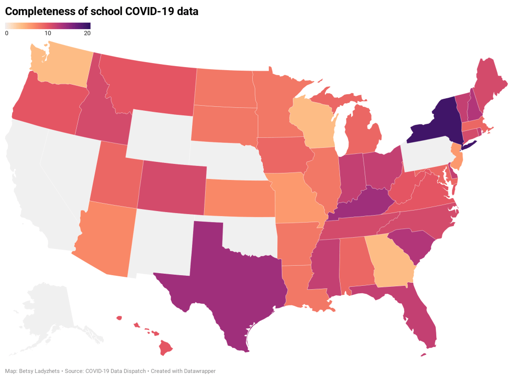
K-12 schools across the country are open for the spring semester, even as America faces serious outbreaks in almost every state and a more contagious strain—more contagious for both children and adults—begins to spread. At the national level, we are still overwhelmingly unable to track how the virus is spreading in these settings.
Perhaps the most newsworthy opening this week was in Chicago, where students returned to classrooms for the first time since last March. Chicago’s teachers union has waged an ongoing battle with Mayor Lori Lightfoot and district CEO Janice Jackson, whom teachers claim have not resolved ongoing safety issues in school buildings. The district is screening staff through optional rapid tests once a month; about 1,200 tests have been reported so far, including three positive results. Four Chicago students and 34 other staff members reported COVID-19 cases this week.
Meanwhile, President-elect Joe Biden announced a $175 billion plan aimed at getting students back to in-person learning. The plan includes $35 billion for higher education and $130 billion for public K-12 schools, with a focus on increasing testing, PPE for students and teachers, ventilation, and other safety measures for which educators have been calling since last spring.
Biden hopes to open “the majority of K-8 schools,” according to Education Week’s Evie Blad. A recent report by the CDC suggests that in-person learning for these younger students, when implemented safely, is not likely to seed an outbreak in the wider community. (College-aged students in the 18-24 range are more likely to cause such outbreaks.)
The report says: “CDC recommends that K–12 schools be the last settings to close after all other mitigation measures have been employed and the first to reopen when they can do so safely.”
But, as Blad points out, it will be difficult to track the impact that more school reopening would have on broader communities, as data on COVID-19 cases in schools are still limited and fractured. There is still no federal dataset on COVID-19 in American public schools. State datasets are fully unstandardized; and most states only report case counts, making it difficult to actually analyze how school outbreaks compare across schools.
As of our most recent K-12 state annotation update, only Delaware, New York, and Texas are providing enrollment numbers, and only New York is providing testing numbers. (Thank you to intern Sarah Braner for doing the update this week!)
In last week’s recommended reading section, I featured an op ed in Nature by school data leader Emily Oster calling on President-elect Biden to develop a unified, national system for tracking COVID-19 in schools. I wanted to highlight it again this week because I absolutely agree with Oster here. As important as her and others’ compilation efforts have been in filling the school data gap, no outside dashboard can replace the work of the federal government:
We need to be able to identify the virus spreading in schools and work out what went wrong. The data we do have suggest that outbreaks in schools are not common, but they do happen. We need a way to find them systematically.
And here’s one more school-related metric we should be tracking: teachers are starting to get vaccinated. According to a recent Kaiser Family Foundation analysis of state vaccination priority groups, 31 states have put K-12 and childcare personnel in their Phase 1 group. In Utah, teachers and childcare workers are even included in Phase 1A. California and New York, two of the biggest states, started vaccinating teachers this past week.
(If you want a heartwarming read this long weekend, I recommend this piece from THE CITY that profiles NYC teachers and other essential workers getting vaccinated in the middle of the night.)
But most states are barely reporting basic demographic data for their vaccinations, much less telling the public the occupations of those who have gotten shots. Without knowing how many teachers have been vaccinated, it will be difficult to factor these inoculations into reopening decisions—or determine how vaccination impacts future school outbreaks.
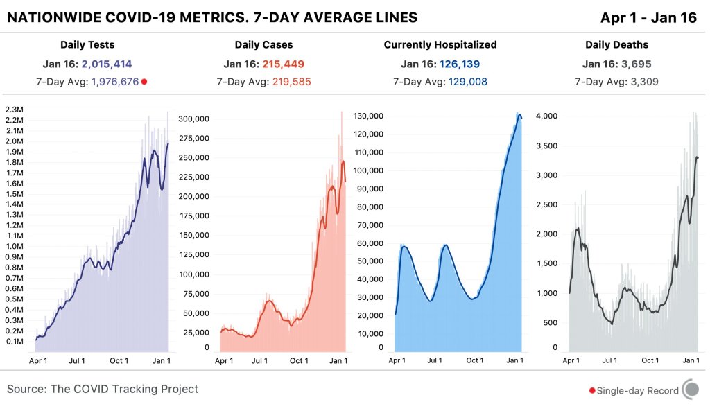
In the past week (January 10 through 16), the U.S. reported about 1.5 million new cases, according to the COVID Tracking Project. This amounts to:
An average of 220,000 new cases each day
469 total new cases for every 100,000 Americans
1 in 213 Americans getting diagnosed with COVID-19 in the past week
Nationwide COVID-19 metrics published in the COVID Tracking Project’s daily update on January 16. Hospitalizations appear to be leveling off, but deaths are still over 3,000 eachday.
Last week, America also saw:
126,000 people now hospitalized with COVID-19 (38 for every 100,000 people)
23,200 new COVID-19 deaths (7.1 for every 100,000 people)
Two weeks out from New Years (and the subsequent reporting weirdness), cases seem to be stabilizing, somewhat. But “stabilizing,” at this point in the pandemic, still means ridiculous numbers. 220,000 new cases each day! That’s like the population of Baton Rouge, Louisiana getting diagnosed with COVID-19 every day.
Meanwhile, COVID-19 deaths are at their highest point in the pandemic, averaging 3,300 deaths per day.
One positive note in this week’s numbers is that hospitalizations appear to be leveling off. But, as the COVID Tracking Project’s weekly update points out, the hospitalization picture is far different across different parts of the country. And with the more contagious B.1.1.7 variant getting detected in more and more states, the worst point of the pandemic for the U.S. may be still to come.
At a time when state dashboards have become increasingly crowded with new information—or expanded onto five different GIS pages—I am comforted by the consistency of Kentucky’s COVID-19 reporting.
The state has posted daily COVID-19 reports since the spring, including all the most important metrics in one place. If you’re looking for total cases, ICU patients, county-level statistics, or demographic data, you can find it all in this one PDF. The report’s formatting has changed over the past few months, but its Cntrl+F ease has not.
Also, Kentucky started reporting race and ethnicity figures in whole numbers instead of percents recently! Thanks, Kentucky!
Hospital facilities visualization by the COVID Tracking Project: Last month, the Department of Health and Human Services (HHS) released an extensive dataset showing how COVID-19 patients are impacting hospitals at the individual facility level. (See my Dec. 13 post for more information on this dataset.) The COVID Tracking Project has produced an interactive visualization from this dataset, allowing users to zoom in to individual facilities or search for hospitals in a particular city or ZIP code. I contributed some copy to this page.
Therapeutics distribution (from HHS): The HHS is posting a list of locations that have received monoclonal antibody therapies, for the purpose of treating COVID-19. Bamlanivimab, one such therapy, received EUA from the FDA in early November. The HHS page notes that this is not a complete list: “Although monoclonal antibody therapeutic treatments have been shipped nationwide, shipment locations are displayed for those States that have opted to have their locations displayed on this public website.”
Hospital discharge summaries (from the Healthcare Cost and Utilization Project): This project, under the HHS umbrella, posts time series data on U.S. hospital patients. The site recently posted summaries on patients from April to June 2020, including datasets specific to COVID-19, flu, and other viral respiratory infections. As epidemiologist Jason Salemi explains in a summary Twitter thread, the data doesn’t provide new information but may be useful for a researcher looking to dig into spring and summer hospitalization trends.
Like everyone else, I spent Wednesday afternoon watching rioters attack the nation’s Capitol. I was horrified by the violence and the ease with which these extremists took over a seat of government, of course, but a couple of hours in, another question arose: did this coup spread COVID-19?
The rioters came to Washington D.C. from across the country. They invaded an indoor space in massive numbers. They pushed legislators, political staff, and many others to hide in small offices for hours. They inspired heated conversations. And, of course, none of them wore masks. These are all perfect conditions for what scientists call a superspreading event—a single gathering that causes a lot of infections.
My concerns were quickly echoed by many other COVID-19 scientists and journalists:
The harm caused by these domestic terrorists will not be limited to DC. They are actively committing biological warfare in what will no doubt be one of the largest superspreader events of this pandemic, and will be felt across the country.
The very next day, Apoorva Mandavilli published a story asking just this question in the New York Times. She quotes epidemiologists who point out that the event was ripe for superspreading among both rioters and Capitol Hill politicians. Many legislators were stuck together in small rooms, having arguments, while some of the Republican representatives refused to wear masks. POLITICO got a video of several Republicans refusing masks in a crowded safe room.
Punchbowl News: House lawmaker: "There's a severe covid outbreak coming among members. At the secure location yesterday at least 50 GOP members refused to wear masks. They were asked repeatedly. Older dem members pleaded. And they wouldn't do it."
By Friday, five Congressmembers had tested positive for COVID-19 in a week. It’s true, many of these legislators received vaccines in the first stage of the U.S. rollout in late December. But it takes several weeks for a vaccine to confer immunity, and we still don’t have strong evidence as to whether the Pfizer and Moderna vaccines prevent the coronavirus from spreading to other people. (They likely do, to some extent, but the evidence mainly shows that these vaccines prevent COVID-19 disease.)
Just this morning, Punchbowl News’ Jake Sherman reported that the attending physician for Congress sent a note to all legislators and staff, warning them that “people in the safe room during the riots may have been exposed to the coronavirus.” I will be carefully watching for more reports of legislators testing positive in the coming weeks. From our nation’s previous experience with COVID-19 outbreaks at the White House, it seems unlikely that the federal government will systematically track these cases—though the incoming administration may change this.
As for the rioters themselves, while the events of January 6 may well have been superspreading, we likely will never know the true extent of this day’s impact. As I’ve written previously, we identify superspreading events through contact tracing, the practice of calling up patients to quiz them on their activities and help identify others who may have gotten sick. When case numbers go up—as they are now—it becomes harder to call up every new patient. One county in Michigan is so understaffed right now, it’s telling COVID-19-positive residents to contact trace themselves.
But even if contact tracing were widely available in the communities to which those rioters are going home, can you really imagine them answering a phone call from a public health official? Much less admitting to an act of treason and risking arrest? No, these so-called patriots likely won’t even get tested in the first place.
It would take rigorous scientific study to actually tie the Capitol riot to COVID-19 spread to the homes of the rioters. (That said, if you see a study like that in the months to come: please send it my way.)
Finally, I have to acknowledge one more impact of the riot on D.C. at large: vaccine appointments were canceled after 4 PM that day. One of the most heinous aspects of that riot, to me, was how it pulled our collective attention away from the pandemic, precisely at a time when our collective health needs that attention most.
Hi! I’m Sarah, and I’m going to be helping out around here for the time being. I’m currently a junior at Barnard College (Betsy’s alma mater) studying cell and molecular biology, and I’m looking to go into health journalism after I graduate. When I’m not dreaming of an all-powerful national data dashboard, I’m writing as the Science Editor for Bwog.com, pipetting a lot (remotely) in the research lab I work for, trying to keep my puppy from eating the carpet, or knitting my thousandth hat.
Happy to be here, and I look forward to digging through the complex world of Covid-19 data with you all!