- COVID-19 Cutback Tracker: Researchers at the Tow Center for Digital Journalism at Columbia University have tracked layoffs, furloughs, closures, and other cutbacks to journalistic outlets since March 2020. Findings from the project were released this past Wednesday in a new tracker.
- We Rate Covid Dashboards: Two weeks ago, I analyzed college and university COVID-19 dashboards for my newsletter. This project from public health experts at Yale and Harvard, meanwhile, goes much further: the researchers have developed a rating scheme based on available metrics, legibility, update schedules, and more, and rated over 100 dashboards so far.
- GenderSci Lab’s US Gender/Sex Covid-19 Data Tracker: The GenderSci Lab, an interdisciplinary research project, is tracking COVID-19 by gender by compiling information from state reports. The tracker includes case counts, death counts, and mortality rates.
- COVIDcast: This dashboard, by the Delphi Group at Carnegie Mellon University, features interactive maps for a variety of COVID-19 indicators, including movement trends, doctors’ visits , and even test positivity based on antigen tests.
- 2019 baby name popularity: Okay, this one isn’t COVID-19 related. But as Stacker’s resident baby names expert, I feel obligated to inform my readers that, last week, the Social Security Administration finally released its counts of how many babies were given which names in 2019. (The annual update is usually released in March, but was delayed this year due to COVID-19 concerns.) Olivia has beat out Emma for the number one-ranked baby girl name, after Emma’s five years at the top. Personally, I always get a kick out of scrolling through the long tails to see what unique and creative names parents are using.
Category: Uncategorized
-
Featured sources, Sept. 13
-
New York’s school COVID-19 dashboard looks incredible… but where is it?
I wrote in last week’s issue that New York state is launching a dashboard that will provide data on COVID-19 in public schools.
New York Governor Andrew Cuomo discussed this dashboard in his online briefing last Tuesday, September 8. (If you’d like to watch, start at about 18:00.) He explained that every school district is now required to report test and case numbers daily to New York’s Department of Health. Local public health departments and state labs performing testing are also required to report these numbers, so that the state department can cross-check against three different sources. Cases and tests will be published by school on the new dashboard, called the COVID Report Card.
In his briefing, Governor Cuomo showed a mockup of what the Report Card will look like. The available data includes positive cases by date, tests administered by the school (including test type, lab used, and test wait time), the school’s opening status (i.e. is it operating remotely, in person, or with a hybrid model), and the percentage of on-site students and staff who test positive.
This dataset promises to be much more complete than any other state’s reporting on COVID-19 in schools. But I haven’t been able to closely examine these data yet, because the dashboard has yet to come online.
According to reporting from Gothamist, state officials planned for the dashboard to begin showing data on September 9. As I send this newsletter on September 13, however, the dashboard provides only a message stating that the COVID Report Card will be live “when the reporting starts to come back.”
“The facts give people comfort,” Governor Cuomo said in his briefing. So, Governor, where are the facts? Where are the data? When will New York students, parents, and teachers be able to follow COVID-19 in their schools? My calls to Governor Cuomo’s office and the New York State Department of Health have as yet gone unanswered, and subsequent press releases have not issued updates on the status of these data.
I hope to return with an update on this dashboard next week. In the meantime, for a thorough look at why school COVID-19 data are so important and the barriers that such data collection has faced so far, I highly recommend this POLITICO feature by Biana Quilantan and Dan Goldberg.
-
Featured sources, Sept. 6
- Colors of COVID: This Canadian project relies on public surveys to collect data on how COVID-19 is impacting marginalized communities in the country. The project plans to release quarterly reports with these survey results.
- America’s Health Rankings’ Senior Report: America’s Health Rankings has conducted annual reviews of health metrics in every U.S. state since 1990. The organization’s most recent Senior Report is over 100 pages of data on older Americans, including rankings of the healthiest states for seniors.
- The Long-Term Care COVID Tracker: I wrote in my August 16 newsletter that the COVID Tracking Project had released a snapshot of a new dataset compiling cases and deaths in nursing homes, assisted living facilities, and other long-term care facilities. As of this week, the full dataset is out, including historical data going back to May 21 and extensive notes on how each state is reporting this crucial information. Read more about it here.
- NIOSH-Approved N-95 Respirators: This CDC list includes thousands of surgical N-95 respirators approved by the National Institute for Occupational Safety and Health (NIOSH); it’s intended as a source for healthcare workers. As a recent article in Salon points out, the list includes over 600 valved models, despite recent guidances instructing the public to avoid valved masks.
-
Featured sources, Aug. 30
- Charity Nagivator: I just have one featured source this week, but it’s crucial. Charity Navigator is a database that compiles and evaluates charities based on their financial health and accountability. The database has detailed rankings and search capability, and when a crisis hits—such as the recent California wildfires or Hurricane Laura—they put together quick lists of organizations where any interested samaritans can help the cause.
-
COVID-19 K-12 data continue to be patchwork
Since I reviewed COVID-19 data in public school systems last week, a few things have changed:
- Alisha Morris’ crowd-sourced spreadsheet of COVID-19 cases, closures, and other reopening plan changes in K-12 schools has leveled up, thanks to collaboration with the National Education Association. Concerned students, parents, and teachers can now explore the data and report cases on a new NEA-run website. This NPR article explains more of the project’s background and findings.
- Brown University and national education organizations are working together to track school pandemic responses. Their findings, planned to be released in a dashboard this September, will include: enrollment, poverty level, internet access, COVID-19 cases, and district opening status.
- Duval County Public Schools, a district in Florida, was barred from reporting school-related COVID-19 cases by the county’s public health department. According to the Florida Times-Union, the county stated that the school district could not publish “school specific data related to COVID-19” without the state health department’s permission.
- Meanwhile, in Kentucky: this state’s COVID-19 dashboard now includes both a K-12 school public health report and a college and university public health report. Both reports, published daily, include active cases, deaths, and other statistics.
-
Featured sources, Aug. 23
- COVID Care Map: Dave Luo, another COVID Tracking Project volunteer, also runs this volunteer effort to aggregate and clean public data on health care system capacity. The source has mapped capacity figures at the state, county, and individual facility levels, as well as other healthcare data from sources such as the Institute for Health Metrics and Evaluation (IHME).
- Federal allocation of remdesivir: This public dataset from HHS shows how many cases of remdesivir, an antiviral drug which has become an important treatment option for COVID-19 patients, have been distributed to each state since early July. The dataset is cited in an NPR investigation which reports confusion and lack of transparency about how remdesivir distribution is decided.
- The White House’s Red Zone Reports: Each week, the White House Coronavirus Task Force sends reports to U.S. governors about the state of the pandemic, including county-level data on cases and tests. The reports are not made public, but the Center for Public Integrity is collecting and releasing many of them. As of August 23, the Center’s document repository includes one report on all 50 states (from July 14) and 13 state-specific reports.
-
March for the dead, fight for the living
Earlier this weekend, I attended a protest in New York City called, “March for the Dead.” The event sought to memorialize New Yorkers who died of COVID-19 and demand that the federal government better address the realities of this pandemic and protect vulnerable Americans.
After a rally and a silent, candlelit march across the Brooklyn Bridge, the protest finished with a reading of names. Two organizers read the names of 1,709 New Yorkers whose lives were lost in this pandemic in front of a makeshift memorial comprised of candles and signs. The names came from a database compiled by local NYC publication THE CITY, the Columbia Journalism School, and the CUNY Craig Newmark Journalism School; they comprise only a small fraction (7.2%) of New Yorkers who have died due to COVID-19.
(Disclaimer: one of the event’s organizers, Justin Hendrix, volunteers with me at the COVID Tracking Project.)
While this newsletter is a journalism project, it felt fitting this week for me to share a few lines I wrote on the subway home after listening to the name reading. “March for the Dead” reminded me of the people behind the numbers I spend so much time compiling and analyzing—a reminder that I think anyone covering this pandemic sorely needs.
how long would it take to read all the names?
1,700 names in the city’s memorial. it took an hour, maybe, give or take. i wasn’t really keeping track. i was listening to the names, the way they rang out in the open square. the way they fell heavy on the pavement, like drops of rain at the start of a thunderstorm. but this is not the start of a thunderstorm, of course. it’s a hurricane, and another hurricane, and a wildfire, and a tornado, and all of it preventable. the father of one of the readers, kept in a nursing home. grocery store clerks, cafe workers, nurses, and parents, siblings. so many pairs of names that rhyme. so many bodies in tiny apartments, bodies in shelters, bodies hooked up to breathing machines, gasping for every molecule of oxygen.
this is not the start of a thunderstorm. it’s a hurricane, and we aren’t stopping it. an hour, perhaps, for 1,700 names. how long would it take, to read all 25,000 names of those who died in new york city? all 175,000 who died in america? all the thousands more who have not been counted yet? how long would it take to talk to the families and friends of the people who bore those names, to find out their favorite colors, what they ate for breakfast, what they were looking forward to this year? how long would it take to attend 175,000 funerals?
this is a metric i can’t count. my back would crack under the weight. all i can do is sit in the square, sit quietly, and listen. and then i return to work, i keep counting the numbers i can count. i let them echo.
-
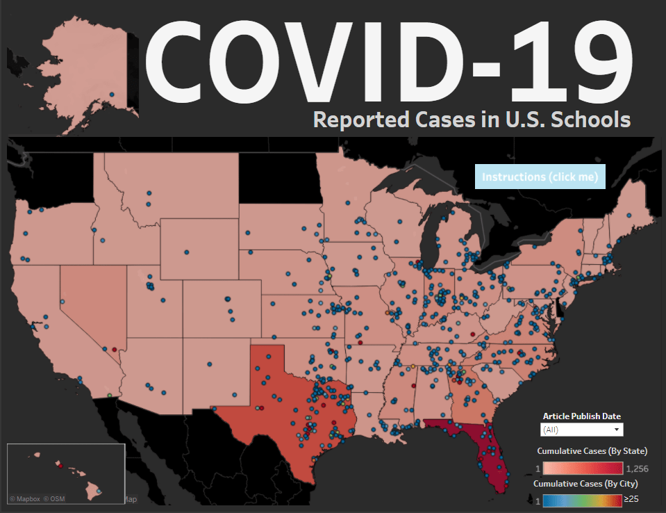
Data on schools reopening lag the actual reopening of schools

Reported COVID-19 cases in K-12 schools, compiled by Alisha Morris and other volunteers. Screenshot via Jon W.’s Tableau dashboard. As I wrote in my coverage of the congressional subcommittee hearing on national COVID-19 response a few weeks ago, everyone wants to reopen the schools.
Politicians on both sides of the aisle, along with public health leaders such as the CDC’s Dr. Robert Redfield and NIAID’s Dr. Anthony Fauci, agree that returning to in-person learning is crucial for public health. Many children rely on food and health resources provided by schools. Parents rely on childcare. Without in-person schools, it is difficult for teachers and other mandated reporters to identify cases of child abuse. And all school students, from kindergarteners to college kids, are facing the mental health deterioration that comes from limited social interaction with their peers.
But in deciding whether and how to return to in-person learning, school districts around the country are facing the same challenge that states faced early in the pandemic: they’re on their own. Some districts may have guidance from local government; in New York, for example, schools are allowed to reopen if they are located in an area with a under 5% of COVID-19 tests returning positive results. Every county in the state meets this guideline, and the state as a whole has had a positivity rate under 1% for weeks.
Still, low community transmission does not indicate that a state is necessarily safe for reopening. Teachers in New York City have protested the city’s plan for school reopening, citing poor ventilation, no plan for regular testing, and other health concerns. Teachers in Detroit, outside of Phoenix, and other districts across the country are considering strikes. Earlier this week, the White House formally declared that teachers are essential workers—meaning they could continue working after exposure to COVID-19—which Randi Weingarten, president of the American Federation of Teachers, called a move to “threaten, bully, and coerce” teachers back into their unsafe classrooms. Meanwhile, many colleges and universities are planning to bring students from out of state into the communities around their campuses.
As conversations on school reopening heighten at both national and local levels, a data journalist like myself has to ask: what data do we have on the topic? Is it possible to track how school reopening is impacting COVID-19 outbreaks, or vice versa?
The answer is, as with any national question about COVID-19, the data are spotty. It’s possible to track cases and deaths at the county level, but no source comprehensively tracks testing at a level more local than the state. It is impossible to compare percent positivity rates—that crucial metric many districts are using to determine whether they can safely reopen—both broadly and precisely across the country.
The best a data journalist can do is represented in this New York Times analysis. The Times pulled together county-level data from local public health departments and evaluated whether schools in each county could safely open based on new cases per 100,000 people and test positivity rates. Test positivity rates are difficult to standardize across states, however, because different states report their tests in different units. And, if you look closely at this story’s interactive map, you’ll find that some states—such as Ohio, New Hampshire, and Utah—are not reporting testing data at the county level at all.
Still, some research projects and volunteer efforts are cropping up to document COVID-19 in schools as best they can. I will outline the data sources I’ve found here, and I invite readers to send me any similar sources that I’ve missed so that I can feature them in future issues.
How schools are reopening
- COVID-19 Testing in US Colleges: Sina Booeshaghi and Lior Pachter, two researchers from CalTech, put together a database documenting testing plans at over 500 colleges and universities throughout the U.S. The database is open for updates; anyone who would like to suggest an edit or contribute testing information on a new school can contact the researchers, whose emails are listed in the spreadsheet. Booeshaghi and Pachter wrote a paper on their findings, which is available in preprint form on medRxiv (it has not yet been reviewed by other scientists).
- The College Crisis Initiative: Davidson College’s College Crisis Initiative (or C2i) maps out fall 2020 plans for about 3,000 colleges and universities. Clicking on a college in the interactive map leads users to see a brief description of the school’s opening policy, along with a link to the school’s website. Corrections may be submitted via a Google form.
- District Budget Decisions: Edunomics Lab at Georgetown University has compiled a database of choices school districts are making about how to change their budgets and hiring during the COVID-19 pandemic. The database includes 302 districts at the time I send this newsletter; district choices are categorized as budget trimming, salary reductions, benefits adjustment, furloughs, and layoffs.
Reporting COVID-19 in schools and districts
- COVID-19 in Iowa: Iowa’s state dashboard includes a page which specifically allows users to check the test positivity rates in the state’s school districts. Click a school district in the table on the left, and the table on the right will automatically filter to show how testing is progressing in the counties encompassed by this district. So far, Iowa is the only state to make such data available in an accessible manner; other states should follow its lead.
- NYT COVID-19 cases in colleges: Journalists at the New York Times surveyed public and private four-year colleges in late July. The analysis found at least 6,600 cases tied to 270 colleges since March. This dataset is not being actively updated, but it is an informative indicator of the schools that faced outbreaks in the spring and summer.
- Individual school dashboards: Any large college or university that chooses to reopen, even in a partial capacity, must inform its students of COVID-19’s progress on campus. Some schools are communicating through regular emails, while others have put together school-specific dashboards for students, professors, and staff. Two examples of school dashboards can be found at Boston University and West Virginia University; at other schools, such as Georgia Tech, students have spun up their own dashboards based on school reports.
Reopening gone wrong
- K-12 school closures, quarantines, and/or deaths: Weeks ago, Alisha Morris, a theater teacher in Kansas, started compiling news reports on instances of COVID-19 causing schools to stall or alter reopening plans. Morris’ project grew into a national spreadsheet with hundreds of COVID-19 school case reports spanning every U.S. state. She now manages the sheet with other volunteers, and the sheet’s “Home” tab advertises a new site coming soon. You can explore the dataset through a Tableau dashboard created by one volunteer.
Datasets under development
- FinMango and Florida COVID Action collaboration: FinMango, a global nonprofit which has pivoted to help COVID-19 researchers, has partnered with Florida COVID Action, a data project led by whistleblower Rebekah Jones, to track COVID-19 cases in K-12 schools. The project, called the COVID Monitor, has already been compiling reports from media and members of the public since July. It includes about 1,300 schools with confirmed or reported COVID-19 cases so far, 200 of which are in the project’s home state of Florida.
- ProPublica school reopening survey: A new initiative from ProPublica asks students, parents, educators, and staff to report on their schools’ reopening plans. Readers who might prefer to share information with ProPublica through more private means can get in touch on Signal or visit the publication’s tips page.
- Nature university reopening survey: Similarly to ProPublica, Nature News is surveying its readers on their reopening experience. This survey specifically calls on research scientists to share how they will be teaching and if they agree with the approach their university has taken on reopening. Respondents who wish for more privacy can use Signal or WhatsApp.
-
Featured sources, Aug. 16
- Lost on the frontline: This week, Kaiser Health News and The Guardian released an interactive database honoring American healthcare workers who have died during the COVID-19 pandemic. 167 workers are included in the database so far, and hundreds more are under investigation. Reading the names and stories of these workers is a small way to remember those we have lost.
- The Long-Term Care COVID Tracker, by the COVID Tracking Project: Residents of nursing homes, assisted living facilities, and other long-term care facilities account for 43% of COVID-19 deaths in the U.S. A new dataset from the COVID Tracking Project compiles these sobering numbers from state public health departments. You can currently explore a snapshot of the data as of August 6; the full dataset will be released this coming week.
- Household Pulse Survey by the U.S. Census: From the end of April through the end of July, the U.S. Census ran a survey program to collect data on how the COVID-19 pandemic impacted the lives of American residents. The survey results include questions on education, employment, food security, health, and housing. I looked at the survey’s final release for a Stacker story; you can see a few statistics and charts from that story here:
-
How many COVID-19 cases are actively circulating in your community?
This section was inspired by a question my friend Abby messaged me yesterday. She asked:
How come there don’t seem to be any stats on active cases? Obviously it’s important to track new cases, but what I mostly want to know is, what is the likelihood that, if I run into someone on the street, they have COVID-19, and it doesn’t seem like new cases tells me that.
In response, I explained that active cases are pretty difficult to track in a country that hasn’t even managed to set up robust contact tracing at national or state levels. To keep tabs of active cases, a public health department would essentially need to call all infected people in its jurisdiction at regular intervals. Those people would need to answer questions about how they’re doing, what symptoms they have, and if they had gotten tested recently. This type of tracking might be doable for some smaller counties, but it’s challenging in larger counties, areas with swiftly rising COVID-19 case counts, areas without sufficient testing capacity, areas with health disparities where some residents aren’t likely to answer a call from a contact tracer… you get the idea.
But it’s still possible to model how many people sick with COVID-19 are likely present in a community at a given time. Epidemiologists and statisticians can use a region’s new case rate—the number of people recently diagnosed with COVID-19—and other COVID-19 metrics, along with population density and demographic information, to estimate how many people in that region are currently infected. A recent analysis in the New York Times used this type of method to estimate how many infected students might come to schools across the country.
If you’d like to see the likely infection rate in your area, check out the COVID-19 Event Risk Assessment Planning Tool developed by researchers at the Georgia Institute of Technology and Applied Bioinformatics Laboratory. Select a state and an event size, and the tool will tell you how likely it is that someone sick with COVID-19 is at this event. For example, at a 50-person event in New York: 2.2% risk. At a 50-person event in Florida: 21.3% risk.
