Category: Uncategorized

  • Was the Capitol invasion a superspreader event?

    Like everyone else, I spent Wednesday afternoon watching rioters attack the nation’s Capitol. I was horrified by the violence and the ease with which these extremists took over a seat of government, of course, but a couple of hours in, another question arose: did this coup spread COVID-19?

    The rioters came to Washington D.C. from across the country. They invaded an indoor space in massive numbers. They pushed legislators, political staff, and many others to hide in small offices for hours. They inspired heated conversations. And, of course, none of them wore masks. These are all perfect conditions for what scientists call a superspreading event—a single gathering that causes a lot of infections.

    (The number can vary, based on how you define a superspreading event; for more background, see this post from November.)

    My concerns were quickly echoed by many other COVID-19 scientists and journalists:

    The very next day, Apoorva Mandavilli published a story asking just this question in the New York Times. She quotes epidemiologists who point out that the event was ripe for superspreading among both rioters and Capitol Hill politicians. Many legislators were stuck together in small rooms, having arguments, while some of the Republican representatives refused to wear masks. POLITICO got a video of several Republicans refusing masks in a crowded safe room.

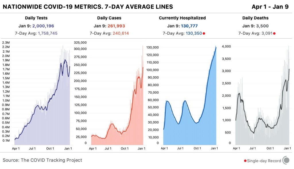
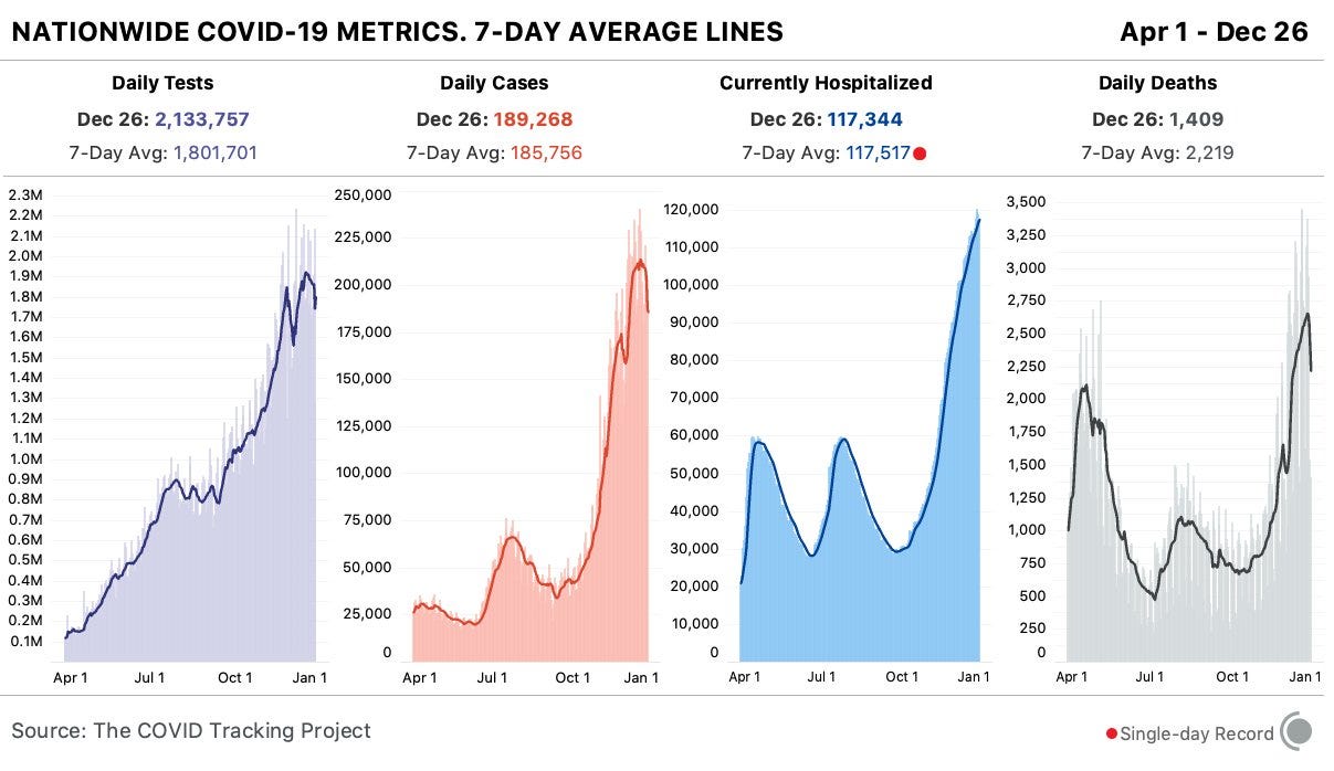
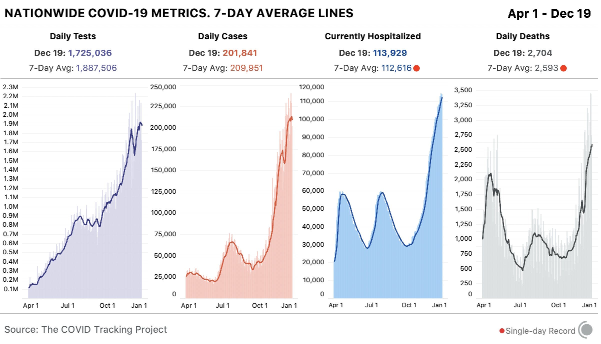
    By Friday, five Congressmembers had tested positive for COVID-19 in a week. It’s true, many of these legislators received vaccines in the first stage of the U.S. rollout in late December. But it takes several weeks for a vaccine to confer immunity, and we still don’t have strong evidence as to whether the Pfizer and Moderna vaccines prevent the coronavirus from spreading to other people. (They likely do, to some extent, but the evidence mainly shows that these vaccines prevent COVID-19 disease.)

    Just this morning, Punchbowl News’ Jake Sherman reported that the attending physician for Congress sent a note to all legislators and staff, warning them that “people in the safe room during the riots may have been exposed to the coronavirus.” I will be carefully watching for more reports of legislators testing positive in the coming weeks. From our nation’s previous experience with COVID-19 outbreaks at the White House, it seems unlikely that the federal government will systematically track these cases—though the incoming administration may change this. 

    As for the rioters themselves, while the events of January 6 may well have been superspreading, we likely will never know the true extent of this day’s impact. As I’ve written previously, we identify superspreading events through contact tracing, the practice of calling up patients to quiz them on their activities and help identify others who may have gotten sick. When case numbers go up—as they are now—it becomes harder to call up every new patient. One county in Michigan is so understaffed right now, it’s telling COVID-19-positive residents to contact trace themselves.

    But even if contact tracing were widely available in the communities to which those rioters are going home, can you really imagine them answering a phone call from a public health official? Much less admitting to an act of treason and risking arrest? No, these so-called patriots likely won’t even get tested in the first place.

    It would take rigorous scientific study to actually tie the Capitol riot to COVID-19 spread to the homes of the rioters. (That said, if you see a study like that in the months to come: please send it my way.)

    Finally, I have to acknowledge one more impact of the riot on D.C. at large: vaccine appointments were canceled after 4 PM that day. One of the most heinous aspects of that riot, to me, was how it pulled our collective attention away from the pandemic, precisely at a time when our collective health needs that attention most.

  • National numbers, Jan. 10

    National numbers, Jan. 10

    In the past week (January 3 through 9), the U.S. reported about 1.7 million new cases, according to the COVID Tracking Project. This amounts to:

    • An average of 240,000 new cases each day
    • 447 total new cases for every 100,000 Americans
    • 1 in 196 Americans getting diagnosed with COVID-19 in the past week
    Nationwide COVID-19 metrics published in the COVID Tracking Project’s daily update on January 9. More than 3,000 Americans are now dying of COVID-19 every day.

    Already, in 2021, America has reported 2.1 million new COVID-19 cases. That’s 31 times the number of cases South Korea has reported in the entire pandemic. (Remember, the two nations had their first cases on the same day back in January 2020.)

    Last week, America also saw:

    • 131,000 people now hospitalized with COVID-19 (40 for every 100,000 people)
    • 21,700 new COVID-19 deaths (7 for every 100,000 people)

    The nation is now recording an average of 3,000 deaths every day, more than the number of lives lost on September 11, 2001. Yet cases are still rising—the COVID Tracking Project reported a record 310,000 on January 8—and hospitals continue to fill with patients.

    Some of the cases and deaths added to national counts this week were likely reported late, making up for holiday dips over the winter holidays. (See previous issues for more on this phenomenon.) But many weren’t. 

    “Things will get worse as we get into January,” Dr. Fauci said in an interview with NPR this week.

  • Your guide to choosing a COVID-19 data source

    Your guide to choosing a COVID-19 data source

    In preparing for this re-launch, I asked a few of my readers what they liked about the COVID-19 Data Dispatch and how it could better serve them. One common answer was that the publication has helped readers navigate the landscape of COVID-19 data sources, and pick the best source for a given story.

    The first two resources pages I’ve produced take this service to the next level.

    First: The Featured Source List is an upgraded version of the Google spreadsheet I’ve been using to keep track of data sources featured in the newsletter since July. You can use the table to search, sort, and filter all 82 featured sources by their names and categories. The little green plus icons toggle expanded views, with more details on every source. Much friendlier than a spreadsheet!  (Though, if you want to see the raw spreadsheet, it’s still accessible here.)

    Second: The Data Source Finder tool tells you exactly where to find the data you need for a given story.  (Or for a Facebook post, or an argument with your friend, and so forth.)  The tool includes detailed annotations on 16 data sources which I consider the primary COVID-19 sources in the U.S.

    Here’s how to use it. You start out by selecting the geographic scale on which you’d like to see data (global, U.S. states, counties, or cities), then choose the type of metric you’re looking for. The tool will return your options, including each dataset’s available metrics, methodologies, update schedule, download links, and more.

    It’s essentially an interactive flowchart, aimed to make it easy to compare and contrast sources for reporters on deadline and students engaged in Twitter debates alike. You can also find the full set of annotations linked on the page.

    While I compiled the annotations, the interactive tool was coded in Twine by my girlfriend, Laura Berry.  Your membership fees will help me buy Laura a nice dinner to thank her for her work.

  • Support the COVID-19 Data Dispatch

    Support the COVID-19 Data Dispatch

    For the past five months, I’ve produced this publication for free. It’s been an act of service to my fellow COVID-19 reporters, public health communicators, and readers who simply want to understand the pandemic a bit better.

    The newsletter will continue to be free, as will many of the COVID-19 data resources I publish. But in tandem with this new site, I’m launching a membership program. 

    This program will enable COVID-19 communicators to connect more directly with each other, as well as to provide feedback that will shape what I cover.  It’ll also help me cover my own costs, which have grown significantly as I moved platforms.

    I already talked about my technical reasons for moving from Substack to a full-fledged website. I have another big reason for setting up a site, though: I’m planning to keep the CDD going beyond this pandemic. Its name might change later in 2021 or 2022, but my mission will stay the same—building accessibility and accountability for public health data in the United States.

    This publication won’t end when COVID-19 does. But even that idea, COVID-19 “ending,” feels tenuous to me. Maybe you feel that way, too. Maybe you’ve been reading articles like Ed Yong’s “Where Year Two of the Pandemic Will Take Us” or Maryn McKenna’s “2021 Will Be a Lot Like 2020,” that unpack how far we still need to go before life returns to some semblance of normalcy. Maybe you realize that America’s recovery from the pandemic won’t be so simple as 70% of the population getting vaccinated. Maybe you feel haunted by the structural inequities that COVID-19 revealed in our healthcare system and beyond, and you know you could never write enough stories or donate to enough mutual aid funds to make up the gap.

    Covering COVID-19, I’ve realized, is not just about this virus.  It’s about making sure we’re ready for the next public health crisis.  And we do that not just by growing our scientific capability but by prioritizing the public in public health.  To change the systems in which we live, we need to understand them—and we need to bring our communities along with us.

    If you feel this way, too, join me!  Help me build a network that will be ready to cover this pandemic and the next one.

    And now, the technical details.  Here are the benefits of membership:

    • Community: Join a Slack server where COVID-19 reporters and communicators share resources and advice.
    • Resources: Exclusive cleaned datasets, visualizations, and other tools to assist you in your work.
    • Shape the Dispatch: Your priorities and needs will shape what the CDD covers and which new resources are produced.
    • Accessibility: Keep the CDD free for all its readers! Support accountability for public health data!

    The recommended membership fee is $10/month.

    But I understand that the pandemic is a difficult time for financial commitments. As such, I’m also offering pay-what-you-will pricing, starting at $2/month. There’s no difference in benefits between the two price tiers.

    In the interest of transparency, I’ve published my major costs here. To break even, I would need 120 members to join at the recommended $10/month tier.

    I also want to call attention to the second line on that costs page: Intern’s research and writing time. That’s right—this is going from a one-person publication to a two-person publication!  My friend (and current Barnard junior) Sarah Braner has agreed to join me as an intern for their spring semester.  You’ll learn more about them next week.

    As I am extremely against unpaid internships, my top financial priority right now is paying Braner’s salary. That shakes out to 18 members joining at $10/month.

    If you’re not ready to commit to membership right now, you can still support the publication with a one-time donation on Ko-fi.

  • The COVID-19 Data Dispatch has moved

    The COVID-19 Data Dispatch has moved

    It feels like every journalist started a Substack in 2020. I proudly joined that number when I launched the COVID-19 Data Dispatch in late July.

    But after five months of screenshotting Tableau charts, struggling to keep organized, and hitting Gmail’s email size limit again and again—I realized the platform wasn’t serving my needs. I wanted to give my readers clear archives and easy-to-navigate resources, and Substack just wasn’t providing.

    From now on, I’ll be publishing each issue as a series of posts on the site and sending out a newsletter with the highlights. This will help keep issues concise while still allowing me to do deep dives into important data issues.

    More on the new site below. But first, some housekeeping.

    Housekeeping

    Here’s how to make sure you don’t miss my emails on the new platform.

    If you have any questions or find that you’re missing my emails on Sundays, hit me up at betsy@coviddatadispatch.com.

    Why I moved

    The choice to switch platforms wasn’t an easy one. Substack allowed me to focus on content without worrying about any technical setup, and it provided an easy experience for new readers who wanted to sign up. But after deliberating the move, talking to mentors, and spending a few weeks setting up my new system, I’m feeling good about this decision.

    Here are a few of the reasons why I made this move.

    • Linking out to posts: Probably the most common criticism of the CDD (Substack edition) was that it was simply too long. Emails got cut off in inboxes, and readers would need to scroll past thousands of words of analysis to get to new featured sources or my weekly snarky comment about a data dashboard.  I wanted to make the email reading experience easier without compromising my desire to really dive into data sources.  This new format—short blurbs in the newsletter, linked out to longer posts on the site—helps me do just that.
    • Organized archives: Publishing each newsletter as a series of posts rather than as one long article also helps me keep the site organized—and makes it easier for you to find the information you need. I’ve set up several major categories, such as “Federal data,” “K-12 schools,” and “Hospitalization,” which group similar newsletter segments together. The archives are also organized with tags (which get a little more specific than the categories) and by date.
    • Hosting data resources: In addition to posts from my newsletter issues, the new website includes dedicated resource pages. These pages pull together data source recommendations, annotations, and tips in a format that’s much more accessible than a Google spreadsheet. (Shout-out to the WordPress plugin TablePress, which is my new best friend.) The first couple of pages are up; more will be posted in the coming weeks.
    • Hosting visualizations: One big reason for moving off Substack: on this website, I can actually embed Tableau dashboards. And Datawrapper charts, and Flourish charts, and basically any other type of visualization. This will make it much easier for you to interact with the charts I feature, whether those are charts I produced specifically for the newsletter or figures I’m hosting from other sources.
    • Setting up for search: The new website is searchable both internally and externally. Internally: a “Search” widget on the site’s sidebar and at the bottom of every page allows you to search for topics like “Texas” or “Dr. Fauci.” Externally: I’m using a couple of WordPress tools to make the website more easily recognizable by Google and other search engines. This should help more readers find the publication.
  • National numbers, Jan. 3

    National numbers, Jan. 3

    In the past week (December 27 through January 2), the U.S. reported about 1.4 million new cases, according to the COVID Tracking Project. This amounts to:

    • An average of 201,000 new cases each day
    • 430 total new cases for every 100,000 Americans
    • 1 in 232 Americans getting diagnosed with COVID-19 in the past week
    Nationwide COVID-19 metrics published in the COVID Tracking Project’s daily update on January 2. Daily cases hit a new record thanks to reporting backlogs from New Years.

    These numbers must be interpreted with caution: COVID-19 reporting has been significantly impacted by Christmas and New Years. 20 states didn’t update their COVID-19 data on December 25, and 24 didn’t update their data on January 1—followed by a record day with 276,000 cases reported on January 2. As I’ve noted in previous issues, reporting gaps over holidays lead to spikes several days later, as states catch up on the cases, deaths, and tests that took place over their break.

    But hospitals didn’t close for the holidays. Over 125,000 Americans were hospitalized with COVID-19 this week—the nation continues to break its own record for this morbid metric. For more context and regional analysis on hospitalizations, see the COVID Tracking Project’s most recent weekly update.

  • The 20 best COVID-19 data stories of 2020

    The 20 best COVID-19 data stories of 2020

    Here are 20 stories that have uncovered significant patterns of the pandemic, demonstrated a mastery of craft, and inspired me to be a better data journalist.

    (Disclaimer: I primarily read U.S. coverage from national and New York City-specific publications, so this list is not as diverse as I’d like; still, I did my best to include a variety of outlets and topics, featuring data viz-heavy stories as well as more traditional articles which explain COVID-19 numbers.)

    • Edward Holmes’ tweet announcing that the novel coronavirus genome has been posted (Jan. 10): Okay, so this isn’t technically a work of data journalism. But it seemed crucial to me that I include the most important tweet of the year. When Holmes publicly shared the genome of SARS-CoV-2—sequenced by Shanghai professor Yong-Zhen Zhang—scientists around the world immediately sprung into action, developing tests and therapeutics for the novel virus. “Please feel free to download, share, use, and analyze this data,” a note on the Virological.org posting reads. And scientists did: the first vaccines were designed within days.
    • Limited data may be skewing assumptions about severity of coronavirus outbreak, experts say (STAT News, Jan. 30): Helen Branswell’s diligent record on covering COVID-19 speaks for itself—I had to go eight pages back in her archive to find stories from January. (Her first story on the virus was published on January 4). This January 30 piece points out how a limited case definition hindered Chinese scientists attempting to determine how far the virus had spread through the country. Throughout the pandemic, Branswell has been an experienced voice who can clearly spell out the implications of medical data, as she does here: she explains why the severe COVID-19 cases that had been reported so far were the “tip of the iceberg.”
    • The Strongest Evidence Yet That America Is Botching Coronavirus Testing (The Atlantic, March 6): I wish I could include every single one of Alexis Madrigal and Rob Meyer’s COVID-19 data stories in this list; throughout the pandemic, these reporters have used data from the COVID Tracking Project (which they cofounded) to explain major COVID-19 trends and draw attention to issues in the U.S. Their work shows how journalists can benefit from truly getting inside of a dataset and spending months watching the same metrics. I chose these reporters’ first story, however, because it was the basis for the COVID Tracking Project itself. “How many people have actually been tested for the coronavirus?” Madrigal and Meyer ask. The answer, it turns out, took hundreds of volunteers, intensive infrastructure, and endless partnerships that spanned far beyond March.
    • Why It’s So Freaking Hard To Make A Good COVID-19 Model (538, March 31): At a time when it seemed like every other Twitter account suddenly belonged to an armchair epidemiologist, 538’s Maggie Koerth, Laura Bronner, and Jasmine Mithani swept in to expound upon the complexities of infectious disease modeling. The article uses simple graphics—flowcharts of color-coded boxes—to show all the factors that can go into calculations of how many people might get sick and die during the COVID-19 pandemic. Rereading it this week, I was struck by how relevant the story still is in articulating fundamental uncertainties about this virus.
    • Mapping Covid-19 outbreaks in the food system (Food & Environment Reporting Network, April 22/ongoing): Meatpacking plants and other food processing facilities have been some of the biggest outbreak sites in the U.S., but most government sources do not report specifically on these outbreaks. Reporter Leah Douglas has singlehandedly filled this gap by synthesizing reports from local news outlets, health agencies, and food production companies. She has updated the data visualizations in this story regularly since April. As of December 18, the most recent update, at least 1,257 meatpacking and food processing plants have seen COVID-19 cases. Tyson Foods has seen the most cases, at over 11,000.
    • How to Understand COVID-19 Numbers (ProPublica, July 21): Caroline Chen is a veteran infectious disease reporter who lived through Hong Kong’s SARS outbreak and reported on Ebola. With the help of designer Ash Ngu, she walks readers through a couple of key principles in understanding—and reporting—COVID-19 data. The story explains why to use seven-day averages over raw case numbers, how to understand test positivity rates, and more. I covered it in my first newsletter issue back in July and was inspired to write my own “how to understand COVID-19 numbers” story for Stacker in the fall.
    • To Navigate Risk In a Pandemic, You Need a Color-Coded Chart (WIRED, July 21): In this delightfully meta story, Maryn McKenna unpacks the design choices that go into those green-to-red risk charts that were widely shared across social media when states began reopening in the summer. She explains the challenge of taking risk—something that is inherently impossible to fully quantify—and putting it into one-size-fits-all guidance. True COVID-19 risk, the story explains, must incorporate one’s location, environment, behavior, and many more factors.
    • Which Cities Have The Biggest Racial Gaps In COVID-19 Testing Access? (538, July 22): A lot of journalists have tried to explain how systemic racism in America led to disproportionately high COVID-19 cases and deaths for the Black community. But this story, by a team of six 538 researchers and designers, is particularly effective. The graphics demonstrate a clear disparity: “testing sites in and near predominantly Black and Hispanic neighborhoods are likely to serve far more patients than those near predominantly white areas.” In South Texas, for example, a single testing site may have served 600,000 people—leading to extensive test wait times and other barriers to healthcare for COVID-19 patients.
    • Thousands of Texans are getting rapid-result COVID tests. The state isn’t counting them. (Houston Chronicle, Aug. 2): Fun story about this one: back in August, when I was working on my antigen testing issue, I needed to cite this piece on the disconnect between how antigen tests were being reported by Texas’ state public health agency and how they were being reported by several Texas counties. I paid for a subscription to the Houston Chronicle to get around the site’s paywall. And then, probably because I am a Millennial/Gen Z cusp who hates unnecessary phone calls… I never canceled my subscription. I have no regrets, though—the Houston Chronicle does good work. This particular story provided a clear explanation of antigen test reporting issues long before many other news outlets became aware of the test type.
    • Why the United States is having a coronavirus data crisis (Nature, Aug. 25): This story, by Nature’s Amy Maxmen, uses global context to explain why it is so damn hard for the U.S. to collect and share COVID-19 data. While South Korea has coordinated case reporting and contact tracing from 250 regional public health agencies, local agencies in the U.S. are overworked, underpaid, and relying on outdated technology. The article also discusses how a lack of federal leadership and data standards trickles down to make data collection, analysis, and transparency harder for epidemiologists.
    • A long time to wait (Spotlight PA, Sept. 24): There was a period in summer 2020 during which Sara Simon tweeted every day about delays in Pennsylvania’s COVID-19 reporting. The state often reported COVID-19 deaths months later than they had occurred, due to an antiquated data system that was not updated in time for Pennsylvania’s outbreaks—and caused additional confusion for public health workers and state data watchers alike. Simon and her colleagues’ story explores these reporting issues, while a data visualization of the death reporting lag in every state provides context.
    • Data Journalists’ Roundtable: Visualizing the Pandemic (The Open Notebook, Sept. 29): This roundtable interview brings together four data journalists to share the design choices behind COVID-19 graphics they produced. It includes both discussions of the journalists’ biggest challenges and behind-the-scenes notes on specific charts, ranging from a visualization of cell phone data to one of high-risk health conditions in minority communities. (One of the graphics featured is, in fact, a chart from the 538 article on COVID-19 modeling that I highlighted earlier in this list.)
    • This Overlooked Variable Is the Key to the Pandemic (The Atlantic, Sept. 30): Never has a science writer elaborated upon a single variable so expertly as Zeynep Tufekci does in this story. She uses k, a measure of how a virus disperses, to explain why some COVID-19 patients are able to infect many other people—in what epidemiologists call superspreading events—while other patients do not infect anyone else at all. The story walks readers through an immense amount of scientific evidence while clarifying basic principles with easy-to-grasp analogies.
    • Covid-19’s stunningly unequal death toll in America, in one chart (Vox, Oct. 2): This story lives up to its headline’s promise. The chart in question, by Vox’s Christina Animashaun, visualizes COVID-19 death rates with small human icons: each “person” represents one in 100,000 Americans who have died from the disease. As of early October, 98 of every 100,000 Black Americans had died from COVID-19, compared to 47 of every 100,000 white Americans. As of December 26, 126 out of every 100,000 Black Americans and 74 out of every 100,000 white Americans have now died of this disease.
    • Test Positivity in the US Is a Mess (The COVID Tracking Project, Oct. 8): Out of the many informative blog posts produced by the COVID Tracking Project since last spring, this is the one I’ve shared most widely. Project Lead Erin Kissane and Science Communication Lead Jessica Malaty Rivera clearly explain how COVID-19 test positivity—what should be a simple metric, the share of tests conducted in a given region that return a positive result—can be calculated in several different ways. Graphics by Júlia Ledur illustrate the different options, with the help of a cartoon COVID-19 patient called Bob. The post both highlights a major issue in COVID-19 data reporting and explains why the Project does not report test positivity on its own site.
    • We Don’t Really Know if COVID is Spreading in Lincoln Schools (Seeing Red Nebraska, Oct. 13): This local news story takes a deep dive into reporting issues in the Lincoln Public Schools district. Reporter Trish Wonch Hill explains why the school district’s data dashboard is “close to useless,” unpacks a flaw in the district’s contact tracing protocol that discounts in-school disease spread, and highlights a group of parents who have been tracking school cases on their own crowd-sourced dashboard. Data on COVID-19 in schools have been severely lacking throughout the pandemic—every local news outlet should be conducting this type of investigation.
    • A room, a bar and a classroom: how the coronavirus is spread through the air (El País, Oct. 28): This set of data visualizations by Madrid-based newsletter El País was shared far and wide after its publication in the fall—for good reason. As a reader scrolls through the charts, they clearly see how the novel coronavirus may travel through aerosols, or small air particles, in an indoor space. The charts effectively dispel widespread beliefs that sitting six feet apart or keeping masks on throughout a long conversation will protect everyone in the room from getting infected.
    • Pandemic Backlash Jeopardizes Public Health Powers, Leaders (KHN, Dec. 15/ongoing): Since the summer, reporters at KHN and The Associated Press have produced stories in the publications’ joint “Underfunded and Under Threat” series, highlighting how public health departments across the nation were ill-prepared for the pandemic. (The dataset behind this series was a featured source in one of my early issues back in August.) This story focuses on the leaders of local public health agencies who have faced pressure to leave their jobs during the pandemic, putting faces to the impacts of budget cuts and anti-mask threats.
    • 1 in 5 Prisoners in the U.S. Has Had COVID-19 (The Marshall Project, Dec. 18/ongoing): Similarly to the KHN story above, this article by criminal justice-focused outlet The Marshall Project is part of a broader reporting project. Since March, the Project has been compiling data on COVID-19 cases and deaths in prisons around the country, in partnership with The Associated Press. (Dataset available here.) This December article visualizes the full brunt of the pandemic in each state’s prisons—in South Dakota, three out of five prisoners have been infected—while also telling several individual stories about the people who have gotten sick in prison and the advocates who are fighting for them.
    • Remembering the New Yorkers We’ve Lost to‌ COVID‑19 (THE CITY, ongoing): Nonprofit local newsroom THE CITY is building an online memorial of the New Yorkers who have died due to COVID-19. As of December 18, the memorial includes 1,946 names—remembering about 8% of the over 24,000 New Yorkers who have been lost. Earlier in December, THE CITY hosted a two-day event series to honor the dead, including readings of poetry and the obituaries written by the publication’s staff. I also participated in a protest last summer during which hundreds of these names were read aloud; it was a sobering reminder of the people behind the COVID-19 data I use in my work every day.
  • National numbers, Dec. 27

    National numbers, Dec. 27

    National numbers

    In the past week (December 20 through 26), the U.S. reported about 1.3 million new cases, according to the COVID Tracking Project. This amounts to:

    • An average of 186,000 new cases each day
    • 397 total new cases for every 100,000 Americans
    • 1 in 252 Americans getting diagnosed with COVID-19 in the past week
    Four bar charts showing key COVID-19 metrics for the US for April 1 to December 26. Today, states reported 2.1M tests, 189k cases, 117,344 currently hospitalized, and 1,409 deaths.
    Nationwide COVID-19 metrics published in the COVID Tracking Project’s daily update on December 26.

    Last week, America also saw:

    • 117,000 people now hospitalized with COVID-19 (36 for every 100,000 people)
    • 15,600 new COVID-19 deaths (4.7 for every 100,000 people)

    Around Thanksgiving, I wrote that COVID-19 data would likely get weird during and after the holiday. When the public health officials who compile and publish COVID-19 counts take a (well deserved!) day or two off, the cases, tests, and deaths that were not reported on those days off will be belatedly added to post-holiday counts. Here’s a COVID Tracking Project blog post that explains the trend in more detail.

    This pattern did, in fact, come to pass after Thanksgiving: the week of the holiday, 1.1 million cases were reported, followed by 1.3 million cases the next week and 1.6 million the week after that. We should expect this to happen once again over Christmas; indeed, the COVID Tracking Project noted that 20 states did not report COVID-19 data on December 25. The true impact of over a million people traveling will not be seen in the data for weeks to come.

    But while public health agencies may take a day off, hospitals never close. This week, more Americans were hospitalized with COVID-19 than ever: the number peaked on December 24, at over 120,000. That’s double the highest national patient number we saw in the spring or summer.

    Over 3 million Americans died in 2020—the highest number of lives lost in one year since the nation began this morbid count. At least 323,000 of those deaths were directly caused by the novel coronavirus.

  • Featured sources, Dec. 20

    These sources, along with all others featured in previous weeks, are included in the COVID-19 Data Dispatch resource list.

    • Mass Incarceration, COVID-19, and Community Spread: The nonprofit Prison Policy Initiative has published a new report showing how prisons impacted COVID-19 case rates in 2020. One major finding: rural counties with more incarcerated people per square mile had more COVID-19 cases, especially at higher percentiles.
    • COVID Border Accountability ProjectThis interactive map documents travel and immigration bans that countries have introduced in response to COVID-19. It’s compiled by a team of academic researchers, engineers, and other non-academic volunteers, and updated weekly on Wednesdays.
    • The Buffalo News’ trackers of COVID-19 cases in college athletics: CDD reader Rachel Lenzi, who covers college athletics for The Buffalo News, has kindly allowed me to share her spreadsheets compiling COVID-19 reports of COVID-19 cases in NCAA football and basketball programs. Football spreadsheetbasketball spreadsheet.
  • National numbers, Dec. 20

    National numbers, Dec. 20

    In the past week (December 13 through 19), the U.S. reported about 1.5 million new cases, according to the COVID Tracking Project. This amounts to:

    • An average of 211,000 new cases each day
    • 451 total new cases for every 100,000 Americans
    • 1 in 222 Americans getting diagnosed with COVID-19 in the past week
    • 39% of the total cases reported across the globe this week, according to the World Health Organization
    4 bar charts showing key COVID-19 metrics for the US over time from April 1 to December 19. Today, states reported 1.7M tests, 202k cases, 113,929 currently hospitalized, and 2,704 deaths.
    Nationwide COVID-19 metrics published in the COVID Tracking Project’s daily update on December 19. Seven-day averages for hospitalizations and deaths are at all-time highs.

    Cases appear to be slowing nationwide, the Project’s weekly update reports—but the trend should be interpreted with caution, as many cases reported last week were delayed by the Thanksgiving holiday. And national counts obscure regional patterns: while the Midwest may have finally passed its peak of new cases, the Northeast, South, and West are all facing still-rising outbreaks. California alone reported 287,000 cases this week, and the state’s hospitals are already full.

    Last week, America also saw:

    • 114,000 people now hospitalized with COVID-19 (35 for every 100,000 people)
    • 18,300 new COVID-19 deaths (5.6 for every 100,000 people)

    The nation continues to pass its own record for deaths reported in a single week. COVID-19 is, unambiguously, the leading cause of death in the U.S. right now.