Category: Uncategorized

  • Privacy-first from the start: The backstory behind your exposure notification app

    Privacy-first from the start: The backstory behind your exposure notification app

    New Jersey reports data on how people are using the state exposure notification app, COVID Alert NJ. Screenshot taken on March 28.

    Since last fall, I’ve been fascinated by exposure notification apps. These phone applications use Bluetooth to track people’s close contacts and inform them when a contact has tested positive for COVID-19. As I wrote back in October, though, data on the apps are few and far between, leaving me with a lot of questions about how many people actually have these apps on their phones—and how well they’re working at preventing COVID-19 spread.

    This week, I put those questions to Jenny Wanger, co-founder of the TCN Coalition and Director of Programs at the Linux Foundation of Public Health. TCN stands for Temporary Contact Numbers, a privacy-first contact tracing protocol developed by an international group of developers and public health experts. As a product manager, Wanger was instrumental in initial collaboration between developers in the U.S. and Europe, and now helps more U.S. states and countries bring exposure notification apps to their populations.

    Wanger originally joined the team as what she thought would be a two-week break between her pandemic-driven layoff and a search for new jobs. Now, as the TCN Coalition approaches its one-year anniversary, exposure notification apps are live on 150 million phones worldwide. While data are still scarce for the U.S., research from other countries has shown how effective these apps may be in stopping transmission.

    My conversation with Wanger ranged from the privacy-first design of these apps, to how some countries encouraged their use, to how this project has differed from other apps she’s worked on.

    The interview below has been lightly edited and condensed for clarity.


    Betsy Ladyzhets: To start off, could you give me some background on how you got involved with the TCN colatition and what led you to this role you’re in now?

    Jenny Wanger: My previous company did a very large round of layoffs with the beginning of the pandemic because the economics changed quite dramatically, and I was caught in that crossfire. And a couple of days later, a friend reached out and asked whether I was available to help—he was like, “I need a product manager for this thing, we’re trying to launch these apps for the pandemic. It should be, like, two weeks, and then you can go back to whatever.” So I signed up for that. I thought, sure, I’m not gonna be getting a job in the next two weeks. 

    A lot of what we were trying to do, the person who brought me on, was to convince people to use the same system and be interoperable with each other, to have more collaboration across projects. As opposed to all of these different apps being built, none of which would be able to work with each other. We found that there was somebody doing the same thing over on the European side, which was Andreas [Gebhard].

    We scheduled a meeting with all of the people we were trying to convince to do something interoperable and all of their people, and out of that meeting came the TCN Coalition. Andreas suggested the name TCN Coalition pretty much on a whim, which we’ve learned, never try to name a project in a meeting with other people there, because it will haunt you for a long time.

    That’s what we ended up with… TCN Coalition was formed, and we started trying to get everybody to build an interoperable standard and protocol and share that kind-of thing together. It was probably a week or two later that Apple and Google announced that they were going to be having APIs available to use. We weren’t totally sure what to do with that, so we kept moving forward, waiting for more information from them, and then also coaching everybody, like let’s make this interoperable with Apple and Google, that fixes a lot of problems that we weren’t able to fix otherwise.

    We kept growing, we started building out some relationships with public health authorities. And meanwhile, somebody started poking around in our area from the Linux Foundation… Eventually, it became clear that we were not gonna be able to grow to the degree that we wanted without a business model, and Linux Foundation brought that piece of the puzzle. So we merged our community to seed the Linux Foundation Public Health, and Linux Foundation Public Health brought in a business model and some funding that allowed us to keep doing the work that we were doing. We were also getting to the point where a bunch of our volunteers were saying that they needed to go back to having jobs… There was a lot of early momentum, and that slowed down over time, understandably.

    So yeah, that’s how TCN ended up merging in with LFPH. That man who was poking around TCN way back at the beginning was a guy—his name is Dan Kohn, he unfortunately passed away from cancer at the beginning of November. With that, I ended up taking on more of a leadership role in LFPH than I’d anticipated. We eventually got a new executive director at this point, and I’ve been part of the leadership team throughout. That’s sort-of the high level story.

    BL: Thank you. So, how did your background—you do product management stuff, right, how did that lead into connecting coders and running this coalition?

    JW: As a product manager, I’ve always been focused on how to get something built that actually meets the needs of a certain population, and is actually useful. There’s two sides to that. One is the project management side, of like, okay, we need to get this done.

    But much more relevant has been, on the product side, we need to make sure that we’re building things that—there are so many different players in the space, with an exposure notification app or now as we’re looking at vaccine credentials. You’ve got the public health authority, who is trying to achieve public health goals. You’ve got the end user, who actually is going to have this product running on their phone. You have Apple and Google, or anybody else who is controlling the app stores, that have their own needs. You’ve got the companies that are actually building these tools out, building out these products who are trying to hit their own goals. It’s a lot of different players, and I think where my background as a product manager has really helped has been, I’ve got frameworks and tools of how to balance all these different needs, figure out how to move things forward and get people working together, get them on the same page, to actually have something go to market that does what we think it’s supposed to do.

    BL: Right. To talk about the product itself now, can you explain how an exposure notification app works? Like, how would you explain it to someone who’s not very tech savvy.

    JW: The way I explain exposure notification is essentially that your phone uses Bluetooth to detect whether other phones are nearby. They do this by broadcasting random numbers, and the other phones listen for these random numbers and write them down in a database.

    That’s really all that’s happening—your phone shouts out random numbers, they’re random so that they don’t track you in any way, shape, or form, they’re privacy-preserving. You’ve got that cryptographic security to it. The other phones write down the numbers, and they can’t even tell, when they get two numbers, whether they’re from the same phone or different phones. They just know, okay, if I received a number, if I wrote it down, that means I was close enough to that phone in order to be at a distance, being at risk of COVID exposure.

    Then, let’s say one of those phones that you were near, the owner of that phone tests positive. They report to a central database, “Hey, I tested positive.” When this happens, all of the random numbers that that phone was broadcasting get uploaded to a central server. And what all the other phones do is, they take a look at the list on the central server of positive numbers, and they compare it to the list that’s local on their phone. If there’s a match, they look to see, like, “How long was I in the vicinity of this phone? Was it for two minutes, five minutes, 30 minutes?”

    If it goes over the threshold of being near somebody who tested positive for enough time that you’re considered a close contact, then you get a notification on your phone saying, “Hey, you were exposed to COVID-19, please follow these next steps.”

    The nice thing about this system is, it’s totally privacy-preserving, there’s pretty much no way for anybody to look at these random numbers and tell who’s tested positive or who hasn’t. They can’t tell who anybody else has been by. So it’s a really privacy-first system.

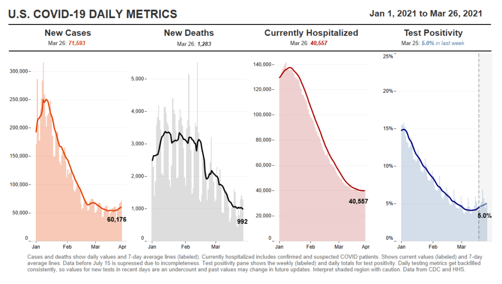
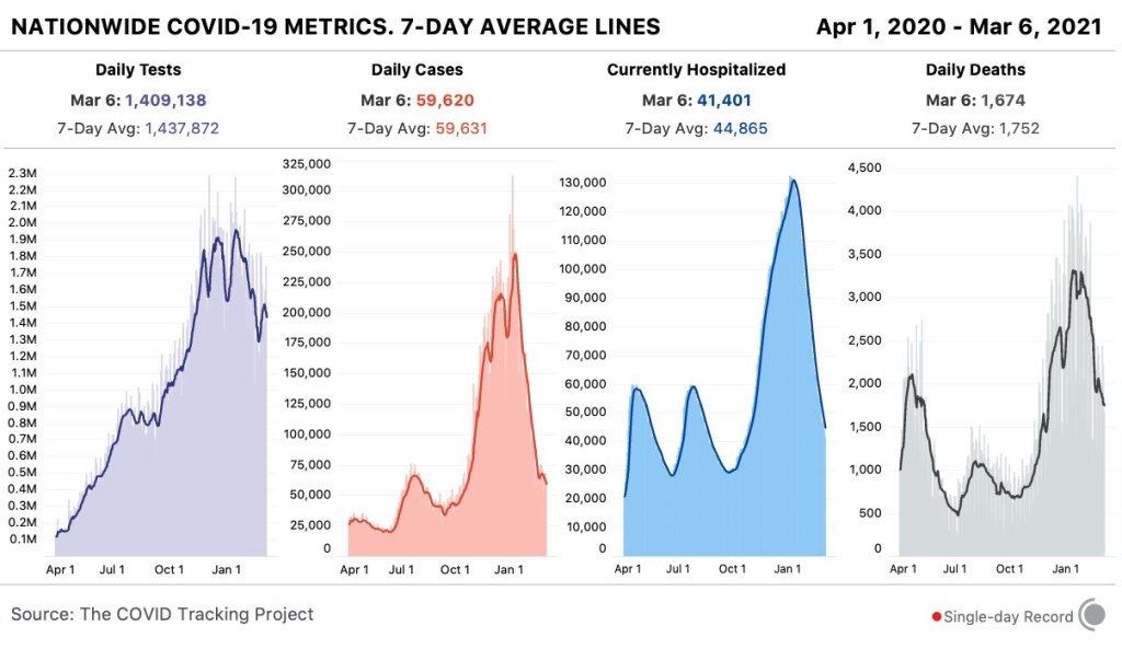
    And what we’re now seeing, which is really exciting, is that it’s effective. There’s a great study that just came out of the U.K. about a month ago, showing that for every additional one percent of the population that downloaded the NHS’s COVID-19 app, they saw a reduction in cases of somewhere between 0.8 and 2.3 percent.

    BL: Oh, wow.

    JW: The more people that adopt the app, it actually has had a material impact on their COVID-19 cases. The estimates overall are as many as 600,000 cases were averted in the U.K. because of this app.

    Editor’s note: The study, by researchers at the Alan Turing Institute, was submitted for peer review in February 2021. Read more about the research here.

    BL: That goes into something else I was going to ask you, which is this kind-of interesting dynamic between all the code behind the apps being open source, that being very public and accessible, as opposed to the data itself being very anonymized and private—it’s this tradeoff between the public health needs, of we want to use the app and know how well it’s working, versus the privacy concerns.

    JW: The decision was made from the beginning, since the models showed higher levels of adoption of these apps was going to be critical in order for them to be successful. The more people you could get opting into it, the better. Because of that, the decision was made to try and design for the lowest common denominator, as it were. To make sure that you’re designing these apps to be as acceptable to as many people as possible, to be as unobjectionable as possible in order to maximize adoption.

    With all of that came the privacy-first design. Yes, a lot of people don’t care about the privacy issues, but we were seeing that enough people cared about it that, if we were to launch something that compromised somebody’s privacy, we were going to see blowback in the media and we were going to see all sorts of other issues that tanked the success of the product.

    Yes, it would be nice to get as much useful information to public health authorities as possible, but the goal of this was not to supplant contact tracing, but to supplement it. The public health authorities were going to be getting most of the data that we were able to provide via they know who’s tested positive. They’re already getting contact tracing interviews with them. It wasn’t clear what we could deliver to the public health authority system that wasn’t already being gathered some other way.

    There could’ve been something [another version of the app] where it gave the exposure information, like who you’ve been with, to the public health authority, and allowed them to go and contact those people before the case investigations did. But there were so many additional complications to that beyond just the privacy ones, and that wasn’t what—we weren’t hearing that from the public health authorities. That wasn’t what they needed. They were trying to figure out ways to get people to change behavior.

    We really pressed forward with this as a behavior change tool, and to get people into the contact tracing system. We never wanted it to replace the contact tracing that the public health authorities were already spinning up.

    BL: I suppose a counter-argument to that, almost, is that in the U.S., contact tracing has been so bad. You have districts that aren’t able to hire the people they need, or you have people who are so concerned with their privacy that they won’t answer the phone from a government official, or what-have-you. Have you seen places where this system is operating in place of contact tracing? Or are there significant differences in how it works in U.S. states as opposed to in the U.K., where their public health system is more standardized.

    JW: Obviously, none of us foresaw the degree to which contact tracing was going to be a challenge in the U.S. I think, though, it’s very hard—the degree to which we would’ve had to compromise privacy in order to supplant contact tracing would have been enormous. It’s not like, oh, we could loosen things just a little bit and then it would be a completely useful system. It would have to have been a completely centralized, surveillance-driven system that gave up people’s social graphs to government agencies.

    We weren’t designing this, at any point in time, to be exclusively a U.S. program. The goal was to be a global program that any government could use in order to supplement their contact tracing system. And so we didn’t want to build anything that would advance the agenda—we had to think about bad actors from the very beginning. There are plenty of people just in the U.S. who would use these data in a negative way, and we didn’t want to open that can of worms. And if you look at more authoritarian or repressive governments, we didn’t want to allow them a system that we would regret having launched later.

    BL: Yeah. Have you seen differences in how European countries have been using it, as compared to the U.S.?

    JW: There have been some ways in which it’s been different, which has more to do with attitudes of the citizenry than with government use of the app itself. The NHS [in the U.K.] has a more unique approach.

    The U.K. and New Zealand both ended up building out a QR code check-in system, where if you go to a restaurant or a bar… You have a choice, either you write your name and phone number in a ledger that the venue keeps at their front door. So if there’s an outbreak later, they can call you, reach out and do the case investigation. Or you scan a QR code on your phone that allows you to check into that location and figure out where you’re moving. If there’s an alert [of an outbreak] there, you get a notification saying, you were somewhere that saw an outbreak, here’s your next steps.

    One of the big advantages of the U.K. choosing to do that is essentially that—every business had to print out a QR code to post at their front door. Something like 800,000 businesses across England and Wales printed out these QR codes. And that means anyone who walks into one of those venues gets an advertisement for their app, every single time they go out. It was very effective in getting good adoption.

    We’ve also seen a very big difference in how different populations think about the app and use it. For instance, Finland has had very good compliance with their app. What we mean by that is, if you test positive and you get a code that you need to upload, in Finland, there’s a very high likelihood that you actually go through that process in your exposure notification app. That’s something that I think a lot of jurisdictions have been struggling with in the U.S. and other countries—once you get the code, making sure that somebody actually uploads it.

    It makes sense, because getting a positive diagnosis for COVID is a very stressful thing. It’s a very intense moment in your life. And you might not be thinking immediately, “Oh, I should open my app and upload my code!”

    BL: Right, that’s not the first thing you think of… This relates to another question I have, which is how you’ve seen either U.S. states or other countries adapting the technology for their needs. You talked about the U.K. and New Zealand, but I’m wondering if there are other examples of specific location changes that have been made.

    JW: There have been some mild differences. Like, this app will allow you to see data about how each county is performing in your jurisdiction, so you can also go there to get your COVID dashboard. I’ve seen some apps where, if you get a positive exposure notification, that jumps you to the front of a line for a test. You can schedule a test in the app and you can get a free test as opposed to having to pay for it.

    I’ve seen things like that, but overall, at least with the Google/Apple exposure notification system, it’s been small changes to that degree. Where you see more dramatic changes is where countries have built their own system. You can look at something like Singapore, where people who don’t have phones get a dongle that they can use to participate in the system. It’s entirely centralized, and so they are able to do things like, a lot of contact tracing actually from the information they get with the app. There are places where it’s more aggressive in that sense.

    For the most part, though, I’d say it’s been pretty consistent… The one-year anniversary of the TCN Coalition isn’t until April 5, but if you think about how far we’ve come from this just being an idea in a couple of people’s heads to, last I heard, the GAIN [Google/Apple] exposure notification apps are on 150 million phones worldwide.

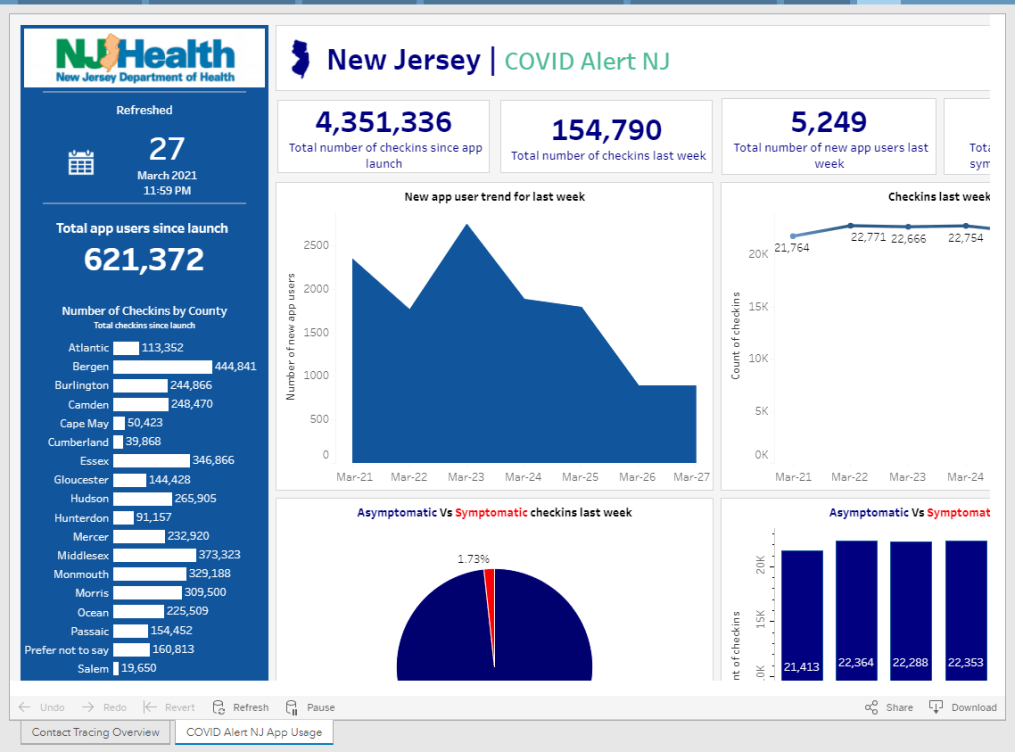
    BW: Wow! Is that data publicly available, on say, how many people in a certain country have downloaded apps?  I know, one state that I’ve found is publishing their data is New Jersey, they have a contact tracing pane on their dashboard. I was curious if you’d seen that, if you have any thoughts on it, or if there are any other states or countries that are doing something similar.

    JW: I wish there was more transparency. Switzerland has a great dashboard on the downloads and utilization of their app. DC, Washington state, also publicly track their downloads. I’m sure a few others do but I don’t know off the top of my head who makes the data public.

    I do wish it were the default for everybody to make that data public… There’s a lot of concern by states where there’s not good adoption, that by making the data public they’re opening up a can of worms and are going to get negative press and attention for it, so they don’t want to. So it’s been a mix in that way.

    BL: I think part of that is also an equity concern. How do you know that you have a good distribution of the population that’s adopting it, or even that the people who need these apps the most, say essential workers, people of color, low-income communities—how do you know that they’re adopting it when it’s all anonymous?

    JW: It’s actually—if you’re going to have low adoption, what’s much more effective is if you have high adoption in a certain community. There is a health equity question, but it’s not necessarily about equal distribution of the app, but rather—and this is where some states have been successful, is that they haven’t gotten high adoption across the board but they’ve decided on a couple of high-need communities that are the ones they’re going to target for getting adoption of the app. They’ve gone after those instead, and that, for many of the states, has been a more effective way to drive use.

    BL: I live in New York City, and I know I’ve seen ads for the New York one, like, in the subways and that sort of thing, which I have appreciated.

    Is there a specific state or country that you’d consider a particularly successful example of using these apps?

    JW: NHS, England and Wales, definitely. I think Ireland has done a pretty good job of it, and Ireland is—we’re particularly fond of them because they were one of the first to open source their code, and make it available. They open-sourced with LFPH to make it available for other countries, and so that is the code that powers the New York app as well. New York, New Jersey, Pennsylvania, Delaware, and then a couple of other countries globally, including New Zealand. It’s the most used code, besides the exposure notification express system that Apple and Google built for getting these apps out.

    I also mentioned Finland before, I think they got the messaging right such that they have very high buy-in on their app.

    BL: Are you collecting user feedback, or do you know if various states and countries are doing this, in order to improve the apps as they go?

    JW: Usually as a product manager, you’re constantly wanting to improve the UI [user experience] of your app, getting people to open it, and all that. These are interesting apps in that they’re pretty passive. Your only goal is to get people not to delete them. They can run in the background for all of eternity. As long as the phone is on and active, that’s all that’s needed.

    BL: As long as you have your Bluetooth turned on, right?

    JW: As long as you have your Bluetooth turned on. So the standard for the success of these apps is a completely different beast. We at LFPH have not been monitoring the user feedback on this, but a lot of states and countries are. Most of them have call centers to deal with questions about the app.

    Some jurisdictions are improving it, but most improvements are focused on the risk score, which is the settings about how sensitive the app should be.

    BL: Like how far apart you need to be standing, or for how long?

    JW: Right. How to translate the Bluetooth signal into an estimate of distance, and how likely should it be—how willing are you to send an alert to somebody, telling them that they’ve been exposed, based on your level of confidence about whether they actually were near somebody or not. There’s a decent amount of variance there in terms of how a state thinks about that, but that’s been much more on the technical side, where people are trying to tweak the system, than on the actual app. There have been some language updates to clarify things, to make it easier for people to know what to do next, but it’s not been the core focus of the app designs like it would be if this were a more traditional system.

    BL: What does your day-to-day job actually look like, coordinating all of these different systems?

    JW: We’re [LFPH/TCN] really an advisor to the jurisdictions. It’s not a coordinating thing but rather, I spend a lot of my time on calls with various states saying, “Here’s what’s happening with the app over in this place, here’s what this person is doing, have you considered this, do you want to talk to that person.” I’m trying to connect people, trying to provide education about how these systems work, and for the states that are still trying to figure out whether to launch or not, convincing them to do it and sharing best practices.

    Also, with Linux Foundation Public Health, we’re working on a vaccination credentials project. So I’m splitting my time between those, as well as just running the organization and keeping financials, board relationships, networking, fundraising, keeping all of those things together.

    BL: Sounds like a lot of meetings.

    JW: It’s a fair number of meetings, this is true.

    BL: So, that’s everything I wanted to ask you. Is there anything else you’d like folks to know about the system?

    JW: Ultimately, the verdict is, now that we’re seeing it’s effective [from the U.K. study], I think that adds to the impetus to download and use the system. Even before that, though, the verdict was—this is extraordinarily privacy-preserving, there’s no reason not to do it. That continues to be our message. There’s no harm in having this on your phone, it doesn’t take up much battery life, so turn it on!

  • National Numbers, March 28

    National Numbers, March 28

    In the past week (March 20 through 26), the U.S. reported about 399,000 new cases, according to the CDC. This amounts to:

    • An average of 57,000 new cases each day
    • 122 total new cases for every 100,000 Americans
    • 1 in 823 Americans getting diagnosed with COVID-19 in the past week
    • 27,000 more new cases than last week (March 13-19)
    Nationwide COVID-19 metrics as of March 26, sourcing data from the CDC and HHS. Posted on Twitter by Conor Kelly.

    Last week, America also saw:

    • 33,000 new COVID-19 patients admitted to hospitals (10.1 for every 100,000 people)
    • 6,600 new COVID-19 deaths (2.0 for every 100,000 people)
    • An average of 2.6 million vaccinations per day (per Bloomberg)

    After several weeks of declines, our national count of new cases has started creeping up: the current 7-day average is 57,000, after 53,000 last week and 55,000 the week before. Michigan continues to see concerning numbers, as do New York, New Jersey, Florida, Texas, and California—all states with higher counts of reported variant cases.

    Last week, I described America’s present situation as a race between vaccines and variants. As of Thursday, we have 8,300 reported B.1.1.7 cases—up from about 5,000 last week, and likely still a significant undercount. The variant-driven surge that some experts warned may come in late March may now be starting.

    Still, the pace of vaccinations continues to pick up. We hit more vaccination records this week: 3.4 million doses were reported on Friday, and 3.5 million were reported yesterday. Over 50 million Americans have now been fully vaccinated, according to White House COVID-19 Data Director Cyrus Shahpar.

    President Biden set a new goal for his first 100 days in office: 200 million vaccinations, double the 100-million goal that we hit last week. At the nation’s current pace (about 2.6 million doses administered each day), we are well on track to meet that milestone.

    43 states have announced that they’ll open up vaccine eligibility to all adults on or before Biden’s May 1 deadline, as of Friday—though opening up wider eligibility can sometimes mean that vaccine access for vulnerable populations becomes even more challenging. A recent data release from the CDC makes it easier for us to analyze vaccinations at a more local level; more on that later in the issue.

  • Featured sources, March 21

    • Data Reporting & Quality Scorecard from the UCLA Law COVID-19 Behind Bars Data Project: The researchers and volunteers at UCLA have been tracking COVID-19 in prisons, jails, and other detention facilities since March 2020. This new scorecard, described on the project’s blog, reflects the quality of data available from state correctional agencies, the Federal Bureau of Prisons, Immigrations and Customs Enforcement, and other government sources. No state or federal institution on the list scores an A; the vast majority score Fs.
    • Yelp Data Reveals Pandemic’s Impact on Local Economies: The public review site Yelp recently published results of an analysis tying listings on the site to trends in business openings and closings. It’s actually pretty interesting—almost 500,000 small businesses have actually opened in the past year, including about 76,000 restaurant and food businesses. (On a lighter note, here’s one of my favorite posts I ghost-wrote during my tenure at the Columbia news site Bwog. It’s a collection of very good Yelp reviews people have left about the university.)

  • K-12 school updates, March 21

    Four items from this week, in the real of COVID-19 and schools:

    • New funding for school testing: As part of the Biden administration’s massive round of funding for school reopenings, $10 billion is specifically devoted to “COVID-19 screening testing for K-12 teachers, staff, and students in schools.” The Department of Education press release does not specify how schools will be required to report the results of these federally-funded tests, if at all. The data gap continues. (This page does list fund allocations for each state, though.)
    • New paper (and database) on disparities due to school closures: This paper in Nature Human Behavior caught my attention this week. Two researchers from the Columbia University Center on Poverty and Social Policy used anonymized cell phone data to compile a database tracking attendance changes at over 100,000 U.S. schools during the pandemic. Their results: school closures are more common in schools where more students have lower math scores, are students of color, have experienced homelessness, or are eligible for free/reduced-price lunches. The data are publicly available here.
    • New CDC guidance on schools: This past Friday, the CDC updated its guidance on operating schools during COVID-19 to half its previous physical distance requirement: instead of learning from six feet apart, students may now take it to only three feet. This change will allow for some schools to increase their capacity, bringing more students back into the classroom at once. The guidance is said to be based on updated research, though some critics have questioned why the scientific guidance appears to follow a political priority.
    • New round of (Twitter) controversy: This week, The Atlantic published an article by economist Emily Oster with the headline, “Your Unvaccinated Kid Is Like a Vaccinated Grandma.” The piece quickly drew criticism from epidemiologists and other COVID-19 commentators, pointing out that the story has an ill-formed headline and pullquote, at best—and makes dangerously misleading comparisons, at worst. Here’s a thread that details major issues with the piece and another thread specifically on distortion of data. There is still a lot we don’t know about how COVID-19 impacts children, and the continued lack of K-12 schools data isn’t helping; as a result, I’m wary of supporting any broad conclusion like Oster’s, much as I may want to go visit my young cousins this summer.

  • National Numbers, March 21

    National Numbers, March 21

    In the past week (March 13 through 19), the U.S. reported about 372,000 new cases, according to the CDC. This amounts to:

    • An average of 53,000 new cases each day
    • 113 total new cases for every 100,000 Americans
    • 1 in 881 Americans getting diagnosed with COVID-19 in the past week
    • Only 10,000 fewer new cases than last week (March 6-12)
    Nationwide COVID-19 metrics as of March 19, sourcing data from the CDC and HHS. Posted on Twitter by Conor Kelly.

    Last week, America also saw:

    • 32,900 new COVID-19 patients admitted to hospitals (10 for every 100,000 people)
    • 7,200 new COVID-19 deaths (2.2 for every 100,000 people)
    • An average of 2.3 million vaccinations per day (per Bloomberg)

    Three months into his presidency, Joe Biden has already met one of his biggest goals: 100 million vaccinations in 100 days. This includes 79 million people who have received at least one dose, and 43 million who are now fully vaccinated. Two-thirds of Americans age 65 and older have received at least their first dose.

    Our current phase of the pandemic may be described as a race between vaccinations and the spread of variants. Right now, it’s not clear who’s winning. Despite our current vaccination pace, the U.S. reported only 10,000 fewer new cases this week than in the week prior—and rates in some states are rising.

    Michigan is one particular area of concern: COVID Tracking Project data watchers devoted an analysis post to the state this week, writing, “the Detroit area now ranks fourth for percent change in COVID-19 hospital admissions from previous week—and first in increasing cases and test positivity.” Hospitalization rates in New York and New Jersey are also in a plateau.

    These concerning patterns may be tied to coronavirus variants. Michigan has the second-highest reported count of B.1.1.7 cases, after Florida, and New York City is currently facing its own variant. The CDC’s national B.1.1.7 count passed 5,000 this week—more than double the count from late February.

    As genomic surveillance in the U.S. improves, the picture we can paint of our variant prevalence becomes increasingly concerning. But that picture is still fuzzy—more on that later in this issue. 

  • Where are we most likely to catch COVID-19?

    Where are we most likely to catch COVID-19?

    This week, I wrote a story for Popular Science that goes over what we know (and don’t know) about the most common settings for COVID-19 infection.

    Most of the main points will probably be familiar to CDD readers, but it’s still useful to compile this info in one concise article. Here are the main points: Outside events are always safer. Surfaces are not a common transmission source. Communal living facilities and factories tend to be hotspots. Indoor dining and similar settings carry a lot of risk. Essential workers are called essential for a reason. And don’t rule out small gatherings, even though such events are safer for those of us who’ve been vaccinated.

    This story gave me an excuse to revisit one of my favorite COVID-19 datasets: the Superspreading Events Database, a project that compiles superspreading events from media reports, scientific papers, and public health dashboards. I interviewed Koen Swinkels, the project’s lead, for the CDD back in November.

    At that time, the database had about 1,600 events; now, it includes over 2,000. All of the patterns I wrote about in November still hold true now, though. Notably, no event in the database took place solely outside (though Swinkels told me he’s seen some events with both an indoor and outdoor component). And the vast majority of events in the database took place in the U.S.

    For those U.S. events, most common superspreading settings are prisons (166,000 cases), nursing homes (30,000 cases), rehabilitation/medical centers (24,000 cases), and meat processing plants (13,000 cases). By this database’s definition, a superspreading event may comprise a sustained outbreak at one location over a long period of time—and prisons have been continuous hotspots since last spring. 

    You can check out the U.S. superspreading events in the database below. I made this visualization in November and updated it this past week.

    One of the reasons why I like the Superspreading Events Database is that Swinkels and his collaborators are extremely clear on the project’s limitations. If you load the database’s public Google sheet, you’ll see a prominent note at the top reading, “Note that the database is NOT a representative sample of superspreading events. Please read this article for more information about the limitations of the database.” The article, a post on Swinkels’ Medium blog, goes in-depth on the biases associated with the database. It’s easier to identify superspreading events in institutional settings, for example, since many of them employ frequent testing. Still, I think that—when carefully caveated—this database is an incredibly useful resource for identifying patterns in COVID-19 spread.

    Swinkels additionally pointed me to another great source for exposure data: the state of Colorado publishes outbreak data in weekly reports. A few other states publish similar info, but Colorado’s data are highly detailed and complete. In this past week’s report, released on March 10, the state says that 6,900 out of a total 28,000 cases in active outbreaks are linked to state prisons. 3,900 more cases are linked to jails.

    I’ve visualized the March 10 Colorado outbreak data below. As you may notice, the next-biggest outbreak setting after prisons and jails is higher education—colleges and universities represent 6,700 active outbreak cases. Colorado’s dataset does not specify how many of those cases are linked to the mask-less University of Colorado party that drew wide criticism last weekend… but we can assume that party was no small player.

    Finally, this PopSci story also gave me an excuse to revisit one of my favorite COVID-19 data gripes: the lack of contact tracing info we have in the U.S. I’ve written about this issue in the CDD before; I surveyed state dashboards in October, and drew connections from the Capitol invasion in January. But it was still disheartening to find that now, in March, we continue to be largely in the dark about how many contact tracers are actively employed in most states and how many people they’re reaching.

    Here’s a clip from the story:

    In the US, though, the practice is done unevenly, if at all. Most states and local jurisdictions, struggling from years of underfunded public health departments leading up to the pandemic, have not been able to hire and train the contact tracers needed to keep tabs on every case.

    Many states have attempted to supplement their limited contact tracing workforces with exposure notification apps, which are theoretically able to notify users when they’ve come into contact with someone who tested positive. Though these apps became more widespread in the US this past winter, they’re still not used widely enough to provide useful information. New Jersey, one state that provides data on its app use, reports that about 574,000 state residents have downloaded the app as of March 6—out of a population of 8.9 million.

    This situation is not likely to improve much in the coming months as Americans aren’t about to change their perspectives on privacy any time soon. But if you have the opportunity to download an exposure notification app for your state, do it! The more data we have on where people are getting exposed to COVID-19, the better we can understand this virus.

    Related posts

    • We need better contact tracing data
      The majority of states do not collect or report detailed information on how their residents became infected with COVID-19. This type of information would come from contact tracing, in which public health workers call up COVID-19 patients to ask about their activities and close contacts. Contact tracing has been notoriously lacking in the U.S. due to limited resources and cultural pushback.
  • Global.health has gone public—what’s actually in the database?

    Global.health has gone public—what’s actually in the database?

    Last week, we included Global.health in our featured sources section. The initiative aims to document 10 million plus cases in one source. Instead of just listing numbers of positive cases and deaths, they collect individual cases and gather information about said case. What was their age range? Gender? When did symptoms develop? The dataset has room for more than 40 variables aside from just “tested positive.” While there are lots of dashboards and tracking sources, none collect detailed data about (anonymized!) individual cases.

    Collecting data like this is critical for understanding how epidemics spread, and an open repository could help researchers determine what the actual infection rate is or divine more information about lasting immunity. The set has been available to researchers for a while, but now it’s been released to the public. It might seem strange to release it now as it looks like cases are finally sustainably declining, but we’re still going to have to track COVID-19 even as everyone gets vaccinated. As one of the founders, Samuel Scarpino says, “COVID-19 is gonna become rare. It will fall back into the milieu of things that cause respiratory illness. As a result, we’re going to need higher-fidelity systems that are capturing lots of information and informing rapid public health response, identifying new variants and capturing information on their spread.”

    Since the data are now public,let’s take a look at what’s possible with this source.

    The first thing I discovered is that, predictably, the full dataset is just too big for Excel to open. I recently switched computers and I’m pretty sure this file was the death knell for my old one. You’re gonna need to either stick with their website or use something like Python or R to really sink your teeth in. Even just the website slowed down my new computer a lot, so beware. Elderly computers should probably be spared.

    Still, the website is very well designed and easy to navigate. You can have your data two ways: as a table with, at time of writing, more than 200,000 pages, or as a map where you can click on the country or region you want to look at, which will then direct you to a much smaller table. (All roads lead to tables, but the map function does make it a lot easier to navigate.)

    The country map is fairly self-explanatory—a deeper shade of blue means more cases— but the regional map also just looks very cool:

    Regional map.

    You can of course zoom in to your region of choice. My one quibble with the display is that I wish you could rotate your field of view, as sometimes the region behind a particularly tall spike can literally be overshadowed and thus be a little harder to access.

    Going through every part of this giant resource would take days, so I’m going to be focusing on the United States data. Here’s what I got when I clicked on it on the map:

    U.S. map.

    It should be understood that this is a sample of the U.S. data (same presumably goes for data in other countries.) Because this is line-list data, it’s supposed to be very granular—recent travel history, when a case became symptomatic, and so on. Data at this level of detail just aren’t available or possible to get for every case in the country (and even less so for the rest of the world.) So that should be remembered when working with this dataset. It’s extremely comprehensive, but not all-encompassing. (That being said, it is strange that there are P.1 cases recorded, but no B.1.1.7, which is much more common here.)

    So how granular are the data? When you’re directed to the table for that country, the table on the website has columns for:

    • Case Identification Number
    • Confirmation date (I assume this is confirmation that yes, this person is infected)
    • “Admin 1, Admin 2, and Admin 3” (short for “administrative areas” – for example, for a U.S. patient, 1 would be country, 2 would be state, and 3 would be county)
    • Country
    • Latitude and longitude (I assume of the hospital or of the lab where the case was identified)
    • Age
    • Gender
    • Outcome
    • Hospitalization date/period
    • Symptom onset
    • URL for the source

    Which is indeed pretty granular! It should be noted, however, that there are a lot of blank spots in the database. It has the capacity to be extremely comprehensive, but don’t go in expecting every single line item to have every detail. I’m not sure if this is going to improve as records are updated, but I suppose we’ll see.

    What can you do with these data? I loaded the full dataset into R to mess around with the data a bit. The disclaimer here is that I am by no means an R wizard. Another fair warning is that R will take a hot second to load everything up, but when you load up the full dataset there are a ton more columns for more data categories, like preexisting conditions. (That one seems important, why is it not on the more accessible website?)

     I found that making some frequency tables was a good way to assess just how complete the data was for certain variables. Here’s a frequency table I made with the outcome values:

    Frequency table.

    The first thing I notice is just how many lines have a blank value for the outcome. (65% of them.) Again, a lot of these data are incomplete. The second thing is that there are a ton of synonyms for the same thing. A capitalization change will shunt a number to a completely different category, making it a little annoying to compile results, so you’ll have to tinker with it a little bit to make a clear graphic/graph/etc. The bar graph R spit out for this was unreadable because of all the categories.

    I tried another one for the gender demographics and the bar graph was actually readable this time. As expected, the percentage of lines with no data available was lower this time (19%) but still sizable.

    Bar graph showing gender availability.

    As I should have expected, I got a gigantic table when I tried it for ethnicity. But 75.49% of the lines were blank. 99.6568% were blank for occupation, which I was inspired to look at because occupational data are similarly barren for vaccination data as well. Somewhat predictably, and just as a check, cases by country had much fewer blank cells.Overall this is a really interesting resource, but there are a lot of blank spots that keep it from being the god of all datasets. I think asking any source to be 100% complete is a tall order given the circumstances, and this is still the only source out there of its kind and of its scale. I look forward to checking in again and seeing if those blank cells drop in number.

  • National numbers, March 7

    National numbers, March 7

    In the past week (February 28 through March 6), the U.S. reported about 417,000 new cases, according to the COVID Tracking Project. This amounts to:

    • An average of 60,000 new cases each day—comparable to the seven-day average for daily cases in early August
    • 127 total new cases for every 100,000 Americans
    • 1 in 786 Americans getting diagnosed with COVID-19 in the past week
    Nationwide COVID-19 metrics published in the COVID Tracking Project’s daily update on March 6. This will be the final week we use Project data for these updates.

    Last week, America also saw:

    • 41,400 people now hospitalized with COVID-19 (13 for every 100,000 people)
    • 12,100 new COVID-19 deaths (3.7 for every 100,000 people)
    • An average of 2.2 million vaccinations per day (per Bloomberg)

    The U.S. recorded fewer new daily cases this week than last week, finally dropping to a level lower than the summer surge. We saw fewer hospitalized COVID-19 patients and deaths from the disease this week as well. But the possibility of a plateau—or even a variant-driven fourth surge—is worrying some experts. CDC Director Dr. Rochelle Walensky has cited this concern in press briefings over the past week, encouraging that Americans “double down on prevention measures.”

    Dr. Walensky’s assertion is backed up by a new CDC report that links mask mandates and dining restrictions to reduced community spread. (We knew this already, of course, but it’s always nice to have a CDC report you can cite.)

    Variants, meanwhile, continue to spread. We’re up to 2,600 reported B.1.1.7 cases, though this and other variant counts are likely significantly underreported. Nature’s Ewen Callaway calls attention to variant reporting issues in a recent story: despite national efforts to ramp up sequencing, the practice is still heavily decentralized in the U.S., with heavily-resourced states like New York and California sequencing thousands of genomes while other states collect far fewer. And “homegrown” variants of concern, such as the variant reportedly spreading through New York City, don’t even appear on the CDC’s dashboard yet.

    But vaccinations give us one place to be optimistic. More than two million Americans are now getting a dose each day, per Bloomberg, with the first Johnson & Johnson shots landing on the market this week. After the announcement of a cross-pharma partnership (Merck giving J&J a manufacturing boost), President Biden said that the U.S. will have enough COVID-19 vaccine doses for every adult by the end of May. How quickly—and how equitably—those doses get administered will be another battle. 

    Finally, a sad acknowledgment: with the COVID Tracking Project concluding data collection today, I will be switching my source for these updates starting next week. I plan to use CDC and HHS data, relying heavily on the CDC’s new COVID Data Tracker Weekly Reviews. More on filling the CTP-shaped hole in your data in the next section.

  • Featured sources and federal data updates, Feb. 28

    We’re sneaking a few more federal updates into the source section this week.

    • CDC changed their methodology for state vaccination counts: Last Saturday, February 20, the CDC made two major changes to how it reports vaccination data. First, instead of simply reporting doses administered by federal agencies (the Department of Defense, Indian Health Services, etc.) as fully separate counts, the agency started reporting these doses in the states where they were administered. Second, the CDC started reporting vaccinations in the state where someone is counted as a resident, rather than where they received the shot. Both of these changes make state-reported counts and CDC-reported counts less directly comparable, since states typically don’t track federal agency doses and count doses based on where they were administered. You can read more about these changes on Bloomberg’s vaccine tracker methodology and analysis blog; Bloomberg is now using CDC data only to update its U.S. data.
    • VaccineFinder is open for COVID-19 vaccines: As of Wednesday, Americans can use this national tool to find COVID-19 vaccine appointments. Just put in your ZIP code and select a radius (1 mile, 10 miles, 50 miles, etc.), and the tool will show you providers nearby. For each provider, the tool provides contact information—and, crucially, whether this location actually has vaccines in stock. Unlike many other federal dashboards, VaccineFinder isn’t a new tool; it was developed during the H1N1 flu outbreak in 2009. STAT’s Katie Palmer provides more history and context on the site here.
    • Government Accountability Office may push for more data centralization: The Government Accountability Office (or GAO), a watchdog agency that does auditing and evaluations for Congress, has been investigating the federal government’s COVID-19 data collection—and is finding this collection “inconsistent and confusing,” according to a report by POLITICO’s Erin Banco. While the GAO’s report won’t be finalized and made public until March, the agency is expected to recommend that data should be more standardized. It could call for the CDC to make changes to its data collection on cases, deaths, and vaccines similar to how the HHS revamped collection for testing and hospitalization data in summer 2020. CDC officials are wary of these potential changes; it’ll definitely be a big data story to follow this spring.
    • Global.health is ready for research: Back in January, I wrote about Global.health, a data science initiative aiming to bring anonymized case data to researchers on a global scale. The initiative’s COVID-19 dataset is now online, including over 10 million individual case records from dozens of countries. 10 million case records! Including demographic and outcomes data! If you’d like to better understand why this dataset is a pretty big deal, read this article in Nature or this one in STAT. I plan on digging into the dataset next week, and may devote more space to it in a future issue.
    • NIH COVID-19 treatment guidelines: In one of the White House COVID-19 press briefings this week, Dr. Fauci referenced this National Institutes of Health (NIH) website intended to provide both physicians and researchers with the latest guidance on how to treat COVID-19 patients. The website acts as a living medical document, featuring an interactive table of contents and a text search tool. Follow @NIHCOVIDTxGuide on Twitter for updates.
    • Burbio’s K-12 School Opening Tracker: Burbio, a digital platform for community events, is actively monitoring over 1,200 school districts to determine which schools are currently using virtual, in-person, and hybrid models. The sample size includes the 200 largest districts in the U.S. and other districts with a mix of sizes and geographies, in order to reflect local decision-making across the U.S. See more methodology details here.
    • COVID-19’s impact on LGBTQ+ communities: The Journalist’s Resource at Harvard Kennedy School has compiled a list of recent research on how the coronavirus pandemic impacted LGBTQ+ Americans. In many cases, the pandemic furthered disproportionate poverty and poor health outcomes in this community; they shouldn’t be ignored in COVID-19 coverage.
    • The Accountability Project: A repository of public data run by the Investigative Reporting Workshop, the Accountability Project reached 1 billion records last week. The Project includes several COVID-19-related datasets, including a dataset of Paycheck Protection Program loans and data on hospitals and nursing homes.

  • National numbers, Feb. 28

    National numbers, Feb. 28

    In the past week (February 21 through 27), the U.S. reported about 475,000 new cases, according to the COVID Tracking Project. This amounts to:

    • An average of 68,000 new cases each day—about 2,000 more cases than the seven-day average on July 27, near the peak of the summer surge
    • 145 total new cases for every 100,000 Americans
    • 1 in 692 Americans getting diagnosed with COVID-19 in the past week
    Nationwide COVID-19 metrics published in the COVID Tracking Project’s daily update on February 27. New daily cases are now at a level similar to the summer peak.

    Last week, America also saw:

    • 48,900 people now hospitalized with COVID-19 (15 for every 100,000 people)
    • 14,300 new COVID-19 deaths (4.4 for every 100,000 people)
    • An average of 1.65 million vaccinations per day (per Bloomberg)

    After several weeks of declines, cases now appear to be in a plateau. But the COVID Tracking Project cautions that these numbers may also be the aftershocks of President’s Day and the winter storm, which led to artificially low numbers last week and delayed reporting arriving this week.

    One thing is for certain, though: vaccinations are recovering from the storm. We had two record vaccination days Friday and yesterday, with 2.2 million doses and 2.4 million doses reported, respectively. Nearly one in five adults and half of American seniors have received their first shot, White House advisor Andy Slavitt said in a COVID-19 briefing on Friday.

    Last week, we noted that vaccinations were already having an impact in nursing homes and other long-term care facilities. The Kaiser Family Foundation picked up that trend this week, with an analysis showing that deaths in these facilities have declined at the same time as residents have received vaccine doses. In the first month of America’s vaccine rollout, long-term care deaths decreased by 66%, while all other U.S. deaths increased by 61%.

    We can’t get complacent, though. The U.S. has now reported over 2,100 cases of the B.1.1.7 variant, up from 1,500 last week. Homegrown variants that originated in California and New York aren’t yet reported on the CDC’s variant cases dashboard, but I recommend reading up on them. B.1.526, the New York variant, may now account for one in four cases in NYC, per the New York Times; this variant has acquired a mutation that may make it less susceptible to vaccines.

    Federal public health leadership cited variant cases in COVID-19 briefings this week, advising Americans to keep up all the public health measures that have become so familiar by now: wear a mask, avoid crowds and travel, and get a vaccine when it’s available to you.