- State-by-state vaccination trends from the CDC: The CDC’s COVID Data Tracker has a new feature, added on July 29: you can now see vaccination trends for every state. On the Vaccination Trends page, use the “Select a Location” dropdown menu to pick a specific state or territory, then check out day-by-day numbers and rolling averages for doses administered and people newly vaccinated in that region. You can also download the state’s time series data from a table underneath the chart.
- COVID-19 Vaccine Breakthrough Cases: Data from the States (KFF): Looking to see how your state reports vaccine breakthrough cases? The Kaiser Family Foundation has you covered with this dashboard, including data and annotations from every state that reports breakthroughs. This resource was published on July 30; it’s unclear whether KFF intends to update it in the coming weeks.
- Poverty and Access to Internet, by County: Internet access has been a major issue during the pandemic as workplaces and schools have gone remote. This newly-updated dataset from the HHS Agency for Healthcare Research and Quality provides information on internet and cellular access in every U.S. county from 2014 to 2018.
Category: Uncategorized
-
Featured sources, August 1
-

National numbers, August 1
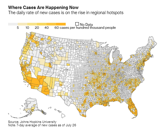
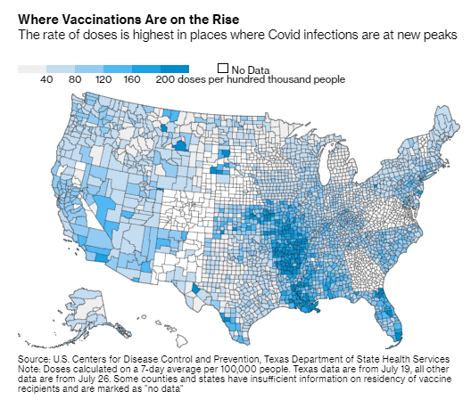
Vaccination numbers are going up in many of the counties currently seeing COVID-19 spikes. Charts from Bloomberg, shared on Twitter by Drew Armstrong. In the past week (July 24 through 30), the U.S. reported about 466,000 new cases, according to the CDC. This amounts to:
- An average of 66,600 new cases each day
- 142 total new cases for every 100,000 Americans
- 64% more new cases than last week (July 17-23)
Last week, America also saw:
- 38,300 new COVID-19 patients admitted to hospitals (11.7 for every 100,000 people)
- 2,100 new COVID-19 deaths (0.6 for every 100,000 people)
- 82% of new cases now Delta-caused (as of July 17)
- An average of 660,000 vaccinations per day (per Bloomberg)
Not only is the Delta variant driving a case rise, it’s driving an exponential case rise. This week, about 466,000 new COVID-19 cases were reported; that number is more than five times higher than what we saw during the week ending July 2.
Parts of the country with lower vaccination rates are more vulnerable to Delta, of course. Current hotspots include Louisiana, Florida, Arkansas, Mississippi, and Alabama, all of which reported at least 300 new cases for every 100,000 people in the past week and all of which have under half of their populations fully vaccinated.
But Delta is now entirely dominant—causing at least 82% of cases in the country, per the most recent (yet two weeks old) CDC estimate—and every single state is seeing case surges right now. Hospitalizations are also up, 46% higher than last week, and deaths are up 33%. About 300 Americans are dying from COVID-19 every day—and almost all of those deaths are entirely preventable.
The CDC is now recommending that vaccinated people wear masks in indoor settings, if they live in high-transmission areas, have young children, or fit other criteria. While you can use the CDC’s county-level data to find your community’s COVID-19 status, it’s important to note that everyone’s risk levels are elevated right now.
Katherine J. Wu said it well in The Atlantic on Friday:
Some 70 percent of American counties are, according to the map, currently on fire; that percentage will probably tick up before it drops again. For now, I am tracking my pandemic circumstances. But my boundaries for my “community” are bigger than what the map says they are. They don’t stop at my county line, or my state line. They go as far as the virus treads—everywhere. Right now, I’m masking for as many people as I can.
All that said, there’s one silver lining to this new surge: vaccination numbers are ticking up again, with the highest daily rates now in states like Louisiana, Arkansas, and Missouri where the new COVID-19 wave is hitting the hardest. The vaccines are still our best protection against Delta and other variants; more on that later in the issue.
-
Featured sources, July 25
- 2021 Health Disparities Report by America’s Health Rankings: This source isn’t specific to COVID-19, but it may be invaluable for reporting on the disparities worsened by the pandemic. America’s Health Rankings has put together comprehensive reports on national health data for decades; this is the first report to focus specifically on social determinants of health, including social, economic, physical environment, and other factors.
- COVID-19 Orphanhood Calculator: Researchers at Imperial College London built this dashboard to track one of the most dire consequences of the pandemic: children who lost their parents or primary caregivers to COVID-19. That group includes more than 1.5 million children worldwide, according to a recent study by the same researchers. The estimates are based on COVID-19 mortality data and fertility data.
- WHO COVID-19 Detailed Surveillance Data Dashboard: The World Health Organization has a new COVID-19 dashboard, and it’s incredibly detailed. Here, you can find testing data, case fatality ratios, cases and deaths by age, healthcare worker data, and more for all WHO member nations.
-
Featured sources, July 18
- COVID-19 resources by Evidence Aid: Evidence Aid is a U.K.-based nonprofit that provides evidence-based guidance for disaster response. The organization’s COVID-19 page includes plain-language research summaries about COVID-19 epidemiology, treatments, and more, available in several different languages.
- Public Health England Technical Briefings on SARS-CoV-2 variants: While the CDC has not done the best job of providing data on variants and breakthrough cases, the U.K.’s public health agency is sequencing more cases than any other country—and providing detailed reports on the results of those efforts. These reports may be useful for anyone seeking to keep a close eye on Delta and other variants’ ability to beat our vaccines. (h/t Your Local Epidemiologist)
- Excess mortality and COVID-19 deaths in 67 countries: Researchers from the University of Bologna (in Italy) analyzed the gaps between excess deaths and COVID-19 deaths in 67 countries, revealing the capacity of different national health systems to accurately identify COVID-19 cases. Their work was published this week in JAMA Network Open. (For more on excess deaths, see this CDD post about Peru.)
- Characterizing long COVID in an international cohort: In another new paper, published this week in The Lancet, COVID-19 long-haulers from the Patient-Led Research Collaborative share the results of an international survey on long COVID-19. The findings indicate that the vast majority of long-haulers (over 90% of those surveyed) suffer from symptoms for at least 35 weeks.
- COVID-19 Vaccine Acceptance and Hesitancy in Low and Middle Income Countries: One more new paper, this one published in Nature: an international group of researchers analyzed vaccine acceptance across several low- and middle-income countries (LMICs), the U.S., and Russia. They found much higher vaccine acceptance in LMICs (80%) compared to the U.S. (65%) and Russian (30%). The study data are available on GitHub.
-
One year of the CDD: Reader reflections
Earlier this week, I asked readers to share what the COVID-19 Data Dispatch has meant to them over this past year. Thank you to everyone who responded—it was wonderful to hear how my work has helped you make sense of the pandemic.
Here are a couple of responses that I wanted to share out with everyone:
I made a career change to data analytics in November last year. Reading your newsletter has been very inspiring, i’m very interested in data journalism but I’m still very new to the field so everything is difficult still 😅 however I love reading your newsletter and seeing what’s possible! I also find it very comforting to read compared to the hyped nature of the general media. I think it’s the only corona news I read without feeling like someone is trying to wind me up 😅
HarrietA whole year??!?!?!?! Damn. Is it weird that the steady pace of your updates has felt very much like having a friend who was out there keeping me updated on shit when I’ve been entirely out of cope? I feel informed, which sometimes is reassuring, and sometimes terrifying. I’ve definitely shared things I’ve gotten from you when I’ve been in discussions elsewhere, and I’m sure it’s incredibly stressful work for you but I’m so glad to be a recipient of it.
ElaineMany of the resources you cited/brought to my attention were really helpful in assessing risk, especially over the summer and fall. Reading the CDD also made me more aware of how people (especially in the media) were talking about the COVID-19 numbers, and made me more likely to interrogate their sources/interpretation of data. And as a bonus, I sounded REALLY smart talking to other people about COVID-19 data.
AbbyThe CDD has meant a lot to me: I’ve seen someone I love find meaning in their work; I’ve been more informed, more alert, and less fearful about the pandemic; I haven’t spiraled emotionally over heated Twitter debates about the pandemic.
Laura (my girlfriend 💖) -
National numbers, July 18
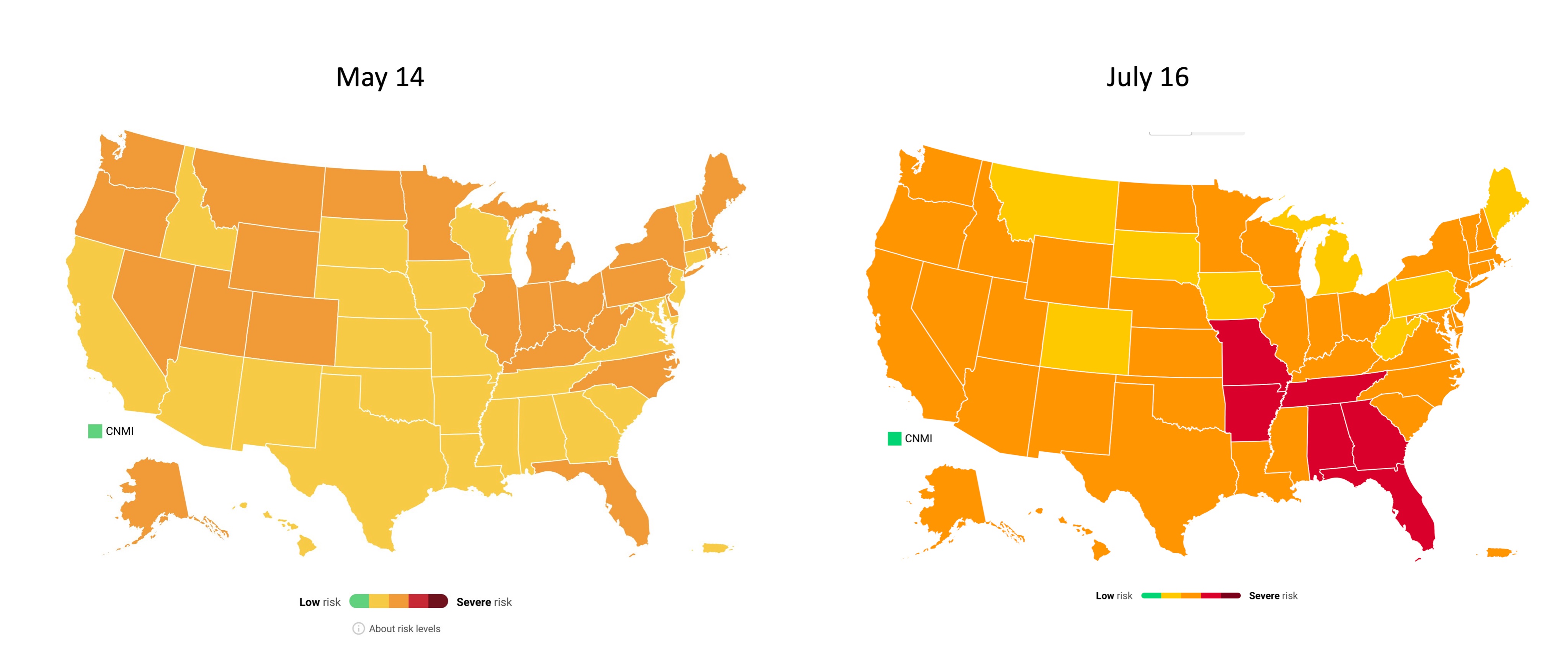
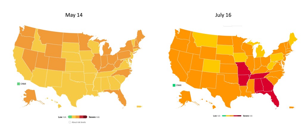
COVID-19 risk levels by state in May and July. Data from Covid Act Now, posted on Twitter by Eric Topol. In the past week (July 10 through 16), the U.S. reported about 184,000 new cases, according to the CDC. This amounts to:
- An average of 26,300 new cases each day
- 56 total new cases for every 100,000 Americans
- 69% more new cases than last week (July 3-9)
Last week, America also saw:
- 19,600 new COVID-19 patients admitted to hospitals (6.0 for every 100,000 people)
- 1,500 new COVID-19 deaths (0.5 for every 100,000 people)
- 58% of new cases now Delta-caused (as of July 3)
- An average of 500,000 vaccinations per day (per Bloomberg)
Cases have been rising for a couple of weeks now, but we’re now seeing the sharpest increase since fall 2020. Between July 9 and July 16, we went from an average of 15,000 new cases a day to an average of 26,000 new cases a day.
Hospitalizations and deaths are also increasing. We’re now seeing about 26% more new COVID-19 patients in hospitals every day and 36% more new deaths—it’s the first time that deaths have increased since the winter.
“There is a clear message that is coming through: this is becoming a pandemic of the unvaccinated,” CDC Director Dr. Rochelle Walensky said at a press briefing on Friday. As I’ve continually emphasized in recent issues, states and counties with lower vaccination rates are more vulnerable to the Delta variant.
Missouri continues to be a hotspot, as does Arkansas, with other states in the Midwest and South also seeing major surges. Florida is of particular concern: one in five U.S. cases in the last week were reported in this state, and Florida has seen a 109% case increase from the first to the second week of July.
The under-vaccinated hotspots are more likely to see hospitals become overwhelmed with COVID-19 patients (see: this great data visualization by Conor Kelly). But even areas with high vaccination rates are seeing Delta take over. In New York City, Delta now causes 69% of new cases—and case numbers have doubled in the past two weeks. In San Francisco, where a full three-quarters of the eligible population is fully vaccinated, cases and test positivity rates have jumped in July.
Despite the clear dangers of Delta, millions of Americans still refuse to get vaccinated. As Ed Yong put it in a recent piece on Missouri’s surge: “Vaccines were meant to be the end of the pandemic. If people don’t get them, the actual end will look more like Springfield’s present: a succession of COVID-19 waves that will break unevenly across the country until everyone has either been vaccinated or infected.”
-
Featured sources, July 11
- COVID-19 Vaccination Equity: A new page of the CDC’s COVID Data Tracker allows users to compare a county’s vaccination rate to its vulnerability, using the CDC Social Vulnerability Index—unless that county is in Texas or Hawaii. For more on the Social Vulnerability Index, see this CDD post. The interactive map employs a unique two-tone color scheme, about which my girlfriend (who has graphic design expertise) said, “The purple loses me a little.”
- US COVID-19 Vaccination Tracking: If you’d like to scroll through a county-level vaccine dashboard that actually includes Texas, researchers from the Bansal Lab at Georgetown University have you covered. This dashboard includes data from state public health departments to supplement the CDC’s incomplete reporting. The Bansal Lab researchers also recently published a new analysis, identifying clusters of under-vaccinated counties that are likely to seed outbreaks; I wrote about this analysis for the Daily Mail.
- The human genetic architecture of COVID-19: Since spring 2020, an international group of geneticists have worked to analyze DNA from COVID-19 patients. A major manuscript on these efforts was accepted to Nature and posted online last week (it’s still going through edits); see the supplementary information section for extensive genetic data. And for more backstory on the project, see this article by STAT’s Megan Molteni.
- Nebraska’s COVID-19 dashboard: Is the latest to get discontinued, as part of the trend in states cutting down on their COVID-19 reporting (even though the pandemic is far from over). Unlike Florida, which recently switched from a dashboard to weekly reports, Nebraska is not promising any regular reporting schedule. A note on the public health agency’s website reads: “The State of Nebraska COVID-19 Dashboard is no longer available as of June 30, 2021. Any future updates regarding coronavirus will be provided in news releases and through other means.”
-

National numbers, July 11
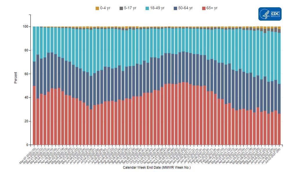
COVID-19 hospitalizations by age, via the CDC. Adults between ages 18 and 49 now make up over 40% of these patients. In the past week (July 3 through 9), the U.S. reported about 104,000 new cases, according to the CDC. This amounts to:
- An average of 14,900 new cases each day
- 32 total new cases for every 100,000 Americans
- 16% more new cases than last week (June 26-July 2)
Last week, America also saw:
- 14,300 new COVID-19 patients admitted to hospitals (4.3 for every 100,000 people)
- 1,100 new COVID-19 deaths (0.3 for every 100,000 people)
- 52% of new cases now Delta-caused (as of July 3)
- An average of 500,000 vaccinations per day (per Bloomberg)
The Delta variant is now officially causing more than half of new cases in the U.S., per the CDC’s Nowcast estimates. This super-transmissible variant has contributed to rising cases in under-vaccinated parts of the country.
Cases are now up 16% from last week—and there may be more cases that were delayed in reporting due to the July 4 holiday. Missouri continues to be a hotspot, with 127 cases per 100,000 people in the last week; Arkansas is close behind, at 123 cases per 100,000. Both states have under 40% of their populations fully vaccinated.
Hospitalizations are also rising. We’re up to 2,000 admissions a day; this is far from the country’s peak in January (over 16,000 admissions a day), but is concerning after months of decreases. Like cases, hospitalizations are rising more in the South and West.
Numerous studies have shown that the vast majority of COVID-19 patients now in U.S. hospitals are unvaccinated. These patients are also younger, on average, than those hospitalized in earlier stages of the pandemic. Adults between ages 18 and 49 now make up over 40% of COVID-19 hospitalizations, according to the CDC; those over 65 only make up 27% of hospitalizations.
Meanwhile, vaccinations continue to slow. The U.S. administered an average of only 500,000 shots a day last week, per Bloomberg, and surveys indicate that many remaining unvaccinated Americans are unlikely to be convinced. Two changes that might be able to turn the tide, according to the Kaiser Family Foundation: full FDA approval for a vaccine and more vaccination encouragement (or mandates) from employers.
-
Featured sources, July 4
No new COVID-19 data sources caught my eye this week, so here are a couple of favorites from the archives.
- Post-COVID Care Centers (featured on 5/2/21): Post-COVID Care Centers, or PCCCs, are clinics where long COVID patients can receive treatment. They’re staffed by a growing group of multidisciplinary doctors and medical researchers seeking to understand this prolonged condition. The long COVID advocacy network Survivor Corps has compiled this database of PCCCs by state; as of July 3, eight states still do not have any such centers.
- The CoronaVirusFacts Alliance Database (featured on 8/2/20): Since the start of the pandemic, Poynter’s International Fact-Checking Network has connected fact-checkers in over 70 countries working to correct COVID-19 misinformation. The results of these fact-checkers’ work are compiled in a database, which you can search by country, fact rating, and topic.
- COVID-19 diverse sources (featured on 3/28/21): NPR journalists from the organization’s Source of the Week project have compiled this database of COVID-19 experts from diverse backgrounds. The database is divided into 13 major categories, including virology, disease origin, health policy, racial/ethnic health disparities, and more.
-
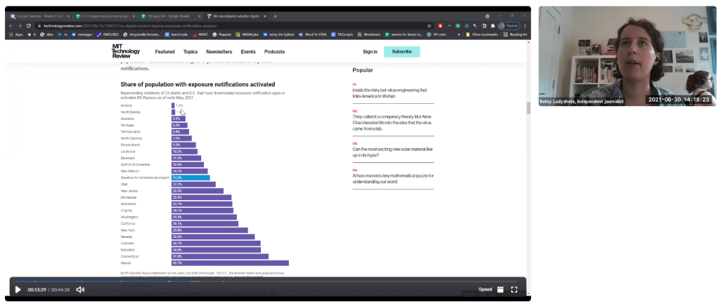
Video: The future of exposure notifications

Discussing my exposure notifications reporting at the webinar! This week, I had the opportunity to participate in a webinar about the future of exposure notifications, the digital contact tracing systems used in about half of U.S. states. The webinar was hosted by PathCheck Foundation, a global nonprofit that works on public health technology—including exposure notification apps.
I talked about my recent feature in MIT Technology Review, which investigated usage rates and public opinion around exposure notification technology. Other panelists included Jeremy Hall, project manager of Hawaii’s exposure notification system, Sam Zimmerman, director of exposure notification programs at PathCheck, and Ramesh Raskar, technology professor at MIT and PathCheck founder.
It was a great session, with discussion ranging from the challenges of implementing exposure notification technology in the U.S. to the ways this technology may be used for future infectious disease outbreaks. With a year of work under their belts, Zimmerman and Raskar brought insider perspectives to the challenges that I had seen from the outside in my reporting. For example, Raskar discussed how Massachusetts’ own exposure notification app is still in a trial run even though PathCheck approached the state public health agency offering to provide that technology in summer 2020.
I was also excited to hear from Hall on how Hawaii’s public health agency promoted exposure notification technology in their state. At the time I collected data for my Technology Review piece, Hawaii had about 650,000 people in the state’s exposure notification system, including those who downloaded the app and those who turned on the EN Express option in their iPhone settings. That represented 46% of the state’s population—a larger share than any other state.
Since I did my data collection, Hawaii has added an additional 250,000 users, I learned from Hall. This includes both Hawaii residents and tourists; tourists with iPhones get push notifications encouraging them to opt into EN Express when they enter the state. Hawaii has also worked with county public health departments and local organizations to publicize its exposure notification system. I think the state could be a model for other public health institutions working to implement exposure notification technology.
If you’d like to watch the webinar, it was recorded and is available at this link—you’ll just need to put in a name and email. The conversation starts about one minute in.
More on contact tracing
- We need better contact tracing dataThe majority of states do not collect or report detailed information on how their residents became infected with COVID-19. This type of information would come from contact tracing, in which public health workers call up COVID-19 patients to ask about their activities and close contacts. Contact tracing has been notoriously lacking in the U.S. due to limited resources and cultural pushback.
- We need better contact tracing data