Category: Testing

  • At-home tests, wastewater: COVID-19 testing after the public health emergency ends

    At-home tests, wastewater: COVID-19 testing after the public health emergency ends

    Nationwide, fewer people are getting lab-based COVID-19 tests now than at any time since the start of the pandemic. Chart via the CDC.

    When the public health emergency ends this spring, COVID-19 testing is going to move further in two separate directions: rapid, at-home tests at the individual level, and wastewater testing at the community level.

    That was my main takeaway from an online event last Tuesday, hosted by Arizona State University and the State and Territory Alliance for Testing. This event discussed the future of COVID-19 testing following the public health emergency, with speakers including regulatory experts, health officials from state agencies, and executives from diagnostic companies. 

    “The purpose of testing has shifted” from earlier in the pandemic, said Dr. Thomas Tsai, the White House’s COVID-19 testing coordinator, in opening remarks at the event. Public health agencies previously used tests to monitor COVID-19 in their communities and direct contact-tracing efforts; now, individual tests are mostly used for diagnosing people, and the resulting data are widely considered to be a major undercount of true cases.

    While the speakers largely agreed about the continued value of rapid, at-home tests (for diagnosing people) and wastewater surveillance (for tracking COVID-19), they saw a lot of challenges ahead for both technologies. Here are some challenges that stuck out to me.

    Challenges for rapid, at-home tests:

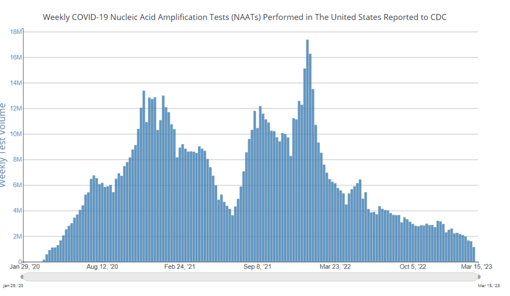
    The public health emergency’s end won’t have an immediate impact on which COVID-19 tests are available, health policy researcher Christina Silcox from Duke University explained at the event. But, in the coming months, the FDA is likely to also end its emergency use authorization for COVID-19 diagnostics. As a result, companies that currently have tests authorized under this emergency will need to apply for full approval. Relatively few rapid tests are currently approved in this way, so the change could lead to fewer choices for people buying tests.

    At the same time, it will become harder for many Americans to access rapid tests. After the federal emergency ends, private insurance companies will no longer be required to cover rapid tests. Some insurance providers might still do this (especially if large employers encourage it), said Amy Kelbik from McDermott+Consulting, but it will no longer be a universal option. At the same time, Medicare will stop covering rapid tests; Medicaid coverage will continue through fall 2024.

    In light of these federal changes, state health officials at the ASU event talked about a need for continued funding to support rapid test distribution from state and local agencies. “Testing will continue to inform behavior, but will become drastically less available,” said Heather Drummond, testing and vaccine program leader at the Washington State Department of Health. Washington has led a free test distribution program, but it’s slated to end with the conclusion of the federal health emergency, Drummond said; she’d like to see services like this continue for the people who most need free tests.

    Drummond and other health officials also discussed the challenges of educating people about how to interpret their test results, as COVID-19 guidance becomes less widely available. The vast majority of rapid, at-home test results are not reported to public health agencies—and, based on the event’s speakers, this isn’t a problem health agencies are particularly interested in devoting resources to solving right now. But as rapid tests become the default for diagnosing COVID-19, continued outreach will be needed on how to use them.

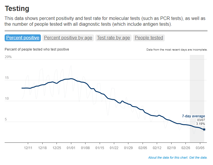
    Also, as I’ve written before, some PCR testing infrastructure should still be maintained, for cases when someone needs a more definitive test result or wants documentation in case of long-term symptoms. PCR test access will likely get even worse after the federal health emergency ends, though, as insurance plans will also stop covering (or cover fewer costs for) these tests.

    Challenges for wastewater surveillance:

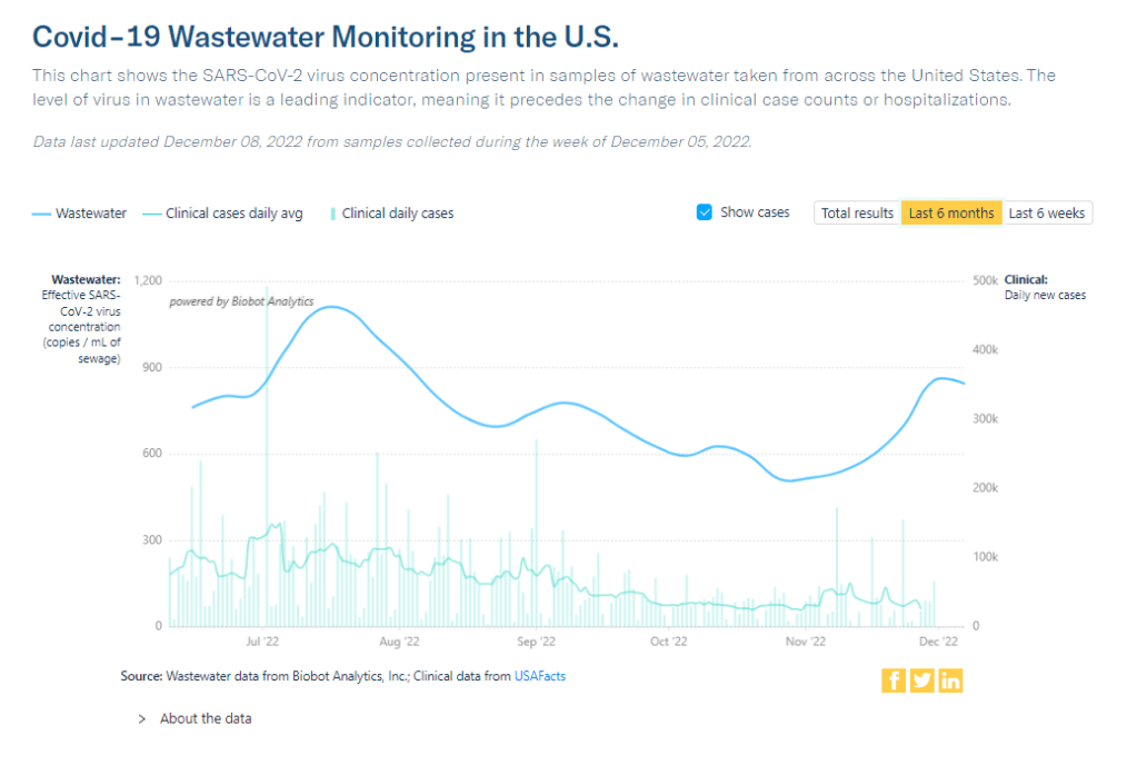
    Overall, wastewater surveillance is the best source for community-level COVID-19 data, speakers at the ASU event agreed. Official case numbers represent significant undercounts of true infections, and hospitalizations (while more reliable) are a delayed indicator. Wastewater data are unbiased, real-time, population-level—and the technology can be expanded to other common viruses and health threats, health officials pointed out at the event.

    But wastewater surveillance is still very uneven across the U.S. It’s clear just from looking at the CDC’s map that some states have devoted resources to detailed wastewater testing infrastructure, with a testing site in every county—while others just have a handful of sites. Funding uncertainty likely plays a role here; speakers at the event expressed some confusion about the availability of CDC funds for long-term wastewater programs.

    The CDC’s wastewater surveillance system has also faced challenges with standardizing data from different testing programs. And, at state and local agencies, health officials are still figuring out how to act on wastewater data. Agencies with more robust surveillance programs (such as Massachusetts, which had two officials speak at the ASU summit) may be able to provide success stories for other agencies that aren’t as far along.

    Broader testing challenges:

    For diagnostic company leaders who spoke at the event, one major topic was regulatory challenges. Andrew Kobylinski, CEO and co-founder of Primary.Health, said that the FDA’s test requirements prioritize highly accurate tests, even though less sensitive (but easier to use) tests might be more useful in a public health context.

    Future COVID-19 tests—and tests for other common diseases—may need a new paradigm of regulatory requirements that focus more on public health use. At the same time, health agencies and diagnostic companies could do more to collect data on how well different test options are actually working. While it’s hard to track at-home tests on a large scale, more targeted studies could help show which tests work best in specific scenarios (such as testing after an exposure to COVID-19, or testing to leave isolation).

    Company representatives also talked about financial challenges for developing new tests, particularly as interest in COVID-19 dies down and as recession worries grow this year. While a lot of biotech companies dove into COVID-19 over the last three years, they haven’t always received significant returns on their investments. For example, Lucira, the company behind the first flu-and-COVID-19 at-home test to receive authorization, recently filed for bankruptcy and blamed the long FDA authorization process.

    Mara Aspinall, the ASU event’s moderator and a diagnostic expert herself, ended the event by asking speakers whether COVID-19 has led to lasting changes in this industry. The answer was a resounding, “yes!” But bringing lessons from COVID-19 to other diseases and health threats will require a lot of changes—to regulatory processes, funding sources, data collection practices, and more.

    More testing data

  • National numbers, March 12

    National numbers, March 12

    In New York City, where I live, COVID-19 test positivity is the lowest it’s been since early spring 2022. Chart from the NYC health department.

    In the past week (March 2 through 8), the U.S. officially reported about 170,000 new COVID-19 cases, according to the CDC. This amounts to:

    • An average of 24,000 new cases each day
    • 52 total new cases for every 100,000 Americans
    • 25% fewer new cases than last week (February 23-March 1)

    In the past week, the U.S. also reported about 20,000 new COVID-19 patients admitted to hospitals. This amounts to:

    • An average of 2,800 new admissions each day
    • 6.1 total admissions for every 100,000 Americans
    • 13% fewer new admissions than last week

    Additionally, the U.S. reported:

    • 1,900 new COVID-19 deaths (270 per day)
    • 90% of new cases are caused by Omicron XBB.1.5; 2% by XBB.1.5.1; 1% by CH.1.1 (as of March 11)
    • An average of 50,000 vaccinations per day

    Following the same pattern we’ve seen for the last few weeks, COVID-19 spread is still on the decline nationally. Official case counts, hospital admissions, and wastewater surveillance data all continue to point in this direction.

    This week, the decline in CDC-reported cases was sharper than it’s been in a couple of months (with 25% fewer cases reported than the prior week). But this may be due to reporting issues, rather than an actual change in transmission patterns: the CDC’s case trends page explains that Florida, Washington State, and Utah all did not report cases in the week ending March 8.

    Still, I’m heartened by the fact that hospital admissions—which are reported more reliably—dropped by 13% this week, compared to smaller week-over-week changes over the last month. Wastewater surveillance data from Biobot also continue to show steady declines, though we’re still not close to the national lows observed during this time in 2021 and 2022.

    Biobot’s data suggest declining surveillance in all four major regions of the country, with coronavirus levels in the Northeast now dropping below the Midwest, South, and West coast. Some individual counties in the Midwest are still reporting increased viral concentrations in their wastewater; I specifically noted Sheridan County and Teton County, Wyoming in Biobot’s data.

    Omicron XBB.1.5 has been the dominant variant in the U.S. since mid-January, and we have yet to see a new subvariant rise to meaningfully compete with it. CH.1.1, which has driven increased transmission in other parts of the world, has remained under 2% of new cases nationally, per the CDC’s estimates.

    The CDC’s latest variant update also breaks out XBB.1.5.1, an offshoot of XBB.1.5, at about 2% of new cases nationally. I have yet to see much discussion of this offshoot or how it differs from XBB.1.5; I’ll cover it more in future issues as we learn more. In addition, variant experts are keeping an eye on XBB.1.9, XBB.1.16, and other subvariants that have further mutated from the XBB lineage.

    In his latest Substack newsletter, long-time COVID-19 commentator Eric Topol suggests that the U.S. might be in a welcome “break from COVID-19 waves.” He points to XBB.1.5’s dominance and the fact that its rise “was not associated with a surge of COVID-19 hospitalizations or deaths in the United States or elsewhere in the world” despite the subvariant’s increased capacity to spread.

    At the same time, Topol explains the problem with our current “high baseline” of continued COVID-19 spread, which leads to continued severe cases among vulnerable people and the ongoing risk of Long COVID. He also explores the potential for another Omicron-like event, which would potentially cause another major surge. His article is helpful for understanding our current COVID-19 moment.

    In NYC, where I live, COVID-19 case rates and test positivity are lower than they’ve been since early 2022—while still much higher than we saw last spring post-Omicron BA.1, or in spring 2021 as vaccines were widely rolled out. And the numbers are likely going to get more unreliable soon, as the city begins to wind down public testing sites.

  • Sources and updates, March 5

    • FDA authorizes joint COVID/flu rapid test, but there’s a catch: Late last week, the FDA issued emergency use authorization to the U.S.’s first at-home, rapid test capable of detecting both COVID-19 and the flu. This could be a really useful tool for people experiencing respiratory symptoms, since COVID-19 and flu can appear so similar. But you might not be seeing this test on pharmacy shelves anytime soon: Lucira Health, the test’s manufacturer, just declared bankruptcy. And the company actually blamed FDA authorization delays for contributing to its financial situation, as it had produced supplies anticipating a fall/winter sale of tests. Brittany Trang at STAT News reported on the situation; read her story for more details.
    • COVID-19 surveillance stressed out essential workers: For a new report, the nonprofit Data & Society interviewed 50 essential workers from meatpacking and food processing, warehousing, manufacturing, and grocery retail industries about their experiences with COVID-19 surveillance efforts, like temperature checks and proximity monitoring. Overall, workers found that these surveillance measures added time and stress to the job but did not actually provide information about COVID-19 spread in their workplaces. (Companies often cited privacy concerns as a reason not to share when someone got sick, according to the report.) The report shows how health data often doesn’t make it back to the people most impacted by its collection.
    • Vaccinations vs. Long COVID meta-analysis: A new paper published this week in the BMJ examines how COVID-19 vaccination impacts Long COVID risk. The researchers (at Bond University in Australia) performed a meta-analysis, compiling results from 16 prior studies. While the studies overall showed that vaccination can decrease risk of getting Long COVID after an infection (and may reduce symptoms for patients already sick with Long COVID), the studies were too different in their methodologies to actually allow for “any meaningful meta-analysis,” the authors noted. To better study this question, more rigorous clinical trials are needed, the researchers wrote.
    • Tracking Long COVID with insurance data: Another notable Long COVID paper, published this week in JAMA Health Forum: researchers at the insurance company Elevance Health compared health outcomes for about 13,000 people with post-COVID symptoms compared to 27,000 who did not have symptoms. The researchers found that, in the one year following acute COVID-19, Long COVID patients had higher risks for several health outcomes, including strokes, heart failure, asthma, and COPD; people in the post-COVID cohort were also more likely to die in that year-long period. I expect insurance databases like the one used in this paper may become more common Long COVID data sources. Also, see Eric Topol’s Substack for commentary.
    • FDA committee recommends RSV vaccine applications: Finally, a bit of good news on the “other respiratory viruses” front: the FDA’s vaccine advisory committee has recommended the agency move forward with two applications for RSV vaccines. Major pharmaceutical companies Pfizer and GlaxoSmithKline (GSK) have been working on RSV vaccine options; while early data appear promising, clinical trials on both vaccines have found potentially concerning safety signals. The trial populations have been relatively small, making these signals difficult to interpret right now but worthy of additional study. As usual, Katelyn Jetelina at Your Local Epidemiologist has provided a great summary of the FDA advisory committee meeting.

  • Sources and updates, February 19

    Just a couple of updates today!

    • Test positivity will become less reliable after PHE ends: CBS News COVID-19 reporter Alexander Tin flagged last week that, after the federal public health emergency for COVID-19 ends this spring, private labs that process PCR tests will no longer be required to report their results to state health departments. States will still report any results they get to the CDC, but federal officials expect that this data will become much less reliable, according to a background press briefing from the Department of Health and Human Services (HHS). Case data are already unreliable; soon, we won’t even have consistent test positivity data to tell us how unreliable they are. This may be one of several data sources that get worse after the end of the PHE.
    • HHS is supporting improved healthcare data sharing: The inability to connect different health records systems (or lack of interoperability, to use the technical term) has been a big problem during the pandemic, as researchers and health officials often couldn’t answer questions that require multiple health datasets. HHS has taken some steps to improve this situation, while also making it easier for individual patients to access their personal records. Most recently, HHS announced that it’s chosen six companies and organizations to develop data-sharing platforms, according to POLITICO. It’ll take some time for these organizations to start actually sharing data, but I’m glad to see any movement on this important issue.
    • Yes, vaccination is still the best way to get protected from COVID-19: A new study from the Institute for Health Metrics and Evaluation, published in the Lancet this week, has been making the rounds on social media recently. Anti-vax pundits are claiming the study shows that immunity from a prior coronavirus infection is more effective than immunity from vaccination at preventing future severe COVID-19. While the study does show that a prior infection can be helpful, the authors found a significant drop in the value of this type of protection after Omicron variants started circulating in late 2021. And, as some commentators have pointed out, infections can always lead to severe symptoms and Long COVID—the risks from vaccination are much lower. Basically, this XKCD comic remains accurate.

  • Sources and updates, January 22

    • New CDC dashboards track respiratory illness hospitalizations: This week, the CDC released two new dashboards that combine COVID-19 data with data on other respiratory illnesses. First, the RESP-NET dashboard summarizes information from population-based hospital surveillance systems in 13 states for COVID-19, the flu, and RSV; it includes overall trends and demographic data. Second, the National Emergency Department Visits dashboard provides data on emergency department visits for COVID-19, the flu, RSV, and all three diseases combined; this dashboard includes data from all 50 states, though not all hospitals are covered.
    • Early results from NIH at-home test self-reporting: Last week, ABC News shared early results from MakeMyTestCount.org, an online tool run by the National Institutes of Health allowing Americans to self-report their rapid, at-home test results. Between the site’s launch in late November and early January, “24,000 people have reported a test result to the site,” according to ABC. (While the article says “people have reported,” I think this number actually represents the number of test results reported, given that the website doesn’t track when one person submits multiple test results over time.) The majority of results reported are positive and women are more likely to self-report than men, per ABC. It’s unclear how useful these early data may be for any analysis, but I’m glad to see some numbers becoming public.
    • New preprint updates county-level excess death estimates: A new preprint from Boston University demographer Andrew Stokes and colleagues, posted this week on medRxiv, shares updated estimates on excess deaths and COVID-19 deaths by U.S. county. According to the analysis, about 270,000 excess deaths were not officially attributed to COVID-19 during the first two years of the pandemic, representing 24% of all excess deaths during that time. And the analysis reveals regional patterns: for example, in the South and in rural patterns, excess deaths were less likely to be officially attributed to COVID-19. For more context on these data, see MuckRock’s Uncounted project (which is a collaboration with Stokes and his team).
    • Factors contributing to low bivalent booster uptake: Another notable paper from this week: results from a survey of Americans who were previously vaccinated about their reasons for receiving (or not receiving) a bivalent, Omicron-specific booster this fall, conducted by researchers at Duke University, Georgia Institute of Technology, and others. Among about 700 people who didn’t get the booster, their most common reasons were a lack of awareness that the respondent was eligible for this vaccine, a lack of awareness that the bivalent vaccine was widely available, and a perception that the respondent already had sufficient protection against COVID-19. This survey shows how governments at every level have failed to advertise the bivalent boosters, likely to dire results.
    • More wastewater surveillance on airplanes: And one more notable paper: researchers at Bangor University tested wastewater from three international major airports in the U.K., including samples from airplanes and airport terminals. About 93% of the samples from airplanes were positive for SARS-CoV-2, while among the airport terminal samples, 100% at two airports were positive and 85% at the third airport were positive. Similar to the study from Malaysia I shared last week, this paper suggests that there’s a lot of COVID-19 going around on air travel—to put it mildly. The paper also adds more evidence that airplane/airport wastewater can be a useful source for future COVID-19 surveillance.
    • Nursing home infections ran rampant early in the pandemic: A new report from the Health and Human Services Office of Inspector General examines how much COVID-19 spread through nursing homes in 2020. The report’s authors used Medicare data from about 15,000 nursing homes nationwide, identifying those with “extremely high infection rates” in spring and fall 2020. In more than 1,300 of these facilities, 75% or more of the Medicare patients had COVID-19 during these surges; the same facilities had way-above-average mortality rates. “These findings make clear that nursing homes in this country were not prepared for the sweeping health emergency that COVID-19 created,” the authors write in the report’s summary.

  • China’s not the only country with unreliable COVID-19 data

    China is currently facing a massive COVID-19 surge, after ending many of its stringent “zero COVID” policies in December. Some estimates suggest that the country is experiencing over a million new cases each day, and widespread travel over the Lunar New Year later this month will likely prolong the surge.

    Among U.S. media outlets covering the situation, a common topic is China’s lack of reliable COVID-19 data. For example: “The country no longer tallies asymptomatic infections or reliably reports COVID deaths—employing not the distortion of statistics but their omission,” writes Dhruv Khullar in The New Yorker.

    Articles like Khullar’s accurately describe how difficult it is to understand the scale of COVID-19’s impact on a country without accurate data. But they fail to explain that this is far from a uniquely Chinese problem. In fact, many of the same claims that writers and health experts have made about China could also apply to the U.S., albeit on a different scale.

    Some examples:

    • Without widespread PCR testing, officially-reported case counts are likely significant underestimates of true infections.
    • Public health agencies are no longer doing widespread contact tracing or attempting to track asymptomatic cases.
    • Official death statistics are also likely underestimates, due to errors and omissions on death certificates.
    • Unchecked spread of the virus could contribute to the development of new variants that evade prior infections and/or vaccinations, but such variants will be hard to quickly identify due to low testing rates.

    This Twitter thread, from the writer and podcast host Artie Vierkant, shows the similarities pretty clearly:

    Don’t get me wrong—the current surge in China is an immense tragedy. But we can’t talk about it in a vacuum, or ignore the very similar problems plaguing the U.S. and many other countries. Poor COVID-19 data is, unfortunately, a global issue right now.

    More international data

  • Sources and updates, January 8

    • NIH launches at-home testing telehealth program: This week, the National Institutes of Health announced the first location for “Home Test to Treat,” a new program that will make it easier for people in vulnerable communities to receive Paxlovid after testing positive on at-home, rapid tests. The Biden administration first announced this program in September, but it’s formally launching now with Berks County, Pennsylvania as the first participating community. As Paxlovid shifts to a drug that must be privately purchased instead of provided for free by the federal government, more programs like this one will be needed to fill access gaps.
    • Study estimates global Long COVID prevalence: A large team of researchers, led by population health scientists at the University of Washington, conducted an extensive review of Long COVID symptoms. The analysis used 54 prior studies and two medical record databases, incorporating data from 1.2 million people in total. Overall, about 6% of patients reported at least one class of Long COVID symptoms three months after their initial infections, with the vast majority of cases occurring in people who had mild acute cases. The study was published in JAMA in October, but gained attention this week thanks to an article that its leading authors wrote in The Conversation.
    • China’s COVID-19 data are unreliable: It’s been about a month since China loosened its COVID-19 protocols in the wake of protests and contagious Omicron subvariants, and the country is now facing a massive surge—with as many as one million new cases a day according to some modeling estimates. Yet COVID-19 deaths reported in the country have been very low, fewer than five a day. This discrepancy suggests that China’s authorities are not correctly counting their COVID-19 deaths, while the country’s dismantled testing infrastructure has also led to less reliable case numbers. Officials from the World Health Organization have formally called on the country to “be more forthcoming with information” about its COVID-19 surge, reports Helen Branswell at STAT News.
    • CDC testing airplane wastewater on flights from China: In response to surveillance concerns, the CDC is working to test wastewater on flights arriving from China in select U.S. airports. This method is, of course, more efficient than testing every single traveler from the country in the interest of identifying any new variants that might arise. (Though it’s worth noting that some experts are skeptical about the potential of new variants arising in China.) Scientists from Concentric, a company that works with the CDC on traveler surveillance, previously talked about plane wastewater testing during our interview in November.
    • Race/ethnicity differences among child vaccination rates: Finally, a notable study in this week’s CDC Morbidity and Mortality Weekly Report: researchers at the CDC and collaborators examined vaccination rates among children ages five to 17 using data from the National Immunization Survey. They found vaccination coverage (with at least one dose) was highest among Asian children (at about 75%), followed by Hispanic or Latino children (49%), white children (45%), and Black children (43%). The researchers also noted differences among vaccination rates by other socioeconomic factors, and by parents’ mask-wearing habits.

  • XBB.1.5 FAQ: What you should know about the latest Omicron subvariant

    XBB.1.5 FAQ: What you should know about the latest Omicron subvariant

    XBB.1.5 caused about 28% of new cases in the week ending January 7 (confidence interval: 14% to 47%), according to the CDC’s estimates.

    You’ve probably seen it in the news this week: XBB.1.5 is the latest Omicron subvariant to spread rapidly through the U.S.

    It is, of course, more transmissible and more capable of evading immunity from past infections than other versions of Omicron that have gone before it, as this lineage continues mutating. Scientists are still learning about XBB.1.5; it emerged from the U.S. during the holiday season, which has posed surveillance challenges. But we know enough to say that this variant is bad news for an already overstretched healthcare system.

    Here’s a brief FAQ post on XBB.1.5.

    Where did XBB.1.5 come from?

    XBB, the parent of this latest lineage, emerged in Asia in October 2022. It evolved from Omicron BA.2 via recombination, which basically means two different BA.2 subvariants fused—likely while the same person was infected with both—and formed this new strain. (See my variants post from October for more details on XBB.)

    XBB started spreading and mutating in the U.S. a few weeks later, leading to XBB.1.5. This subvariant was first identified in New York State in mid-December, though it could have evolved elsewhere in the northeast (since New York has better variant surveillance than some other states). Eric Topol’s newsletter has more details about XBB evolution.

    What are XBB.1.5’s advantages compared to other variants?

    It spreads faster, likely because it is more capable of evading immune system protections from past infection or vaccination than other Omicron subvariants. In the U.S., CDC data suggests that XBB.1.5 is starting to outcompete other lineages in the “Omicron variant soup” we currently have circulating.

    BQ.1.1 and XBB (original) were already known to be the best-evolved subvariants in this area before XBB.1.5 came along, according to this December 2022 paper in Cell. XBB.1.5 has taken this immune escape further, as it evolved a mutation called F486P that’s tied to this property.

    “It’s crazy infectious,” Paula Cannon, a virologist at the University of Southern California, told USA TODAY reporter Karen Weintraub. Cannon added that protections that have worked against other coronavirus strains for the last three years will likely be less effective against XBB.1.5 and other new variants.

    What questions are scientists currently working to answer about XBB.1.5?

    One major question that arises with any new subvariant is severity: will XBB.1.5 have a higher capacity to cause severe symptoms than other coronavirus lineages? (We now know, for example, that Delta was more severe compared to prior variants.)

    The World Health Organization is currently working on a report about XBB.1.5’s severity, according to POLITICO. Scientists and public health officials will also study whether current COVID-19 treatments work against this subvariant. Antiviral treatments Paxlovid and Mulnopiravir likely won’t be impacted, but Omicron’s continued evolution has put a lot of restrictions on monoclonal antibodies.

    Another important question will be how well our updated booster shots work against XBB.1.5. The shots used in the U.S. were primed for BA.4 and BA.5, while XBB is derived (albeit indirectly) from BA.2, so our shots are not the best match. Still, antibody neutralization studies have shown that the shots provide protection against XBB, meaning some impact on XBB.1.5 is likely. This is a great time to get your booster if you haven’t yet.

    What impact is XBB.1.5 currently having in the U.S.?

    The subvariant caused about 28% of new cases in the week ending January 7, according to CDC estimates. These estimates have a fairly wide confidence interval, though, meaning that XBB.1.5’s true prevalence could be between 14% and 47%; the CDC will improve these estimates in the coming weeks as it collects more XBB.1.5 samples.

    But we know with more confidence that XBB.1.5 has already taken over in the Northeast. It’s causing the vast majority of cases in HHS Region 1 (New England) and Region 2 (New York and New Jersey). Other mid-Atlantic states are catching up.

    Some experts have noted that New York and other Northeast states are currently reporting rising COVID-19 hospitalizations, which could be a sign that XBB.1.5 causes more severe disease. It’s currently unclear how much the increased hospitalizations may be attributed to XBB.1.5’s presence, though, as the entire country is seeing this trend already in the wake of the holidays.

    Sam Scarpino, a disease surveillance expert at Northeastern University, has a helpful Twitter thread explaining this issue. “It’s clear that XBB.1.5 is correlated [to] an increase in hospitalizations in many highly vaccinated states,” he writes. “I suspect it will hit harder in states with lower bivalent booster rates.”

    Why has XBB.1.5’s prevalence been harder to pin down than other subvariants?

    Many of the news articles you might have read this week about XBB.1.5 cited that the subvariant’s prevalence more than doubled in about one week, according to CDC estimates. But then the CDC’s estimates were revised down this week, suggesting that XBB.1.5 actually caused 18% of new cases in the last week of December—not 41%.

    Why did the estimate change so dramatically? Well, it actually didn’t: as the CDC itself pointed out in its Weekly Review newsletter this Friday, the 41% estimate had a big confidence interval (23% to 61%), so the revision down to 18% was not far outside the existing realm of possibility. The CDC revises its variant estimates constantly as new data come in; this might be a bigger shift than we’re used to seeing, but it’s still pretty unsurprising.

    The CDC’s variant forecasting team is also facing a couple of challenges unique to XBB.1.5 right now. First, this is a homegrown, U.S.-derived variant, so they don’t have a wealth of international sequences to analyze in preparation for a U.S. surge. And second, XBB.1.5 arose during the holidays, when a lot of COVID-19 testing and sequencing organizations were taking time off. The CDC is currently working with very limited data, but it will continue to revise estimates—and make them more accurate—as more test results come in.

    For more info on the CDC’s process here, I recommend this Twitter thread from epidemiologist Duncan MacCannell:

    Also, as always when it comes to the CDC’s variant data, please remember that Eric Feigl-Ding is not a reliable source and shouldn’t be amplified.

    How will XBB.1.5 impact the next phase of the pandemic?

    Scientists will be closely watching to see how quickly XBB.1.5 spreads in other parts of the U.S., as well as how it performs in other countries that recently had surges of other Omicron subvariants.

    Overall, the data we have about this subvariant so far suggest that it’s not distinct enough from other versions of Omicron to drive a massive new surge on the level of Omicron BA.1 last winter. But it’s still arriving in the wake of holiday travel and gatherings—and in a country that has largely abandoned public health measures that stop the virus from spreading.

    In New York, for example, XBB.1.5 might not be the main cause of rising hospitalizations. Yet it is undoubtedly making more people sick with COVID-19, at a time when this region also faces continued healthcare pressure from flu and RSV. And an impending nurses’ strike won’t help the situation either, to put it mildly.

    I think this Twitter thread from T. Ryan Gregory, an evolutionary biology expert who tracks coronavirus variants, is helpful at putting XBB.1.5 into context. This latest lineage follows other versions of Omicron that have kept the U.S. and other countries at relatively high levels of COVID-19 transmission throughout the last year. While our current moment may not look as dire as January 2022, we are currently seeing COVID-19 go up from an already-unsustainable baseline.

     “BA.1 was the highest peak,” he writes, referring to 2022 in Canada and the U.K., “but the area under the curve of the others was as bad or worse.”

    More variant reporting

  • Answering reader questions about data interpretation, good masking

    Answering reader questions about data interpretation, good masking

    As this chart from Biobot shows, trends in wastewater and case data often look a bit different. But how do you compare wastewater numbers to true infection numbers?

    This week, I’m sharing answers to three questions from readers that came in recently, through emails and the COVID-19 Data Dispatch Google form. The questions discuss interpreting wastewater and case data, and an interesting masking conundrum.

    Q1: Comparing wastewater trends to case trends

    I would love to know if there is any data on what levels of COVID in wastewater equals what risk level—are there any guidelines that could be used to turn masking policies on or off, for example? We know going up is bad and that the data is noisy but, if there’s any information on what concentrations in sewage corresponds to what level of cases I would love to know.

    I would love to be able to point you to specific guidelines about matching wastewater levels to cases, but unfortunately this isn’t really available right now. And if it were available, you would likely need to tailor the analysis pretty closely to where you live.

    An ongoing challenge with using wastewater surveillance data, as I wrote about for FiveThirtyEight and MuckRock in the spring, is that this type of environmental information is categorically pretty different from traditional case data. When a public health agency provides case numbers, they are adding up results from tests done in hospitals, doctors’ offices, and other healthcare settings. Each test result generally represents one person and can be interpreted with that framework.

    But with wastewater data, figuring out exactly what your test results represent can be more complicated. The data generally include people sick with COVID-19 who shed the coronavirus in their waste, but different people might shed different amounts of virus depending on what stage of illness they’re at, the severity of their symptoms, and possibly other factors that scientists are still working to figure out. Environmental factors like a big rainstorm or runoff from nearby agriculture could also interfere with the data. Population shifts, like college students returning to their campus after a break, can cause noise, too.

    As a result, public health experts who interpret wastewater data generally need a lot of data—like, a year or more of testing’s worth of data—from a specific location in order to analyze how wastewater trends correlate with case trends. And the data has to be consistent; if your wastewater collection team switches their sample processing methods halfway through the year, that might interrupt the analysis.

    A few institutions have figured out the wastewater-to-cases correlation for their communities. For examples, see the section on San Diego in this story and this paper by researchers in Gainesville, Florida. But for most research groups and health departments, it’s still a work in progress.

    All of that said, I don’t think this complexity should stop individuals or organizations from using wastewater data to recommend turning mask policies (or other policies) on or off. This surveillance might be less precise, but a sustained increase in coronavirus concentrations in the sewer is still certainly cause for concern and can be used to inform public health guidance.

    Q2: Estimating case underreporting

    How do you estimate how undercounted COVID testing is? Asking because I work for Whentotest.org—our COVID Risk Quiz assumes that COVID testing is undercounted by 7x, but I believe I’ve seen you estimate that it could be undercounted by as much as 20x. Wondering how you get to that number—we want to keep our Quiz as up to date as possible, and that number is a moving target.

    It is definitely a moving target, since COVID-19 testing (especially the lab-based PCR testing that generally contributes to official case numbers) can go up or down depending on people’s access to tests, perceptions of how much transmission is going on, and so many other factors.

    That said, I would personally put undercounting in the 10 times to 20 times range for this fall, likely with different levels of undercounting for different locations. I have two sources for the 20 times number: the first is an estimate from the Institute for Health Metrics and Evaluation made in September, suggesting that 4% to 5% of infections in the U.S. were reported at that time. (If 5% of infections are reported, case counts are 20 times higher than reported cases.)

    My second source is a paper from epidemiologist Denis Nash and his team at the City University of New York, released as a preprint earlier this fall. The researchers surveyed a representative sample of 3,000 U.S. adults, finding that about 17% of the respondents had Omicron during a two-week period in the summer BA.5 surge. Extrapolating from the survey findings, the researchers estimated that about 44 million people across the country had COVID-19 in this timeframe—compared to 1.8 million reported cases. This estimate suggests reported cases were undercounted by a factor of 24.

    Unfortunately, I have to use months-old estimates here because the U.S. does not have a regular data source comparing cases to true infections. The Census and CDC’s Household Pulse Survey comes close to this, as it includes questions about whether survey respondents have recently received a COVID-19 diagnosis; but it doesn’t ask about rapid tests, recent exposure, or other factors needed to determine the true infection rate, so the numbers here are also underestimates.

    Personally, I keep a close eye out for survey studies like those done by Nash and his team at CUNY and use those results to inform how I interpret national case data. I’ll make sure to flag any future studies like this for readers.

    Q3: Nose-only masking

    I follow some masking subs on Reddit and folks periodically suggest to others or refer to hacking masks that only cover their nose (KN95, N95s, etc.) for dental appointments or unavoidable indoor eating scenarios. Assuming they’re successful in creating a proper seal for these “half masks,” would there actually be any scientific backing this is helpful in minimizing risk?

    I wasn’t sure how to answer this question, so I shared it on Twitter, tagging a couple of masking and ventilation experts I know.

    Overall, the consensus that emerged from my replies is that it could be helpful to wear a mask over one’s nose for short periods of time, but it’s hard to say for sure due to a lack of rigorous research in this area. Behavior also plays a big role in how effective such a mask might be in alleviating risk.

    One expert, Devabhaktuni Srikrishna, pointed out that having a sealed filter over one’s nose could reduce the amount of virus that gets inhaled, if the coronavirus is present in the space. (This “inhalation dose” might correlate with one’s chances of infection and/or severity of symptoms if infected, though research is still ongoing on these questions.)

    Achieving a sealed filter over the nose is easier said than done, though. You can’t just use a standard mask, since that’s designed for the nose and mouth. One commenter shared a system that he uses, an elastomeric nose mask held in place with a headband. Another suggested using nasal filters designed to block allergens. As far as I know, there hasn’t been any research showing what might be most successful—unlike the extensive research that has gone into showing the value of high-quality face-masks and respirators.

    In addition to the discussion of designing a nose-only mask, this reader’s question led to some discussion about the careful behavior needed to use it successfully. One commenter pointed out that, if you’re eating alone, it’s easier to stay focused on breathing patterns than if you’re eating in a group and engaged in conversation. I also appreciated this reply from a Louisiana-based behavioral scientist:

    So, to summarize, I’d say that a nose filter could be helpful for situations like a dentist appointment and could be helpful (but trickier) for indoor dining—but it’s hard to say for sure. A much easier conclusion: avoid indoor dining as much as possible during COVID-19 surges like the one we’re in right now.

    More reader responses

  • COVID source shout-out: New NIH tool to report at-home test results

    COVID source shout-out: New NIH tool to report at-home test results

    Make My Test Count is a new NIH website for people to report at-home COVID-19 test results.

    This week, the National Institutes of Health launched a new website that allows people to anonymously report their at-home test results. While I’m skeptical about how much useful data will actually result from the site, it could be a helpful tool to gauge how willing Americans are to self-report test results.

    The website, MakeMyTestCount.org, puts users through a series of basic questions about their at-home test experience: your test result, the test brand you used, when you tested, and whether you have COVID-19 symptoms. The site also asks for basic demographic information, including your age, ZIP code, race, and ethnicity. After you report your test result, the website provides additional context on interpreting that result, such as suggesting a repeat test in the next two days if you have symptoms.

    These survey questions mimic the information that typically gets collected when someone receives a PCR test, and the resulting data could potentially be used to examine who is using at-home tests and what their results are. The NIH’s Rapid Acceleration of Diagnostics (or RADx) initiative, a program to speed up development and use of COVID-19 testing technologies, designed the website.

    Of course, there are a lot of potential issues here. This website was launched more than two years after the first COVID-19 rapid tests were authorized and almost one year after they gained widespread popularity during the first Omicron surge. No matter how many people report their results now, the NIH will miss a lot of data and a lot of opportunities to advertise the site.

    And how many people will report their results now? Pandemic safety measures like at-home testing are less popular than they were a year ago, and the launch of this website doesn’t seem to be paired with a public outreach campaign about using and reporting at-home tests. Basically, the results shared with the NIH are likely to be biased towards people who still care about taking precautions (and those who pay attention to federal COVID-19 resources). It’s also very easy to submit false results, as the website doesn’t ask for a photo of your test or anything similar.

    Still, I’m excited to see this website launched—collecting some at-home test results is better than no test results! I hope lots of people use it, and I look forward to seeing any data the NIH eventually releases from the tool.