As official COVID-19 case data become less and less reliable, wastewater surveillance can help provide a picture of where and how much the virus is spreading. This week, I put together a new COVID-19 Data Dispatch resource page that outlines major national, state, and local wastewater dashboards across the U.S.
Of course, wastewater surveillance is not capable of completely replacing clinical data. Wastewater testing is still pretty spotty across the country (though almost all states are now represented on the CDC’s dashboard), while scientists and public health officials are still working to determine how best to interpret and use these data; see my April FiveThirtyEight article for more on these challenges. There are also equity concerns around which communities have access to wastewater surveillance, as discussed in this recent paper from Colleen Naughton et al.
Still, if you live in a place where wastewater data are publicly available, I highly recommend keeping an eye on these numbers. Trends in wastewater data tend to closely match—or preempt—trends in case data, and wastewater testing includes everyone in a sewershed regardless of their access to (or interest in) getting a PCR test. This is one of the best COVID-19 indicators we have right now.
In the U.S., there are currently two main national wastewater dashboards:
CDC’s National Wastewater Surveillance System (NWSS) dashboard: This dashboard presents data from about 800 sewershed sites across the country, including both those managed by state and local health departments and those tested through the CDC’s contract with Biobot. Different data providers have different testing and analysis methods, which can make it difficult to interpret the information here on a national scale. But, if your state or county is represented on the dashboard, you can click into an individual site to see coronavirus trends. Historical data are available for download here.
Biobot Network dashboard: In addition to the company’s contract with the CDC, Biobot also tests wastewater at hundreds of sites across the country though its free Biobot Network, as well as through paid contracts with individual health departments and wastewater treatment plants. Biobot presents data from these non-CDC sites on its dashboard, updated weekly. One advantage of the Biobot dashboard over the CDC’s is that all Biobot sites are tested and analyzed with a uniform methodology, making the data easier to interpret. Data are available for download here.
My resource page also links out to COVIDPoops19, a dashboard summarizing wastewater monitoring efforts around the world. Run by researchers at the University of California Merced, this project links out to almost 150 public and academic wastewater sites. If you’re looking for wastewater surveillance in your area, this dashboard may be a good place to check.
At the smaller level, my page includes 17 statewide wastewater dashboards, seven at the local level (dedicated to a specific city or metropolitan area), and four at the regional level (representing multiple counties in a state).
While many more states are doing wastewater surveillance, the majority of state health departments have not yet developed their own dashboards—redirecting residents to the CDC NWSS site. Personally, I think some state-specific dashboards are much easier to navigate and interpret than the CDC’s, and would like to see more states produce their own. But I understand the resource limitations here.
Here are a few state and local dashboards I’d like to highlight:
Boston, Massachusetts: The Massachusetts Water Resources Authority’s dashboard is one of the oldest in the U.S., launched in spring 2020 through a partnership with Biobot. It’s fairly simple (presenting static images, not interactive dashboards), and easy to interpret, with charts showing long-term and short-term trends.
Colorado: Colorado’s dashboard follows a common format for presenting wastewater surveillance data: users are presented with a map of wastewater service areas, and can click into a specific area to see coronavirus trends for that sewershed. This state is also planning to expand wastewater testing to schools and other specific buildings, according to local reporting.
Maine: Maine’s wastewater “dashboard” is really a collection of PDF reports, posted for individual counties at regular intervals. The PDFs come directly from Biobot, which is running the state’s surveillance through a contract with the Maine CDC; I find it interesting to see the report format Biobot is using for its clients.
New York State: Researchers at Syracuse University, the State University of New York (SUNY), state departments of health and environmental conservation, and others collaborate on this wastewater surveillance project, which includes 54 counties and 90 treatment plants. Notably, the project does not include the five boroughs of New York City; the city has its own wastewater surveillance effort, but does not have its own dashboard. (NYC sites haven’t been updated on the CDC dashboard since April.)
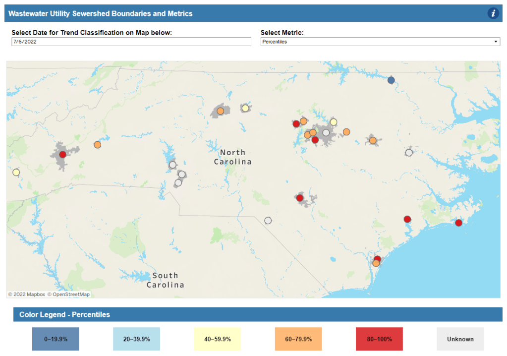
North Carolina: Similarly to Colorado’s, North Carolina’s wastewater dashboard allows users to click into specific sites for coronavirus trends. This dashboard also provides reported case trends for comparison and information about concentration percentiles, similar to the metrics used by the CDC. It also gives users a lot of information about where the data come from—good for transparency!
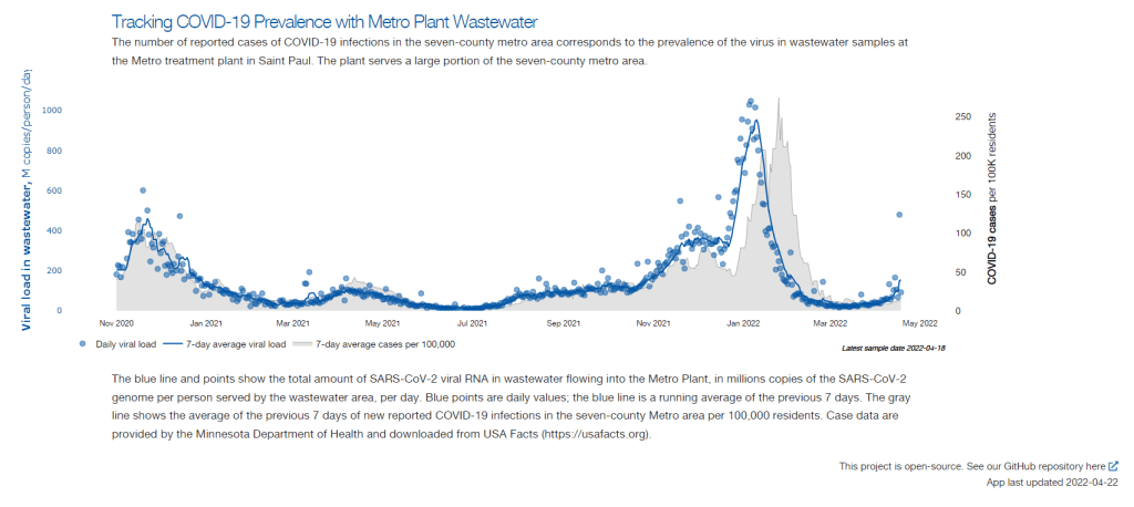
Twin Cities, Minnesota: The Metropolitan Council, a local agency in the Twin Cities, Minnesota metro area, has monitored COVID-19 in wastewater since early in the pandemic; I shared an interview with a lead scientist there in April. Recently, the Met Council added variant information to its dashboard, showing which versions of the virus are currently driving spread (BA.5 is taking the lead right now).
I know (from looking at the COVIDPoops19 dashboard) that my new resource page includes a small sample of academic and local wastewater sites; I chose to focus on those at the state level and for larger metro areas due to my own capacity. But if there’s another dashboard that you’d like to see added to the page, please reach out and let me know! I’ll try to keep it updated on a monthly cadence.
COVID-19 levels in waste—or, from our poop—have become an increasingly popular data source in the last couple of months (in this newsletter and for many other reporters and commentators), as PCR testing sites close and at-home tests become the norm. Wastewater can provide us with early warnings of rising transmission, and it includes COVID-19 infections from people who can’t or don’t want to get a PCR test.
But wastewater surveillance is very uneven across the country, as I’ve noted before. A lot of local health agencies, research groups, and utility companies are now trying to expand their COVID-19 monitoring in wastewater, but they face a lot of barriers. My reporting suggests that we are many months (and a lot of federal investment) out from having a national wastewater surveillance system that can actually replace case data as a reliable source for COVID-19 trends and a driver for public health action.
Wastewater surveillance is highly sensitive to changes in a community’s coronavirus transmission levels, particularly when those levels are low, as has been the case across the U.S. in recent weeks.
Every wastewater collection site is different, with unique environmental and demographic factors – such as weather patterns or popularity with tourists – that must be accounted for.
While the CDC has led some coordinated efforts through the National Wastewater Surveillance System (NWSS), wastewater sampling techniques overall aren’t standardized across the country, leading to major differences in data quality.
Sparsely populated, rural communities are particularly challenging to monitor, as their small sizes lead to even more heightened sensitivity in wastewater.
Wastewater data is hard to communicate, especially when public health officials themselves aren’t sure how to use it. The CDC’s NWSS dashboard is a prime example.
As bonus material in today’s COVID-19 Data Dispatch, I wanted to share one of the interviews I did for the story, which provides a good case study of the benefits and challenges of COVID-19 surveillance in wastewater.
In this interview, I talked to Steve Balogh, a research scientist at the Metropolitan Council, a local agency in the Twin Cities, Minnesota metro area that manages the public water utility (along with public transportation and other services). Balogh and his colleagues started monitoring Twin Cities’ wastewater for COVID-19 in 2020, working with a research lab at the University of Minnesota.
Balogh gave me a detailed description of his team’s process for analyzing wastewater samples. Our conversation also touches on the learning curve that it takes to set up this surveillance, the differences between monitoring in urban and rural areas, and the dynamics at play when a wastewater plant suddenly becomes an important source for public health information. Later in the interview, Bonnie Kollodge, public relations manager at the Metropolitan Council, chimed in later to discuss the wastewater data’s media reception.
This interview has been lightly edited and condensed for clarity. Also, it’s worth noting that the interview was conducted in early April; since then, COVID-19 levels have started rising again in the Twin Cities metro area’s wastewater.
Betsy Ladyzhets: The first thing I wanted to ask about was, the backstory of sampling at the Metro Plant. I saw the dashboard goes back to November 2020, and I was wondering if that’s when you got started, and how that happened?
Steve Balogh: We actually started looking into it in April of 2020. And we contracted with Biobot at that time… But in May, their price went up, so we started looking for alternatives. Then, we started a partnership with people at the University of Minnesota Genomics Center, who know about measuring RNA in things.
At that point, we tried to figure out how to extract the RNA from our samples. They [University of Minnesota researchers] didn’t know anything about wastewater, but they knew everything about RNA. We know all about wastewater, but we don’t know anything about RNA. So it was a good match.
That summer, [the university researchers] started trying to do the extractions and it didn’t really work out so well… So we said, “Okay, we’re going to try this.” By September of 2020, we had built our own lab, and we were trying out our own extractions, based on what we were seeing in the literature, and all the preprints that were piling up. In October, basically we settled on [a sampling process] that worked. And by November 1, we were actually getting data.
BL: Yeah, that definitely aligns with what I’ve heard from some of the other scientists I’ve talked to who have worked on this, where it’s like, everybody was figuring [wastewater sampling methods] out on their own back in 2020.
SB: Yeah, it was on the fly. Papers were coming out daily, just about, with new ideas on how to do things. And we had, like, four different extraction methods that we wanted to look at, also looking at sludge, in addition to influent wastewater… Honestly, it was pretty much pure luck that we settled on [a method] that really, really worked.
We tried to get daily samples, and to put up numbers and see what [the data] looked like. And it actually did work—it actually tracked the reported caseload quite well. We figured, well, it must be working. We also did QA [quality assurance] in the lab, spiking the samples with known amounts of RNA, and trying to get that back. And all of that came back really well, too. So, we have a lot of confidence in our method.
BL: So that [QA] is like, you put in certain RNA, and then you check to make sure that it shows up in the sample?
SB: Exactly, yeah.
BL: What is your process for analyzing the samples and distinguishing those trends, like seeing how they match the case numbers?
SB: We do the extractions at our lab, with the samples from the Metro Plant. We take three milliliters of wastewater and we add 1.5 milliliters of something called Zymo DNA/RNA Shield, from a company in California called Zymo. That’s a buffer that stabilizes the RNA—it basically explodes whatever virus particles are in there, breaks them up, and then it stabilizes the RNA in the sample. So you can actually store those samples at room temperature for days, or maybe even weeks, because the RNA is stabilized.
Then, we put that treated sample through a two-step extraction process. The first step is, we put the whole thing into a Zymo III-P column, combined with 12 milliliters of pure ethanol, and run that through the column. This is a silica column, so the RNA in the sample binds to the silica. Then we wash it and elute that RNA in 200 microliters of water. And then we take that 200 microliters, and run it though the second stage, which is just a smaller silica column. The RNA that’s in that 200 microliters binds onto the smaller column, and then we wash it and elute that into 20 microliters.
Our total concentration is going from three milliliters of wastewater down to 20 microliters of pure water. That’s a concentration factor of 150. We figured that would work for pretty much most situations, and it’s turned out to be true.
Then, we store those samples at minus 80 degrees Celsius. Until we take them over weekly to the University of Minnesota, where they do droplet digital PCR, RT-PCR, to amplify and detect the RNA that’s in our samples. We started out just getting the total viral load back in November 2020. But then, in the early part of 2021 when Alpha showed up, we started doing variant analysis as well. We’re now also looking for specific mutations that distinguish the different variants of concern, like Alpha and Delta and Omicron.
BL: So, you take the samples every day, but then you bring them over [to the university] once a week, is that correct?
SB: That’s correct.
BL: When you’re getting that data, coming from the U of MN lab, what are you doing to interpret it? Or, in communicating the data on your dashboard, what are the considerations there?
SB: We work up the numbers and calculate a total load of the virus, or the particular variants, that’s coming into the plant. And then we basically put that up on the dashboard. There’s not a whole lot of interpretation or manipulation of the data—we’re simply importing the load, basically, of what we see coming into the plant. The load is the concentration that we’ve measured in the sample, times the total volume of wastewater coming into the plant.
We think that’s a sufficient normalization procedure for a large wastewater treatment plant. I know some groups are using other normalization techniques, but we think load is sufficient to tell us what’s happening out in our sewer shed.
BL: Yeah, that makes sense. I know this gets more complicated when you have smaller sites, but your sewer shed is serving a big population—
SB: Almost two million people. Yeah, it’s a big sewershed. If you had 50% of your population leaving during the day to go to work in the next community, that would be something that you might have to consider using other normalization techniques. But that just isn’t the case [in the Twin Cities]. We see a pretty steady signal here.
BL: Makes sense. Have you considered expanding to other sites? Or are is the plan to just stick with sampling at the main sewer ship location?
SB: We already have, actually. We operate nine different wastewater treatment plants in the seven-county metro area. And we’ve already expanded to three of those other sites, so we now have four total plants that we’re taking samples at and having them analyzed at the Genomic Center. It only started within the last month, so we don’t have quite the database to really start showing it on our dashboard yet. But when we do [have more data], our plan is to put that up [on the dashboard] as well.
BL: Do you have a sense of how much time it might take before you feel the data is useful enough to put on the dashboard?
SB: Part of the problem has been, all of these samples that we’re getting from these other plants, we’re just taking the entire sample over to the Genomics Center, and they’re doing the extractions. They’re using my extraction procedure, but they’re doing it in their lab. So, there was some learning curve for them to figure that out. And also to hire staff and come up to speed in terms of facility, and procedure, and people… Now, it’s been a few weeks, and I think they’re just about there [in getting a handle on the RNA extraction methods]. So, I think our data will start to shape up pretty quickly.
Another thing that may be keeping us, at this point, from showing the data is, nothing’s happening. We’re at this bottom [with low coronavirus levels in the wastewater] where everything just looks noisy, because nothing’s changing. But as soon as we start to go up, and if we get higher—the current position is just going to look like a flat line. But right now, people could look at it and say, “Well, that’s just junk.”
So, in that sense, we just don’t want to confuse matters and say, “Here’s a bunch of junk for you to look at. We want to put it into some context. And the context really is, when things start taking off, then you see, “Oh, it used to be very low. And now it’s very high.”
BL: That makes a lot of sense. Also, I hear you on the challenges of learning these methods. I was a biology major in school, and I worked in a lab, briefly, that did RNA extraction. And I remember how tricky it is, so I can envision the learning curve.
SB: Well, these are experts at the Genomics Center, they know what they’re doing. But I think even they have been surprised at how how robust the viral RNA is in wastewater. A lot of people at the beginning of this pandemic said, “You’ll never see it in wastewater. It’s RNA, RNA is very sensitive, it’ll break down.” But that just isn’t the case—the RNA is quite robust in wastewater, and the signal lasts for a long time. It has to last for many hours, for it to travel from the far end of our sewershed to get to us [at the treatment plant]. And then, even in the refrigerator, when you refrigerate just the raw sample, it’ll stay in a reasonable concentration without dropping too much for days.
BL: What has the reception to this work been from the public, the state health department, or from local media or other people who are using and watching the data?
SB: It’s been incredible. You can ask Bonnie more about it.
Bonnie Kollodge: It’s ginormous. I mean, it just has spread everywhere. I don’t even know the social spread, but I think somebody was tracking our impressions in print and online media… I think there were, like, 11 million impressions between January and the end of March. And we get lots of requests for Steve’s time, lots of requests for a daily accounting [of the data].
When we began this work, it really was out of public service—seeing that there’s a pandemic going on, and what can we do to help? That’s when they started developing this idea, then working with the Depratment of Health, which is really our state lead on this [COVID-19 response]. They came to rely heavily on our information, to compare it against what their test results were showing. Then, as people started to do home testing, that was a whole other factor. It was really wastewater that was taking the lead on showing what was happening with the virus and the variants…
Every week, we put an update online, and reporters go right to it, to determine how they’re gonna position [their COVID-19 updates]. Steve also provides, in addition to the data, a little narrative about what’s happening that helps reporters—some who are very conversant in data, but others who are not—it helps them it understand what we’re seeing.
BL: I can see how that would be helpful, especially if you’re releasing a week’s worth of data points at once. You sort-of have a mini trend to talk about.
BK: Yeah, and we send it to the governor’s office, and to the Health Department. They appreciate the transparency… They know what’s happening [with the virus], and can adapt.
BL: Right. And Bonnie, you mentioned something I wanted to ask more about, which is how the increased use of at-home tests and lower availability of PCR tests has increased the demand for wastewater data in the last few months, in particular. Now that you maybe have less reliable case data to compare against, has the thinking and interpreting the wastewater data shifted at all?
SB: I think we’ve actually had that statement from reporters. They’ve said, “We can’t trust the testing data anymore. And it’s going to be wastewater from here on out.”
BK: Just this week, there was a reporter who asked to get early results tomorrow. And he said, “This [wastewater data] is what I’m watching.” … The public has glommed on to this resource as a demonstration of what’s happening. And, like Steve said, it’s not a small sample. There are almost two million people served by this by this particular plant.
BL: From what I understand, part of what can be really helpful [with wastewater data] is when you have that longevity of data, as you all do. You have a year and a half of trends. And so when you see a new spike, it’s easier to compare to past numbers than for other parts of the country that are just starting their wastewater surveillance right now.
SB: Yeah. I think the other thing that has been really useful for our [state] department of health is, they’ve really appreciated the variant data that we have. That was really the first thing that got their attention… And we were giving them [variant] data ahead of time. The clinical tests were taking days or weeks to come back, and we could give them variant data the same week. So, that was the first thing that got our department of health here interested. But when they saw that we can track trends, they recognized that this has value at lower levels when testing goes away, basically.
BL: How would you want to see support from the federal government in expanding this wastewater work? Like you mentioned, getting it in more treatment plants, and any other resources that you feel would be helpful.
SB: Well, I think that’s underway, as we understand it, with the National Wastewater Surveillance System, NWSS. I think they’re funded through 2025, and I think the goal there is to basically sign up as many treatment plants as they can in the country.
Hopefully, that’s the beginning of something that is going to go beyond the pandemic, and give us a measure of community health in the future. Because wastewater is a community urine test, basically. It’s everybody contributing, and it can be useful for other pathogens and viruses in the future. So, yeah, [expanding that network] would be great. Let’s do it.
BL: Do you envision adding other viruses to the testing that you’re doing? Flu or RSV are ones that I’ve heard some folks are considering.
SB: Yeah, that would be something to do going forward for us. Though, it’s not clear how long we continue this work, just because these other projects are expanding, like the national project. And even our department of health here [in Minnesota] is talking about bringing this type of analysis into their own laboratory. Certainly going forward, long-term, that would be a goal for any work done here in Minnesota—to add those things to the menu of what we’re analyzing.
BL: Right. So you might be taking the samples to the Minnesota health department instead of the university, or something like that?
SB: Someday. Yeah, we just don’t know at this point.
BK: This is an evolving scinece. And this is not what we typically do—I mean, we do wastewater collection and treatment. So this [COVID-19 reporting] is a little outside of our regular parameters. But, like Steve and his superiors have been saying, this is an evolving science, so let’s see where this takes us, in terms of infectious disease.
It’s funny, when I go out and talk to people and say, “I work for the Met Council, and I help in communications with the wastewater analysis,” everybody knows what I’m talking about. It’s just so much out there. But I think that these things [testing for other diseases] are all being explored, and this has really opened up new possibilities.
SB: From the beginning, it’s just been a scramble. You don’t know what’s going to be coming. What I’m doing, a lot, is trying to get ourselves in a position so that, when the next variant of concern pops up, we have an assay that can measure it. There’s still a lot of unknowns about what’s going on, and everything’s new every day, just about.
This week, I’m sharing a short dispatch from the Society of Environmental Journalists (SEJ) conference in Houston, Texas. Unlike other journalism conferences I’ve attended, SEJ meetings don’t just sequester you in your hotel all day: the organizers plan field trips that are designed to give reporters on-the-ground information about environmental issues at the place they’re visiting.
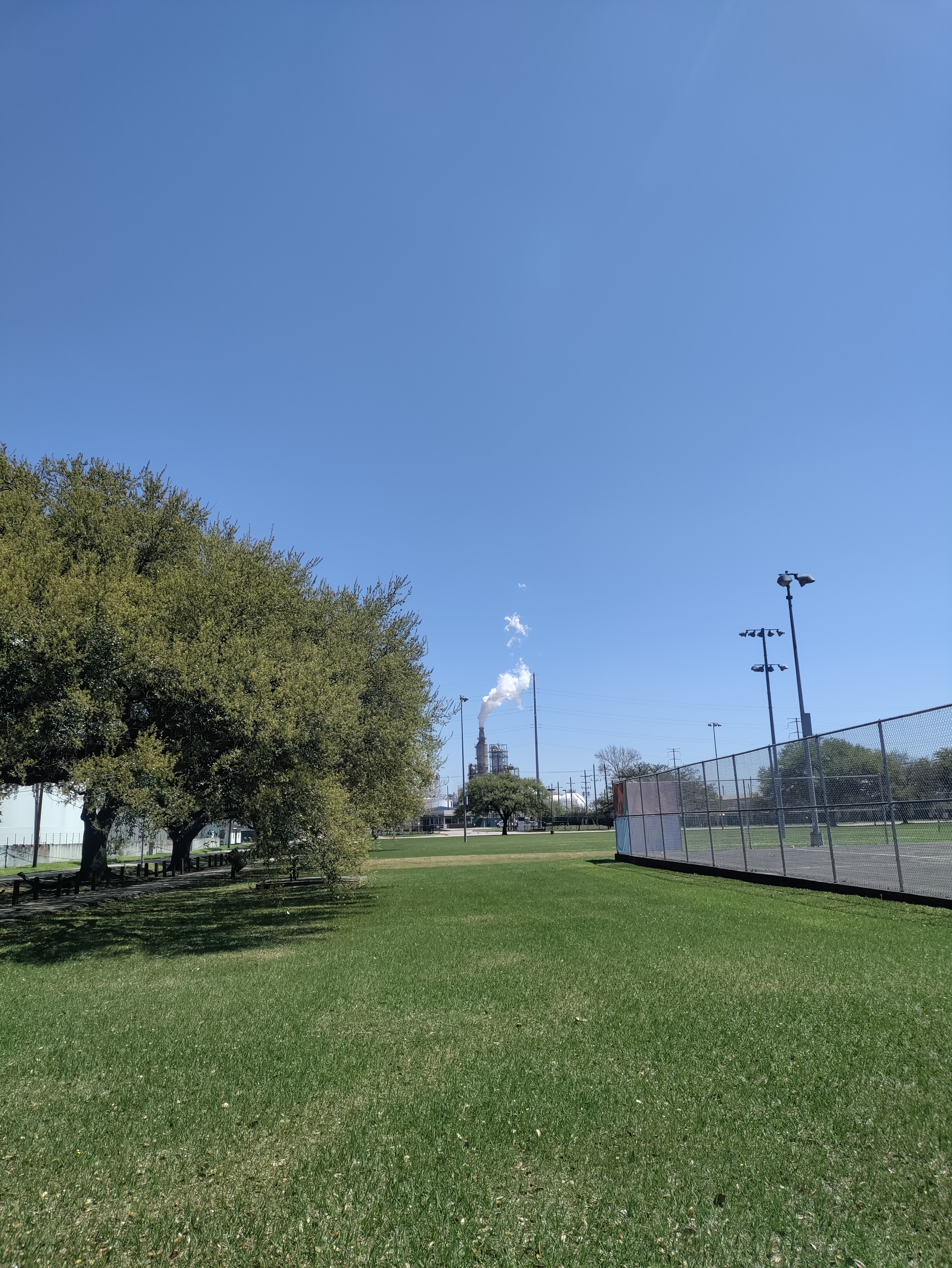
I went on one of these trips, to the Houston Ship Channel and surrounding communities impacted by industrial pollution. For me, this experience was a lesson in the cascading health issues caused by environmental racism—including, of course, COVID-19—as well as the ways that data gaps can make it harder for hard-hit communities to get needed public health assistance.
The Houston Ship Channel, I learned this week, is a passage for ships going between Houston’s port and the Gulf of Mexico. According to the Port Houston website, it’s the largest container port in the Gulf Coast, handling about two-thirds of all shipping containers that travel through the region. (Shipping containers include all the consumer products that we order online.)
It is also the single largest U.S. port for petroleum exports. Every month, thousands of tons of oil and plastics (which are made from oil) pass through the Houston Ship Channel; much of this cargo is processed right on the banks of the channel, in massive refineries that define the landscape around Houston.
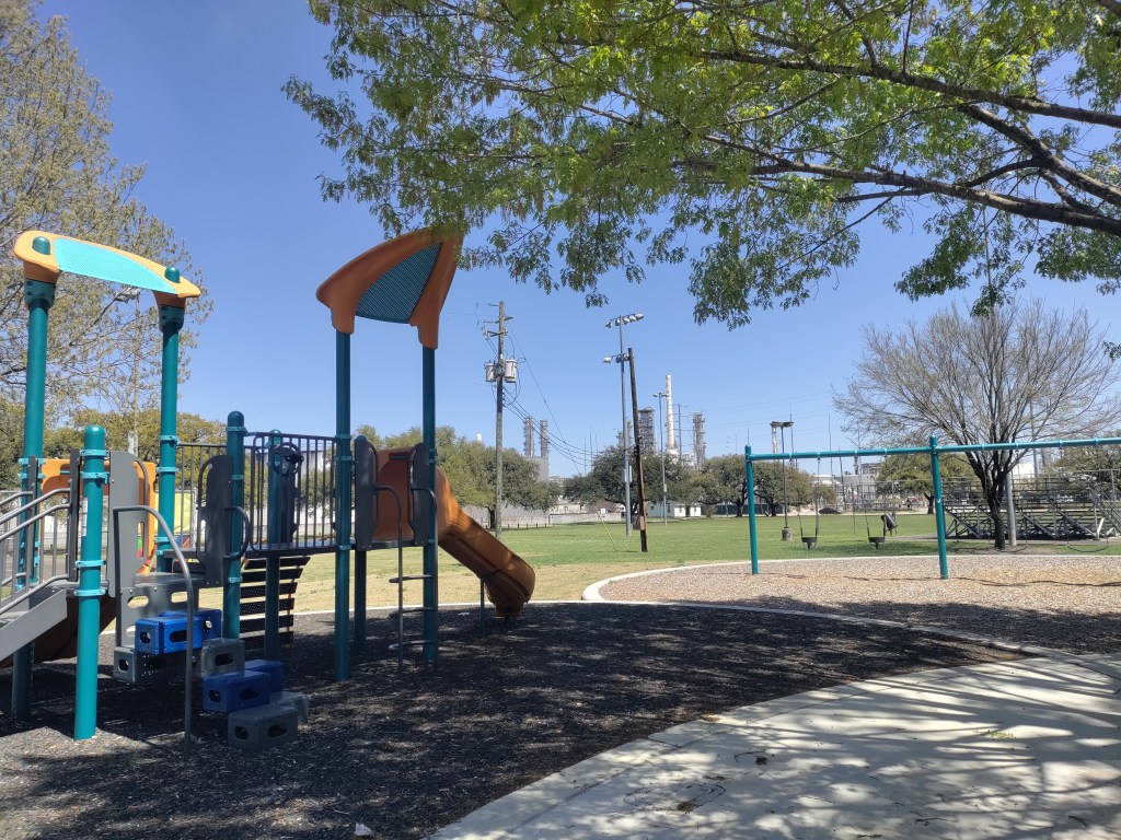
Houston is the largest U.S. port for petroleum exports. Refineries and chemical plants surround the ship channel. Photos by Betsy Ladyzhets.
With SEJ, I went on a boat tour through the Houston Ship Channel. We passed refineries and industrial plants from Valero, Chevron, Exxon-Mobil, and other major companies, getting a close look at just how much space these facilities take up and how they decimate the surrounding land.
After the boat, my group went to Manchester, a neighborhood close to the channel in southeast Houston. Community activists from the local environmental advocacy group TEJAS explained that this neighborhood’s population is overwhelmingly Latino; many residents are low-income workers with no college degrees who speak Spanish as their first language.
Manchester residents have faced intense pollution from industrial plants that border their homes, schools, and community spaces. We walked through a park that is surrounded on multiple sides by these plants; we could see smoke from chemicals burning, and smell the results of that burning in the air. Valero, which owns one of the nearby plants, had recently sponsored a playground in this park as a small gesture, barely acknowledging the harm it’s caused to this neighborhood.
Of course, my immediate question was: what are the COVID-19 statistics for this neighborhood? To me, it seemed obvious that Manchester residents living with this intense pollution would face higher rates of respiratory conditions, cancers, and other diseases that would make them more vulnerable to severe COVID-19 symptoms. (Poor quality air has been linked with more severe COVID-19 outcomes since the early days of the pandemic.)
Here’s the problem: nobody could actually answer my question. I spoke to Leticia Ablaza, government relations director at Air Alliance Houston and another speaker on the tour, who explained that the link between pollution and COVID-19 in Manchester and other similar Houston neighborhoods has yet to be studied. Anecdotally, she said, she knows community members with respiratory conditions who have faced heightened vulnerability to COVID-19. But there’s no formal data.
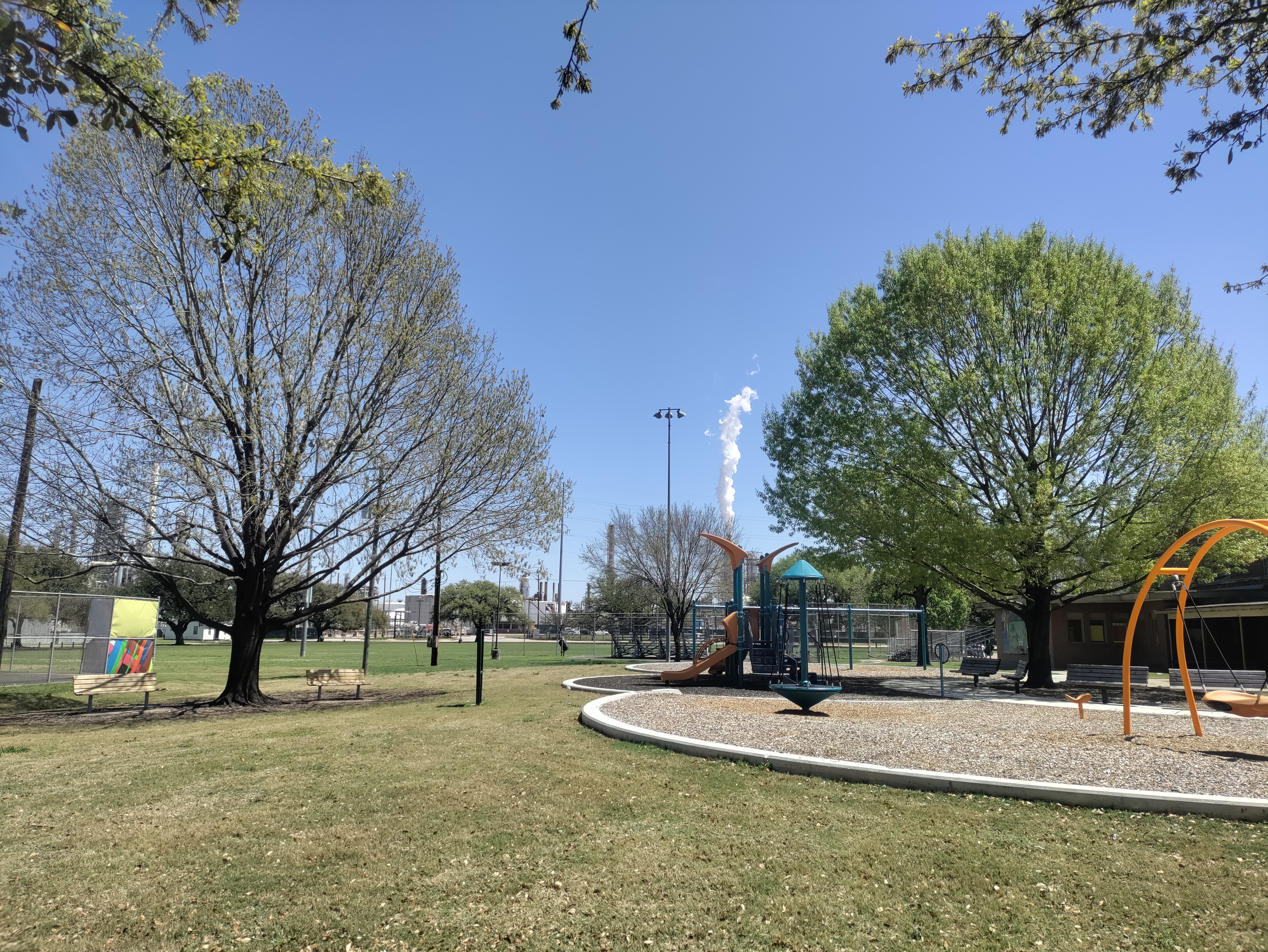
Manchester, a Houston neighborhood near the Ship Channel, is surrounded by industrial plants that pollute the community. Photos by Betsy Ladyzhets.
The reason for this lack of formal studies became clear to me later, when I attended a conference session on the links between COVID-19 and environmental health. Annie Xu, a Rice University student who has studied health disparities in Texas, said at this session that the state of Texas does not publish any COVID-19 data below the county level.
Xu’s research group did identify links between Texas counties’ racial demographics and their COVID-19 burden, published in Nature Scientific Reports in January. But when the group looked for links between air pollution and COVID-19, the analysis didn’t lead to significant results.
This finding is likely because pollution can vary widely within Texas counties, Xu said. For example, there’s a huge gap between air quality in Manchester and on Rice’s campus, both of which are included in Harris County. To truly find a connection between pollution and COVID-19, a research group like hers would require more granular data, such as at the ZIP code or census tract level.
But the Texas public health department only publishes COVID-19 data at the county level—with the exception of vaccinations, one metric that is available by ZIP code. The federal government doesn’t report COVID-19 data below the county level either.
Without this granular information, it’s difficult to demonstrate the impacts of petrochemical pollution on COVID-19 in neighborhoods like Manchester. The community isn’t able to get priority status for public health interventions like vaccines or testing—meaning that its vulnerabilities are unlikely to change.
As longtime readers know, I have spent a lot of time grappling with COVID-19’s demographic disparities. I was a leading volunteer for the COVID Tracking Project’s COVID Racial Data Tracker, and have sought to call attention to the terrible state of this type of COVID-19 data in the U.S. whenever I can. Still, it was a new experience to actually see a community left behind by the data gaps that I cover.
What kind of investment would be required to truly study how COVID-19 has impacted a place like Manchester, in Houston? And what other environment-related health conditions do we need to be investigating in these areas? I hope that future stories will enable me to answer these questions.
For now, if you have any questions, comments, or data source recommendations in this area, please reach out!
In last week’s issue, I mentioned that I am thinking more about preparedness: how the U.S. can improve our capacity to respond to public health threats, future COVID-19 surges and beyond. This mindset shift was brought on, in part, by a recent story I worked on at the Documenting COVID-19 project: examining the vulnerabilities in Idaho’s hospitals as a case study of the U.S.’s decentralized healthcare system.
Last summer and fall, Idaho was completely overrun by the Delta variant. State leaders implemented crisis standards of care, a practice allowing hospitals to conserve their limited resources when they are becoming overwhelmed. All hospitals in Idaho were in crisis standards for weeks, with the northern Panhandle region remaining in this crisis mode for over 100 days.
During this time, Idaho hospitals sent out 6,300 patient transfers in the span of four months. With Audrey Dutton, my reporting partner at the Idaho Capital Sun (a nonprofit newsroom covering Idaho state government), I analyzed data from the Idaho health department that showed where these patients were transferred, as well as how the crisis period compared to previous months.
This map shows all patient transfers out of Idaho hospitals between April and November 2021. Chart by Betsy Ladyzhets, published in the Idaho Capital Sun and MuckRock.
Here are the major findings from our story (borrowing some text from my Twitter thread, linked above):
More than one in three transfers went to hospitals in neighboring states, with the highest numbers going to eastern Washington.
Transfers went as far as Seattle, Salt Lake City, San Francisco, Billings, and even Phoenix. Many of these trips required air ambulances, due to Idaho’s mountainous geography.
These transfers strained Washington hospitals. Dr. Dave Chen, chief medical officer at MultiCare Deaconess Hospital in Spokane—one Washington hospital that took on a lot of Idaho patients—told me that smaller, rural facilities in his area are all “competing for the same beds and resources,” whether these facilities are based in Washington or Idaho.
Workers at facilities in the northern Idaho region, which remained in crisis standards for over 100 days, described doubling patients up in ambulances, traveling for hours to find free beds, and taking EMS staff away from their normal duties for long trips.
Idaho is particularly vulnerable to transfer challenges: it has a lot of small rural hospitals without many ICU beds or specialized equipment, combined with geography that often requires an air ambulance rather than driving.
This story has implications beyond Idaho, as it shows the impact of America’s fractured health system. In our system, when hospitals in one state are in crisis, they cannot easily communicate with other hospitals that might be able to help them out—whether “communicating” means calling up hospital administrators to ask about free beds or sharing data about patient numbers and resources.
This is not just a COVID-19 problem. Consider what happens when a wildfire, hurricane, or other natural disaster hits. When hospitals in one area become overwhelmed, they should be able to easily reach out to other facilities—but our system makes this incredibly difficult.
One potential solution to this issue may be centralized transfer centers, which field calls from hospitals that need to send out their patients. Washington started such a transfer center during the pandemic, to great success: Dr. Steve Mitchell, who helps run the center, told me that it facilitated more than 3,500 patient transfers, mostly between summer 2021 and early 2022.
But there’s a kicker: Washington’s transfer center is funded by the state health department, and therefore it can only answer calls from Washington hospitals. If an Idaho hospital wants to transfer a patient into Washington, it has to call various Washington hospitals directly until finding a bed for that patient—a much more time- and resource-intensive process.
Look at how siloed our current system is! This is ridiculous! Clearly, we need transfer centers with regional—or even national—reach, coordinated by a national health agency. We also need more data sharing between hospitals, and better communication between facilities and EMS providers.
Early this week, I had a big story published in The Missouri Independent, as part of the Documenting COVID-19 project’s ongoing collaboration with that nonprofit newsroom. This piece goes in-depth on the Missouri health department’s contract with SLSCO, a Texas-based construction company that expanded to provide healthcare support during the pandemic.
While this was a local story, to me, the piece provides important insights about the type of support that is actually needed in U.S. hospitals right now: not temporary assistance, but long-term, structural change.
The Missouri agency hired SLSCO to provide two services, with a total contract of $30 million:
Provide staffing support (nurses, technicians, etc.) to hospitals across the state struggling in the wake of the Delta surge.
Set up, staff, and operate six monoclonal antibody infusion sites where Missourians infected with the coronavirus could easily access the treatment.
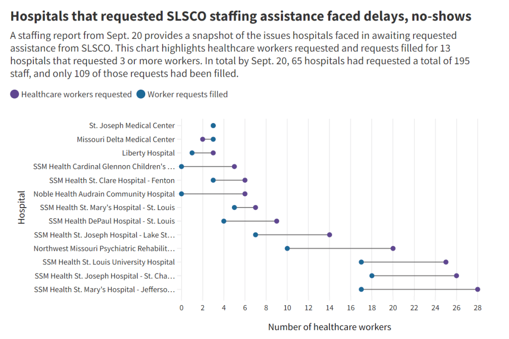
SLSCO made lofty promises to the Missouri health department, citing its ability to quickly send hundreds of workers to facilities that required assistance. But in fact, the hospital staffing assistance was marred by delays, no-shows, and high rates.
Here are a few paragraphs from the story:
Fewer hospitals signed on to receive staff than the Department of Health and Senior Services anticipated. Within the first few weeks, some hospitals faced no-shows, while the company’s hourly rates — up to $215 an hour for some nurses and $550 an hour for doctors — were too high for other hospitals to afford after state funds ran out, according to emails obtained by The Independent and the Documenting COVID-19 project through records requests. (Copies of SLS’ contract and emails between state agencies can be found here.)
“153 staff requested and only 10 deployed,” wrote Alex Tuttle, the governor’s legislative budget director, after receiving a staffing report early in the contract period. “Am I reading that right?”
From mid-August through November, just 206 staff were ultimately sent to 53 hospitals, said Lisa Cox, a spokeswoman for DHSS. The healthcare support had left by the time omicron hit in the winter.
The monoclonal antibody infusion sites were more successful; in fact, the Missouri health department ended up redirecting funding from the staffing support to the infusion sites. The six sites served a total of 3,688 patients over a two-month period.
However, the sites could have served a lot more patients: these clinics could have treated up to 136 patients each day but peaked at about 90, with numbers often much lower, according to my analysis of data from the health department. Due to these low numbers, the state of Missouri ended up spending more than $5,600 for each patient. One monoclonal antibody expert I talked to for the piece called this an “exorbitant” cost.
Now, I don’t mean to hate on monoclonal antibody treatments here—these drugs are truly a great way to boost the immune systems of COVID-19 patients who may be at higher risk for severe symptoms. Maggie Schaffer, a case management nurse who helped set up one of the infusion sites, told me that people who had this treatment typically are “feeling like a whole new person” within a day or two.
However, the treatments are very expensive and inefficient; one patient’s infusion appointment can take hours. The drugs themselves cost around $2,100 per dose, about 100 times as much as one vaccine. Health departments and facilities that offer monoclonal antibodies need to focus on getting the word out to patients so that these expensive supplies aren’t wasted.
At the same time, temporary healthcare staff can be great to help a facility out a surge—but they are not a long-term solution. In particular, nurses at a hospital may be frustrated by watching new staff come in from out of town and receive much higher pay rates; the “traveling nurse phenomenon,” as this is called, may contribute to burnout and staff leaving to go become traveling workers themselves.
What do hospitals actually need to do to address their staffing crisis? Here are a few ideas from Tener Veenema, a nursing expert focused on health systems a professor of nursing who researches health systems and emergency preparedness at Johns Hopkins’ Bloomberg School of Public Health:
Higher pay and assistance with education bills.
Regulations on things like work hours, the number of patients one nurse can be responsible for at once.
Mental health assistance that nurses are actually given time and space to access.
I’ll end the post with this quote from Veenema, which is also the last line of the story:
“If we don’t fix the toxic work environment, this issue of mandatory overtime, inadequate staffing levels, lack of time to access mental health resources,” Veenema said, “then you’re simply shooting more new nurses out of the cannon, but into the lake where they’re going to drown.”
Screenshot from the California SMARTER plan. This week, California became the first state to officially shift to an endemic strategy for dealing with COVID-19.
Last week, I discussed the recent trend in states ending mask requirements in public schools, businesses, and other settings, by providing readers with some suggestions for encouraging safety during this push to “open everything” (that wasn’t already open). This week, more states are dropping safety measures; for example, Washington governor Jay Inslee announced that the state’s indoor mask mandate will end on March 21, though this change is also contingent on a low level of COVID-19 hospital admissions.
At the same time, some states are also making major shifts in the ways they collect and report COVID-19 data. State public health departments are essentially moving to monitor COVID-19 more like the way they monitor the flu: as a disease that can pose a serious public health threat and deserves some attention, but does not entirely dictate how people live their lives.
You may have seen this shift discussed as a movement to treat COVID-19 as “endemic.” An endemic disease, from an epidemiologist’s standpoint, is one that’s controlled at an acceptable level—it hasn’t been completely eradicated, but the levels of cases, hospitalizations, and deaths are generally deemed as levels that can continue without major public health measures. For more on the topic, I recommend this post from epidemiologist Ellie Murray (whom I’ve quoted on this topic before).
We can argue—and many COVID-19 experts on Twitter are arguing—about whether this is the appropriate time to shift into endemic mode. Still, regardless of individual opinions, state public health departments are starting to make this shift, and I think it’s worthwhile to discuss how they’re doing it, particularly when it comes to data.
Here’s a brief roundup of four states that are shifting their COVID-19 data collection and reporting.
California
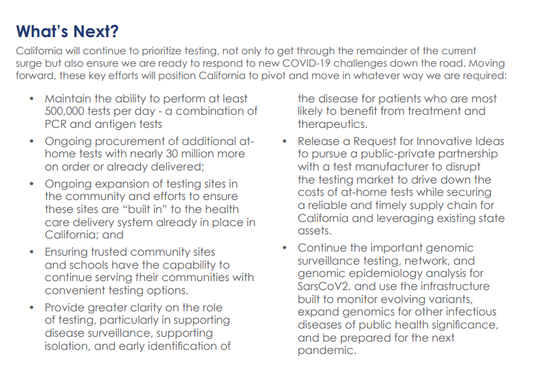
California made headlines this week for being the first state to officially shift into “endemic” policy for dealing with COVID-19. State officials have drafted a plan called “SMARTER”—which stands for Shots, Masks, Awareness, Readiness, Testing, Education, and Rx (treatment). I took a look at the plan, which reporters from NBC Bay Area kindly shared publicly on DocumentCloud.
Here are a few data-related highlights:
State officials will “focus on hospital numbers” to gauge how California should react to potential new variants that may be more infectious or more capable of causing severe disease.
Unlike some other states, California is maintaining testing capacity going forward, including an expansion of community testing sites and ongoing procurement of at-home antigen tests for public schools, long-term care facilities, and other institutions.
Throughout the pandemic, California has invested in genomic sequencing for COVID-19 cases, as well as a statewide modeling tool that compiles several different forecasts. These surveillance tools will be further expanded to respond to COVID-19 and other infectious disease outbreaks.
California also intends to “build a robust, regionally based wastewater surveillance and genome sequencing network” that can provide early warnings about new outbreaks.
The plan includes a focus on equity: California leaders will monitor testing, cases, and other metrics in minority communities so that resources can be provided to address disparities if needed.
Missouri
Missouri started its shift to “endemic” in December, as the governor declared an end to the state’s public health emergency around COVID-19—even though cases were at their highest-ever level in the state. Now, the Missouri health department is preparing to change its data reporting accordingly, my colleague Derek Kravitz and I reported in the Missouri Independent this week. (The Independent, a nonprofit newsroom focused on Missouri’s state government, is a long-time collaborator of the Documenting COVID-19 project, where I work part-time.)
Here are the planned data changes highlighted in our story:
Case investigations and contact tracing, where local health departments’ staffers reach out to people exposed to the virus in workplace or other public settings, will cease, unless a new, more transmissive or deadly variant emerges;
Daily reports on COVID-19 cases and deaths by the state health department will be replaced by aggregate weekly reports. In some cases, metro health departments, including those in St. Louis and Springfield, will likely continue collecting and disseminating daily reports but the state will stop its reporting;
Positivity rates will be phased out, as they are already difficult to interpret, with many Americans having switched from PCR tests to at-home antigen tests. Most people don’t report their results to local health departments. Missouri officials in January said they were prepared to be a “trend setter” in eliminating positivity rate reporting.
Hospitalization data will become even more important, with state health officials hoping to make reporting more timely;
Wastewater surveillance will become a more relied-on data point for public health officials, as a way to spot COVID-19 early in its life cycle and identify potential hot spots. Missouri is a leader in wastewater surveillance, as the state has the highest number of collection sites reported on a new CDC dashboard.
Iowa
A couple of weeks ago, I called out the state of Iowa for decommissioning its two COVID-19 dashboards, one dedicated to vaccination data and one for other major metrics. (I’m still bummed out about this, to be honest! Iowa had one of my favorite/most chaotic dashboards to check as a COVID Tracking Project data entry volunteer.)
Rather than reporting daily COVID-19 case numbers, vaccinations, and other data, Iowa is now providing weekly updates. The new, pared-down dashboard includes positive tests and death numbers over time, case and vaccination rates by county, and some demographic data.
For more frequent COVID-19 reporting, the Iowa dashboard now directs residents to federal data sources. Iowa is still reporting daily to the federal government, as all states are required to do.
The state health department “will continue to review and analyze COVID-19 and other public health data daily,” Governor Kim Reynolds said. But some teams focused on the COVID-19 response will return to pre-pandemic responsibilities.
This reporting change is intended to align with “existing reporting standards for other respiratory viruses,” Gov. Reynolds said.
Iowa is focusing on at-home tests with a program called “Test Iowa at Home,” in which residents can request to have a test kit sent to their homes for free. (It was unclear to me, from browsing the website, whether these are rapid antigen tests or PCR tests.) The state health department processes these tests and collects data from the program.
South Carolina
A Tweet from South Carolina data expert Philip Nelson alerted me to this one: not only is South Carolina shifting from daily to weekly data reports, the state is essentially ending all reporting of COVID-19 cases. This is paired with a gradual shutdown of testing sites in the state.
South Carolina’s health department will stop reporting daily COVID-19 case counts on March 15.
The agency will continue to report COVID-19 hospitalizations and deaths as important indicators of disease severity, but these will switch to a weekly update schedule rather than daily.
The shift away from case reporting aligns with a greater focus on rapid at-home tests, which South Carolina’s health department says are “not reportable.” (While it’s true that the vast majority of rapid at-home test results are not reported, some jurisdictions, like D.C., allow residents to self-report their results!)
South Carolina’s health department is planning to gradually shut down almost all public PCR testing sites in the state throughout the month of March. According to the department, these sites have seen “a significant decrease in demand” due to increased availability for rapid tests.
The department is also discouraging regular testing for asymptomatic South Carolina residents, saying that individuals who are currently symptomatic or have a close contact who tested positive should be prioritized.
More news on this topic
The CDC continues adding wastewater collection sites to its new dashboard. Two weeks ago, I wrote that only ten states had ten or more sites included on the dashboard; since then, three additional states have crossed that threshold: Illinois, Washington, and West Virginia. But the dashboard is still empty for the majority of states, indicating a lack of this important surveillance tool in much of the country.
For an upcoming story, I recently interviewed Lauren Ancel Meyers, a modeling expert at the University of Texas at Austin and lead author on this fascinating paper about using hospital admissions and mobility data for pandemic surveillance. Meyers has considered cases to be a messy indicator throughout the pandemic, she told me. She finds hospital admissions to be more useful, as this metric will directly show how many people are seeking healthcare due to their COVID-19 symptoms.
Another interesting paper, published in Nature this week, describes the use of machine learning models to drive COVID-19 testing at a university. The models could “predict which students were at elevated risk and should be tested,” the researchers write; students tested because of the models tended to be tested more quickly and were more likely to test positive than those identified through manual contact tracing or general surveillance. Such modeling could be used to augment the type of random sampling that Natalie Dean described in a recent article, shared in last week’s issue.
Are there any other states shifting their data reporting for an endemic COVID-19 state that I’ve missed? Email me or comment below and let me know!
On February 16, Iowa’s two COVID-19 dashboards—one dedicated to vaccination data, and one for other major metrics—will be decommissioned. The end of these dashboards follows the end of Iowa’s public health emergency declaration, on February 15.
In a statement announcing the end of the public health emergency, Iowa Governor Kim Reynold assures residents that “the state health department will continue to review and analyze COVID-19 and other public health data daily.” Data reporting on COVID-19 will be more closely aligned to reporting on the flu and other respiratory diseases, she said. Even though COVID-19 is causing the death of more than 100 Iowa residents a week, according to CDC data.
Iowa used to be the state with the most frequent COVID-19 data reporting, with a dashboard that updated multiple times an hour. In fact, I wrote an ode to its frequent updates here at the COVID-19 Data Dispatch, back in fall 2020. But now, Iowa joins Florida, Nebraska, and other states in ending its public health emergency and, consequently, severely downgrading the level of information that it’s providing to residents who are very much still living in a public health emergency.
At least the state will continue providing regular updates to the CDC—those requirements haven’t changed.
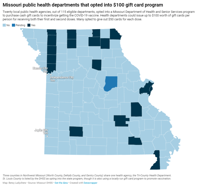
Over the past year, vaccine incentives have become a popular strategy among businesses and state and local governments. From free donuts to free Mets tickets, Americans have had opportunities to get bonus rewards along with protection from the coronavirus. And one particularly common incentive is cash, offered through small payments accompanying vaccinations and lotteries that only vaccinated people can enter.
While politicians at all levels have praised cash incentives, research has shown that this strategy has little impact on actually convincing Americans to get vaccinated. A recent investigation I worked on (at the Documenting COVID-19 project and the Missouri Independent) provides new evidence for this trend: the state of Missouri allocated $11 million for gift cards that residents could get upon receiving their first or second vaccine dose, but the vast majority of local health departments opted not to participate in the program—and a very small number of gift cards have been distributed thus far.
The Missouri program’s limited success fits into a national pattern. “It’s hard to tease out a causal effect of a program that’s not introduced with the purpose of a research experiment,” Dr. Allan Walkey, an epidemiologist at Boston University who’s studied vaccine incentives, told me. Still, Walkey said, the majority of research on these programs has found that cash incentives are not driving huge numbers of people to get their shots.
Walkey specifically studied a vaccine lottery in Ohio, the first state to set up such a program. While initial reports by state leaders suggested that a lot of people got vaccinated after the lottery was announced, Walkey found that, in fact, the new vaccinations were more likely caused by an expansion of vaccine eligibility. Two days before the lottery was announced, the Pfizer vaccine was authorized for children between the ages of 12 and 15.
For this story, I also spoke to Ashley Kirzinger, a polling expert at the Kaiser Family Foundation (KFF) who helps run KFF’s Vaccine Monitor surveys. In these surveys, KFF sorts unvaccinated Americans into categories based on their vaccine attitudes: “wait and see,” “only if required,” and “definitely not.” Kirzinger told me that cash incentives, vaccine requirements for events, and other social pressures are more likely to “motivate the ‘wait and see’ or ‘only if required’” groups.
But for those Americans who “definitely” don’t want to get vaccinated, these incentives aren’t likely to move the needle. In fact, the people in this group may be angered by incentives, because they could see such programs as unfair pressure from the health system.
This was true in some Missouri local public health departments. For example, in Carter County—where the local agency did opt in to the state gift card program—a planned vaccination drive with the gift cards was canceled due to local opposition.
“So many parents and community members were upset, we were not allowed to hold the vaccination event at the school,” said Michelle Walker, the county health center administrator.
Overall, out of 115 local public health agencies in Missouri that were eligible to participate in the incentive program, just 20 opted to get gift cards. Most departments purchased $50 gift cards, so that residents could get $50 at their first vaccine dose and $50 at their second dose.
Through surveying the local agencies that participated, my colleague Tessa Weinberg and I obtained data from 10. Out of 6,378 gift cards that the agencies were able to purchase with state funding, we found that just 1,712 had been distributed so far, as of late November.
!function(){“use strict”;window.addEventListener(“message”,(function(e){if(void 0!==e.data[“datawrapper-height”]){var t=document.querySelectorAll(“iframe”);for(var a in e.data[“datawrapper-height”])for(var r=0;r<t.length;r++){if(t[r].contentWindow===e.source)t[r].style.height=e.data["datawrapper-height"][a]+"px"}}}))}();
Read the full story for more on why many departments didn’t participate in this gift card program, and how it’s going for the departments that did opt in.
Ohio is one of just eight states reporting demographic data for booster shots administered in the state. Screenshot taken on November 7.
It’s now been over a month since the FDA and the CDC authorized third doses of Pfizer’s COVID-19 vaccine for a large swath of the U.S. population, and a couple of weeks since the agencies did the same thing for additional doses of Moderna and Johnson & Johnson’s vaccines. In that time, over 20 million Americans have received their boosters.
This weekend, I set out to see what data are now available on these booster shots. I updated my vaccination data in the U.S. resource page, which includes detailed annotations on every state’s vaccine reporting along with several national and international sources.
The majority of states (and national dashboards) are now including booster shots in their vaccine reporting, I found. But in most cases, the reporting stops at just one statistic: the total number of residents who have received an additional dose. A few states are reporting time series information—i.e. booster shots administered by day—and a few are reporting demographics—i.e. booster shot recipients by age, gender, race, and ethnicity—but these metrics are lacking across most dashboards.
Demographic information, particularly race and ethnicity, should be a priority for booster shot data, as it should be for numerous other COVID-19 metrics. At the beginning of the U.S.’s vaccine rollout, Black and Hispanic/Latino Americans lagged behind white Americans in getting their shots, but limited data hindered the public health system’s ability to respond to this trend. (Now, the trends have evened out somewhat, though Black vaccination rates still lag white rates in some states.)
Will we see the same pattern with booster shots? Considering the immense confusion that has surrounded America’s booster shot rollout in the last couple of months, it would not be surprising if disadvantaged communities are less likely to know about their potential need for a booster, or where and how to get those shots.
But so far, we don’t have enough data to tell us whether this pattern is playing out. The CDC has yet to report booster shot data by race or ethnicity, though the agency is now reporting some figures by age and by state. Note: the CDC still has yet to report detailed vaccination data by race and ethnicity, period; the agency just reports national figures, nothing by state or other smaller geographies.
At the state level, just eight states are reporting booster shots by race and ethnicity. 13 states are reporting some kind of time series (boosters administered by day or week), and three are reporting doses administered by vaccine manufacturer.
Here are all the states that I found reporting booster shot data, with links to their dashboards:
Wyoming: Total boosters and doses administered by manufacturer.
Local reporters: If your state is reporting demographic data, I recommend taking a look at those numbers. How does the population receiving booster shots compare to the overall population of your state, or to the population that’s received one or two doses? And if your state is not reporting demographic data (or any booster data at all), ask your public health department for these numbers!
Last week, I called out the state of Nebraska for basically demolishing its COVID-19 vaccination data. I wrote that the state’s “Weekly Data Update” report now includes just two metrics: variants of concern and vaccine breakthroughs. This came after the state discontinued its comprehensive COVID-19 dashboard in late June. (You can see screenshots of the old dashboard here.)
While I was correct in writing that Nebraska’s weekly update is now incredibly sparse, I missed that the state has, in fact, brought back its COVID-19 dashboard—kind-of. A New York Times article by Adeel Hassan and Lisa Waananen Jones alerted me to this update.
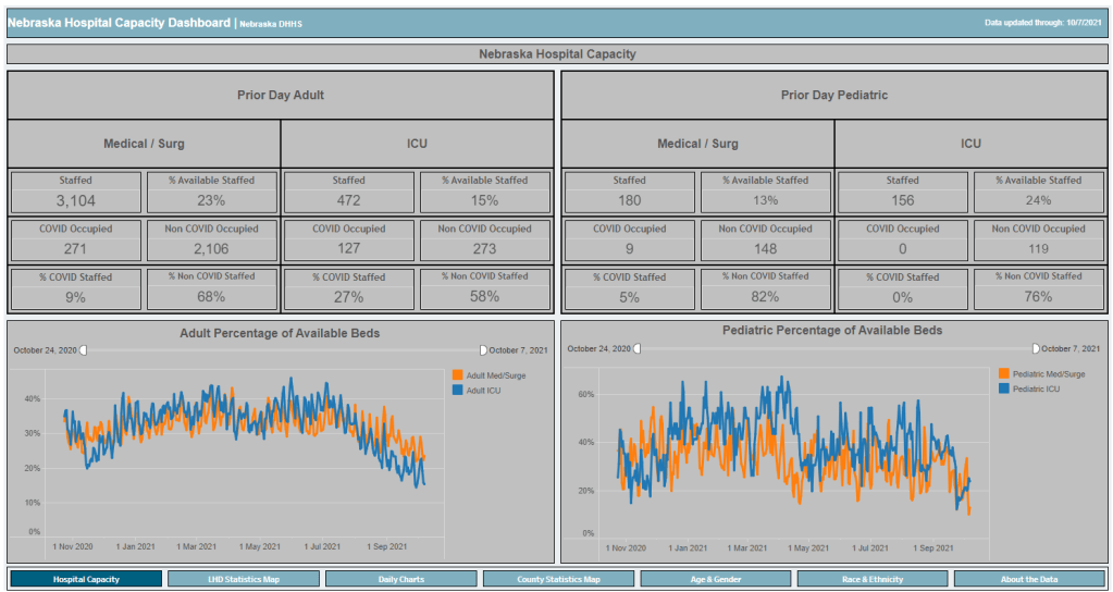
Instead of resuming updates of the state’s previous dashboard, Nebraska’s state public health agency has now built a new, less comprehensive one, called the Nebraska Hospital Capacity Dashboard. As you might expect from the title, this new dashboard focuses on hospitalization data, such as the share of hospital beds available state-wide and by local public health region.
But this new dashboard also includes some trends data (new cases, tests, and vaccinations by day, etc.) and demographics data. The demographics data are similar to what Nebraska provided on its old dashboard, reporting total cases, hospitalizations, deaths, and vaccinations by race, ethnicity, age, and gender.
So, allow me to correct last week’s post: Nebraska is currently reporting more vaccination data than what the state is posting on its weekly reports page. However, the new dashboard, is short-lived, according to the NYT:
On Sept. 20, after coronavirus hospitalizations surpassed 10 percent of the state’s capacity of staffed hospital beds, [Nebraska Governor Pete] Ricketts announced that county-level case data would once again be made public on a new “hospital capacity” state dashboard.
But he said the data will disappear again if the number drops below 10 percent on a 7-day rolling average. And the state is still not reporting county-level deaths.
Governor Ricketts ordered the new Hospital Capacity dashboard to be developed after public health experts and state legislators pushed for Nebraska to report more COVID-19 data. With limited state-level data and just a few Nebraska counties providing their own pandemic reports, residents were unable to see how the virus was spreading in their communities for all of July and August—when the Delta surge was at its worst.
The new dashboard is a victory for Nebraska’s public health and medical experts. But state residents have very limited access to testing, leaving some experts to think the data on this dashboard may be “vast underestimates,” the NYT reports.
Nebraska is not alone in cutting down on COVID-19 data reporting in recent months. Florida switched from a detailed dashboard and daily updates to pared-down weekly updates in June, and other states have stopped reporting on weekends or made other cuts. While the CDC and HHS continue to update their datasets daily, a lack of detailed data at the state level may heighten the challenge of another virus surge, if we see one this winter.