Category: Source spotlight

  • COVID source shout-out: A new national team

    COVID source shout-out: A new national team

    While some of President Biden’s lieutenants in the pandemic control effort await Senate confirmation, many leaders have already taken charge. Mere hours after the inauguration, new CDC Director Rochelle Walensky extended the agency’s eviction moratorium until March 31. And Dr. Anthony Fauci is once again taking a prominent role in White House communications, appearing at press briefings and announcing America’s return to the World Health Organization.

    Maybe it’s the lighting, but Dr. Fauci looks ten years younger. We love to see it.

  • COVID source shout-out: Kentucky

    At a time when state dashboards have become increasingly crowded with new information—or expanded onto five different GIS pages—I am comforted by the consistency of Kentucky’s COVID-19 reporting.

    The state has posted daily COVID-19 reports since the spring, including all the most important metrics in one place. If you’re looking for total cases, ICU patients, county-level statistics, or demographic data, you can find it all in this one PDF. The report’s formatting has changed over the past few months, but its Cntrl+F ease has not.

    Also, Kentucky started reporting race and ethnicity figures in whole numbers instead of percents recently!  Thanks, Kentucky!

  • COVID source shout-out: Dr. Fauci

    COVID source shout-out: Dr. Fauci

    This newsletter observes Dr. Anthony S. Fauci Day, a new holiday declared in Washington, D.C. on December 24 in honor of Dr. Fauci’s 80th birthday. Thank you, Dr. Fauci, for your tireless years of service.

    And thank you, ABC News, for this video of Dr. Fauci getting vaccinated, which I have watched approximately 50 times since last Tuesday. To quote my girlfriend: “dr. fauci’s vaccination video is exactly asmr.”

  • COVID source shout-out: FDA’s techies

    I watched a pretty significant quantity of the FDA’s vaccine advisory committee (or VRBPAC) meeting on Thursday. The meeting lasted nearly nine hours, from 9 AM to about 5:40 PM Eastern, and was plagued by top infectious disease experts who simply could not turn on their microphones.

    It was a typical Zoom meeting with a few older colleagues. But it was also a critically important meeting to discuss the safety of a novel biological product that might save thousands of lives. That’s why, this week, I am paying homage to the FDA tech people behind the scenes who needed to turn on and off those microphones, share those slides, and generally get all the VRBPAC information where it needed to go. As far as I could tell, they kept the meeting running smoothly without seriously angering any of the esteemed committee members. No small achievement!

    Also, the meeting had banger hold music during the breaks. (Disclaimer: I am a 23-year-old white girl who listens to indie instrumentals and the “How to Train Your Dragon” soundtrack while working. You might want to take my categorization of banger hold music with a grain of salt.)

    If you want to read actual, serious coverage of the VRBPAC meeting, STAT News kept a thorough liveblog.

  • COVID source callout: Wyoming

    COVID source callout: Wyoming

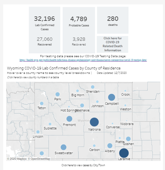
    Look, I like Wyoming’s COVID-19 dashboard. I like that it’s not actually one dashboard, but five dashboards—one for cases, one for deaths, one for tests, one for hospitals, one for county-level data—each of which has its own update schedule. I like that I need to hover over bars and download crosstabs in order to obtain precise figures. I like that sometimes the percentages add up to 100% and sometimes they don’t.

    I find it charming to need five or six tabs open every time I check the state. It’s a nice challenge. Those states that include all their data on one page, they make things too easy!

  • COVID source shout-out: The CDC

    This past Thursday, the CDC held a media briefing. Normally, this wouldn’t be big news; the agency is expected to alert the press—and by extension, the American public—of major new developments in its work. During the pandemic, however, the very existence of these briefings has become newsworthy.

    The CDC held COVID-19 briefings regularly throughout January, February, and March, then stopped abruptly at the height of the spring outbreak in the Northeast. The next briefing after that was in June, and they’ve been sporadic since. Before Thursday’s call, the previous two briefings were held in late October and mid-August.

    Thursday’s press call highlighted the release of a new CDC guidance, which encourages Americans not to travel for Thanksgiving and provides safety suggestions for those who feel they must travel. Reporters on the call (fairly) questioned why the CDC put out this new guidance now, only a week before the holiday, when many Americans have already made plans. Public health experts, science communicators, and others (including this newsletter) have been calling for reduced Thanksgiving travel for several weeks now.

    Still, the guidance and associated press call indicate that the CDC wants to step up as the nation’s outbreak worsens. Whether the agency can regain public trust remains to be seen.


  • Our favorite COVID-19 sources

    Last week, I asked readers to share their go-to sources for COVID-19 data about their community. Thank you to everyone who responded! I am always on the lookout for great sources myself, so I appreciated seeing what folks are using.

    Here are a couple of responses that I wanted to highlight:

    • The New York Times cases map: Two readers noted that they liked the NYT dashboard, which makes it easy to compare COVID-19 metrics in different parts of the country. The NYT offers data at the county level and provides annotations and context with much more detail than most government sources.
    • City and county sites: Seven readers said that they regularly check their county or city dashboards for local information. One reader complimented the City of Chicago dashboard as “consistently updated with official data, easy to use.”
    • Social media: Readers referred to Twitter links to articles shared by both national and local journalists. One reader praised daily COVID-19 update posts shared on a local Boston subreddit: “The posts take publicly available Massachusetts health data and synthesize them in a way I’ve gotten very used to. This is the source I depend on when I tell people that COVID hasn’t been getting better in Massachusetts since June.”
    • The Glastonbury Town Manager weekly email: My mom’s favorite source is the email newsletter sent by the local administration in my hometown, Glastonbury, Connecticut. This email—which I’ve highlighted in the newsletter before—includes data for the town, updates for the state, and public service announcements.
    • New York Governor Cuomo’s daily updates: You have to hand it to him: no other local leader is using PowerPoint quite like Cuomo. Also, nobody else built a literal model of his state’s COVID-19 case curve.
  • COVID source callout: Missouri

    COVID source callout: Missouri

    In some states, if you would like to see the numbers of COVID-19 cases and deaths for different racial and ethnic groups, you can simply look at tables clearly presented on the state’s public health dashboard.

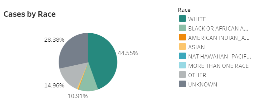
    In Missouri, it is not so easy. Missouri presents its race and ethnicity data in pie charts, showing the percents of cases and deaths that are reported in each category. A lot of states use this type of pie chart presentation, as it draws attention to the most impacted groups. But pie charts have a significant drawback: smaller demographic groups, such as Native American/Alaska Native and Native Hawaiian/Pacific Islander, are relegated to tiny slices that are nearly impossible to see. These groups may be disproportionately impacted by COVID-19, but the pie chart makes them seem unimportant.

    Screenshot of Missouri’s demographic COVID-19 data tab, taken on November 8.

    It takes several rounds of hovering, recording percentages, and running calculations to determine COVID-19 case and death numbers for those smaller racial groups in Missouri. Demographic data should not be this complicated.

  • COVID source callout: Iowa

    To the tune of “Iowa Stubborn” from Meredith Wilson’s The Music Man:

    And we’re so good at updating,
    We can shift our case count
    Twice every hour
    With no timestamp to make a dent.
    But we’ll give you our case counts,
    And demographics to go with it
    If you should love hovering over percents!

    So what the heck, you’re welcome,
    Glad to have you checking,
    Even though we may not ever mention it again.
    You really ought to give Iowa… a try.

    Parody lyrics aside, Iowa’s frequent dashboard updates are very impressive. But a little transparency about precisely when those updates occur would go a long way.

  • COVID source shout-out: Glastonbury, CT

    COVID source shout-out: Glastonbury, CT

    I’m doing a shout-out instead of a callout this week, because sometimes even I tire of finding data issues to upon which I can focus my tirades.

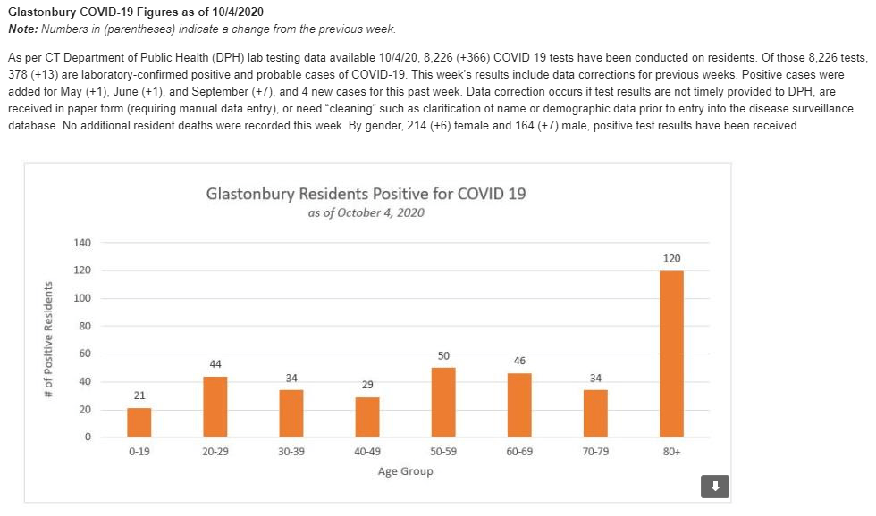
    Every few weeks, my mom forwards me an email from the Town Manager in my hometown, Glastonbury, Connecticut. This email comprises the Town Manager’s Weekly COVID-19 update, including data for the town, updates for the state, and the occasional public service announcements. The most recent email, sent on October 7, includes Halloween best practices, information on flu clinics, and absentee ballot resources.

    After peering at endlessly complicated state dashboards during COVID Tracking Project shifts, it’s refreshing to see a COVID-19 update which presents data as simply as possible—no hovering or scrolling required. And yeah, they clearly made that chart in Microsoft Excel, but it does its job!