Category: Source spotlight

  • COVID source shout-out: I’ve never wanted to be an “NIH-er” this bad

    COVID source shout-out: I’ve never wanted to be an “NIH-er” this bad

    George Harrison who? Paul McCartney WHO?! NIH Director Dr. Francis Collins is coming for your wigs. 

    On Friday, Collins posted a video of a “COVIDized” “Here Comes The Sun” to his NIH Director’s blog, in which he thanked “NIH-ers” and promised a way out of the “long, dark, COVID winter.” It’s best if you see for yourself:

    The song was great of course but I loved the cat (her name is Zoe!) cameo the most. 

    Indeed, while numbers are looking a little worrying now, it’s pretty certain that we’re riding out the tail end, at least in the U.S.

  • COVID source shout-out: New York expands eligibility

    COVID source shout-out: New York expands eligibility

    This week, New York Governor Andrew Cuomo announced two major expansions for vaccine eligibility. State residents age 30 and older became eligible starting on March 30, and residents age 16 and older became eligible starting on April 6.

    The announcement inspired a surge in “very online” people booking appointments, Twitter comedy, and speculation about what else we might be able to push the increasingly scandal-embroiled Governor Cuomo to do (legalize weed, apparently!).

    But most importantly, it allowed two of my favorite vaccine communicators to get their shots: Drew Armstrong, lead data wrangler for the Bloomberg Vaccine Tracker, and Huge Ma, computer engineer behind the TurboVax Twitter account, which shares available vaccine appointments in New York City.

    If you’d like to learn more about Bloomberg’s tracker, check out the recording and recap of our first Diving into COVID-19 data workshop, at which Armstrong was a featured speaker. And if you’d like to learn more about TurboVax, check out this recent (and rather horny) profile in The Cut. Ma has been using his platform to spread awareness about anti-Asian racism and raise money for Welcome to Chinatown, an initiative to support Chinatown businesses. It’s a pretty cool organization; I recommend checking it out and donating if you can, especially if you (like me) used the TurboVax account to find your vaccine appointment.

  • COVID Source callout: Federal Bureau of Prisons

    For the past year, nonprofit news organization The Marshall Project has tracked COVID-19 cases in prisons, in collaboration with The Associated Press. The tracking effort has primarily focused on compiling numbers from state and federal prison bureaus, through a weekly tally that compares total cases reported by these agencies to their previous totals.

    This week, though, the Federal Bureau of Prisons started excluding a lot of prisoners from their count. The bureau is removing cases of any prisoner who gets released from their overall COVID-19 case total—and they aren’t reporting any data on those formerly incarcerated individuals who tested positive while in prison.

    For more detail, see this thread from The Marshall Project’s Twitter account:

    “We continue to pursue this information about the number of prisoners who have been sickened in federal prisons,” The Marshall Project writes. “But until the Bureau of Prisons provides it, we are unable to record their total.”

    The Federal Bureau of Prisons has reported more COVID-19 cases than any other prison system in the country (at least 49,000 to date), so this new data practice may become a major data gap. I know journalists at The Marshall Project will continue extensive coverage of the BOP, though, as they have for the past year. (For more on their tracker of COVID-19 in the prison system, see the recording and recap of our second Diving into COVID-19 Data workshop.)

  • COVID source shout-out: Hawaii

    COVID source shout-out: Hawaii

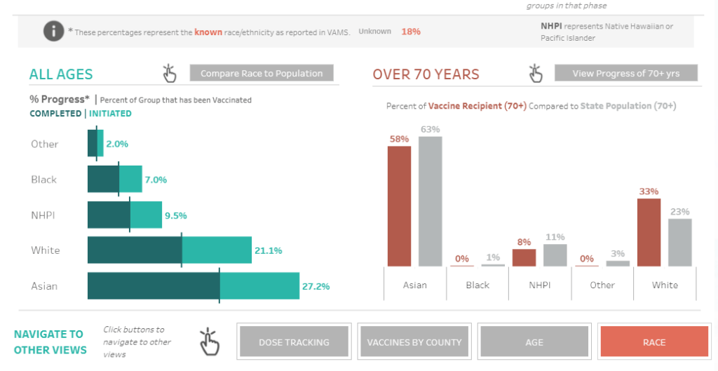
    Hawaii is the latest state to add vaccinations by race to its dashboard. I am a fan of both the state’s green-and-orange color choices and its handy finger-pointing icon, instructing users to hover over each bar in order to compare vaccination numbers to Hawaii’s demographics.

    Screenshot from Hawaii’s vaccination dashboard, taken on March 20.

    We’re now down to just four states that haven’t yet reported this crucial metric: Montana, New Hampshire, South Dakota, and Wyoming.

  • COVID source callout: CDC race/ethnicity data

    COVID source callout: CDC race/ethnicity data

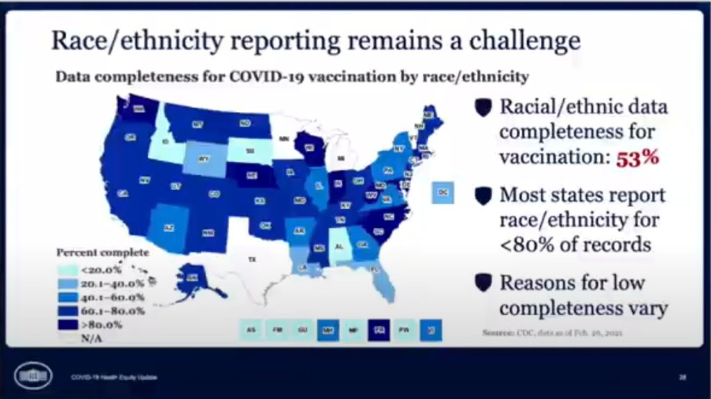
    In the White House COVID-19 briefing this past Monday, equity task force director Dr. Marcella Nunez-Smith showed, for one fleeting minute, a slide on completeness of state-by-state data on vaccinations by race and ethnicity. The slide pointed out that racial/ethnic data was only available for 53% of vaccinations, and most states report these data for fewer than 80% of records.

    Still, though, this slide demonstrated that the CDC does have access to these crucial data. As we’ve discussed in past issues, while many states (45 plus DC) are now reporting vaccinations by race/ethnicity, huge inconsistencies in state reporting practices make these data difficult to compare. It is properly the job of the CDC to standardize these data and make them public.

    The CDC is actually under scrutiny right now from the HHS inspector general for failing to collect and report complete COVID-19 race/ethnicity data. You can read POLITICO for more detail here; suffice it to say, I’m excited to see the results of this investigation.

    Also, while we’re at it, let’s publicly shame the five states that are not yet reporting vaccinations by race/ethnicity on their own dashboards. Get it together, Hawaii, Montana, New Hampshire, South Dakota, and Wyoming!

  • COVID source callout: Age brackets

    COVID source callout: Age brackets

    As of yesterday, 45 states and D.C. are reporting vaccinations by race and ethnicity. (See the CDD’s full annotations here.) This is great—with five more states, we’ll have national coverage. But the lack of standardization in how states report these figures leaves much to be desired.

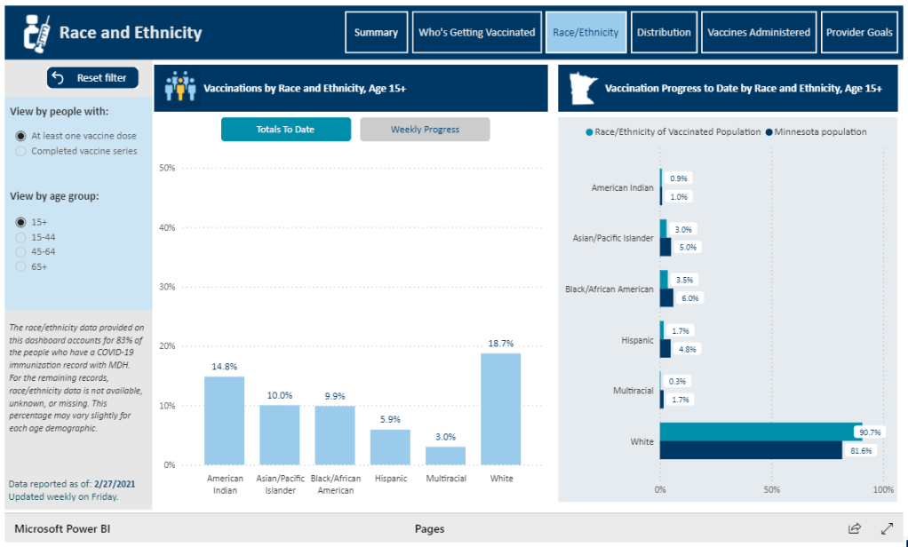
    One of the newest states to start reporting race/ethnicity vaccination data is Minnesota. At a glance, the Race/Ethnicity tab of the state’s vaccine data dashboard looks comprehensive: it includes demographic data stratified by age, as well as a bar chart that compares the population that’s been vaccinated to Minnesota’s population overall.

    Race/Ethnicity tab on Minnesota’s vaccine dashboard, showing percent comparisons.

    But a closer examination shows that the age groups reported on this Race/Ethnicity tab (15-44, 45-64, 65+) don’t match the age groups used to report vaccinations by age on a different tab (16-17, 18-49, 50-64, 65+). So if a journalist or researcher were trying to analyze Minnesota’s vaccine demographics, they wouldn’t be able to derive whole numbers from these percentages.

    This is one small example of a common issue across state vaccine demographic reporting—and demographic reporting in general. When categories don’t match, it’s difficult to make comparisons, and age brackets are particularly heinous. We need the CDC to start providing vaccine demographics by state, like, last December.

  • COVID source shout-out: Oklahoma

    As of yesterday, 42 states and D.C. are reporting vaccinations by race and ethnicity. You can see the CDD’s full annotations of state vaccination data here.

    One of those 42 states is Oklahoma. Oklahoma wasn’t listed as reporting any demographic data in our annotations until yesterday—but in fact, this state has been reporting vaccinations by race, ethnicity, age, and gender since January. I missed this information in previous weeks because the state has been reporting these data in its Weekly Epidemiology and Surveillance Reports, rather than on its main COVID-19 dashboard where the totals are reported.

    So, this week, the COVID source shout-out section is also a public apology to the good state of Oklahoma. I’m sorry I missed your vaccination demographics. You’re doing great.

  • COVID source callout: Iowa

    Usually, we only update our K-12 school COVID-19 data annotations every two weeks. But it came to my attention during a COVID Tracking Project shift yesterday that Iowa has taken down a page on its dashboard that used to report test positivity by school district. The page now goes to a 404 error, and there’s no mention of school data elsewhere on the state’s COVID-19 website.

    Yes, test positivity is a fraught metric—it should be used with a combination of other factors, not as a sole determinant of whether a school district can open for in-person learning. But it’s still troubling that this state took down the closest thing it had to school data reporting. What’s up, Iowa?

  • COVID source callout: Andrew Cuomo

    Usually when we do a COVID source callout, we’re putting our sights on a dashboard that’s actually five separate dashboards or a state that likes to surprise us when they update their dataset. This is to say that, usually, we don’t call out an actual source of coronavirus. 

    But that’s what New York Governor Andrew Cuomo apparently wants to be when he grows up, as he opened up limited indoor dining on February 12th for New York City, where Betsy and I both live. We talked last week about a frankly terrifying ProPublica article that warned about the dangers of reopening indoor dining and loosening guidelines in general, not only with variants on the rise, but with most people in the dark of just how on the rise they are. So why, dear god why, would you decide this is the time to LOOSEN restrictions? 

    Look, I can make a few guesses. As much as I think Cuomo is acting really really stupidly, I don’t think he’s an idiot. There’s definitely political and economic pressure, along with a court ruling in mid-January that said there was no “rational basis” for keeping things closed when hospitalizations and deaths are falling – this led to indoor dining resuming in most of the state

    But that court ruling did not affect New York City, or wedding capacity restrictions, which are also being loosened in March in the pursuit of “marital bliss.” This is just irresponsible; “marital bliss” isn’t worth it even when there isn’t a deadly pandemic, as Cuomo himself clearly knows. In the announcement, he suggested you could “propose on Valentine’s Day and then you can have the wedding ceremony March 15, up to 150 people. People will actually come to your wedding because you can tell them with the testing it will be safe.” Cuomo is not only about to open up the possibility for more serious supersreader events, he’s also about to rob every introvert of their best excuse for skipping Aunt Marsha’s wedding since she said she’d be serving roasted pangolin. Unforgivable. 

    So apparently the biggest city in the country can reopen indoor dining and have weddings on the horizon when, again, we don’t even know just how much these variants are going to screw us over. I knew Tom’s Restaurant was a dangerous game for my own health, but they’re about to seriously expand their blast radius. 

  • COVID source shout-out: COVID Tracking Project

    This past Monday, the COVID Tracking Project announced that it will soon close its operations. The Project will release its final update on March 7; then, after two more months of documentation, analysis, and archival work, it will close out in May.

    “We didn’t come to this decision easily, but we have believed from the very beginning of the project that the work of compiling, publishing, and analyzing COVID-19 data for the US properly belongs to federal public health agencies,” the Project leads explain in a Tweet thread announcing the decision. “The CDC and HHS are now publishing data that is much more comparable to the figures we have been compiling from states since last spring.”

    I recommend reading Erin Kissane and Alexis Madrigal’s article on the CTP website, which explains the decision more fully. They also note specific “good signs” of the federal government’s commitment to data transparency—all of which I’ve also covered in the CDD.

    I’ve been volunteering for the COVID Tracking Project since early April 2020, and I have a lot of feelings about what that experience has meant to me. I’ll probably write a longer post about it on March 7 (which is, coincidentally enough, a Sunday). But for now, I’d like to say an enormous thank you to the staffers and volunteers who have worked to keep the Project going. It’s been an honor to contribute to this collective public service with all of you.