Starting this week, I’m joining the team at Documenting COVID-19 on a part-time basis. Documenting COVID-19, for those unfamiliar, is an open-records project that makes pandemic data and records from all levels of the U.S. government available to journalists and researchers.
Project researchers also help journalists craft stories around these government records, contributing to investigative articles on topics ranging from death certificates to contact tracing challenges.
Documenting COVID-19 is run out of the Brown Institute for Media Innovation, a research institute run by Columbia and Stanford Universities; it’s been funded by the public records site MuckRock and other supporters.
The project is currently expanding to collect even more COVID-related documents and data, and I’m excited to be part of that expansion! I look forward to unearthing stories, collaborating with local newsrooms, developing my investigative skills, and generally working to hold U.S. institutions accountable for their pandemic failures.
And, for any local reporters reading this, if you have a story idea or project where you could use some assistance from Documenting COVID-19, let me know! (Email me, hit me up on Twitter, etc.)
Two Abbott BinaxNOW antigen tests used by Betsy and her sister during their trip, demonstrating single-line negative results.
As I mentioned in last week’s newsletter, I went on vacation during the last week of August. I traveled to California to visit my younger sister, who was living there over the summer for an internship. We spent a couple of days in the Bay Area, then drove to Southern California, hit a few different destinations, and finally flew out of Los Angeles International Airport (LAX).
Both my sister and I are fully vaccinated, of course, but we still took a number of precautions to make our trip as safe as possible in light of the current COVID-19 surge. I wanted to share what we did in case it’s useful for others thinking about travel right now.
Key precautions included:
Limited exposure and tests before traveling: For ten days before my flight out to California, I avoided all unmasked indoor activities, including small gatherings with fully vaccinated friends. Closer to my flight, I also avoided other activities outside my home (grocery shopping, taking the subway, and the like). I got a PCR test at a NYC Health site two days before my flight, and didn’t leave my apartment between that test and heading out to the airport.
Rapid testing every two days during the trip: I carried three packs’ worth of Abbott BinaxNOW rapid antigen tests in my suitcase, and bought a couple more packs in California. Starting two days after I arrived, my sister and I tested ourselves every other day. While antigen tests like these are more likely to give you a false negative than PCR tests, testing frequently increases your chances of catching a case—and catching it early in your disease progression, when you’re most likely to infect others. The tests were easy to incorporate into our routines, especially once we got used to the swabbing process.
Sticking to outdoor activities: Our trip included a lot of outside time: hiking in a redwood forest, hitting up Southern California beaches, camping for a night at Joshua Tree National Park, and lots of outdoor dining. The riskiest two activities of the week, we agreed, were an afternoon at Monterey Bay Aquarium and a day at Universal Studios in LA. But both of those establishments did a great job of reminding all patrons (including the vaccinated) to keep their masks on inside—following current mask regulations in the Bay Area and LA County.
Double-masking indoors: On both my flights and whenever I needed to be inside for a longer period of time, I wore two masks: a surgical mask and a fitted, multi-layer cloth mask. Studies suggest that cloth masks on their own are not the best option for protecting against Delta, but layering a cloth and surgical mask can increase protection. I especially like to layer masks because surgical masks typically don’t fit well on my face; when I add a cloth mask on top, the fit becomes much more snug.
Precautions when visiting relatives: My sister and I visited a few relatives over the course of our trip. For these visits, we basically followed the precautions that health experts recommended last Thanksgiving: eat outside whenever possible, mask up in common areas inside, open windows for extra ventilation, etc. We also organized the trip so that no visits occurred after Universal Studios, which we had deemed the riskiest activity of the week.
Extra testing after traveling: Flying out of LAX proved to be incredibly stressful, as neither the airport nor our airline put in effort to enforce mask guidance. My sister and I even gave extra masks to two fellow travelers at the check-in desk, because the airline apparently did not have any extras available. Because of this extra COVID-19 exposure risk, I did some extra testing upon my return to the East coast: daily rapid tests for two days in a row, followed by a PCR test.
hi @JetBlue! your mask availability and enforcement is apparently so bad that my sister and I had to literally GIVE TWO OF OUR OWN EXTRA MASKS to fellow travelers at the (very crowded) LAX check-in desk. this is extremely irresponsible in the face of the current covid surge.
Personally, this will probably be my last major trip for a while. Conferences that I’d planned to attend in the fall have been moved to all-virtual formats, and I’m lucky to live close enough to my parents that I don’t need a flight to see them for the holidays. If I were to travel again, though, I’d likely follow these same precautions—with adjustments based on COVID-19 infection rates at my destination. Also, I would probably avoid LAX.
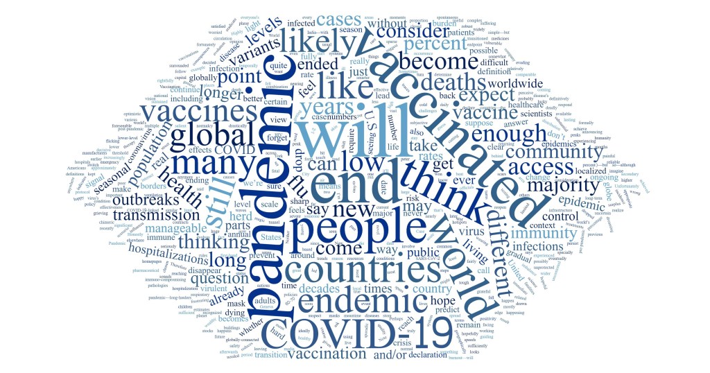
Wordcloud of the survey’s responses, made by Betsy Ladyzhets.
In July 2020, I started the COVID-19 Data Dispatch. Inspired in part by a desire to express my thoughts on the challenges of pandemic tracking and in part by a desire to be useful for my friends and colleagues who were less plugged into COVID-19 news, the project grew from a newsletter to a full-fledged publication with its own website, resources, and membership program.
Within months of my starting the publication, though, people started asking me about its end. What would I do when COVID-19 was “over”? I never knew how to answer. While there may be benchmarks that public health experts can use to declare the pandemic at an end, this end feels more complex for science writers like myself who have been intensely covering the COVID-19 crisis.
The questions reached a fever pitch this spring as millions of Americans got vaccinated and reopenings became inevitable. So, I did what I often do when I face a challenge in my work: I reached out to my community.
Working with The Open Notebook, I surveyed 26 other COVID-19 reporters and communicators. I asked when they thought the pandemic might come to an end, as well as how they would take lessons from the past year into the “post-COVID” stages of their careers.
Many of the writers who responded took that first question literally. They provided vaccination thresholds (60 percent, 70 percent), positivity rate thresholds (1 percent, 2 percent), and other metrics. “When there is a sustained period with no or little COVID-19 related fatalities globally,” wrote The City’s Ann Choi.
Others took the question in more complicated and nuanced directions. These writers redirected the question back at me—noting that even when the world meets numeric thresholds, millions will remain vulnerable.
For example, freelance journalist Roxanne Khamsi wrote, “We’re still living in an HIV pandemic.” The Atlantic’s Ed Yong said, “I’ve come to think that the question, ‘When will the pandemic end?’ isn’t very useful, and it’s more salient to ask, ‘For whom is the pandemic still ongoing?’” Other writers pointed to immunocompromised people for whom the vaccines may not be effective, long-haulers still suffering from symptoms, and the inequities between the U.S. and the many nations with little access to vaccines.
As a science writer covering public health, I feel duty-bound to think of the most vulnerable; many of the writers who responded to my survey echoed that sentiment. Even when the majority of the U.S. is vaccinated, I still intend to cover the communities that face barriers to getting their shots, the immunocompromised patients for whom the shots may not work, and the countries where shots are still not available at all. I’m inspired by the boundless curiosity and compassion of other writers who continue this work, too.
In addition to asking about the end of the pandemic itself, I asked what lessons these writers would take into their future reporting. Their answers fit a similar theme, compassion and curiosity. Some wrote that science writing must intersect more with non-science fields: “Every beat is deeply intersectional, and it’s time to see newsrooms that reflect that,” said U.S. News reporter Chelsea Cirruzzo. Climate coverage may be one example of this trend; climate reporters like HEATED’s Emily Atkin are calling for more collaboration between science and non-science journalists writing about this crisis.
Other survey responses discussed the importance of communicating uncertainty, challenging established scientific norms, and holding accountable the institutions that fail to protect the vulnerable. “Assume nothing, question everything and everyone,” wrote The New York Times’s Apoorva Mandavilli.
When will the pandemic end? It won’t be when the world sees its last COVID-19 case, because that could be centuries from now. Maybe it will be, as Berlin-based freelancer Hristio Boytchev wrote, “When the incidence numbers disappear from the homepages of major news media.”
Even if incidence numbers disappear from homepages, though, I know that science sections, health sections, and independent publications like mine will keep the coverage going for a long time yet.
Issue #1 of the COVID-19 Data Dispatch was published on July 26, 2020. Today, we hit Issue #52.
During that time, we’ve explored data issues from testing to vaccinations to variants. We’ve moved from Substack to a new website, supported an internship, and logged over 150 data source recommendations for readers.
In reflecting on what I’ve learned running the publication this past year, I wanted to share a few of my favorite posts—those where I provided original analysis, introduced a new source, or had an impact on readers.
Hospital capacity dataset gets a makeover: This was our very first issue in July 2020. COVID-19 hospitalization data had switched from CDC responsibility to HHS responsibility; the switch garnered a lot of data challenges (and some political attention). This post explains what we knew so far about why the switch had occurred and what issues it was causing—and paved the way for many more posts on HHS hospitalization data.
Three different units for COVID-19 tests: In this September post, I explained a major challenge I’d dealt with in my volunteer work for the COVID Tracking Project: every state counted its tests in a slightly different way. The post goes over tests counted in specimens, people, and encounters, with examples from different states and an explanation of why the issue matters.
School data with denominators: In October, I interviewed Emily Oster, an economist at Brown University who has led one of the major research efforts to track COVID-19 cases in U.S. schools. We discussed the challenges of compiling school data—many of which still persist now, nine months later. Oster has also become a bit of a controversial figure in the debates over school reopening, and I’m proud to have asked her some challenging questions at a time when her work was just starting to gain prominence in the COVID-19 world.
Your Thanksgiving could be a superspreading event: This post—which provides a data-driven explainer of COVID-19 superspreading events—was inspired by a reader’s question on how holiday celebrations might contribute to COVID-19 spikes. It was published on November 8, a time when many Americans were carefully considering holiday plans; I wanted to help people understand their risk and act accordingly.
A new metric for conceptualizing cases: Here, I described a metric first used by my friend (and fellow COVID Tracking Project volunteer) Nicki Camberg: one in X Americans has been diagnosed with COVID-19 in the past [insert timeframe here]. The metric was later picked up by the New York Times and other outlets, and I’ve consistently used it in updates throughout the year. The post includes a quote from Nicki, reflecting on how the metric can make COVID-19 cases more personally relatable.
Who should get the first vaccine doses?: This post (from late November) might be the one I’ve most often sent to other journalists, mostly because it includes a detailed description of the CDC’s Social Vulnerability Index—a source that provides social, economic, and environmental data by U.S. counties and ZIP codes, and one I frequently recommend to anyone reporting on demographics or equity. (At the time, I hoped that it would be used to determine vaccination priorities; this has been true for some parts of the country, but far from universal.)
COVID-19 data for your local hospital: This post discusses a new release of facility-level hospitalization data from the HHS. At the time, it was described as “probably the single most important data release that we’ve seen from the federal government.” I explained why it was so important and gave some examples of some stories that could be told with the data, including an interactive Tableau dashboard.
We’re not doing enough sequencing to detect B.1.1.7: This was one of intern Sarah Braner’s first posts, and it became the first post in our now-extensive Variants category. At the time (January 10), just 63 B.1.1.7 cases had been identified in the U.S., but Sarah explained why the true numbers were likely much higher and why that data gap should be cause for concern.
Access barriers lead to vaccination disparity in NYC: The CDD usually takes a national focus, but in this post, I zeroed in on my home city as a microcosm of the vaccination barriers faced across the country. At the time (February 7), Black New Yorkers made up 25% of the NYC population but just 12% of those vaccinated. I visualized the disparities, and discussed potential reasons and solutions.
Privacy-first from the start: The backstory behind your exposure notification app: This March 28 interview is one of my favorites from the past year. I spoke to Jenny Wanger, product manager and leader for exposure notification apps. After months of following these apps (and getting frustrated at the lack of available data), I was thrilled at the opportunity to talk to an expert in the space; this interview helped inspire my later feature for MIT Tech Review on the same topic.
Some personal news: In April, I left my full-time job in order to focus on freelancing and the COVID-19 Data Dispatch. This post announces the decision and explains my rationale; I appreciated the opportunity to reflect on my choice and talk about what might be next for me, and I think readers did as well.
In India’s COVID-19 catastrophe, figures are only part of the story: As COVID-19 cases surged in India, guest writer Payal Dhal explained why official figures fell short at capturing the scale of the tragedy. Comparisons to data quality, testing availability, and hospital capacity in the U.S. help to explain the issue.
COVID source shout-out: TUSHY: In the May 9 issue, I featured a bidet company promoting vaccinations with NSFW tactics: “Can We Eat Ass Yet?” “NO.” I will forever be grateful to TUSHY’s marketing team for responding to my press request on short notice and providing more backstory on the page.
The data behind the CDC’s new mask guidance: This post aimed to provide a service to readers confused by the CDC’s sudden shift in masking recommendations. I outlined the epidemiological evidence behind the agency’s assertion that fully vaccinated Americans could go maskless basically anywhere.
The US missed Biden’s July 4 goal: How did your community do?: To commemorate the July 4 holiday, I did a deep-dive into President Biden’s missed goal: 70% of adults vaccinated with at least one dose by that date. The story includes interactive maps and quotes from experts on where we go from here.
Editor’s note: Sarah Braner originally titled this post, “So long, farewell, I kinda hope this newsletter isn’t as necessary in the nearish future but also I hope we meet again.” While this is a very good title, I didn’t want anyone to see it and think that I, Betsy, am ending the publication (which I am not). Sarah has been an invaluable help these past few months—staying on top of COVID-19 data news, brainstorming post ideas, working on the K-12 data annotations, and more. I’m excited to watch her kill it at CNN and beyond!
This will be my last week writing for the CDD. I’m so incredibly grateful to everyone who has read my posts, to Betsy for literallyeverything, and to Dr. Ashish Jha for being the only one allowed to tweet from here on out. (Honorable mention to AstraZeneca for giving me an excuse to put a Simpsons meme in the newsletter.)
If you, for some reason, want to read more of my work this summer, you can catch me pumping out some Content for CNN Health after I figure out how their Slack channel works. When the school year starts up, I’ll be resuming my work as Bwog’s Science Editor with hopefully much less COVID-19 to write about. If my hopes pan out, I will fill that void by writing a weird amount of posts about Barnard laundry.
The Incubator for Media Education and Development, or iMedD, is a nonprofit based in Athens, Greece that supports new practices, credibility, and transparency in international journalism. I was lucky enough to meet Kelly Kiki, a journalist and project manager at iMedD’s content production arm, at the NICAR conference earlier this year.
Kelly has spent much of the past year compiling and reporting on Greek COVID-19 data; we found a lot of common ground in the challenges we have both faced, from discrepancies in regional numbers to a lack of data on cases in schools.
After an international Zoom call and many emails, Kelly wrote a profile of my work at the COVID-19 Data Dispatch. The profile was published on iMedD Lab’s site earlier this week—you can read it in English or in Greek!
The profile touches on why I started the CDD, how I compile each issue, and some of my thoughts on major COVID-19 data problems in the U.S.:
Asked about the quality of pandemic data in the US at both federal and state level, Ladyzhets tells us that what she perceives as one of the biggest problems is the fact that “in this country, we are not actually dealing with one singular, standardized system. We’re instead dealing with 56 smaller systems (50 states and 6 territories). Each system has its own rules, its own reporting practices, its own data definitions. All the systems have been underfunded for decades and were given very little guidance from the federal government… You really see this lack of leadership and consistency everywhere, from the fact that some states reported their tests in units of specimens while others reported in units of people, to the fact that two states are still not reporting race and ethnicity data for their vaccinated residents, even now, four months into the vaccination effort”.
Shout-out to my friend Raquel for both taking this picture and giving me a pre-photo haircut.
This will be my final week at my day job, the data journalism publication Stacker. I do not have another staff job lined up. Instead, I’ll be freelancing and working on the COVID-19 Data Dispatch full-time.
Why this move
I’ve worked at Stacker for over three years now. I started as an intern in January 2018, then was hired on as a data journalist when I graduated college. The job taught me so much of what I now know about data reporting, from VLOOKUPs and pivot tables to the mindset I needed to really interrogate a dataset and figure out what stories may be told.
I’m incredibly grateful to my colleagues at Stacker—especially Sam Gross, who has been my supervisor and mentor since I started. He supported me as I got up to speed on data reporting, built a science and health vertical, and managed our COVID-19 coverage. I’m also grateful to have had the flexibility to pursue freelance projects and start the CDD while working full-time there.
But I’m committed to the COVID-19 beat—and beyond that, the wider public health beat—and it’s become clear to me that, to continue on this path, I need the time and bandwidth to pursue more stories outside of Stacker’s capacity.
Also, I have to be honest here: I’ve come really close to burnout in the last few months. Stacker, running the CDD, volunteering at the COVID Tracking Project, additional freelance projects on top of that… It’s a lot. I’ve been working 40 hours a week at my day job, then spending all my nights and weekends working more. Reading, writing, analyzing, visualizing. Immersing myself in COVID-19 data. I’ve had little time for other creative writing, movie nights with my girlfriend, or basically anything else that would be a real break—and when I did take a night off, I’d feel guilty for not working. I haven’t had a break longer than, like, four days since February 2020.
This shit isn’t sustainable! I spent a few weeks earlier in 2021 looking for another staff job; but after a few interviews, I realized that even with a full-time gig that aligned more closely with my desired beat, I’d still take time out of my “non-working hours” to work more. Another staff job would just drive me deeper into burnout.
My choice to go independent will, I hope, enable me to spend my time more intentionally. I want to actually work 40-hour weeks, instead of 60+ hour weeks. In addition to seeking out new projects and opportunities for the CDD, I’m aiming to spend time learning Python and other coding languages, developing my data viz skills, and reporting on new topics in the public health realm. (Also, NYC friends, you may see me out on the streets more.)
All this said, in the interest of transparency, I want to acknowledge the privilege I have that allows me to make this move. My parents paid for a large part of my college tuition; while I did take out a student loan, I paid my debt within a year of graduating. I am 24, young enough to stay on my mom’s health insurance for two more years. And I’ve been able to save up from Stacker and past freelance projects—nothing major, but enough to provide me with a sufficient cushion during this transition. Many young journalists would not be able to do what I am doing this spring.
I hope to give back to my early-career community in the coming months by offering a (paid) platform to other journalists whose voices may add to the CDD. Readers, you can support that goal by becoming a member… more on that option below.
What’s next
My last day at Stacker is this Thursday, April 22. Starting in May, I’ll be officially open for freelance work.
For the potential future clients reading this: Hi! Here’s some of the work I can do for you:
Data journalism stories on science and health topics, both short-form/news and long-form/features
Data analysis and visualizations (Tableau, Flourish, Datawrapper, etc.)
Content writing for science/health nonprofits
Webinar planning/virtual event management
If you’d like to work with me, hit me up at betsy@coviddatadispatch.com, or schedule a meeting on my Calendly page. This also goes for anyone who would like to collaborate with the COVID-19 Data Dispatch on anything pandemic data-related.
Meanwhile! My new independence will allow me to spend time implementing a lot of the CDD ideas I’ve failed to act on (or half-assed) in recent months. Current members, expect some Slack revamping and one-on-one reach-outs. Everyone, expect more reader surveys, data resources, events, and more.
If you have any ideas for CDD projects or other ways you think I should be spending my time, please reply to this email!
And, if you’d like to support me during this exciting and terrifying career move, here are three things you can do:
Share the CDD with a friend whom you think might find it useful. Help me grow the community of data nerds (and data novices) around this publication! It’s as simple as forwarding this issue—or any issue you’ve loved in the past few weeks.
Become a member. Your regular contribution (suggested $10/month, or pay-what-you-will starting at $2/month) will help me devote more time and resources to the CDD by making this project more financially sustainable. You can find the publication’s current costs here, but in the coming months I hope to hire a regular editor, solicit pitches from outside writers, produce further events, and more.
Buy me a coffee. If you’d like to contribute to the CDD but can’t commit to membership right now, I get it! These are, by all definitions, unprecedented times. But every dollar helps, and I’m deeply appreciative of those who have donated through my Ko-fi page.
As vaccinations increase in the U.S. but outbreaks surge elsewhere in the world, it will be a challenging time to remain on the COVID-19 beat—and I intend to. I’ll be relying on you, loyal readers, to ask me questions and shape my coverage in the months to come.
Also, you may expect to see more posts here that supplement my freelance work: behind-the-scenes reporting notes, interviews with sources, data visualizations, commentary, and more. If there’s anything that particularly interests you about a COVID-19 story I do, don’t hesitate to reach out!
Starting a sustainable media business has been a goal of mine since college. The CDD might be that business, or it might lead me into something bigger. But with this move, I’m done pursuing that goal halfway during my nights and weekends. I’m diving in headfirst. And I’m grateful to have all of you along for the ride.
And a P.S.
Stacker is hiring right now! If you’re a budding data journalist with an eye for research and an immense curiosity for new topics, my soon-to-be old job might be a good fit for you. Here’s the job posting, reach out if you have questions.
Hi! I’m Sarah, and I’m going to be helping out around here for the time being. I’m currently a junior at Barnard College (Betsy’s alma mater) studying cell and molecular biology, and I’m looking to go into health journalism after I graduate. When I’m not dreaming of an all-powerful national data dashboard, I’m writing as the Science Editor for Bwog.com, pipetting a lot (remotely) in the research lab I work for, trying to keep my puppy from eating the carpet, or knitting my thousandth hat.
Happy to be here, and I look forward to digging through the complex world of Covid-19 data with you all!
This week, the American Medical Association (AMA) announced that the association recognizes racism as a public health threat. The association is adopting a new policy which acknowledges systemic racism, cultural racism, and interpersonal racism as barriers to healthcare for many Americans and as threats to equitable public health across the country. Although the policy does not specifically address COVID-19, it speaks to the impact that America’s racist history and healthcare system has had in making it more likely for Black Americans to become infected with the coronavirus and suffer worse health outcomes.
“The AMA recognizes that racism negatively impacts and exacerbates health inequities among historically marginalized communities. Without systemic and structural-level change, health inequities will continue to exist, and the overall health of the nation will suffer,” said AMA Board Member Willarda V. Edwards, M.D., M.B.A.
I highlighted this decision because, in order to address a public health threat, the threat must be tracked with good, complete data. In the several months I’ve worked on the COVID Racial Data Tracker, I have seen how public health agencies often push demographic data on COVID-19 into inaccessible charts or hard-to-find reports, or do not even report these data at all. In other words, it may be difficult for many people of color in the U.S. to find crucial information on how the pandemic is impacting their communities.
Many states have greatly increased their demographic reporting on COVID-19 cases, deaths, and other metrics since the spring, and states have supported initiatives to serve minority communities. But there is still a lot of room for improvement. The AMA’s decision signals that the medical community is committed to dismantling the threat racism poses to American public health. Journalists, science communicators, and other community leaders must join in that work.
If you’d like to advocate for better demographic data in your state: you can see the disparities using the COVID Racial Data Tracker’s Infection and Mortality charts, and you can reach out to your state’s leadership with a custom contact form.
This week, I’ve gotta be honest, I’m pretty wiped. The Science Writers 2020 virtual conference was a full slate of sessions on diversity, climate change, and other important topics—on top of my usual Stacker workload. So, today’s issue provides a rundown of the session I led on the intersections between data journalism and science writing.
The session I organized was called “Diving into the data: How data reporting can shape science stories.” Its goal was to introduce science writers to the world of data and to show them that this world is not a far-off inaccessible realm, but is rather a set of tools that they can add to their existing reporting skills.
The session was only an hour long, but I packed in a lot of learning. First, I gave a brief introduction to data journalism and my four panelists introduced themselves. Then, I walked the attendees through a tutorial on Workbench, an online data journalism platform. Finally, panelists answered questions from the audience (and a couple of questions from me). The session itself was private to conference attendees, but many of the materials and topics we discussed are publicly available, hence my summarizing the experience for all of you.
First, let me introduce the panelists (and recommend that you check out their work!):
Jessica Malaty Rivera: Science Communication Lead at the COVID Tracking Project and infectious disease epidemiologist at the COVID-19 Dispersed Volunteer Research Network.
The Workbench tutorial that I walked through with attendees was one of two that I produced for The Open Notebook this year, in association with my instructional feature on data journalism for science writers. Both workflows are designed to give science writers (or anyone else interested in science data) some basic familiarity with common science data sources and with the steps of cleaning and analyzing a dataset. You can read more about the tutorials here. If you decide to try them out, I am available to answer any questions that you have—either about Workbench as a whole or the choices behind these two data workflows. Just hit me up on Twitter or at betsyladyzhets@gmail.com.
I wasn’t able to take many notes during the session, of course, but if there’s one thing I know about science writers, it’s that they love to livetweet. (Conference organizers astutely requested that each session organizer pick out a hashtag for their event, to help keep the tweets organized. Mine was #DataForSciComm.)
Here are two great threads you can read through for the highlights:
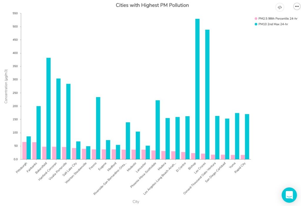
Although some attendees had technical difficulties with Remo, Workbench, or both, I was glad to see that a few people did manage to follow the tutorial along to its final step: a bar chart showcasing American cities which have seen high particle pollution days in 2019.
Finally, I’d like to share a few insights that I got from the panelists’ conversation during our Q&A. As an early-career journalist myself, I always jump at the chance to learn from those I admire in my field—and yes, okay, I did invite four of them to a panel partially in order to manufacture one of those opportunities. The conversation ranged from practical questions about software tools to more ethical questions, such as how journalists can ensure their stories are being led by their data, rather than the other way around.
These are the main conclusions I took for my own work:
Use the simplest tool for the job, but make sure it does work for that job. I was surprised to hear all four panelists say that they primarily use Google Sheets for their data work, as I sometimes feel like I’m not a “real data journalist” due to my inexperience with coding. (I’m working on learning R, okay?) But they also acknowledged that simpler tools may cause problems, such as the massive reporting error recently seen by England’s public health department thanks to reliance on Microsoft Excel.
Fact-checking is vital. Data journalists must be transparent about both the sources they use and the steps they take in analysis, and fact-checkers should go through all of those steps before a big project is published—just as fact-checkers need to check every quote and assertion in a feature.
A newsroom’s biggest stories are often data stories. Many publications now are seeing their COVID-19 trackers or other large visualizations get the most attention from readers. Data stories can bring readers in and keep them engaged as they explore an interactive feature or look for updates to a tracker, which can often make them worth the extra time and resources that they take compared to more traditional stories.
There’s a data angle to every story. Sara Simon talked about building her own database for her Miss America project, and how this process prepared her for more thorough coverage when she actually attended a pageant. Sometimes, a data story is not based around an analysis or visualization; rather, building a dataset out of other information can help you see trends which inform a written story.
Collaboration is key. Duncan Geere talked about finding people whose strengths make up for your weaknesses, whether that is their knowledge of a coding language or their eye for design. Now, I’m thinking about what kind of collaborations I might be able to foster with this newsletter. (If you’re reading this and you have an idea, hit me up!)
COVID-19 data analysis requires time, caution, and really hard questions. Jessica Malaty Rivera talked about the intense editing and fact-checking process that goes into COVID Tracking Project work to ensure that blog posts and other materials are as accurate and transparent as possible. Hearing about this work from a more outside perspective stuck with me because it reminded me of my goals for this newsletter. Although I work solo here, I strive to ask the hard questions and lift up other projects and researchers that are excelling at accuracy and transparency work.
If you attended the session, I hope you found it informative and not too fast-paced. If you didn’t, I hope this recap gave you an idea of how data journalism and science communication may work together to tell more complex and engaging stories.