I couldn’t decide which of these news items to focus on for a short post this week, so I wrote blurbs for all five. This title and format are inspired by Rob Meyer’s Weekly Planet newsletter.
HHS added vaccinations to its facility-level hospitalization dataset: Last week, I discussed the HHS’s addition of COVID-19 patient admissions by age to its state-level hospitalization dataset. This week, the HHS followed that up with new fields in its facility-level dataset, reflecting vaccinations among hospital staff and patients. You can find the dataset here and read more about the new fields in the FAQ here (starting on page 14). It’s crucial to note that these are optional fields, meaning hospitals can submit their other COVID-19 numbers without any vaccination reporting. Only about 3,200 of the total 5,000 facilities in the HHS dataset have opted in—so don’t sum these numbers to draw conclusions about your state or county. Still, this is the most detailed occupational data I’ve seen for the U.S. thus far.
A new IHME analysis suggests the global COVID-19 death toll may be double reported counts: 3.3 million people have died from COVID-19 worldwide as of May 8, according to the World Health Organization. But a new modeling study from the University of Washington’s Institute for Health Metrics and Evaluation (IHME) suggests that the actual death number is 6.9 million. Under-testing and overburdened healthcare systems may contribute to reporting systems missing COVID-19 deaths, though the reasons—and the undercount’s magnitude—are different in each country. In the U.S., IHME estimates about 900,000 deaths, while the CDC counts 562,000. Read STAT’s Helen Branswell for more context on this study.
The NYT published a dangerous misrepresentation of vaccine hesitancy (then quietly corrected it): A New York Times story on herd immunity garnered a lot of attention (and Twitter debate) earlier this week. One specific aspect of the story stuck out to some COVID-19 data experts, though: a U.S. map entitled, “Uneven Willingness to Get Vaccinated Could Affect Herd Immunity.” The map, based on HHS estimates, claims to display vaccine confidence at the county level. But the estimates are really more reflective of state averages, and moreover, the NYT originally double-counted the people who are strongly opposed to vaccines, leading to a map that made the U.S. look much more hesitant than it actually is. Biologist Carl Bergstrom has a thread detailing the issue, including original and corrected versions of the map.
We still need better demographic data: A poignant article in The Atlantic from Ibram Kendi calls attention to gaps in COVID-19 data collection that continue to loom large, more than a year into the pandemic. The story primarily discusses race and ethnicity data, citing the COVID Racial Data Tracker (which I worked on), but Kendi also highlights other underreported populations. For example: “The only available COVID-19 data on undocumented immigrants come from Immigration and Customs Enforcement detention centers.”
NIH college student trial is having a hard time recruiting: If you, like me, have been curious about how that big NIH trial to study vaccine effectiveness in college students has progressed since it was announced last March, I recommend this story from U.S. News reporter Chelsea Cirruzzo. The study aimed to recruit 12,000 students at a select number of colleges, but because the vaccine rollout has progressed faster than expected, researchers are having a hard time finding not-yet-vaccinated students to enroll. (1,000 are enrolled so far.) Now, students at all higher ed institutions can join.
This past Tuesday, April 6, the Centers for Disease Control and Prevention put out a press release that I found heartening, yet confusing.
“Nearly 80 percent of teachers, school staff, and childcare workers receive at least one shot of COVID-19 vaccine,” the release proclaims. These vaccinations include “more than 2 million” people in these professions who received doses through the federal retail pharmacy program and “5-6 million” vaccinated through state programs, all of whom received shots before the end of March.
This CDC release is exciting because occupational data—or, figures tying vaccination counts to the jobs of those who got vaccinated—have been few and far between. As I wrote last month, state and local health departments have been unprepared to track this type of data; even getting states to report the race and ethnicity of their vaccinated residents has been a struggle.
While you may need to be a teacher or fit another essential worker category in order to get vaccinated in your state, your provider may require you to show some proof of eligibility without recording that eligibility status anywhere. Meanwhile, school districts and local public health departments might be wary of surveying their local teachers to see who’s been vaccinated. Madeline Will explains the issue in EdWeek:
Yet many vaccination sites do not collect or report occupation data, and many districts are not tracking vaccination rates themselves. Some district leaders say they’re wary of asking employees if they’ve gotten vaccinated because they don’t want to run afoul of any privacy laws, although the U.S. Equal Employment Opportunity Commission has said that employers can ask whether employees have gotten a COVID-19 vaccine.
This brings us to the question: how did the CDC get its 80% figure? The agency’s press release is frustratingly unspecific; it’s all of 282 words long, with just one paragraph devoted to what a data journalist like myself would call the methodology, or the explanation of where the data come from.
Here’s that explanation:
CDC, in collaboration with the Administration for Children and Families, the Department of Education, and our non-federal partners, conducted surveys of Pre-K-12 teachers, school staff, and childcare workers at the end of March. CDC received almost 13,000 responses from education staff and nearly 40,000 responses from childcare workers. The responses closely matched available national race/ethnicity and demographic data on this specific workforce.
Let’s unpack this. The CDC worked with two other federal agencies to conduct a survey of this high-priority occupation group, including 13,000 school staff and 40,000 childcare workers. The agency then extrapolated the results of this 53,000-person survey to estimate that 80% of Americans in these occupations have been vaccinated overall. While the CDC doesn’t provide any detail on how workers were chosen for the survey, the press release notes that responses match demographic data for this workforce, indicating that agency researchers did collect race, ethnicity, and other demographic information for those they surveyed.
So, here’s my big question: is the CDC planning to release more detailed results from this survey? And if not… why?
As we’ve noted in past CDD issues, teacher vaccination can go a long way towards inspiring confidence in school reopening programs, in school staff and parents alike. And that confidence is needed right now: February results of the Department of Education’s school COVID-19 survey, released last week, demonstrate that even though the majority of U.S. schools are now offering in-person instruction, only about one-third of students are learning in the classroom full-time. (More on those findings via AP’s Collin Binkley.)
If the CDC released results of this vaccination survey for individual states and demographic groups, local public health and school district leadership may be able to see how their populations compare and respond accordingly. If, say, Texas is vaccinating fewer teachers than New York, Governor Greg Abbott can make a speech telling his state to step it up.
And those states where a higher share of teachers have been vaccinated can use the information to inform school opening plans. The CDC’s press release doesn’t specify what share of that 80% vaccinated represents partially versus fully vaccinated school and childcare workers (which would also be useful data!), but even a workforce that was partially vaccinated at the end of March may be ready for in-person work by the end of April.
All this is to say: show your work, CDC! Give us more detailed data!
It’s also important to note, though, that while teachers are in the spotlight, they aren’t the only occupation for whom vaccination data should be a priority. Many staff in long-term care facilities have been unwilling to get vaccinated even though it would be a highly protective measure for the seniors they care for, Liz Essley Whyte wrote in late March at The Center for Public Integrity.
The federal program that partnered with pharmacy chains to get LTC residents and staff vaccinated is now winding down, Whyte reports, even though some states still have a lot of LTC workers left who need shots. In seven states and D.C., less than a third of staff are vaccinated.
Whyte writes:
Low vaccination rates among staff at these facilities mean that workers continue to have greater risk of contracting COVID-19 themselves or passing the virus to their patients, including residents who can’t be inoculated for medical reasons. Low staff uptake can also complicate nursing homes’ attempt to reopen their doors to visitors like Caldwell, who are striving for some sense of normalcy.
The Centers for Medicare & Medicaid Services are hoping to improve data on this issue. This agency proposed a new rule this week that would require nursing homes to tell the CDC how many of their health care workers are vaccinated against COVID-19, POLITICO reported on Friday. This rule would enable the CMS to identify specific facilities that are faring poorly and take appropriate action. And, if such data are made public, it would be easier for both reporters and families of nursing home residents to push for more LTC worker vaccinations.
Still, privacy concerns continue to be a barrier for more detailed vaccination data of all types. Some of the big pharmacy chains that are administering huge shares of shots are requiring vaccine recipients to share their emails or phone numbers when they register for an appointment—then saving that data to use for future marketing. Getting patient contact information is an easy way to ensure people actually show up for their appointments, but when it’s a private company collecting your phone number instead of your public health department, it’s understandable that people might be a bit concerned about giving any information away.
More detailed data standards, along with communication between governments and vaccine providers, could have saved the U.S. from the patchwork of vaccination data we’re now facing. But instead, here we are. Asking the CDC to please send out a longer press release. Maybe with a state-by-state data table included.
As dedicated CDD readers may remember, one of President Biden’s big COVID-19 promises was the creation of a “Nationwide Pandemic Dashboard” that would be a central hub for all the information Americans needed to see how the pandemic was progressing in their communities.
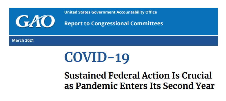
The Biden administration sees the CDC’s COVID Data Tracker as that dashboard and plans to continue improving it as time goes on, White House COVID-19 Data Director Cyrus Shahpar said in an interview with The Center for Public Integrity last month. But a new report from the Government Accountability Office suggests that the CDC’s tracker has a long way to go before it becomes the centralized system that Americans need.
The Government Accountability Office, or GAO, is a federal watchdog agency that evaluates other federal agencies on behalf of Congress. Its full report, released last Wednesday, is over 500 pages of problems and recommendations, ranging from the Emergency Use Authorization process to health care for veterans.
But, as COVID Tracking Project leader Erin Kissane pointed out on Twitter, there are some real data bangers starting in the appendix:
Recommending that the federal government provides more comprehensive data on who gets a COVID-19 vaccine. The GAO specifically wants to see more data on race and ethnicity, so that the public can gauge how well vaccination efforts are reaching more vulnerable demographic groups. The agency also notes the challenge of finding occupational data on vaccinations, something we’ve bemoaned before at the CDD.
Calling out the lack of public awareness for federal data. Some experts the GAO interviewed noted that “the public may be more aware of non-federal sources of data on COVID-19 indicators (e.g., the COVID Tracking Project, Johns Hopkins) than sources from the federal government,” in part because those non-federal sources started providing public data earlier in 2020. The federal agencies need to step up their communications game.
Stating the need for central access to federal data. The GAO describes how the HHS lacks a central, public-facing COVID-19 data website, while the CDC’s COVID Data Tracker fails to provide access to the full suite of information available from the HHS. Specific missing data pages include COVID-19 health indicators and vaccine adverse events.
Overall, the GAO says, the agency recommends that “HHS make its different sources of publicly available COVID-19 data accessible from a centralized location on the internet.” One would think this is a pretty straightforward recommendation to follow, but HHS reportedly “neither agreed nor disagreed” with the assessment.
While there’s a lot more to dig into from this report, it is only part of a long evaluation process to improve federal data collection and reporting. The new report is part of a GAO effort that started last March, reports POLITICO’s Sarah Owermohle:
The latest report is part of nearly yearlong effort by GAO to track the federal pandemic response after a directive in the March 2020 CARES Act. The watchdog first called on CDC to “completely and consistently collect demographic data” including comprehensive results on long-term health outcomes across race and ethnicity, in September. It later criticized the government’s lack of “consistent and complete COVID-19 data” in a January report.
I, for one, am excited to see what the GAO does next—and how the federal public health agencies respond.
The CDC made two major updates to its COVID-19 data this week.
First: On Tuesday, the agency published a new dataset with more granular information on COVID-19 cases. Like previous case surveillance datasets, this new source compiles cases shared with the CDC, along with anonymized information on their symptoms, underlying medical conditions, race/ethnicity, and other variables. The new dataset is notable because it includes detailed geographic data, going down to the county level.
After months of no state-by-state demographic data from the federal government, we now have county-by-county demographic data. This is a pretty big deal! It’s also a pretty big dataset; it includes about 22 million cases (out of a total 30 million U.S. cases to date).
Of those 22 million cases, race is available for about 13 million cases (58%) and ethnicity is available for about 10 million cases (47%). The dataset will be updated monthly, so we may see better completion with further updates. I haven’t had time to do much detailed analysis of the new dataset yet (hell, I haven’t even managed to get it to load on my computer), but I’m excited to dive into it for future issues.
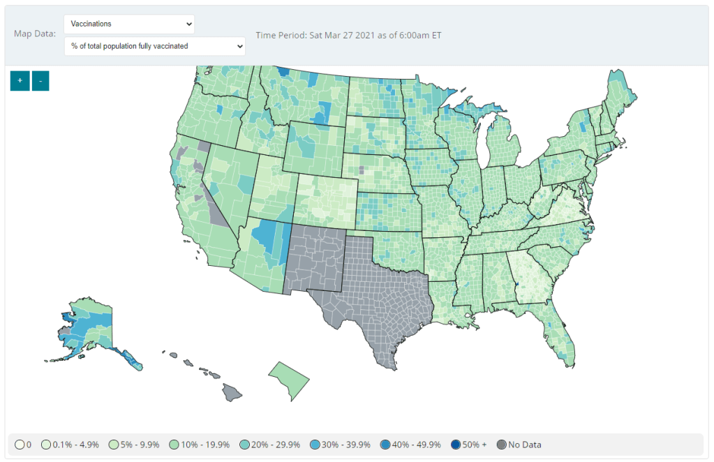
Second: Vaccination data at the county level are now available on the CDC’s COVID Data Tracker, as of Friday. No, not in the vaccinations section—you need to go to the County View section, then select “Vaccinations” in the dropdown menu. Click on a specific county (or select it using dropdown menus), and you’ll be able to see data for that county.
County-level vaccination data from the CDC. Screenshot taken on March 27.
At the moment, only three data points are available: total fully vaccinated population, fully vaccinated population over age 18, and fully vaccinated population over age 65. Also, data are missing for Texas, New Mexico, and select other counties. Still, this a great start for more standardized vaccination data at the national level. (Can we get more demographic data next?)
These county-level vaccination data aren’t downloadable directly from the CDC’s tracker, but the COVID Tracking Project is archiving the data at the Project’s public GitHub. The New York TImes has also built an interactive map with the data, which you can find on their vaccine tracker.
It’s worth noting that I found out about both of these updates via tweets from the White House COVID-19 Data Director, Cyrus Shahpar. I’m on both the CDC’s press list and the White House press list, and I watch nearly every White House COVID-19 press briefing, so it seems a little odd that I’m getting the news from Twitter.
(Not that I don’t love Cyrus’ daily tweets! I just wonder about the PR strategy here. Also, Cyrus, if you’re reading this, that interview request I sent back in January still stands.)
Liz Essley Whyte, an investigative reporter at the Center for Public Integrity, discussed her work bringing White House COVID-19 reports to the public before they were officially released. Erica Hensley, an independent health and data journalist based in Jackson, Mississippi, provided advice for navigating relationships with local public health officials based on her work reporting on COVID-19 in Mississippi. And Tom Meagher, a senior editor at The Marshall Project, described the communication and coordination work behind his newsroom’s yearlong tracker of COVID-19 in the U.S. prison system. Thank you to everyone who attended!
For those who couldn’t make it live, you can watch the recording of the session below. You can also check out the slides here. I’m also sharing a brief recap of the workshop in today’s issue.
The final workshop in our series, Communicating COVID-19 data, is coming up this coming Wednesday, March 3, from 4:30 to 6 PM ET. This session will feature freelance reporter Christie Aschwanden, The Washington Post’s Júlia Ledur, and THE CITY’s Ann Choi, and Will Welch discussing strategies for both written reporting and data visualization. If you aren’t registered for the series yet, you can sign up here.
Finding and navigating government data
Liz Essley Whyte started her talk by providing backstory on the White House COVID-19 reports.
In the middle of the summer, she said, a source gave her access to documents that the White House Coronavirus Task Force was sending out to governors—but wasn’t publishing publicly. The documents included detailed data on states, counties, and metro areas, along with recommendations for governors on how to mitigate the spread. Whyte published the documents to which she’d obtained access, marking the start of a months-long campaign from her and other journalists to get the reports posted on a government portal.
“Despite weeks of me asking the White House, why aren’t these public, they were never made public for a while,” Whyte said. She continued collecting the reports and publishing them; the historical reports are all available in DocumentCloud.
If you need to find some government data—such as private White House reports—there are a few basic questions that Whyte recommended you start with:
Who collects the data?
Who uses it?
Who has access to it?
Has anyone else found it or published it before?
What do you really want to find out? If you can’t get the data you really need, are there other datasets that could illuminate the situation?
While journalists often like to find fully original scoops, Whyte said, sometimes your best source for data could be another reporter. “There’s some really great datasets out there, especially in the health space, that people have maybe written one or two stories, but they have hundreds of stories in them.” So get creative and look for collaborators when there’s a source you really want to find.
She provided a few other ideas for obtaining government data: besides getting a leak from a source (which can be hard to do), you can scour government websites, ask public information officers what data are available behind their public website, contact other officials (such as those mentioned in a one-off legislative report), or file a FOIA. Third-party sources such as the COVID Tracking Project or The Accountability Project also may have useful repositories of public information, or could help you navigate to what you need. Even for-profit data collecting companies might let journalists use their work for free.
Once you have the data, talk to your contact person for the dataset and “make sure you fully understand it,” Whyte said. Ask: Who collected the data and how? How is it being used? What’s the update schedule? How complete is it? And other similar questions, until you’re sure you know how to best use the dataset. If a data dictionary is available, make sure to comb through it and ask all your term and methodology questions.
In some cases this year, Whyte has looked at document information and contacted people who are listed as a document’s author or modifier. These are often great sources, she said, who can provide context on data even if they aren’t able to speak on the record.
The White House COVID-19 reports that Whyte spent so much time chasing down this past summer are now public. The Trump’s administration started publishing the data behind these reports in December, and Biden’s administration has now started publishing the PDF reports themselves—albeit minus the recommendations to governors that previous iterations contained. Whyte provided a run-down of the reports on Twitter, which should be required reading for any local journalist who wants to get more in-depth with their pandemic coverage.
“I think they’re really great for local reporting because they break down all kinds of different metrics by state, county, and metro area,” she said. The reports notably make it easy for us to compare across jurisdictions, since the federal government has standardized all the data. And you can find story ideas in the data notes, such as seeing where a state or region had a data error. The CDD also wrote about these reports when they were first published.
Working with local gatekeepers to find data
Erica Hensley discussed a few lessons she learned from covering COVID-19 in Mississippi, where data availability has lagged some other states.
Local reporting, she said, provides journalists with a unique situation in which they’re directly relying on one local agency for news and data. She stressed the importance of building a relationship with agency representatives, helping them understand exactly what you’re looking for and why you need it.
“They’re [Mississippi’s public health agency] an under-resourced agency that was strapped for time to even address my request,” she said. Understanding on her part and a lot of back-and-forth helped her to eventually get those requests met.
Hensley also described how she worked to fill data gaps by doing her own analysis at Mississippi Today, a local nonprofit newsroom, then showed her work to the public health agency. For example, she used the total case numbers published by the state to calculate daily and weekly figures, and presented the data in a percent change map. This project helped Mississippi residents see where COVID-19 spread was progressing most intensely—but it also showed the state that this information was needed. She similarly calculated a test positivity rate; to this day, she said, state public health officials go to Mississippi Today’s website to see positivity rates, as these rates are not included on the state’s COVID-19 site.
When you can do some calculations yourself, Hensley said, do those—and focus your FOIA time on those data that are less readily available, such as names of schools and long-term care facilities that have faced outbreaks. Long-term care has been a big focus for her, as residents in these facilities tend to be more vulnerable.
Since Mississippi wasn’t releasing state long-term care data, she used federal data from the Centers for Medicare and Medicaid Services (CMS) and ProPublica to investigate the facilities. Matching up sites with high COVID-19 case counts and sites that had completed infection control training, Hensley found that the majority of long-term care facilities in the state had failed to adequately prepare for outbreaks. Her reporting revealed serious issues in the state.
Hensley advocates for local reporters to dig into long-term care stories; the CMS dataset has a lot of rich data, down to the individual facility level, that can be a springboard to stories about how facilities are (or aren’t) keeping their residents safe.
While Hensley stressed the importance of earning a local health department’s trust, she also said that health reporters need to be trusted by their colleagues. “A big part of my job early on, on top of collecting the data, was helping the newsroom understand how this applies to other local beats,” she explained. Reporters who serve as resources to each other will produce more interdisciplinary stores, and reporters who team up to request data will get the information out faster.
Building a massive system to track COVID-19 in prisons
Reporters at The Marshall Project have spent the past year tracking COVID-19 cases in U.S. prisons. Tom Meagher discussed how they did it, including a lot of external and internal communication.
After the newsroom went on lockdown, Meagher said, “Once of the first things we thought of was, prisons—being congregate living facilities—were going to be seriously affected by this pandemic.” But at first, the data they wanted simply didn’t exist.
To compile those data on COVID-19 in prisons, The Marshall Project’s team had to manage relationships with agencies in every state and D.C. They divided up all the states among their newsroom, and later worked with The Associated Press as well. At first, the reporters called every state and simply asked for numbers with no intention to publish them, in order to see if a compilation would be possible. This was easier said than done: “Prisons are not always the most transparent agencies to deal with,” Meagher said.
TMP reporters asked each agency three carefully-worded questions: How many people have been tested for the coronavirus? How many have tested positive? And how many have died? They wanted to get those numbers for both prison inmates and staff. Meagher and his colleague Katie Park had to do a lot of work to clean and standardize the numbers, which are often inconsistent across states.
The team made it clear to prison agencies that this wasn’t just a one-off ask—they came back with the same questions every week. Within a month, a lot of state agencies started setting up websites, which made data collection easier; but reporters still call and email every week in order to clarify data issues and fill in gaps. Meagher uses Google Sheets and Mail Merge to coordinate much of the data collection, cleaning, and outreach back to states with lingering questions.
The newsroom also uses a tool called Klaxon to monitor prison websites for changes and record screenshots, often useful for historical analysis. In one instance, TMP’s screenshots revealed that Texas’ justice system removed seven names from its list of prison deaths; they were able to use this evidence to advocate for names to be returned.
TMP’s data collection system is manual—or, primarily done by humans, not web scrapers. They opted for this route because prison data, like a lot of COVID-19 data, are messy and inconsistent. You might find that an agency switches its test units from people to specimens without warning, Meagher said, or fixes a historical error by removing a few cases from its total count. In these instances, a human reporter can quickly notice the problem and send a question out to the state agency.
“If we’ve learned anything from all of this, it’s that there’s a lot of different ways data can go wrong,” Meagher said. Even when public health officials are well-intentioned and questions are clearly asked, misunderstandings can still happen that lead to data errors down the line.
The goal of this dataset is really to give people insight into what’s happening—for prison inmates, for their families, and for advocates. Even agencies themselves, he said, are “eager to see how they’re doing compared to other states.” Since a similar dataset doesn’t exist on a federal level, states are using TMP’s to track their own progress, creating an incentive for them to report more accurately to begin with. These data are freely available online, including case and death numbers for every week since March. If you have questions, Meagher and his colleagues may serve as a resource for other reporters hoping to report on COVID-19 in the prison system.
Since our main stories this week focused on NYC, here are a couple of updates from the federal public health agencies.
CDC releases demographic vaccination data: This past Monday, the CDC published a MMWR report on characteristics of Americans vaccinated during the first month of our vaccine rollout, December 14 to January 14. Race/ethnicity data are missing for almost half of the vaccinations recorded here, but the existing data show white Americans getting vaccinated at higher rates than Black and Hispanic/Latino Americans.
CDC vaccination dashboard now includes time series: As of Thursday, the CDC’s COVID Data Tracker now includes a page called “Vaccination Trends,” which shows daily counts of total doses administered, people receiving 1 dose, and people receiving 2 doses. The doses are assigned to the date they’re administered, not the date they’re reported, so they may not match time series on other dashboards. Time series aren’t yet available for individual states.
U.S. Department of Education surveying COVID-19’s impact for students: On Friday, the Department of Education announced that the Institute of Education Sciences would collect “vital data on the impact of COVID-19 on students and the status of in-person learning.” Data gathered in the survey will include the share of America’s schools that are open in-person vs. remote, enrollment by various demographic metrics, attendance rates, and information on the logistics of in-person and remote instruction. Notably, the survey does not promise to collect data on COVID-19 cases, hospitalizations, and deaths associated with K-12 schools.
At-home tests are coming: This week, the White House announced that the new administration has contracted with diagnostic company Ellume and six other suppliers to produce tens of millions of at-home tests by the end of the summer. Ellume’s test is an antigen test, and, though the other test suppliers haven’t yet been announced, we can assume they also make antigen or rapid nucleic acid amplification tests; neither test type is currently reported by the federal government. If these tests do become a significant part of America’s COVID-19 response—and some experts are skeptical that this will happen—a major change in test reporting practices will be needed.
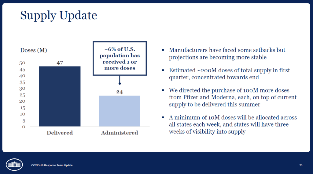
A slide from the January 27 White House COVID-19 briefing, featuring the Biden team’s new commitment to provide states with three weeks’ lead time into their vaccine supply.
Good afternoon only to the reporters on last Wednesday’s White House COVID-19 press call who told Dr. Anthony Fauci that he was on mute.
IS ANYONE GOING TO TELL DR. FAUCI THAT HE'S ON MUTE
And yes, you read that right: the White House is doing regular COVID-19 press calls again! With Dr. Fauci! Who is now President Biden’s Chief Medical Advisor on COVID-19! And CDC Director Dr. Rochelle Walensky! And chair of Biden’s health equity task force Dr. Marcella Nunez-Smith!
Okay, that’s enough exclamation points. The briefings, which will be held three times a week, provide data-driven updates on the state of the pandemic and allow journalists to ask hard questions of the Biden administration’s response. In addition to the scientific experts, briefings so far have featured White House advisors/COVID-19 coordinators Jeff Zients and Andy Slavitt, who can speak to the more logistical aspects of the administration’s actions.
This is, essentially, what a responsible federal government should have been doing since January 2020. But after a year of the Trump administration’s confusion, lack of coordination, and outright lies, it’s refreshing to watch a White House COVID-19 briefing in which every statement doesn’t need to be rigorously fact-checked in real-time.
Besides the press briefings, here are a couple of moves the Biden team made this week that underscore the new administration’s commitment to better (and more transparent) COVID-19 data:
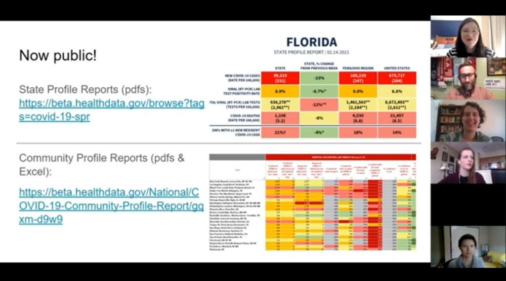
Publicly releasing the COVID-19 State Profile Reports: Since last spring, the White House COVID-19 Task Force has regularly compiled detailed reports to help national and state leaders respond to the pandemic. The reports include COVID-19 data for states, counties, and cities, along with specific assessments on where governors and state public health officials should focus their efforts in order to control the virus’ spread. In late December, the data behind these reports were released to the public; here’s a CDD post with more info on that release. Biden’s COVID-19 Task Force has kept the data releases going, and this week, they also shared the PDF reports themselves. What’s more, new White House COVID-19 Data Director Cyrus Shahpar made this release hisfirst Tweet on his new official account—and he thanked public advocates for these data, such as the Center for Public Integrity’s Liz Essley Whyte and COVID Exit Strategy’s Ryan Panchadsaram. The release indicates a new commitment to data transparency that we did not see from Trump’s White House for the majority of his tenure.
Updating the CDC’s COVID-19 dashboard: The CDC has been building out a COVID-19 tracker since the spring, featuring data on cases, testing, vulnerable populations, and (since December) vaccination. But it got a major upgrade this week: the dashboard now has a curated landing page and a sidebar menu that makes it much easier for users to see all the available data. This dashboard also now includes those State Profile Reports I mentioned above, making it easy for users to find information about their regions. And, under the “Your Community” label, you’ll also find an interactive COVID-19 vulnerability index: select your county, and the map will show you how susceptible you are to the pandemic based on your community’s current infection rate, testing, population demographics, health disparities, and more.
More lead time for vaccine distribution: Last week, I discussed how unpredictable vaccine shipments from the federal government were making it difficult for states—and by extension, local public health departments and individual providers—to coordinate their dose administration. Biden’s team improved the situation this week by giving states their shipment numbers three weeks in advance. The extended lead time will allow vaccine providers to plan out appointments and coordinate other logistics in order to ensure all doses are used. Both the CDC’s Pfizer and Moderna distribution datasets were most recently updated on January 26, with allocation numbers for January 25 and February 1.
Stepping up the genomic surveillance: In both of this week’s White House COVID-19 briefings, CDC Director Rochelle Walensky announced that the agency is actively looking for new SARS-CoV-2 variants by working with local and international partners. She gave some specifics in Friday’s briefing: “We are now asking for surveillance from every single state,” she said, requiring states to sequence 750 strains each week. Collaborations with both commercial labs and research universities will take the surveillance to thousands of strains per week. As Sarah Braner wrote earlier in January, such surveillance is key to understanding how prevalent the new—and more contagious—coronavirus strains are in the U.S., as well as to detecting future strains that may become a threat in the coming months.
It looks like the CDC may be on its way to adapting its current dashboard into the Nationwide Pandemic Dashboard that Biden promised in his transition plan. But I, for one, am trying not to get too comfortable. The statements still need to be fact-checked, and the hard questions need to be asked. Biden’s team is making the bare minimum look nice—albeit with a few Zoom glitches.
As I look forward into my coverage of the Biden administration’s COVID-19 response, and its healthcare policies more broadly, I’m thinking about this quote from Chris La Tray in his most recent newsletter issue, “Same as it Ever Was”:
“I’m already sick of all the white liberal people humping each other’s legs every time Biden does something that is simply his damn job. “It’s so nice to have a president that….” Blech. Puke. There is copious lingering accountability to be addressed and Joe goddamn Biden is neck deep in it. We are not going back to anything that resembles the last 40 years of his political career, our only way is forward.”
Our only way is forward. To end this pandemic, to prepare for the next one.
Shortly after President Joe Biden’s inauguration, the official White House website got a makeover. It now hosts the president’s priorities and COVID-19 plan—including a promise to create a “Nationwide Pandemic Dashboard.”
Create the Nationwide Pandemic Dashboard that Americans can check in real-time to help them gauge whether local transmission is actively occurring in their zip codes. This information is critical to helping all individuals, but especially older Americans and others at high risk, understand what level of precaution to take.
We don’t have a clear timeline for this dashboard yet, of course, much less details on what it will include. But the foundation was laid this week: Biden released a detailed national COVID-19 plan and signed 30 executive orders—three of which are directly related to tracking the pandemic.
In the coming weeks, I’ll be closely watching to see how the Biden administration follows through on these plans. Will the new administration build on the strengths of existing federal and state data systems, or will it tear down old systems and sow unnecessary confusion?
What Biden is promising:
A Nationwide Pandemic Dashboard: We covered this one already. Biden’s national strategy document specifies that the federal government will track cases, testing, vaccinations, and hospital admissions—and will “make real-time information available.” The “real-time” promise here is worth highlighting, as real-time pandemic data do not actually exist; every metric from cases to vaccinations has its own lag based on reporting and data-sharing technologies. (COVID-19 deaths, in particular, may be reported weeks after they occur.) Still, the federal government is already tracking all of these metrics. The Biden team’s goal, then, is to consolidate them into an easily accessible dashboard that is widely used by everyone from county public health leaders to elementary school teachers.
Coordinated federal data collection: One of Biden’s executive orders, signed on January 21, requires several federal agencies to “designate a senior official” who will lead that agency’s COVID-19 data collection. The officials must both coordinate with each other and make data public. Meanwhile, the Department of Health and Human Services secretary will review the national public health data systems and figure out how to increase their efficiency and accuracy. (Xavier Becerra, Biden’s pick for HHS secretary, hasn’t been confirmed by the Senate yet; will this review need to wait until he officially starts the position?)
A focus on equity: Another Biden executive order promises to address the disproportionate impact that COVID-19 has had on people of color and other minority communities. The executive order specifically calls out a lack of standardized COVID-19 data on these communities, saying this data gap has “hampered efforts to ensure an equitable pandemic response.” Biden’s COVID-19 Health Equity Task Force will be required to address this data gap by coordinating with federal agencies—both expanding data collection for underserved populations right now and making recommendations to prevent this issue in future public health crises. This task is easier said than done, though; a recent STAT News article called using data to ensure vaccination equity one of the biggest challenges Biden faces as he takes office.
School data collection: Last week, I wrote that there was no mention of data-gathering in Biden’s K-12 COVID-19 plan. Well, maybe someone from his team reads the COVID-19 Data Dispatch, because his executive order on supporting school reopening requires data collection in two areas: data to inform safe reopening of K-12 schools, and data to understand the pandemic’s impact on students and educators. I would have liked to see a more specific promise to track COVID-19 cases, tests, and student enrollment in public schools, but this is a good start.
Data-based briefings: Jen Psaki, the new White House press secretary, said on Wednesday that the administration would hold regular briefings with health officials, “with data.” Ideally, such briefings should explain trends in COVID-19 data and put numbers into context for the Americans watching at home.
The promises are, well, promising. And I’m rooting for President Biden! Seriously! My job would be way easier if I could just give you all updates using one centralized dashboard each week. But I’ve spent enough time hacking through the weeds of this country’s highly confusing, irregular data systems to know that the new president can’t just flip a switch and make a nationwide pandemic dashboard magically appear on whitehouse.gov.
If anyone from the Biden administration is reading this, hello! Please put me on all your press lists! And here’s what this data reporter would, personally, like to see you focus on.
What I want to see:
Don’t break what we already have: Or, build on the existing federal data systems (and dashboards) rather than creating something entirely new. Last week, Alexis Madrigal published a feature in The Atlantic advocating for the new administration to keep COVID-19 hospitalization data under its current HHS control rather than transferring this responsibility back to the CDC. I’ve covered the HHS’s hospitalization data extensively in the CDD, but this feature really paints a cohesive picture of the dataset—from its turbulent, politically charged beginnings to its current, comprehensive, trustworthy format. The story is worth a read. And on a similar note, I’ve been glad to see federal data sources like the CDC’s dashboard and the Community Profile Reports, continue to update on their usual schedules. Biden’s team should seek to improve upon these systems and make them easier to access, not start from scratch.
More public metadata: When the federal government has put out large data releases in recent months, responsibility has largely fallen on journalists and other outside communicators to make those releases accessible. I’ve done some of that work in this publication and at the COVID Tracking Project. But it shouldn’t really be my job—the federal agencies that put out these datasets should be releasing FAQ documents, holding press calls, and generally making themselves available to help out researchers and communicators who want to use their data.
Count the rapid tests: Since August, I’ve called on the federal public health agencies to release national data on antigen tests and other types of rapid tests. A recent article in The Atlantic by Whet Moser makes clear that data for these tests are still widely unavailable. Moser writes that antigen test numbers are not reported at the federal level, and at the state level, such reporting is highly fractured and inconsistent; as a result, about three-quarters of the antigen tests that the federal government has distributed are unaccounted for in public data. The HHS should focus on tracking these tests as comprehensively as it has tracked PCR tests, and it should make the numbers publicly available.
Survey the genomes: Another massive challenge that the U.S. faces right now is keeping track of the SARS-CoV-2 variants that are circulating through the population, some of which may be more contagious or more life-threatening. As Sarah Braner reported two weeks ago, the majority of COVID-19 cases aren’t genomically sequenced, making it difficult for us to know how many of those cases are new strains as opposed to the regular coronavirus that we’ve all come to know and hate over the past year. Biden’s health and science leadership should make it a priority to step up the nation’s genetic sequencing game, and all of those data should be publicly shared.
Support the local public health agencies: Nationwide data coordination is obviously important, and is something that’s been desperately needed since last spring. But most of the COVID-19 data work—logging test results, standardizing those test results, sending them to a central location—is done by state and local public health officials. Local public health agencies, in particular, have been under-funded and threatened by partisan policies since before the pandemic started. To truly improve COVID-19 data collection, the Biden administration must provide support to these local agencies in the form of funding, personnel, technology, and truly anything else they need right now.
When Biden’s nationwide pandemic dashboard does drop, you’d better believe I’ll be giving it a comprehensive review. For now, if you want to see how well Biden’s doing at keeping his campaign trail promises, I recommend checking out Politifact’s Biden Promise Tracker.
Despite the holiday, many jurisdictions have begun reporting COVID-19 vaccination data since my last issue. Here are the major updates:
CDC added vaccinations to its dashboard: Mere hours after I published last week’s newsletter questioning when the federal government would release a national count of how many Americans had been vaccinated, the CDC began posting just that. The CDC COVID Data Tracker now includes both a count of how many vaccine doses have been distributed and a count of how many people have received their first dose—1.9 million as of Saturday, December 26. The count includes both Pfizer and Moderna’s vaccines, and incorporates reporting from states, local public health agencies, and federal entities including the Bureau of Prisons, Veterans Administration, and Indian Health Services. More detailed geographic and demographic data are not yet available from the CDC.
27 states are now reporting COVID-19 vaccination data: While the COVID Tracking Project is not tracking vaccinations, the Project is keeping a running list of states that are reporting vaccine-related metrics. As of December 25, 27 states are reporting vaccine doses administered or another similar metric. Of the states reporting vaccinations, nine are reporting race and ethnicity of the residents vaccinated—that’s a huge jump from last Sunday, when only Florida was reporting this information. In other demographic metrics: 14 states are reporting age of those vaccinated, 10 are reporting sex or gender, and 14 are reporting county.
How the COVID Tracking Project hopes vaccines will be tracked: In addition to its state dashboard annotations, the Project released a blog post last week detailing key information that Project leads believe should be prioritized by state and federal public health departments, as well as what states are reporting so far. Key metrics include: the number of people fully vaccinated (not just the number of doses administered), demographic data reported in absolute numbers (not percentages), county-level data, and data on vaccinations in long-term care facilities.
New Mexico will notify residents when they qualify for vaccination: This past Wednesday, the New Mexico Department of Health launched a website where state residents can sign up to learn when they will be eligible to receive a COVID-19 vaccine. The sign-up form is currently somewhat confusing to use, as a new user must click “Schedule a New Appointment” to put in their contact details—even if they aren’t eligible for vaccination yet. Still, this effort to provide transparency about vaccination progress on such an individual level is unique among states thus far.
Our World in Data is tracking COVID-19 vaccinations worldwide: As of December 26, the open-source data repository Our World in Data is compiling vaccination counts from 10 countries: the U.S., the U.K., China, Russia, Israel, Canada, Bahrain, Chile, Mexico, and Costa Rica. So far, the U.S. has administered the most doses at 1.9 million, while Bahrain has administered the most doses when adjusted for population, at 3 doses for every 100 people.
Initial COVID-19 vaccine data in North Carolina reveals racial disparities: Samantha Kummerer, reporter for ABC11 in Raleigh-Durham, North Carolina, used the state’s early demographic data to draw attention to healthcare disparity. “When compared to the overall population of North Carolina, both Black and Latino communities are severely underrepresented in COVID-19 vaccination data,” Kummerer writes. She goes on to explain that these data reflect the hospital workforce in North Carolina, which was the first group to be vaccinated—and which is overwhelmingly white. This story reflects why it is so important for states to be transparent about their vaccination demographics, even at such an early stage of vaccine deployment.
In the interest of giving credit to the HHS where credit is due: the agency updated its new facility-level hospitalization dataset right on schedule this past Monday.
This dataset allows Americans to see exactly how COVID-19 is impacting individual hospitals across the country. In last week’s issue, I explained why I was excited about this dataset and what researchers and reporters could do with it. (The highlights: hyperlocal data that can be aggregated to different geographies, a time series back to August, demographic information on COVID-19 patients, and HHS transparency.)
Last week, I used this hospitalization dataset—along with the HHS’s state-level hospitalization data—to build several visualizations showing how COVID-19 has hit hospitals at the individual, county, and state levels.
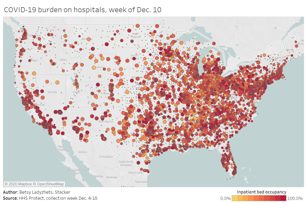
I also wrote a brief article on COVID-19 hospitalizations for Stacker, hosting visualizations and highlighting some major insights. The article was sent out to local journalists across the country via a News Direct press release. (If your outlet wants to repurpose Stacker’s article, get in touch with my coworker Mel at melanie@thestacker.com!)
A few national statistics:
Nearly 700 hospitals are at over 90% inpatient capacity, as of the most recent HHS data. 750 hospitals are at over 90% capacity in their ICUs.
The states with the highest rates of occupied beds are Maryland (79.8% of all beds occupied), Washington D.C. (80.0%), and Rhode Island (85.2%).
States with the highest shares of their populations hospitalized with COVID-19 are Arizona (53 patients per 100,000 population), Pennsylvania (55 per 100K), and Nevada (67 per 100K).
19% of hospitals in the nation are facing critical staffing shortages, while 24% anticipate such a shortage within the next week.
Staffing shortages are highest in Arkansas (33.6% of hospitals in the state), Wisconsin (35.6%), and North Dakota (42.0%).
Meanwhile, The Accountability Project has developed a datasette version of this hospitalization dataset. With a bit of code, you can query the data to access metrics for a specific hospital, city, county, or state. The Project has provided example queries to help you get started.