Category: Federal data

  • Tips for following COVID-19 trends this winter

    Tips for following COVID-19 trends this winter

    This chart from Biobot Analytics shows that current coronavirus levels in wastewater (the light green line) have followed a similar pattern to fall 2021 (light blue).

    The U.S. is heading into our first winter since the end of the federal public health emergency for COVID-19. Those of us still following COVID-19 trends might need to change which data sources we use to track the disease this winter, and how we think about trends.

    The pandemic certainly hasn’t ended: COVID-19 still leads to hundreds of hospitalizations and deaths each day, not to mention millions with Long COVID. Since the U.S. government ended its emergency response to this disease, we now have significantly less information—but not zero information—about how it’s spreading.

    To recap the key changes to COVID-19 data following the emergency’s end (see this post from May for more details):

    • The CDC is no longer collecting case data, as it lost authority to require reporting from PCR testing labs.
    • Following the CDC’s lead, many state and local health departments have also stopped tracking COVID-19 cases.
    • The CDC is still tracking COVID-19 hospitalizations, though these data are more delayed and less comprehensive following the PHE’s end.
    • Death reporting is also more delayed and less comprehensive.
    • The CDC is using networks of testing labs and healthcare centers (like the National Respiratory and Enteric Virus Surveillance System) to estimate COVID-19 trends, similar to its strategies for tracking flu and RSV.
    • To track variants, the CDC is relying on a mix of continued PCR samples, wastewater testing, and travel surveillance.
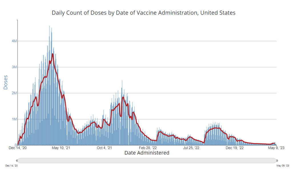
    • Vaccinations are no longer reported directly to the CDC, leading the agency to track the 2023-24 vaccines through other means.

    In short, we lost a few of the primary data sources that people have used to follow COVID-19 over the last three years. But there’s still a lot of data available, primarily from wastewater surveillance, the CDC’s sentinel networks, and local health agencies.

    Here are my tips for tracking COVID-19 this winter.

    Look at multiple sources for your community.

    Following COVID-19 in your city or state used to be easy: you could just look at case numbers. Now, with that metric unavailable in many places, I would recommend having two or three go-to data sources that you check in tandem. Don’t be certain about a trend (like a new surge) until you’ve seen it in multiple sources at once. These sources might be local wastewater pages, local health department pages, and regional trends from the CDC.

    For example, when I want to check on COVID-19 spread in New York City (where I live), I look at:

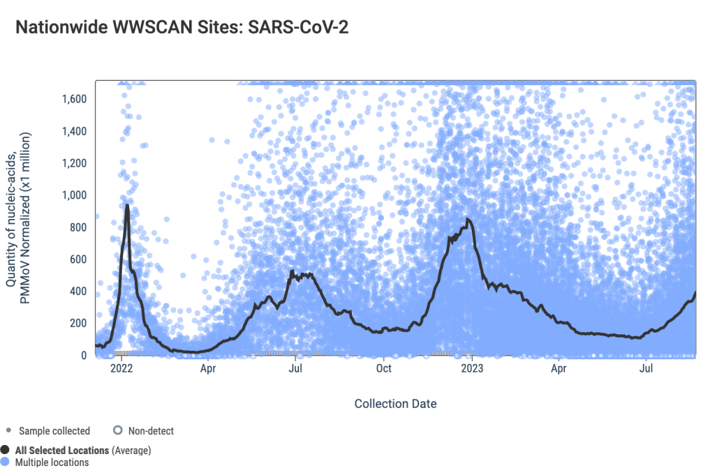
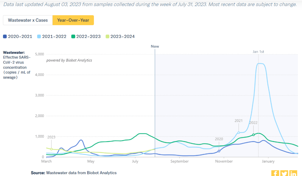
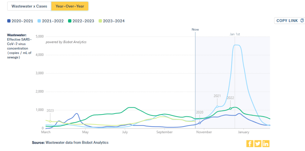
    Wastewater is the best early indicator.

    It’s pretty universally acknowledged among epidemiologists and public health experts at this point in the pandemic that, without case data, wastewater surveillance is now our best way to spot new changes in COVID-19 spread. When a new surge occurs, coronavirus levels in wastewater tend to go up days or weeks before other metrics, like hospitalizations.

    So, as you track COVID-19 for your community, I would highly recommend that one of your top sources is a wastewater surveillance dashboard.

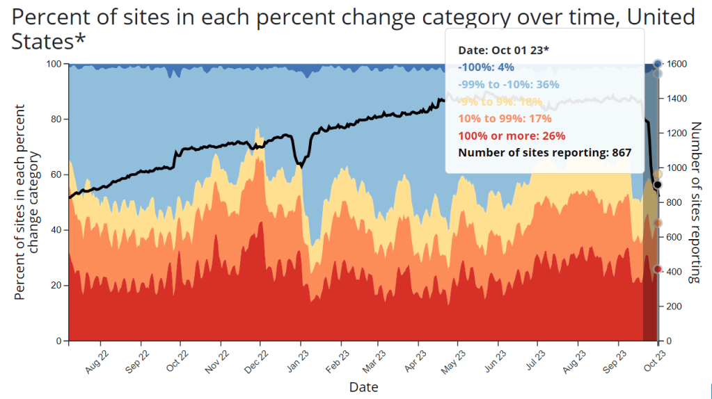
    Test positivity is still helpful for trends.

    Test positivity—the rate of COVID-19 tests that returned positive results—was a popular indicator early in the pandemic, with policy decisions like whether students could attend school in-person tied to this metric. While test positivity numbers are less available now, people are still getting tested for COVID-19: these tests mostly occur in healthcare settings among people who present with COVID-like symptoms or had recent exposures to the virus.

    I still find test positivity to be a helpful metric for watching trends in COVID-19 spread. When the positivity rate goes up, more people are getting COVID-19; and when the rate goes over 10%, that’s a decent indicator that the disease is spreading in significant magnitudes.

    Two places to find test positivity data:

    Acknowledge data delays, especially around holidays.

    Many COVID-19 dashboards used to update on a daily basis. Now, we get weekly updates from most health agencies—and even less frequency in some places. With these update schedules, all data are inevitably delayed by at least a few days. So, when you look at a dashboard, it’s important to keep the update schedule in mind and ask yourself how a trend might have continued following the most recent data available.

    Data delays become particularly prominent after holidays: remember, public health officials take days off just like the rest of us. Holiday reporting delays often lead to appearances of low COVID-19 during the immediate week of a holiday, followed by appearances of higher COVID-19 in the weeks after as cases (and other metrics) are retroactively reported. The weeks around Christmas and New Year’s are particularly bad, as most people take both of those holidays off.

    Compare current trends to past surges and lulls.

    With interpreting COVID-19 data, context is everything. Spread of the virus is usually either rising or falling; comparing current numbers to historical data can help you understand the magnitude of those recent patterns. Is your community seeing as much COVID-19 as it has at past times commonly recognized as surges? Or are you in more of a lull between waves?

    One helpful tool that I often use for such context is a chart on Biobot’s COVID-19 dashboard that provides year-over-year comparisons between coronavirus levels in wastewater in the U.S. Right now, for example, you can see that current viral levels have followed a similar trendline to what we observed in the fall 2021 Delta surge (before Omicron appeared), but lower than this time last year (when different BA variants were spreading quickly).

    The original Omicron surge in winter 2021-22 is often a popular point for these comparisons, as pundits love to assure us that a new variant won’t cause as intense a wave as we saw with Omicron’s first appearance. While this can be reassuring, I think it’s important to not just look at the highest peaks for comparison. The summer/fall of Delta in 2021 wasn’t a great time either, and we’re on track to repeat it right now even if no wildly competitive new variants appear.

    Keep an eye on variants.

    As we watch for a likely COVID-19 surge this winter, viral variants could have an impact on how much the virus is able to spread during our holiday travel and gatherings. You can keep an eye on variant development through a couple of CDC data pages:

    • The CDC’s variant proportions, which estimate levels of different variants based on PCR testing;
    • Variant patterns from wastewater, which the CDC and local health departments track from select sewage testing sites (many state and local wastewater dashboards include these data as well);
    • Travel-based genomic surveillance, a CDC program in which international travelers can opt into PCR testing as they return to U.S. airports, contributing to the agency’s understanding of variants circulating globally.

    If you have further data tracking questions or suggestions, please reach out via email or in the comments below.

  • Paxlovid will be far more expensive and covered by private insurance in 2024, likely leading to access issues

    Paxlovid will be far more expensive and covered by private insurance in 2024, likely leading to access issues

    !function(){“use strict”;window.addEventListener(“message”,(function(a){if(void 0!==a.data[“datawrapper-height”]){var e=document.querySelectorAll(“iframe”);for(var t in a.data[“datawrapper-height”])for(var r=0;r<e.length;r++)if(e[r].contentWindow===a.source){var i=a.data["datawrapper-height"][t]+"px";e[r].style.height=i}}}))}();

    Starting in 2024, the antiviral drug Paxlovid will be a private—and expensive—treatment for COVID-19. The Department of Health and Human Services (HHS) announced about a week ago that it’s reached a deal with Pfizer, the pharmaceutical company that produces Paxlovid, to “transition” this drug into the commercial market within the next few months. The transition will lead to Paxlovid becoming even less accessible than it is now and will exacerbate health inequities that we’ve seen with this drug. 

    A few days ago, news outlets reported that Pfizer will charge about $1,400 per course as the list price for Paxlovid upon this transition. This is about double the price that HHS previously paid for the drug, which was about $530 per course.

    HHS previously purchased about 24 million courses of Paxlovid, of which about 17 million have been distributed and 11 million have been administered, according to the agency’s data. Under the privatization agreement, HHS will return about 8 million courses back to Pfizer, which will serve as a credit for covering continued free supply to people who have Medicare, Medicaid, or who are uninsured.

    According to HHS, people who have public insurance or no health insurance should continue to receive free Paxlovid through the end of 2024. And after that, Pfizer will run a patient assistance program for people who are uninsured or underinsured. Still, the transition is likely to cause health equity issues, as people who have public insurance or no insurance will have to jump through more hoops to receive free Paxlovid under these programs, as opposed to the current situation where everyone can get it for free. We’ve all seen how chaotically this fall’s vaccine rollout went, after all.

    The HHS’s data for Paxlovid administration (shown above) demonstrate that states where healthcare is more easily accessible and/or where patient populations are wealthier tend to have higher rates of receiving Paxlovid over the nearly two years that it’s been available. We also know from scientific studies looking at Paxlovid that this drug has followed access issues similar to the COVID-19 vaccines and tests.

    Considering these prior patterns, combined with the increasing price, it unfortunately seems like a foregone conclusion that Paxlovid will get harder to access in 2024. This will be a huge issue for preventing severe disease and death from COVID-19 as well as limiting risks of Long COVID, which research suggests Paxlovid can do as well.

    If you are a reader who’s had a hard time getting Paxlovid, or if you want to share more comments or questions on this issue, please reach out.

  • How is the CDC tracking the latest round of COVID-19 vaccines?

    How is the CDC tracking the latest round of COVID-19 vaccines?

    The CDC’s vaccination data pages all stopped updating in May 2023. How is the agency tracking our current round of shots?

    It’s now been a couple of weeks since updated COVID-19 vaccines became available in the U.S. At this point in prior COVID-19 vaccine rollouts, we would know a lot about who had received those vaccines: data would be available by state, for different age groups, and other demographic categories.

    This time, though, the data are missing on a national scale. Following the end of the federal public health emergency in May, the CDC has lost its authority to collect vaccination data from all state and local health agencies that keep immunization records. As a result, the CDC is no longer providing comprehensive vaccination numbers on its COVID-19 dashboards.

    But we still have some information about this year’s vaccination campaign, thanks to continued CDC efforts as well as reporting by other health agencies and research organizations. In fact, last week, the federal Department of Health and Human Services (HHS) told reporters that more than seven million Americans have received updated COVID-19 vaccines so far this fall.

    HHS also said that about 14 million doses have been shipped to vaccination sites, primarily pharmacies. In addition, 710,000 vaccines for children have been ordered through a federal program that provides these shots.

    Vaccine distribution numbers are slightly easier for the CDC and HHS to collect, as they can work directly with vaccine manufacturers. To understand how many people are getting the shots, though, is more challenging—requiring a mix of data from state and local agencies, surveys, and other surveillance mechanisms.

    What changed with the PHE’s end:

    Early in the pandemic, the CDC established data-sharing agreements with the health agencies that keep immunization records. This includes all states, territories, and a few large cities (such as New York City and Philadelphia) that have separate records systems from their states; you can see a full list of records systems here.

    Through those agreements, the CDC collected vaccine administration numbers, standardized the data (as much as possible), and reported them on public dashboards. The CDC wasn’t able to collect as detailed demographic information as many health experts would’ve liked—for example, they never reported vaccinations by race and ethnicity below the national level. But the data were still useful for tracking who got vaccinated across the U.S.

    These data-sharing agreements concluded with the end of the public health emergency (PHE) in May 2023. According to a CDC report published at that time, the CDC was able to extend agreements with some jurisdictions past the PHE’s end. Still, the report’s authors acknowledged that “future data might not be as complete” as during the emergency period. Even if 40 out of 50 states keep reporting, the remaining 10 represent data gaps.

    Notably, the May report also claims that the CDC would continue to provide data on COVID-19 vaccination coverage on the CDC’s COVID-19 dashboard and a separate vaccination dashboard. But neither of those dashboards has been updated with any information from this fall’s vaccine campaign, as of this publication.

    In addition to compiling data from state and local systems, the CDC has other mechanisms for tracking vaccinations. According to CBS News reporter Alexander Tin, CDC officials highlighted a couple during a briefing on October 4:

    • The National Immunization Survey, a phone survey conducted by CDC officials to estimate national vaccination coverage based on a representative sample of Americans. This survey is currently the CDC’s method for tracking flu vaccinations.
    • CDC’s Bridge Access and Vaccines for Children (VFC) programs, both of which buy vaccines to distribute to Americans who may not have health insurance or face other financial barriers to vaccination. The Bridge Access program was specifically set up for COVID-19 vaccines, while the VFC program covers other childhood vaccines.
    • Contact with vaccine manufacturers and distributors, i.e. the pharmaceutical companies that make the vaccines and the pharmacies and healthcare organizations that give them out. These companies share data with the CDC, offering insights into how many vaccines have been distributed to different locations; though the data may not be comprehensive if not all distributors are included (i.e. just big pharmacy chains, not smaller, independent stores).

    Other places to look for vaccination data:

    Outside of the CDC, there are a few other places where you can look for vaccination data. Here are a couple that I’m monitoring:

    • State and local public health agencies: Some agencies that track immunizations have their own dashboards, reporting on vaccinations in a specific state or locality. For example, New York City’s health department tracks COVID-19 vaccinations among city residents, although the agency hasn’t yet published data for this fall’s vaccines. I have a list of state vaccination dashboards here; this doesn’t currently represent data on the fall 2023 vaccines, but I aim to do that update in the coming weeks.
    • Outside surveys, such as KFF’s COVID-19 Vaccine Monitor: Like the CDC’s National Immunization Survey, other health organizations conduct surveys to track vaccinations. The Kaiser Family Foundation’s COVID-19 Vaccine Monitor is one well-known project, which has been doing regular surveys on COVID-19 vaccine uptake since December 2020.
    • Scientific reports answering specific vaccination questions: Public health researchers may use surveys, immunization records, or other data systems to study specific questions about vaccination, such as the impact that vaccination has on lowering a patient’s risk of severe disease. These studies are often published in the CDC’s Morbidity and Mortality Weekly Report and other journals.

    If you have other questions about vaccination data—or want to share a data source I didn’t mention here—please reach out: email me or leave a comment below.

  • The CDC has a new wastewater surveillance contract; here’s what this means for public data sources

    The CDC has a new wastewater surveillance contract; here’s what this means for public data sources

    The number of wastewater testing sites that recently reported to the CDC’s national surveillance system has dropped in recent weeks, likely in time with a contract switch.

    Editor’s note, October 15: This article has been updated with comments from Verily.

    This week, the CDC and life sciences company Verily announced that the agency awarded a five-year wastewater surveillance contract to Verily. The announcement marks a shift in the U.S. sewage monitoring landscape and will impact our public COVID-19 data, with short-term gaps and changing coverage in a couple of sources—but ultimate improvements in the long term.

    First, some background:

    In fall 2020, the CDC launched the National Wastewater Surveillance System (NWSS), a network of sewage testing sites around the country all reporting data to a central location. While some state and local health agencies quickly developed in-house systems for testing wastewater and reporting their data to NWSS, others lacked the resources (staff, lab capacity, data infrastructure, etc.) to start doing this new type of health surveillance.

    As a result, the CDC began working with private testing companies to fill gaps in the NWSS network and expand surveillance more quickly across the country. The first contactor was a diagnostic company headquartered in Canada called LuminUltra. Then, last spring, the CDC awarded a contract to Biobot Analytics, a startup focused on wastewater surveillance. Biobot did a lot of work to extend the NWSS, helping bring the total CDC network up to nearly 1,400 sites; but the contractor switch initially led to a few weeks of missing data for about 150 sites covered by the CDC contract, as they transitioned from one set of testing protocols to another. (See my coverage at the time for more details.)

    One advantage of Biobot working with the NWSS, if you’re someone who cares about public wastewater data, is that the company added data from many CDC contract sites to its COVID-19 wastewater dashboard, making that dashboard more comprehensive in its view of national COVID-19 patterns. You couldn’t view the CDC sites in Biobot’s county-level visualizations; those present data from other sites that have individual contracts with the company or are participating in the free Biobot Network program. But Biobot added CDC sites that opted into data-sharing to its national and regional visualizations, a company spokesperson told me last year.

    What’s changing with the new contract:

    Biobot’s contract with the CDC ended last month. The CDC’s new contract with Verily replaces it. Verily’s contract covers five years (as opposed to shorter periods for prior CDC wastewater testing contracts), and includes additions of more pathogens that may be tested through NWSS, in addition to SARS-CoV-2. These are both great improvements, adding to the surveillance system’s longevity and expanding its capacity beyond COVID-19—though additional federal funds will likely be needed past this contract.

    However, in the short term, we will see data gaps on NWSS as contracted sites change over to Verily from Biobot. These testing sites may have to adjust how they collect samples, how they package and ship samples, and other logistical changes. The CDC NWSS dashboard already indicates a reporting dip in the last couple of weeks, coinciding with the contract change.

    Meanwhile, Biobot will no longer have the same direct access to the CDC contract testing sites. While all the sites’ data will still be published publicly by the CDC, the Biobot-Verily switch will likely lead to changes in sample processing and analysis that make data from those sites no longer directly comparable with the hundreds of other sites covered by Biobot. My guess here is that Biobot may no longer be able to include the CDC contract sites in its national and regional visualizations.

    I reached out to Biobot for comment about this shift, and haven’t heard back from them yet. I’ve also reached out to Verily asking about the contract changeover and any data-sharing plans they may have, and haven’t heard back there yet either. I will update this post with more details from the companies as I receive them.

    How this new contract may impact major data sources:

    • CDC NWSS: Data from all sites participating in NWSS will continue to be available on the CDC’s dashboard, though the sites covered by the CDC’s national testing contract (previously with Biobot, now with Verily) may have missing data for a couple of weeks. NWSS continues to be the most comprehensive place to find wastewater data in the U.S., but unfortunately doesn’t share national or regional trends because it is compiling from many different testing programs with different methodologies.
    • Biobot Analytics: County-level data won’t change. National and regional data will still be available, but are likely to be less comprehensive pictures of wastewater trends across the U.S., if I’m right about Biobot no longer including CDC contract sites in those visualizations. Also worth noting, Biobot shifted its update schedule recently to once a week on Mondays (with a longer delay in data, but likely less retroactive updating).
    • WastewaterSCAN: No changes due to this contract switch, though WastewaterSCAN has been working with Verily for a while to test sewage samples from its network. This project also recently announced that it’s adding six more disease targets to its program: parainfluenza, rotavirus, adenovirus group F, enterovirus D68, Candida auris, and hepatitis A. See the statement from WastewaterSCAN below for more details.
    • In the long-term: The CDC’s new five-year contract will enable continued expansion of the NWSS, potentially with both more sites and more disease targets. I also expect public data offerings will continue to improve as scientists and public health officials learn more about how to interpret wastewater surveillance data.

    Statement from WastewaterSCAN about the new contract

    WastewaterSCAN was pleased to learn that the CDC selected Verily to support the National Wastewater Surveillance System (NWSS). As our lab partner, Verily has an important role managing sample collection logistics from wastewater treatment plants participating in the WastewaterSCAN network, processing samples, and supporting our research to advance the science of wastewater-based epidemiology.

    WastewaterSCAN continues to demonstrate that wastewater monitoring can provide comprehensive, efficient, community-wide tracking of seasonal and emerging diseases. We recently added six disease targets to our program and are helping many communities prepare for the respiratory virus season with a public data dashboard to communicate what wastewater is telling us about the diseases circulating in our communities.

    At this time, only data from our program will appear on WastewaterSCAN’s data dashboard. WastewaterSCAN will continue to make our methods public and to collaborate and share data with NWSS and contribute to its important, mission-critical work.

    Statement from Verily, responding to COVID-19 Data Dispatch questions

    CDD: Will the WastewaterSCAN dashboard start including data from wastewater testing sites included in the CDC contract, as they come online? Or is Verily planning to launch its own dashboard that will share data from those sites (perhaps in aggregate, national trends, similar to the current Biobot dashboard)?

    Verily: WastewaterSCAN representatives have responded.
    On the question of sharing aggregated, national trends data from these sites: This is a CDC decision for the NWSS testing program.

    CDD: Besides public dashboards, will there be alignment between WastewaterSCAN and Verily in how wastewater data are processed, analyzed, and interpreted?

    Verily: There are many methods for analyzing the concentration of pathogens in wastewater. Verily offers several methods for wastewater analysis to its customers and ones chosen by the CDC NWSS and WastewaterSCAN programs differ primarily in what part of the wastewater is analyzed and how the pathogens are concentrated and extracted before measurement of pathogen concentrations. Beyond these initial steps, Verily’s lab processes all samples similarly.

    The liquid fraction (of influent samples) will be concentrated and tested for the CDC NWSS program, similar to the approach previously used for NWSS contract testing.

    The solid fraction of samples (from the primary clarifier or influent) has been shown to concentrate many pathogens and is tested for the WastewaterSCAN program.

    Results from methods have shown agreement with case data in the literature. However, differences between the methods make them complementary to each other.

    CDD: When the CDC previously switched contractors in spring 2022, some testing sites covered by the contract didn’t report to NWSS for several weeks while they transferred to a new process. What is Verily doing to help transition sites during the current switch?

    Verily: Verily has an established system and team dedicated to onboarding new sites with the ability to rapidly initiate testing. This is informed by our previous experience providing logistics and lab services to over 200 sites in wastewater monitoring programs.

    As we receive information from the CDC NWSS program about which sites will transition, we will get sites up and running as soon as possible. Our goal is to have up to 200 sites testing within the first four weeks of the contract.

  • Sources and updates, September 24

    • Free at-home tests from the federal government: The Department of Health and Human Services (HHS) and U.S. Postal Service are restarting their program offering free COVID-19 rapid, at-home tests. Starting tomorrow, every U.S. household will be able to order four more tests at covidtests.gov. HHS also announced that it’s buying about 200 million further rapid tests from major manufacturers, paying a total of $600 million to twelve companies. Of course, four tests per household is pretty minimal when you consider all the exposures people are likely to have this fall and winter—but it’s still helpful to see the federal government acknowledge a continued need for testing.
    • New grants support Long COVID clinics: The HHS and Agency for Healthcare Research and Quality (AHRQ) also announced a new grant program for clinics focused on Long COVID, aiming to make care for this condition more broadly accessible to underserved communities. Nine clinics across the country have received $1 million each, with the opportunity to renew their grants over the next five years. (At least, that’s my interpretation of the HHS press release, which says $45 million in total is allocated to this program.) This is a pretty significant announcement, as it marks the first time that the federal government is specifically funding Long COVID care; funding has previously gone to RECOVER and other research projects.
    • CDC announces new disease modeling network: One more federal announcement: the CDC’s Center for Forecasting and Outbreak Analytics has established a new program to improve the country’s disease surveillance, working with research institutions across the country. The CDC has awarded $262.5 million of funding to the thirteen institutions participating in this program, which it’s calling the Outbreak Analytics and Disease Modeling Network. These institutions will develop new surveillance tools, test them in small-scale projects, and scale up the successful options to broader public health systems. For more context on the CDC’s forecasting center, see my story for FiveThirtyEight last year.
    • Testing wildlife for COVID-19: Speaking of surveillance: researchers at universities and public agencies are collaborating on new projects aiming to better understand how COVID-19 is spreading and evolving among wild animals. One project, at Purdue University, is focused on developing a test to better detect SARS-CoV-2 among wild animals. A second project, at Penn State University, is focused on increased monitoring, with plans to test 58 different wildlife species and identify sources of transmission from animals to humans. Both projects received grants from the U.S. Department of Agriculture and involve collaboration with state environmental agencies.
    • Paxlovid access falls along socioeconomic lines: A new study, published this week in JAMA Network Open, examines disparities in getting Paxlovid. Researchers at the National Institutes of Health analyzed public data on Paxlovid availability as of May 2023. Counties with higher poverty, less health insurance coverage, and other markers of high socioeconomic vulnerability had significantly less access to Paxlovid than better-off counties, the scientists found. Meanwhile, a separate study (also in JAMA Network Open last week) found that Paxlovid and another antiviral treatment, made by Merck, both remain very effective in reducing severe COVID-19 symptoms. Improving access to these treatments should be a top priority for the public health system.
    • Undercounted COVID-19 cases in Africa: One more study that caught my attention this week: researchers at York University in Canada developed a mathematical model to assess how many people actually got COVID-19 in 54 African countries during the first months of the pandemic. Overall, only 5% of cases in these countries were actually reported, the researchers found, with a range of reporting from 30% in Libya to under 1% in São Tomé and Príncipe. A majority of cases in these countries were asymptomatic, the models suggested, indicating many people may not have realized they were infected. The study shows “a clear need for improved reporting and surveillance systems” in African countries, the authors wrote.

  • National numbers, September 3

    National numbers, September 3

    COVID-19 data from WastewaterSCAN suggest that coronavirus spread is still trending up nationwide.

    During the most recent week of data available (August 13-19), the U.S. reported about 15,100 new COVID-19 patients admitted to hospitals, according to the CDC. This amounts to:

    • An average of 2,200 new admissions each day
    • 4.6 total admissions for every 100,000 Americans
    • 19% more new admissions than the prior week (August 6-12)

    Additionally, the U.S. reported:

    • 14.9% of tests in the CDC’s surveillance network came back positive
    • A 3% higher concentration of SARS-CoV-2 in wastewater than last week (as of August 30, per Biobot’s dashboard)
    • 23% of new cases are caused by Omicron XBB.1.6; 22% by EG.5; 15% by FL.1.5.1 (as of September 2)

    The late-summer COVID-19 surge is still in full swing, with all major metrics showing further increases in disease spread this week. BA.2.86 isn’t spreading widely yet but is worth continued surveillance.

    Last week, I wrote that wastewater data from Biobot Analytics showed a potential plateau—but cautioned those data were tentative. Unfortunately, further updates this week suggest that COVID-19 transmission is still increasing, albeit not as dramatically as it was in July.

    Data from WastewaterSCAN show a similar pattern: a sharp increase in COVID-19 spread from late June through July, followed by a slight leveling off, and then followed by further increase. This could be caused by a newer variant entering the picture, driven by behaviors, or (most likely) some combination of the two.

    Regional data from both Biobot and WastewaterSCAN indicate that COVID-19 transmission might be approaching plateaus in the South and Midwest, but is going up sharply in the Northeast and West coast. The Midwest, after showing decreases in Biobot’s data over recent weeks, is now trending up again.

    The CDC’s test positivity and hospitalization numbers continue to rise as well. New hospital admissions for COVID-19 reached 2,000 per day during the week ending August 19, and are likely still higher now. Test positivity is up to 15%, the highest this metric has been since last winter’s holiday surge.

    In the CDC’s latest variant estimates (posted on Saturday), EG.5 and XBB.1.6 continue to dominate in a crowded landscape of Omicron XBB relatives. The agency hasn’t yet found enough BA.2.86 for this new variant to be included in the update. However, this could indicate low testing rather than an actual low prevalence of BA.2.86.

    The CDC often takes COVID-19 reporting breaks over holiday weekends, and this one is no exception: the agency will not update its dashboard on Monday, according to a note posted at the top of the page. Hospitalizations, test positivity, and other metrics will be updated later in the week.

    Of course, the coronavirus doesn’t care about holidays—in fact, it usually spreads more widely when people travel and gather. Fully understanding this Labor Day weekend’s impact could take several weeks, at our current pace of data reporting.

  • This summer, COVID-19 safety is more individualized than ever

    This summer, COVID-19 safety is more individualized than ever

    Current coronavirus levels in wastewater are close to the summer 2021 Delta surge, according to Biobot.

    COVID-19 metrics have been on the rise in the U.S. for about a month now, indicating that we’re experiencing a summer surge. This is pretty unsurprising for many public health experts, as the country has experienced increased transmission during the last three summers.

    Unlike past years, though, this summer’s surge comes after the end of the federal public health emergency. We now have less data than ever to follow COVID-19 trends, combined with less access to health measures than ever.

    We’re also dealing with continued minimization of the problem. Coverage of the current surge in mainstream media sources tends to downplay any concerns, suggesting that hospitalizations are low (even though those data are delayed), or that masking isn’t necessary (even though this tool works best as a preventative measure), or that all infections are now mild (even though Long COVID remains a risk for any case). The People’s CDC offers more critique here.

    Despite these challenges, enough information is out there that anyone committed to safety can keep up with COVID-19 news and protect themselves. Unfortunately, this practice now requires much more individual effort—a far cry from the collective measures that we took back in 2020. But we still have opportunities to show leadership, by sharing information and resources with our communities.

    Here are a few things I’m doing in the current surge, and recommendations to consider sharing:

    • Assume all data are delayed and undercounted. COVID-19 data sources are sparser than ever, so the trends we see are likely to be small reflections of larger issues. Biobot’s wastewater dashboard, for example, provides results from a sample of sewersheds across the U.S.; the same increases are likely happening in places where we aren’t tracking them.
    • Watch your local wastewater numbers. Despite the uneven coverage of wastewater surveillance, this is still the best tool for advanced warnings on COVID-19 now that case data are no longer available. If your city or county doesn’t have a wastewater testing site, you can likely find a nearby one to follow for trends. See the CDD’s resource page for links to dashboards.
    • Stock up on high-quality masks. N95s and KN95s are really necessary to protect yourself from the ever-evolving Omicron variants. There are a lot of places to buy these online; Project N95 is my personal favorite, as you can get masks directly from their manufacturers and contribute to mask donations for less-resourced communities.
    • Consider a higher-value respirator for riskier activities. If you’re traveling or going to a higher-risk event this summer, a reusable respirator might be helpful. I wrote more about why I bought one in this post last summer.
    • Stock up on rapid tests. Most health insurance plans no longer cover these (following the end of the federal health emergency), but some local governments are still giving them out for free in public spaces, like libraries in NYC. You might also buy tests in bulk online. I personally use iHealth Labs, because they sell packs of five tests that are easy to bring while traveling and frequently run sales.
    • Make a plan for isolation/quarantine. In case you or a member of your household gets sick, it can be helpful to have an advance plan on where you might isolate, how to keep air clean in shared spaces, where to get Paxlovid, etc. Your Local Epidemiologist has more tips on how to deal with a positive test.
    • Share information and resources. Surveys have suggested that many Americans would mask and take other public health measures during surges, but those people might not know about the current rise in transmission. Sharing information with your community (along with masks, rapid tests, and other tools, if you have surplus) can help broaden safety measures.
    • Remember why you’re taking precautions. During increased social pressures against COVID-19 safety, I personally find it helpful to remember why I find these behaviors important. Some reasons are selfish (for example, taking a week or two off work would be difficult) while others are more philosophical (such as a dedication to the principles of broader public health)—but all of them are valuable.

    If you have questions or additional suggestions, please share them below.

  • New pandemic preparedness office at the White House

    The White House has launched a new office focused on high-level pandemic preparedness, about six months after Congress requested this. The new Office of Pandemic Preparedness and Response Policy will be a permanent office in the executive branch, according to a fact sheet from the Biden administration.

    This announcement is good news; it’s a small step towards improving the U.S.’s infrastructure for responding to future disease threats. But we shouldn’t just be focusing on pandemic preparedness—the U.S. also needs better infrastructure for many health issues impacting the country now, including the continued impacts of COVID-19.

    According to the White House, the new office’s responsibilities include:

    • Coordinating the executive branch’s “domestic response to public health threats that  have pandemic potential or may cause significant disruption.” Current notable threats include COVID-19, mpox, polio, flu, and RSV.
    • Coordinating federal science and technology efforts related to pandemic preparedness, such as developing next-generation vaccines and treatments. A current focus here is next-gen vaccines for COVID-19, though it’s unclear how this new office will coordinate with other federal agencies on that initiative, per reporting by Sarah Owermohle at STAT.
    • Develop pandemic preparedness reports for Congress, including a shorter review every two years and more in-depth reports every five years.

    The Biden administration has appointed retired Major General Paul Friedrich (MD), currently the senior director for global health security at the National Security Council, to lead the new office. Friedrich has decades of experience leading global health initiatives in the military and for the federal government; he advised the Pentagon in the early months of COVID-19.

    Between this new office and Congress’ work on reauthorizing the Pandemic and All-Hazards Preparedness Act, there’s been a lot of discussion on preventing future pandemics in the last couple of weeks. This is obviously good news; COVID-19 has taught U.S. officials at all levels that they will need more resources for the next big health threat.

    But at the same time, the focus on pandemic preparedness can potentially distract us from the many current health threats that we face now. That includes COVID-19 and Long COVID, along with many common diseases, chronic conditions, and other health issues that could be managed better. For example, our seasonal flu surveillance could use an upgrade! 

    The U.S. has plenty of resources to devote to present and future health threats; we could be doing much more on both fronts.

  • Debt ceiling deal will mean even less COVID-19 funding

    You’ve probably seen the news that last weekend, President Joe Biden and Congressional leaders reached a deal to raise the U.S. government’s debt ceiling. The deal passed both houses and Biden signed it yesterday.

    In order to reach this bipartisan deal, Biden had to make a lot of compromises—including limiting funding for COVID-19 and other public health needs. The deal could make it harder for state and local governments to distribute COVID-19 vaccines, track disease through programs like wastewater surveillance, and prepare for future health threats.

    The federal government is essentially taking back $27 billion of COVID-19 funds that it provided to various federal agencies, according to reporting by Ximena Bustillo and Tamara Keith at NPR. The move focuses on funds for programs that concluded or have “no immediate demands,” per a White House document shared by NPR.

    But programs with “no immediate demands” could easily have demands in the coming months. One of NPR’s examples is funding for the federal Department of Health and Human Services (HHS) to research and distribute vaccines, which can be distributed to other agencies (the CDC, NIH, FDA, state and local health departments, etc.). Vaccine distribution might not be a big need right now, but it likely will be in the fall, when new COVID-19 boosters become available.

    Another potential need could be wastewater surveillance for COVID-19 and other health threats. The CDC’s National Wastewater Surveillance System (NWSS) was funded through 2025 by the American Rescue Plan, but it’s possible some of those funds could be in the HHS money pulled back by the debt ceiling deal. This would obviously be a huge loss for the U.S.’s ability to get early warning about future COVID-19 surges, as well as warnings about other pathogens. (Shout-out to Sean Kennedy for pointing this one out.)

    In addition, the debt ceiling deal may lead to a smaller budget for the NIH, as Sarah Owermohle reports in STAT News. This could have implications for the agency’s ability to fund research into many pressing diseases, including Long COVID. The NIH has already wasted a lot of its Long COVID funding so far, according to my reporting, so it would be pretty bad news if more support for this research is not available.

    The White House has claimed that Biden’s deal preserves funds for some key COVID-19 issues, according to NPR, including next-generation vaccines and Long COVID research. It’s hard to verify this, though, because of how convoluted federal COVID-19 funding has been. From a recent brief by the Association of State and Territorial Health Officials:

    “Given the way Congress appropriated COVID-19 funding, and the way funding was later transferred between federal accounts and agencies, it is extremely difficult to discern which federal public health programs are affected by the rescissions.”

    Public health funding often follows a cycle of “panic and neglect.” When a crisis occurs, governments panic and put tons of money into the immediate response. But after that crisis fades, it falls into neglect, with less money devoted to preparedness—even though preparedness efforts could help avert the next crisis. We’re clearly in that neglect part of the cycle for COVID-19 now; the debt ceiling deal is just the latest example.

    More federal data

  • The CDC’s new COVID-19 dashboard hides transmission risk

    The CDC’s new COVID-19 dashboard hides transmission risk

    The CDC’s new COVID-19 dashboard suggests that the national situation is totally fine, because hospitalizations are low. But is that correct?

    On Thursday, the CDC revamped its COVID-19 dashboard in response to changing data availability with the end of the federal public health emergency. (For more details on the data changes, see my post from last week.) The new dashboard downplays continued COVID-19 risk across the U.S.

    Overall, the new dashboard makes it clear that case counts are no longer available, since testing labs and state/local heath agencies aren’t sending those results to the CDC anymore. You can’t find case counts or trends on the homepage, at the top of the dashboard, or in a county-level map.

    Instead, the CDC is now displaying data that shows some of COVID-19’s severe impacts— hospitalizations and deaths—without making it clear how widely the virus is still spreading. Its key metrics are new hospital admissions, currently-hospitalized patients, emergency room visits, and the percentage of recent deaths attributed to COVID-19. You can find these numbers at national and state levels in a revamped “trends” page, and at county levels in a “maps” page.

    The “maps” page with county-level data has essentially replaced the CDC’s prior Community Level and Transmission Level page, where users were previously able to find COVID-19 case rates and test positivity rates by county. In fact, as of May 13, the URL to this maps page is still labeled as “cases” when you click into it from the main dashboard.

    While these changes might be logical (given that case numbers are no longer available), I think the CDC’s design choices here are worth highlighting. By prioritizing hospitalizations and deaths, the CDC implicitly tells users of this dashboard that the virus should no longer be a concern for you unless you’re part of a fairly small minority of Americans at high risk of those severe outcomes.

    But is that actually true, that COVID-19 is no longer a concern unless you’re going to go to the hospital? I personally wouldn’t agree. I’d prefer not to be out sick for a week or two, if I can avoid it. And I’d definitely like to avoid any long-term symptoms—or the long-term risks of heart problems, lung problems, diabetes, etc. that may come after a coronavirus infection.

    These outcomes still persist after a mild COVID-19 case. But the current CDC data presentation makes it hard to see those potential outcomes, or your risk of getting that mild COVID-19 case. The agency still has some data that can help answer these questions (wastewater surveillance, variant surveillance, Long COVID survey results, etc.) but those numbers aren’t prioritized to the same degree as hospitalizations and deaths.

    I’m sure the CDC data scientists behind this new dashboard are doing the best they can with the information they have available. Still, in this one journalist’s opinion, they could’ve done more to make it clear how dangerous—and how widely prevalent—COVID-19 still is.

    For other dashboards that continue to provide updates, see my list from a few weeks ago. I also recommend looking at your state and local public health agencies to see what they’re doing in response to the PHE’s end.

    More federal data