Author: Betsy Ladyzhets

  • National numbers, Nov. 29

    National numbers, Nov. 29

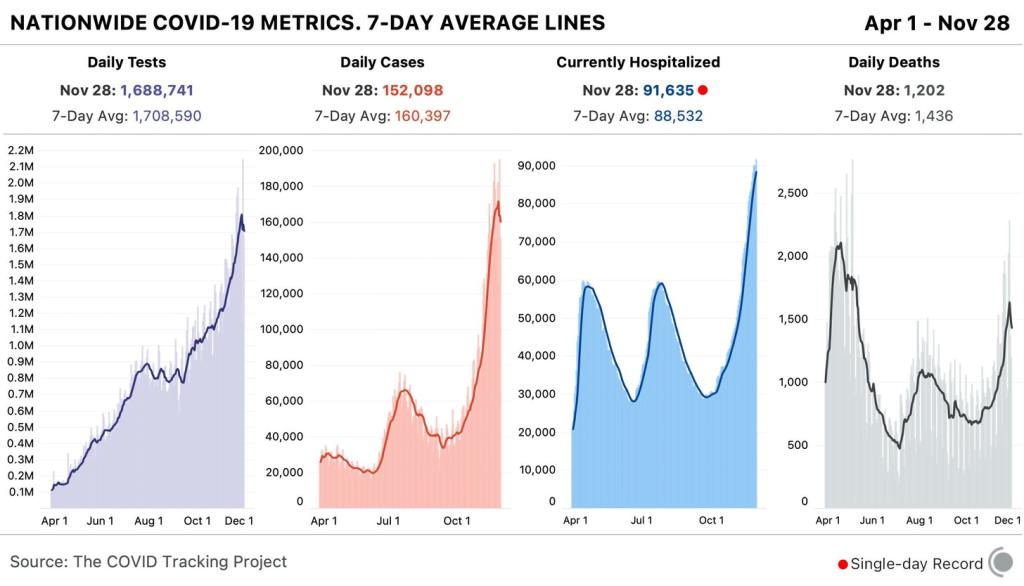
    In the past week (November 22 through 28), the U.S. reported about 1.1 million new cases, according to the COVID Tracking Project. This amounts to:

    • An average of 160,000 new cases each day (4% decrease from the previous week)
    • 343 total new cases for every 100,000 Americans
    • 1 in 292 Americans getting diagnosed with COVID-19 in the past week
    • 9% of the total cases the U.S. reported in the full course of the pandemic
    Chart of tests, cases, current hospitalizations, and deaths nationwide. Current hospitalizations are a single-day record.
    Nationwide COVID-19 metrics published in the COVID Tracking Project’s daily update on November 21. While reported cases have fluctuated due to the Thanksgiving holiday (see below), hospitalizations continue to rise.

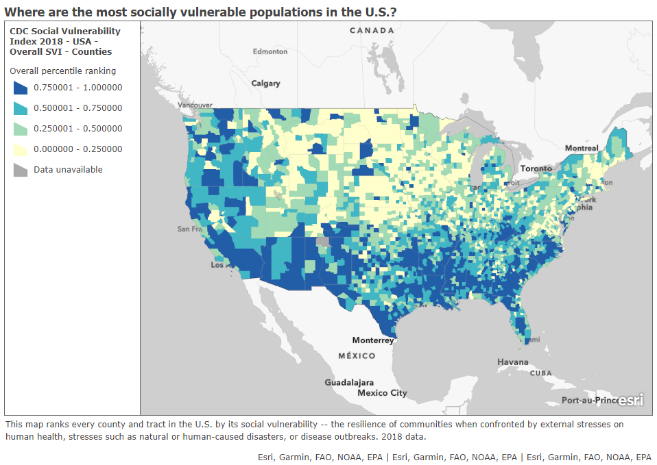
    1 in every 82 Americans has been diagnosed with COVID-19 since the beginning of November. Sit with that number for a minute. Picture 82 people. Imagine one of them getting sick, going to the hospital, having debilitating symptoms for months afterward. That is the weight of this pandemic on America right now.

    The COVID Exit Strategy tracker now categorizes the virus spread in every state except for Maine, Vermont, and Hawaii as “uncontrolled,” and even those three states are “trending poorly.” I know we just finished an exhaustive public health news cycle about Thanksgiving travel, but… I would recommend that you start making your Christmas plans now.

    America also saw:

    • 10,000 new COVID-19 deaths last week (3.1 per 100,000 people)
    • 91,600 people currently hospitalized with the disease, as of yesterday (93% increase from the start of November)

    This week, though, I need to caveat the data pretty heavily. The public health officials who collect and report COVID-19 numbers celebrate holidays just like the rest of us; but when dashboards go dark for a day or two, those data gaps can lead to some weird trends.

    Here’s how COVID Tracking Project lead Erin Kissane explains it, in a recent Project blog post:

    First, by Thanksgiving Day and perhaps as early as Wednesday, all three metrics [tests, cases, and deaths] will flatten out or drop, probably for several days. This decrease will make it look like things are getting better at the national level. Then, in the week following the holiday, our test, case, and death numbers will spike, which will look like a confirmation that Thanksgiving is causing outbreaks to worsen. But neither of these expected movements in the data will necessarily mean anything about the state of the pandemic itself. Holidays, like weekends, cause testing and reporting to go down and then, a few days later, to “catch up.” So the data we see early next week will reflect not only actual increases in cases, test, and deaths, but also the potentially very large backlog from the holiday.

    And indeed, new daily cases dropped from 183,000 on Wednesday to 125,000 on Thursday, rose to 194,000 on Friday, then dropped back to 152,000 on Saturday. Even in the states which still reported new cases, deaths, and tests on Thanksgiving, many testing sites and labs were closed, further contributing to reporting backlogs and discrepancies.

    If you’re watching (or reporting) the numbers in your community, the Project recommends using seven-day averages—for example, rather than just looking at today’s new cases for evidence that the pandemic is slowing, calculate the average of today’s new cases and new cases from the six previous days. Current hospitalization figures and the hospital capacity data reported by the Department of Health and Human Services (HHS) may also be more reliable, as hospitals don’t take days off.

    Finally, I’d like to echo the COVID Tracking Project in thanking the many thousands of people behind these data. There are healthcare workers, lab technicians, public health leaders, and data pipeline IT workers behind every single number that you see in this newsletter. I am grateful for all of their efforts.

  • Who should get the first vaccine doses?

    Who should get the first vaccine doses?

    With this past Monday’s announcement from the University of Oxford and the pharmaceutical company AstraZeneca, three COVID-19 vaccine candidates have now demonstrated clinical trial results which could land them Emergency Use Authorization from the Food & Drug Administration (EUA from the FDA, for short). Pfizer, the first vaccine manufacturer to release its trial results, applied for EUA on November 20. The FDA advisory committee will meet on December 10 to review this application, and vaccines could start shipping out as early as December 12.

    These dates are incredibly exciting—December 12 is only three weeks away. But that first vaccine shipment will likely include 50 million doses, at most. Since two doses are required for a patient to be protected against COVID-19, this means up to 25 million people will be able to get vaccinated. That represents just 7.6% of the country’s population. So, who will get vaccinated first?

    As per usual in America’s fractured pandemic response, the answer to this question will largely depend on state and local public health authorities. Still, national guidances and data on health disparity allow us to see who should get the vaccine first—and evaluate our local public health authorities when the doses start rolling out.

    Earlier this week, the Advisory Committee on Immunization Practices (ACIP) released a report which aims to help local authorities make these decisions. The ACIP is a group of medical and public health experts affiliated with the Centers for Disease Control and Prevention (CDC), which develops recommendations on how vaccines should be used among U.S. residents. The committee has been considering COVID-19 vaccine ethics since April, through a Work Group which conducted literature reviews and presented its findings to the rest of the team.

    The ACIP recommends that four ethical principles guide COVID-19 vaccine distribution:

    1. Maximize benefits and minimize harms. The first people to get vaccinated should be those who, when they are healthy, are better able to protect the health of others in their community. This includes healthcare workers, other essential workers, and people with preexisting health conditions who would likely need to be hospitalized if they became sick with COVID-19.
    2. Promote justice. Americans of all backgrounds and communities should have an equal opportunity to be vaccinated. The ACIP recommends that public health authorities work with external partners and community representatives to help make vaccines available (and attractive) to everyone—both when vaccine supply is limited and when everyone is able to get inoculated.
    3. Mitigate health inequities. People of color, especially Black Americans, Native Americans, and Native Hawaiians/Pacific Islanders, have been disproportionately impacted by COVID-19 in the U.S. The legacy of systemic racism in this nation’s healthcare system and economy, as well as disparities in testing availability and care, have contributed to these inequitable outcomes. Vaccine distribution must directly address such inequities by prioritizing racial and ethnic minorities, low-income communities, rural communities, and other marginalized groups.
    4. Promote transparency. All the decisions that public health authorities make about who gets the vaccine, when, and how must be communicated clearly to the public. Furthermore, communities should be invited to participate in the decision-making process whenever possible. This kind of transparency helps promote trust in both the vaccines and the people who administer them.

    The ACIP’s recommendations are also laid out more practically in two tables at the end of the report. The first table poses essential questions for public health authorities to consider for each ethical principle, while the second applies these principles to four key groups who will be prioritized in the first round of vaccinations: healthcare workers, other essential workers, adults with high-risk medical conditions, and adults over the age of 65.

    Dr. Uché Blackstock, the founder of Advancing Health Equitycritiqued the recommendations on Twitter for failing to specifically call out the role of systemic racism in shaping how COVID-19 has impacted Black communities. Still, these principles are a good start in providing us reporters and community members with a framework for watching how our public health authorities distribute vaccines.

    The federal government will simply be sending vaccine doses to states based on their overall populations rather than taking the ACIP’s recommendations, according to NPR’s Pien Huang. So, it will be entirely up to states and more local public health departments to prioritize justice, equity, and transparency. What tools should public health departments use in order to apply these principles?

    In a webinar last week on vaccine distribution, STAT News reporter Nicholas St. Fleur suggested turning to the CDC’s Social Vulnerability Index. Social vulnerability, as the CDC defines it, measures a community’s ability to recover from events that are hazardous to human health. These events can include tornados, chemical spills, and—of course—pandemics. CDC researchers have calculated the social vulnerability of every Census tract in the U.S. based on 15 social, economic, and environmental factors such as poverty, lack of vehicle access, and crowded housing.

    The most recent update of this index was released in March 2020 based on analysis of 2018 Census data. Here’s what it looks like, mapped by Esri’s Urban Observatory:

    The CDC’s Census tract-level Social Vulnerability Index, as mapped by Esri’s Urban Observatory. Communities colored in dark blue are more vulnerable to hazardous health events.

    Here’s the interactive map, and here’s the CDC page where you can download all the underlying data for this index. I highly recommend zooming in to your state and looking at which areas are ranked most highly—if COVID-19 vaccines are distributed equitably, these are the communities that should get priority.

    St. Fleur also recommends checking out how your state, city, or county defines essential workers, as these distinctions may vary from region to region. In New York, for example, essential workers include teachers, pharmacists, and grocery store workers. In Texas, essential workers include law enforcement and the Texas Forest Service. The Kaiser Family Foundation report which I featured in last week’s issue compiles links to draft COVID-19 vaccination plans for every state, some of which include these definitions.

    I anticipate that vaccine distribution and reporting will continue to be a major topic for this newsletter in the coming months. Questions and topic suggestions are always welcome; you can drop me a line at betsyladyzhets@gmail.com, on Twitter, or in the comments.

  • COVID source shout-out: The CDC

    This past Thursday, the CDC held a media briefing. Normally, this wouldn’t be big news; the agency is expected to alert the press—and by extension, the American public—of major new developments in its work. During the pandemic, however, the very existence of these briefings has become newsworthy.

    The CDC held COVID-19 briefings regularly throughout January, February, and March, then stopped abruptly at the height of the spring outbreak in the Northeast. The next briefing after that was in June, and they’ve been sporadic since. Before Thursday’s call, the previous two briefings were held in late October and mid-August.

    Thursday’s press call highlighted the release of a new CDC guidance, which encourages Americans not to travel for Thanksgiving and provides safety suggestions for those who feel they must travel. Reporters on the call (fairly) questioned why the CDC put out this new guidance now, only a week before the holiday, when many Americans have already made plans. Public health experts, science communicators, and others (including this newsletter) have been calling for reduced Thanksgiving travel for several weeks now.

    Still, the guidance and associated press call indicate that the CDC wants to step up as the nation’s outbreak worsens. Whether the agency can regain public trust remains to be seen.

  • Featured sources, Nov. 22

    These sources, along with all others featured in previous weeks, are included in the COVID-19 Data Dispatch resource list.

    • State COVID-19 vaccine plans: A new report from the Kaiser Family Foundation explores how state public health departments are planning to distribute COVID-19 vaccines once they become available. The report includes common themes and concerns across all 50 state plans, as well as links to the plans themselves. One insight that stuck out to me: “Just over half (25 of 47, or 53% ) of state plans report having immunization registries/database systems in place that are described as being (at least fairly) comprehensive and reliable; in the other state plans that information is unclear.”
    • COVID-19 Testing Communications Toolkit: The Brown School of Public Health has compiled a resource to help public health communicators encourage COVID-19 testing. The toolkit includes evidence-based tutorials, handouts, and an image library, all of which are free for public use.
    • COVID-19 and Impacted Communities: A Media Communications Guide: This is another communications tool from the New York COVID-19 Working Group. The guide includes best practices for explaining key terms, advice on framing stories, and how to avoid stereotypical narratives about minority communities.
    • SARS-CoV-2 and COVID-19 Data Hub: Erin Sanders, a nurse practitioner and contact tracer, has compiled a list of data sources on the novel coronavirus. The list includes clinical data, transmission data, and genomic data, among other medical and epidemiological topics.
  • Racism is a public health threat

    This week, the American Medical Association (AMA) announced that the association recognizes racism as a public health threat. The association is adopting a new policy which acknowledges systemic racism, cultural racism, and interpersonal racism as barriers to healthcare for many Americans and as threats to equitable public health across the country. Although the policy does not specifically address COVID-19, it speaks to the impact that America’s racist history and healthcare system has had in making it more likely for Black Americans to become infected with the coronavirus and suffer worse health outcomes.

    “The AMA recognizes that racism negatively impacts and exacerbates health inequities among historically marginalized communities. Without systemic and structural-level change, health inequities will continue to exist, and the overall health of the nation will suffer,” said AMA Board Member Willarda V. Edwards, M.D., M.B.A.

    I highlighted this decision because, in order to address a public health threat, the threat must be tracked with good, complete data. In the several months I’ve worked on the COVID Racial Data Tracker, I have seen how public health agencies often push demographic data on COVID-19 into inaccessible charts or hard-to-find reports, or do not even report these data at all. In other words, it may be difficult for many people of color in the U.S. to find crucial information on how the pandemic is impacting their communities.

    Many states have greatly increased their demographic reporting on COVID-19 cases, deaths, and other metrics since the spring, and states have supported initiatives to serve minority communities. But there is still a lot of room for improvement. The AMA’s decision signals that the medical community is committed to dismantling the threat racism poses to American public health. Journalists, science communicators, and other community leaders must join in that work.

    If you’d like to advocate for better demographic data in your state: you can see the disparities using the COVID Racial Data Tracker’s Infection and Mortality charts, and you can reach out to your state’s leadership with a custom contact form.

  • Federal data updates, Nov. 22

    America’s federal public health agencies are busy in the lead-up to Thanksgiving, as are the researchers and volunteer networks filling those agencies’ information gaps. Here are three major updates:

    • CDC’s COVID Data Tracker now reports more county-level data: Since it was first published in the spring, the CDC’s COVID-19 data dashboard has included cases and deaths by U.S. county, relying upon data compiled by USA Facts and verified by the agency. As of yesterday, the county dashboard now also reports total PCR tests and test positivity. Testing data have previously been available directly from the HHS (state-level) and the Center for Medicare & Medicaid Services (county-level), but the CDC dashboard is far more accessible. Users can select a specific county and see a variety of trends in cases, tests, and deaths. The data from this dashboard aren’t yet available for download; I’ll report back if this changes.
    • Pharmacies will be able to distribute COVID-19 vaccinesLast week, the HHS announced that the agency has set up partnerships with both national pharmacy chains and networks representing smaller pharmacies in order to broadly distribute COVID-19 vaccines as they become available. (Pfizer applied for Emergency Use Authorization this past Friday.) According to the HHS, these partnerships cover “approximately 60 percent of pharmacies throughout the 50 states, the District of Columbia, Puerto Rico, and the U.S. Virgin Islands.” The press release does not mention how these pharmacies will be plugged into their respective state vaccine registries.
    • How state COVID-19 dashboards are faringAlthough many states are reporting more COVID-19 data than they were last spring, their dashboards are overall still not conveying some key metrics, according to a new report from Resolve to Save Lives. This research group, a nongovernmental initiative run by the global health organization Vital Strategies, first reviewed state dashboards in July. (See my first issue for more details.) The new report—along with an interactive map—reflects improvements that states have made since the summer while highlighting what crucial public health information is still missing. Case investigation and contact tracing are two key areas where “data… remained largely unavailable.”
  • HHS releases data on new admissions, staffing shortages

    HHS releases data on new admissions, staffing shortages

    How many people in the U.S. are currently hospitalized with COVID-19? As of yesterday, 83,200.

    This question calls attention to the people deeply impacted by the pandemic—people in hospital beds, on ventilators, struggling to breathe. But it is also a deeply practical question. Public health experts and policymakers need to know where hospitals are becoming overwhelmed with patients in order to distribute supplies where they are most needed. Researchers and data nerds like myself, meanwhile, can use hospitalization metrics to track the pandemic’s impact on different communities: reported cases may be an unreliable metric, challenged by inadequate testing and uneven reporting guidelines, but it’s hard to miss a person in the hospital.

    Longtime readers may remember that this newsletter started because of hospitalization data. Back in July, when hospitalization data moved from the purview of the CDC to the HHS, I wanted to explain why these data are so important and how the change in control impacted the numbers themselves. In the months since, the HHS has increased both the number of hospitals reporting to its system and the volume of information that is publicly released about those hospitals.

    I’m returning to the topic now because the HHS has made two major upgrades to its hospitalization dataset in the past week: it now includes new admissions and staffing shortages for every state. The metrics are only available at the state level; I’m hoping that county- and even individual hospital-level numbers may be released in the coming weeks.

    New admissions are a useful metric because they provide a clear picture of where outbreaks are worsening, and by what degree. Patients may stay in the hospital (and be counted in a “current hospitalizations” figure) for weeks on end; isolating the number of new patients incoming allows public health researchers to see how the burden on hospitals is growing.

    Across the U.S., over 10,000 patients with confirmed cases of COVID-19 are now being admitted each day.

    New COVID-19 admissions rose from about 6,000 per day in late October to over 10,000 per day in mid-November. Full-size chart available here.

    Staffing shortages, meanwhile, are a useful metric because they demonstrate where in the country healthcare systems are hardest hit. The HHS specifically asks hospitals to report when their staffing shortages are critical, meaning that these facilities are in serious danger of being unable to operate as normal. Staffing shortages may be the result of healthcare workers feeling burnt out, quitting, or becoming sick with COVID-19 themselves.

    As of November 19, the most recent date these data are available, 18% of hospitals are currently facing a critical shortage—that’s about 1,100 out of the 6,100 hospitals reporting. 200 more hospitals report that they will be facing a critical shortage in the next week.

    In North Dakota, Wisconsin, Missouri, and New Mexico, over one third of hospitals are facing a critical staffing shortage. Full-size chart available here.

    Finally, here’s a look at the nation’s current hospital capacity—that is, how many hospital beds are currently occupied with sick people. As of November 19, about 600,000 of the nation’s 980,000 hospital beds are full (61%). 88,000 of those people have been diagnosed with COVID-19 (9%). These numbers will grow in the coming weeks as thousands of recently diagnosed Americans become sicker.

    Across the Midwest and South, several states have over three quarters of hospital beds occupied. Full-size chart available here.

    For more context on these hospitalization data and what they mean for the exhausted, terrified healthcare workers serving patients, check out:

  • National numbers, Nov. 22

    National numbers, Nov. 22

    In the past week (November 15 through 21), the U.S. reported about 1.2 million new cases, according to the COVID Tracking Project. This amounts to:

    • An average of 167,000 new cases each day (19% increase from the previous week)
    • 358 total new cases for every 100,000 Americans
    • 1 in 279 Americans getting diagnosed with COVID-19 in the past week
    • 10% of the total cases the U.S. reported in the full course of the pandemic
    Nationwide COVID-19 metrics published in the COVID Tracking Project’s daily update on November 21. The new cases seven-day average has doubled since the beginning of November.

    1 in every 114 Americans has been diagnosed with COVID-19 since the beginning of November, and cases aren’t slowing anywhere in the nation. The COVID Exit Strategy tracker categorizes the spread in every state except for Maine and Hawaii as “uncontrolled”; even Vermont, praised by public health experts for its mitigation efforts, is now seeing record numbers.

    America also saw:

    • 10,100 new COVID-19 deaths last week (3.1 per 100,000 people)
    • 83,200 people currently hospitalized with the disease, as of yesterday (20% increase from the previous week; 76% increase from the start of November)

    To see how your community is faring, check the COVID-19 Risk Levels Dashboard for state- and county-level insights.

  • Featured sources, Nov. 15

    These sources, along with all others featured in previous weeks, are included in the COVID-19 Data Dispatch resource list.

  • Our favorite COVID-19 sources

    Last week, I asked readers to share their go-to sources for COVID-19 data about their community. Thank you to everyone who responded! I am always on the lookout for great sources myself, so I appreciated seeing what folks are using.

    Here are a couple of responses that I wanted to highlight:

    • The New York Times cases map: Two readers noted that they liked the NYT dashboard, which makes it easy to compare COVID-19 metrics in different parts of the country. The NYT offers data at the county level and provides annotations and context with much more detail than most government sources.
    • City and county sites: Seven readers said that they regularly check their county or city dashboards for local information. One reader complimented the City of Chicago dashboard as “consistently updated with official data, easy to use.”
    • Social media: Readers referred to Twitter links to articles shared by both national and local journalists. One reader praised daily COVID-19 update posts shared on a local Boston subreddit: “The posts take publicly available Massachusetts health data and synthesize them in a way I’ve gotten very used to. This is the source I depend on when I tell people that COVID hasn’t been getting better in Massachusetts since June.”
    • The Glastonbury Town Manager weekly email: My mom’s favorite source is the email newsletter sent by the local administration in my hometown, Glastonbury, Connecticut. This email—which I’ve highlighted in the newsletter before—includes data for the town, updates for the state, and public service announcements.
    • New York Governor Cuomo’s daily updates: You have to hand it to him: no other local leader is using PowerPoint quite like Cuomo. Also, nobody else built a literal model of his state’s COVID-19 case curve.