Author: Betsy Ladyzhets

  • 15 states are reporting COVID-19 vaccination data—federal government lags behind

    15 states are reporting COVID-19 vaccination data—federal government lags behind

    !function(){“use strict”;window.addEventListener(“message”,(function(a){if(void 0!==a.data[“datawrapper-height”])for(var e in a.data[“datawrapper-height”]){var t=document.getElementById(“datawrapper-chart-“+e)||document.querySelector(“iframe[src*=’”+e+”‘]”);t&&(t.style.height=a.data[“datawrapper-height”][e]+”px”)}}))}();

    Back in September, I read the Interim COVID-19 Vaccination Playbook released by the Centers for Disease Control and Prevention—the first national plan for how vaccination was supposed to proceed. Here’s an excerpt from my newsletter issue covering this playbook:

    Once COVID-19 vaccination begins, the CDC will report national vaccination data on a dashboard similar to the agency’s existing flu vaccination dashboard. According to the playbook, this dashboard will include estimates of the critical populations that will be prioritized for vaccination, locations of CDC-approved vaccine providers and their available supplies, and counts of how many vaccines have been administered.

    This past week, the first COVID-19 vaccine doses were administered to frontline healthcare workers across the country. The FDA issued Emergency Use Authorization to a second vaccine. But I haven’t seen a vaccination dashboard from the CDC; the closest we’ve come so far is a dataset listing initial allocations of Pfizer doses for every state. This federal agency is lagging behind several states that are making their vaccination counts public, as well as journalists who have already begun to compile the limited information that’s available.

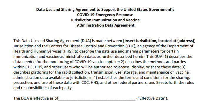
    Here’s how the reporting of vaccination data is supposed to work. When someone goes in to get their COVID-19 shot, the provider of that shot will enter their name and other personal information to a state registry called an Immunization Information System, or IIS. Vaccine providers that issue shots and send data may include hospitals, clinics, pharmacies, pop-up vaccination sites, and any other institution that is giving shots.

    Most states and several large cities, like New York City, have these immunization registries; New Hampshire is still getting its registry ready to track COVID-19 vaccines. The registries stay private, with data only available for the people who ship, administer, and manage vaccines. A data system called the IZ gateway will help different state immunization systems link up with each other and with the CDC, which has asked all states to formally agree to share their data with this federal agency. (The CDC has asked states to share a pretty extensive list of data points for each vaccine patient, including names and addresses, which some states are not willing to send.)

    The CDC has also developed a system to help vaccine providers manage supplies and patients, a public-facing website that will help Americans see where they can get vaccinated, and a new software that will pull all vaccine-related information into one place for Operation Warp Speed officials to use. Finally, an HHS data system called the Vaccine Adverse Event Reporting System will collect information on patient reactions to the vaccines, such as headaches and fatigue—both of which are expected reactions to the Pfizer and Moderna vaccines.

    For more detail on these data systems, see this article by USA TODAY’s Aleszu Bajak and Janet Loehrke, which I drew upon to write this part of the newsletter.

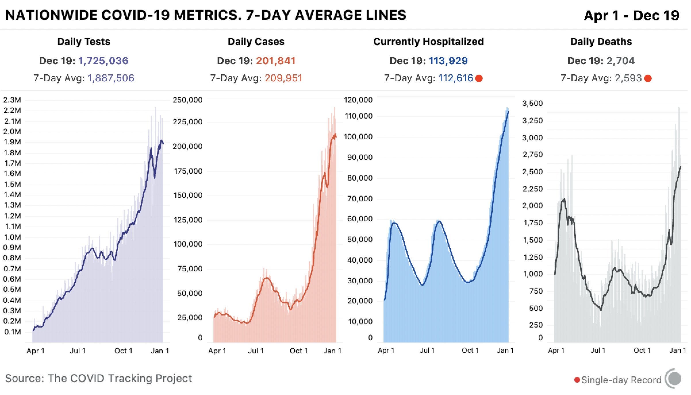
    Theoretically, the CDC should have precise counts of how many people have received vaccine doses in every state, as well as personal identifying information for all of those people. So far, however, it appears that many states are beginning to make these data public, while the federal government has yet to release national numbers.

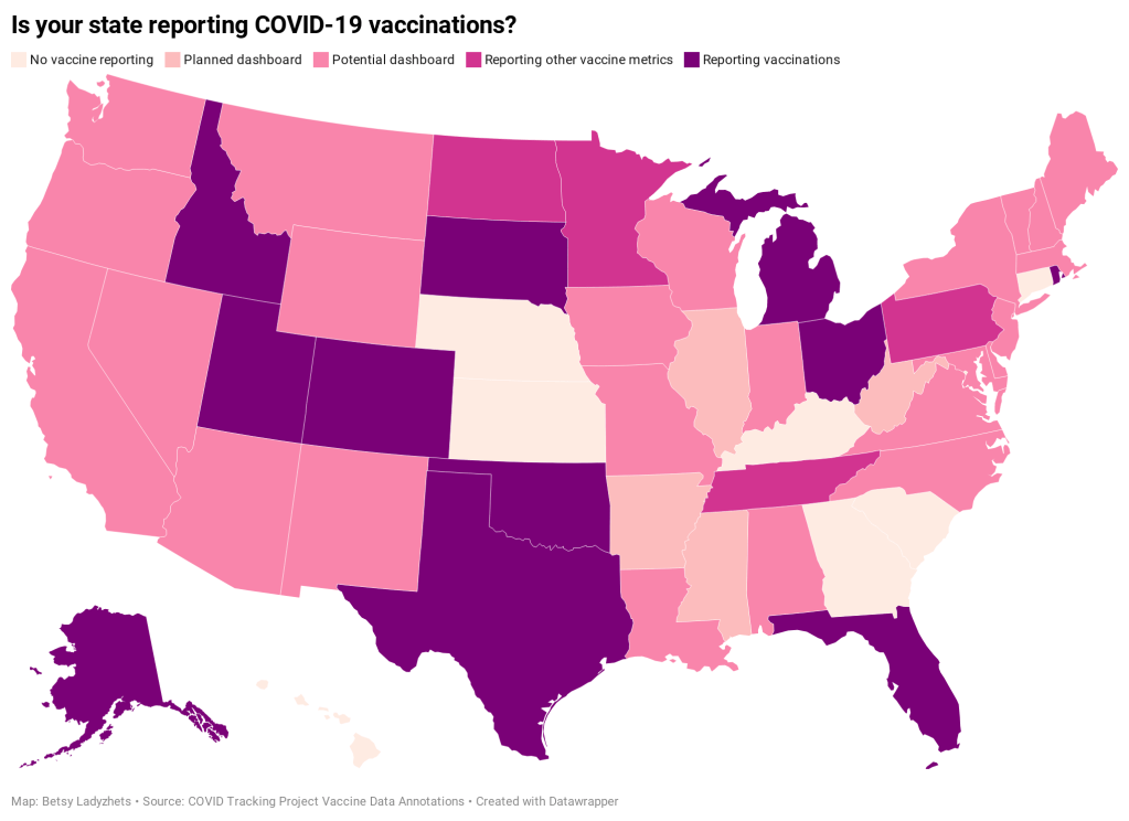
    According to ongoing analysis by the COVID Tracking Project, 15 states are reporting some form of vaccination data as of December 19. Here’s the breakdown:

    • Five states have added a count of vaccine doses administered as a single metric on their dashboards: Alaska, Colorado, Idaho, Oklahoma, and Rhode Island.
    • Two states have added vaccination-specific pages to their dashboards: South Dakota and Utah.
    • Three states have built entirely new dashboards for vaccination: Michigan, Ohio, and Texas.
    • Florida is releasing daily vaccination reports.
    • Four states are reporting vaccine-related metrics (such as counts of approved providers and doses delivered) that don’t yet include actual counts of the doses administered: Minnesota, Pennsylvania, North Dakota, and Tennessee.
    • Five states are reporting some form of demographic data: Michigan reports vaccinations by age; Texas reports by county; Utah reports by local health jurisdiction; Ohio reports by age and county; South Dakota reports by age, gender, and county; and Florida reports by race, age, gender, and county.

    For links to all of these states’ dashboards and reports, see the COVID Tracking Project’s annotations.

    Florida is the only state to report vaccination counts broken down by race so far, though the state has not yet reported such counts for different ethnicities. Public health experts have widely agreed that people of color—especially Black Americans, Native Americans, and Hispanic/Latino Americans—should be prioritized in COVID-19 vaccination because these communities have been disproportionately impacted by the pandemic. But without knowing vaccination rates in these vulnerable communities, it will be impossible to determine whether they are receiving the medical treatment they deserve.

    A recent article by ProPublica’s Caroline Chen, Ryan Gabrielson, and Topher Sanders calls attention to the lack of standardization that currently exists for state collection of race and ethnicity data:

    In state vaccination registries, race and ethnicity fields are simply considered “nice to have,” explained Mitchel Rothholz, chief of governance and state affiliates for the American Pharmacists Association. While other fields are mandatory, such as the patient’s contact information and date of birth, leaving race and ethnicity blank “won’t keep a provider from submitting the data if they don’t have it.”

    In other words, if a Black woman gets the Moderna vaccine at a Walgreens in Brooklyn, she could feel uncomfortable disclosing her race on the pharmacy’s form—and little action would be taken to explain to her why such disclosure is important and how her information would be used. The “race” checkbox on her form would be left blank. She would likely go uncounted by researchers and journalists trying to hold the government accountable to its promises of equity.

    The federal government should be both more rigorous in requiring race and ethnicity data and more transparent in disclosing these data—but I’d take a simple, national count of how many people in America have received COVID-19 shots to start. Recent data releases from the HHS have made me pretty optimistic about the federal public health agency’s ability to be transparent (see: the next two sections of this issue.) But the lack of a federal dataset so far means that key COVID-19 information is once again scattered.

    In a Poynter webinar last week, Al Thompkins asked a panel of top infectious disease experts—including scientists on both the FDA’s and the CDC’s vaccine advisory panels—a simple question: Will the public be able to see counts of how many people are getting vaccinated? None of those experts had a clear answer. There may be a dashboard in the works behind the scenes of which the panelists hadn’t been informed, but their responses still did not inspire confidence.

    Of course, journalists are once again stepping in to cobble together vaccination counts from all the public sources they can find. Bloomberg has counted 211,000 Pfizer doses in the U.S., as of December 19, by compiling numbers from state websites, press conferences, and interviews. The New York Times has surveyed state public health departments. Benjy Renton continues to update a Tableau dashboard that compares planned Pfizer and Moderna shipments to state populations.

    And the Kaiser Family Foundation released its COVID-19 Vaccine Monitor, an ongoing project to track public perception of and experiences with vaccination. The latest survey from this monitor shows that 71% of Americans would “definitely or probably” get a vaccine for COVID-19 if it was determined to be safe and freely available.

    This week, as I’ve seen the vaccination numbers—and the photos of frontline healthcare workers getting these well-deserved shots—I’ve felt something strange. Something hopeful. For the first time since March, I’m looking at numbers that I actually want to see go up. Now, if we could just get more comprehensive numbers, and get them more standardized, and get them reported with a priority on racial justice…

  • National numbers, Dec. 20

    National numbers, Dec. 20

    In the past week (December 13 through 19), the U.S. reported about 1.5 million new cases, according to the COVID Tracking Project. This amounts to:

    • An average of 211,000 new cases each day
    • 451 total new cases for every 100,000 Americans
    • 1 in 222 Americans getting diagnosed with COVID-19 in the past week
    • 39% of the total cases reported across the globe this week, according to the World Health Organization
    4 bar charts showing key COVID-19 metrics for the US over time from April 1 to December 19. Today, states reported 1.7M tests, 202k cases, 113,929 currently hospitalized, and 2,704 deaths.
    Nationwide COVID-19 metrics published in the COVID Tracking Project’s daily update on December 19. Seven-day averages for hospitalizations and deaths are at all-time highs.

    Cases appear to be slowing nationwide, the Project’s weekly update reports—but the trend should be interpreted with caution, as many cases reported last week were delayed by the Thanksgiving holiday. And national counts obscure regional patterns: while the Midwest may have finally passed its peak of new cases, the Northeast, South, and West are all facing still-rising outbreaks. California alone reported 287,000 cases this week, and the state’s hospitals are already full.

    Last week, America also saw:

    • 114,000 people now hospitalized with COVID-19 (35 for every 100,000 people)
    • 18,300 new COVID-19 deaths (5.6 for every 100,000 people)

    The nation continues to pass its own record for deaths reported in a single week. COVID-19 is, unambiguously, the leading cause of death in the U.S. right now.

  • COVID source shout-out: FDA’s techies

    I watched a pretty significant quantity of the FDA’s vaccine advisory committee (or VRBPAC) meeting on Thursday. The meeting lasted nearly nine hours, from 9 AM to about 5:40 PM Eastern, and was plagued by top infectious disease experts who simply could not turn on their microphones.

    It was a typical Zoom meeting with a few older colleagues. But it was also a critically important meeting to discuss the safety of a novel biological product that might save thousands of lives. That’s why, this week, I am paying homage to the FDA tech people behind the scenes who needed to turn on and off those microphones, share those slides, and generally get all the VRBPAC information where it needed to go. As far as I could tell, they kept the meeting running smoothly without seriously angering any of the esteemed committee members. No small achievement!

    Also, the meeting had banger hold music during the breaks. (Disclaimer: I am a 23-year-old white girl who listens to indie instrumentals and the “How to Train Your Dragon” soundtrack while working. You might want to take my categorization of banger hold music with a grain of salt.)

    If you want to read actual, serious coverage of the VRBPAC meeting, STAT News kept a thorough liveblog.

  • Featured sources, Dec. 13

    These sources, along with all others featured in previous weeks, are included in the COVID-19 Data Dispatch resource list.

    • National report from the White House Coronavirus Task Force: The Center for Public Integrity, a nonprofit newsroom focused on investigations of democracy, has been periodically releasing reports of COVID-19 statistics intended for internal use by the White House Coronavirus Task Force and state governors. Reporters at the Center are often only able to obtain state-level reports, but last week, they released a national report including summary data and recommendations for all 50 states. The report is dated November 29.
    • Searchable database of PPP loans: On December 1, the Small Business Administration released extensive data on loans issued through the Paycheck Protection Program (PPP), including specific loan amounts and company names. Accountable.US, a nonpartisan watchdog group, has made this information available in an easy-to-navigate database. You can search for a specific business or filter by different geographic regions and industries.
    • Searchable database of federal COVID-19 purchases: Since March, ProPublica has tracked where federal government spending on the pandemic is going. The database represents $28 billion, 14,209 government contracts, and 6,832 individual vendors. Data can be sorted by spending categories, vendor types, and contract sizes.
    • COVID-19 Global Travel Restrictions and Airline Information: The Humanitarian Data Exchange is an international repository run by the United Nations Office for the Coordination of Humanitarian Affairs. One of the repository’s COVID-19 datasets displays travel restrictions and airline restrictions for nearly 300 jurisdictions, updated every day.
  • Federal data updates, Dec. 13

    Rounding out the week with a couple of updates on federal data, unrelated to hospitalizations and vaccines.

    • New app for testing data: The Centers for Disease Control & Prevention (CDC) have developed an app called SimpleReport, which allows COVID-19 test providers to quickly report data to their local public health departments. An assisted living center in Tucson, Arizona was the first to pilot the app this week. The center’s Community Director said this app helped her quickly file data that would otherwise need to be entered in three different places.
    • CMS proposes that providers build standard databases: This past Thursday, the Centers for Medicare & Medicaid Services (CMS) announced a new rule to streamline data sharing between the agency and individual healthcare providers. Under this rule, providers would need to build application programming interfaces, or APIs. APIs are essentially data-sharing systems that provide a standardized format for information. Such standardization, CMS claims, would make it easier for patients to get medical treatments and prescriptions authorized by Medicaid.
    • Bill to make federal court filings free passes the House: PACER, or Public Access to Court Electronic Records, is an antiquated federal database of court filings which journalists and other researchers must pay to use. It costs 10 cents a page to access court dockets and other documents through PACER—and since court documents can get long, that cost adds up. The Open Courts Act, a bill which would make PACER free to the public, passed in the House of Representatives this past week. It now heads to the Senate. This bill may not be directly COVID-related right now, but I anticipate that journalists will be covering COVID-19 lawsuits for years after the pandemic ends.
  • Florida data scientist faces police break-in

    Florida data scientist faces police break-in

    In May, Rebekah Jones was fired from the Florida Department of Health. As a specialist in geographic information systems (GIS), she worked on the department’s COVID-19 dashboard; she claims that she was fired because she refused to manipulate data to look like Florida was in a better spot for reopening. After her firing, Jones started her own, independent Florida dashboard which includes more open information and methodology details. She also started the COVID Monitor, a school data tracking project which I have cited in previous newsletters.

    This past Monday, Florida state police raided Jones’ home. They seized her computer, which she had been using to update her Florida state and school data dashboards. They also pointed guns at her and her children.

    The Florida Department of Law Enforcement issued a search warrant against Jones, who is suspected of hacking into the state Emergency Response Team’s communications and sending an unauthorized message. Jones has stated that she believes this action was actually an attempt to silence her. She has been a vocal critic of Florida Governor Ron DeSantis and his mishandling of the pandemic in her state, as well as of school reopenings across the country.

    Whether the police raid was due to legitimate hacking concerns or political motivation, there should be no excuse for this type of violence:

    Thanks to this tweet—which quickly went viral—the raid against Jones became a national story. She’s appeared on several news networks and garnered sympathy from science communication leaders. Ron Filipkowski, a Florida attorney who was a longtime member of a committee to appoint judges in the state, resigned from his post in protest of this raid.

    The nation watched this spring and summer as journalists faced police violence while covering Black Lives Matter protests. Journalists were tear-gassed, shoved, and arrested, but continued to do their jobs. Like many of those journalists, Jones is dedicated to her data and her view of public accountability. Both of her dashboards have continued to update since Monday.

  • Vaccines are shipping out, but is the U.S. ready to track them?

    Vaccines are shipping out, but is the U.S. ready to track them?

    This past Friday, the Food & Drug Administration (FDA) officially issued Emergency Use Authorization for America’s first COVID-19 vaccine. This is a monumental achievement. One year ago, no Americans had even heard of the novel coronavirus; now, the federal government is beginning to ship out vaccine doses for our frontline healthcare workers.

    But as excitement builds, so do concerns about the nation’s capacity to deploy vaccine doses to all who need them. The Atlantic’s Sarah Zhang wrote this week that we are entering a phase of “vaccine purgatory,” in which a myriad of challenges could delay the country’s path to herd immunity. Already, four states are claiming that they will be unable to start administering vaccinations until January, while several other states have deferred the decision about who gets a shot first to healthcare providers. While the CDC has issued guidances, many logistics are left up to states—the same type of fractured system which has prevented America from getting its testing under control.

    True to my beat, I am most concerned about vaccine data. Earlier this week, the New York Times’s Sheryl Gay Stolberg reported that some states are refusing to report vaccination data to the CDC.

    Historically, each state has tracked vaccinations independently, through Immunization Information Systems (or IIS). While the CDC does report some national immunization information, such as its flu vaccination dashboard, this information typically comes from outside surveys and is not reported in real-time. Of course, this won’t do for COVID-19. To build up a national system, the CDC has asked every state to sign a Data Use and Sharing Agreement promising to send vaccination counts and associated demographic data to the CDC.

    It seems simple, right? But according to Stolberg’s reporting, the CDC has asked states to send personal information—such as names, birth dates, ethnicities, and home addresses—for each vaccine recipient. While demographic information should be tracked for COVID-19 vaccines in order to monitor equity in distribution, there is no need for the CDC to collect such specific information as names or home addresses. In fact, such a practice both discourages people from getting vaccinated and discourages states from cooperating with the federal public health agency.

    Stolberg quotes an official from Minnesota who is concerned about privacy:

    In Minnesota, officials are refusing to report any identifying details to the C.D.C., but they will submit “de-identified doses-administered data” on a daily basis once the vaccine campaigns begin.

    “This is a new activity for us, as we don’t typically report this level of detail on this frequency to the federal government,” Doug Schultz, a spokesman for the Minnesota Department of Health, said in an email. He added, “We will not be reporting name, ZIP code, race, ethnicity or address.”

    States which refuse to send personal data to the federal government may still report anonymous demographic information, such as the races and ethnicities of individuals who get vaccinated, on state-level dashboards. But it seems increasingly likely that vaccination data will face the same challenges as testing data: with every state deciding on a different reporting practice, it could be difficult to standardize and answer basic questions at the national level.

    Other vaccine data news and resources from this week:

  • National numbers, Dec. 13

    National numbers, Dec. 13

    In the past week (December 6 through 12), the U.S. reported about 1.6 million new cases, according to the COVID Tracking Project. This amounts to:

    • An average of 228,000 new cases each day (23% increase from the previous week)
    • 487 total new cases for every 100,000 Americans
    • 1 in 205 Americans getting diagnosed with COVID-19 in the past week
    • 44% of the total cases reported across the globe this week, according to the World Health Organization
    4 bar charts showing key COVID-19 metrics for the US over time. Today, states reported 1.9M tests, 223k cases, 108,487 currently hospitalized (record), and 2,477 deaths.
    Nationwide COVID-19 metrics published in the COVID Tracking Project’s daily update on December 12. Seven-day averages for cases, deaths, and hospitalizations are all at all-time highs.

    In the month of November, one in 74 Americans was diagnosed with COVID-19. This terrible rise in cases has already put enormous strain on the nation’s healthcare system, and the outbreak is not slowing down. One in 131 Americans was diagnosed with COVID-19 in the first 12 days of December alone.

    Last week, America also saw:

    • 108,500 people now hospitalized with COVID-19 (33.1 for every 100,000 people)
    • 17,300 new COVID-19 deaths (5.3 for every 100,000 people)

    In last Sunday’s issue, I reported that 15,000 deaths in one week marked a national record; this week, we saw 2,000 more. How do you think about numbers this big? You could compare the pandemic to 9/11, Pearl Harbor, and other American tragedies, but even this practice minimizes the fact that a day of 3,000 deaths is only one day in a year of mass suffering.

    Stay safe out there, readers. Stay well. Stay kind.

  • COVID-19 data for your local hospital

    COVID-19 data for your local hospital

    var divElement = document.getElementById(‘viz1608004219965’); var vizElement = divElement.getElementsByTagName(‘object’)[0]; if ( divElement.offsetWidth > 800 ) { vizElement.style.width=’100%’;vizElement.style.height=(divElement.offsetWidth*0.75)+’px’;} else if ( divElement.offsetWidth > 500 ) { vizElement.style.width=’100%’;vizElement.style.height=(divElement.offsetWidth*0.75)+’px’;} else { vizElement.style.width=’100%’;vizElement.style.height=’650px’;} var scriptElement = document.createElement(‘script’); scriptElement.src = ‘https://public.tableau.com/javascripts/api/viz_v1.js’; vizElement.parentNode.insertBefore(scriptElement, vizElement);

    When the Department of Health and Human Services (HHS) started reporting hospitalization data at the state level back in July, I wistfully told a friend that I wished the agency would report facility-level numbers. Another federal agency had recently started reporting this type of data for nursing homes, and I appreciated the flexibility and granularity with which I was able to analyze how the pandemic was impacting nursing home patients and staff. I wanted to see the pandemic’s impact on hospitals in the same way.

    At the time, I considered this a pipe dream. The HHS was already facing major challenges: implementing a new data pipeline across the country, navigating bureaucratic issues with state public health departments, and working with individual hospitals to help them report more accurately and more often. Plus, transparency issues and political scandals plagued the agency. Making more data public seemed to be the least of its priorities.

    But I’m happy to say that this week, my pipe dream came true. On Monday, the HHS published a new hospitalization dataset including capacity, new admissions, and other COVID-19-related numbers—for over 4,000 individual facilities across America.

    This is, as I put it in a COVID Tracking Project blog post analyzing the dataset, a big deal. Project lead Alexis Madrigal called it “probably the single most important data release that we’ve seen from the Federal government.” I, in somewhat less professional terms, texted my girlfriend:

    Please appreciate the level of self-control it took for me to not actually title this issue “HHS queen shit.”

    Let me explain why this new dataset is so exciting—not just for a nerd like me, but for any American following the pandemic. I’m drawing on a COVID Tracking Project blog post unpacking the dataset, to which I contributed some explanatory copy.

    • Hyperlocal data: At a time when hospitals are overwhelmed across the nation, it is incredibly useful to see precisely which hospitals are the worst off and how COVID-19 is impacting them. Data scientists can pinpoint specific patterns and connections between regions. National aid groups can determine where to send PPE and other supplies. Journalists can see which hospitals should be the focus of local stories. The stories that can be told with this dataset are endless.
    • Aggregating to different geographies: The individual facility is the most detailed possible level of reporting for COVID-19 hospitalizations. But this HHS dataset also includes the state, county, and ZIP code for each hospital, along with unique codes that identify hospitals in the Medicare and Medicaid system. The data for specific facilities can thus be combined to make comparisons on a variety of geographic levels. I tried out a county-level visualization, for example; some counties are not represented, but you can still see a much more granular picture of hospital capacity than you would in a state-level map.
    • Time series back to August: HHS didn’t just provide data on how hospitals are coping with COVID-19 right now. They provided a full time series going back to the first week of August, with data starting shortly after the HHS began collecting information from hospitals. These historical data allow researchers to make more detailed comparisons between the nation’s last major COVID-19 peak and our current outbreak. There are some reporting errors from hospitals in the early weeks of the dataset; COVID Tracking Project analysis has shown that these errors become less significant in the week of August 28.
    • Includes coverage details: The dataset includes fields that can help researchers check the quality of an individual hospital’s reporting. These fields, called “coverage” numbers, show the number of days in a given week on which data were reported. A value of six for total_adult_patients_hospitalized_confirmed_and_suspected_covid_7_day_coverage, for example, indicates that this hospital reported how many adult COVID-19 patients it was treating on six of seven days in the past week. Many hospitals are now reporting all major metrics on six or seven days a week—HHS has really stepped up to encourage this level of reporting in recent months. For more information on hospital reporting coverage, see HHS Protect.
    • Admissions broken out by age: The HHS began reporting hospital COVID-19 admissions, or new COVID-19 patients entering the hospital, at the state level in November. The new dataset includes this information, at the facility level, for every week going back until August, and breaks out those new patients by age group. You can see exactly who is coming to the hospital with COVID-19 in age brackets of 18-19, ten-year ranges from 20 to 79, and 80+. Several other metrics in the dataset are also broken out by adult and children patients.
    • New fields: This dataset reports counts of emergency department visits, including both total visits for any reason and visits specifically related to COVID-19. (The HHS data dictionary defines this as “meets suspected or confirmed definition or presents for COVID diagnostic testing.”) These figures allow researchers to calculate the share of emergency department visits at a given hospital that are COVID-related, a new metric that wasn’t available from previous HHS reporting.
    • Signifies major effort from the HHS: When it comes to reporting hospitalization data, this agency has come a long way from the errors and transparency questions of the summer. Last week, the COVID Tracking Project published an analysis finding that HHS counts of COVID-19 patients are now in close proximity to similar counts reported by state public health departments—signifying that the federal data may be a useful, reliable complement to state data. (I discussed this analysis in last week’s issue.) The new facility-level dataset indicates that HHS data scientists understand the needs of COVID-19 researchers and communicators, and are working to make important data public. I will continue to carefully watch this agency, as will many of my fellow reporters. But I can’t deny that this data release was a major step for transparency and trust.

    To get started with this dataset, you can zoom in to look at your community on this Tableau dashboard I made, visualizing the most recent week of data. (That most recent week of data reflects November 27 through December 3. As the dataset was first published last Monday, December 7, I’m anticipating an update tomorrow.)

    Or, if you’d like to see more technical details on how to use the dataset, check out this community FAQ page created by data journalists and researchers at Careset Systems, the University of Minnesota, COVID Exit Strategy, and others.

    Finally, for more exploration of the research possibilities I outlined above, you can read the COVID Tracking Project’s analysis. The post includes some pretty striking comparisons from summer outbreaks to now.

  • COVID source callout: Wyoming

    COVID source callout: Wyoming

    Look, I like Wyoming’s COVID-19 dashboard. I like that it’s not actually one dashboard, but five dashboards—one for cases, one for deaths, one for tests, one for hospitals, one for county-level data—each of which has its own update schedule. I like that I need to hover over bars and download crosstabs in order to obtain precise figures. I like that sometimes the percentages add up to 100% and sometimes they don’t.

    I find it charming to need five or six tabs open every time I check the state. It’s a nice challenge. Those states that include all their data on one page, they make things too easy!