Author: Betsy Ladyzhets

  • Diving into COVID-19 data #2: Workshop recap

    Diving into COVID-19 data #2: Workshop recap

    Our second workshop happened this week!

    Liz Essley Whyte, an investigative reporter at the Center for Public Integrity, discussed her work bringing White House COVID-19 reports to the public before they were officially released. Erica Hensley, an independent health and data journalist based in Jackson, Mississippi, provided advice for navigating relationships with local public health officials based on her work reporting on COVID-19 in Mississippi. And Tom Meagher, a senior editor at The Marshall Project, described the communication and coordination work behind his newsroom’s yearlong tracker of COVID-19 in the U.S. prison system. Thank you to everyone who attended!

    For those who couldn’t make it live, you can watch the recording of the session below. You can also check out the slides here. I’m also sharing a brief recap of the workshop in today’s issue.

    The final workshop in our series, Communicating COVID-19 data, is coming up this coming Wednesday, March 3, from 4:30 to 6 PM ET. This session will feature freelance reporter Christie Aschwanden, The Washington Post’s Júlia Ledur, and THE CITY’s Ann Choi, and Will Welch discussing strategies for both written reporting and data visualization. If you aren’t registered for the series yet, you can sign up here.

    Finding and navigating government data

    Liz Essley Whyte started her talk by providing backstory on the White House COVID-19 reports.

    In the middle of the summer, she said, a source gave her access to documents that the White House Coronavirus Task Force was sending out to governors—but wasn’t publishing publicly. The documents included detailed data on states, counties, and metro areas, along with recommendations for governors on how to mitigate the spread. Whyte published the documents to which she’d obtained access, marking the start of a months-long campaign from her and other journalists to get the reports posted on a government portal.

    “Despite weeks of me asking the White House, why aren’t these public, they were never made public for a while,” Whyte said. She continued collecting the reports and publishing them; the historical reports are all available in DocumentCloud.

    If you need to find some government data—such as private White House reports—there are a few basic questions that Whyte recommended you start with:

    • Who collects the data?
    • Who uses it?
    • Who has access to it?
    • Has anyone else found it or published it before?
    • What do you really want to find out? If you can’t get the data you really need, are there other datasets that could illuminate the situation?

    While journalists often like to find fully original scoops, Whyte said, sometimes your best source for data could be another reporter. “There’s some really great datasets out there, especially in the health space, that people have maybe written one or two stories, but they have hundreds of stories in them.” So get creative and look for collaborators when there’s a source you really want to find.

    She provided a few other ideas for obtaining government data: besides getting a leak from a source (which can be hard to do), you can scour government websites, ask public information officers what data are available behind their public website, contact other officials (such as those mentioned in a one-off legislative report), or file a FOIA. Third-party sources such as the COVID Tracking Project or The Accountability Project also may have useful repositories of public information, or could help you navigate to what you need. Even for-profit data collecting companies might let journalists use their work for free.

    Once you have the data, talk to your contact person for the dataset and “make sure you fully understand it,” Whyte said. Ask: Who collected the data and how? How is it being used? What’s the update schedule? How complete is it? And other similar questions, until you’re sure you know how to best use the dataset. If a data dictionary is available, make sure to comb through it and ask all your term and methodology questions.

    In some cases this year, Whyte has looked at document information and contacted people who are listed as a document’s author or modifier. These are often great sources, she said, who can provide context on data even if they aren’t able to speak on the record.

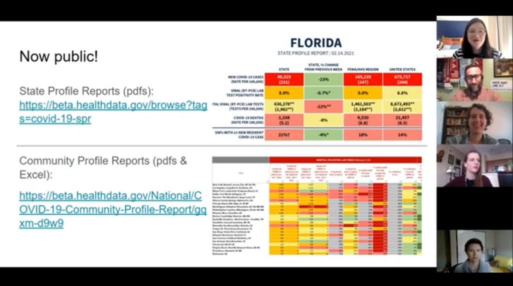
    The White House COVID-19 reports that Whyte spent so much time chasing down this past summer are now public. The Trump’s administration started publishing the data behind these reports in December, and Biden’s administration has now started publishing the PDF reports themselves—albeit minus the recommendations to governors that previous iterations contained. Whyte provided a run-down of the reports on Twitter, which should be required reading for any local journalist who wants to get more in-depth with their pandemic coverage.

    “I think they’re really great for local reporting because they break down all kinds of different metrics by state, county, and metro area,” she said. The reports notably make it easy for us to compare across jurisdictions, since the federal government has standardized all the data. And you can find story ideas in the data notes, such as seeing where a state or region had a data error. The CDD also wrote about these reports when they were first published.

    Working with local gatekeepers to find data

    Erica Hensley discussed a few lessons she learned from covering COVID-19 in Mississippi, where data availability has lagged some other states.

    Local reporting, she said, provides journalists with a unique situation in which they’re directly relying on one local agency for news and data. She stressed the importance of building a relationship with agency representatives, helping them understand exactly what you’re looking for and why you need it.

    “They’re [Mississippi’s public health agency] an under-resourced agency that was strapped for time to even address my request,” she said. Understanding on her part and a lot of back-and-forth helped her to eventually get those requests met.

    Hensley also described how she worked to fill data gaps by doing her own analysis at Mississippi Today, a local nonprofit newsroom, then showed her work to the public health agency. For example, she used the total case numbers published by the state to calculate daily and weekly figures, and presented the data in a percent change map. This project helped Mississippi residents see where COVID-19 spread was progressing most intensely—but it also showed the state that this information was needed. She similarly calculated a test positivity rate; to this day, she said, state public health officials go to Mississippi Today’s website to see positivity rates, as these rates are not included on the state’s COVID-19 site.

    When you can do some calculations yourself, Hensley said, do those—and focus your FOIA time on those data that are less readily available, such as names of schools and long-term care facilities that have faced outbreaks. Long-term care has been a big focus for her, as residents in these facilities tend to be more vulnerable.

    Since Mississippi wasn’t releasing state long-term care data, she used federal data from the Centers for Medicare and Medicaid Services (CMS) and ProPublica to investigate the facilities. Matching up sites with high COVID-19 case counts and sites that had completed infection control training, Hensley found that the majority of long-term care facilities in the state had failed to adequately prepare for outbreaks. Her reporting revealed serious issues in the state.

    Hensley advocates for local reporters to dig into long-term care stories; the CMS dataset has a lot of rich data, down to the individual facility level, that can be a springboard to stories about how facilities are (or aren’t) keeping their residents safe.

    While Hensley stressed the importance of earning a local health department’s trust, she also said that health reporters need to be trusted by their colleagues. “A big part of my job early on, on top of collecting the data, was helping the newsroom understand how this applies to other local beats,” she explained. Reporters who serve as resources to each other will produce more interdisciplinary stores, and reporters who team up to request data will get the information out faster.

    Building a massive system to track COVID-19 in prisons

    Reporters at The Marshall Project have spent the past year tracking COVID-19 cases in U.S. prisons. Tom Meagher discussed how they did it, including a lot of external and internal communication.

    After the newsroom went on lockdown, Meagher said, “Once of the first things we thought of was, prisons—being congregate living facilities—were going to be seriously affected by this pandemic.” But at first, the data they wanted simply didn’t exist.

    To compile those data on COVID-19 in prisons, The Marshall Project’s team had to manage relationships with agencies in every state and D.C. They divided up all the states among their newsroom, and later worked with The Associated Press as well. At first, the reporters called every state and simply asked for numbers with no intention to publish them, in order to see if a compilation would be possible. This was easier said than done: “Prisons are not always the most transparent agencies to deal with,” Meagher said.

    TMP reporters asked each agency three carefully-worded questions: How many people have been tested for the coronavirus? How many have tested positive? And how many have died? They wanted to get those numbers for both prison inmates and staff. Meagher and his colleague Katie Park had to do a lot of work to clean and standardize the numbers, which are often inconsistent across states.

    The team made it clear to prison agencies that this wasn’t just a one-off ask—they came back with the same questions every week. Within a month, a lot of state agencies started setting up websites, which made data collection easier; but reporters still call and email every week in order to clarify data issues and fill in gaps. Meagher uses Google Sheets and Mail Merge to coordinate much of the data collection, cleaning, and outreach back to states with lingering questions.

    The newsroom also uses a tool called Klaxon to monitor prison websites for changes and record screenshots, often useful for historical analysis. In one instance, TMP’s screenshots revealed that Texas’ justice system removed seven names from its list of prison deaths; they were able to use this evidence to advocate for names to be returned.

    TMP’s data collection system is manual—or, primarily done by humans, not web scrapers. They opted for this route because prison data, like a lot of COVID-19 data, are messy and inconsistent. You might find that an agency switches its test units from people to specimens without warning, Meagher said, or fixes a historical error by removing a few cases from its total count. In these instances, a human reporter can quickly notice the problem and send a question out to the state agency.

    “If we’ve learned anything from all of this, it’s that there’s a lot of different ways data can go wrong,” Meagher said. Even when public health officials are well-intentioned and questions are clearly asked, misunderstandings can still happen that lead to data errors down the line.

    The goal of this dataset is really to give people insight into what’s happening—for prison inmates, for their families, and for advocates. Even agencies themselves, he said, are “eager to see how they’re doing compared to other states.” Since a similar dataset doesn’t exist on a federal level, states are using TMP’s to track their own progress, creating an incentive for them to report more accurately to begin with.
    These data are freely available online, including case and death numbers for every week since March. If you have questions, Meagher and his colleagues may serve as a resource for other reporters hoping to report on COVID-19 in the prison system.

    Related resources

    A few links shared during this session:

  • What makes a successful semester during COVID-19?

    What makes a successful semester during COVID-19?

    Despite outbreak risks, a lot of colleges and universities brought their students back to campus during the fall 2020 semester. Everyone from epidemiologists to the students themselves asked: What worked, and what didn’t? How do we even measure success, when every campus is unique and every option is complicated?

    A lot of journalists have tried to answer these questions in the past few months. I took a crack at them in a feature for Science News, published this past Tuesday. My editor and I picked five universities, ranging from large state schools to small close-knit institutions. I graphed their cases and tests, attempting to determine both the drivers of campus outbreaks and how school leadership got them under control. And I spoke to administrators and students at each school who explained their campus’ approach to COVID-19 mitigation.

    Obviously, I want you to read the full story. Any institution trying to handle COVID-19 can learn valuable lessons from these universities, especially from those that got their students involved in the COVID-19 protection efforts—like Rice University, which set up a student-run court to judge those who broke safety rules, or North Carolina Agricultural & Technical University, which let students go live on Instagram while they got tested.

    But in the COVID-19 Data Dispatch this week, I wanted to share some bonus material. One of my favorite interviews that I did for this feature was with Dr. Pardis Sabeti, a computational geneticist at the Broad Institute of Harvard University and MIT. The Broad Institute helped over 100 colleges and universities set up COVID-19 testing and student symptom monitoring, most of them in New England. When I talked to Dr. Sabeti, though, she mostly spoke about Colorado Mesa University—a small school in Grand Junction, Colorado that saw it as a moral imperative to bring all of their students back to campus this fall.

    Dr. Sabeti told me all about why the Broad Institute and Colorado Mesa University (or CMU) were a great match, able to try out novel COVID-19 control efforts that many other schools didn’t consider. She also gave me her perspective on what makes a successful pandemic semester—spoiler, she has a pretty high bar.

    The interview below has been lightly edited and condensed for clarity.


    Betsy Ladyzhets: Tell me about how the Broad Institute started working on infectious disease management, and how that led to your current efforts with COVID-19.

    Pardis Sabeti: I do a lot of work in infectious diseases, mostly in West Africa. In 2014, Harvard University set up an outbreak surveillance committee that helped the school through all of these things around Ebola. And then, it was sort-of in-place, we had this committee of folks across the institution that were working together on outbreaks. 

    Then, in 2016, we got re-empaneled when there was a mumps outbreak at Harvard that ended up spreading across Massachusetts. We learned that yes, universities are laboratories for infectious disease spread, and Massachusetts has 110 of them.

    So, there was a lot going on there. We worked with the Mass. Department of Public Health and the higher ed consortium in Boston and we were really able to move things forward together, to cooperate, share data. We even found a transmission link between an outbreak—there was an outbreak in east Boston that happened in an unvaccinated community that was thought to be a separate outbreak, but then our genome sequencing data showed that it was firmly within the Harvard University cluster. And then additional case investigations showed that there were three members of that community that were Harvard affiliates, that were the likely links.

    When we did the genome sequencing, it showed us this idea that traditional epidemiology is very accurate. Whatever links the public health teams had found, we confirmed with genome sequencing. But they missed most of the transmissions. There were a lot of transmission events that were very obviously tied to each other but that the public health teams didn’t catch. 

    So at that point, we really doubled down on this idea of genome sequencing and genomic epidemiology being really important for understanding outbreaks. But then also, we understood that we needed to be very fast about doing outbreaks [sic]. What the rest of the world figured out during COVID, we figured out because of mumps—that we needed apps to essentially allow people to start sharing information about their symptoms, so people can get quick diagnoses.

    It was this funny thing where four people on my team all became infected while we were investigating the mumps outbreak with what looked like mumps. Each of them went to their own PCP [primary care provider], and their own PCP did a work-up, and you’re like—wait a second. Wouldn’t it be useful to know these four people are all in connection with each other? If one of them had a diagnosis, it would probably inform everyone else’s diagnosis.

    We created what’s now called Scout. It’s an app that allows you to share with your contacts what’s going on if you have an infection, allows people to quickly figure out what their diagnosis might be and to alert people. We weren’t thinking about it necessarily for pandemic reporting. We were just thinking, wouldn’t it be something handy, that next time you get sick, you immediately know what you have and what to do about it. Particularly since viral and bacterial infections need entirely different courses of action from people. Like, could we help everybody get informed? And then we also built Lookout, which is a dashboard that collects all that information and shows public health teams and administrators what’s going on.

    BL: Yeah, the CMU administrators I talked to talked about that [dashboard] a lot.

    PS: Yeah, which is great. We joke that CMU has one of the most sophisticated public health systems. The school can see, at this exquisite level, what the cases are, where they’re located. It’s really allowing you to do those investigations that most people I’ve seen elsewhere are doing on the back of an envelope.

    We [Broad] needed a place to work with that was going to be very collaborative and open. And so we were talking to a lot of different folks in different places, and everywhere there were different challenges of getting in the ground. And Colorado Mesa, to us, was this breath of fresh air. One, it was heartwarming to be working with this school in Colorado that has a large population of first-in-their-families-to-go-to-college students. And it was also empowering to hear the need that they had, the fact that they had to come back and they had to come back fully on campus because the students’ livelihoods and future success depended on it. And it was also heartwarming to see the way that the leadership was so engaged, so strong, so open, to anything.

    And also, like, the wastewater testing is being done by faculty and students in the engineering department. The clinical sample collection is being led by Amy Bronson and the nursing team. That’s a lot of what you want to see happening on college campuses. To me, the way I pitched it is, what we were building was the Facebook app for outbreaks that also needed to start with a close-knit community where you could get a lot of adoption. 

    But also, this idea that colleges are both high risk but also exactly where innovation can happen. It’s where people are ready to explore and try things out.

    I hadn’t seen that [mindset] at a lot of other schools. I saw this administrator, top-down, we’re gonna tell you how to behave and you’re gonna be in this room. A lot of schools got into a frame of like, we’re gonna manage these students, whereas CMU really was like, no, we’re going to partner with these brilliant students and figure this out together.

    In my mind, I was always perplexed, where we kept describing this year as this kind-of less-than year, where we were just going to suffer through education. In my mind, it was a more-than year. People learn the best when the stakes are the highest. There’s no other time we’re gonna teach kids about public health, infectious disease, genomics, and epidemiology than now. So we should shift what we’re trying to do. It shouldn’t be like, let’s get the Chaucer done while an outbreak is killing people in our community. We should’ve shifted our attention and all learned math, and stats, and clinical medicine, and public health, and biology around what’s going on.

    And that’s what CMU is doing. They’re hosting classes that are around outbreak response. The coaching teams and the sports teams are the ones doing contact tracing. It’s interesting, because it’s, in a way, it’s a school that doesn’t have all the resources where the ingenuity is going to happen. They can’t just call an outside consultant to do these things for them, they had to rely on themselves and the students.

    Did they show you the videos that they made?

    BL: I watched that “CMU is Back” one, which is great.

    PS: Yeah. They made many of them. They have a new song—I have to make a video later this afternoon for it.

    The fascinating thing is, right, even the art students got in on it and started doing public health messaging. I say, and it’s true—they already had me at the team. I just thought the team was so delightful and inspiring, but they sealed the deal with the video.

    What communities do you know that would make a video together? Most offices, they hate each other, everyone’s resentful and no one’s gonna make a video. In a lot of the schools that I know, there’s taglines that they hate the administration. There’s a fight between the administration and the students. Where here, it’s like, the administrators and the students got together and made a music video. They told me that they have a very close-knit culture and a trust in each other, that would make things go forward.

    And I’m sorry, I know this is very much my pitch for CMU, but I just love talking about this place. Here’s this thing where—did they show you the simulation that happened over Halloween weekend? Did they show you that data?

    BL: I think so, yeah.

    PS: It was the real-time where you’re seeing everybody clustering?

    BL: Oh yeah, yeah.

    PS: Yeah. What is fascinating about that whole scenario is that you had 358 students, voluntarily without any real advertisement from us, download an app that tracks all of their movements over Bluetooth, over Halloween weekend. And then proceeded to go out and do their thing. So here’s that kind-of interaction, and you’re seeing, minute-by-minute, the kind-of high resolution data that we’re getting on how students are interacting with each other. What clusters they’re forming, what times of day we need to watch out for for interactions. It’s pretty bananas.

    These students have an enormous number of contacts. This is the fear that you have with college students. Someone might look at [these data] and say, it’s terrible. But in other ways, it’s like, these kids trusted you enough to download an app, get themselves tracked, and go on and basically engage in behavior that they could get themselves thrown out. That’s trust in the leadership. That is what we need to be able to stop outbreaks.

    And then, the last piece I’ll say before I go off of my CMU storyline is… I’ve been trying in Massachusetts, for a long time, to get people to understand that you’re gonna spend millions. Each of these colleges are spending millions and millions of dollars on diagnostic testing on a daily basis or a weekly basis. That’s an incredible amount of tests that are being used with no hypothesis. Meanwhile, the surrounding communities are talking about seven days ‘til getting a test result, and standing in line for four hours for a test.

    That’s dangerous. I kept trying to convince a lot of the colleges that testing yourself in the middle of a shortage of tests looks selfish and is ineffective. Ultimately, the way that COVID spreads, one person can come into a room and infect 50 people. And so, the metaphor I use is, it’s like being in a drought with a fire alarm shortage, and putting all the fire alarms in your own house. You’ll be exquisitely good at detecting a fire when it hits your house, but at that point, it’s burning to the ground. What you should do is, you should get [the fire alarms], and you should put them in all your neighbors’ homes. For a wide stretch.

    Ultimately, what colleges should do is to support their communities’ testing, by reaching out and saying, okay, every faculty and staff and student, tell us who your contacts are, and have them tell us who their contacts are, and we will prioritize testing for those individuals. We’ll get them tested. That’s how the colleges should have interacted.

    And that really fell on deaf ears in general, there’s a variety of reasons for that. But Colorado Mesa doubled down. We [Broad] tried all these different models, like use 100% of your tests on yourself, use 100% of your tests on other people, or use 25%, 50%, 75%, those different groupings. And we found that the most effective way of stopping an outbreak is if you use 75% of your tests outside of the school. You keep 25% for yourself, but 75% should be used outside the school. That’s how you stop outbreaks on campus.

    We’re writing up that work right now, but even when we showed Colorado Mesa the preliminary data, they were like—that’s now their new model. It’s essentially what they’ve done. They’re putting the majority of their tests [in Grand Junction, the city around the school]. And to me, that’s going to be the really remarkable thing to watch going forward. We’ve created the apps, and the dashboards, and the systems to be able to do this well, but now we really want to reach out to our surrounding community and see where we can go here.

    BL: I know they mentioned to me that they were starting to help the other schools—like, the elementary and middle and high schools in Grand Junction get tested as well.

    PS: Yeah. Our foray into community testing was there. Basically, when the school stopped and they had this break over the holidays, they started pushing this community testing… It’s all about trust, right? They got the trust of their students, and now they’re getting the trust of the community. They’re saying, okay, we’re here to help you, how do we work through this together. That’s the idea behind it.

    So that’s all of my CMU backstory. But it also just generally tells you about the way I think things need to happen. Colleges are both a laboratory for infectious disease spread and also a great laboratory in which to try new technologies out, but it really has to involve community engagement, empowering of all the actors in the system, and trust-building. It does have to involve bringing the students on board on the mission, not just coming top-down and telling them how to do things, and reaching out to the communities and doing testing for your communities.

    It both makes you look more selfless because you’re a college helping your community. That’s always a great way, when you’re going to throw a party in the middle of the night, for them to be happy that you’re there. This[fall 2020] was the opportunity for all colleges to get buy-in from their communities, to show why they’re there and why they’re useful, and that’s another thing where it’s like, why are we not doing that? We have that opportunity.

    BL: That’s definitely something that I saw in part at some of the other schools [in my story], but not to the same degree as what Colorado Mesa was doing. I think you answered a lot of my questions already, because I was going to ask you, like, what makes colleges a good place to try out mitigation methods.

    But one more question is, do you have specific parameters that you would think about when you look at, say, cases and testing numbers, of what you would consider a successful fall semester for a campus?

    PS: The thing is, most schools had very unsuccessful semesters…. For me, success would be… The bar for me for success is really high. To justify coming back when so many people can’t… It would be, not having an outbreak on campus, or not seeding an outbreak in the community. Which could happen—you could not have an outbreak on campus but could have seeded one in the community, if you caught it and you were able to quarantine your people but you already spread it there and the whole thing went on fire. Essentially if your surrounding community has lower case rates.

    I always talk about, when you do something that’s counter to what you should be doing, success is going far and beyond. For me, when I have my students go into someone else’s lab, I’m like, you need to leave that lab better than when you found it. If you’re a guest in someone’s home, if you are treading in a place you shouldn’t tread, your level of success is leaving the college and the community better than when you found it. And having the students learn new skills, be engaged, and feel excited about the future.

    The fact, again, that CMU has their new song— which they just sent me, and it’s a little silly ‘cause it has all these excerpts of me talking—is, “The Future is Now.” And that, to me—even though, by the metrics of what I was just talking about, they weren’t successful. They had an outbreak on campus, it might have spread to the community. But they made a big headway, they learned a lot, the students engaged a ton, and they collectively were making the community around them better. That to me is—I think they had a successful semester in that the students were engaged and they learned, and they attempted to support the community around them. And from that will learn to be even better and stronger.

    BL: Is there anything in particular that you are expecting to be different this spring, learning from CMU and from the other schools you’ve worked with via the Broad Institute?

    PS: This spring is going to be very… it’s going to be hard to know how it will go. You’re gonna get vaccines coming in, that’s gonna make things better, but you have case numbers that are really high, variants that are more infectious, that are gonna make things worse. And a lot of civil unrest and tensions and all of that.

    It’s one of those things where we really have to double down on our civic engagement, I think that’s going to be really important. And on our public health view of what’s going on.

  • National numbers, Feb. 28

    National numbers, Feb. 28

    In the past week (February 21 through 27), the U.S. reported about 475,000 new cases, according to the COVID Tracking Project. This amounts to:

    • An average of 68,000 new cases each day—about 2,000 more cases than the seven-day average on July 27, near the peak of the summer surge
    • 145 total new cases for every 100,000 Americans
    • 1 in 692 Americans getting diagnosed with COVID-19 in the past week
    Nationwide COVID-19 metrics published in the COVID Tracking Project’s daily update on February 27. New daily cases are now at a level similar to the summer peak.

    Last week, America also saw:

    • 48,900 people now hospitalized with COVID-19 (15 for every 100,000 people)
    • 14,300 new COVID-19 deaths (4.4 for every 100,000 people)
    • An average of 1.65 million vaccinations per day (per Bloomberg)

    After several weeks of declines, cases now appear to be in a plateau. But the COVID Tracking Project cautions that these numbers may also be the aftershocks of President’s Day and the winter storm, which led to artificially low numbers last week and delayed reporting arriving this week.

    One thing is for certain, though: vaccinations are recovering from the storm. We had two record vaccination days Friday and yesterday, with 2.2 million doses and 2.4 million doses reported, respectively. Nearly one in five adults and half of American seniors have received their first shot, White House advisor Andy Slavitt said in a COVID-19 briefing on Friday.

    Last week, we noted that vaccinations were already having an impact in nursing homes and other long-term care facilities. The Kaiser Family Foundation picked up that trend this week, with an analysis showing that deaths in these facilities have declined at the same time as residents have received vaccine doses. In the first month of America’s vaccine rollout, long-term care deaths decreased by 66%, while all other U.S. deaths increased by 61%.

    We can’t get complacent, though. The U.S. has now reported over 2,100 cases of the B.1.1.7 variant, up from 1,500 last week. Homegrown variants that originated in California and New York aren’t yet reported on the CDC’s variant cases dashboard, but I recommend reading up on them. B.1.526, the New York variant, may now account for one in four cases in NYC, per the New York Times; this variant has acquired a mutation that may make it less susceptible to vaccines.

    Federal public health leadership cited variant cases in COVID-19 briefings this week, advising Americans to keep up all the public health measures that have become so familiar by now: wear a mask, avoid crowds and travel, and get a vaccine when it’s available to you.

  • COVID source callout: Iowa

    Usually, we only update our K-12 school COVID-19 data annotations every two weeks. But it came to my attention during a COVID Tracking Project shift yesterday that Iowa has taken down a page on its dashboard that used to report test positivity by school district. The page now goes to a 404 error, and there’s no mention of school data elsewhere on the state’s COVID-19 website.

    Yes, test positivity is a fraught metric—it should be used with a combination of other factors, not as a sole determinant of whether a school district can open for in-person learning. But it’s still troubling that this state took down the closest thing it had to school data reporting. What’s up, Iowa?

  • Featured sources, Feb. 21

    • Bloomberg’s COVID-19 Vaccine Tracker: We’ve featured Bloomberg’s tracker in the CDD before (in fact, you can read Drew Armstrong’s walkthrough of the dashboard here), but it’s worth highlighting that the Bloomberg team made two major updates this week. First, they added a demographic vertical, which includes race and ethnicity data for the U.S. overall and for 27 states that are reporting these data. This vertical will be updated weekly. Second, the team made all of their data available on GitHub! I, for one, am quite excited to dig through the historical figures.
    • CoVariants: This new resource from virus tracker Dr. Emma Hodcroft provides an overview of SARS-CoV-2 variants and mutations. You can explore how variants have spread across different parts of the world through brightly colored charts. The resource is powered by GISAID, Nextstrain, and other sequencing data; follow Dr. Hodcroft on Twitter for regular updates.
    • The Next Phase of Vaccine Distribution: High-Risk Medical Conditions (from KFF): The latest analysis brief from the Kaiser Family Foundation looks at how individuals with high-risk medical conditions are being prioritized for vaccine distribution in each state. KFF researchers compared each state’s prioritization plans to the CDC’s list of conditions that “are at increased risk” or “may be at an increased risk” for severe illness due to COVID-19; the analysis reflects information available as of February 16.
    • First Month of COVID-19 Vaccine Safety Monitoring (CDC MMWR): This past Friday, the CDC released a Morbidity and Mortality Weekly Report with data from the first month of safety monitoring, using the agency’s Vaccine Adverse Event Reporting System (or VAERS). Out of the 13.8 million vaccine doses administered during this period, about 7,000 adverse events were reported—and only 640 were classified as serious. Check the full report for figures on common side effects and enrollment in the CDC’s new v-safe monitoring program.

  • Diving into COVID-19 data #1: Workshop recap

    Diving into COVID-19 data #1: Workshop recap

    Our first workshop happened this week!

    Drew Armstrong, Bloomberg News‘s senior editor for health care, talked about his work on the publication’s Vaccine Tracker; and Arielle Levin Becker, director of communications and strategic initiatives for the Connecticut Health Foundation, discussed how to navigate COVID-19 race and ethnicity data. Thank you to everyone who attended—we had a great turnout!

    For those who couldn’t make it live, you can watch the recording of the session below. You can also check out the slides here. I’m also sharing a brief recap of the workshop in today’s issue.

    In next Wednesday’s workshop, we’ll discuss engaging COVID-19 data providers, featuring Liz Essley Whyte (Center for Public Integrity), Tom Meagher (The Marshall Project), and Erica Hensley (independent reporter from Mississippi). If you aren’t registered for the series yet, you can sign up here.

    The Bloomberg Vaccine Tracker

    In his presentation, Drew Armstrong provided a behind-the-scenes look at Bloomberg’s tracker and shared some advice on analyzing vaccine data more broadly. 

    “We attempt to capture every vaccine dose that’s reported for COVID-19, every single day, around the world,” he said. In addition to the tracker’s daily updates on vaccine doses distributed and administered, the site also includes information on vaccine contracts between companies and countries—allowing a window into future distribution.

    All of the data on the tracker comes from public sources, largely national and state public health departments that share figures via their own dashboards, press conferences, and social media. Like other aspects of pandemic data, these figures can be pretty messy. Every country, and even every state, may have its own definition of an “administered dose” or a “vaccinated individual”—and these definitions are evolving as the rollout progresses.

    Armstrong provided one example: Tennessee reports “number of people with 1 dose only” vs. “2 doses,” and moves people from the first category to the second after they receive that second dose. Maryland, on the other hand, reports total people who have received one and two doses; both totals are always growing. It’s difficult to make apples-to-apples comparisons when every jurisdiction is doing something different. If you can, Armstrong said, actually get on the phone with your local official and make sure you understand precisely what the terms on their vaccine reports mean. When the Johnson & Johnson vaccine (which only requires one dose) starts rolling out, this definitional landscape will only get more complicated.

    As a result of this messy data landscape, figures for the Bloomberg Vaccine Tracker are compiled manually by a huge team, including reporters from every bureau of the publication. “You have to really get your hands dirty with this data to understand it,” Armstrong said.

    Armstrong also provided four ways for reporters to measure vaccination success. I’m including his slide here because I think it provides a good look at the multifaceted nature of vaccine data analysis and communication; your state might be vaccinating residents at a quick pace, but if the most vulnerable members of your community have been left out, you can’t fully call that rollout a success.

    Slide from Drew Armstrong’s talk discussing the Bloomberg Vaccine Tracker.

    On the equity front: Armstrong announced that the Bloomberg tracker now includes a demographic vertical. This tracker currently includes data from 27 states and two cities which are reporting vaccinations by race and/or ethnicity—you can check it out here. Bloomberg’s team is planning to update this tracker weekly, adding more states as their data become available.

    Armstrong emphasized that he and his colleagues want their tracker to be a resource for other journalists, civic engagement, and other public health communication. “All of our DMs are open,” he said. (Or you can send feedback to the team through a public form.)

    He also noted that reporting on these data—or even @-ing your governor on Twitter and asking them why the numbers aren’t better—is a useful way of actually making the data better. By letting public officials know that we’re looking at these numbers and noticing the gaps, we can put the pressure on for changes to be made.

    Analyzing sources of race and ethnicity data

    In her presentation, Arielle Levin Becker shared some strategies and resources for navigating a new data source—with a focus on demographic data.

    “Data is incredibly important—and easy to misuse,” she said at the start of her talk. Vetting a source properly, she explained, can help you understand both how to properly use this source and how to address its limitations in your reporting.

    Vetting questions to consider:

    • Who’s compiling this source?
    • Who’s funding it?
    • How transparent are they about their methods? Can you identify how it was compiled, or even track the chain of their methodology?
    • Do they disclose the limitations of the data?

    Similarly to Armstrong, Levin Becker recommended reaching out to a source directly when you have questions. People who compile public data are often “very welcoming” about explaining their work, she said, and may be excited to help you better use their data.

    Once you get to the analysis stage, Levin Becker suggested asking another round of questions, such as, “Do the numbers in this source match other numbers from similar sources?” and “How could I explain these numbers in plain English?” One particularly important question, she said, is: “What’s the denominator?” Does this analysis apply to everyone in a state or to a particular subset, like the over-65 population? As we’ve discussed before, denominators can be a particular challenge for COVID-19 school data—without enrollment numbers or clear data definitions, case numbers associated with schools are difficult to interpret. 

    Levin Becker honed in on age adjustment, a process that’s commonly used in health data analysis to compare outcomes for different populations. It’s kind-of a complicated statistical process, she said, but the basic idea is, you weight your data by the age distribution of a population. White populations tend to skew older than Black and Hispanic/Latino populations, for example; to compare these groups in a more equivalent way, a researcher might calculate what their disease rates would be if the different populations had the same age distribution.

    Before the state of Connecticut started age-adjusting its COVID-19 death rates, Levin Becker said, the public health department was boasting that Hispanic/Latino residents of the state were less likely to die from the disease than white residents. But after doing an age adjustment, the state revealed that residents of color were actually at higher risk.

    Slide from Arielle Levin Becker’s talk, showing how age adjustment can reveal health disparities. Chart is from the CT health department.

    “The median age for a non-Hispanic white resident is 47 years,” Levin Becker said. “For a non-Hispanic Black resident, the median age is 34 years, and for a Hispanic resident, it’s 29 years.”

    To put COVID-19 race and ethnicity data in context, Levin Becker recommended looking at other health data—particularly on preexisting conditions that might constitute higher risks for severe COVID-19. The Kaiser Family Foundation, Behavioral Risk Factor Surveillance System, and CDC life expectancy data by ZIP code are three sources she suggested reporters dig into.

    Finally, of course, there are many instances in which the lack of data is the story. There’s been a big focus on race and ethnicity data for COVID-19 vaccinations, but we’re also still missing data on other pandemic impacts. For example, the federal government and the vast majority of states don’t report COVID-19 tests by race and ethnicity. In a lot of cases, Levin Becker said, healthcare providers simply aren’t required to record the race and ethnicity of their patients—“it hasn’t been prioritized in health systems.”

    When the COVID-19 pandemic is no longer an imminent crisis, she said, “keep poking at the questions of what’s being collected and how it’s used.” Continued advocacy by journalists and other communicators can keep the pressure on to improve our race and ethnicity healthcare data—and use it to reveal the disparities that must be fixed. 

    Related resources

    A few links shared in the chat during this session:

  • How to talk about COVID-19 vaccines

    How to talk about COVID-19 vaccines

    I wrote a tipsheet on covering COVID-19 vaccines for The Open Notebook. If you aren’t familiar with it, The Open Notebook is a nonprofit publication that acts as a living manual for science, health, and environmental writers by providing them with tools, resources, and behind-the-scenes looks into how stars in the field do their work.

    My new piece provides tools and resources specifically for writers on the vaccine beat—both those who have been covering the pandemic for months and those who are now incorporating vaccine news into other aspects of their reporting. It’s kind-of sequel to a tipsheet that Scientific American EIC Laura Helmuth wrote back in March, when the pandemic was first exploding into the historic news story it is now. I interviewed several experienced COVID-19 reporters, and gathered their advice on navigating all the complications of vaccine communication. I also compiled a list of resources on COVID-19 vaccines (including a few data sources which COVID-19 Data Dispatch readers will recognize).

    While the tipsheet is geared towards journalists, much of the advice I gathered also applies more broadly to anyone simply talking about vaccines—whether you’re walking your dad through his vaccination appointment or navigating a friend’s mistrust of the medical system.

    Here are a couple of tips that I found particularly valuable. If they resonate with you, too—or if you have other suggestions to share—please let me know! You can reply to this email, leave a comment on the CDD website, or hit us up on Twitter.

    • Put your numbers in context. When explaining the results of a vaccine trial or discussing dose administration numbers, pick your figures carefully and compare them to something a reader will understand. The best comparison is usually a human one: What does the number mean for an individual person and their community? One example that freelance journalist Maryn McKenna offers: If you’re saying that Operation Warp Speed has contracted 185 million vaccine doses, remind readers that there are about 255 million adults over 18 in the U.S., and the current vaccines on the market require two doses each.
    • Get specific about immunity. One challenge of explaining how vaccines work, Sarah Zhang says, is conveying the different levels of immunity that they provide. “Biologically, immunity is not all or nothing,” she explains. Tell your readers what it means to be protected from symptoms, from infection, from transmission, from mild versus severe illness, from one variant more than another.
    • Assign responsibility precisely. Since everyone is watching the vaccine rollout, Drew Armstrong says, journalists can “assume that there’s a deep interest in real and specific problems.” In other words: dig into the details. When you talk to a politician or public health official in your region, tell them exactly what the gap is in your knowledge, and demand that they give you specific answers. Such reporting can allow reporters to identify root problems rather than, say, allowing the governor of New York and the mayor of New York City to blame each other when doses in the city run out.
    • Remember that some vaccine mistrust is reasonable. Nicholas St. Fleur and McKenna note that some groups that have been hit hardest by COVID-19, such as racial minorities and low-income communities, are also likely to have bad experiences with the U.S. medical system—in many cases, bad experiences that took place during the pandemic itself. “If you’re going to bring up the statistics [on hesitancy], then make sure your next sentence brings up the history,” St. Fleur says. This history includes the oft-cited Tuskegee Syphilis Study, yes, but it also includes the lives of people in the U.S. who have been unable to access the testing and treatment they needed in the past year due to racism that is still systemic in the healthcare system.
    • Stay calm and keep your work in perspective. Just as vaccination—and the COVID-19 pandemic at large—is a deeply personal topic for many readers, it is a personal topic for many writers. But as communicators of science and health knowledge, we must remember the broader purpose of our work. We can’t let our own emotions drive our reporting. “The facts can be scary and dramatic enough—you don’t need to do more than that,” Armstrong says. André Biernath echoes that sentiment: “Breathe deeply, before you write something that could have a huge impact on public health.”

    Read the full tipsheet here. It was also translated into Spanish by Rodrigo Pérez Ortega and Debbie Ponchner—you can read the translation here!

  • National numbers, Feb. 21

    National numbers, Feb. 21

    In the past week (February 14 through 20), the U.S. reported about 464,000 new cases, according to the COVID Tracking Project. This amounts to:

    • An average of 66,000 new cases each day
    • 141 total new cases for every 100,000 Americans
    • 1 in 708 Americans getting diagnosed with COVID-19 in the past week
    • About two-fifths of the new cases reported in the week of January 23
    Nationwide COVID-19 metrics published in the COVID Tracking Project’s daily update on February 20. Hospitalizations are now dropping below the spring and summer peaks.

    Last week, America also saw:

    • 58,200 people now hospitalized with COVID-19 (18 for every 100,000 people)
    • 13,300 new COVID-19 deaths (4.1 for every 100,000 people)
    • An average of 1.49 million vaccinations per day (per Bloomberg)

    The number of COVID-19 patients in U.S. hospitals is now the lowest it’s been since early November. About 7,000 new patients were admitted each day this week—while this is still a huge number, it’s a notable drop from the peak (18,000 per day) we saw earlier in the winter.

    I got those new hospital admission numbers from the COVID Data Tracker Weekly Review, a new report that the CDC recently started publishing in conjunction with its COVID-19 dashboard. It’s kind-of like a longer, more numbers-heavy, less snarky version of this newsletter segment.

    The Weekly Review this past Friday also highlighted the progression of coronavirus variants in the U.S. We’ve now detected over 1,500 cases of B.1.1.7 (the variant originating in the U.K.), as well as 21 cases of B.1.351 (originated in South Africa) and 5 cases of P.1 (originated in Brazil). While sequencing efforts have increased significantly in the past few weeks, these numbers are likely still massive undercounts. The CDC encourages Americans to “stop variants by stopping the spread.” In other words, all the behaviors we’ve been using to keep ourselves and our communities safe from spreading the virus will also help reduce its opportunities to mutate.

    One more piece of good news from this week’s COVID-19 data: vaccinations may already be having an impact in nursing homes and other long-term facilities. The share of deaths occurring in these facilities dropped under 20% this week, for the first time since the COVID Tracking Project started collecting these data.

    The pace of vaccinations was slowed this week thanks to winter storms across the South and Midwest. But this news from LTC facilities is a hopeful note of how elderly Americans may be more protected in the weeks to come.

  • Featured sources, Feb. 14

    • COVID-19 Federal Datasets webinar: This past week, the health data research organization CareSet hosted a webinar walking the audience through the HHS’s Community Profile Reports and other facets of federal COVID-19 data reporting. The session featured Kevin Duvall from HHS and Amy Gleason from the U.S. Digital Services. If you use (or are interested in using) the Community Profile Reports, I highly recommend watching the recording; Duvall and Gleason provided great context on how the HHS stepped up its data collection this year.
    • Subnational COVID-19 vaccination data: Barcelona-based data scientist Lucas Rodés-Guirao has compiled vaccination data at subnational levels (or, states and regions) for 20 different countries. The dataset includes the U.S. as well nations in Europe and South America; it’s sourced from public data released by national public health agencies.
    • Anti-Asian Hate Incidents: Stop AAPI Hate, a national coalition documenting anti-Asian hate and discrimination during the COVID-19 pandemic, has released a new report with data on 2020 incidents. According to the report, Stop AAPI Hate has received 2,800 firsthand accounts of anti-Asian hate from 47 states and D.C. since the organization started collecting reports in mid-March.

  • Next in vaccination data demands: More hyperlocal data

    Next in vaccination data demands: More hyperlocal data

    Demographic data released by the CDC; figures as of Feb. 14.

    The CDC continues to improve its vaccination reporting. The agency is now regularly reporting demographic data on its dashboard—including race, ethnicity, age, and sex. You can see counts for both U.S. residents who have received one and two doses. Like the rest of the CDC’s dashboard, the agency is updating these figures every day.

    Advocates for greater equity in the vaccine rollout have pushed for such a data release for weeks. Meanwhile, more states than ever before are publishing their own demographic data: as of yesterday, we’re up to 33 states reporting race and/or ethnicity of vaccinated residents, 36 reporting age, and 32 reporting sex/gender.

    But when it comes to tracking who’s getting vaccinated in America, we still have a long way to go. Now that demographic data are becoming more available at the federal and state levels, equity advocates are pushing for more local data—vaccinations by county, by town, by ZIP code.

    New York City data reporter Ann Choi, for example, pointed out on Friday that this city has lagged behind cities such as Chicago and D.C. in releasing ZIP code-level vaccination data, which would allow researchers and journalists to see precisely which neighborhoods are getting more shots. And NYC ZIP codes are precise—I’m literally moving two blocks, but my ZIP code is changing.

    (P.S. Ann will be speaking at the third workshop in the Diving into COVID-19 data series, on March 3, about her work at THE CITY!)

    The Biden administration will soon start sending doses directly to Community Vaccination Centers, sites operated in partnership with existing community health clinics in an attempt to capitalize on existing connections that these clinics have in their neighborhoods. In order to judge the success of these clinics, we need data about their communities. Local data, demographic data, occupation data… the more complete picture that we can get, the better.

    With more local data, we can do more stories like these:

    Related posts

    • Sources and updates, November 12
      Sources and updates for the week of November 12 include new vaccination data, a rapid test receiving FDA approval, treatment guidelines, and more.
    • How is the CDC tracking the latest round of COVID-19 vaccines?
      Following the end of the federal public health emergency in May, the CDC has lost its authority to collect vaccination data from all state and local health agencies that keep immunization records. As a result, the CDC is no longer providing comprehensive vaccination numbers on its COVID-19 dashboards. But we still have some information about this year’s vaccination campaign, thanks to continued CDC efforts as well as reporting by other health agencies and research organizations.
    • Sources and updates, October 8
      Sources and updates for the week of October 8 include new papers about booster shot uptake, at-home tests, and Long COVID symptoms.
    • COVID source shout-out: Novavax’s booster is now available
      This week, the FDA authorized Novavax’s updated COVID-19 vaccine. Here’s why some people are excited to get Novavax’s vaccine this fall, as opposed to Pfizer’s or Moderna’s.