Author: Betsy Ladyzhets

  • Privacy-first from the start: The backstory behind your exposure notification app

    Privacy-first from the start: The backstory behind your exposure notification app

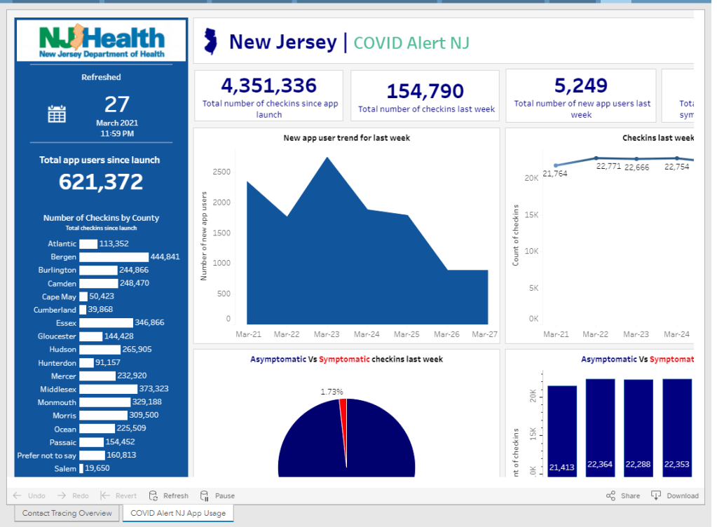
    New Jersey reports data on how people are using the state exposure notification app, COVID Alert NJ. Screenshot taken on March 28.

    Since last fall, I’ve been fascinated by exposure notification apps. These phone applications use Bluetooth to track people’s close contacts and inform them when a contact has tested positive for COVID-19. As I wrote back in October, though, data on the apps are few and far between, leaving me with a lot of questions about how many people actually have these apps on their phones—and how well they’re working at preventing COVID-19 spread.

    This week, I put those questions to Jenny Wanger, co-founder of the TCN Coalition and Director of Programs at the Linux Foundation of Public Health. TCN stands for Temporary Contact Numbers, a privacy-first contact tracing protocol developed by an international group of developers and public health experts. As a product manager, Wanger was instrumental in initial collaboration between developers in the U.S. and Europe, and now helps more U.S. states and countries bring exposure notification apps to their populations.

    Wanger originally joined the team as what she thought would be a two-week break between her pandemic-driven layoff and a search for new jobs. Now, as the TCN Coalition approaches its one-year anniversary, exposure notification apps are live on 150 million phones worldwide. While data are still scarce for the U.S., research from other countries has shown how effective these apps may be in stopping transmission.

    My conversation with Wanger ranged from the privacy-first design of these apps, to how some countries encouraged their use, to how this project has differed from other apps she’s worked on.

    The interview below has been lightly edited and condensed for clarity.


    Betsy Ladyzhets: To start off, could you give me some background on how you got involved with the TCN colatition and what led you to this role you’re in now?

    Jenny Wanger: My previous company did a very large round of layoffs with the beginning of the pandemic because the economics changed quite dramatically, and I was caught in that crossfire. And a couple of days later, a friend reached out and asked whether I was available to help—he was like, “I need a product manager for this thing, we’re trying to launch these apps for the pandemic. It should be, like, two weeks, and then you can go back to whatever.” So I signed up for that. I thought, sure, I’m not gonna be getting a job in the next two weeks. 

    A lot of what we were trying to do, the person who brought me on, was to convince people to use the same system and be interoperable with each other, to have more collaboration across projects. As opposed to all of these different apps being built, none of which would be able to work with each other. We found that there was somebody doing the same thing over on the European side, which was Andreas [Gebhard].

    We scheduled a meeting with all of the people we were trying to convince to do something interoperable and all of their people, and out of that meeting came the TCN Coalition. Andreas suggested the name TCN Coalition pretty much on a whim, which we’ve learned, never try to name a project in a meeting with other people there, because it will haunt you for a long time.

    That’s what we ended up with… TCN Coalition was formed, and we started trying to get everybody to build an interoperable standard and protocol and share that kind-of thing together. It was probably a week or two later that Apple and Google announced that they were going to be having APIs available to use. We weren’t totally sure what to do with that, so we kept moving forward, waiting for more information from them, and then also coaching everybody, like let’s make this interoperable with Apple and Google, that fixes a lot of problems that we weren’t able to fix otherwise.

    We kept growing, we started building out some relationships with public health authorities. And meanwhile, somebody started poking around in our area from the Linux Foundation… Eventually, it became clear that we were not gonna be able to grow to the degree that we wanted without a business model, and Linux Foundation brought that piece of the puzzle. So we merged our community to seed the Linux Foundation Public Health, and Linux Foundation Public Health brought in a business model and some funding that allowed us to keep doing the work that we were doing. We were also getting to the point where a bunch of our volunteers were saying that they needed to go back to having jobs… There was a lot of early momentum, and that slowed down over time, understandably.

    So yeah, that’s how TCN ended up merging in with LFPH. That man who was poking around TCN way back at the beginning was a guy—his name is Dan Kohn, he unfortunately passed away from cancer at the beginning of November. With that, I ended up taking on more of a leadership role in LFPH than I’d anticipated. We eventually got a new executive director at this point, and I’ve been part of the leadership team throughout. That’s sort-of the high level story.

    BL: Thank you. So, how did your background—you do product management stuff, right, how did that lead into connecting coders and running this coalition?

    JW: As a product manager, I’ve always been focused on how to get something built that actually meets the needs of a certain population, and is actually useful. There’s two sides to that. One is the project management side, of like, okay, we need to get this done.

    But much more relevant has been, on the product side, we need to make sure that we’re building things that—there are so many different players in the space, with an exposure notification app or now as we’re looking at vaccine credentials. You’ve got the public health authority, who is trying to achieve public health goals. You’ve got the end user, who actually is going to have this product running on their phone. You have Apple and Google, or anybody else who is controlling the app stores, that have their own needs. You’ve got the companies that are actually building these tools out, building out these products who are trying to hit their own goals. It’s a lot of different players, and I think where my background as a product manager has really helped has been, I’ve got frameworks and tools of how to balance all these different needs, figure out how to move things forward and get people working together, get them on the same page, to actually have something go to market that does what we think it’s supposed to do.

    BL: Right. To talk about the product itself now, can you explain how an exposure notification app works? Like, how would you explain it to someone who’s not very tech savvy.

    JW: The way I explain exposure notification is essentially that your phone uses Bluetooth to detect whether other phones are nearby. They do this by broadcasting random numbers, and the other phones listen for these random numbers and write them down in a database.

    That’s really all that’s happening—your phone shouts out random numbers, they’re random so that they don’t track you in any way, shape, or form, they’re privacy-preserving. You’ve got that cryptographic security to it. The other phones write down the numbers, and they can’t even tell, when they get two numbers, whether they’re from the same phone or different phones. They just know, okay, if I received a number, if I wrote it down, that means I was close enough to that phone in order to be at a distance, being at risk of COVID exposure.

    Then, let’s say one of those phones that you were near, the owner of that phone tests positive. They report to a central database, “Hey, I tested positive.” When this happens, all of the random numbers that that phone was broadcasting get uploaded to a central server. And what all the other phones do is, they take a look at the list on the central server of positive numbers, and they compare it to the list that’s local on their phone. If there’s a match, they look to see, like, “How long was I in the vicinity of this phone? Was it for two minutes, five minutes, 30 minutes?”

    If it goes over the threshold of being near somebody who tested positive for enough time that you’re considered a close contact, then you get a notification on your phone saying, “Hey, you were exposed to COVID-19, please follow these next steps.”

    The nice thing about this system is, it’s totally privacy-preserving, there’s pretty much no way for anybody to look at these random numbers and tell who’s tested positive or who hasn’t. They can’t tell who anybody else has been by. So it’s a really privacy-first system.

    And what we’re now seeing, which is really exciting, is that it’s effective. There’s a great study that just came out of the U.K. about a month ago, showing that for every additional one percent of the population that downloaded the NHS’s COVID-19 app, they saw a reduction in cases of somewhere between 0.8 and 2.3 percent.

    BL: Oh, wow.

    JW: The more people that adopt the app, it actually has had a material impact on their COVID-19 cases. The estimates overall are as many as 600,000 cases were averted in the U.K. because of this app.

    Editor’s note: The study, by researchers at the Alan Turing Institute, was submitted for peer review in February 2021. Read more about the research here.

    BL: That goes into something else I was going to ask you, which is this kind-of interesting dynamic between all the code behind the apps being open source, that being very public and accessible, as opposed to the data itself being very anonymized and private—it’s this tradeoff between the public health needs, of we want to use the app and know how well it’s working, versus the privacy concerns.

    JW: The decision was made from the beginning, since the models showed higher levels of adoption of these apps was going to be critical in order for them to be successful. The more people you could get opting into it, the better. Because of that, the decision was made to try and design for the lowest common denominator, as it were. To make sure that you’re designing these apps to be as acceptable to as many people as possible, to be as unobjectionable as possible in order to maximize adoption.

    With all of that came the privacy-first design. Yes, a lot of people don’t care about the privacy issues, but we were seeing that enough people cared about it that, if we were to launch something that compromised somebody’s privacy, we were going to see blowback in the media and we were going to see all sorts of other issues that tanked the success of the product.

    Yes, it would be nice to get as much useful information to public health authorities as possible, but the goal of this was not to supplant contact tracing, but to supplement it. The public health authorities were going to be getting most of the data that we were able to provide via they know who’s tested positive. They’re already getting contact tracing interviews with them. It wasn’t clear what we could deliver to the public health authority system that wasn’t already being gathered some other way.

    There could’ve been something [another version of the app] where it gave the exposure information, like who you’ve been with, to the public health authority, and allowed them to go and contact those people before the case investigations did. But there were so many additional complications to that beyond just the privacy ones, and that wasn’t what—we weren’t hearing that from the public health authorities. That wasn’t what they needed. They were trying to figure out ways to get people to change behavior.

    We really pressed forward with this as a behavior change tool, and to get people into the contact tracing system. We never wanted it to replace the contact tracing that the public health authorities were already spinning up.

    BL: I suppose a counter-argument to that, almost, is that in the U.S., contact tracing has been so bad. You have districts that aren’t able to hire the people they need, or you have people who are so concerned with their privacy that they won’t answer the phone from a government official, or what-have-you. Have you seen places where this system is operating in place of contact tracing? Or are there significant differences in how it works in U.S. states as opposed to in the U.K., where their public health system is more standardized.

    JW: Obviously, none of us foresaw the degree to which contact tracing was going to be a challenge in the U.S. I think, though, it’s very hard—the degree to which we would’ve had to compromise privacy in order to supplant contact tracing would have been enormous. It’s not like, oh, we could loosen things just a little bit and then it would be a completely useful system. It would have to have been a completely centralized, surveillance-driven system that gave up people’s social graphs to government agencies.

    We weren’t designing this, at any point in time, to be exclusively a U.S. program. The goal was to be a global program that any government could use in order to supplement their contact tracing system. And so we didn’t want to build anything that would advance the agenda—we had to think about bad actors from the very beginning. There are plenty of people just in the U.S. who would use these data in a negative way, and we didn’t want to open that can of worms. And if you look at more authoritarian or repressive governments, we didn’t want to allow them a system that we would regret having launched later.

    BL: Yeah. Have you seen differences in how European countries have been using it, as compared to the U.S.?

    JW: There have been some ways in which it’s been different, which has more to do with attitudes of the citizenry than with government use of the app itself. The NHS [in the U.K.] has a more unique approach.

    The U.K. and New Zealand both ended up building out a QR code check-in system, where if you go to a restaurant or a bar… You have a choice, either you write your name and phone number in a ledger that the venue keeps at their front door. So if there’s an outbreak later, they can call you, reach out and do the case investigation. Or you scan a QR code on your phone that allows you to check into that location and figure out where you’re moving. If there’s an alert [of an outbreak] there, you get a notification saying, you were somewhere that saw an outbreak, here’s your next steps.

    One of the big advantages of the U.K. choosing to do that is essentially that—every business had to print out a QR code to post at their front door. Something like 800,000 businesses across England and Wales printed out these QR codes. And that means anyone who walks into one of those venues gets an advertisement for their app, every single time they go out. It was very effective in getting good adoption.

    We’ve also seen a very big difference in how different populations think about the app and use it. For instance, Finland has had very good compliance with their app. What we mean by that is, if you test positive and you get a code that you need to upload, in Finland, there’s a very high likelihood that you actually go through that process in your exposure notification app. That’s something that I think a lot of jurisdictions have been struggling with in the U.S. and other countries—once you get the code, making sure that somebody actually uploads it.

    It makes sense, because getting a positive diagnosis for COVID is a very stressful thing. It’s a very intense moment in your life. And you might not be thinking immediately, “Oh, I should open my app and upload my code!”

    BL: Right, that’s not the first thing you think of… This relates to another question I have, which is how you’ve seen either U.S. states or other countries adapting the technology for their needs. You talked about the U.K. and New Zealand, but I’m wondering if there are other examples of specific location changes that have been made.

    JW: There have been some mild differences. Like, this app will allow you to see data about how each county is performing in your jurisdiction, so you can also go there to get your COVID dashboard. I’ve seen some apps where, if you get a positive exposure notification, that jumps you to the front of a line for a test. You can schedule a test in the app and you can get a free test as opposed to having to pay for it.

    I’ve seen things like that, but overall, at least with the Google/Apple exposure notification system, it’s been small changes to that degree. Where you see more dramatic changes is where countries have built their own system. You can look at something like Singapore, where people who don’t have phones get a dongle that they can use to participate in the system. It’s entirely centralized, and so they are able to do things like, a lot of contact tracing actually from the information they get with the app. There are places where it’s more aggressive in that sense.

    For the most part, though, I’d say it’s been pretty consistent… The one-year anniversary of the TCN Coalition isn’t until April 5, but if you think about how far we’ve come from this just being an idea in a couple of people’s heads to, last I heard, the GAIN [Google/Apple] exposure notification apps are on 150 million phones worldwide.

    BW: Wow! Is that data publicly available, on say, how many people in a certain country have downloaded apps?  I know, one state that I’ve found is publishing their data is New Jersey, they have a contact tracing pane on their dashboard. I was curious if you’d seen that, if you have any thoughts on it, or if there are any other states or countries that are doing something similar.

    JW: I wish there was more transparency. Switzerland has a great dashboard on the downloads and utilization of their app. DC, Washington state, also publicly track their downloads. I’m sure a few others do but I don’t know off the top of my head who makes the data public.

    I do wish it were the default for everybody to make that data public… There’s a lot of concern by states where there’s not good adoption, that by making the data public they’re opening up a can of worms and are going to get negative press and attention for it, so they don’t want to. So it’s been a mix in that way.

    BL: I think part of that is also an equity concern. How do you know that you have a good distribution of the population that’s adopting it, or even that the people who need these apps the most, say essential workers, people of color, low-income communities—how do you know that they’re adopting it when it’s all anonymous?

    JW: It’s actually—if you’re going to have low adoption, what’s much more effective is if you have high adoption in a certain community. There is a health equity question, but it’s not necessarily about equal distribution of the app, but rather—and this is where some states have been successful, is that they haven’t gotten high adoption across the board but they’ve decided on a couple of high-need communities that are the ones they’re going to target for getting adoption of the app. They’ve gone after those instead, and that, for many of the states, has been a more effective way to drive use.

    BL: I live in New York City, and I know I’ve seen ads for the New York one, like, in the subways and that sort of thing, which I have appreciated.

    Is there a specific state or country that you’d consider a particularly successful example of using these apps?

    JW: NHS, England and Wales, definitely. I think Ireland has done a pretty good job of it, and Ireland is—we’re particularly fond of them because they were one of the first to open source their code, and make it available. They open-sourced with LFPH to make it available for other countries, and so that is the code that powers the New York app as well. New York, New Jersey, Pennsylvania, Delaware, and then a couple of other countries globally, including New Zealand. It’s the most used code, besides the exposure notification express system that Apple and Google built for getting these apps out.

    I also mentioned Finland before, I think they got the messaging right such that they have very high buy-in on their app.

    BL: Are you collecting user feedback, or do you know if various states and countries are doing this, in order to improve the apps as they go?

    JW: Usually as a product manager, you’re constantly wanting to improve the UI [user experience] of your app, getting people to open it, and all that. These are interesting apps in that they’re pretty passive. Your only goal is to get people not to delete them. They can run in the background for all of eternity. As long as the phone is on and active, that’s all that’s needed.

    BL: As long as you have your Bluetooth turned on, right?

    JW: As long as you have your Bluetooth turned on. So the standard for the success of these apps is a completely different beast. We at LFPH have not been monitoring the user feedback on this, but a lot of states and countries are. Most of them have call centers to deal with questions about the app.

    Some jurisdictions are improving it, but most improvements are focused on the risk score, which is the settings about how sensitive the app should be.

    BL: Like how far apart you need to be standing, or for how long?

    JW: Right. How to translate the Bluetooth signal into an estimate of distance, and how likely should it be—how willing are you to send an alert to somebody, telling them that they’ve been exposed, based on your level of confidence about whether they actually were near somebody or not. There’s a decent amount of variance there in terms of how a state thinks about that, but that’s been much more on the technical side, where people are trying to tweak the system, than on the actual app. There have been some language updates to clarify things, to make it easier for people to know what to do next, but it’s not been the core focus of the app designs like it would be if this were a more traditional system.

    BL: What does your day-to-day job actually look like, coordinating all of these different systems?

    JW: We’re [LFPH/TCN] really an advisor to the jurisdictions. It’s not a coordinating thing but rather, I spend a lot of my time on calls with various states saying, “Here’s what’s happening with the app over in this place, here’s what this person is doing, have you considered this, do you want to talk to that person.” I’m trying to connect people, trying to provide education about how these systems work, and for the states that are still trying to figure out whether to launch or not, convincing them to do it and sharing best practices.

    Also, with Linux Foundation Public Health, we’re working on a vaccination credentials project. So I’m splitting my time between those, as well as just running the organization and keeping financials, board relationships, networking, fundraising, keeping all of those things together.

    BL: Sounds like a lot of meetings.

    JW: It’s a fair number of meetings, this is true.

    BL: So, that’s everything I wanted to ask you. Is there anything else you’d like folks to know about the system?

    JW: Ultimately, the verdict is, now that we’re seeing it’s effective [from the U.K. study], I think that adds to the impetus to download and use the system. Even before that, though, the verdict was—this is extraordinarily privacy-preserving, there’s no reason not to do it. That continues to be our message. There’s no harm in having this on your phone, it doesn’t take up much battery life, so turn it on!
  • National Numbers, March 28

    National Numbers, March 28

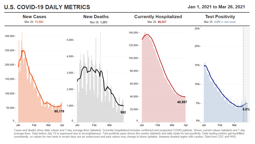
    In the past week (March 20 through 26), the U.S. reported about 399,000 new cases, according to the CDC. This amounts to:

    • An average of 57,000 new cases each day
    • 122 total new cases for every 100,000 Americans
    • 1 in 823 Americans getting diagnosed with COVID-19 in the past week
    • 27,000 more new cases than last week (March 13-19)
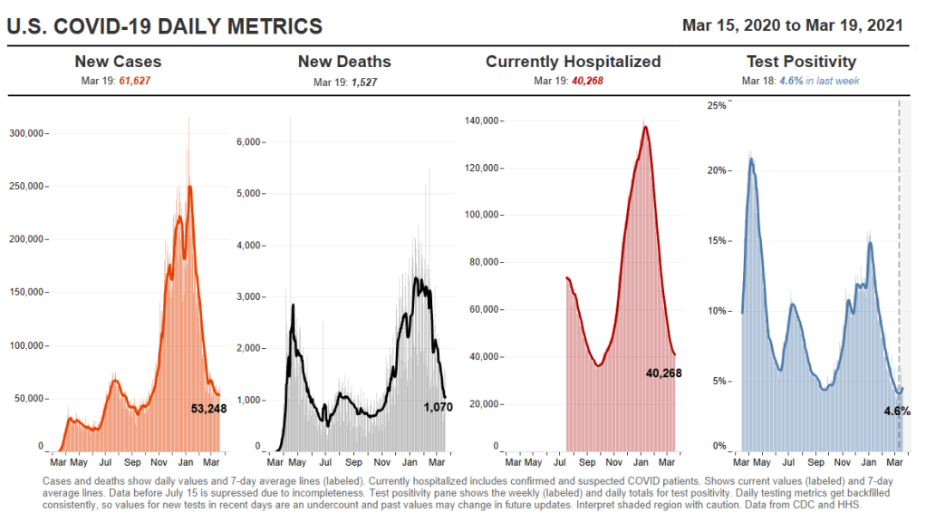
    Nationwide COVID-19 metrics as of March 26, sourcing data from the CDC and HHS. Posted on Twitter by Conor Kelly.

    Last week, America also saw:

    • 33,000 new COVID-19 patients admitted to hospitals (10.1 for every 100,000 people)
    • 6,600 new COVID-19 deaths (2.0 for every 100,000 people)
    • An average of 2.6 million vaccinations per day (per Bloomberg)

    After several weeks of declines, our national count of new cases has started creeping up: the current 7-day average is 57,000, after 53,000 last week and 55,000 the week before. Michigan continues to see concerning numbers, as do New York, New Jersey, Florida, Texas, and California—all states with higher counts of reported variant cases.

    Last week, I described America’s present situation as a race between vaccines and variants. As of Thursday, we have 8,300 reported B.1.1.7 cases—up from about 5,000 last week, and likely still a significant undercount. The variant-driven surge that some experts warned may come in late March may now be starting.

    Still, the pace of vaccinations continues to pick up. We hit more vaccination records this week: 3.4 million doses were reported on Friday, and 3.5 million were reported yesterday. Over 50 million Americans have now been fully vaccinated, according to White House COVID-19 Data Director Cyrus Shahpar.

    President Biden set a new goal for his first 100 days in office: 200 million vaccinations, double the 100-million goal that we hit last week. At the nation’s current pace (about 2.6 million doses administered each day), we are well on track to meet that milestone.

    43 states have announced that they’ll open up vaccine eligibility to all adults on or before Biden’s May 1 deadline, as of Friday—though opening up wider eligibility can sometimes mean that vaccine access for vulnerable populations becomes even more challenging. A recent data release from the CDC makes it easier for us to analyze vaccinations at a more local level; more on that later in the issue.

  • COVID source shout-out: Hawaii

    COVID source shout-out: Hawaii

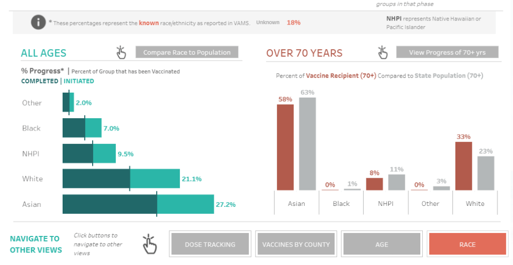
    Hawaii is the latest state to add vaccinations by race to its dashboard. I am a fan of both the state’s green-and-orange color choices and its handy finger-pointing icon, instructing users to hover over each bar in order to compare vaccination numbers to Hawaii’s demographics.

    Screenshot from Hawaii’s vaccination dashboard, taken on March 20.

    We’re now down to just four states that haven’t yet reported this crucial metric: Montana, New Hampshire, South Dakota, and Wyoming.

  • Featured sources, March 21

    • Data Reporting & Quality Scorecard from the UCLA Law COVID-19 Behind Bars Data Project: The researchers and volunteers at UCLA have been tracking COVID-19 in prisons, jails, and other detention facilities since March 2020. This new scorecard, described on the project’s blog, reflects the quality of data available from state correctional agencies, the Federal Bureau of Prisons, Immigrations and Customs Enforcement, and other government sources. No state or federal institution on the list scores an A; the vast majority score Fs.
    • Yelp Data Reveals Pandemic’s Impact on Local Economies: The public review site Yelp recently published results of an analysis tying listings on the site to trends in business openings and closings. It’s actually pretty interesting—almost 500,000 small businesses have actually opened in the past year, including about 76,000 restaurant and food businesses. (On a lighter note, here’s one of my favorite posts I ghost-wrote during my tenure at the Columbia news site Bwog. It’s a collection of very good Yelp reviews people have left about the university.)

  • K-12 school updates, March 21

    Four items from this week, in the real of COVID-19 and schools:

    • New funding for school testing: As part of the Biden administration’s massive round of funding for school reopenings, $10 billion is specifically devoted to “COVID-19 screening testing for K-12 teachers, staff, and students in schools.” The Department of Education press release does not specify how schools will be required to report the results of these federally-funded tests, if at all. The data gap continues. (This page does list fund allocations for each state, though.)
    • New paper (and database) on disparities due to school closures: This paper in Nature Human Behavior caught my attention this week. Two researchers from the Columbia University Center on Poverty and Social Policy used anonymized cell phone data to compile a database tracking attendance changes at over 100,000 U.S. schools during the pandemic. Their results: school closures are more common in schools where more students have lower math scores, are students of color, have experienced homelessness, or are eligible for free/reduced-price lunches. The data are publicly available here.
    • New CDC guidance on schools: This past Friday, the CDC updated its guidance on operating schools during COVID-19 to half its previous physical distance requirement: instead of learning from six feet apart, students may now take it to only three feet. This change will allow for some schools to increase their capacity, bringing more students back into the classroom at once. The guidance is said to be based on updated research, though some critics have questioned why the scientific guidance appears to follow a political priority.
    • New round of (Twitter) controversy: This week, The Atlantic published an article by economist Emily Oster with the headline, “Your Unvaccinated Kid Is Like a Vaccinated Grandma.” The piece quickly drew criticism from epidemiologists and other COVID-19 commentators, pointing out that the story has an ill-formed headline and pullquote, at best—and makes dangerously misleading comparisons, at worst. Here’s a thread that details major issues with the piece and another thread specifically on distortion of data. There is still a lot we don’t know about how COVID-19 impacts children, and the continued lack of K-12 schools data isn’t helping; as a result, I’m wary of supporting any broad conclusion like Oster’s, much as I may want to go visit my young cousins this summer.

  • New CDC page on variants still leaves gaps

    New CDC page on variants still leaves gaps

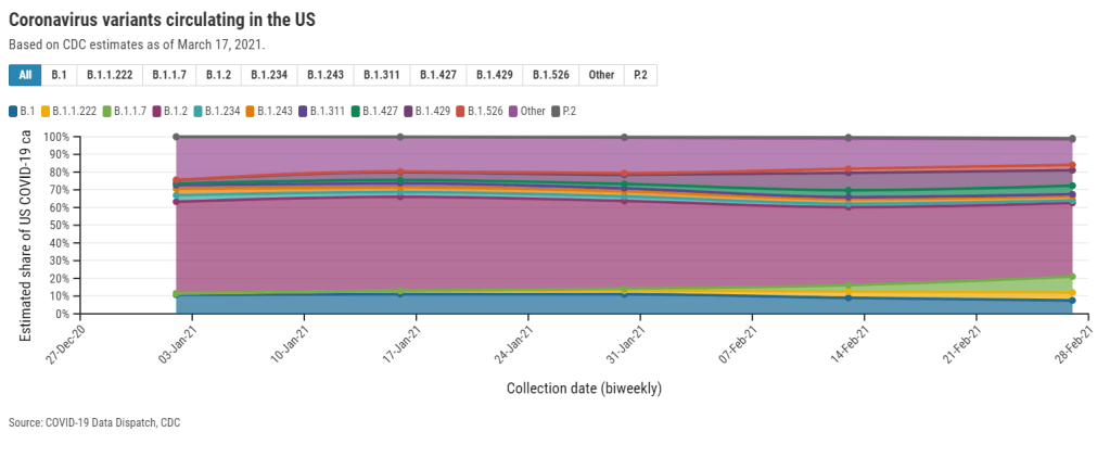
    This week, the CDC published a new data page about the coronavirus variants now circulating in the U.S. The page provides estimates of how many new cases in the country may be attributed to different SARS-CoV-2 lineages, including both more familiar, wild-type variants (B.1. and B.1.2) and newer variants of concern.

    This new page is a welcome addition to the CDC’s library, as their “Cases Caused by Variants” page only provides numbers of variant cases reported to the agency—which, as we have repeatedly stated at the CDD, represent huge undercounts.

    However, the page still has three big problems:

    First, the data are old. The CDC is currently reporting data for four two-week periods, the most recent of which ends February 27. That’s a full three weeks ago—a pretty significant lag when several “variants of concern” are concerning precisely because they are more infectious, meaning they can spread through the population more quickly.

    The CDC’s B.1.1.7 estimate (about 9% as of Feb. 27) particularly sticks out. CoVariants, a variant tracker run by independent researcher Emma Hodcroft, also puts B.1.1.7 prevalence in the U.S. at about 10% in late February… but estimates this variant accounts for 22% of sequences as of March 8. These estimates indicate that B.1.1.7 may have doubled its case counts in the two weeks after the CDC’s data stop.

    Second, the CDC data reveal geographic gaps in our current sequencing strategy. The CDC is providing state-by-state prevalence estimates for 19 select states—or, those states that are doing a lot of genomic sequencing. Of course, this includes big states such as California and New York, but excludes much of the Midwest and other smaller, less scientifically-endowed states.

    Michigan, that state currently facing a concerning surge, is not represented—even though the state has one of the highest raw counts of B.1.1.7 cases, as of this week. We can gather from a footnote that Michigan did not submit at least 300 sequences to the CDC between January 13 and February 13; still, this exclusion poses a challenge for researchers watching that surge.

    And finally, the data are presented in a confusing manner. When I shared this page with a couple of COVID Tracking Project friends on Friday, it took the group a lot of close-reading and back-and-forth to unpack those first two problems. And we’re all used to puzzling through confusing data portals! The CDC claims this page is an up-to-date tracker, “used to inform national and state public health actions related to variants,” but its data are weeks old and represent less than half of the country.

    The CDC needs to improve its communication of data gaps, lags, and uncertainties, especially on such an alarming topic as variants. And, of course, we need better variant data to begin with. The U.S. is aiming to sequence 25,000 samples per week, but that’s still far from the 5% of new cases we would need to sequence in order to develop an accurate picture of variant spread in the U.S.

    On that note: you may notice that we now have a new category for variant posts on the CDD website. I expect that this will continue to be a major topic for us going forward.

    Related posts

    • How one biostatistics team modeled COVID-19 on campus

      How one biostatistics team modeled COVID-19 on campus

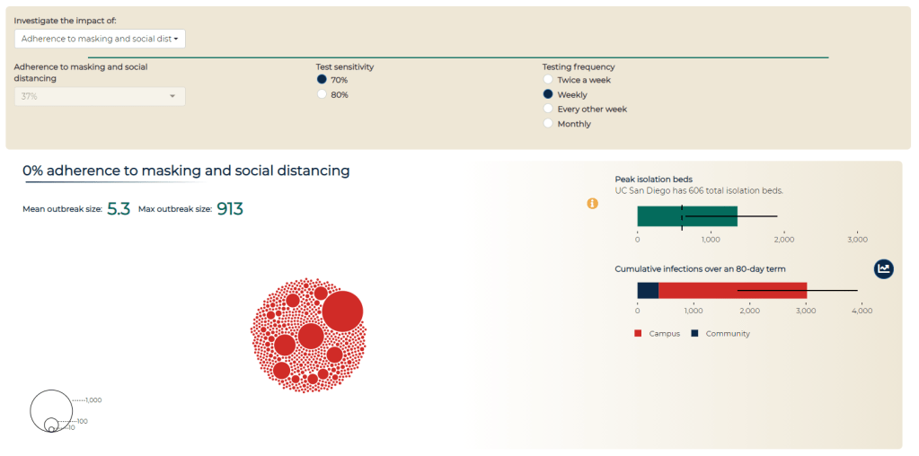
      Screenshot of a modeling dashboard Goyal worked on, aimed at showing UC San Diego students the impact of different testing procedures and safety compliance.

      When the University of California at San Diego started planning out their campus reopening strategy last spring, a research team at the school enlisted Ravi Goyal to help determine the most crucial mitigation measures. Goyal is a statistician at the policy research organization Mathematica (no, not the software system). I spoke to Goyal this week about the challenges of modeling COVID-19, the patterns he saw at UC San Diego, and how this pandemic may impact the future of infectious disease modeling.

      Several of the questions I asked Goyal were informed by my Science News feature discussing COVID-19 on campus. Last month, I published one of my interviews from that feature: a conversation with Pardis Sabeti, a computational geneticist who worked on COVID-19 mitigation strategies for higher education. If you missed that piece, you can find it here.

      In our interview, Goyal focused on the uncertainty inherent in pandemic modeling. Unlike his previous work modeling HIV outbreaks, he says, he found COVID-19 patterns incredibly difficult to predict because we have so little historical data on the virus—and what data we do have are deeply flawed. (For context on those data problems, read Rob Meyer and Alexis Madrigal in The Atlantic.)

      Paradoxically, this discussion of uncertainty made me value his work more. I’ve said before that one of the most trustworthy markers of a dataset is a public acknowledgment of the data’s flaws; similarly, one of the most trustworthy markers of a scientific expert is their ability to admit where they don’t know something.

      The interview below has been lightly edited and condensed for clarity.


      Betsy Ladyzhets: I’d love to hear how the partnership happened between the university and Mathematica, and what the background is on putting this model together, and then putting it into practice there.

      Ravi Goyal: Yeah, I can give a little bit of background on the partnership. When I did my PhD, it was actually with Victor De Gruttola [co-author on the paper]. We started using agent-based models back in 2008 to sort of understand and design studies around HIV.  And in particular in Botswana, for the Botswana Combination Prevention Project, which is a large random cluster study in Botswana.

      So we started using these kinds of [models] to understand, what’s the effect of the interventions? How big of a study has to be rolled out to answer epidemiological questions? Because, as you would imagine, HIV programs are very expensive to roll out, and you want to make sure that they answer questions.

      I’ve been working with [De Gruttola] on different kinds of HIV interventions for the last decade, plus. And he has a joint appointment at Harvard University, where I did my studies, and at the University of California in San Diego. And so when the pandemic happened, he thought some of the approaches and some of the stuff that we’ve worked on would be very applicable to helping think about how San Diego can open. He connected me with Natasha Martin, who is also on the paper and who is part of UC San Diego’s Return to Learn program, on coming up with a holistic way of operating procedures there. She’s obviously part of a larger team there, but that’s sort of where the partnership came about.

      BL. Nice. What would you say were the most important conclusions that you brought from that past HIV research into now doing COVID modeling?

      RG: Two things. One is uncertainty. There’s a lot of things that we don’t know. And it’s very hard to get that information when you’re looking at infectious diseases—in HIV, in particular, what was very difficult is getting really good data on contacts. In that setting, it’s going to be sexual contacts. And what I have understood is that people do not love revealing that information. When you do surveys where you get that [sexual contact] information, there’s a lot of biases that creep in, and there’s a lot of missing data.

      Moving that to the COVID context, that is now different. Different kinds of uncertainty. Biases may be recall biases, people don’t always know how many people they have interacted with. We don’t have a good mechanism to sort of understand, how many people do interact in a given day? What does that look like?

      And then, maybe some of these that can creep in when you’re looking at this, is that people may not be completely honest in their different risks. How well are they wearing masks? How well are they adhering to some of those distancing protocols? I think there’s some stigma to adhering or not to adhering. Those are biases that people bring in [to a survey].

      BL: Yeah, that is actually something I was going to ask you about, because I know one of the big challenges with COVID and modeling is that the underlying data are so challenging and can be very unreliable, whether that’s, you know, you’re missing asymptomatic cases or it’s matching up the dates from case numbers to test numbers, or whatever the case may be. They’re just a lot of possible pitfalls there. How did you address that in your work with the University of California?

      RG: At least with the modeling, it makes it a little more difficult in the timeframe that we were modeling and looking at opening, both for our work on K-12 and for UCSD. We kicked it off back in April, and May, thinking about opening in the fall. So, the issue there is, what does it look like in the fall? And we can’t really rely on—like, the university was shut down. There’s not data on who’s contacting who, or how many cases are happening. There were a lot of things that were just completely unknown, we’re living in a little bit of a changing landscape.

      I’m sure other people have much more nuance [on this issue], but I’m going to just broadly stroke where this COVID research was different than HIV. For HIV, people might not radically change the number of partnerships that they’re having. When we’re thinking about a study in Botswana, we can say, what did it look like in terms of incidents four years prior? And make sure we’re making our modeling represents that state of how many infections we think are happening.

      Here [with COVID], when we’re thinking about making decisions in September or October. You don’t have that, like, oh, let’s match it to historical data option because there was no historical data to pin it to. So it was pooling across a lot—getting the estimates to run to the model, getting those is, you’re taking a study from some country X, and then you’re taking another different study from country Y, and trying to get everything to work and then hopefully when things open up, you sort-of re-look at the numbers and then iteratively go, what numbers did I get wrong? Now in the setting where things are open, what did we get wrong and what do we need to tweak?

      BL: I noticed that the opening kind-of happened in stages, starting with people who were already on campus in the spring and then expanding. So, how did you adjust the model as you were going through those different progressions?

      RG: Some assumptions were incorrect in the beginning. For example, how many people were going to live off campus, that was correct. But how many people, of those off-campus people, were ever going to come to campus, was not there. A lot of people decided not to return to San Diego. They were off-campus remote, but they never entered campus. Should they have been part of that model? No. So once we had those numbers, we actually adjusted.

      Just this past week, we’ve sort of started redoing some of the simulations to look towards the next terms. Our past miscalculation or misinformation, what we thought about how many people would be on campus, now we adjusted from looking at the data. 

      And some of the things that we thought were going to be higher risk, at least originally, ended up being a little bit lower risk than anticipated. One thing is around classrooms. There have been—at least, from my understanding, there have been very few transmissions that are classroom-related. And we thought that was going to be a more of a higher transmission environment in the model, wasn’t what we saw when we actually had cases. So now we’re adjusting some of those numbers to get it right to their particular situation. It’s a bit iterative as things unroll.

      BL: Where did you find that most transmissions were happening? If it’s not in the classroom, was it community spread coming into the university?

      RG: They [the university] have a really nice dashboard, where it does give some of those numbers, and a lot of the spread is coming from the community coming on to campus, and less actual transmissions that are happening within. I think that’s where the bulk is. I think the rates on campus were lower than the outside.

      BL: Yeah, that kind-of lines up with what I’ve seen from other schools that I’ve researched that, you know, as much as you might think a college is an environment where a lot of spread’s gonna happen, it also allows for more control, as opposed to just a city where people might be coming in and out.

      Although one thing, another thing I wanted to ask you about, is this idea that colleges, when they’re doing testing or other mitigation methods, they need to be engaging with the community. Like UC Davis, there’s been some press about how they offer testing and quarantine housing for everybody. Not just people who are students and staff. I was wondering if this is something accounted for in your model, and sort of the level of community transmission or the level of community testing that might be tied to the university and how that impacts the progression of things on campus.

      RG: The model does incorporate these infections coming in for this community rate, and that was actually based off of a different model modeling group, which includes Natasha, that is forecasting for the county [around UC San Diego]. Once again, you have to think about all the biases on who gets tested. False positives, all of those kinds of caveats. They built a model around that, which fed into the agent-based modeling that we use. We do this kind-of forecasting on how many infections do we think are going to be coming in from people who live off-campus, or staff, or family—what’s their risk?

      That’s where that kind of information was. In terms of quarantining my understanding is, I don’t think they were quarantining people who weren’t associated [with the school] in the quarantine housing.

      BL: Right. Another thing I wanted to ask about, I noticed one of the results was that the frequency of testing doesn’t make a huge difference in mitigation compared to other strategies as long as you do have some frequency. But I was wondering how the test type plays in. Say, if you’re using PCR tests as opposed to antigen tests or another rapid test. How can that impact the success of the surveillance mechanism?

      RG: Yeah, we looked a little bit in degrading the sensitivity from a PCR test to antigen. The conclusion was that it’s better to more frequently test, even with a worse-performing test than it is to just do monthly on the PCR.

      We put it on the dashboard. This is the modeling dashboard… It has a couple of different purposes. So first, there was obviously when the campus was opening, a lot of particular anxiety on what may happen come September, October, and some of that [incentive behind the dashboard] was to be transparent. Like, here’s the decisions being made, and here is some of the modeling work… Everything that we know or have is available to everyone.

      And the second piece was to have a communication that safety on campus is the responsibility of everyone. That’s where the social distancing and adherence to masking comes in, why you’re allowed to change that [on the dashboard], is supposed to hopefully indicate that, you know, this really matters. Here’s where the students and faculty and staff roles are on keeping campus open. That was the two points, at least on my end, in putting together a dashboard and that kind of communication.

      BL (looking at the modeling dashboard): It’s useful that you can look at the impacts of different strategies and say, okay, if we all wear masks versus if only some of us wear masks, how does that change campus safety?

      Another question: we know that university dorms, in particular, are communal living facilities—a lot of people living together. And so I was wondering what applications this work might have for other communal living facilities, like prisons, detention centers, nursing homes. Although I know nursing homes are less of a concern now that a lot of folks are vaccinated there. But there are other places that might not have the resources to do this kind of modeling, but may still share some similarities.

      RG: Yeah, I think that’s a really interesting question. I sit here in Colorado. The state here runs some nursing homes. So we originally looked at some of those [modeling] questions, thinking about, can we model [disease spread in nursing homes]?

      I think there’s some complexities there, thinking about human behavior, which may be a little bit easier in a dorm. The dorm has a sort-of structure of having people in this suite, and then within the dorm—who resides there, who visits there, has some structure. It’s a little bit harder in terms of nursing homes, or probably it’s the same with detention centers, in that you might have faculty or staff moving across a lot of that facility, and how that movement is a constantly-evolving process. It wasn’t like a stationary state, having a structure, if that makes sense?

      BL: Yeah. Did you have success in modeling that [nursing homes]?

      RG: Not really so much with [a long-term model], it was more, we had a couple of meetings early on, providing guidance. My wife works for the state with their COVID response, so that was an informal kind-of work. They were trying to set up things and think about it, so I met with them to share some lessons learned that we have.

      BL: That makes sense. What were the main lessons? And I think that is a question, returning to your university work, as well—for my readers who have not read through your paper, what would you say the main takeaways are?

      RG: I think I would probably take away two things that are a little bit competing. One is, based on both some of the university work and the K-12 work, that we have the ability to open. We have a lot of the tools there, and some things can open up safely given that these protocols that we have in place, particularly around masking and stuff like that, can be very effective. Even in settings that I would have originally thought were very high risk. Areas that could have a very rapid spread, for example college campuses.

      Some campuses, clearly, in the news, [did have rapid spread]. But it’s possible to open safely. And I think some of the positive numbers around UC San Diego showed that. Their case counts were very manageable for us. It was possible to open up safely, and same with the K-12. That requires having a first grader wear a mask all day, and I wasn’t sure it would work! But it seems like some of that takeaway is that these mitigation strategies can work. They can work in these very areas that we would have not thought they would have been successful.

      So that’s one takeaway, that they can work. And the competing side is that there’s a lot of uncertainty. Even if you do everything right, there is a good amount of uncertainty that can happen. There’s a lot of luck of the draw, in terms of, if you’re a K-12 school, are you going to have just a couple people coming in that could cause an outbreak? That doesn’t mean that you did anything wrong. [There’s not any strategy] that’s 100% guaranteed that, if you run the course, you won’t get any outbreaks.

      BL: I did notice that the paper talks about superspreading events a little bit, and how that’s something that’s really difficult to account for.

      RG: Human behavior is the worst. It’s tough to account for, like, are there going to be off-campus parties? How do you think about that? Or is that, will the community and their communication structure going to hamper that and effectively convince people that these safety measures are there for a reason? That’s a tricky thing.

      BL: Did you see any aspect of disciplinary measures whether that is, like, students who had a party and then they had to have some consequence for that, or more of a positive affirmation thing? One thing that I saw a couple of schools I’ve looked at is, instituting a student ambassador program, where you have kids who are public health mini-experts for their communities, and they tell everyone, make sure you’re wearing your masks! and all that stuff. I was wondering if you saw anything like that and how that might have an impact.

      RG: The two things that I know about… I know there were alerts that went out, like, oh, you’re supposed to be tested every week. I don’t know about any disciplinary actions, that’s definitely out of my purview. But talking to grad students as well, I knew that if they didn’t get tested in time, they would get an alert.

      And the other thing that I will say in terms of the planning process—I got to be a fly on the wall in UC San Diego’s planning process on opening up. And what I thought was very nice, and I didn’t see this in other settings, is that they actually had a student representative there, hearing all the information, hearing the presentations. I had no idea who all of these people are on all these meetings, but I know there was a student who voiced a lot of concerns, and who everyone seemed to very much listen to and engage with. It was a good way to make sure the students aren’t getting pushed under—a representative was at the table.

      BL: Yeah, absolutely. From the student perspective, it’s easier to agree to something when you know that some kind of representative of your interest has been there, as opposed to the administrators just saying, we decided this, here’s what you need to do now.

      My last question is, if you’ve seen any significant changes for this current semester or their next one. And how vaccines play into that, if at all.

      RG: That’s the actual next set of questions that we’re looking into. If weekly testing continues, does the testing need change as people get vaccinated? The other thing that they have implemented is wastewater testing and alerts. They’re sampling all the dorms. And how does that impact individual testing, as well? Does that—can you rely on [wastewater] and do less individual testing? That’s some of the current work that we’re looking into.

      BL: That was all my questions. Is there anything else that you’d want to share about the work?

      RG: I will say, on [UC San Diego’s] end… I think you can use models for two things. You can use them to make decisions—or not make them, but help guide potential decisions. Or you can use them to backdate the decisions that you wanted to make. You can always tweak it. And I would say, in the work I’ve done, it’s been the former on the part of the school.

      The other thing is, thinking about the role of modeling in general as we move forward, because I think there’s definitely been an explosion there.

      BL: Oh, yeah.

      RG: I think it brought to light the importance of thinking about… A lot of our statistical models, for example, are very much individual-based. Like, your outcome doesn’t impact others. And I can see these ideas, coming from COVID—this idea that what happens to you impacts me, it’s going to be a powerful concept going forward.

    • National Numbers, March 21

      National Numbers, March 21

      In the past week (March 13 through 19), the U.S. reported about 372,000 new cases, according to the CDC. This amounts to:

      • An average of 53,000 new cases each day
      • 113 total new cases for every 100,000 Americans
      • 1 in 881 Americans getting diagnosed with COVID-19 in the past week
      • Only 10,000 fewer new cases than last week (March 6-12)
      Nationwide COVID-19 metrics as of March 19, sourcing data from the CDC and HHS. Posted on Twitter by Conor Kelly.

      Last week, America also saw:

      • 32,900 new COVID-19 patients admitted to hospitals (10 for every 100,000 people)
      • 7,200 new COVID-19 deaths (2.2 for every 100,000 people)
      • An average of 2.3 million vaccinations per day (per Bloomberg)

      Three months into his presidency, Joe Biden has already met one of his biggest goals: 100 million vaccinations in 100 days. This includes 79 million people who have received at least one dose, and 43 million who are now fully vaccinated. Two-thirds of Americans age 65 and older have received at least their first dose.

      Our current phase of the pandemic may be described as a race between vaccinations and the spread of variants. Right now, it’s not clear who’s winning. Despite our current vaccination pace, the U.S. reported only 10,000 fewer new cases this week than in the week prior—and rates in some states are rising.

      Michigan is one particular area of concern: COVID Tracking Project data watchers devoted an analysis post to the state this week, writing, “the Detroit area now ranks fourth for percent change in COVID-19 hospital admissions from previous week—and first in increasing cases and test positivity.” Hospitalization rates in New York and New Jersey are also in a plateau.

      These concerning patterns may be tied to coronavirus variants. Michigan has the second-highest reported count of B.1.1.7 cases, after Florida, and New York City is currently facing its own variant. The CDC’s national B.1.1.7 count passed 5,000 this week—more than double the count from late February.

      As genomic surveillance in the U.S. improves, the picture we can paint of our variant prevalence becomes increasingly concerning. But that picture is still fuzzy—more on that later in this issue. 

    • COVID source callout: CDC race/ethnicity data

      COVID source callout: CDC race/ethnicity data

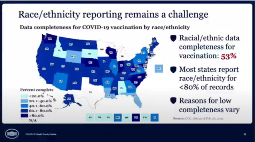
      In the White House COVID-19 briefing this past Monday, equity task force director Dr. Marcella Nunez-Smith showed, for one fleeting minute, a slide on completeness of state-by-state data on vaccinations by race and ethnicity. The slide pointed out that racial/ethnic data was only available for 53% of vaccinations, and most states report these data for fewer than 80% of records.

      Still, though, this slide demonstrated that the CDC does have access to these crucial data. As we’ve discussed in past issues, while many states (45 plus DC) are now reporting vaccinations by race/ethnicity, huge inconsistencies in state reporting practices make these data difficult to compare. It is properly the job of the CDC to standardize these data and make them public.

      The CDC is actually under scrutiny right now from the HHS inspector general for failing to collect and report complete COVID-19 race/ethnicity data. You can read POLITICO for more detail here; suffice it to say, I’m excited to see the results of this investigation.

      Also, while we’re at it, let’s publicly shame the five states that are not yet reporting vaccinations by race/ethnicity on their own dashboards. Get it together, Hawaii, Montana, New Hampshire, South Dakota, and Wyoming!

    • Featured sources, March 14

      • Helix COVID-19 Surveillance Dashboard: Helix, a population genomics company, is one of the leading private partners in the CDC’s effort to ramp up SARS-CoV-2 sequencing efforts in the U.S. The company is reporting B.1.1.7 cases identified in select states, along with data on a mutation called S gene target failure (or SGTF) that scientists have found to be a major identification point in distinguishing B.1.1.7 from other strains.
      • COVID-19 related deaths by occupation, England and Wales: This is another source that I used for my Pop Sci story. The U.S. doesn’t publish any data connecting COVID-19 cases or deaths to occupations, but the U.K. data falls along similar lines to what we’d expect to see here: essential workers have been hit hardest. Men in “elementary occupations,” a class of jobs that require some physical labor, and women in service and leisure occupations have the highest death rates.
      • The Impact of the COVID-19 Pandemic on LGBT People: This brief from the Kaiser Family Foundation addresses a key data gap in the U.S.; the national public health agencies and most states do not publish any data on how the pandemic has specifically hit the LGBTQ+ community. KFF surveys found that a larger share of LGBTQ+ adults have experienced job loss and negative health impacts in the past year, compared to non-LGBTQ+ adults.