37,400 new COVID-19 patients admitted to hospitals (11.4 for every 100,000 people)
5,000 new COVID-19 deaths (1.5 for every 100,000 people)
An average of 3.1 million vaccinations per day (per Bloomberg)
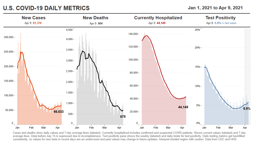
This is the fourth week in a row of case increases in the U.S. While this week’s jump is lower (we went from 57,000 new daily cases two weeks ago, to 63,000 last week, to 64,000 this week), the level where we’ve landed is still reason for concern. Our case numbers now are comparable to last July, when the summer surge was threatening hospital systems in the South and West.
Five states now account for almost half of our new cases, Dr. Katelyn Jetelina notes in her newsletter Your Local Epidemiologist. Those states are Michigan, New York, New Jersey, Florida, and Pennsylvania. “These states also happen to have some of the highest B.1.1.7 levels reported by the CDC,” Jetelina writes. “Is this a coincidence? Probably not.”
CDC data on coronavirus variants are reported with a significant time lag, as I discussed in detail last week. Still, the most recent update of the agency’s Variant Proportions page (now reflecting data as of March 13) tells us that B.1.1.7 accounts for at least 39% of cases in Michigan, 35% of cases in Tennessee, and 35% of cases in Florida. B.1.1.7 accounts for at least 20% of cases in five other states; it is now the most common variant in the country, CDC Director Dr. Rochelle Walensky said in a press briefing last week.
Vaccinations are of course continuing—more than one in three Americans has now had a shot, and one in five is fully vaccinated—but we can’t get complacent. This week’s seven-day average is barely above last week’s (both about 3 million), and as more states open up their eligibility to all adults, we’re seeing access issues and vaccine hesitancy prevent all shots from getting used.
Also, as Dr. Eric Topol pointed out on Twitter, the federal government is refusing to send surplus vaccine supply to Michigan despite pleas from Michigan leaders and public health experts to support this hotspot state in its time of crisis.
This week, New York Governor Andrew Cuomo announced two major expansions for vaccine eligibility. State residents age 30 and older became eligible starting on March 30, and residents age 16 and older became eligible starting on April 6.
The announcement inspired a surge in “very online” people booking appointments, Twitter comedy, and speculation about what else we might be able to push the increasingly scandal-embroiled Governor Cuomo to do (legalize weed, apparently!).
But most importantly, it allowed two of my favorite vaccine communicators to get their shots: Drew Armstrong, lead data wrangler for the Bloomberg Vaccine Tracker, and Huge Ma, computer engineer behind the TurboVax Twitter account, which shares available vaccine appointments in New York City.
If you’d like to learn more about Bloomberg’s tracker, check out the recording and recap of our first Diving into COVID-19 data workshop, at which Armstrong was a featured speaker. And if you’d like to learn more about TurboVax, check out this recent (and rather horny) profile in The Cut. Ma has been using his platform to spread awareness about anti-Asian racism and raise money for Welcome to Chinatown, an initiative to support Chinatown businesses. It’s a pretty cool organization; I recommend checking it out and donating if you can, especially if you (like me) used the TurboVax account to find your vaccine appointment.
Vaccination data update: Two more states are now reporting vaccinations by race/ethnicity. New Hampshire has reported the figures in one of the state’s recent daily updates, which include vaccination data on a weekly basis. And South Dakota has added race/ethnicity to the vaccines tab of its dashboard. As always, you can find detailed annotations on state and national vaccine data sources (updated yesterday) on the COVID Data Dispatch website.
KFF COVID-19 Vaccine Monitor: The Kaiser Family Foundation released the latest update for their Vaccine Monitor, an ongoing survey project to track public attitudes and experiences with COVID-19 vaccines. In this update, published this past Tuesday, KFF reports that 62% of those surveyed say they’ve already gotten a shot or plan to do so as soon as possible, while 17% want to “wait and see” how the rollout goes. That “wait and see” share is down from previous reports.
CDC Provisional Mortality Data for 2020: This past Wednesday, the CDC released death counts for 2020. As we’ve discussed before, mortality data tend to be reported with a lag compared to other types of public health numbers due to the complex processes involved with tallying up death certificates. About 3.3 million deaths occurred overall in 2020, according to these new data; this was a 16% increase from 2019. COVID was the third leading cause of death that year, accounting for 345,000 lives lost.
Federal COVID-19 Chart Gallery: Peter Walker, former data visualization co-lead for the COVID Tracking Project, has put together a new Tableau gallery using data from the CDC COVID Tracker and HHS Protect. The gallery includes many chart formats that CTP fans may recognize, such as national views, four-pane views, and regional comparisons. More charts are coming!
Pfizer COVID-19 Clinical Trials: An interactive, searchable map from Pfizer lets you look up vaccine trials around the world. For each trial, you can see the location, the trial’s phase, who’s eligible to join, and a link out to more information on ClinicalTrials.gov. Trials are happening in the U.S., the U.K., Spain, and Japan.
mRNA sequence for the Moderna vaccine: A group of scientists at Stanford used small amounts of Moderna vaccine left after all doses were extracted from vials to sequence the mRNA in that vaccine, then posted the sequence publicly on GitHub. The full sequence takes up two pages. You can read more about the scientists’ work and their decision to post the sequence in Motherboard.
Pulse of the Purchaser 2021 Report: This new report from the National Alliance of Healthcare Purchaser Coalitions examines how employer attitudes to healthcare have shifted during the COVID-19 pandemic. The report presents results from a survey of 151 major employers, representing diverse industries and sizes; it includes attitudes towards COVID-19 vaccines, telehealth, equity, and other healthcare topics.
As dedicated CDD readers may remember, one of President Biden’s big COVID-19 promises was the creation of a “Nationwide Pandemic Dashboard” that would be a central hub for all the information Americans needed to see how the pandemic was progressing in their communities.
The Biden administration sees the CDC’s COVID Data Tracker as that dashboard and plans to continue improving it as time goes on, White House COVID-19 Data Director Cyrus Shahpar said in an interview with The Center for Public Integrity last month. But a new report from the Government Accountability Office suggests that the CDC’s tracker has a long way to go before it becomes the centralized system that Americans need.
The Government Accountability Office, or GAO, is a federal watchdog agency that evaluates other federal agencies on behalf of Congress. Its full report, released last Wednesday, is over 500 pages of problems and recommendations, ranging from the Emergency Use Authorization process to health care for veterans.
But, as COVID Tracking Project leader Erin Kissane pointed out on Twitter, there are some real data bangers starting in the appendix:
Recommending that the federal government provides more comprehensive data on who gets a COVID-19 vaccine. The GAO specifically wants to see more data on race and ethnicity, so that the public can gauge how well vaccination efforts are reaching more vulnerable demographic groups. The agency also notes the challenge of finding occupational data on vaccinations, something we’ve bemoaned before at the CDD.
Calling out the lack of public awareness for federal data. Some experts the GAO interviewed noted that “the public may be more aware of non-federal sources of data on COVID-19 indicators (e.g., the COVID Tracking Project, Johns Hopkins) than sources from the federal government,” in part because those non-federal sources started providing public data earlier in 2020. The federal agencies need to step up their communications game.
Stating the need for central access to federal data. The GAO describes how the HHS lacks a central, public-facing COVID-19 data website, while the CDC’s COVID Data Tracker fails to provide access to the full suite of information available from the HHS. Specific missing data pages include COVID-19 health indicators and vaccine adverse events.
Overall, the GAO says, the agency recommends that “HHS make its different sources of publicly available COVID-19 data accessible from a centralized location on the internet.” One would think this is a pretty straightforward recommendation to follow, but HHS reportedly “neither agreed nor disagreed” with the assessment.
While there’s a lot more to dig into from this report, it is only part of a long evaluation process to improve federal data collection and reporting. The new report is part of a GAO effort that started last March, reports POLITICO’s Sarah Owermohle:
The latest report is part of nearly yearlong effort by GAO to track the federal pandemic response after a directive in the March 2020 CARES Act. The watchdog first called on CDC to “completely and consistently collect demographic data” including comprehensive results on long-term health outcomes across race and ethnicity, in September. It later criticized the government’s lack of “consistent and complete COVID-19 data” in a January report.
I, for one, am excited to see what the GAO does next—and how the federal public health agencies respond.
If the U.S. does see a fourth surge this spring, one of the main culprits will be variants. Three months after the first B.1.1.7-caused case was detected in this country, that variant now causes about one third of new COVID-19 cases nationwide. The B.1.1.7 variant, first detected in the U.K., spreads more readily and may pose a higher risk of hospitalization and death.
Meanwhile, other variants have taken root. There’s the variant that originated in California, B.1.427/B.1.429, which now accounts for over half of cases in the state. There’s the variant that originated in New York City, B.1.526, which is quickly spreading in New York and likely in neighboring states. And there’s the variant that originated in Brazil, P.1; this variant has only been identified about 200 times in the U.S. so far, but it’s wreaking havoc in Brazil and some worry that it may be only a matter of time before we see it spread here.
The thing about viral variants—especially those more-transmissible variants—is, they’re like tribbles. They might seem innocuous at first, but if left to multiply, they’ll soon take over your starship, eat all your food, and bury you in the hallway. (If you didn’t get that reference, watch this clip and then get back to me.) The only way to stop the spread is to first, identify where they are, and then use the same tried-and-true COVID-19 prevention measures to cut off their lineages. Or, as Dr. McCoy puts it: “We quit feeding them, they stop breeding.”
In the U.S., that first part—identify where the variants are—is tripping us up. The CDC has stepped up its sequencing efforts in a big way over the past few months, going from 3,000 a week in early January to 10,000 a week by the end of March. But data on the results of these efforts are scarce and uneven, with some states doing far more sequencing than others. New York City, for example, has numerous labs frantically “hunting down variants,” while many less-resourced states have sequenced less than half a percent of their cases. And the CDC itself publishes data with gaping holes and lags that make the numbers difficult to interpret.
The CDC has three places you can find data on variants and genomic sequencing; each one poses its own challenges.
First, there’s the original variant data tracker, “US COVID-19 Cases Caused by Variants.” This page reports sheer numbers of cases caused by three variants of concern: B.1.1.7 (U.K. variant), B.1.351 (South Africa variant), and P.1 (Brazil variant). It’s updated three times a week, on Tuesdays, Thursdays, and Sundays—the most frequent schedule of any CDC variant data.
But the sheer numbers of cases reported lack context. What does it mean to say, for example, the U.S. has about 12,500 B.1.1.7 cases, and 1,200 of them are in Michigan? It’s tricky to explain the significance of these numbers when we don’t know much sequencing Michigan is doing compared to other states.
This dataset is also missing some pretty concerning variants: both the B.1.526 (New York) and B.1.427/B.1.429 (California) variants are absent from the map and state-by-state table. According to other sources, these variants are spreading pretty rapidly in their respective parts of the country, so there should be case numbers reported to the CDC—it’s unclear why the CDC hasn’t yet made those numbers public.
(To the CDC’s credit, the California variant was recently reclassified as a “variant of concern,” and Dr. Walensky said at a press briefing this week that the New York variant is under serious investigation to get that same reclassification bump. But that seems to be a long process, as it hasn’t happened weeks after the variant emerged.)
Second, there’s the variant proportions tracker, which reports what it sounds like: percentages, representing the share of COVID-19 cases that CDC researchers estimate are caused by different coronavirus variants. The page includes both national estimates and state-by-state estimates for a pretty limited number of states that have submitted enough sequences to pass the CDC’s threshold.
I wrote about this page when it was posted two weeks ago, calling out the stale nature of these data and the lack of geographic diversity. There’s been one update since then, but only to the national variant proportions estimates; those numbers are now as of March 13 instead of February 27. The state numbers are still as of February 27, now over a month old.
Note that Michigan—the one state everyone’s watching, the state that has reported over 1,000 B.1.1.7 cases alone—is not included in the table. How are we supposed to use these estimates when they so clearly do not reflect the current state of the pandemic?
!function(){“use strict”;window.addEventListener(“message”,(function(a){if(void 0!==a.data[“datawrapper-height”])for(var e in a.data[“datawrapper-height”]){var t=document.getElementById(“datawrapper-chart-“+e)||document.querySelector(“iframe[src*=’”+e+”‘]”);t&&(t.style.height=a.data[“datawrapper-height”][e]+”px”)}}))}();
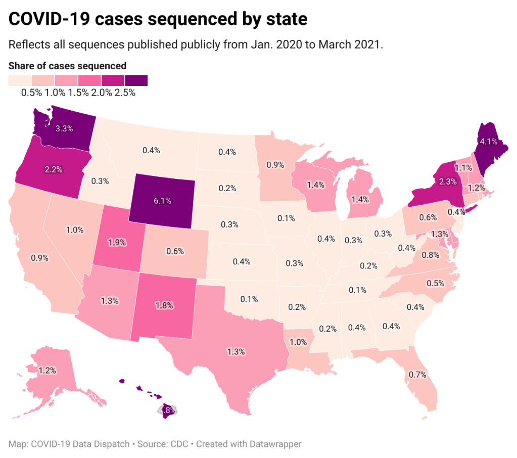
A third variant-adjacent data page, added to the overall CDC COVID Data Tracker this past week, provides a bit more context. This page provides data on published SARS-CoV-2 sequences provided by the CDC, state and local public health departments, and other laboratory partners. You can see the sheer number of sequenced cases grow by week and compare state efforts.
It’s pretty clear that some states are doing more sequencing than others. States with major scientific capacity—Washington, Oregon, New York, D.C.—are near the top. Some states with smaller populations are also on top of the sequencing game: Wyoming, Hawaii, Maine. But 32 states have sequenced fewer than 1% of their cases in total, and 21 have sequenced fewer than 0.5%. That’s definitely not enough sequences for the states to be able to find pockets of new variants, isolate those transmission chains, and stop the breeding.
!function(){“use strict”;window.addEventListener(“message”,(function(a){if(void 0!==a.data[“datawrapper-height”])for(var e in a.data[“datawrapper-height”]){var t=document.getElementById(“datawrapper-chart-“+e)||document.querySelector(“iframe[src*=’”+e+”‘]”);t&&(t.style.height=a.data[“datawrapper-height”][e]+”px”)}}))}();
Chart captions state that the state-by-state maps represent cases sequenced “from January 2020 to the present,” while a note at the bottom says, “Numbers will be updated every Sunday by 7 PM.” So are the charts up to date as of today, April 4, or are they up to date as of last Sunday, March 28? (Note, I put simply “March 2021” on my own chart with these data.)
Obviously, the lack of date clarity is annoying. But it’s also problematic that these are cumulative numbers—reflecting all the cases sequenced during more than a year of the pandemic. Imagine trying to make analytical conclusions about COVID-19 spread based on cumulative case numbers! It would simply be irresponsible. But for sequencing, these data are all we have.
So, if anyone from the CDC is reading this, here’s my wishlist for variant data:
One singular page, with all the relevant data. You have a COVID Data Tracker, why not simply make a “Variants” section and embed everything there?
Regular updates, coordinated between the different metrics. One month is way too much of a lag for state-by-state prevalence estimates.
Weekly numbers for states. Let us see how variants are spreading state-by-state, as well as how states are ramping up their sequencing efforts.
More clear, consistent labeling. Explain that the sheer case numbers are undercounts, explain where the prevalence estimates come from, and generally make these pages more readable for users who aren’t computational biologists.
And if you’d like to see more variant case numbers, here are a couple of other sources I like:
Coronavirus Variant Tracker by Axios, providing estimated prevalence for four variants of concern and two variants of interest, along with a varants FAQ and other contextual writing.
Nextstrain, an open-source genome data project. This repository was tracking pathogens long before COVID-19 hit, and it is a hub for sequence data and other related resources.
The U.S. has blown past its current sequencing goal (7,000 cases per week), but is aiming to ramp up to 25,000—and has invested accordingly. I hope that, in addition to ramping up all the technology and internal communications needed for this effort, the CDC also improves its public data. The virus is multiplying; there’s no time to waste.
34,600 new COVID-19 patients admitted to hospitals (10.6 for every 100,000 people)
6,200 new COVID-19 deaths (1.9 for every 100,000 people)
An average of 3 million vaccinations per day (per Bloomberg)
“I’m gonna pause here, I’m gonna lose the script, and I’m gonna reflect on the recurring feeling I have of impending doom.”
You’ve probably seen headlines with this quotation, something CDC Director Dr. Rochelle Walensky said at the White House COVID-19 briefing on Monday before launching into an impassioned plea to “just hold on a little while longer.” Still, I recommend watching the full video, if you haven’t yet. I watched it live, and was struck by Dr. Walensky’s drive to avoid any more people sent to the hospital with COVID-19, any more unnecessary deaths.
The pandemic’s current state puts public health leaders like Dr. Walensky in a challenging position. New cases continue to rise, with states like Michigan, New York, New Jersey, and other parts of the northeast seeing more concerning spikes. While a 60,000-cases-per-day average may seem small compared to the numbers we saw this winter, it’s comparable to the summer surge that devastated much of the country. And our still-improving genomic surveillance system is finding more and more cases caused by variants.
Yet at the same time, millions of people are getting vaccinated—a new record was set just yesterday, with 4 million doses reported in one day. The weekly average is now at 3 million new doses each day. Not four days after that briefing when Dr. Walensky warned of impending doom, the CDC put out a travel guidance that many took as a license to book post-vaccination plane tickets. (It’s not, though by the way some have described it, you could be forgiven for thinking that way.)
Those who’ve been vaccinated may find it hard to believe another surge is coming. But we can’t let down our guard yet! About three in ten Americans have received at least one vaccine dose—that’s far from herd immunity.
For the past year, nonprofit news organization The Marshall Project has tracked COVID-19 cases in prisons, in collaboration with The Associated Press. The tracking effort has primarily focused on compiling numbers from state and federal prison bureaus, through a weekly tally that compares total cases reported by these agencies to their previous totals.
This week, though, the Federal Bureau of Prisons started excluding a lot of prisoners from their count. The bureau is removing cases of any prisoner who gets released from their overall COVID-19 case total—and they aren’t reporting any data on those formerly incarcerated individuals who tested positive while in prison.
For more detail, see this thread from The Marshall Project’s Twitter account:
This week, new COVID-19 cases in prisons were near the lowest of the pandemic in @marshallproj and @AP’s data. But we noticed that @officialFBOP has been removing cases from their totals. So now we can’t accurately count how many cases there have been. https://t.co/qeOZKfSQuD
“We continue to pursue this information about the number of prisoners who have been sickened in federal prisons,” The Marshall Project writes. “But until the Bureau of Prisons provides it, we are unable to record their total.”
The Federal Bureau of Prisons has reported more COVID-19 cases than any other prison system in the country (at least 49,000 to date), so this new data practice may become a major data gap. I know journalists at The Marshall Project will continue extensive coverage of the BOP, though, as they have for the past year. (For more on their tracker of COVID-19 in the prison system, see the recording and recap of our second Diving into COVID-19 Data workshop.)
COVID-19 diverse sources: NPR journalists from the organization’s Source of the Week project have compiled this database of COVID-19 experts from diverse backgrounds. The database is divided into 13 major categories, including virology, disease origin, health policy, racial/ethnic health disparities, and more. I know I’ll be using this database in my own reporting!
School Survey Dashboard from the Institute of Education Statistics: As part of the Biden Administration’s commitment to reopening K-12 schools across the country, the federal government is now collecting data on how students are receiving education—and releasing those data on a monthly basis. This dashboard draws from surveys of a nationally represented sample including 7,000 rural, suburban, and urban schools, focusing on fourth-graders and eighth-graders. We don’t have data on COVID-19 cases, tests, or enrollment numbers, and several major states are missing, but this is a good start! For more on these data, read Lauren Camera in U.S. News.
Counties with High COVID-19 Incidence and Relatively Large Racial and Ethnic Minority Populations (CDC MMWR): The CDC continues adding to the overwhelming body of evidence pointing to disproportionately high COVID-19 impacts for people of color in the U.S. This report, released last Wednesday, identified counties across the U.S. that had both large minority populations and high COVID-19 case counts (relative to their populations) between April and December 2020. Different racial/ethnic groups have had different trajectories, but by mid-December, almost all counties in the U.S. had high case numbers thanks to the overwhelming winter surge.
PreventCOVIDU study examines vaccine effectiveness in college students: At the White House COVID-19 briefing this Friday, Dr. Fauci described a new clinical trial that kicked off this past week. 12,000 college students, age 18-26, at 22 universities across the country, will be followed over the 5 months. Half of the students are receiving Moderna vaccine doses now, while the other half will serve as a control group (and get vaccinated later). All students will get tested daily—and, in a unique move for vaccine studies, about 25,000 of these students’ close contacts will also get tested daily. The study is designed to determine if the Moderna vaccine prevents coronavirus infection and transmission. See the list of participating universities at the link.
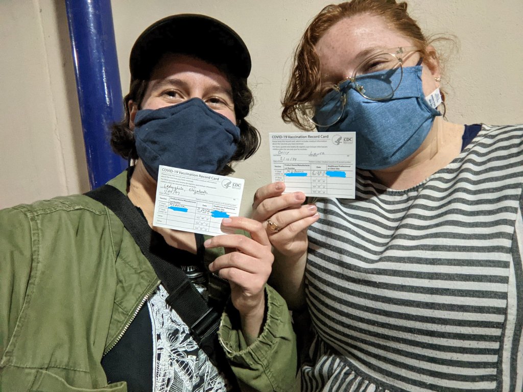
Last night, I received my first dose of the Moderna COVID-19 vaccine. I don’t usually publish more personal writing in the CDD, but it felt appropriate to share a short reflection I wrote during my 15-minute waiting period.
I write this sitting in a back corner of the Science Skills High School gym, a couple of minutes after receiving my first dose of the Moderna vaccine.
“I can’t take credit for it,” said the health professional who gave me the shot, with a voice that reminded me of my high school biology teacher.
I believe she was referring to how easy the shot went in—in and out, the smoothest jab, I might not have felt it if I hadn’t been paying close attention, the goosebumps on my arms rising. I believe she was being specific. But I like to imagine she meant the whole thing—the gym, the people in scrubs and yellow vests, the red dots marking six-foot intervals on the floor, the vials. The vials, manufactured somewhere in New Hampshire or maybe Colorado, packed and stored below freezing and brought here. All the centuries of science and people that brought me here, to the gym, brought the shot to my arm. It went in smooth, but I felt the weight behind it.
I thought about telling her, I’m a science reporter. I’ve been on the COVID beat for a year. We are almost one year since my first COVID Tracking Project shift, my first time squinting at the numbers on dashboards and wondering if that ever might be me. But I didn’t say anything, let her deliver her form speech, her warnings about the side effects. “Your arm will be sore, maybe a light fever, take Tylenol,” she said. “Better than getting COVID, though!” I replied.
Better to let me be just another data point, today. Another body moving through the pipeline. Another voice saying, thank you.
The CDC made two major updates to its COVID-19 data this week.
First: On Tuesday, the agency published a new dataset with more granular information on COVID-19 cases. Like previous case surveillance datasets, this new source compiles cases shared with the CDC, along with anonymized information on their symptoms, underlying medical conditions, race/ethnicity, and other variables. The new dataset is notable because it includes detailed geographic data, going down to the county level.
After months of no state-by-state demographic data from the federal government, we now have county-by-county demographic data. This is a pretty big deal! It’s also a pretty big dataset; it includes about 22 million cases (out of a total 30 million U.S. cases to date).
Of those 22 million cases, race is available for about 13 million cases (58%) and ethnicity is available for about 10 million cases (47%). The dataset will be updated monthly, so we may see better completion with further updates. I haven’t had time to do much detailed analysis of the new dataset yet (hell, I haven’t even managed to get it to load on my computer), but I’m excited to dive into it for future issues.
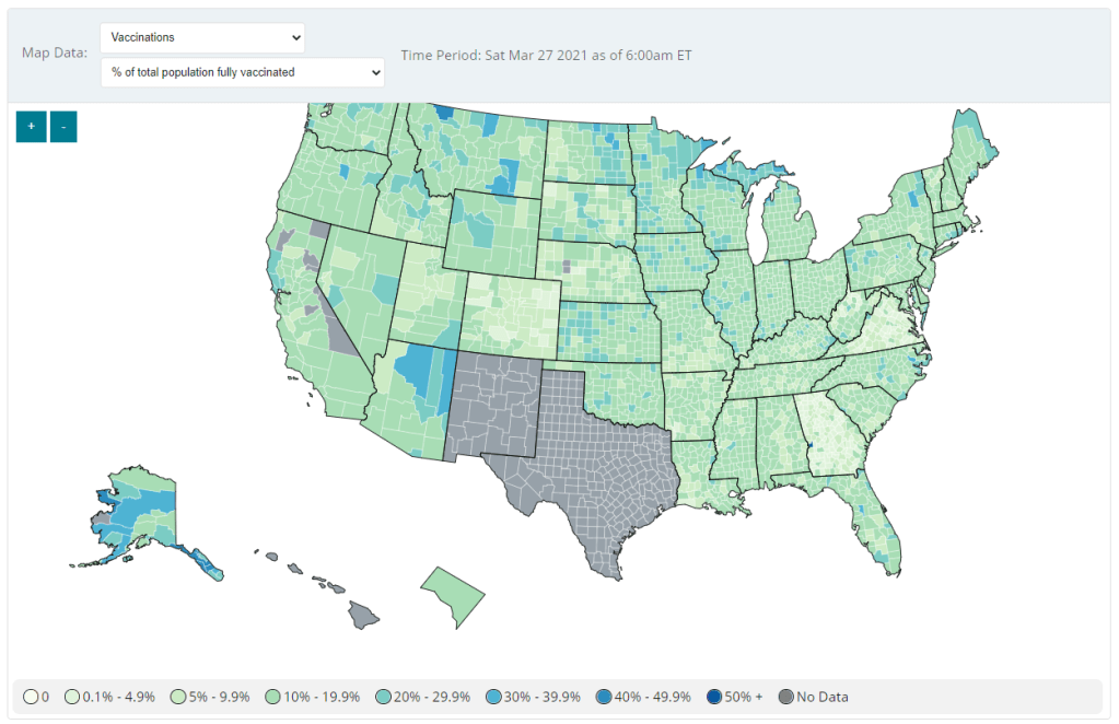
Second: Vaccination data at the county level are now available on the CDC’s COVID Data Tracker, as of Friday. No, not in the vaccinations section—you need to go to the County View section, then select “Vaccinations” in the dropdown menu. Click on a specific county (or select it using dropdown menus), and you’ll be able to see data for that county.
County-level vaccination data from the CDC. Screenshot taken on March 27.
At the moment, only three data points are available: total fully vaccinated population, fully vaccinated population over age 18, and fully vaccinated population over age 65. Also, data are missing for Texas, New Mexico, and select other counties. Still, this a great start for more standardized vaccination data at the national level. (Can we get more demographic data next?)
These county-level vaccination data aren’t downloadable directly from the CDC’s tracker, but the COVID Tracking Project is archiving the data at the Project’s public GitHub. The New York TImes has also built an interactive map with the data, which you can find on their vaccine tracker.
It’s worth noting that I found out about both of these updates via tweets from the White House COVID-19 Data Director, Cyrus Shahpar. I’m on both the CDC’s press list and the White House press list, and I watch nearly every White House COVID-19 press briefing, so it seems a little odd that I’m getting the news from Twitter.
(Not that I don’t love Cyrus’ daily tweets! I just wonder about the PR strategy here. Also, Cyrus, if you’re reading this, that interview request I sent back in January still stands.)