Author: Betsy Ladyzhets

  • Unpacking Delta numbers from this week’s headlines

    Unpacking Delta numbers from this week’s headlines

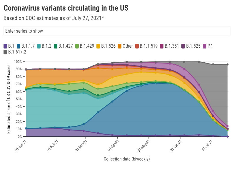
    It should be no surprise, at this point in the summer, that Delta (B.1.617.2) is bad news. From the moment it was identified in India, this variant has been linked to rapid transmission and rapid case increases, even in areas where the vaccination rates are high.

    This week, however, the CDC’s changed mask guidance—combined with new reports on breakthrough cases associated with Delta—has triggered widespread conversation about precisely how much damage this variant can do. “I’ve not seen this level of anxiety from everyone since the beginning of the pandemic,” Dr. Katelyn Jetelina wrote in her newsletter Friday.

    In the CDD today, I’m unpacking six key statements that you’ve likely seen in recent headlines, including where the statistics came from and what they mean for you.

    1. Delta causes a viral load 1,000 times higher than the original coronavirus strain.

    This number comes from a recent study in Guangzhou, China that was published as a preprint earlier in July. The researchers looked at viral load, a measurement of how much virus DNA is present in patients’ test samples; a higher viral load generally means the patient can infect more people, though it’s not a one-to-one relationship (more on that below).

    Based on measurements from 62 people infected with Delta, the researchers concluded that Delta patients have about 1,000 times more virus in their bodies compared to patients infected with the original coronavirus strain in early 2020. This paper has not yet been peer-reviewed, but outside experts have cited it as evidence behind Delta’s super-spreading ability.

    For more explanation on how Delta differs from past coronavirus strains, check out this KHN story by Liz Szabo.

    2. Delta causes similar viral loads in vaccinated and unvaccinated people who get infected.

    This finding comes from a highly anticipated CDC report published Friday in the agency’s Morbidity and Mortality Weekly Report (MMWR). CDC researchers measured viral loads—remember, a reflection of how much virus DNA is in a patient’s body—in vaccinated and unvaccinated people who got infected during an outbreak in Provincetown, Massachusetts. They found that the two groups had similar measurements, on average. Test samples in this outbreak were also sequenced; 90% of cases in the outbreak were definitively caused by Delta.

    It’s important to be precise when we talk about this CDC report, because viral load is just one specific measurement. While the viral load can reflect how capable someone is of transmitting the coronavirus, the CDC’s data do not definitively tell us that vaccinated and unvaccinated people are equally capable of transmitting Delta.

    Experts commenting on the CDC’s findings have said that other factors, such as length of infection and virus presence in a patient’s nose and mouth, also play into coronavirus transmission.For example, here’s a quote from a Science News story discussing the CDC’s findings:

    The result “just gives you an indication of how much viral RNA is in the sample, it tells you nothing about infectiousness,” says Susan Butler-Wu, a clinical microbiologist at the University of Southern California. These data “are a cause for concern, but this is not a definitive answer on transmissibility” from vaccinated people, she says.

    And here’s a Twitter thread from a vaccine scientist discussing how the CDC has conflated viral load measurements with actual transmission:

    In other words: vaccinated people are not capable of spreading Delta to the same degree as the unvaccinated. The infection and transmission risks for vaccinated people are still much lower. Here’s one reason why…

    3. A breakthrough infection will be over faster than a non-breakthrough infection.

    This finding comes from a study out of Singapore, published yesterday as a preprint. Researchers looked at viral loads over time for patients infected with Delta, comparing numbers for those patients who had and had not been vaccinated. They found that the viral load decreased more quickly in those vaccinated patients who had a breakthrough case, signifying that vaccinated patients both recover more quickly and lose their ability to get someone else infected more quickly.

    In other words, when a vaccinated person has a breakthrough case, their immune system is more prepared to face the coronavirus. That prepped immune system will help the person avoid severe disease, while also getting the virus out of the body more quickly than the immune system would be able to without a vaccine’s help.

    This study is not yet peer-reviewed, but it aligns with other research showing that vaccinated people with breakthrough cases tend to have mild symptoms and spend less time being contagious.

    4. An interaction of one second is enough time for Delta to spread from one person to another.

    In spring 2020, public health leaders agreed on a rule of thumb for COVID-19 risk: if you were indoors with someone, unmasked, for at least 15 minutes, that person qualified as a “close contact” who could give you the coronavirus, or vice versa. Now, with Delta, the equivalent of that 15-minute close contact is one second. I first saw this statistic in a STAT News interview with epidemiologist Dr. Céline Gounder, but it’s been reported in other publications as well.

    Let me emphasize here, though, that this one-second rule applies to indoor transmission. We don’t yet know how much Delta increases the risk of outdoor transmission, which was almost entirely negligible for past variants.

    5. The average person with Delta infects at least twice as many others as the average person with the original coronavirus strain.

    In spring 2020, the average person who got sick with COVID-19 would infect a couple of others, while a select few would cause superspreading events. Now, we’re learning that the average person who gets Delta can infect more. An internal CDC report leaked by the Washington Post says that Delta may infect eight or nine people on average and spreads “as easily as chickenpox.”

    While this comparison is obviously pretty concerning, outside experts have been skeptical of the CDC’s generalization of data from that one Massachusetts outbreak. Plus, the CDC’s estimate of Delta’s capacity for infection is higher than estimates we’ve seen from other sources. Studies out of England suggest that the variant infects five to seven people on average—still high, but not quite chickenpox levels.

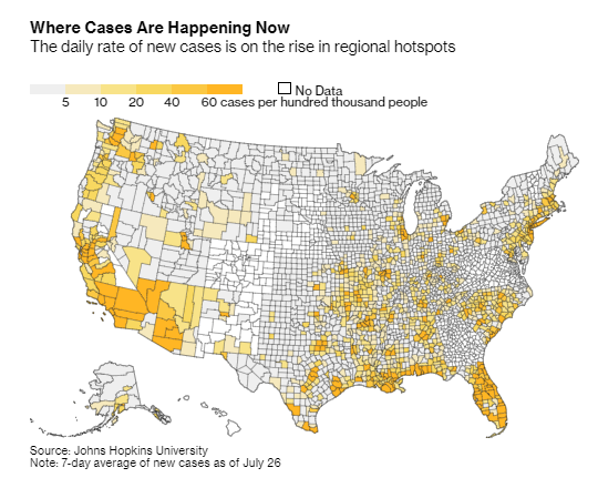
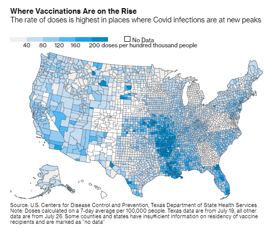
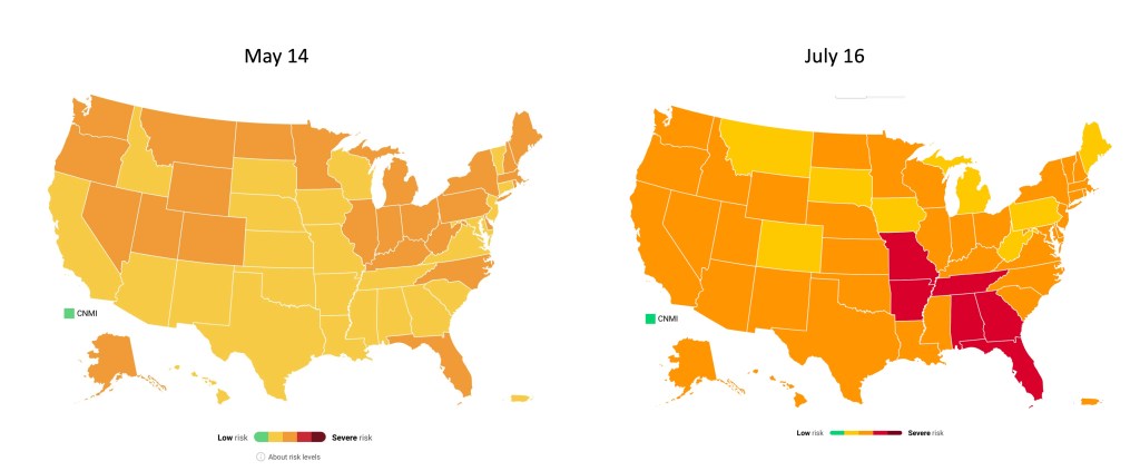
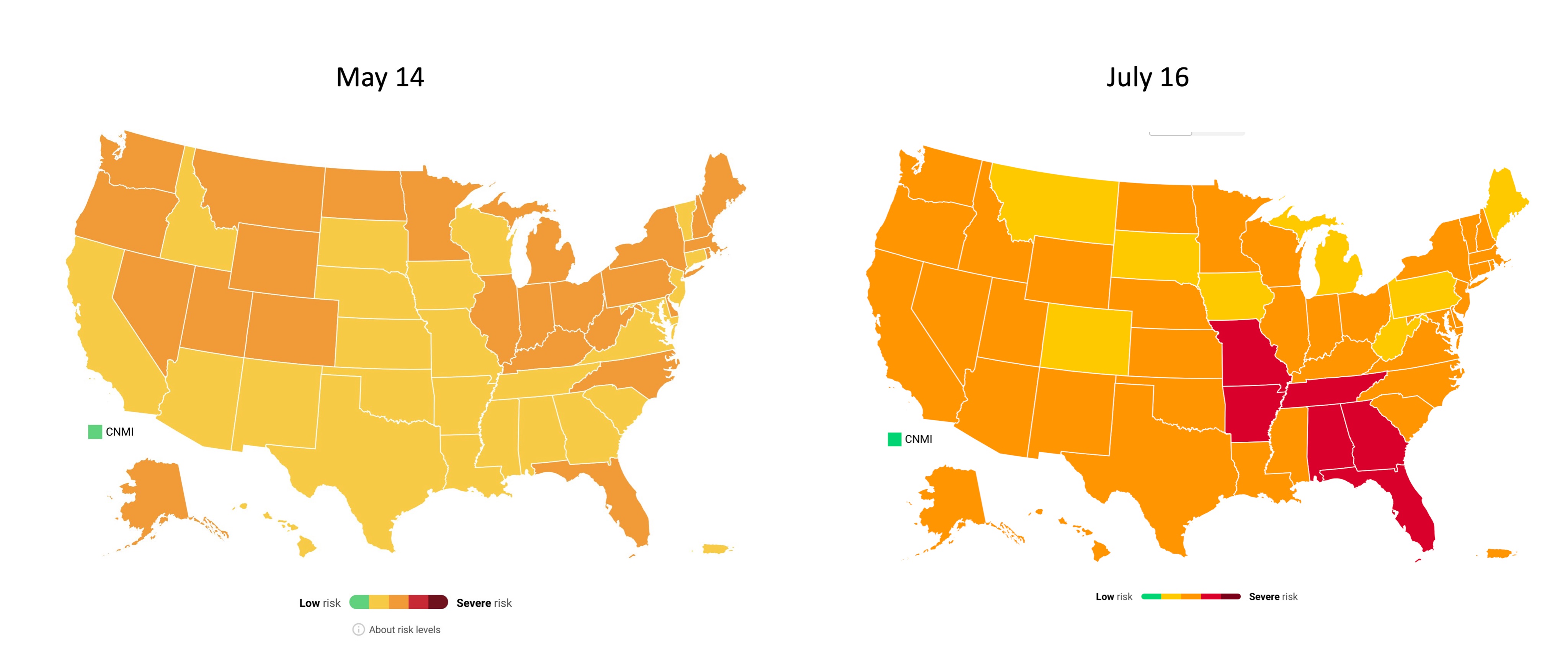
    6. Hospitalizations are rising in undervaccinated areas, while well-vaccinated areas are on the alert.

    Florida has been setting COVID-19 records recently. The state now has more people in the hospital with COVID-19 than at any other time during the pandemic, including the winter surge.

    Meanwhile, hospitalizations in Texas are up more than 300% from lows in late June. Austin is running out of ICU beds. Louisiana, Arkansas, and Nevada have all seen more than 10 new COVID-19 patients for every 100,000 residents in the past week. And the healthcare workers treating these patients are burnt out from over a year of pandemic work.

    In well-vaccinated areas, hospitalizations are low for now; even with Delta, the vaccines do a great job of protecting people against severe disease and death. But hospitals in these cities are still on high alert, ready to treat unvaccinated patients and those seniors, immunocompromised patients, and others for whom the vaccines may not be as effective.

    For example, see this thread from University of California San Francisco medical professor Bob Wachter. (San Francisco has the highest vaccination rate of any city in America.)

    TL;DR

    The TL;DR here is: Delta is way more contagious than any variant we’ve seen before. For unvaccinated people, any indoor, unmasked interaction with someone who has Delta—even a very short interaction—is enough for you to get infected. For vaccinated people, the risk of getting and spreading Delta is elevated compared to past coronavirus strains, but it is still far lower than the risk for unvaccinated people.

    So, when the CDC suggests that vaccinated people go back to mask-wearing (if you ever stopped), the agency is saying, wear a mask on behalf of the unvaccinated people around you. Those who are vaccinated are at more risk now than they were in May or June, but vaccination is still the best protection we have against infection, transmission, and—most importantly—severe COVID-19 disease.

    Or, to quote WNYC health and science editor Nsikan Akpan: “The vaccines will keep you from dying. Masks will keep away infections. Otherwise, the COVID odds are against you.”

    More variant reporting

    • National numbers, August 1

      National numbers, August 1

      In the past week (July 24 through 30), the U.S. reported about 466,000 new cases, according to the CDC. This amounts to:

      • An average of 66,600 new cases each day
      • 142 total new cases for every 100,000 Americans
      • 64% more new cases than last week (July 17-23)

      Last week, America also saw:

      • 38,300 new COVID-19 patients admitted to hospitals (11.7 for every 100,000 people)
      • 2,100 new COVID-19 deaths (0.6 for every 100,000 people)
      • 82% of new cases now Delta-caused (as of July 17)
      • An average of 660,000 vaccinations per day (per Bloomberg)

      Not only is the Delta variant driving a case rise, it’s driving an exponential case rise. This week, about 466,000 new COVID-19 cases were reported; that number is more than five times higher than what we saw during the week ending July 2.

      Parts of the country with lower vaccination rates are more vulnerable to Delta, of course. Current hotspots include Louisiana, Florida, Arkansas, Mississippi, and Alabama, all of which reported at least 300 new cases for every 100,000 people in the past week and all of which have under half of their populations fully vaccinated.

      But Delta is now entirely dominant—causing at least 82% of cases in the country, per the most recent (yet two weeks old) CDC estimate—and every single state is seeing case surges right now. Hospitalizations are also up, 46% higher than last week, and deaths are up 33%. About 300 Americans are dying from COVID-19 every day—and almost all of those deaths are entirely preventable.

      The CDC is now recommending that vaccinated people wear masks in indoor settings, if they live in high-transmission areas, have young children, or fit other criteria. While you can use the CDC’s county-level data to find your community’s COVID-19 status, it’s important to note that everyone’s risk levels are elevated right now.

      Katherine J. Wu said it well in The Atlantic on Friday:

      Some 70 percent of American counties are, according to the map, currently on fire; that percentage will probably tick up before it drops again. For now, I am tracking my pandemic circumstances. But my boundaries for my “community” are bigger than what the map says they are. They don’t stop at my county line, or my state line. They go as far as the virus treads—everywhere. Right now, I’m masking for as many people as I can.

      All that said, there’s one silver lining to this new surge: vaccination numbers are ticking up again, with the highest daily rates now in states like Louisiana, Arkansas, and Missouri where the new COVID-19 wave is hitting the hardest. The vaccines are still our best protection against Delta and other variants; more on that later in the issue.

    • Featured sources, July 25

      • 2021 Health Disparities Report by America’s Health RankingsThis source isn’t specific to COVID-19, but it may be invaluable for reporting on the disparities worsened by the pandemic. America’s Health Rankings has put together comprehensive reports on national health data for decades; this is the first report to focus specifically on social determinants of health, including social, economic, physical environment, and other factors.
      • COVID-19 Orphanhood Calculator: Researchers at Imperial College London built this dashboard to track one of the most dire consequences of the pandemic: children who lost their parents or primary caregivers to COVID-19. That group includes more than 1.5 million children worldwide, according to a recent study by the same researchers. The estimates are based on COVID-19 mortality data and fertility data.
      • WHO COVID-19 Detailed Surveillance Data Dashboard: The World Health Organization has a new COVID-19 dashboard, and it’s incredibly detailed. Here, you can find testing data, case fatality ratios, cases and deaths by age, healthcare worker data, and more for all WHO member nations.

    • When will the pandemic end? 26 science writers and communicators respond

      When will the pandemic end? 26 science writers and communicators respond

      Wordcloud of the survey’s responses, made by Betsy Ladyzhets.

      In July 2020, I started the COVID-19 Data Dispatch. Inspired in part by a desire to express my thoughts on the challenges of pandemic tracking and in part by a desire to be useful for my friends and colleagues who were less plugged into COVID-19 news, the project grew from a newsletter to a full-fledged publication with its own website, resources, and membership program.

      Within months of my starting the publication, though, people started asking me about its end. What would I do when COVID-19 was “over”? I never knew how to answer. While there may be benchmarks that public health experts can use to declare the pandemic at an end, this end feels more complex for science writers like myself who have been intensely covering the COVID-19 crisis.

      The questions reached a fever pitch this spring as millions of Americans got vaccinated and reopenings became inevitable. So, I did what I often do when I face a challenge in my work: I reached out to my community.

      Working with The Open Notebook, I surveyed 26 other COVID-19 reporters and communicators. I asked when they thought the pandemic might come to an end, as well as how they would take lessons from the past year into the “post-COVID” stages of their careers.

      Many of the writers who responded took that first question literally. They provided vaccination thresholds (60 percent, 70 percent), positivity rate thresholds (1 percent, 2 percent), and other metrics. “When there is a sustained period with no or little COVID-19 related fatalities globally,” wrote The City’s Ann Choi.

      Others took the question in more complicated and nuanced directions. These writers redirected the question back at me—noting that even when the world meets numeric thresholds, millions will remain vulnerable.

      For example, freelance journalist Roxanne Khamsi wrote, “We’re still living in an HIV pandemic.” The Atlantic’s Ed Yong said, “I’ve come to think that the question, ‘When will the pandemic end?’ isn’t very useful, and it’s more salient to ask, ‘For whom is the pandemic still ongoing?’” Other writers pointed to immunocompromised people for whom the vaccines may not be effective, long-haulers still suffering from symptoms, and the inequities between the U.S. and the many nations with little access to vaccines.

      As a science writer covering public health, I feel duty-bound to think of the most vulnerable; many of the writers who responded to my survey echoed that sentiment. Even when the majority of the U.S. is vaccinated, I still intend to cover the communities that face barriers to getting their shots, the immunocompromised patients for whom the shots may not work, and the countries where shots are still not available at all. I’m inspired by the boundless curiosity and compassion of other writers who continue this work, too.

      In addition to asking about the end of the pandemic itself, I asked what lessons these writers would take into their future reporting. Their answers fit a similar theme, compassion and curiosity. Some wrote that science writing must intersect more with non-science fields: “Every beat is deeply intersectional, and it’s time to see newsrooms that reflect that,” said U.S. News reporter Chelsea Cirruzzo. Climate coverage may be one example of this trend; climate reporters like HEATED’s Emily Atkin are calling for more collaboration between science and non-science journalists writing about this crisis.

      Other survey responses discussed the importance of communicating uncertainty, challenging established scientific norms, and holding accountable the institutions that fail to protect the vulnerable. “Assume nothing, question everything and everyone,” wrote The New York Times’s Apoorva Mandavilli.

      When will the pandemic end? It won’t be when the world sees its last COVID-19 case, because that could be centuries from now. Maybe it will be, as Berlin-based freelancer Hristio Boytchev wrote, “When the incidence numbers disappear from the homepages of major news media.”

      Even if incidence numbers disappear from homepages, though, I know that science sections, health sections, and independent publications like mine will keep the coverage going for a long time yet.

      To read the full responses from each science writer, head over to The Open Notebook’s website.

    • COVID source shout-out: Transparency in Utah

      COVID source shout-out: Transparency in Utah

      Utah hasn’t hit 70% adult vaccinations yet—but a recent data error led state officials to erroneously announce the benchmark had been hit. Spencer Cox, Utah’s governor, posted an apology on Twitter that drew attention for his commitment to transparency and accountability.

      “My fellow Utahns,” the statement opens, “We screwed up. And I sincerely apologize.” Cox goes on to explain the data error, affirm the state health agency’s commitment to accurate numbers, and emphasize the need for easily-accessible vaccinations.

      The data error arose from the challenge of matching state and federal data. In Utah, like in every other state, a small number of vaccine doses are administered under the federal government’s purview via the federal-pharmacy chain partnership, the Department of Defense, Indian Health Services, and other agencies. When Utah officials added the federal doses to state numbers, they initially found that 70% of adults had received at least one shot—the true number is just over 67%, Cox said. 

      Also, while poking around Utah’s COVID-19 website to better understand the data error, I found that the state has some great vaccine promotions going. These include the option to request a free mobile vaccination clinic in your community and this truly incredible “Vaccine Mythbusters” video. With the help of these initiatives, Utah is sure to hit 70% soon.

    • Featured sources, July 18

      • COVID-19 resources by Evidence Aid: Evidence Aid is a U.K.-based nonprofit that provides evidence-based guidance for disaster response. The organization’s COVID-19 page includes plain-language research summaries about COVID-19 epidemiology, treatments, and more, available in several different languages.
      • Public Health England Technical Briefings on SARS-CoV-2 variants: While the CDC has not done the best job of providing data on variants and breakthrough cases, the U.K.’s public health agency is sequencing more cases than any other country—and providing detailed reports on the results of those efforts. These reports may be useful for anyone seeking to keep a close eye on Delta and other variants’ ability to beat our vaccines. (h/t Your Local Epidemiologist)
      • Excess mortality and COVID-19 deaths in 67 countries: Researchers from the University of Bologna (in Italy) analyzed the gaps between excess deaths and COVID-19 deaths in 67 countries, revealing the capacity of different national health systems to accurately identify COVID-19 cases. Their work was published this week in JAMA Network Open. (For more on excess deaths, see this CDD post about Peru.)
      • Characterizing long COVID in an international cohort: In another new paper, published this week in The Lancet, COVID-19 long-haulers from the Patient-Led Research Collaborative share the results of an international survey on long COVID-19. The findings indicate that the vast majority of long-haulers (over 90% of those surveyed) suffer from symptoms for at least 35 weeks.
      • COVID-19 Vaccine Acceptance and Hesitancy in Low and Middle Income Countries: One more new paper, this one published in Nature: an international group of researchers analyzed vaccine acceptance across several low- and middle-income countries (LMICs), the U.S., and Russia. They found much higher vaccine acceptance in LMICs (80%) compared to the U.S. (65%) and Russian (30%). The study data are available on GitHub.

    • The booster shot conversation: What you should know

      The booster shot conversation: What you should know

      Pfizer vaccine, in use at Walter Reed National Military Medical Center. DoD photo by Lisa Ferdinando.

      Recently, a lot of U.S. COVID-19 news has centered around booster shots—additional vaccine doses to boost patients’ immunity against the coronavirus. Questions abound: do we need these shots, when might we need them, how do they impact vaccination campaigns?

      In other countries, booster shots are being deployed as a measure of extra protection for people with weaker immune systems as Delta spreads. In France, extra vaccine doses are available for organ transplant recipients, those on dialysis, and others. Israel is similarly offering third Pfizer doses to Israelis with medical conditions that cause immunodeficiency. And in Thailand, healthcare workers are getting booster shots of the AstraZeneca vaccine after two doses of Sinovac, which has demonstrated lower efficacy than other vaccines.

      Even in the U.S., a small number of immunocompromised patients have received third doses—many of them in clinical trials analyzing how well boosters work. Medical experts tend not to question why boosters may be needed for immunocompromised patients, as their weakened immune systems also make the patients more vulnerable to severe cases of COVID-19.

      The real questions come when we start to consider booster shots for everyone. Pfizer, which has developed a third dose for the general population, recently announced that the company applied for Emergency Use Authorization from the FDA. The company says its currently approved two-shot regimen will cause patients to lose some protection six months after they’ve been vaccinated—and become more vulnerable to Delta—with continued lower immunity over time.

      Officials at the FDA and CDC, however, have said that boosters aren’t yet necessary. The agencies released a joint statement to that effect, and U.S. health officials say they want to see more data—especially from Israel, where Pfizer has been in heavy use. Pfizer’s data on waning efficacy aren’t yet public (released by press release, not scientific paper), which complicates the conversation. Still, some health officials say we will eventually need booster shots, just not right now, according to POLITICO.

      While U.S. public health experts seek more data, our booster shot conversation appears selfish in other parts of the world. While over 3.6 billion doses have been administered globally across 180 countries, high-income countries are getting vaccinated 30 times faster than lower-income countries, according to Bloomberg. More than half of Americans have received at least one shot, compared to under 1% in many African countries.

      Dr. Tedros Adhanom Ghebreyesus, Director-General of the WHO, slammed the U.S. and other wealthy nations at a press briefing last week for even considering booster shots. “The priority now must be to vaccinate those who have received no doses and protection,” he said. “Instead of Moderna and Pfizer prioritizing the supply of vaccines as boosters to countries whose populations have relatively high coverage, we need them to go all out to channel supply to COVAX, the Africa Vaccine Acquisition Task Team and low- and low-middle income countries, which have very low vaccine coverage.”

      For more details and expert takes on the situation, I recommend this article from several ace STAT News reporters.

      More vaccine reporting

      • Sources and updates, November 12
        Sources and updates for the week of November 12 include new vaccination data, a rapid test receiving FDA approval, treatment guidelines, and more.
      • How is the CDC tracking the latest round of COVID-19 vaccines?
        Following the end of the federal public health emergency in May, the CDC has lost its authority to collect vaccination data from all state and local health agencies that keep immunization records. As a result, the CDC is no longer providing comprehensive vaccination numbers on its COVID-19 dashboards. But we still have some information about this year’s vaccination campaign, thanks to continued CDC efforts as well as reporting by other health agencies and research organizations.
      • Sources and updates, October 8
        Sources and updates for the week of October 8 include new papers about booster shot uptake, at-home tests, and Long COVID symptoms.
      • COVID source shout-out: Novavax’s booster is now available
        This week, the FDA authorized Novavax’s updated COVID-19 vaccine. Here’s why some people are excited to get Novavax’s vaccine this fall, as opposed to Pfizer’s or Moderna’s.
      • COVID-19 vaccine issues: Stories from COVID-19 Data Dispatch readers across the U.S.
        Last week, I asked you, COVID-19 Data Dispatch readers, to send me your stories of challenges you experienced when trying to get this fall’s COVID-19 vaccines. I received 35 responses from readers across the country, demonstrating issues with insurance coverage, pharmacy logistics, and more.
    • One year of the CDD: Reader reflections

      Earlier this week, I asked readers to share what the COVID-19 Data Dispatch has meant to them over this past year. Thank you to everyone who responded—it was wonderful to hear how my work has helped you make sense of the pandemic. 

      Here are a couple of responses that I wanted to share out with everyone:

      I made a career change to data analytics in November last year. Reading your newsletter has been very inspiring, i’m very interested in data journalism but I’m still very new to the field so everything is difficult still 😅 however I love reading your newsletter and seeing what’s possible! I also find it very comforting to read compared to the hyped nature of the general media. I think it’s the only corona news I read without feeling like someone is trying to wind me up 😅

      Harriet

      A whole year??!?!?!?! Damn. Is it weird that the steady pace of your updates has felt very much like having a friend who was out there keeping me updated on shit when I’ve been entirely out of cope? I feel informed, which sometimes is reassuring, and sometimes terrifying. I’ve definitely shared things I’ve gotten from you when I’ve been in discussions elsewhere, and I’m sure it’s incredibly stressful work for you but I’m so glad to be a recipient of it.

      Elaine

      Many of the resources you cited/brought to my attention were really helpful in assessing risk, especially over the summer and fall. Reading the CDD also made me more aware of how people (especially in the media) were talking about the COVID-19 numbers, and made me more likely to interrogate their sources/interpretation of data. And as a bonus, I sounded REALLY smart talking to other people about COVID-19 data.

      Abby

      The CDD has meant a lot to me: I’ve seen someone I love find meaning in their work; I’ve been more informed, more alert, and less fearful about the pandemic; I haven’t spiraled emotionally over heated Twitter debates about the pandemic.

      Laura (my girlfriend 💖)

    • One year of the CDD: My favorite posts

      One year of the CDD: My favorite posts

      Issue #1 of the COVID-19 Data Dispatch was published on July 26, 2020. Today, we hit Issue #52.

      During that time, we’ve explored data issues from testing to vaccinations to variants. We’ve moved from Substack to a new website, supported an internship, and logged over 150 data source recommendations for readers.

      In reflecting on what I’ve learned running the publication this past year, I wanted to share a few of my favorite posts—those where I provided original analysis, introduced a new source, or had an impact on readers.

      • Hospital capacity dataset gets a makeover: This was our very first issue in July 2020. COVID-19 hospitalization data had switched from CDC responsibility to HHS responsibility; the switch garnered a lot of data challenges (and some political attention). This post explains what we knew so far about why the switch had occurred and what issues it was causing—and paved the way for many more posts on HHS hospitalization data.
      • Three different units for COVID-19 tests: In this September post, I explained a major challenge  I’d dealt with in my volunteer work for the COVID Tracking Project: every state counted its tests in a slightly different way. The post goes over tests counted in specimens, people, and encounters, with examples from different states and an explanation of why the issue matters.
      • School data with denominators: In October, I interviewed Emily Oster, an economist at Brown University who has led one of the major research efforts to track COVID-19 cases in U.S. schools. We discussed the challenges of compiling school data—many of which still persist now, nine months later. Oster has also become a bit of a controversial figure in the debates over school reopening, and I’m proud to have asked her some challenging questions at a time when her work was just starting to gain prominence in the COVID-19 world.
      • Your Thanksgiving could be a superspreading event: This post—which provides a data-driven explainer of COVID-19 superspreading events—was inspired by a reader’s question on how holiday celebrations might contribute to COVID-19 spikes. It was published on November 8, a time when many Americans were carefully considering holiday plans; I wanted to help people understand their risk and act accordingly.
      • A new metric for conceptualizing cases: Here, I described a metric first used by my friend (and fellow COVID Tracking Project volunteer) Nicki Camberg: one in X Americans has been diagnosed with COVID-19 in the past [insert timeframe here]. The metric was later picked up by the New York Times and other outlets, and I’ve consistently used it in updates throughout the year. The post includes a quote from Nicki, reflecting on how the metric can make COVID-19 cases more personally relatable.
      • Who should get the first vaccine doses?: This post (from late November) might be the one I’ve most often sent to other journalists, mostly because it includes a detailed description of the CDC’s Social Vulnerability Index—a source that provides social, economic, and environmental data by U.S. counties and ZIP codes, and one I frequently recommend to anyone reporting on demographics or equity. (At the time, I hoped that it would be used to determine vaccination priorities; this has been true for some parts of the country, but far from universal.)
      • COVID-19 data for your local hospital: This post discusses a new release of facility-level hospitalization data from the HHS. At the time, it was described as “probably the single most important data release that we’ve seen from the federal government.” I explained why it was so important and gave some examples of some stories that could be told with the data, including an interactive Tableau dashboard.
      • We’re not doing enough sequencing to detect B.1.1.7: This was one of intern Sarah Braner’s first posts, and it became the first post in our now-extensive Variants category. At the time (January 10), just 63 B.1.1.7 cases had been identified in the U.S., but Sarah explained why the true numbers were likely much higher and why that data gap should be cause for concern.
      • Access barriers lead to vaccination disparity in NYC: The CDD usually takes a national focus, but in this post, I zeroed in on my home city as a microcosm of the vaccination barriers faced across the country. At the time (February 7), Black New Yorkers made up 25% of the NYC population but just 12% of those vaccinated. I visualized the disparities, and discussed potential reasons and solutions.
      • Privacy-first from the start: The backstory behind your exposure notification app: This March 28 interview is one of my favorites from the past year. I spoke to Jenny Wanger, product manager and leader for exposure notification apps. After months of following these apps (and getting frustrated at the lack of available data), I was thrilled at the opportunity to talk to an expert in the space; this interview helped inspire my later feature for MIT Tech Review on the same topic.
      • Some personal news: In April, I left my full-time job in order to focus on freelancing and the COVID-19 Data Dispatch. This post announces the decision and explains my rationale; I appreciated the opportunity to reflect on my choice and talk about what might be next for me, and I think readers did as well.
      • In India’s COVID-19 catastrophe, figures are only part of the story: As COVID-19 cases surged in India, guest writer Payal Dhal explained why official figures fell short at capturing the scale of the tragedy. Comparisons to data quality, testing availability, and hospital capacity in the U.S. help to explain the issue.
      • COVID source shout-out: TUSHY: In the May 9 issue, I featured a bidet company promoting vaccinations with NSFW tactics: “Can We Eat Ass Yet?” “NO.” I will forever be grateful to TUSHY’s marketing team for responding to my press request on short notice and providing more backstory on the page.
      • The data behind the CDC’s new mask guidance: This post aimed to provide a service to readers confused by the CDC’s sudden shift in masking recommendations. I outlined the epidemiological evidence behind the agency’s assertion that fully vaccinated Americans could go maskless basically anywhere.
      • The US missed Biden’s July 4 goal: How did your community do?: To commemorate the July 4 holiday, I did a deep-dive into President Biden’s missed goal: 70% of adults vaccinated with at least one dose by that date. The story includes interactive maps and quotes from experts on where we go from here.

    • National numbers, July 18

      National numbers, July 18

      Image
      COVID-19 risk levels by state in May and July. Data from Covid Act Now, posted on Twitter by Eric Topol.

      In the past week (July 10 through 16), the U.S. reported about 184,000 new cases, according to the CDC. This amounts to:

      • An average of 26,300 new cases each day
      • 56 total new cases for every 100,000 Americans
      • 69% more new cases than last week (July 3-9)

      Last week, America also saw:

      • 19,600 new COVID-19 patients admitted to hospitals (6.0 for every 100,000 people)
      • 1,500 new COVID-19 deaths (0.5 for every 100,000 people)
      • 58% of new cases now Delta-caused (as of July 3)
      • An average of 500,000 vaccinations per day (per Bloomberg)

      Cases have been rising for a couple of weeks now, but we’re now seeing the sharpest increase since fall 2020. Between July 9 and July 16, we went from an average of 15,000 new cases a day to an average of 26,000 new cases a day.

      Hospitalizations and deaths are also increasing. We’re now seeing about 26% more new COVID-19 patients in hospitals every day and 36% more new deaths—it’s the first time that deaths have increased since the winter.

      “There is a clear message that is coming through: this is becoming a pandemic of the unvaccinated,” CDC Director Dr. Rochelle Walensky said at a press briefing on Friday. As I’ve continually emphasized in recent issues, states and counties with lower vaccination rates are more vulnerable to the Delta variant.

      Missouri continues to be a hotspot, as does Arkansas, with other states in the Midwest and South also seeing major surges. Florida is of particular concern: one in five U.S. cases in the last week were reported in this state, and Florida has seen a 109% case increase from the first to the second week of July.

      The under-vaccinated hotspots are more likely to see hospitals become overwhelmed with COVID-19 patients (see: this great data visualization by Conor Kelly). But even areas with high vaccination rates are seeing Delta take over. In New York City, Delta now causes 69% of new cases—and case numbers have doubled in the past two weeks. In San Francisco, where a full three-quarters of the eligible population is fully vaccinated, cases and test positivity rates have jumped in July.

      Despite the clear dangers of Delta, millions of Americans still refuse to get vaccinated. As Ed Yong put it in a recent piece on Missouri’s surge: “Vaccines were meant to be the end of the pandemic. If people don’t get them, the actual end will look more like Springfield’s present: a succession of COVID-19 waves that will break unevenly across the country until everyone has either been vaccinated or infected.”