Wastewater data from Biobot suggest that COVID-19 spread is still declining throughout the country, but slowly.
In the past week (February 23 through March 1), the U.S. officially reported about 230,000 new COVID-19 cases, according to the CDC. This amounts to:
An average of 32,000 new cases each day
69 total new cases for every 100,000 Americans
5% fewer new cases than last week (February 16-22)
In the past week, the U.S. also reported about 23,000 new COVID-19 patients admitted to hospitals. This amounts to:
An average of 3,300 new admissions each day
7.1 total admissions for every 100,000 Americans
8% fewer new admissions than last week
Additionally, the U.S. reported:
2,300 new COVID-19 deaths (330 per day)
90% of new cases are caused by Omicron XBB.1.5; 8% by BQ.1 and BQ.1.1; 1% by CH.1.1 (as of March 4)
An average of 50,000 vaccinations per day
At the national level, major COVID-19 metrics continue to indicate slow declines in transmission. As I’ve been writing for the last few weeks, we’re at a “low tide” point in COVID-19 spread: clearly lower than the peaks that occur after holidays or new variants, but much higher than the baselines that we experienced before the Omicron era.
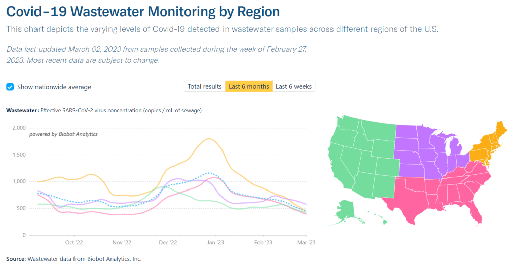
Official cases reported by the CDC dropped by 5% last week compared to the week prior, while new hospital admissions dropped by 8%. Wastewater data from Biobot show declining coronavirus levels nationally, but viral concentrations in wastewater are twice as high as they were at this point in 2021 or 2022.
Biobot’s regional data suggest that the Midwest has overtaken the Northeast in coronavirus concentrations for the first time since late summer 2022. Both regions are seeing declines, but the declining spread in the Northeast has accelerated a bit faster than that in the Midwest.
While most individual states and counties are reporting COVID-19 declines as well, a few have reported increased coronavirus in their wastewater in recent weeks. This includes counties in Idaho, Wyoming, Montana, Florida, Texas, and others in the Midwest and South.
Omicron XBB.1.5 continues to be the dominant variant in the U.S., now accounting for about 90% of new cases in the last week, per CDC estimates. Viral evolution experts will be watching to see if XBB.1.5 mutates further, or if some other variant arrives to compete with it.
As we head into the spring, U.S. COVID-19 data continue to get harder to find and less reliable. Last week, the Department of Health and Human Services announced that it would retire its Community Profile Reports, which I used to rely on as a regular source for this newsletter.
Meanwhile, a study from Denis Nash and his team at the City University of New York that estimated true COVID-19 prevalence during the BA.4/BA.5 surge last summer was recently published in the journal Preventative Medicine. I covered this study when it was released as a preprint last fall, and find it striking that no other estimates like this have emerged since then.
Twitter user @tay_kass captioned this image, “the moment Zach realized he had COVID.” I don’t disagree!
This week, the Bachelor tested positive for COVID-19. As both an avid watcher of the franchise and a COVID-19 reporter, I was immediately curious to see how the production would handle this. Unfortunately, the show was pretty sparse on safety details.
Now, I understand why Bachelor producers and the higher-ups at ABC may not want to spend much of their episode time on the logistics of PCR tests or contestant quarantines. But I think they missed an opportunity here to show the viewers exactly what goes into COVID-19 safety on a high-budget TV show like the Bachelor.
Film and TV sets tend to have rigorous safety protocols (with regular testing, masking for production teams, etc.), and could serve as models for other settings. The Bachelor could have shown millions of viewers what that looks like; instead, the lead’s COVID-19 case is mostly framed as a bummer for the women who were supposed to go on dates with him.
With that in mind, here are a few things we know (and don’t know) about how the Bachelor handled this COVID-19 case, based on the episode itself and this interview on Entertainment Weekly:
Show lead Zach Shallcross isolated in his hotel room after testing positive. He’d already skipped a group date earlier in the day when he started to experience symptoms, but it’s unclear if he was actually isolating at that point (there might have been a camera person or two in his hotel room?).
All of the contestants get tested on a daily basis. Unclear if these are PCR or at-home/rapid tests, though my guess is PCR given that the production apparently had to wait some time for Zach’s test results after he started to not feel well.
The day before he tested positive, Zach went on a one-on-one date with contestant Gabi Elnicki. According to the EW interview, Gabi was “tested multiple times” immediately following Zach’s positive test, and got her own hotel room. This doesn’t appear to have been a full quarantine, though.
The other contestants seemed to have gotten lucky, to a certain extent, because Zach’s COVID-19 case occurred right after travel to London—so no other contestants had been exposed to him.
Zach’s symptoms were fairly mild, to the point that the production held a remote cocktail party and rose ceremony with him in his hotel room (i.e. he talked to contestants and then identified those who will stay for the next week over Zoom).
In next week’s episode, Zach will go on more dates, per the EW interview, so I assume he will have “recovered” enough to leave isolation. Will that mean his symptoms resolving, a negative rapid test, or just waiting a few days? It’s currently unclear.
The entire cast and crew of the Bachelor was fully vaccinated. Of course, this doesn’t prevent infection or transmission, but it could’ve played some role in keeping this one case from becoming an outbreak. It also seems like crew members are usually masked on set, though I could just be extrapolating based on a few shots we’ve seen of producers.
As you can see, there are a lot of gaps in what we know about COVID-19 safety measures on the Bachelor… and I doubt those gaps will be filled, given what the production seems to prioritize in its airtime. If any editors reading this want to give me an assignment to investigate further, I am available.
Deaths in U.S. prisons: Throughout the pandemic, the UCLA COVID Behind Bars Data Project has been a leading source for data on COVID-19 cases and deaths in carceral settings. As COVID-specific data on prisons and jails have become more sporadic, the project recently turned its attention to overall mortality data in these settings. Last week, the UCLA team released a new dataset sharing all-cause deaths in prisons through 2020, which combines data from public reports and records requests. The full dataset is available on GitHub, and a summary of this project’s findings on all-cause mortality was published in the New York Times last weekend.
BIOFIRE syndromic trends data: BIOFIRE Diagnostics is a biotech company focused on diagnostic testing, offering tests for a variety of viruses, bacteria, and other pathogens. The company publishes anonymized test results from its labs on its Syndromic Trends dashboard; this dashboard is a helpful way to get an overview of test positivity for COVID-19 compared to other common diseases. (H/t Force of Infection.)
R&D roadmap for COVID-19 vaccines: The University of Minnesota’s Center for Infectious Disease Research and Policy has published a new report outlining the research and development steps needed for the world to produce coronavirus vaccines that are “broadly protective,” not tied to a specific variant. It includes recommendations for research on virology, immunology, and vaccine technologies, along with information on using animal models and guidance on vaccine policy. Related: the CDC’s Advisory Community on Immunization Practices met this week to discuss COVID-19 and other vaccines.
CDC reports on travel surveillance: Two new studies about COVID-19 among international travelers to the U.S. were published in this week’s CDC Morbidity and Mortality Weekly Report. Both studies describe results from the agency’s Travel Surveillance program, which is a collaboration with biotech company Ginkgo Bioworks and testing company XpresCheck. One report compares traveler test results from before and after the U.S. ended its pre-departure testing requirement for international flights, finding that travelers were much more likely to have COVID-19 after the requirement was lifted. The second report provides results from a pilot program testing airplane wastewater at JFK Airport; this report found that the vast majority of plane samples tested were positive for SARS-CoV-2, and researchers identified a variety of Omicron variants. More work is needed to really get airplane wastewater testing going in the U.S., but it’s good to see early results showing this program’s feasibility.
Early data from XBB.1.5 in NYC: Another notable study in CDC MMWR this week provided analysis from New York City’s health department on Omicron XBB.1.5. The subvariant was first identified in the city in October 2022 (though it may have evolved somewhere else), and quickly spread through the region; it accounted for 81% of sequenced COVID-19 test samples by early January. The NYC health department linked sequencing data with patient outcomes data, finding that people infected with XBB.1.5 were not significantly more likely to be hospitalized or to die from COVID-19 compared to those infected with other variants. In other words, XBB.1.5 appears to not cause more severe disease, based on this report.
Predicting COVID-19 cases based on wastewater results: One more newsworthy study to share this week: researchers at Hokkaido University developed a mathematical model to predict COVID-19 cases based on coronavirus concentration levels in Sapporo, Japan. I’m always on the lookout for studies like this, as wastewater data become increasingly important to track true infection numbers. (Here’s a prior example, from the University of Florida.) Of course, it’s worth noting that the Hokkaido researchers had consistent wastewater and case data from spring 2020 through 2022 to use for their model; for wastewater researchers working in the U.S. now, that consistency is often harder to achieve.
Last week, I wrote about my experience with a CO2 monitor that I recently bought, and have been using to informally study the air quality in my New York City apartment. I asked readers to share their experiences with these monitors, and several of you did!
Here are some snippets from those responses; I hope it will be helpful for some readers to see how other folks are using air quality monitors.
Joyce R.:
I bought a much less expensive one (this one for $60), and I’ve been using it in my downtown office that I go to twice a week (it’s a WeWork facility and I’m in a small 2-person office there; my co-worker and I take turns using it so only one of us is in it at any given time). I of course am always masked in the building—unlike about 98% of the other tenants, sadly—except when I eat (alone in my office, or outdoors on the roof if the weather is good enough). I also have one of those personal HEPA air purifiers going all day. The monitor is showing that usually the range is 800-900, so I’m pretty happy with that.
Mark:
I have an Aranet4 and I’m amazed at the accuracy of it. I put it in my kid’s backpack and could track when he changed classes, went outside or got on the bus. It was REALLY interesting.
In a follow-up email, Mark added:
When I got his class schedule, the changes matched up to the exact 5 minute windows of changes. When I saw high numbers and asked my kid (who couldn’t see the numbers) what the class was like, he said ‘biggest class, 30 kids.’ Yep, the CO2 monitor picked it up. Really really impressive.
Kate:
Not only do I use a CO2 monitor to make risk decisions in my personal life—which shops and concert venues to avoid, are the university shuttles where I work safe (no), what setup of windows and fan make my car safer, what is the natural ventilation air exchange rate… But also, I used CO2 readings to persuade my boss to get facilities to fix a broken vent in my workplace… And EVEN BETTER, the non-profit I co-founded, ‘Community Access to Ventilation Information,’ has been helping libraries in Canada and the US lend patrons CO2 monitors and understand how to act on the readings.
I will be talking to Kate and her co-founder at Community Access to Ventilation Information this coming week, and plan to share a Q&A based on that conversation in next Sunday’s newsletter. If there are any specific questions you’d like me to ask them, please reach out!
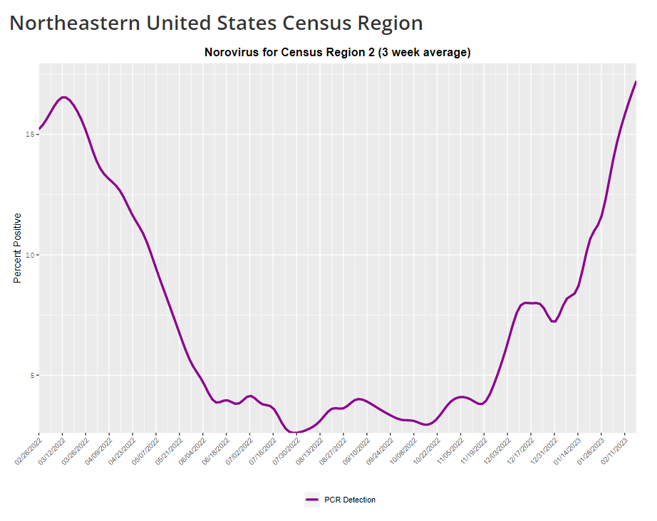
The CDC provides norovirus test positivity data from a select number of labs that report test results for this virus. Due to limited reporting, data are only available at the regional level.
This week, I have a new story out in Gothamist and WNYC (New York City’s public radio station) about norovirus, a nasty stomach bug that appears to be spreading a lot in the U.S. right now. The story shares some NYC-specific norovirus information, but it also talks more broadly about why it’s difficult to find precise data on this virus despite its major implications for public health.
Reporting this story led me to reflect on how COVID-19 has revealed cracks in the country’s infrastructure for tracking a lot of common pathogens. I’ve written previously about how the U.S. public health system monitored COVID-19 more comprehensively than any other disease in history; the scale of testing, contact tracing, and innovation into new surveillance technologies went far beyond the previous standards. Now, people who’ve gotten used to detailed data on COVID-19 have been surprised to find out that such data aren’t available for other common pathogens, like the flu or norovirus.
It might feel disappointing to realize how little we actually know about the impacts of endemic diseases. But I choose to see this as an opportunity: as COVID-19 revealed gaps in public health surveillance, it inspired development in potential avenues to close those gaps. Wastewater surveillance is one big example, along with the rise of at-home tests and self-reporting mechanisms, better connectivity between health systems, mobility data, exposure notifications, and more.
Norovirus is a good example of this trend. Here are a few main findings from my story:
People who become infected with norovirus are often hesitant to seek medical care, because the symptoms are disgusting and embarrassing. Think projectile vomit, paired with intense diarrhea.
Even when patients do seek medical care, norovirus tests are not widely available, and there isn’t a ton of incentive for doctors to ask for them. Testing usually requires a stool sample, which patients are often hesitant to do, one expert told me.
The virus is not a “reportable illness” for the CDC, meaning that health agencies and individual doctors aren’t required to report norovirus cases to a national monitoring system. (So even when a patient tests positive for norovirus, that result might not actually go to a health agency.)
The CDC does require health agencies and providers to report norovirus outbreaks (i.e. two or more cases from the same source), but national outbreak estimates are considered to be a vast undercount of true numbers.
Even in NYC, where the city’s health agency does require reporting of norovirus cases, there’s no recent public data from test results or outbreaks. (The latest data is from 2020.)
It seems like the lack of a requirement and the difficulty of tracking kind-of play into each other, where it’s not required because it’s hard to track—but it’s also hard to track because it’s not required.
The lack of detailed data on pathogens like norovirus can be frustrating on an individual level, for health-conscious people who might want to know what’s spreading in their community so that they can take appropriate precautions. (For norovirus, precautions primarily include rigorous handwashing—hand sanitizer doesn’t work against it—along with cleaning surfaces and care around food.)
These data gaps can also be a challenge for public officials, as more detailed information about where exactly a virus is spreading or who’s getting sick could inform specific public health responses. For example, if the NYC health department knew which neighborhoods were seeing the most norovirus, they could direct handwashing PSAs to those areas. In addition, scientists who are developing norovirus vaccines could use better data to estimate the value of those products, and determine who would most benefit.
So, how do we improve surveillance for norovirus and other viruses like it? Here are a few options I found in my reporting:
Wastewater surveillance, of course. The WastewaterSCAN project is already tracking norovirus along with coronavirus and several other common viruses; its data from this winter has aligned with other sources showing a national norovirus surge, one of the project’s principal investigators told me.
Better surveillance based on people’s symptoms. The Kinsa HealthWeather project offers one example; it aggregates anonymous information from smart thermometers and a symptom-tracking app to provide detailed data on respiratory illnesses and stomach bugs.
At-home tests, if they’re paired with a mechanism for people to report their results to a local public health agency. Even without a reporting mechanism, at-home tests could help curb outbreaks by helping people recognize their illness when they might be asymptomatic.
Simply increasing awareness and access to the tests that we already have. If more people go to the doctor for gastrointestinal symptoms and more doctors test for norovirus, our existing data would get more comprehensive.
Are there other options I’ve missed? Is there another pathogen that might be a good example of common surveillance issues? Reach out and let me know.
In the past week (February 16 through 22), the U.S. officially reported about 240,000 new COVID-19 cases, according to the CDC. This amounts to:
An average of 34,000 new cases each day
72 total new cases for every 100,000 Americans
9% fewer new cases than last week (February 9-15)
In the past week, the U.S. also reported about 25,000 new COVID-19 patients admitted to hospitals. This amounts to:
An average of 3,500 new admissions each day
7.5 total admissions for every 100,000 Americans
5% fewer new admissions than last week
Additionally, the U.S. reported:
2,400 new COVID-19 deaths (350 per day)
85% of new cases are caused by Omicron XBB.1.5; 12% by BQ.1 and BQ.1.1; 1% by CH.1.1 (as of February 25)
An average of 60,000 vaccinations per day
The national COVID-19 plateau continues. As I’ve been saying for a few weeks now, COVID-19 spread has dropped significantly from its high during the winter holidays, but it has not fallen to the low levels we’ve previously seen this time of year due to a combination of lax precautions and the latest Omicron variant, XBB.1.5.
Case and hospitalization data from the CDC, along with wastewater surveillance data, all show COVID-19 spread declining—but very slowly. Cases declined by 9% this week compared to the week prior, while new hospital admissions declined by 5%. Biobot’s wastewater surveillance dashboard shows slight declines or plateaus in all four major regions of the country.
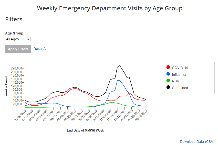
Respiratory virus season is clearly waning in the U.S., according to hospital emergency room visit data from the CDC’s National Syndromic Surveillance Program. ER visits for the flu and RSV have pretty much returned to baseline after their winter peaks. But COVID-19 ER visits have plateaued at a higher level, close to the visit numbers reported in September and October—another sign of the elevated “low tide” we’ve now been dealing with since spring 2022.
On the variant front: Omicron XBB.1.5 continues to dominate in the U.S. It caused an estimated 85% of new cases nationwide in the week ending February 25, according to the CDC, and is the main variant circulating in every region. After several months of “variant soup” with a number of Omicron subvariants competing, XBB.1.5 has emerged as the clear victor; no other single lineage is causing more than 10% of new cases in the country, per the CDC’s estimates.
I continue to write about COVID-19 case numbers from the CDC here, mostly because A) the directional patterns (i.e. upticks and downturns) of these data are still a decent representation of actual directional patterns in infections, and B) the CDC’s case numbers are more nationally representative (when it comes to geography) than data from the National Wastewater Surveillance System.
But I have to stress that these case numbers are increasingly undercounting actual infections. The last decent estimates I’ve seen comparing cases to infections, dated from last fall, suggested that case numbers are undercounted by a factor of 10 to 20. These days, I expect we’re likely closer to a factor of 20, if not higher. As evidence, test positivity for the entire U.S. has been at 10% for a couple of weeks now.
Other evidence for this continued undercounting comes from wastewater data. From resources like the Biobot dashboard, which compares wastewater surveillance trends to case trends, it’s abundantly clear that these two metrics used to align closely—but now coronavirus levels in wastewater are consistently much higher. In New York City, for example, wastewater data show that the city experienced one of its greatest COVID-19 surges this winter.
Hadn't run the NYC wastewater COVID numbers in a while, but was pretty surprised when I did.
I'd known there was a surge this winter, but didn't realize that Dec. 2022 wastewater concentrations were the *highest* since the start of the pandemic outside the omicron spike pic.twitter.com/lihRq8u5YU
Speaking of unreliable numbers: the team behind the CDC’s COVID Data Tracker Weekly Review has begun to update its readers on how the end of the federal public health emergency will impact COVID-19 data. The first update, published on Friday, explains that some data, including hospitalization and vaccination numbers, “may be reported less frequently” or with new gaps. I anticipate we’ll get more details about this in the coming weeks, as the CDC negotiates new data-sharing requirements with other health agencies.
The CDC’s data tracking newsletter is also shifting from a weekly newsletter to biweekly, starting March 3. It continues to boggle my mind how I, a single freelance journalist writing this publication in my spare time, am able to keep up more regular data updates than a massive federal agency.
Political leaders in New York State recently ended a policy requiring masks in healthcare settings. This is obviously a big issue for high-risk New Yorkers, many of whom have spoken out on social media about wanting to attend important doctors’ appointments without risking COVID-19.
In response to the change, local advocacy organization Mandate Masks NY has compiled a list of hospitals and healthcare centers in New York that are still maintaining mask requirements independently of the state policy. You can find the list here; and the organization has compiled several other lists of businesses requiring masks, available on their website.
As a former COVID Tracking Project volunteer, I’m always glad to see volunteer efforts producing important databases that wouldn’t otherwise be available. Also: it looks like the Mandate Masks NY Twitter account was suspended this weekend—if you know anything about that, please reach out!
Test positivity will become less reliable after PHE ends:CBS News COVID-19 reporter Alexander Tin flagged last week that, after the federal public health emergency for COVID-19 ends this spring, private labs that process PCR tests will no longer be required to report their results to state health departments. States will still report any results they get to the CDC, but federal officials expect that this data will become much less reliable, according to a background press briefing from the Department of Health and Human Services (HHS). Case data are already unreliable; soon, we won’t even have consistent test positivity data to tell us how unreliable they are. This may be one of several data sources that get worse after the end of the PHE.
HHS is supporting improved healthcare data sharing: The inability to connect different health records systems (or lack of interoperability, to use the technical term) has been a big problem during the pandemic, as researchers and health officials often couldn’t answer questions that require multiple health datasets. HHS has taken some steps to improve this situation, while also making it easier for individual patients to access their personal records. Most recently, HHS announced that it’s chosen six companies and organizations to develop data-sharing platforms, according to POLITICO. It’ll take some time for these organizations to start actually sharing data, but I’m glad to see any movement on this important issue.
Yes, vaccination is still the best way to get protected from COVID-19: A new study from the Institute for Health Metrics and Evaluation, published in the Lancet this week, has been making the rounds on social media recently. Anti-vax pundits are claiming the study shows that immunity from a prior coronavirus infection is more effective than immunity from vaccination at preventing future severe COVID-19. While the study does show that a prior infection can be helpful, the authors found a significant drop in the value of this type of protection after Omicron variants started circulating in late 2021. And, as some commentators have pointed out, infections can always lead to severe symptoms and Long COVID—the risks from vaccination are much lower. Basically, this XKCD comic remains accurate.
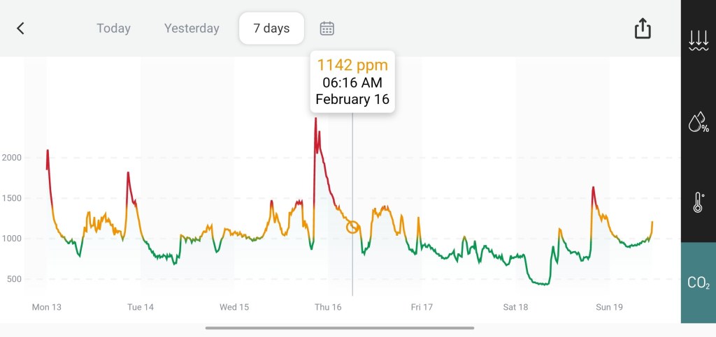
A chart from the Aranet app shows CO2 concentrations in my apartment over the last week.
I recently bought a carbon dioxide monitor, and have been using it to collect data in my apartment and other places. In the week since I’ve been monitoring, I’ve noticed how personal data collection like this can be helpful in identifying ventilation issues, but comes with many caveats.
You might have seen photos of these devices on Twitter or in news articles; they’ve become an increasingly popular way to measure ventilation in public spaces, as a proxy for potential risks of COVID-19 spread. The basic theory is that CO2 builds up more in spaces where there’s not a lot of clean air circulation. So, when you see higher CO2 readings, that indicates less clean air coming in, which likely means COVID-19 and other viruses could be hanging around for longer, too. Higher CO2 is also correlated with other health risks, like headaches and diminished neurological function.
My CO2 monitor has mostly lived on the desk in my home office for the last week, with a couple of outings (to the park near my apartment, on the subway, etc.). I’ve been surprised by how much CO2 varies even in this one spot. A few observations:
The highest peaks of CO2 concentration usually correspond with cooking, since my kitchen has a gas stove. Even though my desk is across the apartment from the stove, the gas is still enough to send the meter above 1,500 ppm or higher.
CO2 concentration also tends to increase when there’s more conversation in the room, such as me doing Zoom interviews or talking to my partner, who shares the home office. (Talking puts more particles into the air than just breathing.)
CO2 concentration tends to drop when the room is empty and/or when the electric heater is turned off, leading to lowest levels overnight. (Our apartment has electric heating/cooling units instead of older-school radiators, and my desk sits right underneath the one in the office. Do these units expel CO2? I need to do more research here.)
Opening the office’s window usually corresponds with a decrease in CO2 concentration, though not as significant a decrease I’d expect given that the CO2 concentration outside is much lower—around 400 to 500 ppm. Perhaps opening the window further would lead to improvements, but it’s too cold in New York City to test that right now.
Of course, it’s hard to explain every single uptick and downturn in the CO2 monitor’s readings. I also have to acknowledge that a device I can buy for $250 on the internet is far from perfect; it has quirks and errors that will take me much longer than a week to fully understand. Still, I’m enjoying this small-self experiment into my environment.
Overall, the CO2 monitor has shown me and my partner that our apartment is not particularly well-ventilated. The CO2 concentrations in our office often range from 1,000 to 1,400 ppm, which indicates poor airflow. (Under 1,000 ppm is generally considered a safe level.) I’ve taken the meter on the subway a couple of times, and found that subway cars may even have lower CO2 than our office, if the car isn’t too crowded.
We were already thinking about buying an air filter for the apartment, and the CO2 results add some urgency to this task. Also, the next time we move, we’re going to look for places without gas stoves—often a challenging task when you’re renting in New York City, but there are some options.
Have you used a CO2 monitor, or tried to upgrade the ventilation in your home? I’d love to hear from you about it: comment below or reach out via email.
I got an interesting question from a reader last weekend, asking if excess deaths might be one way to identify the impact of Long COVID. It’s an interesting idea: could the numbers of deaths from medical causes above what researchers expect in a given timeframe indicate some premature deaths tied to Long COVID?
Based on my previous work with excess deaths (see MuckRock’s Uncounted project), I think this could be possible, though it’d likely be very hard to identify direct relationships between Long COVID and specific deaths. As far as I know, no researchers are working on this question; if you know of anyone who is, please reach out.
Still, the reader’s question got me thinking about how, exactly, we track the impacts of Long COVID. Doctors, researchers, and long-haulers themselves have learned a lot about the condition over the last three years. We still don’t have clear estimates of exactly how many people in the U.S. are dealing with this chronic disease, but we’ve come much closer to understanding its impacts than we were when patients first began advocating for themselves in 2020.
Tracking Long COVID is challenging because of uneven access to COVID-19 tests and to medical care, which means long-haulers with certain types of privilege are more likely to get an accurate diagnosis. A lack of knowledge about Long COVID, both among medical professionals and among the overall population of people who might get it, also contributes to this issue. (For more details, see this post from early December.)
Still, some strategies have emerged for identifying people with Long COVID and tracking how the condition is impacting them. Here are a few.
Following people who were hospitalized for COVID-19:
In this strategy, researchers identify people who had COVID-19 and track how the virus impacts them over time. It’s often easiest for researchers to track people who were hospitalized, since hospitals keep detailed medical records of their patients, though this tactic leaves out long-haulers who initially had mild cases.
Sometimes, researchers doing this type of follow-up study will directly survey COVID-19 patients, which can lead to more comprehensive data than using health records alone. One recent study in this category found that, among a group of 800 adults hospitalized for COVID-19, about half were still experiencing some financial issues and limitations in their ability to do day-to-day activities six months later. The study’s authors noted that financial issues were “reported more frequently” among patients who identified with demographic minorities.
Following COVID-positive patients through electronic health records:
Angela Vázquez, president of the Long COVID group Body Politic, summarized the two new studies succinctly on Twitter, writing: “Black and Hispanic Americans appear to experience more symptoms and health problems related to #LongCovid than white people, but are not as likely to be diagnosed with the condition.” Vázquez also pointed out that the studies may have missed neurological symptoms among Black and Hispanic patients, due to less access to care for these groups.
Black and Hispanic Americans appear to experience more symptoms and health problems related to #LongCovid than white people, but are not as likely to be diagnosed with the condition, according to new research funded by the National Institutes of Health.https://t.co/IUjyfdzqIZ
Electronic health records are far from perfect sources of Long COVID data, as they often present only sets of information that doctors are already compiling—and they are often biased towards the people who are able to access medical care for COVID-19 (or Long COVID) in the first place. As a result, some researchers track Long COVID through broader surveys, seeking to identify everyone who might have some long-term symptoms following a COVID-19 case, even if those people might not be calling their condition “Long COVID.”
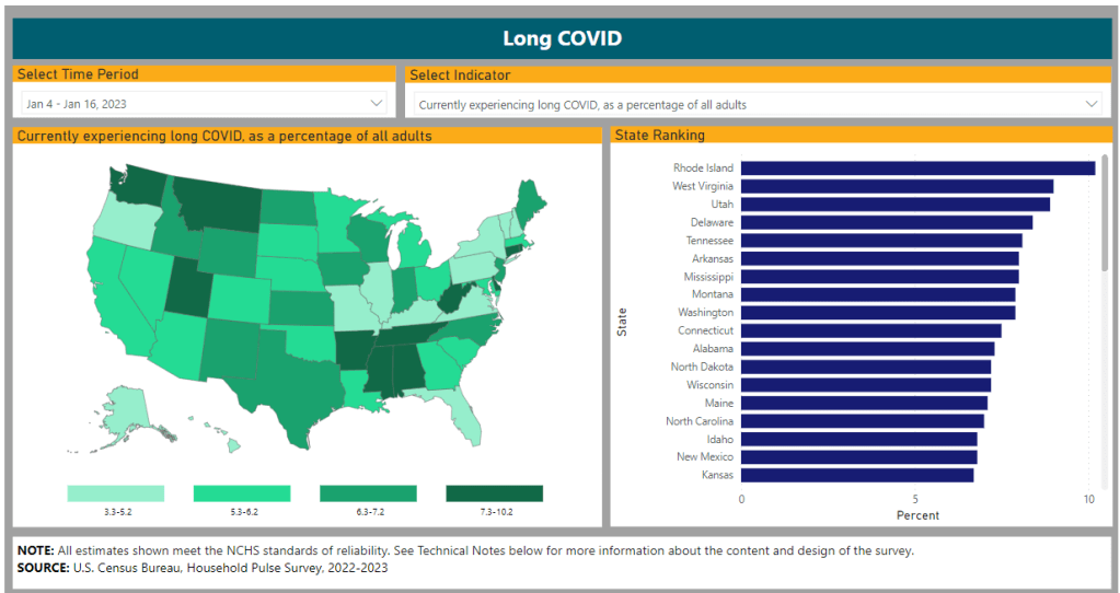
The Census and CDC’s Household Pulse Survey questions on Long COVID are one notable example of this strategy. Census researchers ask a random sample of Americans whether they’ve had “any symptoms lasting 3 months or longer” following a COVID-19 case, then follow up with questions about whether those symptoms are current and whether they impact the respondent’s ability to carry out day-to-day activities. The resulting data provide a broader view of Long COVID in the U.S., including people who may not have sought medical care for their symptoms.
Biological studies of specific organs impacted by COVID-19:
In order to better understand how a case of COVID-19 may lead to long-term, debilitating symptoms, some researchers focus on studying exactly what happens to different parts of the body after a coronavirus infection. This research sometimes focuses on testing for the continued presence of virus after a patient’s acute COVID-19 case is over or tracking changes to the immune system, as scientists test different theories into how Long COVID occurs.
One major area of research has been the brain. Freelance journalist Stephani Sutherland recently published a major feature in Scientific American exploring how Long COVID impacts the brain and nervous system, summarizing research into the biological causes of common symptoms like fatigue and brain fog. Physician E. Wesley Ely, who cares for Long COVID patients, wrote an essay on the same topic that appeared in STAT News this week; Ely discussed what he’s learned from autopsy studies examining the brains of people who had COVID-19.
Identifying trends in the labor market:
Finally, researchers often seek to track the impacts of Long COVID indirectly, by looking at statistics on people who have left the labor market during recent years. It’s no secret that a lot of people have left their jobs during the pandemic; Long COVID experts argue that the chronic disease may be one major driver of the labor shortage. One often-cited Brookings Institution analysis suggested two to four million people may be out of work due to Long COVID.
This strategy for studying Long COVID may be the most difficult, as it’s hard to actually tie job loss numbers to the condition without more specific data. Most research surveys or electronic health records databases don’t ask people about their work situations; the recent study cited above is a notable outlier. Similarly, most unemployment claims and short-term disability datasets don’t ask people if Long COVID is contributing to their need for assistance.
Still, I hope to see more studies in the future that examine Long COVID’s impact on work and other activities. Related: the U.S. Department of Labor recently published a report about the need for more assistance geared toward workers with Long COVID.