Tag: South Carolina

  • States treating COVID-19 as “endemic” is leading to shifts in data collection and reporting

    States treating COVID-19 as “endemic” is leading to shifts in data collection and reporting

    Screenshot from the California SMARTER plan. This week, California became the first state to officially shift to an endemic strategy for dealing with COVID-19.

    Last week, I discussed the recent trend in states ending mask requirements in public schools, businesses, and other settings, by providing readers with some suggestions for encouraging safety during this push to “open everything” (that wasn’t already open). This week, more states are dropping safety measures; for example, Washington governor Jay Inslee announced that the state’s indoor mask mandate will end on March 21, though this change is also contingent on a low level of COVID-19 hospital admissions.

    At the same time, some states are also making major shifts in the ways they collect and report COVID-19 data. State public health departments are essentially moving to monitor COVID-19 more like the way they monitor the flu: as a disease that can pose a serious public health threat and deserves some attention, but does not entirely dictate how people live their lives.

    You may have seen this shift discussed as a movement to treat COVID-19 as “endemic.” An endemic disease, from an epidemiologist’s standpoint, is one that’s controlled at an acceptable level—it hasn’t been completely eradicated, but the levels of cases, hospitalizations, and deaths are generally deemed as levels that can continue without major public health measures. For more on the topic, I recommend this post from epidemiologist Ellie Murray (whom I’ve quoted on this topic before).

    We can argue—and many COVID-19 experts on Twitter are arguing—about whether this is the appropriate time to shift into endemic mode. Still, regardless of individual opinions, state public health departments are starting to make this shift, and I think it’s worthwhile to discuss how they’re doing it, particularly when it comes to data.

    Here’s a brief roundup of four states that are shifting their COVID-19 data collection and reporting.

    California

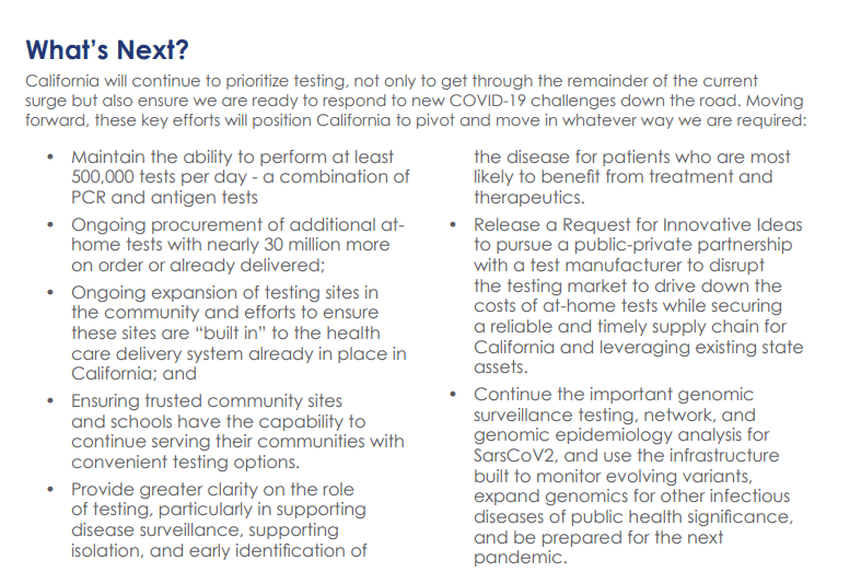
    California made headlines this week for being the first state to officially shift into “endemic” policy for dealing with COVID-19. State officials have drafted a plan called “SMARTER”—which stands for Shots, Masks, Awareness, Readiness, Testing, Education, and Rx (treatment). I took a look at the plan, which reporters from NBC Bay Area kindly shared publicly on DocumentCloud.

    Here are a few data-related highlights:

    • State officials will “focus on hospital numbers” to gauge how California should react to potential new variants that may be more infectious or more capable of causing severe disease.
    • Unlike some other states, California is maintaining testing capacity going forward, including an expansion of community testing sites and ongoing procurement of at-home antigen tests for public schools, long-term care facilities, and other institutions.
    • Throughout the pandemic, California has invested in genomic sequencing for COVID-19 cases, as well as a statewide modeling tool that compiles several different forecasts. These surveillance tools will be further expanded to respond to COVID-19 and other infectious disease outbreaks.
    • California also intends to “build a robust, regionally based wastewater surveillance and genome sequencing network” that can provide early warnings about new outbreaks.
    • The plan includes a focus on equity: California leaders will monitor testing, cases, and other metrics in minority communities so that resources can be provided to address disparities if needed.

    Missouri

    Missouri started its shift to “endemic” in December, as the governor declared an end to the state’s public health emergency around COVID-19—even though cases were at their highest-ever level in the state. Now, the Missouri health department is preparing to change its data reporting accordingly, my colleague Derek Kravitz and I reported in the Missouri Independent this week. (The Independent, a nonprofit newsroom focused on Missouri’s state government, is a long-time collaborator of the Documenting COVID-19 project, where I work part-time.)

    Here are the planned data changes highlighted in our story:

    Case investigations and contact tracing, where local health departments’ staffers reach out to people exposed to the virus in workplace or other public settings, will cease, unless a new, more transmissive or deadly variant emerges;

    Daily reports on COVID-19 cases and deaths by the state health department will be replaced by aggregate weekly reports. In some cases, metro health departments, including those in St. Louis and Springfield, will likely continue collecting and disseminating daily reports but the state will stop its reporting;

    Positivity rates will be phased out, as they are already difficult to interpret, with many Americans having switched from PCR tests to at-home antigen tests. Most people don’t report their results to local health departments. Missouri officials in January said they were prepared to be a “trend setter” in eliminating positivity rate reporting.

    Hospitalization data will become even more important, with state health officials hoping to make reporting more timely;

    Wastewater surveillance will become a more relied-on data point for public health officials, as a way to spot COVID-19 early in its life cycle and identify potential hot spots. Missouri is a leader in wastewater surveillance, as the state has the highest number of collection sites reported on a new CDC dashboard.

    Iowa

    A couple of weeks ago, I called out the state of Iowa for decommissioning its two COVID-19 dashboards, one dedicated to vaccination data and one for other major metrics. (I’m still bummed out about this, to be honest! Iowa had one of my favorite/most chaotic dashboards to check as a COVID Tracking Project data entry volunteer.)

    The change actually occurred this week: the old link to Iowa’s vaccination dashboard now goes to a 404 page, and all Iowa COVID-19 data are now consolidated in a single “COVID-19 reporting” page on the overall Iowa health department website.

    Here’s a bit more information on Iowa’s data shift, from a press release by the state’s governor:

    • Rather than reporting daily COVID-19 case numbers, vaccinations, and other data, Iowa is now providing weekly updates. The new, pared-down dashboard includes positive tests and death numbers over time, case and vaccination rates by county, and some demographic data.
    • For more frequent COVID-19 reporting, the Iowa dashboard now directs residents to federal data sources. Iowa is still reporting daily to the federal government, as all states are required to do.
    • The state health department “will continue to review and analyze COVID-19 and other public health data daily,” Governor Kim Reynolds said. But some teams focused on the COVID-19 response will return to pre-pandemic responsibilities.
    • This reporting change is intended to align with “existing reporting standards for other respiratory viruses,” Gov. Reynolds said.
    • Iowa is focusing on at-home tests with a program called “Test Iowa at Home,” in which residents can request to have a test kit sent to their homes for free. (It was unclear to me, from browsing the website, whether these are rapid antigen tests or PCR tests.)  The state health department processes these tests and collects data from the program.
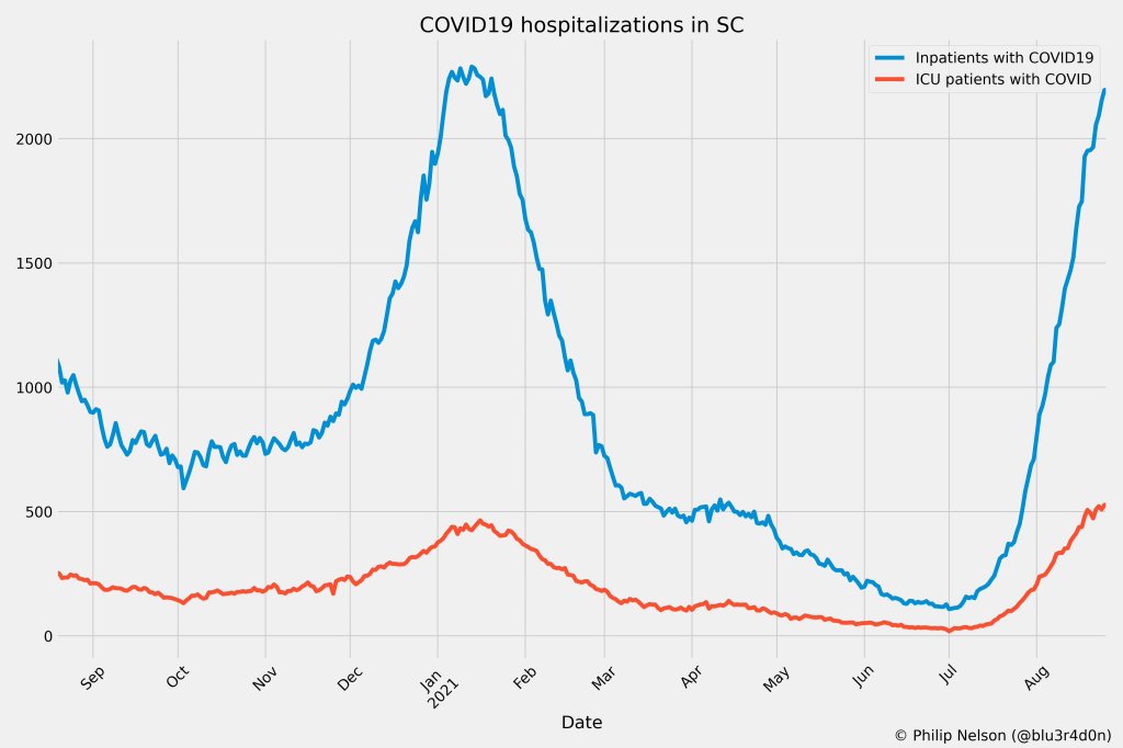
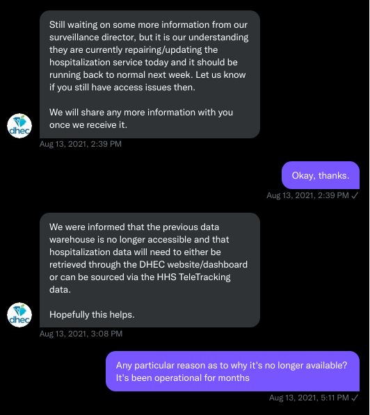
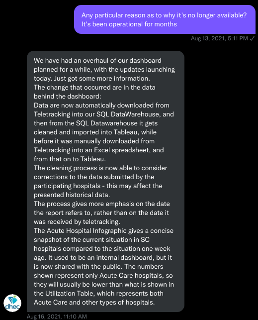
    South Carolina

    A Tweet from South Carolina data expert Philip Nelson alerted me to this one: not only is South Carolina shifting from daily to weekly data reports, the state is essentially ending all reporting of COVID-19 cases. This is paired with a gradual shutdown of testing sites in the state.

    Here’s more info on South Carolina’s shift, based on a press release from the state health department:

    • South Carolina’s health department will stop reporting daily COVID-19 case counts on March 15.
    • The agency will continue to report COVID-19 hospitalizations and deaths as important indicators of disease severity, but these will switch to a weekly update schedule rather than daily.
    • The shift away from case reporting aligns with a greater focus on rapid at-home tests, which South Carolina’s health department says are “not reportable.” (While it’s true that the vast majority of rapid at-home test results are not reported, some jurisdictions, like D.C., allow residents to self-report their results!)
    • South Carolina’s health department is planning to gradually shut down almost all public PCR testing sites in the state throughout the month of March. According to the department, these sites have seen “a significant decrease in demand” due to increased availability for rapid tests.
    • The department is also discouraging regular testing for asymptomatic South Carolina residents, saying that individuals who are currently symptomatic or have a close contact who tested positive should be prioritized.

    More news on this topic

    • The CDC continues adding wastewater collection sites to its new dashboard. Two weeks ago, I wrote that only ten states had ten or more sites included on the dashboard; since then, three additional states have crossed that threshold: Illinois, Washington, and West Virginia. But the dashboard is still empty for the majority of states, indicating a lack of this important surveillance tool in much of the country.
    • For an upcoming story, I recently interviewed Lauren Ancel Meyers, a modeling expert at the University of Texas at Austin and lead author on this fascinating paper about using hospital admissions and mobility data for pandemic surveillance. Meyers has considered cases to be a messy indicator throughout the pandemic, she told me. She finds hospital admissions to be more useful, as this metric will directly show how many people are seeking healthcare due to their COVID-19 symptoms.
    • Another interesting paper, published in Nature this week, describes the use of machine learning models to drive COVID-19 testing at a university. The models could “predict which students were at elevated risk and should be tested,” the researchers write; students tested because of the models tended to be tested more quickly and were more likely to test positive than those identified through manual contact tracing or general surveillance. Such modeling could be used to augment the type of random sampling that Natalie Dean described in a recent article, shared in last week’s issue.

    Are there any other states shifting their data reporting for an endemic COVID-19 state that I’ve missed? Email me or comment below and let me know!

    More on state data

  • One data researcher’s journey through South Carolina’s COVID-19 reporting

    One data researcher’s journey through South Carolina’s COVID-19 reporting

    By Philip Nelson

    COVID-19 hospitalizations in South Carolina, as of August 26. Posted on Twitter by Philip Nelson.

    If you post in the COVID-19 data Twitter-sphere, you’re likely familiar with Philip Nelson, a computer science student at Winthrop University—and an expert in navigating and sharing data from the state of South Carolina. Philip posts regular South Carolina updates including the state’s case counts, hospitalizations, test positivity, and other major figures, and contributes to discussions about data analysis and accessibility.

    I invited Philip to contribute a post this week after reading his Tweets about his ongoing challenges in accessing his state’s hospitalization data. Basically, after Philip publicized a backend data service that enabled users to see daily COVID-19 patient numbers by individual South Carolina hospital, the state restricted this service’s use—essentially making the data impossible for outside researchers to analyze.

    To me, his story speaks to broader issues with state COVID-19 data, such as: agencies adding or removing data without explanation, a lack of clear data documentation, failure to advertise data sources to the public, and mismatches between state and federal data sources. These issues are, of course, tied to the systematic underfunding of state and local public health departments across the country, making them unequipped to respond to the pandemic.

    South Carolina seems to be particularly arduous to deal with, however, as Philip describes below.


    I’ve been collecting and visualizing South Carolina-related COVID-19 data since April 2020. I’m a computer science major at Winthrop University, so naturally I like to automate things, but collecting and aggregating data from constantly-changing data sources proved to be far more difficult than I anticipated.

    At the beginning of the pandemic, I had barely opened Excel and had never used the Python library pandas, but I knew how to program and I was interested in tracking COVID-19 data. So, in early March 2020, I watched very closely as the South Carolina Department of Health and Environmental Control (DHEC) reported new cases.

    During the early days of the pandemic, DHEC provided a single chart on their website with their numbers of negative and positive tests; I created a small spreadsheet tracking these cases. After a few days, DHEC transitioned to a dashboard that shared county level data.

    On March 23, I noticed an issue with the new dashboard. Apparently, someone had misconfigured authentication on something in the backend. (When data sources are put behind authentication, anyone outside of the organization providing that source loses access.) The issue was quickly fixed and I carried on with my manual entry, but this was not the last time I’d have to think about authentication.

    Initially, I manually entered the number of cases and deaths that DHEC reported. I thought I might be able to use the New York Times’ COVID-19 dataset, but after comparing it to the DHEC’s data, I decided that I’d have to continue my own manual entry.

    South Carolina’s REST API

    In August 2020, I encountered some other programmers on Twitter who had discovered a REST API on DHEC’s website. REST is a standard for APIs that make it easier for developers to use services on the web. In this case, I was able to make simple requests to the server and receive data as a response. After starting a database fundamentals course during the fall 2020 semester, I figured out how to query the service: I could use the data in the API to get cases and deaths for each county by day.

    This API gave me the ability to automate all of my update processes. By further exploring the ArcGIS REST API website, I realized that DHEC had other data services available. In addition to county-level data, the agency also provided an API for cases by ZIP code. I used these data to create custom zip code level graphs upon request, and another person I encountered built a ZIP code map of cases.

    During August 2020, the CDC stopped reporting hospitalization data and the federal government shifted to using data collected by the Department of Health and Human Services (HHS) and Teletracking. DHEC provided a geoservice for hospitalizations, based off of data provided to DHEC by Teletracking on behalf of the HHS. I did some exploration of the hospitalization REST API and found that the data in this API was facility-level (individual hospitals), updated daily. I aggregated the numbers in the API based on the report date in order to provide data for my hospitalization graph. At the time, I didn’t know that the federal government does not provide daily facility level data to the public.

    In October 2020, DHEC put their ZIP code-level API behind authentication. I voiced my displeasure publicly.  In late December 2020, DHEC put the API that contained county level cases and deaths behind authentication. At this point, I began to get frustrated with DHEC for putting things behind authentication without warning, but I kind-of gave up on getting the deaths data out of an API. Thankfully, DHEC still provided an API for confirmed cases, so I switched my scripts to scrape death data from PDFs provided by DHEC each day. I didn’t like using the PDFs because they did not capture deaths that were retroactively moved from one date to another, unlike the API.

    I ran my daily updates until early June 2021, when DHEC changed their reporting format to a weekday-only schedule.  I assumed that we’d seen the last wave of the pandemic and that, thanks to readily available vaccines, we had relegated the virus to a containable state. Unfortunately, that was not the case — and by mid-July, I had resumed my daily updates.

    Hospitalization data issues

    In August 2021, people in my Twitter circle became interested in pediatric data. I decided to return to exploring the hospitalization API because I knew it had pediatric-related attributes. It was during that exploration that I realized I had access to daily facility-level data that the federal government was not providing to the public; the federal government provides weekly facility-level data. My first reaction was to build a Tableau dashboard that let people look at the numbers of adults and pediatric patients with COVID19 at the facility level in South Carolina over time.

    After posting that dashboard on Twitter, I kept hearing that people wanted a replacement for DHEC’s hospitalization dashboard which, at the time, only updated on Tuesdays. So, I made a similar dashboard that provided more information and allowed users to filter down to specific days and individual hospitals, then I tweeted it at DHEC. Admittedly, this probably wasn’t the smartest move.

    I kept exploring the hospitalization data and found that it contained COVID-19-related emergency department visits by day, another data point provided weekly by HHS. After plotting out the total number of visits each day and reading the criteria for this data point, I decided I needed to make another dashboard for this. A day after I posted the dashboard to Twitter, DHEC put the API I was using behind authentication, again I tweeted my frustration

    A little while later, DHEC messaged me on Twitter and told me that they were doing repairs to the API. I was later informed that the API was no longer accessible, and that I would have to use DHEC’s dashboard or HHS data. The agency’s dashboard does not allow data downloads, making it difficult for programmers to use it as a source for original analysis and visualization.

    I asked for information on why the API was no longer operational; DHEC responded that they had overhauled their hospitalization dashboard, resulting in changes to how they ingest data from the federal government. This response did not make it clear why DHEC needed to put authentication on the daily facility-level hospitalization data.

    Meanwhile, DHEC’s hospital utilization dashboard has started updating daily again. But after examining several days’ worth of data, I cannot figure out how the numbers on DHEC’s dashboard correlate to HHS data. I’ve tried matching columns from a range dates to the data displayed, but haven’t been able to find a date where the numbers are equal. DHEC says the data is sourced from HHS’ TeleTracking system on their dashboard, but it’s not immediately clear to me why the numbers do not match. I’ve asked DHEC for an explanation, but haven’t received a response.

    Lack of transparency from DHEC

    I’ve recently started to get familiar with the process of using FOIA requests. In the past week, I got answers on requests that I submitted to DHEC for probable cases by county per day. This data is publicly accessible (but not downloadable) via a Tableau dashboard, but there is over 500 days’ worth of data for 46 counties. The data DHEC gave to me through the FOI process are heavily suppressed and, in my opinion, not usable.

    This has been quite a journey for me, especially in learning how to communicate and collect data. It’s also been a lesson in how government agencies don’t always do what we want them to with data. I’ve learned that sometimes government agencies don’t always explain (or publicize) the data they provide, and so the job of finding and understanding the data is left to the people who know how to pull the data from these sources.

    It’s also been eye-opening to understand that sometimes, I’m not going to be able to get answers on why a state-level agency is publishing data that doesn’t match a federal agency’s data. Most of all, it’s been a reminder that we always need to press government-operated public health agencies to be as transparent as possible with public health data.