Tag: Source callout

  • COVID source callout: Masks on public transportation

    COVID source callout: Masks on public transportation

    The COVID-19 Data Dispatch does not endorse the new MTA mask guidance.

    Anyone who regularly rides the New York City subway knows that the city’s mask requirement for public transportation has been unenforced and loosely followed—especially in the months following last winter’s Omicron surge.

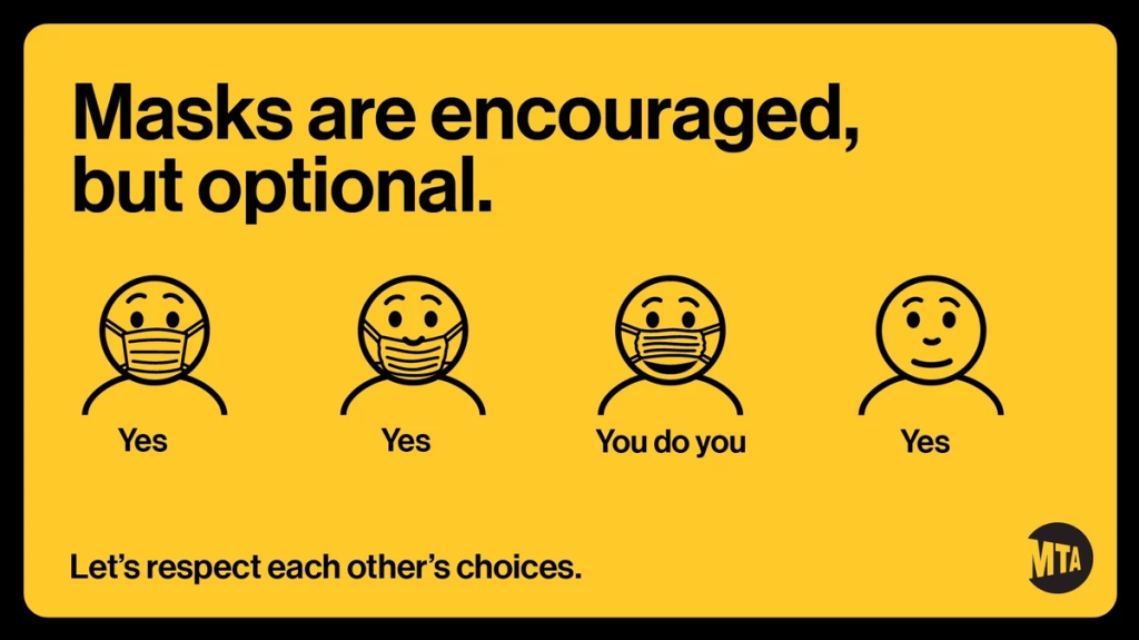
    But last week, even the requirement itself was struck down. New York Governor Kathy Hochul (who oversees the Metropolitan Transportation Authority, as it’s a state-controlled agency) announced that masks are now optional on trains and buses. And she introduced the policy with a new version of the MTA’s masking graphic that felt like a slap in the face to higher-risk New Yorkers who now feel unsafe using the transit system.

    NPR has a good article explaining why health experts have criticized the new graphic. Personally, I think it discourages people from thinking about how their COVID-19 safety choices impact a broader community—something that’s especially important in a dense, diverse city like NYC. Telling New Yorkers, “You do you,” when “doing you” could mean posing an immense risk to your neighbors, is a dangerous message.

    The one silver lining here is, I’ve seen a few excellent posters parodying the MTA’s new mask graphic. Here’s one of my favorites:

  • COVID source callout: Misinformation from the White House

    You might have seen this statistic from President Biden or other White House officials: “COVID deaths are down nearly 90%.” The statistic is misleading and incorrect, to the point that I’d consider it misinformation—especially right now, as the U.S. faces a largely-ignored surge.

    Let me explain where this number comes from. The White House is comparing average daily deaths from COVID-19 in recent weeks to this metric during the peak of the winter 2020-2021 surge, when Biden took office.

    On January 20, 2021, the day of Biden’s inauguration, about 3,200 people were dying from COVID-19 each day, according to CDC data. This past week, as Biden battled COVID-19, about 400 people were dying each day. The percent change between 3,200 and 400 is about 88%, or “nearly 90%.”

    But it’s misleading to just compare daily averages, as Biden has presided over several COVID-19 surges since he took office: the Delta surge last summer and fall, the first Omicron surge in the winter, and the Omicron subvariant surge this spring and summer. In fact, the number of COVID-19 deaths that occurred in the last year (July 2021 to July 2022) is pretty close to what it was in the prior year, and that’s not even accounting for thousands of excess deaths linked to the pandemic.

    While Biden’s administration has contributed to COVID-19 vaccines, treatments, testing, and other safety measures, it’s far from eliminating our collective risk from the coronavirus. Always question when you see a percent change without context!

  • COVID source callout: Failures in the U.S. monkeypox response

    This is not a direct COVID-19 callout, but I wanted to acknowledge that many of the public health failures we saw early in the COVID-19 crisis are now being repeated with monkeypox—which the WHO just declared a global health emergency.

    One major issue is a shortage of tests, leading public health experts to suggest that the true number of cases is much higher than what’s been reported. Also, while vaccines are available for monkeypox, the rollout has been inaccessible and inequitable, with very limited appointments in hotspots like NYC. ACT UP actually held a protest in the city last week to criticize local and federal officials for these issues.

    According to BuzzFeed News coverage of the ACT UP protest, their demands included: “an ‘emergency safety net fund’ for those testing positive, increased access to vaccines, language-inclusive educational resources, and adequate staffing for both vaccination sites and quarantine locations.” All of which sounds familiar!

  • COVID source callout: CDC takes weekends off

    If you went to pretty much any page on the CDC’s COVID Data Tracker this week, you might have noticed a new alert at the top of the page:

    Beginning July 4, 2022, COVID Data Tracker will discontinue daily data refreshes 7 days per week, and will instead refresh data Monday through Friday.

    In other words, the CDC is following in the footsteps of many state and local health departments across the country in taking weekends off from COVID-19 updates. This is pretty unsurprising, considering how many long weekends the agency’s COVID-19 tracking team has taken recently (see: last week’s callout post).

    Indeed, only five states are still updating their COVID-19 dashboards daily, according to the Johns Hopkins University Coronavirus Resource Center. But the CDC’s move is still disappointing, as it represents yet another step away from this national public health agency fulfilling its responsibilities to inform Americans about the pandemic.

  • COVID source callout: CDC Weekly Review

    I frequently rely on the CDC’s Weekly Review, a weekly newsletter that provides COVID-19 data updates, as a source for my own National Numbers updates. The CDC newsletter is usually posted on Friday afternoons. But this summer, the schedule has become far less regular.

    This week, for example, there has been no Weekly Review update, even though the CDC’s long weekend didn’t start until Saturday. The same thing happened over Juneteenth weekend: no report that Friday, either.

    I understand, of course, that the CDC data scientists who work on these updates deserve time off like everyone else. But these data summaries remain important for the millions of Americans relying on the CDC to track the pandemic. When the schedule of a “weekly” report becomes less regular, it demonstrates how the agency has deprioritized COVID-19.

  • COVID source callout: Dr. Fauci, please take a week off

    This past Wednesday, the NIH announced that Dr. Anthony Fauci has tested positive for COVID-19. Dr. Fauci has been leading the U.S. COVID-19 response since early days of the pandemic, and this appears to be his first time getting personal experience with the virus.

    According to the NIH, Dr. Fauci is “fully vaccinated and has been boosted twice,” and was experiencing mild symptoms as of his positive antigen test. This is great news, and I hope that his symptoms remain mild (truly mild, not just non-hospitalized mild), and he has a swift recovery.

    But then we get to a more concerning line in the press release: “Dr. Fauci will isolate and continue to work from his home.” Why is he continuing to work? By all accounts, rest is important for recovering from COVID-19 and avoiding long-term symptoms. This is especially crucial for Dr. Fauci, as someone who’s older (and therefore at higher risk).

    When top-tier government health officials work through COVID-19, they set a dangerous precedent for all the people looking to them for guidance. Anne Helen Peterson wrote about this in Culture Study recently; it’s a good read, especially for those who hold positions of power in their workplaces.

    I hope Dr. Fauci gets some rest—he would deserve a break even if he didn’t have COVID-19.

  • COVID source callout: The Morning

    Many COVID-19 experts have developed a growing skepticism about “The Morning,” the flagship daily newsletter from the New York Times. David Leonhardt, who writes this newsletter, has pretty limited expertise in science and health reporting, yet he frequently delivers pandemic “explainers” that mislead readers—often by cherry-picking data or suggesting false consensus among experts.

    This week, one of Leonhardt’s columns was particularly misleading. Titled “COVID and Race,” the newsletter reported that white Americans are now dying of COVID-19 at higher rates than Black, Latino, and Asian Americans.

    But Leonhardt missed one very important factor: age-adjustment. Public health experts frequently adjust morbidity and mortality rates by age in order to account for demographic differences among groups. For COVID-19, this is especially important, because the disease disproportionately impacts older adults—and white Americans generally live longer than people of color because of many other structural health factors.

    In her Your Local Epidemiologist newsletter, Dr. Katelyn Jetelina further explained why age-adjsutment is important and why this “COVID and Race” column is wrong. When you adjust the death rates by age, Black and Latino Americans are, in fact, still more heavily impacted by COVID-19 deaths than white Americans, though the gap is shrinking.

    Leonhardt’s newsletter also failed to discuss how COVID-19 has impacted Native Americans. This population has faced the highest death rates throughout the pandemic, according to the CDC and other sources.

    It’s important to call out this error, I think, because “The Morning” has a huge reach and can be influential in impacting national pandemic conversations. If we ignore the continued health disparities around COVID-19, we will fail to address them.

  • COVID source callout: CDC Community Levels

    COVID source callout: CDC Community Levels

    (Useless) Community Levels on the left; (useful) Community Transmission Levels on the right. Charts via the CDC.

    Anyone who’s been regularly reading the COVID-19 Data Dispatch for the last few weeks can probably tell that I think the CDC’s Community Levels are pretty useless. I was critical of these new metrics when the agency changed its guidance from the old Community Transmission Levels back in February. And during the BA.2 surge, I’ve pointed out how the CDC’s Community Levels map makes it look like the U.S. is doing fine at managing COVID-19 when, in fact, we are doing anything but.

    If you need a refresher, here are a few of the problems with the Community Levels:

    • The guidance overly uses hospitalization metrics; while these metrics (especially hospital admissions) are very reliable in showing COVID-19’s impact on the healthcare system, they lag behind actual infections and completely ignore Long COVID.
    • Hospitalizations are actually a regional metric, not a county-level metric (since plenty of U.S. counties do not have hospitals). As a result, the CDC’s Community Levels calculations are confusing and difficult to replicate in some places.
    • Thresholds in the Community Levels system, already using lagging indicators, are set very high—to the point that, by the time a county reaches the high level, its healthcare system is already in big trouble.
    • The CDC does not recommend universal masking until a county reaches the high level; it only recommends one-way masking for vulnerable people, which we know doesn’t really work, at lower levels.

    Essentially, these Community Levels are so lenient that many state and local leaders have taken the guidance as an excuse to avoid instituting new COVID-19 safety measures during the BA.2 surge. In Philadelphia, business owners even cited the CDC’s lenient guidance when suing the city for instituting a new indoor mask mandate.

    Moreover, as revealed by a recent article in the Tampa Bay Times, it appears that the CDC is not even consistent with its calculations of these Community Levels. The agency labeled three Florida counties as at medium COVID-19 risk, even though they met all the criteria for high risk, due to a data reporting issue from the Florida state health department.

    To quote from the article: “A public health tool isn’t useful if it can be undone by a single data issue, said University of South Florida virologist Michael Teng.”

    Reminder, you can still see the CDC’s old Community Transmission Level guidance (which is somewhat more useful for determining one’s actual COVID-19 risk) on the agency’s COVID-19 data portal. Just click the dropdown menu on the county view tab and select Community Transmission Levels.

  • COVID source callout: “No recent data” at hundreds of sewershed sites

    COVID source callout: “No recent data” at hundreds of sewershed sites

    Screenshot of the CDC’s wastewater dashboard. Note all the gray dots indicating “no recent data.”

    Anyone who’s pulled up the CDC’s National Wastewater Surveillance System (NWSS) dashboard in the last week or two has likely noticed this trend: hundreds of sewershed sites are currently marked as “no recent data.” I keep a particularly close eye on the sites in New York City, which have been reporting “no recent data” for at least two weeks.

    According to the CDC, a site marked as “no recent data” has reported findings from fewer than two wastewater samples in the last 15 days. In practice, it could either indicate that a site actually isn’t sampling its wastewater frequently enough for the CDC’s standards, or it could indicate a lack of capacity to process those samples. Probably, both things are happening at a lot of these sites.

    From corresponding with press officers at NWSS, I know that the team is working with state and local health agencies, as well as with individual sewershed sites, to ensure accurate data and standardize reporting. This is a massive task, considering that wastewater surveillance started as a grassroots effort in labs with many different sampling and analytical methods, and I appreciate the NWSS team’s efforts.

    But I think they could increase transparency about the sites where recent data isn’t available—either on the dashboard itself or in other public communications. I shouldn’t have to hunt through Twitter replies to find the most basic info about wastewater data updates! Especially when this source is becoming increasingly important in the wake of less reliable case data.

  • COVID source callout: Florida, again

    Last summer, Florida was one of the first states to decommission its daily COVID-19 dashboard and replace it with far-less-detailed weekly reports. Many other states have followed Florida’s lead in the last few months, making their reporting less frequent and cutting down on some metrics like cases and testing.

    But that’s not enough for Florida! The state recently switched from weekly COVID-19 reports to reports every other week—making it even more difficult for reporters, researchers, and others in the state to follow their local COVID-19 trends. Florida additionally stopped reporting cases in non-state residents, which is pretty notable for one of the country’s biggest tourism hotspots.

    Of course, Florida is still reporting some COVID-19 data daily to the federal government, as all states are required to do. But this doesn’t bode well for the future of state data reporting.