Tag: reflection

  • COVID-19 safety and solidarity at Pride: A reflection

    COVID-19 safety and solidarity at Pride: A reflection

    Betsy (center, right) and her partner Laura (left) at the NYC Dyke March, masked up in KN95s.

    For years, Pride has been my favorite holiday. I love the crowds, the parties, the marches (not the parades with corporate floats, but the people-led marches), the explosions of anger and joy, the connections with my community.

    COVID-era Pride has been more complicated than past years, as we layer safety measures onto the celebration. For me and many others I know in the LGBTQ+ community, Pride has become an opportunity to reflect on the importance of connecting this community and those calling for COVID-19 safety—disabled and immunocompromised people, those with Long COVID, and others at higher risk. This practice can be challenging, as others push for a return to the Pride we knew before the pandemic. But it’s not impossible, especially when we remember our values of inclusion and solidarity.

    This year, one of the biggest Pride marches in New York City became emblematic of the tension between safety and a desire to party like it’s 2019. Called Queer Liberation March, this march originated in local organizers’ desires to protest on Pride, honoring the legacy of the original Stonewall protest. (Official NYC Pride, also called “Corporate Pride” by many, has become sanitized over time, to the point that you’re more likely to see corporate floats and politicians than community leaders.) So, Queer Liberation March offers an alternative; I’ve attended it since the first iteration in 2019, which commemorated 50 years since Stonewall.

    A few weeks ago, Queer Liberation March garnered negative attention on social media due to an apparent disregard for COVID-19 safety. When a commenter on the march’s Instagram asked whether masks would be required at the march, an organizer with access to that Instagram account responded with a tirade dismissing the idea of any mask requirement, even suggesting that people who wanted to mask would not be welcome at the march. Obviously, many LGBTQ+ New Yorkers pushed back, expressing anger and disappointment that a Pride protest would exclude our community’s higher-risk members.

    The march’s organizers listened and deliberated. Queer Liberation March has not had explicit COVID-19 safety protocols in 2020, 2021, or 2022, though the march partnered with local health organizations to offer easy vaccine access for people at Pride. (This year, organizations are offering sexual health resources, such as HIV testing and mpox vaccines.) But the community response suggested that, this year, the march had to do more to prioritize COVID-19 safety.

    I actually reached out myself to Queer Liberation March’s organizers; I wasn’t acting as a journalist, but as a member of the Rude Mechanical Orchestra, a band that plays regularly at marches and rallies around the city, including past iterations of this march. Through conversations with a couple of the organizers, I shared resources on COVID-19 safety and walked through how my band approaches this topic. (You can read more about that on our website, though note that our data protocols are due for an update, and in this Science News article I wrote in 2021.)

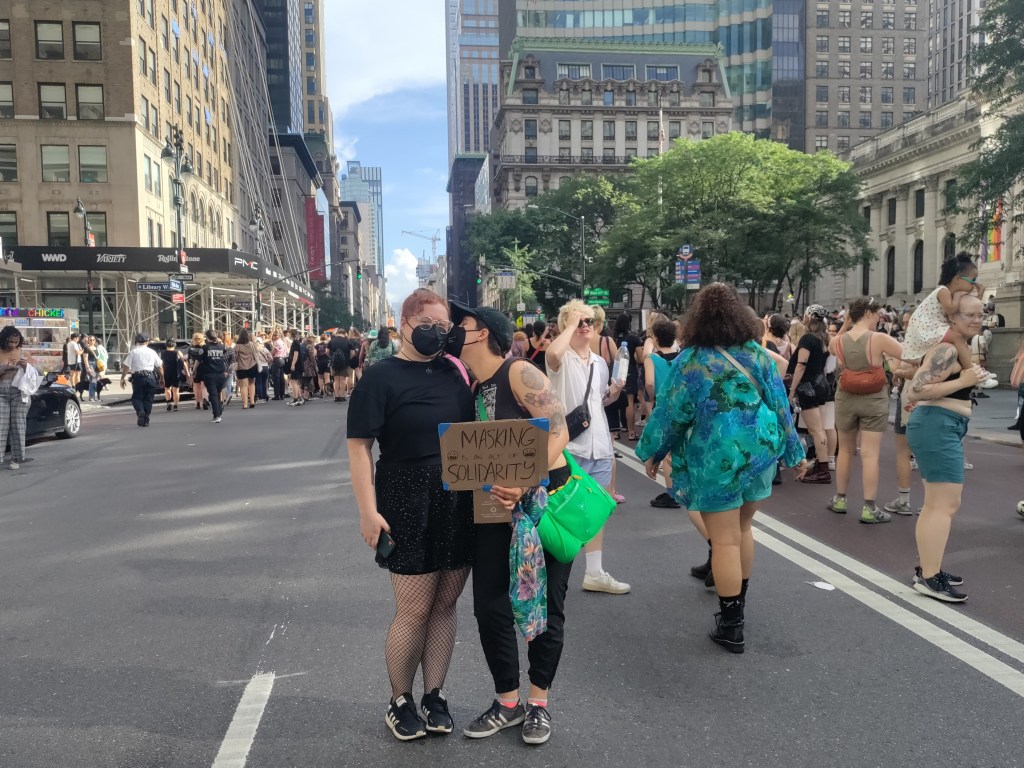
    Eventually, Queer Liberation March announced a safety policy. The march recommends that attendees mask up, along with testing before and after the event. Organizers are also coordinating mask-required sections at the front and back of the march, which will be protected by marshals equipped with extra masks to hand out. This policy is far from perfect; the “masking section” strategy in particular has garnered some criticism for essentially segregating higher-risk marchers from those who see COVID-19 safety as less of a priority.

    Though it’s not perfect, I was personally glad to see these safety steps at one of NYC’s biggest Pride events. Another large march, the Dyke March (which took place yesterday), adopted similar strategies. When my partner and I attended the Dyke March, we masked up in KN95s and saw quite a few other attendees doing the same. One marshall offered to direct us to that march’s mask-required section. I also saw marshalls pushing wheelchairs for marchers who weren’t able to walk the full 40 blocks—another important step towards accessibility.

    The Queer Liberation March is happening this afternoon. Around the time you read this post, I’ll probably be at the starting point, lining up with my band. So I can’t say yet how successful their COVID-19 safety policies will be. But I still wanted to highlight this march as an example, to show that 2023 is not too late to change course and adopt some safety measures. If NYC’s biggest (non-corporate) Pride marches can do it, no other organizers should have an excuse not to.

    Solidarity is a wide tent. Pride is for all LGBTQ+ people, including those who are disabled, chronically ill, or simply can’t afford to miss work for two weeks. If a Pride event doesn’t include these groups, it isn’t a true Pride event. And inclusion is easier than you think. Many people will test if you ask them, or will mask for a few hours if you ask them—especially if you explain why it’s important, using the terms of their community: “We keep us safe.”

  • Reflecting on 100 issues of COVID-19 data reporting

    Reflecting on 100 issues of COVID-19 data reporting

    The author, working on a February 2021 issue after moving apartments. Weekend newsletter writing often looks like this.

    100 weeks ago, I wrote the first issue of this newsletter on Substack.

    I wrote about a change in hospitalization data, which had just shifted from the purview of the CDC to a different team at the Department of Health and Human Services (HHS). This felt like a niche topic at the time, but I wanted to provide a clear explanation of the change after seeing some misleading articles and social media posts suggesting that the CDC was losing control of all COVID-19 data.

    At the time, my goals were simple: explain where COVID-19 data come from and how to interpret the numbers; provide tips and resources for other reporters on this complicated beat; and help people in my broader social network understand pandemic trends. The COVID-19 Data Dispatch’s aims haven’t changed too much, even as I’ve expanded it to its own website, worked with guest writers, coordinated events, and more.

    As I look back on 100 issues, I wanted to share a few lessons for other reporters still on the COVID-19 beat (and, more broadly, anyone working on public health communications). I’m also sharing a couple of notes from readers about how the publication has helped them.

    Lessons I’ve learned:

    • Lay readers can handle complicated topics! You don’t need to overly simplify things, just use clear language and examples that are easy to follow. This is honestly my entire ethos as a science writer so I found it hard to pick an example post, but one may be my piece on why U.S. Long COVID research is so difficult, which built on reporting for a Grid feature.
    • FAQs are good formats for breaking down complex topics or new information. I like to use FAQ formats and lots of subheaders whenever I’m writing about a new variant (or subvariant) of concern, like this post on BA.4 and BA.5, or when walking through the implications of a federal guidance change, like this post discussing testing and isolation with the Omicron variant.
    • Consistency is key. One thing I frequently hear from readers is that they appreciate the regularity of COVID-19 Data Dispatch issues; if they tune out of other pandemic news, they can still expect me to deliver some important updates once a week. This is definitely a built-in advantage of the newsletter format, but I try to take the consistency further by having regular sections (such as “National numbers”) with statistics reported in a similar way each week.
    • Emphasizing the same issues over and over can feel repetitive to the writer, but it’s helpful for readers. Whenever I remind readers about holiday data reporting lags, for example, I have to remind myself that most people are not constantly thinking about COVID-19 trends the way that I am—and might not be consistently reading my newsletters, either. It’s another aspect of being consistent.
    • Provide trends and context, not just isolated numbers. This is another key aspect of my “National numbers” updates: I always explain how a given week’s case or hospitalization numbers compare to previous weeks. Another important piece of context, I think, is where numbers come from: for example, reminding readers that case numbers mainly include PCR test results, not at-home antigen test results.
    • Acknowledge uncertainty! This is crucial in any kind of data reporting, especially when reporting from data systems that are as flawed and incomplete as the U.S.’s COVID-19 data systems. For example, last month’s post about interpreting limited data during our undercounted surge explains the limitations of several common sources, as well as what the sources can still tell us.
    • Provide readers with tools to see local data. This is a central reason why so many publications built COVID-19 dashboards in 2020, and why some outlets continue to maintain them now. People love to look up their states or counties! I often don’t have the bandwidth for hyperlocal visualizations myself, but point to these resources in “Featured sources” updates whenever possible.
    • Use readers’ questions to drive reporting. Some of my favorite COVID-19 Data Dispatch posts have been inspired by reader questions, from the “Your Thanksgiving could be a superspreader” post in fall 2020 to my explanation of why the CDC’s isolation guidance is not based on scientific evidence earlier this spring. If you write to me with a question, you’re probably not the only person with that question—at least, if my metrics on these posts are anything to go by.

    Testimonials from readers:

    Josh Zarrabi (software engineer at the Health Equity Tracker): “You’re, like, the only COVID news I get anymore. Every Sunday morning with my coffee.”

    Chris Persaud (data reporter, Palm Beach Post): “Thanks to your newsletter, I’ve found useful data for my news reports.”

    Jeremy Caplan (director of Teaching & Learning at Newmark J School): “COVID-19 Data Dispatch is consistently informative. I limit my COVID news diet, so it’s helpful to have this singularly focused resource for keeping up with the data.”

    My Grandma: “In our Berkeley family (C, P and me) we have relied on you and your newsletter for helping us through these difficult times.  The research, guidance and advice in your Data Dispatch, is invaluable.”

    Thank you to all of my readers for your support over the last 100 weeks. I hope the COVID-19 Data Dispatch can continue to provide you with the news and resources you need to navigate the (continuing!) pandemic.

    And of course, if you’d like to support this work, consider setting up a reoccurring donation or buying me a coffee!

  • Star Trek predicted post-viral illness, but provided few tools to stop its spread

    Star Trek predicted post-viral illness, but provided few tools to stop its spread

    Spock finds some graffiti by an infected crew member in Star Trek: The Original Series episode The Naked Time. Image via the Memory Alpha wikipedia / Paramount Global.

    It’s been a somewhat slower week for COVID-19 news, so here’s something a little different: a reflection on a very old episode of Star Trek, in the context of post-viral illness.

    Star Trek: Strange New Worlds, one of the new shows airing on Paramount+, has got me on a bit of a kick for the franchise. So, I’ve been rewatching The Original Series (TOS), which was one of my favorite TV shows in high school. (My girlfriend, who hasn’t seen any of the old Star Trek shows, has humored me by watching with me.)

    Last week, we watched an episode I remembered as one of my favorites: The Naked Time, episode four in the first season. In this episode—which first aired in September 1966—a strange virus from an alien planet gets onto the Enterprise and infects a number of crew members. Once infected, crew members lose their inhibitions and behave as though emotionally naked; this leads to such iconic scenes as Spock “sobbing mathematically,” Sulu chasing his colleagues with a rapier, Uhura saying she’s neither fair nor a maiden, and so on.

    Rewatching this episode two years into the pandemic, it struck me that Star Trek predicted—like it predicted iPads, cellphones, and so many other things—neurological symptoms triggered by a viral infection. While the Epstein-Barr virus was discovered in 1964, it would be decades before scientists understood how viruses like this one could cause fatigue, chronic pain, post-exertional malaise, and other similar symptoms.

    Now, of course, the world is facing an epidemic of Long COVID, the most prevalent post-viral illness in history. Recent estimates from the U.K.’s Office for National Statistics suggest that two million people—or, 3% of the entire U.K. population—are living with Long COVID. And Long COVID is bringing renewed attention to other conditions like ME/CFS and dysautonomia, which have a lot of symptom overlap. It’s hard to deny that infectious diseases can have ramifications far beyond what we usually expect from a cold or the flu.

    My girlfriend, who previously hadn’t seen most of TOS, has commented on how much early Star Trek episodes center around psychological dilemmas. Rather than watching phaser battles, we’re watching characters grapple with questions like, “How do you stop a hormonal teenager with infinite power?” and, “What would happen if Captain Kirk were split into good and evil halves?”

    The Naked Time fits into this pattern, but it also feels more like a horror story than the others—especially when one watches it in the midst of a COVID-19 (and Long COVID) surge. Star Trek’s writers guessed, nearly 60 years ago, that an infectious disease could impact people’s minds. But here we are in 2022: Long COVID patients are still systematically discredited by doctors, unable to access treatment and financial support, and discarded by American leaders’ decision to “live with the virus.”

    The episode also offers some lessons in infection control measures by showing us what not to do when confronted with a novel illness. The alien virus gets onto the Enterprise in the first place because a crew member, investigating dead scientists on an abandoned planet, takes off his hazmat suit to touch his face; without realizing it, he transmits the virus from an infected surface to his skin. And after this index case starts acting strangely on the ship, other crew members don’t isolate him until it’s too late. Funny how our basic public health measures haven’t changed since the 60s, either.

    Anyway, because this is Star Trek, Dr. McCoy saves the day by quickly developing a cure for the virus. He has no trouble administering it to the crew—there’s no vaccine hesitancy on the Enterprise.

    Still, this episode sticks with me, more now than when I first watched it years ago. With all the new technology we have now to fight COVID-19, the basic measures we can take to control a novel virus haven’t changed. And the stakes are higher than ever.

    More on Long COVID

  • When will the pandemic end? 26 science writers and communicators respond

    When will the pandemic end? 26 science writers and communicators respond

    Wordcloud of the survey’s responses, made by Betsy Ladyzhets.

    In July 2020, I started the COVID-19 Data Dispatch. Inspired in part by a desire to express my thoughts on the challenges of pandemic tracking and in part by a desire to be useful for my friends and colleagues who were less plugged into COVID-19 news, the project grew from a newsletter to a full-fledged publication with its own website, resources, and membership program.

    Within months of my starting the publication, though, people started asking me about its end. What would I do when COVID-19 was “over”? I never knew how to answer. While there may be benchmarks that public health experts can use to declare the pandemic at an end, this end feels more complex for science writers like myself who have been intensely covering the COVID-19 crisis.

    The questions reached a fever pitch this spring as millions of Americans got vaccinated and reopenings became inevitable. So, I did what I often do when I face a challenge in my work: I reached out to my community.

    Working with The Open Notebook, I surveyed 26 other COVID-19 reporters and communicators. I asked when they thought the pandemic might come to an end, as well as how they would take lessons from the past year into the “post-COVID” stages of their careers.

    Many of the writers who responded took that first question literally. They provided vaccination thresholds (60 percent, 70 percent), positivity rate thresholds (1 percent, 2 percent), and other metrics. “When there is a sustained period with no or little COVID-19 related fatalities globally,” wrote The City’s Ann Choi.

    Others took the question in more complicated and nuanced directions. These writers redirected the question back at me—noting that even when the world meets numeric thresholds, millions will remain vulnerable.

    For example, freelance journalist Roxanne Khamsi wrote, “We’re still living in an HIV pandemic.” The Atlantic’s Ed Yong said, “I’ve come to think that the question, ‘When will the pandemic end?’ isn’t very useful, and it’s more salient to ask, ‘For whom is the pandemic still ongoing?’” Other writers pointed to immunocompromised people for whom the vaccines may not be effective, long-haulers still suffering from symptoms, and the inequities between the U.S. and the many nations with little access to vaccines.

    As a science writer covering public health, I feel duty-bound to think of the most vulnerable; many of the writers who responded to my survey echoed that sentiment. Even when the majority of the U.S. is vaccinated, I still intend to cover the communities that face barriers to getting their shots, the immunocompromised patients for whom the shots may not work, and the countries where shots are still not available at all. I’m inspired by the boundless curiosity and compassion of other writers who continue this work, too.

    In addition to asking about the end of the pandemic itself, I asked what lessons these writers would take into their future reporting. Their answers fit a similar theme, compassion and curiosity. Some wrote that science writing must intersect more with non-science fields: “Every beat is deeply intersectional, and it’s time to see newsrooms that reflect that,” said U.S. News reporter Chelsea Cirruzzo. Climate coverage may be one example of this trend; climate reporters like HEATED’s Emily Atkin are calling for more collaboration between science and non-science journalists writing about this crisis.

    Other survey responses discussed the importance of communicating uncertainty, challenging established scientific norms, and holding accountable the institutions that fail to protect the vulnerable. “Assume nothing, question everything and everyone,” wrote The New York Times’s Apoorva Mandavilli.

    When will the pandemic end? It won’t be when the world sees its last COVID-19 case, because that could be centuries from now. Maybe it will be, as Berlin-based freelancer Hristio Boytchev wrote, “When the incidence numbers disappear from the homepages of major news media.”

    Even if incidence numbers disappear from homepages, though, I know that science sections, health sections, and independent publications like mine will keep the coverage going for a long time yet.

    To read the full responses from each science writer, head over to The Open Notebook’s website.

  • One year of the CDD: My favorite posts

    One year of the CDD: My favorite posts

    Issue #1 of the COVID-19 Data Dispatch was published on July 26, 2020. Today, we hit Issue #52.

    During that time, we’ve explored data issues from testing to vaccinations to variants. We’ve moved from Substack to a new website, supported an internship, and logged over 150 data source recommendations for readers.

    In reflecting on what I’ve learned running the publication this past year, I wanted to share a few of my favorite posts—those where I provided original analysis, introduced a new source, or had an impact on readers.

    • Hospital capacity dataset gets a makeover: This was our very first issue in July 2020. COVID-19 hospitalization data had switched from CDC responsibility to HHS responsibility; the switch garnered a lot of data challenges (and some political attention). This post explains what we knew so far about why the switch had occurred and what issues it was causing—and paved the way for many more posts on HHS hospitalization data.
    • Three different units for COVID-19 tests: In this September post, I explained a major challenge  I’d dealt with in my volunteer work for the COVID Tracking Project: every state counted its tests in a slightly different way. The post goes over tests counted in specimens, people, and encounters, with examples from different states and an explanation of why the issue matters.
    • School data with denominators: In October, I interviewed Emily Oster, an economist at Brown University who has led one of the major research efforts to track COVID-19 cases in U.S. schools. We discussed the challenges of compiling school data—many of which still persist now, nine months later. Oster has also become a bit of a controversial figure in the debates over school reopening, and I’m proud to have asked her some challenging questions at a time when her work was just starting to gain prominence in the COVID-19 world.
    • Your Thanksgiving could be a superspreading event: This post—which provides a data-driven explainer of COVID-19 superspreading events—was inspired by a reader’s question on how holiday celebrations might contribute to COVID-19 spikes. It was published on November 8, a time when many Americans were carefully considering holiday plans; I wanted to help people understand their risk and act accordingly.
    • A new metric for conceptualizing cases: Here, I described a metric first used by my friend (and fellow COVID Tracking Project volunteer) Nicki Camberg: one in X Americans has been diagnosed with COVID-19 in the past [insert timeframe here]. The metric was later picked up by the New York Times and other outlets, and I’ve consistently used it in updates throughout the year. The post includes a quote from Nicki, reflecting on how the metric can make COVID-19 cases more personally relatable.
    • Who should get the first vaccine doses?: This post (from late November) might be the one I’ve most often sent to other journalists, mostly because it includes a detailed description of the CDC’s Social Vulnerability Index—a source that provides social, economic, and environmental data by U.S. counties and ZIP codes, and one I frequently recommend to anyone reporting on demographics or equity. (At the time, I hoped that it would be used to determine vaccination priorities; this has been true for some parts of the country, but far from universal.)
    • COVID-19 data for your local hospital: This post discusses a new release of facility-level hospitalization data from the HHS. At the time, it was described as “probably the single most important data release that we’ve seen from the federal government.” I explained why it was so important and gave some examples of some stories that could be told with the data, including an interactive Tableau dashboard.
    • We’re not doing enough sequencing to detect B.1.1.7: This was one of intern Sarah Braner’s first posts, and it became the first post in our now-extensive Variants category. At the time (January 10), just 63 B.1.1.7 cases had been identified in the U.S., but Sarah explained why the true numbers were likely much higher and why that data gap should be cause for concern.
    • Access barriers lead to vaccination disparity in NYC: The CDD usually takes a national focus, but in this post, I zeroed in on my home city as a microcosm of the vaccination barriers faced across the country. At the time (February 7), Black New Yorkers made up 25% of the NYC population but just 12% of those vaccinated. I visualized the disparities, and discussed potential reasons and solutions.
    • Privacy-first from the start: The backstory behind your exposure notification app: This March 28 interview is one of my favorites from the past year. I spoke to Jenny Wanger, product manager and leader for exposure notification apps. After months of following these apps (and getting frustrated at the lack of available data), I was thrilled at the opportunity to talk to an expert in the space; this interview helped inspire my later feature for MIT Tech Review on the same topic.
    • Some personal news: In April, I left my full-time job in order to focus on freelancing and the COVID-19 Data Dispatch. This post announces the decision and explains my rationale; I appreciated the opportunity to reflect on my choice and talk about what might be next for me, and I think readers did as well.
    • In India’s COVID-19 catastrophe, figures are only part of the story: As COVID-19 cases surged in India, guest writer Payal Dhal explained why official figures fell short at capturing the scale of the tragedy. Comparisons to data quality, testing availability, and hospital capacity in the U.S. help to explain the issue.
    • COVID source shout-out: TUSHY: In the May 9 issue, I featured a bidet company promoting vaccinations with NSFW tactics: “Can We Eat Ass Yet?” “NO.” I will forever be grateful to TUSHY’s marketing team for responding to my press request on short notice and providing more backstory on the page.
    • The data behind the CDC’s new mask guidance: This post aimed to provide a service to readers confused by the CDC’s sudden shift in masking recommendations. I outlined the epidemiological evidence behind the agency’s assertion that fully vaccinated Americans could go maskless basically anywhere.
    • The US missed Biden’s July 4 goal: How did your community do?: To commemorate the July 4 holiday, I did a deep-dive into President Biden’s missed goal: 70% of adults vaccinated with at least one dose by that date. The story includes interactive maps and quotes from experts on where we go from here.