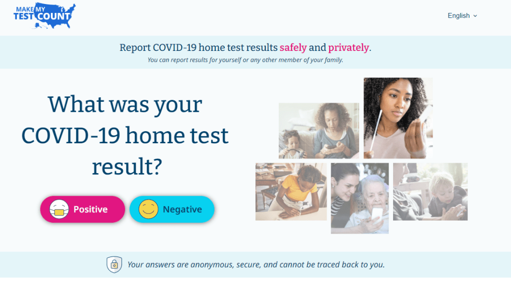
Make My Test Count is a new NIH website for people to report at-home COVID-19 test results.
This week, the National Institutes of Health launched a new website that allows people to anonymously report their at-home test results. While I’m skeptical about how much useful data will actually result from the site, it could be a helpful tool to gauge how willing Americans are to self-report test results.
The website, MakeMyTestCount.org, puts users through a series of basic questions about their at-home test experience: your test result, the test brand you used, when you tested, and whether you have COVID-19 symptoms. The site also asks for basic demographic information, including your age, ZIP code, race, and ethnicity. After you report your test result, the website provides additional context on interpreting that result, such as suggesting a repeat test in the next two days if you have symptoms.
These survey questions mimic the information that typically gets collected when someone receives a PCR test, and the resulting data could potentially be used to examine who is using at-home tests and what their results are. The NIH’s Rapid Acceleration of Diagnostics (or RADx) initiative, a program to speed up development and use of COVID-19 testing technologies, designed the website.
Of course, there are a lot of potential issues here. This website was launched more than two years after the first COVID-19 rapid tests were authorized and almost one year after they gained widespread popularity during the first Omicron surge. No matter how many people report their results now, the NIH will miss a lot of data and a lot of opportunities to advertise the site.
And how many people will report their results now? Pandemic safety measures like at-home testing are less popular than they were a year ago, and the launch of this website doesn’t seem to be paired with a public outreach campaign about using and reporting at-home tests. Basically, the results shared with the NIH are likely to be biased towards people who still care about taking precautions (and those who pay attention to federal COVID-19 resources). It’s also very easy to submit false results, as the website doesn’t ask for a photo of your test or anything similar.
Still, I’m excited to see this website launched—collecting some at-home test results is better than no test results! I hope lots of people use it, and I look forward to seeing any data the NIH eventually releases from the tool.
On September 2, 2022, the federal government stopped taking orders for free at-home COVID-19 tests. The distribution program, which launched during the first Omicron surge in early 2022, allowed households to order free tests up to three times, with either four or eight tests in each order.
The day this program ended, I sent a public records request to the federal government asking for data on how many tests were distributed. I filed it through MuckRock’s portal, so both the original request and my correspondence with the U.S. Postal Service’s records office are publicly available.
Last week, the USPS fulfilled my request. While I’d requested data by state, county, and/or ZIP code, the agency only sent over at-home test orders and distribution numbers by state. According to the formal response letter they sent, more granular data would (somehow) count as “commercial information” and is therefore exempt from FOIA.
Now, obviously, I think that far more data on the test distribution program should be publicly available. As I wrote back in January when the program started, in order to truly evaluate the success of this program, we need test distribution numbers by more specific geographies and demographic groups.
Still, the state-by-state data are better than nothing. With these data, we can see that states with the highest volume of at-home test orders fall on the East and West coasts, with people living in the South and Midwest less likely to use the program.
(The population data that I used to calculate these per capita rates are from the HHS Community Profile Report.)
With the data from my FOIA request, we can see that states with higher vaccination rates also had more people taking advantage of the free COVID-19 test program. States like Vermont and Hawaii rank high up for both metrics, while states like North Dakota and Wyoming are on the lower end for both.
At the same time, many of the states where fewer people ordered the free tests are also states that saw higher COVID-19 death rates in 2022. In Mississippi, for example, about 433 people died of COVID-19 for every 100,000 residents since the year started—the highest death rate of any state. But people in the state ordered free tests at a rate under 0.3 per capita.
These charts basically confirm what many public health experts suspected about the free COVID-19 test program: Americans who already were more protected against COVID-19 (thanks to vaccination) were most likely to order tests. Just as we’re seeing now with the Omicron-specific booster shots, a valuable public health measure went under-utilized here.
New York City has been closing PCR testing sites, even as the city faced a major Omicron resurgence this spring. This was the main finding from a story I wrote for Gothamist and WNYC (New York Public Radio), based on my analysis of public information on city-run testing sites.
While this was a local story, I think the trends I found—and the pushback that the piece received from city health officials—are pretty indicative of the national state of COVID-19 testing right now. Since the federal government ran out of funding to cover testing for Americans without health insurance in late March, private testing companies have started requiring insurance information and, in many cases, raising their prices.
At the same time, state and local health departments have closed their public PCR testing sites and directed people to use at-home rapid tests instead. New York City still has more accessible testing than most of the country, but my story showed how even here, getting tested is becoming more difficult—and less popular.
NYC has faced a major COVID-19 surge this spring — yet the city closed public testing sites and made it harder to get PCR results.
— betsy ladyzhets 📊 (@betsyladyzhets) July 5, 2022
Here are a few key statistics from the piece:
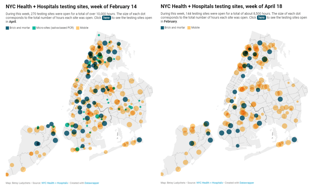
The number of public PCR testing sites run by NYC Health + Hospitals was cut in half between mid-February and mid-April.
The total hours that public testing sites were open decreased from over 10,000 during a week in February, to 8,500 during a week in April, to 7,500 in the last week of June.
Manhattan testing hours remained relatively constant (about 1,500 in each of the weeks I analyzed), while hours were cut in other boroughs.
The numbers of New Yorkers getting tested on a daily basis were similar in June 2021 and June 2022—even though reported case rates were about ten times higher this year.
New York City’s test positivity rate recently shot above 10%, and is now over 15%. It was closer to 1% at this time last year.
The NYC health department had some issues with my story. In fact, city health commissioner Dr. Ashwin Vasan posted a Twitter thread stating that it was “missing key information” and that the city actually has “more testing resources than ever.” But the “testing resources” he cites here are mostly at-home tests; PCR testing in NYC is both less accessible and less popular. A follow-up story that I coauthored with Nsikan Akpan, my editor at Gothamist/WNYC, further explains the situation in the city.
The decline in PCR testing is making it harder to understand where and how fast the coronavirus is spreading, both in the city and around the U.S. To explain the implications of this trend, here’s a short FAQ on how to think about testing during our current surge.
Why is PCR testing still important for individuals?
One of the city officials’ main responses to my story was that NYC has made it easy for people to get free at-home rapid tests, in place of PCR testing. The city has distributed more than 35 million at-home tests at hundreds of libraries and other community sites.
At-home tests certainly have advantages: they’re more convenient, with results back in 15 minutes. Turnaround times for PCR tests are generally pretty fast right now thanks to limited demand (usually under 48 hours, if not under 24 hours, in NYC), but that’s still a long wait compared to a rapid test. Rapid, at-home tests also provide a better indicator of contagiousness.
Still, PCR tests have continued utility because they remain the gold standard of accuracy: they’re able to identify a COVID-19 case with much smaller amounts of coronavirus present in someone’s respiratory tract than a rapid test. As a result, if you were recently exposed or are showing some mild symptoms—but testing negative on rapid tests—a PCR test could be valuable to provide a more reliable COVID-19 status.
PCR tests can also be helpful for documenting a COVID-19 case. While many doctors will take a rapid test positive as a clear indicator of an infection, some settings may require a PCR test—in which results are verified by the lab that processes the test. This can be particularly true for Long COVID clinics, health advocate JD Davids told me. So, if you tested positive on a rapid test but are concerned about Long COVID symptoms, a PCR test may be a helpful verification step.
Why is PCR testing still important for communities?
Rapid, at-home test results generally do not travel further than your trashcan, or maybe your phone camera. They don’t get reported to testing companies, or local public health departments, or the CDC—unlike PCR tests, which have established data pipelines for such reporting. Some jurisdictions do have options for residents to self-report rapid test results, but this self-reporting is generally a small fraction of the total tests conducted.
As a result, public health experts generally rely upon PCR testing data to understand patterns in COVID-19 spread. When less PCR testing takes place, these patterns become more difficult to interpret. For example, in the U.S. as a whole, around 100,000 new cases a day have been reported for the last several weeks; but we know that the true trend would likely be a lot more variable if we had data from rapid tests.
Also, as Brown University epidemiologist Dr. Jennifer Nuzzo pointed out when my editor Nsikan interviewed her for our follow-up story, PCR tests are necessary for tracking variants. A selection of PCR test samples get genetically sequenced; this doesn’t happen for rapid tests.
“It’s really important for us to stay ahead of what variants are circulating in our communities,” Nuzzo said, citing what society has already learned about different variants to date. “Some are more transmissible. Some have been more severe. We need to stay ahead of the virus, so that we can know when and how and if to change our strategy about how to control it.”
What’s the value of abundant local testing sites?
If PCR testing is less popular in this current phase of the pandemic, you might ask, why not just have a few central testing hubs in a place like NYC, and maintain testing capacity in a more efficient way? This seems to be the city’s response, to some extent: officials explained that some brick-and-mortar testing sites (mostly at NYC hospitals) are staying open, while the city’s fleet of mobile testing vans can move around as needed.
But for a lot of people, traveling outside their neighborhood to get a test or tracking down the right mobile van can be a major barrier to getting tested. This is especially true for essential workers and low-income New Yorkers—who are the people most in need of testing. Maintaining public testing throughout the city is a health equity issue.
And even if the testing capacity is technically maintained, location is important. Consider a region like South Brooklyn: Four brick-and-mortar testing sites scheduled to close in mid-July are all located in this area: 4002 Fort Hamilton, Bay Ridge, Bensonhurst and Midwood Pre-K.
It’s unclear whether mobile sites will move to South Brooklyn in response. Shrier said each closing site has “dedicated at-home test distribution sites” within one mile. But residents of Bay Ridge, Bensonhurst and other nearby neighborhoods may need to travel further to get a PCR test — or face high costs at private sites.
What data sources could replace information from PCR tests?
Dr. Denis Nash, an epidemiologist at the City University of New York whom I interviewed for the first NYC story, talked about two types of data that may be collected by a health agency tracking disease spread.
“There’s active surveillance and passive surveillance,” he said. “In active surveillance, the health department staff are actively going out and trying to ascertain how many cases there might be. They’re going to hospitals and to homes, looking for cases. And when you do that, you’re more likely to exhaustively find a high proportion of cases.” One example of active surveillance: a survey conducted by Nash and his team at CUNY in April and May, which indicated about 20% of New Yorkers may have had COVID-19 within a two-week period.
Meanwhile, passive surveillance “relies on healthcare providers and laboratories to voluntarily report their tests and cases to the health department,” Nash said. NYC and other health departments which receive much of their COVID-19 data—PCR test results, hospital admissions, etc.—from healthcare providers are exemplifying this passive approach.
As COVID-19 becomes less of a public concern and testing is less popular, health agencies should step up their active surveillance, Nash said. Wastewater can be another source of data that’s more active than PCR test results, since it reflects COVID-19 spread across a large population. (Unfortunately, in NYC, wastewater data is pretty inaccessible; that’s a topic for another time.)
What’s the best way to use at-home rapid tests?
Rapid test use can fall into three different categories. First, if you are trying to determine whether you’re actively contagious right before a gathering or seeing a high-risk person: take one test, as close in time to the event as possible. (For example, if I’m going to a large march in NYC, I plan to test myself a few minutes before heading to the subway.)
Second, if you had a recent COVID-19 exposure (or attended a high-risk event), test multiple times in succession—ideally at least twice in 48 hours. This testing process should start a couple of days after the exposure, because rapid tests aren’t accurate enough to pick up the infection right away. You could also use a single PCR test to serve the same purpose as multiple rapid tests.
And third, if you are isolating after a positive COVID-19 test, rapid tests can help identify when you’re no longer contagious and able to return to society. As I wrote in an earlier post, the CDC’s five-day isolation guidance is not actually backed up by data; testing out of isolation is much safer.
As always, if you have questions about testing or any other COVID-19 topic, my inbox is open.
A study published in the CDC’s own journal indicated that about half of people infected with Omicron are still contagious 5-10 days after their isolation period starts. Chart via CDC MMWR.
Maybe it’s because I’m a twenty-something living in the Northeast, but: quite a few of my friends have gotten COVID-19 in the last couple of weeks. The number of messages and social media posts I’m seeing about positive rapid tests isn’t at the level it was during the Omicron surge, but it’s notable enough to inspire today’s review of the CDC’s isolation guidance.
Remember how, in December, the CDC changed its recommendations for people who’d tested positive for COVID-19 to isolating for only five days instead of ten? And a bunch of experts were like, “Wait a second, I’m not sure if that’s sound science?” Well, studies since this guidance was changed have shown that, actually, a lot of people with COVID-19 are still contagious after five days. Yet the CDC has not revised its guidance at all.
(Also, to make sure we’re clear on the terms: isolation means avoiding all other human beings because you know that you have a contagious disease and don’t want to infect others. Quarantine means avoiding other humans because you might have the disease, due to close contact with someone who does or another reason for suspicion.)
The current CDC guidance still says that, if you test positive: “Stay home for 5 days and isolate from others in your home.” Yet, in recent weeks, I’ve had a couple of friends ask me: “Hey, so it’s been five days, but… I’m not sure I’m ready to rejoin society. Should I take a rapid test or something?”
Yes. The answer is yes. Let’s unpack this.
Studies indicating contagiousness after five days
As this NPR article on isolating with Omicron points out, the CDC guidance was “largely based on data from prior variants.” At the time of this five-day recommendation, in late December, scientists were still learning about how Omicron compared to Delta, Alpha, and so on, particularly examining the mechanisms for its faster spread and lower severity.
But now, almost four months later, we know more about Omicron. This version of the coronavirus, research suggests, is more capable of multiplying in the upper respiratory tract than other variants. People infected with Omicron are able to spread the virus within a shorter time compared to past strains, and they are able to spread it for a higher number of days—even if their symptoms are mild.
One study that demonstrates this pattern is a preprint describing Omicron infections among National Basketball Association (NBA) players, compared to cases earlier in 2021. Researchers at Harvard’s and Yale’s public health schools, along with other collaborators, compared 97 Omicron cases to 107 Delta cases. NBA players are a great study subject for this type of research, because their association mandates frequent testing (including multiple tests over the course of a player’s infection).
The big finding: five days after their Omicron infections started, about half of the basketball players were still testing positive with a PCR test—and showing significant viral load, indicating contagiousness. 25% were still contagious on day six, and 13% were still contagious on day seven. These patients also saw less of a consistent pattern in the time it took to reach their peak contagiousness than the players infected with Delta.
From the NPR article:
“For some people with omicron, it happens very, very fast. They turn positive and then they hit their peak very quickly. For others, it takes many days” – up to eight or even 10 days after turning positive, says the study’s senior author, Dr. Yonatan Grad, an associate professor of immunology and infectious diseases at the Harvard T.H. Chan School of Public Health.
While this NBA study is a preprint, other research has backed up its findings. One study from Japan, shared as a “preliminary report” in January, found that people infected with Omicron had the highest levels of viral RNA—indicating their highest levels of contagiousness—between three and six days after their symptoms started. The researchers saw a “marked decrease” in viral RNA only after ten days.
Another preprint, from researchers at the University of Chicago (and antigen test proponent Michael Mina), examined Omicron infections among healthcare workers at the university medical center. Out of 309 rapid antigen tests performed on 260 healthcare workers, 134 (or about 43%) were positive results received five to ten days after these workers started experiencing symptoms.
The highest test positivity rate for these workers, according to the study, was “among HCW returning for their first test on day 6 (58%).” In other words, more than half of the workers were still infectious six days after their infection began, even though the CDC guidance would’ve allowed them to return to work.
Later in February, a study in the CDC’s Morbidity and Mortality Weekly Report (MMWR)—or, the CDC’s own journal—shared similar results. The report, authored by CDC researchers and practitioners at a healthcare system in rural Alaska, looked at antigen test results from hundreds of infections reported to this health system during the Omicron wave.
The main finding: between five and nine days after patients were diagnosed with COVID-19, 54% (396 out of 729 patients) tested positive on rapid antigen tests. “Antigen tests might be a useful tool to guide recommendations for isolation after SARS-CoV-2 infection,” the authors wrote.
News@CDCgov publishing its own results showing how POOR their own guidance is surrounding leaving isolation at 5 days w/out a negative rapid test
When starting isolation bc of symptoms:
65%-80% Rapid Ag test Pos at days 5-7 40% Pos through day 9!
Like past research, this study found that over half of patients (with both Omicron and Delta) were still contagious five days into their infections. About one-fourth were still contagious at day eight.
Guidance for people testing positive
All of the above studies suggest similar conclusions: about half of people infected with Omicron will still be contagious five days after their positive test results or the start of their symptoms, despite what the CDC’s guidance says. If you get infected with BA.2 in the coming surge, the best way to figure out whether you’re contagious after day five is by taking a rapid antigen test.
In fact, for the highest accuracy (and peace of mind), I’d recommend taking two antigen tests, two days in a row. If both are negative, then you’re probably good to return to society—but maybe don’t travel to visit an elderly relative just yet.
Seeing a lot of “rapid tests don’t work against BA.2” takes and it’s hard to see that as anything but one more capitulation.
Rapid tests are not perfect. However, they still do work & are arguably more important at this stage of the pandemic than they’ve ever been.
— Dr. Angela Rasmussen (@angie_rasmussen) April 12, 2022
This two-rapid-test guidance comes from the U.K. Health Security Agency, which recommended in December that Brits could isolate for seven days instead of ten if they tested negative on days six and seven of their isolation. (The U.K.’s guidance has since become more lenient, but this is still a good rule for reference—more based in science than the CDC’s guidance.)
What else should you do if you test positive? Here are a few recommendations that I’ve been giving friends and family:
Be prepared to isolate for a week or two, even if you may be able to leave isolation after a shorter period (with rapid tests).
After leaving isolation, wear a good mask (i.e. an N95 or KN95) in all public spaces.
There’s also the HHS Test to Treat program, which allows people to get tested for COVID-19 and receive treatment in one pharmacy visit. This program has faced a pretty uneven rollout so far, though.
Lessons learned from the non-superspreader Anime NYC convention: Last fall, one of the first Omicron cases detected in the U.S. was linked to the Anime NYC convention, a gathering of more than 50,000 fans. Many worried that the event had been a superspreader for this highly contagious variant, but an investigation from the CDC later found that, in fact, Omicron spread at the convention was minimal. My latest feature story for Science News unpacks what we can learn from this event about preventing infectious disease spread—not just COVID-19—at future large events. I am a big anime fan (and have actually attended previous iterations of Anime NYC!), so this was a very fun story for me; I hope you give it a read!
my latest @ScienceNews feature: despite Omicron's presence at the Anime NYC convention last fall, it turned out not to be a COVID-19 superspreader. what can we learn from Anime NYC about preventing disease spread at future large events? (1/5) https://t.co/MMzlyInTiypic.twitter.com/ZMOJ7EEvt9
States keep reducing their data reporting frequency: Last Sunday, I noted that Florida—one of the first states to shift from daily to weekly COVID-19 data updates—has now gone down to updating its data every other week. This is part of an increasing trend, writes Beth Blauer from the Johns Hopkins COVID-19 data team in a recent blog post. “As of March 30, only eight states and territories (AR, DE, MD, NJ, NY, PA, PR, and TX) report case data every day of the week,” Blauer says. And it seems unlikely that states will increase reporting frequencies again without a major change in public health funding or the state of the pandemic.
Biden administration announces Long COVID task force: This week, the Biden administration issued a memo addressing the millions of Americans living with Long COVID. The administration is creating a new, interagency task force, with the goal of developing a “national research action plan” on Long COVID, as well as a report laying out services and resources that can be directed to people experiencing this condition. It’s worth noting that recent estimates from the U.K. indicate 1.7 million people in that country (or one in every 37 residents) are living with Long COVID; current numbers in the U.S. are unknown due to data gaps, but are likely on a similar scale, if not higher.
Long COVID data just out from the ONS TL;DR -1.7 million people now living with long COVID (28 day definition) – that's 1 in 37 people in the commiunity -780,000 have had this for *more than a yr* -at least 334000 got this during the omicron wave (impact since Feb not felt yet)🧵
Study indicates continued utility for COVID-19 testing in schools: During the Omicron surge, testing programs in a lot of schools collapsed, simply because institutions didn’t have enough resources to handle all of the students and staff getting sick. The surge led some schools to consider whether school testing programs are worth continuing at all. But a new study, released last week in The Lancet, suggests that yes, surveillance testing can still reduce transmission—even when schools are dealing with highly contagious variants. (Note that this was a modeling study, not a real-world trial.)
Preprint shows interest in self-reporting antigen test results: Another interesting study released recently: researchers at the University of Massachusetts distributed three million free rapid, at-home antigen tests between April and October 2021, then studied how test recipients interacted with a digital app for ordering tests and logging results. About 8% of test recipients used the app, the researchers found; but more than 75% of those who used it did report their antigen test results to their state health agency. The results (which haven’t yet been peer-reviewed) suggest that, if institutions make it easy and accessible for people to self-report their test results, the reporting will happen.
A couple of data sources, and a few data-related news items:
COVID-19 vaccine data annotations: Yesterday, I updated my annotations page on U.S. vaccination data sources for the first time in a few weeks. The page lists both national dashboards and vaccine data pages from all 50 state public health agencies, including notes on what each source offers. Going through the dashboards yesterday, I was struck by how many states are now offering data on booster shots (43, by my count), as well as how counts of doses distributed in a state, once a major feature of these dashboards, have become less useful now that the U.S. has ample vaccine supplies.
Order more free rapid tests from the federal government: The COVIDtests.gov site is now open for additional orders of free rapid at-home tests, as part of the federal program that launched in mid-January. Each household can now order two sets of four tests. I ordered a set of tests last Monday, and received them on Thursday—much faster than the initial round of this program!
Scientists are investigating combinations of Delta and Omicron: You might have seen some recent headlines about “Deltacron,” a portmanteau of the two variants of concern. When a very unlucky person gets infected with both Delta and Omicron at the same time, the variants can combine and form a new strain with genetic elements of both lineages. Scientists have recently identified a small number of “Deltacron” cases in France, Denmark, the Netherlands, and the U.S.; it’s not cause for major concern at this time, but is under study to determine if this combined strain might have any transmission or severity advantages. The Guardian has a good explainer on the subject.
New studies on masks, vaccines for kids: This week, the CDC MMWR published a new study on masking in K-12 schools; the researchers found that Arkansas school districts with a universal mask requirement in the fall 2021 semester had 23% lower cases than schools that did not have a requirement. The journal also published a new study on vaccinations in children ages 5 to 11; this study found that, within three months of COVID-19 vaccines becoming available for this age group, 92% of kids ages 5 to 11 lived within 5 miles of a vaccine provider. However, vaccination coverage in this age group is low, suggesting the need for more targeted communication to families with young kids.
NIH starts new trial on allergic reactions to vaccines: The National Institutes of Health (NIH) recently announced a new clinical trial to understand “rare but potentially serious systemic allergic reactions” to the COVID-19 vaccines. The trial will include up to 100 people between the ages of 16 and 69 who had allergic reactions to their first vaccine doses; the NIH will provide second doses under heavily monitored conditions and study how these patients respond.
How to better recruit for COVID-19 trials: Speaking of clinical trials, a new preprint posted this week to medRxiv outlines a potential strategy for better studying effectiveness and potential rare side effects of COVID-19 treatments. The preprint authors propose targeting recruitment to people who are high-risk for coronavirus infection, so that studies may collect data on a statistically significant number of cases more quickly.
COVID-19 at the Tokyo Olympics: Another study that caught my eye this week: researchers from Tokyo described the results of intensive surveillance testing for athletes who competed in the 2021 Tokyo Olympics and Paralympics. In total, among over one million PCR tests conducted before and during the Olympic games, just 299 returned positive results—a positivity rate of 0.03%.
COVID-19 on Capitol Hill: Reporters at The Hill analyzed data on COVID-19 test results among House and Senate lawmakers, finding that more than one-quarter have tested positive since the pandemic began. The highest case numbers occurred in January 2022 during the Omicron wave, aligning with the U.S. overall. (Though I imagine many legislators travel and socialize indoors more than the average American.)
As longtime readers know, I have done a lot of reporting on school COVID-19 testing programs. I find these efforts to routinely test K-12 students fascinating, in part because of the unique potential for collaboration between school districts, health departments, and other community institutions—and also because of the immense challenges that arise when schools are asked to become health providers in a way we never would’ve considered before the pandemic.
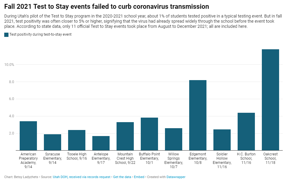
Utah’s program caught my eye last year when I was reporting a story for Science News on the hurdles schools faced in setting up COVID-19 testing. This state was an early pioneer of Test to Stay, a strategy in which students must test negative to attend school after a potential exposure rather than going through a (potentially unnecessary) quarantine.
In Utah’s version of Test to Stay, once 1% of students tested positive for the virus, the entire school would go through a testing event. Students who tested negative could keep attending school without interruption, while those who tested positive (or those who refused to participate) could quarantine. The Utah health department tested out this program in the 2020-2021 school year, and it was so successful that a CDC MMWR boasted it had “saved over 100,000 days of in-person instruction.”
After that successful test, Utah’s state legislature codified the program into law for the 2021-2022 school year. But Test to Stay crashed and burned this past fall, even before the Omicron variant overwhelmed Utah’s test supplies.
Last school year, Utah’s Test to Stay program drew national attention as a novel strategy to prevent COVID outbreaks. But in fall 2021, the program entirely collapsed. @erinalberty and I dug into why, for @sltrib / @19Documenting: (1/12) pic.twitter.com/coho1YgTwP
Here’s why the program failed, according to our investigation:
When putting Test to Stay into law, the Utah state legislature doubled the threshold for school cases that would trigger a testing event, from 1% to 2% of the student body. (Or from 15 to 30 students at smaller schools with under 1,500 students.) This higher threshold allowed COVID-19 to spread more widely before testing events took place, leading to higher case numbers when students were finally tested.
Utah’s lawmakers also banned schools from requiring masks in fall 2021, leading to more transmission. Experts said the original program was intended to be paired with masks and other safety measures; it was not able to stand on its own.
In the 2020-2021 school year, Test to Stay was paired with a second program called Test to Play: mandatory testing every two weeks for students on sports teams and in other extracurriculars. Without this regular testing in fall 2021, Utah schools had less capacity to identify school cases outside of voluntary and symptomatic tests—so it took longer for schools to reach the Test to Stay threshold.
The Utah health department allowed individual schools and districts to request rapid tests for additional surveillance testing. Some administrators requested thousands of tests and made them regularly available to students and staff; others were entirely uninterested and did not encourage testing at their schools.
Testing in schools has become increasingly polarized in recent months, like all other COVID-19 safety measures. One school administrator told me that he faced some vocal parents who felt “that their rights were being trampled on” by the testing program. Without high numbers of students opting in to get tested, testing programs are inherently less successful.
Even though the CDC endorsed Test to Stay as part of its official school COVID-19 guidance last December—citing Utah’s program as a key example—its future in the state is now uncertain. State lawmakers paused the program during the Omicron surge in January and have yet to revive it. At the same time, lawmakers have made it even harder for Utah schools to make their own decisions around safety measures.
What school districts and health departments should actually be doing, experts told me, is stock up on rapid tests now so that they’re ready to do mass testing in future surges. It’s unlikely that the Omicron wave will be our last, much as some Utah Republicans might want to pretend that’s the case.
The CDC is not publicly releasing a lot of its COVID-19 data. Last weekend, New York Times reporter Apoorva Mandavilli broke the news that the CDC has withheld a lot of its COVID-19 data from the public, including information on breakthrough cases, demographic data, and wastewater data. This news was honestly not surprising to me because it follows a pattern: the CDC doesn’t like to share information unless it can control the interpretations. But I appreciated the conversation brought on by this article, with public health experts saying they’d rather have imperfect data than a complete data void. (I agree!)
BA.2 is definitely more transmissible than the original Omicron strain, but it does not appear to be significantly more severe or more capable of evading vaccines. Two recent posts, one in the New York Times COVID-19 updates page and one from Your Local Epidemiologist, share some updates on what scientists have learned about BA.2 in the past couple of weeks. In the U.S. and other countries with BA.2, this sublineage doesn’t seem to be causing a major rise in cases—at least so far.
New CDC study shows the utility of rapid testing out of isolation. More than half of patients infected with the coronavirus tested positive on rapid antigen tests between five and nine days after their initial diagnosis or symptom onset, a new CDC report found. The report includes over 700 patients at a rural healthcare network in Alaska. These findings suggest that rapid testing out of isolation is a good way to avoid transmitting the virus to others, if one has the tests available.
January saw record-high coronavirus infections in hospitals.POLITICO reporters analyzed hospitalization data from the Department of Health and Human Services (HHS), finding that: “More than 3,000 hospitalized patients each week in January had caught Covid sometime during their stay, more than any point of the pandemic.” This high number demonstrates Omicron’s high capacity to infect other people.
Hong Kong’s surge shows the value of vaccinations. Hong Kong has been a global leader in keeping COVID-19 cases low throughout the pandemic, yet Omicron has tested this territory’s strategy—causing record cases and overwhelming hospitals. One major issue for Hong Kong has been low vaccination rates, particularly among the elderly, as people did not see the need to get vaccinated when cases in the territory were practically nonexistent.
Under the new CDC guidance, about 70% of Americans live in counties where they can go unmasked in public. Chart via CDC.gov.
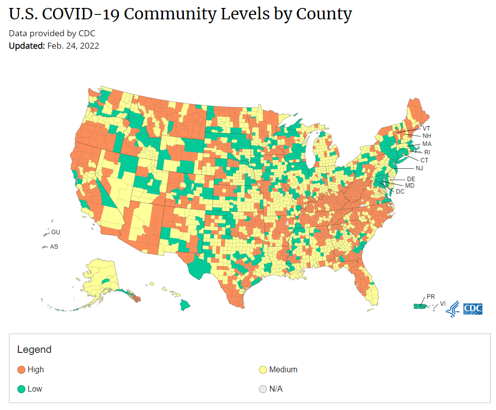
This past Friday, the CDC announced a major shift to its guidance for determining COVID-19 safety measures based on county-level community metrics. The new guidance is intended to replace COVID-19 thresholds that the agency developed last summer, during the Delta wave; here, the CDC is promoting a shift from using cases and test positivity for local decision-making to using metrics tied directly to the healthcare system.
This shift away from cases isn’t new: state health departments have been moving in this direction recently, as I wrote last week. Similarly, the CDC’s recommendation for when Americans should feel safe in taking off their masks aligns with recent guidance changes from state leaders.
The new guidance is essentially a lot more lenient when it comes to mask removal. Overnight, the U.S. goes from under 5% of counties in “low” or “moderate” transmission (under the old guidance) to over 60% of counties, representing 70% of the population, in a “low” or “medium” COVID-19 community level.
🚨🚨 the CDC has updated its guidance on using county-level COVID-19 metrics to drive recommended safety measures.
with the new guidance, we go from 82% of U.S. counties in "high" transmission (on the left) to only 37% of counties in high transmission (on the right). pic.twitter.com/Xz1Xj6FHDN
This shift will embolden more states, local health departments, and individual organizations to lift safety measures and change how they track COVID-19. In this post, I’ll unpack why I believe the CDC made certain choices with this new guidance, what critiques I’m seeing from public health experts, and some recommendations for thinking about your COVID-19 risk during this highly confusing pandemic era.
Rationale for the CDC’s new guidance
With this new framework, the CDC is essentially telling Americans to watch hospitalization numbers—not case numbers—as the most important metric to inform how hard COVID-19 is hitting their community. One piece of their logic is, I suspect, that case numbers are less reliable in this pandemic era than they have been since March 2020.
That lack of reliability largely stems from the rise of at-home rapid antigen tests, which gained popularity during the Omicron surge and are now largely unconstrained by supply issues. (For example: iHealth Labs, one major at-home test provider, now allows shoppers to buy up to 50 test kits per person, up from a limit of 10 during Omicron’s peak.)
Unlike PCR test results, which are systematically processed in labs and reported to public health agencies, at-home test results typically do not travel beyond a patient’s trash can. And while a few local jurisdictions (like D.C.) have given residents options to self-report their antigen tests, the majority have opted not to take on this challenge. As a result, current case numbers for almost everywhere in the U.S. are not very reflective of actual infections in the community.
In previous pandemic eras, researchers could use PCR test positivity as an indicator of how reliable case numbers might be for a particular jurisdiction: higher test positivity usually means that more cases are going unreported. But in the era of widespread rapid tests, test positivity is also less reliable, because rapid tests aren’t accounted for in the test positivity calculations either.
Case numbers do still have some utility, because people who have COVID-19 symptoms or need a test result to travel will continue seeking out PCR tests. The CDC guidance reflects this by keeping cases as one factor of its COVID-19 community level calculation. But cases are no longer the star of the show here.
Instead, the CDC is focusing on hospitalizations: specifically, new COVID-19 admissions per 100,000 people and the share of inpatient beds occupied by COVID-19 patients. New hospital admissions are a more reliable—and more timely—metric than the total number of patients hospitalized with COVID-19, because admissions reflect only the people coming in with symptoms that recently started, not the people who have been hospitalized for days or weeks.
The share of inpatient beds occupied by COVID-19 patients, meanwhile, reflects the strain that this disease is currently putting on a hospital system. The CDC is choosing to include all COVID-19 patients here, not only those who are hospitalized for COVID-specific symptoms (the correct choice, in my view). Agency director Dr. Rochelle Walensky gave a good explanation for this at a media briefing on Friday:
We are considering anybody in a hospital bed with COVID, regardless of the reason for admission, and the reason that we landed there is multifold. First, many jurisdictions can’t differentiate, so that was important for us to recognize and realize. Second, whether or not a patient is admitted with COVID or for COVID, they increase the hospital capacity and they’re resource intensive. They require an isolation bed. They require PPE. They probably require a higher staff ratio. And so they are more resource intensive and they do take a COVID bed potentially from someone else.
Interestingly, as well, as we have less and less COVID in certain communities, the amount of people who are coming into the hospital with COVID will necessarily decrease. We will not have as many people walking around asymptomatically because there will just be less disease out there. So increasingly, as we have less disease in the community, we anticipate that more of the people who are coming into the hospital are going to be coming in because of COVID.
And then finally, as we have even less disease in the community, we anticipate that not every hospital is going to screen every patient for COVID as they walk in the door, especially if we have less and less disease in the community. And when that happens, we won’t actually be able to differentiate. In fact, people who are coming in, who are tested will necessarily be coming in for COVID. So for all of those reasons, comprehensively, we decided to stay with anybody coming in with a COVID diagnosis.
Also, a note on wastewater: I’ve seen some commentators express surprise that the CDC didn’t include wastewater in its new guidance, as this sewage surveillance can be a useful leading indicator for COVID-19 that’s more reliable than cases. The problem here is, wastewater surveillance is not available in much of the country—just look at all the empty space on this map. To use wastewater for decisionmaking, a county or state needs to have enough wastewater collection sites actually collecting these data, and most states are not there yet.
Critiques of the new guidance
While hospitalizations are a more reliable COVID-19 metric than cases, especially in our rapid testing era, they come with a few major issues. First, hospitalizations are a lagging indicator, meaning that they start to rise a couple of weeks after a new surge has started. If we rely on hospitalizations as a signal to put mask requirements or other safety measures in place, those changes will come weeks delayed.
As Boston University epidemiologist Dr. Ellie Murray put it in a recent Twitter thread: “Using lagging indicators like hospitalizations could be okay for turning *off* precautions IF we are sure that no new surge has begun. But that means we need leading indicators, like infection surveillance to guide turning *on* precautions.”
The CDC seems to have forgotten the basics of infectious disease in making these new risk categories.
People infected with SARS-CoV-2 can transmit for days before they show symptoms, and for a week or more before they develop “severe disease”.
Another issue with relying heavily on this lagging indicator is, new COVID-19 safety measures may come too late to protect essential workers, children in schools, and others who face high risk of coronavirus exposure. “These high exposure populations get COVID first and most,” writes health policy expert Julia Raifman.
In other words, by the time case and hospitalization rates are high enough for a community to institute new safety measures under this new CDC guidance, those high-risk people are likely to be the ones already in the hospital. Raifman points to data from the U.S. Census’ Household Pulse Survey, showing that low-income workers were most likely to miss work for COVID-19 throughout last year.
Beyond this lagging indicator issue, another challenge with relying on hospitalizations is that, for many Americans, the hospitals that they might go to if they come down with severe COVID-19 are not located in their county. Plenty of counties, particularly in rural areas, don’t have hospitals! To deal with this, the CDC is actually using regional hospitalization figures, compiling statistics from multiple counties that rely on the same healthcare facilities.
University of South Florida epidemiologist Jason Salemi lays out this calculation in an excellent Twitter thread, linked below. While it makes sense that the CDC would need to use regional instead of local figures here, the agency is being pretty misleading by labeling this new guidance as county-level metrics when really, the metrics are not that localized.
The numerator is based on WHERE PEOPLE ARE ADMITTED.
The denominator is based on WHERE PEOPLE LIVE.
If you just look at FL, there are many counties that either do not report hospitalizations (NO HOSPITAL) or reported 0 in the past 7d.
There are more equity concerns embedded in the new CDC guidance as well. For counties with “low” or “medium” community COVID-19 levels, the CDC recommends that most Americans do not need to wear masks in public. But people who are immunocompromised or at high risk for severe disease should “talk to a healthcare provider” about the potential need to wear a mask indoors, stock up on rapid tests, or consider COVID-19 treatments.
For one thing, telling people, “talk to your doctor” is not a great public health strategy when one in four Americans do not have a primary care physician, and one in ten do not even have health insurance! For another thing, one-way masking among immunocompromised and otherwise high-risk people is also not a great strategy, because masks protect the people around a mask-wearer more than they protect the mask-wearer themselves. (I recommend this recent Slate piece on one-way masking for more on this topic.)
Many of my colleagues on here have eloquently explained their concerns with the new CDC guidelines, so I’ll just add that any guidelines that include “Talk with your provider.” when 25% of Americans don’t have a PCP and 10% are uninsured is inherently problematic.
It is also pretty unclear how the CDC landed on a case threshold for “low transmission” that is much higher in this new guidance than in the old guidance, as Dr. Katelyn Jetelina points out in a recent Your Local Epidemiologist post. If anything, honestly, I would expect that the CDC needs to lower its case threshold, given that current case numbers are not accounting for millions of rapid tests done across the country.
Finally, the new CDC guidance completely fails to account for Long COVID. Of course, it would be very difficult for the CDC to do this, since the U.S. basically isn’t tracking Long COVID in any comprehensive way. Still, overly focusing this new guidance on hospitalizations essentially ignores the fact that a “mild” COVID-19 case which does not lead to hospitalization can still cause major, long-term damage.
Which metrics you should follow right now
Here are my recommendations of COVID-19 metrics to watch in your area as you navigate risk in this confusing pandemic era.
Both the old and new CDC thresholds. While the CDC pushes its new guidance with a brand-new page on CDC.gov, community transmission metrics calculated under the old guidance are still available on the CDC’s COVID-19 dashboard. If you’re not feeling comfortable taking off your mask in public and want to wait until transmission is seriously low in your area, you can look at the old thresholds; though keep in mind that case data are seriously unreliable these days, for the reasons I explained above.
Remember that masks are useful beyond COVID-19. Not a metric, but an additional note about thinking through risk: masks reduce risk of infection for a lot of respiratory diseases! We had a record-low flu season last winter and many Americans have avoided colds for much of the pandemic, thanks in part to masking. Helen Branswell has a great article in STAT News that unpacks this further.
Wastewater data, if available to you. As I mentioned above, wastewater surveillance data are not available in much of the country. But if you live somewhere that this surveillance is happening, I highly recommend keeping an eye on those trends to watch for early warnings of future surges. You can look at the CDC dashboard or Biobot’s dashboard to see if your county is reporting wastewater data.
Vaccination levels. It makes sense that vaccination was not included in the CDC guidance, because vaccinated people can still spread highly contagious variants like Omicron. Still, more highly-vaccinated counties—particularly those with high vaccination rates for seniors—are likely to have less burden on their healthcare systems when a surge arises, so knowing the vaccination rate in your county can still be useful when thinking about your risk tolerance.
Rapid test availability. This is a bit more anecdotal rather than an actual data source, but: looking at rapid test availability in your local pharmacies may be another way to get a sense of community transmission in your area. Right now, these tests are easy to find in many places as case numbers drop; if finding these tests becomes more competitive again, it could be a signal that more people are getting sick or having exposures.
As always, if you have any questions or topics that you’d like me to tackle in this area, please reach out.
Omicron has caused more U.S. COVID-19 deaths than Delta. Despite numerous headlines proclaiming the Omicron variant to be “milder” than previous versions of the coronavirus, this variant infected such a high number of Americans that it still caused more deaths than previous waves, a new analysis by the New York Times shows. Between the end of November and this past week, the U.S. has reported over 30 million new COVID-19 cases and over 154,000 new deaths, the NYT found, compared to 11 million cases and 132,000 deaths from August 1 through October 31 (a period covering the worst of the Delta surge).
124 countries are not on target to meet COVID-19 vaccination targets. The World Health Organization (WHO) set a target for all countries worldwide to have 70% of their populations fully vaccinated by mid-2022. As we approach the deadline, analysts at Our World in Data estimated how many countries have already met or are on track to meet the goal. They found: 124 countries are not on track to fully vaccinate 70% of their populations, including the U.S., Russia, Bangladesh, Egypt, Ethiopia, and other large nations.
Anime NYC was not an omicron superspreader event, CDC says. In early December, the Minnesota health department sounded the alarm about a Minnesotan whose COVID-19 case had been identified as Omicron—and who had recently traveled to New York City for the Anime NYC convention. The CDC investigated possible Omicron spread at this event, both by contact tracing the Minnesota case and by searching public health databases for cases connected to the event. Researchers found that this convention was not a superspreader for Omicron, despite what many feared; safety measures at the event likely played a role in preventing transmission, as did the convention’s timing at the very beginning of NYC’s Omicron wave. I covered the new findings for Science News.
ATTN WEEBS! two new reports, published today by the CDC, find that #AnimeNYC was not actually a superspreader event, despite Omicron's presence at the convention — but the situation is still complicated. I covered this for @ScienceNews: (1/11) pic.twitter.com/zSyCWl2t7H
Americans with lower socioeconomic status have more COVID-19 risk, new paper shows. Researchers at Brookings used large public databases to investigate the relationship between socioeconomic status and the risk of COVID-19 infections or death from the disease. Their paper, published this month in The ANNALS of the American Academy of Political and Social Science, found that education and income are major drivers of COVID-19 risk, as are race and ethnicity. The researchers also found that: “ socioeconomic status is not related to preventative behavior like mask use but is related to occupation-related exposure, which puts lower-socioeconomic-status households at risk.”
The federal government has failed to disclose how much taxpayers are spending for “free” COVID-19 tests. One month into the Biden administration’s distribution of free at-home COVID-19 tests to Americans who request them, millions have received those tests. But the government has not shared how much it spent for the tests, making it difficult for journalists and researchers to determine how much taxpayer money was paid for each testing kit. “The reluctance to share pricing details flies against basic notions of cost control and accountability,” writes KHN reporter Christine Spolar in an article about this issue. The government has also failed to share details about who requested these free tests or when they were delivered, making it difficult to evaluate how equitable this distribution has been.