Every week, I come into your inbox and I say, the vaccine rollout is going badly. And you’re probably like, yeah, Betsy, I know, it’s on the news every single day.
You probably don’t need me to tell you about the announcement this past Tuesday, from Health and Human Services Secretary Alex Azar, telling states to stop saving their second doses and start prioritizing all adults over the age of 65… or the Washington Post scoop this past Friday, revealing that states couldn’t actually vaccinate more people because the federal vaccine reserve was already used up. (I salute all the policy reporters following this madness. Seriously.)
So instead, today, I’m focusing on a vaccination issue that hasn’t gotten as much press: who is actually getting vaccinated? On the national level, we largely can’t answer this question, thanks to a lack of demographic data.
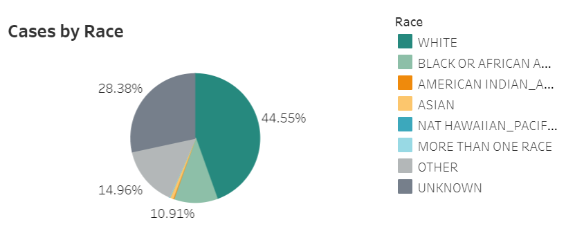
While the CDC’s vaccination tracker has seen some upgrades recently (such as the inclusion of people receiving two doses and downloadable data), it does not report any information on the race, ethnicity, age, gender, or occupation of those Americans who have gotten shots. And the data aren’t much better at the state level, according to recent analysis from the COVID Tracking Project.
The COVID Tracking Project analysis discusses 17 states which report race and/or ethnicity data for vaccine recipients. Since the post was published, two more states—Missouri and West Virginia—have started reporting such data. Still, just reporting these data isn’t sufficient. Alice Goldfarb, Kara Schechtman, Charlotte Minsky, and other Project volunteers who compiled detailed annotations on the vaccine metrics reported by each state found that, even when states do report demographic data, each state uses vastly different categories, making it difficult to compare or combine this state-level information into a useful national dataset.
See the CDD’s updated annotations on both state and national vaccine data sources here.
Using the limited data that are available, though, we can still see that the vaccination effort thus far is incredibly inequitable—despite government promises to prioritize vulnerable populations.
White Americans are getting vaccinated at much higher rates than Black Americans, according to a Kaiser Health News analysis of state data published yesterday. Reporters Hannah Recht and Lauren Weber discuss access issues and mistrust of the healthcare system—tied to systematic racism against Black Americans seeking healthcare—as reasons why Black Americans may be left behind.
But the disparities so far, at a stage of the vaccine rollout that has largely prioritized healthcare workers, means that both national and local public health agencies have a lot of work to do:
“My concern now is if we don’t vaccinate the population that’s highest-risk, we’re going to see even more disproportional deaths in Black and brown communities,” said Dr. Fola May, a UCLA physician and health equity researcher. “It breaks my heart.”
In New York—a state which finally released a vaccine dashboard today, but is not yet reporting demographic data—vaccination trends by hospital suggest a similar pattern. The hospitals with the highest shares of vaccinated workers are, by and large, private hospitals located in Manhattan. The hospitals with fewer vaccinated workers, on the other hand, include those located in Harlem, Brooklyn, and other working-class neighborhoods.
Data are also lacking for long-term care facilities. The CDC reports total vaccine doses administered in these facilities (which include nursing homes, assisted living facilities, and other care homes). But a national total is unhelpful in analyzing where states have been most successful at getting vaccines to this high-priority population. A COVID Tracking Project analysis, published on Thursday, found vaccine data for LTCs in only seven states. South Carolina is the only state releasing detailed data on individual facilities.
Meanwhile, CVS has published a state-by-state dataset of LTC vaccinations administered by this pharmacy chain. The COVID Tracking Project reports that Walgreens may release a similar dataset. It seems pretty wild that independent pharmacy chains are reporting more detailed vaccine data than the federal government itself—until you remember, well, how data reporting has gone this entire pandemic.
Vaccination data, right now, are about as messy as testing data were back in spring 2020. Every state is doing its own thing, and the federal government has yet to provide sufficiently detailed information for meaningful analysis. Readers: I urge you to push for better vaccine demographic data, both in your own region and nationally.
A few more vaccine data updates:
- The Kaiser Family Foundation has published an update on state vaccine prioritization plans, including both topline statistics and detailed annotations for each state.
- Modeler Youyang Gu has incorporated vaccinations into his state-by-state COVID-19 forecasts.
- Axios has compiled a list of COVID-19 vaccine “megasites” at stadiums, fairgrounds, convention centers, and other large spaces across the country.
- The New York Times compiled every state’s current prioritization level for older adults (65+, 70+, 75+).
- The COVID-19 Vaccine Communication Handbook is a new resource from communication initiative SciBeh aimed to help journalists, healthcare workers, and other communicators talk about COVID-19 vaccines and challenge misinformation.
- Sources and updates, November 12Sources and updates for the week of November 12 include new vaccination data, a rapid test receiving FDA approval, treatment guidelines, and more.
- How is the CDC tracking the latest round of COVID-19 vaccines?Following the end of the federal public health emergency in May, the CDC has lost its authority to collect vaccination data from all state and local health agencies that keep immunization records. As a result, the CDC is no longer providing comprehensive vaccination numbers on its COVID-19 dashboards. But we still have some information about this year’s vaccination campaign, thanks to continued CDC efforts as well as reporting by other health agencies and research organizations.
- Sources and updates, October 8Sources and updates for the week of October 8 include new papers about booster shot uptake, at-home tests, and Long COVID symptoms.
- COVID source shout-out: Novavax’s booster is now availableThis week, the FDA authorized Novavax’s updated COVID-19 vaccine. Here’s why some people are excited to get Novavax’s vaccine this fall, as opposed to Pfizer’s or Moderna’s.