Twice a week, the COVID Tracking Project’s COVID Racial Data Tracker compiles and standardizes demographic data from every U.S. state and territory. I am intimately familiar with this work because I’m one of those volunteers. I watch the numbers tick up and, inevitably, paint a clear picture of how centuries of racism have left people of color more vulnerable to this pandemic.
This week, the COVID Tracking Project’s web design team launched a new feature that makes our demographic data more accessible to readers. It’s called Infection and Mortality by Race and Ethnicity: simply click on a state or territory, and the feature will return a chart that compares COVID-19 cases and deaths to that region’s population.
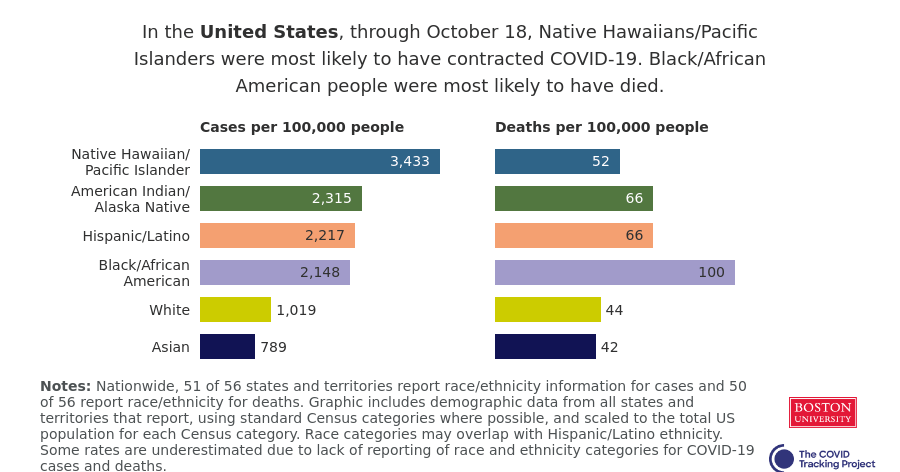
Here’s the chart for the U.S. as a whole:

Adjusting case and death values by population makes it much easier to see disparity. For example, while Native Hawaiians and Pacific Islanders are a relatively small fraction of America’s population, they are much more likely to contract the novel coronavirus. Meanwhile, Black, Hispanic/Latino, and indigenous Americans are more likely to die of the disease.
These charts are easy to share on Facebook, Twitter, and Instagram, and the graphics will be updated automatically when our data updates twice a week. Volunteers who work on this part of the Project are hoping that these charts can make it easier for people to draw attention to COVID-19 disparity in their communities, as well as to the data that are still missing in many states. For example, here’s me yelling about New York.
Check out the chart for your state, and if you feel compelled, share it. We need people talking about these data in order to drive change. (Also: shout-out to product lead Neesha Wadhwa and other design folks working behind the scenes at the COVID Tracking Project who made these charts possible!)
