Tag: federal allocation

  • We need more data on who’s getting Paxlovid

    We need more data on who’s getting Paxlovid

    Last week, I shared a new page from the Department of Health and Human Services (HHS), reporting statistics on COVID-19 therapeutic distribution in the U.S. The new dataset is a helpful step, but it falls far short of the information we actually need to examine who has access to COVID-19 treatments (particularly Paxlovid) and address potential health equity issues.

    The HHS dataset includes total counts of COVID-19 drugs ordered and administered in the U.S., both nationally and by state. It also includes weekly numbers of the doses available for health providers to order from the federal government (which the HHS calls “thresholds”), over the last five weeks; again, these are available nationally and by state.

    As most of the monoclonal antibodies developed for earlier variants do not provide much protection against Omicron, the majority of treatments used in the country last month were antiviral drugs Paxlovid (made by Pfizer) and Molnupiravir (made by Merck).

    Paxlovid is the most effective of the two, and the most in-demand. In recent weeks, some patients have reported difficulties with accessing this antiviral as BA.2 drives rising cases across the country. For instance, one COVID-19 Data Dispatch reader wrote to me last week to share that a family member who should’ve been eligible for Paxlovid had his prescription denied, as his pharmacy said the drug was in “limited supply.”

    In the first Omicron surge, during the winter, Paxlovid definitely was in limited supply. Then, as that surge waned, supplies improved: a Washington Post article last month reported that the federal government had plenty of doses going unused, and health leaders like COVID-19 coordinator Ashish Jha wanted to raise awareness of the antiviral with providers and patients.

    Now, as BA.2 and its subvariants drive a new surge, it’s unclear whether there are still plenty of Paxlovid doses for anyone who might need them—or whether the doses must once again be rationed for only the most vulnerable patients. If the latter is true, even if it’s true only in some states or counties hardest-hit by the Omicron variants, it’s a problem: as the U.S. seems completely unwilling to put in new safety measures, Paxlovid is an important tool to at least reduce severe disease and death. Without it, high-risk people are in an even worse position.

    As a data journalist, I would love to investigate this problem by digging into federal data to see where Paxlovid is getting used, and where there may be gaps. But the existing data are pretty sparse: the HHS has published only limited national and state-level data, with the only numbers on doses actually ordered and administered being cumulative (i.e. totals over a five-month period). There’s no information on how Paxlovid prescriptions have changed in different states or counties over time, or of whether the drug is actually reaching vulnerable people who need it.

    KHN’s Hannah Recht explained why this data gap is a problem for health providers prescribing Paxlovid, in an article earlier in May:

    Los Angeles County’s Department of Public Health has worked to ensure its 10 million residents, especially the most vulnerable, have access to treatment. When Paxlovid supply was limited in the winter, officials there made sure that pharmacies in hard-hit communities were well stocked, according to Dr. Seira Kurian, a regional health officer in the department. In April, the county launched its own telehealth service to assess residents for treatment free of charge, a model that avoids many of the hurdles that make treatment at for-profit pharmacy-based clinics difficult for uninsured, rural, or disabled patients to use.

    But without federal data, they don’t know how many county residents have gotten the pills. Real-time data would show whether a neighborhood is filling prescriptions as expected during a surge, or which communities public health workers should target for educational campaigns.

    Yasmeen Abutaleb’s article in the Washington Post (linked above) also discusses the need for data:

    Other experts welcomed the administration’s efforts, especially as cases rise, but said simply boosting the supply wasn’t enough, noting that inequities persist in who has access to Paxlovid. People without health insurance and those who live far away from medical providers or pharmacies are among those at highest risk from covid and face some of the highest hurdles to receiving effective treatment, said Julie Morita, executive vice president of the Robert Wood Johnson Foundation.

    “It is essential that we collect and report data on who is receiving Paxlovid and other antiviral medications to swiftly pinpoint and address any disparities that emerge,” Morita said. “If done right, this can be a real turning point — but it is essential that all populations and communities have the opportunity to reap the benefits.”

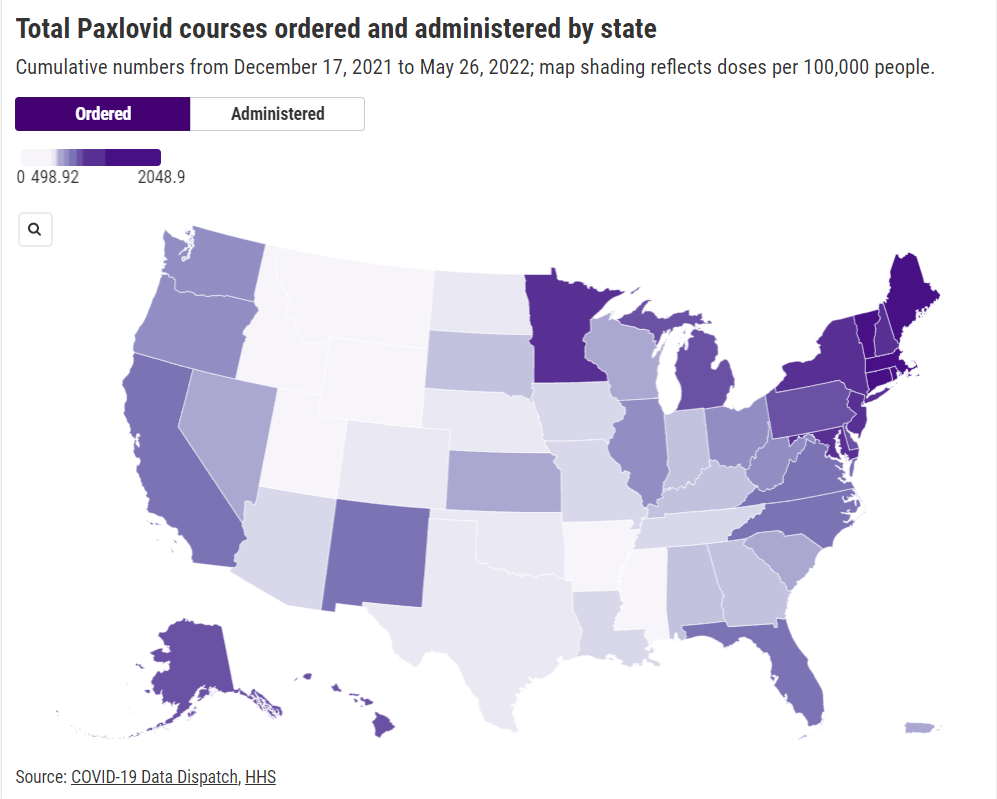
    In short, if health providers like community clinics and pharmacies could see data on which communities are receiving Paxlovid prescriptions and which ones are not, they could work to fill the gaps. The existing state-by-state data (published after Recht’s article) is a helpful starting point, but still has little utility for local health officials.

    Indeed, the limited state-by-state data already suggest that some states in the Northeast, the West Coast, and the Great Lakes region are ordering and administering more Paxlovid (relative to their populations), compared to others in the Midwest and South. This is a pattern worth examining further, but it’s difficult when the data are so unspecific.

    Here’s my wishlist of Paxlovid data that would be more useful:

    • More granular geographies. State-level data is pretty useless if you run a local health clinic, or if you’re a local journalist. We need prescription information at the county level, if not even smaller regions (like census tracts or ZIP codes.)
    • Demographic data. Without data on race and ethnicity, age, or other demographic factors, it’s very difficult to determine whether Paxlovid is reaching people in an equitable way—or if access to the drug is becoming another way in which the pandemic disproportionately impacts already-marginalized groups.
    • Provider type. Along the same lines as demographic data, seeing how many Paxlovid doses are going through large pharmacies as opposed to community health centers, hospitals, or other types of healthcare providers could be a useful measure of equity.
    • Patient health conditions. People with health conditions that predispose them to severe COVID-19 symptoms (compromised immune systems, diabetes, kidney disease, etc.) are supposed to be at the front of the line for Paxlovid. We need data to see whether they are actually getting this priority treatment.

    Come on, HHS: give us the granular data!

    More federal data

  • The federal government starts acting like a federal government

    The federal government starts acting like a federal government

    A slide from the January 27 White House COVID-19 briefing, featuring the Biden team’s new commitment to provide states with three weeks’ lead time into their vaccine supply.

    Good afternoon only to the reporters on last Wednesday’s White House COVID-19 press call who told Dr. Anthony Fauci that he was on mute.

    And yes, you read that right: the White House is doing regular COVID-19 press calls again! With Dr. Fauci! Who is now President Biden’s Chief Medical Advisor on COVID-19! And CDC Director Dr. Rochelle Walensky! And chair of Biden’s health equity task force Dr. Marcella Nunez-Smith!

    Okay, that’s enough exclamation points. The briefings, which will be held three times a week, provide data-driven updates on the state of the pandemic and allow journalists to ask hard questions of the Biden administration’s response. In addition to the scientific experts, briefings so far have featured White House advisors/COVID-19 coordinators Jeff Zients and Andy Slavitt, who can speak to the more logistical aspects of the administration’s actions.

    This is, essentially, what a responsible federal government should have been doing since January 2020. But after a year of the Trump administration’s confusion, lack of coordination, and outright lies, it’s refreshing to watch a White House COVID-19 briefing in which every statement doesn’t need to be rigorously fact-checked in real-time.

    Besides the press briefings, here are a couple of moves the Biden team made this week that underscore the new administration’s commitment to better (and more transparent) COVID-19 data:

    • Publicly releasing the COVID-19 State Profile Reports: Since last spring, the White House COVID-19 Task Force has regularly compiled detailed reports to help national and state leaders respond to the pandemic. The reports include COVID-19 data for states, counties, and cities, along with specific assessments on where governors and state public health officials should focus their efforts in order to control the virus’ spread. In late December, the data behind these reports were released to the public; here’s a CDD post with more info on that release. Biden’s COVID-19 Task Force has kept the data releases going, and this week, they also shared the PDF reports themselves. What’s more, new White House COVID-19 Data Director Cyrus Shahpar made this release his first Tweet on his new official accountand he thanked public advocates for these data, such as the Center for Public Integrity’s Liz Essley Whyte and COVID Exit Strategy’s Ryan Panchadsaram. The release indicates a new commitment to data transparency that we did not see from Trump’s White House for the majority of his tenure.
    • Updating the CDC’s COVID-19 dashboard: The CDC has been building out a COVID-19 tracker since the spring, featuring data on cases, testing, vulnerable populations, and (since December) vaccination. But it got a major upgrade this week: the dashboard now has a curated landing page and a sidebar menu that makes it much easier for users to see all the available data. This dashboard also now includes those State Profile Reports I mentioned above, making it easy for users to find information about their regions. And, under the “Your Community” label, you’ll also find an interactive COVID-19 vulnerability index: select your county, and the map will show you how susceptible you are to the pandemic based on your community’s current infection rate, testing, population demographics, health disparities, and more.
    • More lead time for vaccine distribution: Last week, I discussed how unpredictable vaccine shipments from the federal government were making it difficult for states—and by extension, local public health departments and individual providers—to coordinate their dose administration. Biden’s team improved the situation this week by giving states their shipment numbers three weeks in advance. The extended lead time will allow vaccine providers to plan out appointments and coordinate other logistics in order to ensure all doses are used. Both the CDC’s Pfizer and Moderna distribution datasets were most recently updated on January 26, with allocation numbers for January 25 and February 1.
    • Stepping up the genomic surveillance: In both of this week’s White House COVID-19 briefings, CDC Director Rochelle Walensky announced that the agency is actively looking for new SARS-CoV-2 variants by working with local and international partners. She gave some specifics in Friday’s briefing: “We are now asking for surveillance from every single state,” she said, requiring states to sequence 750 strains each week. Collaborations with both commercial labs and research universities will take the surveillance to thousands of strains per week. As Sarah Braner wrote earlier in January, such surveillance is key to understanding how prevalent the new—and more contagious—coronavirus strains are in the U.S., as well as to detecting future strains that may become a threat in the coming months.

    It looks like the CDC may be on its way to adapting its current dashboard into the Nationwide Pandemic Dashboard that Biden promised in his transition plan. But I, for one, am trying not to get too comfortable. The statements still need to be fact-checked, and the hard questions need to be asked. Biden’s team is making the bare minimum look nice—albeit with a few Zoom glitches.

    As I look forward into my coverage of the Biden administration’s COVID-19 response, and its healthcare policies more broadly, I’m thinking about this quote from Chris La Tray in his most recent newsletter issue, “Same as it Ever Was”:

    “I’m already sick of all the white liberal people humping each other’s legs every time Biden does something that is simply his damn job. “It’s so nice to have a president that….” Blech. Puke. There is copious lingering accountability to be addressed and Joe goddamn Biden is neck deep in it. We are not going back to anything that resembles the last 40 years of his political career, our only way is forward.”

    Our only way is forward. To end this pandemic, to prepare for the next one.

    Related posts

    • Featured sources, Aug. 23

      • COVID Care Map: Dave Luo, another COVID Tracking Project volunteer, also runs this volunteer effort to aggregate and clean public data on health care system capacity. The source has mapped capacity figures at the state, county, and individual facility levels, as well as other healthcare data from sources such as the Institute for Health Metrics and Evaluation (IHME).
      • Federal allocation of remdesivir: This public dataset from HHS shows how many cases of remdesivir, an antiviral drug which has become an important treatment option for COVID-19 patients, have been distributed to each state since early July. The dataset is cited in an NPR investigation which reports confusion and lack of transparency about how remdesivir distribution is decided.
      • The White House’s Red Zone Reports: Each week, the White House Coronavirus Task Force sends reports to U.S. governors about the state of the pandemic, including county-level data on cases and tests. The reports are not made public, but the Center for Public Integrity is collecting and releasing many of them. As of August 23, the Center’s document repository includes one report on all 50 states (from July 14) and 13 state-specific reports.