Under the new schedule, data updates will be cut off on Wednesdays, though it’s unclear if the CDC will actually update its dashboard on Wednesdays or if this will happen on a day later in the week.
According to the CDC’s data FAQ page, this change was made “to allow for additional reporting flexibility, reduce the reporting burden on states and jurisdictions, and maximize surveillance resources.” To me, this makes a lot of sense: as case data become increasingly less reliable (thanks to increased at-home testing, closing PCR sites, etc.), daily updates can be more misleading than they are valuable. Most states are not reporting daily data either.
Also, much as it pains me to say this, the CDC’s COVID-19 dashboard is very likely not getting the views and attention that it received one or two years ago. If this change frees up agency data scientists to work on new tracking mechanisms that will be more useful, that seems like a fair trade-off to me. But it’s still a bummer to see the daily data go, especially at a time when we really need information to track a potential fall surge.
We’re now approaching almost a year since the Department of Health and Human Services (HHS) first started publicly releasing Community Profile Reports, massive documents containing COVID-19 data at the state, county, and metro area levels.
These reports were originally compiled internally, starting in spring 2020, for meetings of Trump’s White House Coronavirus Task Force. Reporters such as Liz Essley Whyte at the Center for Public Integrity were able to obtain some of the documents, but they remained a mostly-secret trove of data until the HHS started publishing them publicly in late December.
At the time, I wrote that I was excited about the public release because these reports contain a wealth of information in one place—including contextual data (such as population-adjusted case numbers and demographic information) and rankings for policy-makers built right into the Excel spreadsheets.
Since then, I’ve relied on Community Profile Reports for weekly data updates in this newsletter, along with numerous other stories. While their update schedule has not remained regular, the reports continue to be a one-stop shop for everything from vaccination rates to hospitalization metrics.
So, this Thanksgiving weekend, I’m thankful for the Community Profile Reports. According to the HHS site, they’ve been downloaded almost 100,000 times, and probably a solid 300 of those are me.
In recent weeks, several states have cut back on their COVID-19 data reporting frequency. Though, as I wrote on June 20, this isn’t a new phenomenon—some states have always skipped updating their data on weekends—the trend signifies that U.S. public health agencies are reallocating time and resources from their COVID-19 dashboards to other programs.
One major federal data source has recently made a similar change. The Community Profile Reports, those extensive PDF reports and Excel files that contain everything from vaccination coverage to hospital capacity, are now published on Tuesdays and Fridays only. (Previously, these reports were posted every day.)
Now, a lot of the data that one can find in the Community Profile Reports are also available from other sources—the CDC COVID Data Tracker, the CDC’s data portal, HHS Protect, etc. The main draw of these reports is that they compile so much info in one place, including data for counties and metro areas. I can understand why the HHS data team may want to cut down on their update schedule to free up resources for other projects. (More variant data, maybe?)
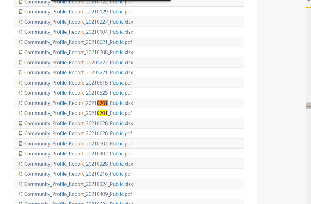
But what really annoys me is, someone at the HHS appears to have… shuffled the order of download links on the Community Profile Report page? That “Attachments” section with all of the PDFs and Excel files going back to December used to be in chronological order, with the most recent files at the top. Now, the order is completely random.
I shouldn’t have to Cntrl+F to the middle of the page to find the most recent report. Come on.
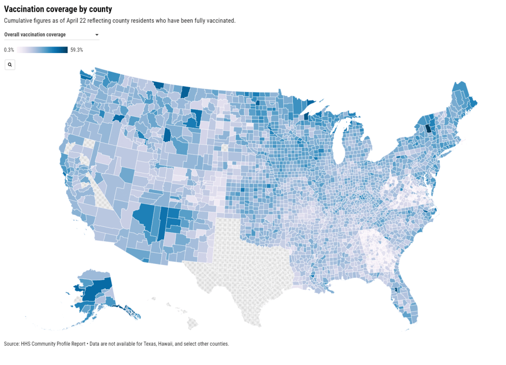
You can now get vaccination numbers for U.S. states, counties, and metropolitan areas in an easily downloadable format: the Community Profile Reports published daily by the Department of Health and Human Services (HHS). These reports are basically the HHS’s one-stop shop for COVID-19 data, including information on cases, deaths, PCR tests, hospitalizations—and now, vaccines. (Read more about the reports here.)
For counties and metro areas, the reports just include numbers and percentages of people who have been fully vaccinated, reported for the overall population and the regions’ seniors (age 65+). For states, the reports include more comprehensive information that matches the data available at the CDC’s COVID Data Tracker.
I visualized the county-level data, including both the overall and 65+ rates. I think this chart demonstrates how valuable it is for the public to have easy access to these data: you can see much more specific patterns reflecting which communities are ahead on vaccination and which still need to catch up.
A COVID Tracking Project friend alerted me to this data news last Monday, April 19. When I dug back into the past couple weeks of Community Profile Reports, however, I found that the HHS started including vaccination data in these reports one week earlier, on April 12. As seems to be common for federal data updates, the new information wasn’t announced in press briefings or other standard lines of communication.
Next, I would love to see the CDC make more granular demographic data available so that we can analyze these patterns with an equity lens. State-level or county-level vaccination rates by race and ethnicity would be huge.
Following the end of the federal public health emergency in May, the CDC has lost its authority to collect vaccination data from all state and local health agencies that keep immunization records. As a result, the CDC is no longer providing comprehensive vaccination numbers on its COVID-19 dashboards. But we still have some information about this year’s vaccination campaign, thanks to continued CDC efforts as well as reporting by other health agencies and research organizations.
This week, the FDA authorized Novavax’s updated COVID-19 vaccine. Here’s why some people are excited to get Novavax’s vaccine this fall, as opposed to Pfizer’s or Moderna’s.
Liz Essley Whyte, an investigative reporter at the Center for Public Integrity, discussed her work bringing White House COVID-19 reports to the public before they were officially released. Erica Hensley, an independent health and data journalist based in Jackson, Mississippi, provided advice for navigating relationships with local public health officials based on her work reporting on COVID-19 in Mississippi. And Tom Meagher, a senior editor at The Marshall Project, described the communication and coordination work behind his newsroom’s yearlong tracker of COVID-19 in the U.S. prison system. Thank you to everyone who attended!
For those who couldn’t make it live, you can watch the recording of the session below. You can also check out the slides here. I’m also sharing a brief recap of the workshop in today’s issue.
The final workshop in our series, Communicating COVID-19 data, is coming up this coming Wednesday, March 3, from 4:30 to 6 PM ET. This session will feature freelance reporter Christie Aschwanden, The Washington Post’s Júlia Ledur, and THE CITY’s Ann Choi, and Will Welch discussing strategies for both written reporting and data visualization. If you aren’t registered for the series yet, you can sign up here.
Finding and navigating government data
Liz Essley Whyte started her talk by providing backstory on the White House COVID-19 reports.
In the middle of the summer, she said, a source gave her access to documents that the White House Coronavirus Task Force was sending out to governors—but wasn’t publishing publicly. The documents included detailed data on states, counties, and metro areas, along with recommendations for governors on how to mitigate the spread. Whyte published the documents to which she’d obtained access, marking the start of a months-long campaign from her and other journalists to get the reports posted on a government portal.
“Despite weeks of me asking the White House, why aren’t these public, they were never made public for a while,” Whyte said. She continued collecting the reports and publishing them; the historical reports are all available in DocumentCloud.
If you need to find some government data—such as private White House reports—there are a few basic questions that Whyte recommended you start with:
Who collects the data?
Who uses it?
Who has access to it?
Has anyone else found it or published it before?
What do you really want to find out? If you can’t get the data you really need, are there other datasets that could illuminate the situation?
While journalists often like to find fully original scoops, Whyte said, sometimes your best source for data could be another reporter. “There’s some really great datasets out there, especially in the health space, that people have maybe written one or two stories, but they have hundreds of stories in them.” So get creative and look for collaborators when there’s a source you really want to find.
She provided a few other ideas for obtaining government data: besides getting a leak from a source (which can be hard to do), you can scour government websites, ask public information officers what data are available behind their public website, contact other officials (such as those mentioned in a one-off legislative report), or file a FOIA. Third-party sources such as the COVID Tracking Project or The Accountability Project also may have useful repositories of public information, or could help you navigate to what you need. Even for-profit data collecting companies might let journalists use their work for free.
Once you have the data, talk to your contact person for the dataset and “make sure you fully understand it,” Whyte said. Ask: Who collected the data and how? How is it being used? What’s the update schedule? How complete is it? And other similar questions, until you’re sure you know how to best use the dataset. If a data dictionary is available, make sure to comb through it and ask all your term and methodology questions.
In some cases this year, Whyte has looked at document information and contacted people who are listed as a document’s author or modifier. These are often great sources, she said, who can provide context on data even if they aren’t able to speak on the record.
The White House COVID-19 reports that Whyte spent so much time chasing down this past summer are now public. The Trump’s administration started publishing the data behind these reports in December, and Biden’s administration has now started publishing the PDF reports themselves—albeit minus the recommendations to governors that previous iterations contained. Whyte provided a run-down of the reports on Twitter, which should be required reading for any local journalist who wants to get more in-depth with their pandemic coverage.
“I think they’re really great for local reporting because they break down all kinds of different metrics by state, county, and metro area,” she said. The reports notably make it easy for us to compare across jurisdictions, since the federal government has standardized all the data. And you can find story ideas in the data notes, such as seeing where a state or region had a data error. The CDD also wrote about these reports when they were first published.
Working with local gatekeepers to find data
Erica Hensley discussed a few lessons she learned from covering COVID-19 in Mississippi, where data availability has lagged some other states.
Local reporting, she said, provides journalists with a unique situation in which they’re directly relying on one local agency for news and data. She stressed the importance of building a relationship with agency representatives, helping them understand exactly what you’re looking for and why you need it.
“They’re [Mississippi’s public health agency] an under-resourced agency that was strapped for time to even address my request,” she said. Understanding on her part and a lot of back-and-forth helped her to eventually get those requests met.
Hensley also described how she worked to fill data gaps by doing her own analysis at Mississippi Today, a local nonprofit newsroom, then showed her work to the public health agency. For example, she used the total case numbers published by the state to calculate daily and weekly figures, and presented the data in a percent change map. This project helped Mississippi residents see where COVID-19 spread was progressing most intensely—but it also showed the state that this information was needed. She similarly calculated a test positivity rate; to this day, she said, state public health officials go to Mississippi Today’s website to see positivity rates, as these rates are not included on the state’s COVID-19 site.
When you can do some calculations yourself, Hensley said, do those—and focus your FOIA time on those data that are less readily available, such as names of schools and long-term care facilities that have faced outbreaks. Long-term care has been a big focus for her, as residents in these facilities tend to be more vulnerable.
Since Mississippi wasn’t releasing state long-term care data, she used federal data from the Centers for Medicare and Medicaid Services (CMS) and ProPublica to investigate the facilities. Matching up sites with high COVID-19 case counts and sites that had completed infection control training, Hensley found that the majority of long-term care facilities in the state had failed to adequately prepare for outbreaks. Her reporting revealed serious issues in the state.
Hensley advocates for local reporters to dig into long-term care stories; the CMS dataset has a lot of rich data, down to the individual facility level, that can be a springboard to stories about how facilities are (or aren’t) keeping their residents safe.
While Hensley stressed the importance of earning a local health department’s trust, she also said that health reporters need to be trusted by their colleagues. “A big part of my job early on, on top of collecting the data, was helping the newsroom understand how this applies to other local beats,” she explained. Reporters who serve as resources to each other will produce more interdisciplinary stores, and reporters who team up to request data will get the information out faster.
Building a massive system to track COVID-19 in prisons
Reporters at The Marshall Project have spent the past year tracking COVID-19 cases in U.S. prisons. Tom Meagher discussed how they did it, including a lot of external and internal communication.
After the newsroom went on lockdown, Meagher said, “Once of the first things we thought of was, prisons—being congregate living facilities—were going to be seriously affected by this pandemic.” But at first, the data they wanted simply didn’t exist.
To compile those data on COVID-19 in prisons, The Marshall Project’s team had to manage relationships with agencies in every state and D.C. They divided up all the states among their newsroom, and later worked with The Associated Press as well. At first, the reporters called every state and simply asked for numbers with no intention to publish them, in order to see if a compilation would be possible. This was easier said than done: “Prisons are not always the most transparent agencies to deal with,” Meagher said.
TMP reporters asked each agency three carefully-worded questions: How many people have been tested for the coronavirus? How many have tested positive? And how many have died? They wanted to get those numbers for both prison inmates and staff. Meagher and his colleague Katie Park had to do a lot of work to clean and standardize the numbers, which are often inconsistent across states.
The team made it clear to prison agencies that this wasn’t just a one-off ask—they came back with the same questions every week. Within a month, a lot of state agencies started setting up websites, which made data collection easier; but reporters still call and email every week in order to clarify data issues and fill in gaps. Meagher uses Google Sheets and Mail Merge to coordinate much of the data collection, cleaning, and outreach back to states with lingering questions.
The newsroom also uses a tool called Klaxon to monitor prison websites for changes and record screenshots, often useful for historical analysis. In one instance, TMP’s screenshots revealed that Texas’ justice system removed seven names from its list of prison deaths; they were able to use this evidence to advocate for names to be returned.
TMP’s data collection system is manual—or, primarily done by humans, not web scrapers. They opted for this route because prison data, like a lot of COVID-19 data, are messy and inconsistent. You might find that an agency switches its test units from people to specimens without warning, Meagher said, or fixes a historical error by removing a few cases from its total count. In these instances, a human reporter can quickly notice the problem and send a question out to the state agency.
“If we’ve learned anything from all of this, it’s that there’s a lot of different ways data can go wrong,” Meagher said. Even when public health officials are well-intentioned and questions are clearly asked, misunderstandings can still happen that lead to data errors down the line.
The goal of this dataset is really to give people insight into what’s happening—for prison inmates, for their families, and for advocates. Even agencies themselves, he said, are “eager to see how they’re doing compared to other states.” Since a similar dataset doesn’t exist on a federal level, states are using TMP’s to track their own progress, creating an incentive for them to report more accurately to begin with. These data are freely available online, including case and death numbers for every week since March. If you have questions, Meagher and his colleagues may serve as a resource for other reporters hoping to report on COVID-19 in the prison system.
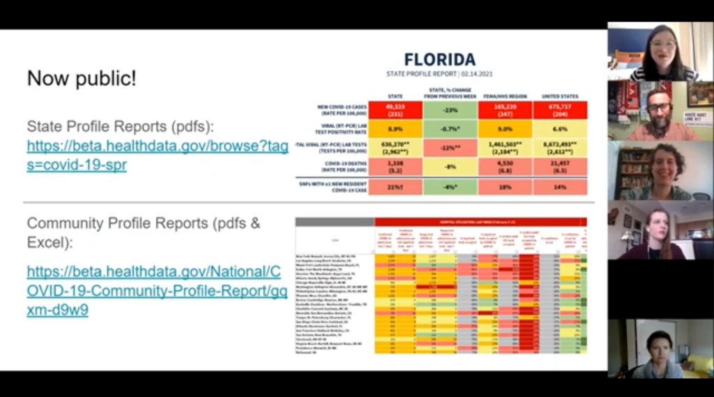
COVID-19 Federal Datasets webinar: This past week, the health data research organization CareSet hosted a webinar walking the audience through the HHS’s Community Profile Reports and other facets of federal COVID-19 data reporting. The session featured Kevin Duvall from HHS and Amy Gleason from the U.S. Digital Services. If you use (or are interested in using) the Community Profile Reports, I highly recommend watching the recording; Duvall and Gleason provided great context on how the HHS stepped up its data collection this year.
Subnational COVID-19 vaccination data: Barcelona-based data scientist Lucas Rodés-Guirao has compiled vaccination data at subnational levels (or, states and regions) for 20 different countries. The dataset includes the U.S. as well nations in Europe and South America; it’s sourced from public data released by national public health agencies.
Anti-Asian Hate Incidents: Stop AAPI Hate, a national coalition documenting anti-Asian hate and discrimination during the COVID-19 pandemic, has released a new report with data on 2020 incidents. According to the report, Stop AAPI Hate has received 2,800 firsthand accounts of anti-Asian hate from 47 states and D.C. since the organization started collecting reports in mid-March.
For months, public health advocates have called on the federal government to release in-depth data reports that are compiled internally by the White House Coronavirus Task Force.
The reports include counts of COVID-19 cases, deaths, and tests, as well as test positivity calculations. In addition to state-level data, the reports feature county-level data and even data for individual metropolitan areas, color-coded according to risk levels for each region. The reports have also drawn on these data to provide specific recommendations for each state. They have been a key piece of the federal government’s support for governors and other state leaders—but they haven’t been shared with the public.
Liz Essley Whyte and her colleagues at the Center for Public Integrity have obtained copies of many of these reports and made them publicly available. But the scattered PDFs—often posted for only a few states at a time—provided only small snapshots from the vast trove of data HHS was using behind the scenes.
This past Friday, the Department of Health and Human Services (HHS) began releasing all national COVID-19 reports and the data behind them. Now officially called “COVID-19 Community Profile Reports,” the reports are expected to be released as PDFs and spreadsheets every day.
I asked Liz Essley Whyte why this release—one that she’s spent months pushing for—is so important. Here’s what she said:
This release has local data that is so important for helping people make daily decisions about what’s safe. It also gives us the same picture of the pandemic that our federal government does, allowing us to weigh its response. It’s data that was assembled with taxpayer dollars and that affects everyone’s lives, so it was past time for it to be made public. I’m very glad it’s out there now. I think if it’s pursuing full transparency the White House should also make public the policy recommendations it gives to states weekly in the governors’ reports, alongside this helpful data.
Here’s my own tour, a.k.a. why I’m excited about this new dataset:
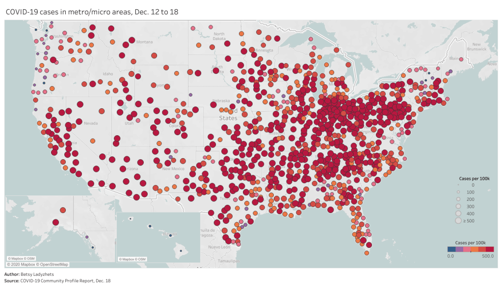
Data on metropolitan areas: Other sources were compiling state- and county-level data prior to Friday, but standardized data on how COVID-19 is impacting America’s cities were basically impossible to find. This new dataset includes information on over 900 metropolitan and micropolitan areas, making it much easier to compare outbreaks in urban centers.
Standardized data: One of the biggest challenges for COVID-19 data users has been a lack of consistency. Some states report every day of the week, some skip weekends. Some states report their tests using one unit, some report using another. Some states include antigen tests in their numbers, some don’t. And so on. But the HHS can smooth out these inconsistencies internally, as national testing laboratories and state public health departments are all required to report in the same way. What I’m saying is, this new report allows us to do something we haven’t been able to reliably do since the start of the pandemic: compare testing numbers across states.
Major metrics in one place: Before Friday, if I wanted case and death numbers by county, I’d go to the New York Times, while if I wanted testing numbers by county, I’d go to the Center for Medicare & Medicaid Services. The scattered nature of pandemic reporting has led researchers and journalists to cobble together stories from multiple disparate sources; now, we can get three major metrics in one easy place. (This data reporter loves to only have one Excel spreadsheet open at a time.)
Contextual data built in: Not only does this new dataset include several important metrics in one place, it also contextualizes those metrics with key demographic information. For each state, county, and metro area in the dataset, numbers such as the share of this region living without insurance and the share of the region over age 65 are included right next to that region’s COVID-19 metrics. Two indices that indicate the region’s demographic vulnerability to the virus are also included: the CDC’s Social Vulnerability Index and the Surgo Foundation’s COVID-19 Community Vulnerability Index. I covered both in my November 29 issue.
Rankings for policymakers: In addition to raw counts of cases, deaths, and tests, the Community Profile Reports include calculated values that make it easy for local leaders to see how their communities compare. The reports rank states according to their cases per 100,000 population, positivity rate (for PCR tests), hospital admissions, and other metrics. They highlight key cities that demand attention and aid, such as Phoenix, Arizona and Nashville, Tennessee. They even forecast death totals based on current case counts—a morbid metric, but a useful one nonetheless.
More transparency: Like the facility-level hospitalization dataset released last week, the Community Profile Reports signify that the HHS is finally stepping up to provide the American public with the information that informs key public health decisions. The absence of national data during this pandemic was never meant to be filled permanently by journalists or volunteer data-gatherers—the federal government is built for this work. Journalists are, instead, built to watch this work closely and hold it accountable.
HHS believes in the power of open data and transparency. By publicly posting the reports that our own response teams use and by having others outside of the federal response use the information, the data will only get better.
As of Saturday night, the dataset has already been downloaded nearly 6,000 times. That’s nearly 6,000 people who can use these data and make them better—and the number will only grow.
COVID Care Map: Dave Luo, another COVID Tracking Project volunteer, also runs this volunteer effort to aggregate and clean public data on health care system capacity. The source has mapped capacity figures at the state, county, and individual facility levels, as well as other healthcare data from sources such as the Institute for Health Metrics and Evaluation (IHME).
Federal allocation of remdesivir: This public dataset from HHS shows how many cases of remdesivir, an antiviral drug which has become an important treatment option for COVID-19 patients, have been distributed to each state since early July. The dataset is cited in an NPR investigation which reports confusion and lack of transparency about how remdesivir distribution is decided.
The White House’s Red Zone Reports: Each week, the White House Coronavirus Task Force sends reports to U.S. governors about the state of the pandemic, including county-level data on cases and tests. The reports are not made public, but the Center for Public Integrity is collecting and releasing many of them. As of August 23, the Center’s document repository includes one report on all 50 states (from July 14) and 13 state-specific reports.