Tag: CDD re-launch

  • Your guide to choosing a COVID-19 data source

    Your guide to choosing a COVID-19 data source

    In preparing for this re-launch, I asked a few of my readers what they liked about the COVID-19 Data Dispatch and how it could better serve them. One common answer was that the publication has helped readers navigate the landscape of COVID-19 data sources, and pick the best source for a given story.

    The first two resources pages I’ve produced take this service to the next level.

    First: The Featured Source List is an upgraded version of the Google spreadsheet I’ve been using to keep track of data sources featured in the newsletter since July. You can use the table to search, sort, and filter all 82 featured sources by their names and categories. The little green plus icons toggle expanded views, with more details on every source. Much friendlier than a spreadsheet!  (Though, if you want to see the raw spreadsheet, it’s still accessible here.)

    Second: The Data Source Finder tool tells you exactly where to find the data you need for a given story.  (Or for a Facebook post, or an argument with your friend, and so forth.)  The tool includes detailed annotations on 16 data sources which I consider the primary COVID-19 sources in the U.S.

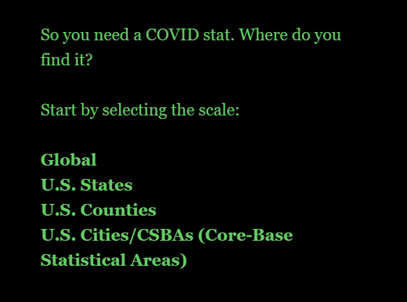
    Here’s how to use it. You start out by selecting the geographic scale on which you’d like to see data (global, U.S. states, counties, or cities), then choose the type of metric you’re looking for. The tool will return your options, including each dataset’s available metrics, methodologies, update schedule, download links, and more.

    It’s essentially an interactive flowchart, aimed to make it easy to compare and contrast sources for reporters on deadline and students engaged in Twitter debates alike. You can also find the full set of annotations linked on the page.

    While I compiled the annotations, the interactive tool was coded in Twine by my girlfriend, Laura Berry.  Your membership fees will help me buy Laura a nice dinner to thank her for her work.

  • Support the COVID-19 Data Dispatch

    Support the COVID-19 Data Dispatch

    For the past five months, I’ve produced this publication for free. It’s been an act of service to my fellow COVID-19 reporters, public health communicators, and readers who simply want to understand the pandemic a bit better.

    The newsletter will continue to be free, as will many of the COVID-19 data resources I publish. But in tandem with this new site, I’m launching a membership program. 

    This program will enable COVID-19 communicators to connect more directly with each other, as well as to provide feedback that will shape what I cover.  It’ll also help me cover my own costs, which have grown significantly as I moved platforms.

    I already talked about my technical reasons for moving from Substack to a full-fledged website. I have another big reason for setting up a site, though: I’m planning to keep the CDD going beyond this pandemic. Its name might change later in 2021 or 2022, but my mission will stay the same—building accessibility and accountability for public health data in the United States.

    This publication won’t end when COVID-19 does. But even that idea, COVID-19 “ending,” feels tenuous to me. Maybe you feel that way, too. Maybe you’ve been reading articles like Ed Yong’s “Where Year Two of the Pandemic Will Take Us” or Maryn McKenna’s “2021 Will Be a Lot Like 2020,” that unpack how far we still need to go before life returns to some semblance of normalcy. Maybe you realize that America’s recovery from the pandemic won’t be so simple as 70% of the population getting vaccinated. Maybe you feel haunted by the structural inequities that COVID-19 revealed in our healthcare system and beyond, and you know you could never write enough stories or donate to enough mutual aid funds to make up the gap.

    Covering COVID-19, I’ve realized, is not just about this virus.  It’s about making sure we’re ready for the next public health crisis.  And we do that not just by growing our scientific capability but by prioritizing the public in public health.  To change the systems in which we live, we need to understand them—and we need to bring our communities along with us.

    If you feel this way, too, join me!  Help me build a network that will be ready to cover this pandemic and the next one.

    And now, the technical details.  Here are the benefits of membership:

    • Community: Join a Slack server where COVID-19 reporters and communicators share resources and advice.
    • Resources: Exclusive cleaned datasets, visualizations, and other tools to assist you in your work.
    • Shape the Dispatch: Your priorities and needs will shape what the CDD covers and which new resources are produced.
    • Accessibility: Keep the CDD free for all its readers! Support accountability for public health data!

    The recommended membership fee is $10/month.

    But I understand that the pandemic is a difficult time for financial commitments. As such, I’m also offering pay-what-you-will pricing, starting at $2/month. There’s no difference in benefits between the two price tiers.

    In the interest of transparency, I’ve published my major costs here. To break even, I would need 120 members to join at the recommended $10/month tier.

    I also want to call attention to the second line on that costs page: Intern’s research and writing time. That’s right—this is going from a one-person publication to a two-person publication!  My friend (and current Barnard junior) Sarah Braner has agreed to join me as an intern for their spring semester.  You’ll learn more about them next week.

    As I am extremely against unpaid internships, my top financial priority right now is paying Braner’s salary. That shakes out to 18 members joining at $10/month.

    If you’re not ready to commit to membership right now, you can still support the publication with a one-time donation on Ko-fi.

  • The COVID-19 Data Dispatch has moved

    The COVID-19 Data Dispatch has moved

    It feels like every journalist started a Substack in 2020. I proudly joined that number when I launched the COVID-19 Data Dispatch in late July.

    But after five months of screenshotting Tableau charts, struggling to keep organized, and hitting Gmail’s email size limit again and again—I realized the platform wasn’t serving my needs. I wanted to give my readers clear archives and easy-to-navigate resources, and Substack just wasn’t providing.

    From now on, I’ll be publishing each issue as a series of posts on the site and sending out a newsletter with the highlights. This will help keep issues concise while still allowing me to do deep dives into important data issues.

    More on the new site below. But first, some housekeeping.

    Housekeeping

    Here’s how to make sure you don’t miss my emails on the new platform.

    If you have any questions or find that you’re missing my emails on Sundays, hit me up at betsy@coviddatadispatch.com.

    Why I moved

    The choice to switch platforms wasn’t an easy one. Substack allowed me to focus on content without worrying about any technical setup, and it provided an easy experience for new readers who wanted to sign up. But after deliberating the move, talking to mentors, and spending a few weeks setting up my new system, I’m feeling good about this decision.

    Here are a few of the reasons why I made this move.

    • Linking out to posts: Probably the most common criticism of the CDD (Substack edition) was that it was simply too long. Emails got cut off in inboxes, and readers would need to scroll past thousands of words of analysis to get to new featured sources or my weekly snarky comment about a data dashboard.  I wanted to make the email reading experience easier without compromising my desire to really dive into data sources.  This new format—short blurbs in the newsletter, linked out to longer posts on the site—helps me do just that.
    • Organized archives: Publishing each newsletter as a series of posts rather than as one long article also helps me keep the site organized—and makes it easier for you to find the information you need. I’ve set up several major categories, such as “Federal data,” “K-12 schools,” and “Hospitalization,” which group similar newsletter segments together. The archives are also organized with tags (which get a little more specific than the categories) and by date.
    • Hosting data resources: In addition to posts from my newsletter issues, the new website includes dedicated resource pages. These pages pull together data source recommendations, annotations, and tips in a format that’s much more accessible than a Google spreadsheet. (Shout-out to the WordPress plugin TablePress, which is my new best friend.) The first couple of pages are up; more will be posted in the coming weeks.
    • Hosting visualizations: One big reason for moving off Substack: on this website, I can actually embed Tableau dashboards. And Datawrapper charts, and Flourish charts, and basically any other type of visualization. This will make it much easier for you to interact with the charts I feature, whether those are charts I produced specifically for the newsletter or figures I’m hosting from other sources.
    • Setting up for search: The new website is searchable both internally and externally. Internally: a “Search” widget on the site’s sidebar and at the bottom of every page allows you to search for topics like “Texas” or “Dr. Fauci.” Externally: I’m using a couple of WordPress tools to make the website more easily recognizable by Google and other search engines. This should help more readers find the publication.