Category: Federal data

  • Answering reader questions: Encouraging policy changes

    Answering reader questions: Encouraging policy changes

    As of February 11, 98% of U.S. counties are seeing high COVID-19 transmission, according to the CDC. Chart from the CDC COVID-19 dashboard.

    In January, I invited readers to fill out a survey asking what you’d like to see from the COVID-19 Data Dispatch in 2022. Thank you to everyone who responded—your feedback gave me some great ideas for topics to focus on and new CDD-related initiatives to pursue this year!

    This week, though, I want to focus on a topic that multiple readers brought up in the survey: how individuals can impact COVID-19 policies. One reader asked, “What can I as an individual do to make better the lacking local, state, federal, and international societal responses to COVID-19?” Another reader asked, along the same lines, “What can I do to encourage policy changes that keep people safer?”

    These questions feel particularly pertinent this week, as leaders of several states loosen up on mask mandates and other COVID-19 safety measures. Governors in New Jersey, Connecticut, Delaware, Oregon, and Massachusetts have all announced that they’re ending mask mandates in public schools, and in some cases, in other public spaces. New York Governor Kathy Hochul is keeping the state’s K-12 school mask mandate in place for now, but ending a mandate for New York businesses.

    Policy changes like these go against long-standing guidance from the CDC. In summer 2021, the agency recommended that communities base their levels of COVID-19 safety measures on two primary metrics: new cases per 100,000 people in the last week, and the percent of PCR tests that returned positive results in the last week. A high case rate indicates a lot of COVID-19 in the community, while a high test positivity rate can indicate the community’s testing infrastructure is not picking up a large share of cases—both suggest that measures should be put in place to control the virus’ spread.

    At the time, this guidance was instituted as a response to the CDC’s preemptive recommendation that vaccinated people could go maskless. The agency said that counties seeing “high” or “substantial” transmission, according to the CDC’s metrics, should mandate masks for all, while counties with lower transmission could allow vaccinated people to go maskless. Gotta be honest: I do not know of a single state or county that’s actually following this guidance. Still, this combination of metrics is, I find, a useful and simple way to evaluate community spread.

    As I’ve pointed out in recent National Numbers updates, even though case numbers in the U.S. have dropped significantly since the Omicron peak in January, they are still at very high levels across the country. You can see on the CDC’s dashboard that, as of this week, about 98% of counties fall into the “high transmission” category—with over 100 new cases per 100,000 people and test positivity over 10%. And beyond the case numbers: many hospitals are currently recovering from record Omicron surges, while over 2,000 Americans are dying of COVID-19 each day.

    According to the CDC’s own guidance, 98% of U.S. counties should have a mask mandate right now. But instead, among the small number of Democrat-led states that have retained mandates, safety measures are now being lifted. The CDC itself is having a hard time commenting on this situation, and is reportedly “considering updating its guidelines on the metrics states should use,” according to POLITICO.

    During this time of “opening” the small number of places that were not already fully open, what can individuals do to make their voices heard—or at least improve COVID-19 safety in their own communities? I have three suggestions:

    1. Call your political representatives and tell them how you feel.

    If your state, city, or other local region is considering lifting some COVID-19 safety measures, you have a representative whose job literally includes listening to your complaints about this issue—whether that’s a state assembly member or city councilor.

    You can use this website to find your national and state representatives, and many localities have their own equivalents (for example, this site for New York City). Once you’ve found the contact information for your representatives, call or email them to express your support for continued COVID-19 precautions. This document offers a couple of potential phone call and email scripts; it’s New York-specific, but can easily be translated to other states.

    In the last couple of years, conservative Americans have often been more politically active at the local level than more left-leaning Americans. Republicans often show up to school board meetings, call their representatives, and make their anger heard—sometimes supported by astroturfing campaigns. Anecdotal reports suggest that public health officials tend to hear more from community members who hate mandates than from those who actually want to see COVID-19 safety in their communities. You can push back against this trend.

    And if you want to do some additional phone-calling or emailing beyond political representatives, consider reaching out to your state or local public health department and offering some support! They can probably use it.

    2. Volunteer for local organizations helping to provide vaccinations, masks, tests, and other resources.

    About 80% of Americans ages five and up have received at least one COVID-19 vaccine dose, according to the CDC. This number may sound impressive, but’s more concerning when we look at the other side of the statistic: 20% of eligible Americans have not yet received at least one COVID-19 vaccine dose. Plus, among those Americans who have been fully vaccinated, more than half haven’t received a booster shot.

    A lot of unvaccinated Americans are conservatives whose minds are very hard to change, this is true. But many of them are low-income workers with intense schedules, lingering health concerns, and other barriers to actually getting the shots that are surmountable, health policy expert Julia Raifman told me for a FiveThirtyEight story last month.

    As a result, volunteer organizations around the country are still working to get their communities vaccinated and boosted. For example, Bed-Stuy Strong, a mutual aid group in my Brooklyn neighborhood, has hosted vaccination drives focused on local seniors and disseminated information on vaccinations and testing in the area.

    Look for an effort like this that you might be able to join in your community! Or, if nothing like this currently exists, reach out to a local organization—like a public school, library, community center, etc.—and see if they might want to host a vaccine drive. Your local public health department could likely provide the supplies.

    3. Educate your friends, family, and community members.

    Beyond political and volunteer efforts, you can increase COVID-19 safety in your community simply by spreading the word about tools like high-quality masks and rapid tests. It might seem obvious, at this point in the pandemic, that we should all be stocking up on KN95s and testing kits, but many people do not have access to these tools—or simply don’t know why they’re useful.

    You can send friends, family, and community members to websites like Project N95, which sells masks and other PPE, and Bona Fide Masks, a family business and leading KN95/N95 distributor. You can also tell them about antigen test distributors like iHealth Labs and Walmart, which are seeing fewer delays and supply crunches as the Omicron surge wanes.

    In addition, if you have the resources, you can buy these masks and rapid tests in bulk and give them out. I recently gave out a couple of KN95 masks to contractors who were sent to look at a water issue in my apartment building, because I had the masks to spare. It’s that easy!

    If you take any of these suggestions and see some impact, please email me (betsy@coviddatadispatch.com) and tell me about it!

    More on federal data

  • The CDC is finally publishing wastewater data—but only ten states are well-represented

    The CDC is finally publishing wastewater data—but only ten states are well-represented

    This week, the CDC added wastewater tracking to its COVID-19 data dashboard. Wastewater has been an important COVID-tracking tool throughout the pandemic, but it gained more public interest in recent months as Omicron’s rapid spread showed the utility of this early warning system. While the CDC’s new wastewater tracker offers a decent picture of national COVID-19 trends, it’s basically useless for local data in the majority of states.

    Wastewater, as you might guess from the name, is water that returns to the public utility system after it’s been used for some everyday purpose: flushing a toilet, bathing, washing dishes, and so forth. In wastewater surveillance, scientists identify a collection point in the sewer system—either beneath a specific building or at a water treatment plant that handles sewage from a number of buildings. The scientists regularly collect wastewater samples from that designated point and test these samples for COVID-19 levels.

    When someone is infected with the coronavirus, they are likely to shed its genetic material in their waste. This genetic signal shows up in wastewater regardless of people’s symptoms, so a wastewater sample may return a positive result for the coronavirus earlier than other screening tools like rapid antigen tests. And, because wastewater samples are typically collected from public sewer networks, this type of surveillance provides information for an entire community—there’s no bias based on who’s able to get a PCR or rapid test.

    Scientists and organizations who utilize wastewater testing consider it an early warning system: trends in wastewater often precede trends in reported COVID-19 cases. For example, the coronavirus RNA levels identified in Boston’s wastewater shot up rapidly before Boston’s actual Omicron case numbers did, then also went down before case numbers did. Similarly, Missouri’s wastewater surveillance system—which includes genetic sequencing for variants—identified Delta cases last summer weeks before PCR testing did.

    Wastewater surveillance is also a popular strategy for colleges and universities, which can set up collecting sites directly underneath student dormitories. Barnard College, where I went to undergrad, is one school that’s employed this strategy. At one point in the fall 2021 semester, the college instructed students living in the Plimpton residence hall (where I lived as a sophomore!) to get individual PCR COVID-19 tests because the wastewater surveillance program had found signals of the virus under their dorm.

    Screenshot of the CDC’s new wastewater dashboard, retrieved on February 6.

    The CDC has been coordinating wastewater surveillance efforts since September 2020, Dr. Amy Kirby, team lead for the National Wastewater Surveillance System, said during a CDC media briefing on Friday. “What started as a grassroots effort by academic researchers and wastewater utilities has quickly become a nationwide surveillance system with more than 34,000 samples collected representing approximately 53 million Americans,” Kirby said.

    It’s a little unclear why it took the CDC so long to set up a dashboard with this wastewater data when surveillance efforts have been underway for a year and a half. Still, many researchers and reporters are glad to see the agency finally publishing this useful information. The dashboard represents wastewater collection sites as colored dots: blue dots indicate that coronavirus RNA levels have dropped at this site in the last two weeks; yellow, orange, and red dots indicate RNA levels have risen; and gray dots indicate no recent data. You can download data from a dropdown beneath the dashboard and on the CDC’s data portal site.

    “More than 400 testing sites around the country have already begun their wastewater surveillance efforts,” Kirby said at the media briefing. But she failed to mention that, out of these sites—the actual total is 471, according to the CDC dashboard—more than 200 are located in just three states: Missouri, Ohio, and Wisconsin. Missouri, with 80 sites, has a long-established system to monitor wastewater, through a collaboration between state agencies and the University of Missouri. Ohio has 71 sites of its own, while Wisconsin has 61.

    After these Midwest wastewater powerhouses, other states with a relatively high number of collection sites include North Carolina with 38, Texas with 35, New York with 32, Utah with 31, Virginia with 29, Colorado with 21, and California with 17. No other state has more than 10 wastewater collection sites, and 18 states do not have any wastewater collection sites at all.

    So, the CDC dashboard is pretty useful if you live in one of these ten states with a high number of collection sites. Otherwise, you just have to… wait for more sites in your area to get added to the dashboard, I guess? (Kirby did say during the media briefing that several hundred more collection sites are in development.) Even within the states that are doing a lot of wastewater surveillance, though, reporting is uneven at more local levels; for instance, many New York sites are concentrated in New York City and surrounding suburbs.

    In this way, biased wastewater surveillance coverage in the U.S. echoes biased genetic sequencing coverage, an issue I’ve written about many times before. (See the genetic surveillance section of this post, for example.) Some states, like California, New York, and others with high-tech laboratories set up for sequencing, have identified variants for a much higher share of their COVID-19 cases than states with fewer resources.

    The CDC gives wastewater treatment plants, local health departments, and research laboratories the ability to join its national surveillance network. But again, this is much easier for institutions in some places than others. Consider the resources available for wastewater sampling in New York City compared to in rural parts of the Midwest and South.

    In addition, for places that do have robust wastewater surveillance systems, there are some caveats to the data, the CDC expert told reporters. Data may be hard to interpret “in communities with minimal or no sewer infrastructure and in communities with transient populations, such as areas with high tourism,” she said. “Additionally, wastewater surveillance cannot be used to determine whether a community is free from infections.”

    If you’re looking for more wastewater data beyond the CDC tracker, here are two sources to check out:

    • Biobot’s Nationwide Wastewater Monitoring Network, which I included in last week’s Featured Sources: This wastewater epidemiology company collects samples from water treatment facilities across the country; their dashboard includes both estimates of coronavirus levels in the U.S. overall and estimates for specific counties in which data are collected. Biobot’s data are available for download on Github. (Interestingly, it seems that some of the counties included in Biobot’s dashboard are not currently included in the CDC’s dashboard; I’ll be curious to see if that changes in the coming weeks.)
    • COVIDPoops19 dashboard: This dashboard, run by researchers at the University of California Merced, provides a global summary of wastewater surveillance efforts. It includes over 3,300 wastewater collection sites tied to universities, public health agencies, and other institutions; click on individual sites to see links to dashboards, align with related news articles and scientific papers.

    More federal data

  • Three more things, January 30

    A couple of additional news items for this week:

    • Two House Democrats called on the CDC to release more Long COVID data. This week, Rep. Ayanna Pressley (from Massachusetts) and Rep. Don Beyer (from Virginia) sent the CDC a letter insisting that the agency report estimates of Long COVID infection numbers, including demographic breakdowns by race, gender, and age. “Collecting and publishing robust, disaggregated demographic data will help us better understand this illness and ensure that we are targeting lifesaving resources to those who need them most,” said Rep. Pressley in a statement to the Washington Post. While studies that may, theoretically, help provide such data are in the works via the National Institutes of Health’s RECOVER consortium, the consortium has yet to release any results. Long COVID continues to represent one of the biggest COVID-19 data gaps in the U.S.
    • We don’t know yet whether cannabis can treat COVID-19, despite promising early studies. Recent studies have shown that CBD, along with other products containing marijuana and hemp, has some capacity to block coronavirus spread in the body in lab-grown cells and in mice. The studies were quickly turned into sensationalist headlines, even though it’s too early to say whether these products could actually be used to treat COVID-19. An excellent STAT News article by Nicholas Florko and Andrew Joseph describes the studies and their limitations, as well as how these early reports of COVID-19 treatment potential are “adding to the FDA’s existing CBD headache” when it comes to regulating these products.
    • Have you received your free at-home rapid tests from the USPS yet? Last week, I described the federal government’s effort to distribute at-home rapid tests to Americans free of charge, along with the equity issues that have come with this initiative so far. This week, I saw some reports on social media indicating that people have started receiving their tests! Have you gotten your tests yet? If you have, I would love to hear from you—in absence of formal data from the USPS, maybe we can do some informal data collection on test shipping times within the COVID-19 Data Dispatch community.

    Note: this title and format are inspired by Rob Meyer’s Weekly Planet newsletter.

  • CovidTests.gov early rollout raises equity concerns; where’s the data?

    CovidTests.gov early rollout raises equity concerns; where’s the data?

    The federal government’s policies aimed at helping Americans get free rapid tests are insufficient for many households including people of color. Graphic via KHN.

    This week, the U.S. government unveiled a new website where Americans can get free at-home COVID-19 tests. The site is hosted by the U.S. Postal Service (USPS)—which will also distribute the tests—and it’s been lauded for its straightforward navigation and ability to handle a high level of traffic, both of which are unusual with government sites.

    On Tuesday, the site went live early in “beta test” form before its formal launch on Wednesday. Within hours of it going live, public health experts were already raising equity concerns about the free test distribution program. To address these concerns, the federal government should release data on where the free tests go—including breakdowns by state, county, ZIP code, race and ethnicity, the tests’ delivery dates, and more.

    As the link to the testing order site was shared widely on social media, one thing quickly became clear: people who lived in high-density settings were at a disadvantage. Americans in traditional apartment buildings, houses split into multiple living spaces, dormitories, and other multi-unit dwellings attempted to order tests—only to get an error message stating someone at their address had ordered tests already.

    The USPS ordering page is set up to allow just one test order per address, to prevent people from abusing the free test program. But, despite having literally every address in the U.S. on file, the USPS apparently failed to account for many apartment buildings. Some apartment-dwellers were able to get around this issue by placing their apartment number on the first address line, removing “Apt” from the address, or otherwise adjusting how they filled out the form, but these tricks didn’t work for everyone.

    I myself ordered the free tests before I learned about these issues on Twitter; I later sheepishly texted the groupchat for my Brooklyn, seven-unit apartment building, preemptively apologizing in case I’d fucked up my neighbors’ chances of obtaining free tests. (Luckily, my building seemed to be unaffected by the USPS issue—one of my neighbors responded saying that she was able to order the tests without a problem.)

    This issue “stems from buildings not being registered as multi-unit complexes and affected only a ‘small percentage of orders,’” the USPS said in a statement to POLITICO. And people facing this issue as they order tests can file a service request with USPS or call the agency at 1-800-ASK-USPS, according to KHN.

    Still, a “small percentage of orders” could add up to millions of people living in multi-unit housing who were unable to obtain free tests, or would have to share just four tests among an apartment building’s worth of residents. Without more precise data, it’s hard to understand the scope of this problem.

    All the Twitter discourse about apartment buildings obscures another group that shouldn’t have to share a small number of tests among many people: large households. The USPS is sending just four tests in each order—not four testing kits, four individual tests. That’s not enough for a family of four to test themselves according to FDA recommendations (i.e. twice within two days) after a potential exposure; it’s certainly not enough for large families including five or more people.

    And minority communities are more likely to include such large households. According to a Kaiser Family Foundation analysis of Census data: “More than a third of Hispanic Americans plus about a quarter of Asian and Black Americans live in households with at least five residents…Only 17% of white Americans live in these larger groups.”

    Households in West coast states are also more likely to include five or more residents, according to a similar analysis from the University of North Carolina Chapel Hill’s Carolina Demography center. States with the highest shares of five or more resident households are: Utah (18.8%), California (13.7%), Hawaii (13.5%), Idaho (13.2%), and Alaska (12.9%). On the other hand, in some East coast states, under 7% of households include five or more residents.

    !function(){“use strict”;window.addEventListener(“message”,(function(e){if(void 0!==e.data[“datawrapper-height”]){var t=document.querySelectorAll(“iframe”);for(var a in e.data[“datawrapper-height”])for(var r=0;r<t.length;r++){if(t[r].contentWindow===e.source)t[r].style.height=e.data["datawrapper-height"][a]+"px"}}}))}();

    The USPS test distribution system also gave an advantage to Americans with internet access. At one point on Tuesday afternoon, the USPS order site was drawing more than half of all government website traffic, demonstrating its popularity with internet users—while people without internet were not yet able to order tests.

    As of Friday, those without internet access can order the free tests over the phone, at 1-800-232-0233. This phone line is open daily from 8 AM to midnight Eastern Time, according to NPR, and Americans can order in over 150 languages. The USPS website itself is available in English, Spanish, and Chinese.

    While this phone line is very helpful now, the delay between the website’s release (on Tuesday) and the phone line’s release (on Friday) means that Americans without internet may be behind in the queue for actually receiving their tests. Already, the federal government has said that people who ordered their tests may need to wait for weeks to receive their tests.

    Of course, as analysis from KHN has shown, Americans of color are less likely to have internet access than their white neighbors. 27% of Native Americans, 20% of Black Americans, and 16% of Hispanic Americans have no internet subscription, compared to 12% of white Americans.

    Finally, the USPS test distribution system leaves out one major group of vulnerable Americans: those who don’t have an address at all. Homeless people are particularly vulnerable to COVID-19: many outbreaks have occurred in shelters, and many of these people have health conditions that increase their risk of severe symptoms. The impact of COVID-19 among homeless Americans is not well understood due to a lack of data collection; still, we know enough to indicate free tests should be a priority for this group.

    The White House has said that equity will be a priority for the free rapid test rollout: each day, 20% of test shipments will go to people who live in highly vulnerable communities, as determined by the CDC’s Social Vulnerability Index. This index ranks ZIP codes according to the communities’ ability to recover from adverse health events, based on a number of social, environmental, and economic factors.

    This priority is nice to hear. But without data on the test rollout, it’ll be difficult to evaluate how well the federal government is living up to its promise of equitable test distribution. I’d like to see data on the free test distribution that goes to the same level of detail as the data on our vaccine distribution, if not even more granular.

    The data could include: tests distributed by state, county, and ZIP code; tests distributed to ZIP codes that rank highly on the Social Vulnerability Index; tests distributed by race, ethnicity, age, gender, and household size; dates that tests were ordered and delivered; tests delivered to single- and multi-unit buildings; and more.

    Unlike other COVID-19 metrics that are difficult to collect and report at the federal level, the federal government literally has all of this information already—they’re collecting the address of every person that orders tests! There is no excuse for the government not to make these data public.

    In short: USPS, where is your free rapid test distribution dashboard? I’m waiting.

  • COVID source callout: COVID-19 deaths in U.S. hospitals

    Readers active on COVID-19 Data Twitter may have seen this alarmist Tweet going around earlier this weekend. In this post, a writer (notably, one with no science, health, or data background) posted a screenshot showing that the Department of Health and Human Services (HHS) is no longer requiring hospitals to include COVID-19 deaths that occur at their facilities in their daily reports to the agency.

    This is not the end of U.S. COVID-19 death reporting, as the Tweet’s author insinuated. Primarily because: hospitals are not the primary source of COVID-19 death numbers. These statistics come from death certificates, which are processed by local health departments, coroners, and medical examiners; death certificate statistics are sent to state health departments, which in turn send the numbers to the CDC. The CDC is still reporting COVID-19 deaths with no disruptions, and, in fact, released a highly detailed new dataset on these deaths last month.

    For more explanation, see this thread by Erin Kissane (COVID Tracking Project co-founder) and this one from epidemiologist Justin Feldman. It’s particularly important to note here that, as Feldman points out, plenty of COVID-19 deaths don’t occur in hospitals! About one-third of COVID-19 deaths occurred outside these facilities in 2020.

    (Note: The Documenting COVID-19 project has written, in great detail, about how COVID-19 deaths are reported in our Uncounted series. See: this article at USA Today and this reporting recipe.)

    It is certainly worth asking why the HHS took in-hospital COVID-19 deaths off the list of required metrics for hospitals. This data field had some utility for researchers looking to identify COVID-19 mortality rates within these facilities—though, from what I could tell, nobody was looking at it very much before this weekend.

    But, again, this is not the end of COVID-19 death reporting! This is the HHS making one small change to a massive hospitalization dataset—which was primarily used for looking at other metrics—while the CDC’s death reporting continues as usual.

  • Six more things, January 9

    Six more things, January 9

    If you test positive for COVID-19, here’s what the CDC says you should do. Graphic via the Maine health agency.

    Here are six other COVID-19 news items from the past week that didn’t quite warrant full posts:

    • The CDC made its COVID-19 isolation guidance even more confusing, somehow. On Tuesday, the CDC updated its isolation guidance again—and the new guidance is, kind-of a “dumpster fire,” as the headline on this article by The Atlantic’s Katherine J. Wu aptly puts it. The agency still isn’t requiring rapid tests to get out of isolation early, but it says you can test if you have one available. Also, wear a mask if you leave isolation after five days and avoid travel, restaurants, and other high-exposure activities. Wu’s article provides a good summary of the guidance (and criticism of that guidance), as does this Your Local Epidemiologist post from Dr. Katelyn Jetelina.
    • New reporting recipe explains how to explore “uncounted” COVID-19 deaths with CDC data. Last week, I shared a new investigative story from my team at the Documenting COVID-19 project that dives into unreported COVID-19 deaths in the U.S. Up to 200,000 deaths may have gone unrecorded thanks to a lack of training, standardization, tests, and other issues with death reporting. This week, the team published a reporting recipe aimed to help other journalists do similar stories in their states, cities, and regions. If you have questions about the project or recipe, you can reach out to us at info@documentingcovid19.io.
    • B.1.640.2, or the “IHU variant” from France, is not currently cause for concern. In the past few days, you might have seen headlines about a new variant called B.1.640.2 that was identified in France last November. The variant has a number of mutations, including some mutations that have also been identified in other highly-contagious variants, according to a recent preprint from French researchers. But it’s not currently a concern, say experts at the World Health Organization and elsewhere. This variant actually predates Omicron, and only 20 cases had been reported between early November and early January (compared to well over 100,000 Omicron cases in the same timespan). Omicron is the main variant we should be worrying about right now.
    • “Flurona” means getting the flu and COVID-19 at the same time; it’s not a new mutant disease. Another buzzword you might’ve seen in headlines this week: “flurona,” a portmanteau of coronavirus and flu. Los Angeles and other places have recently reported cases in which a patient tests positive for both the flu and COVID-19 at the same time. While having two respiratory diseases at once is certainly unpleasant—and might lead to increased risk of severe symptoms—it’s not necessarily worth freaking out over. Roxanne Khamsi covered these potential coinfections in The Atlantic back in November 2021, writing: “Recent screening studies have found that 14 to 70 percent of those hospitalized with flu-like illness test positive for more than one viral pathogen.”
    • Senators call for HHS to answer key questions about COVID-19 testing. This week, Senators Roy Blunt (Missouri) and Richard Burr (North Carolina) wrote to Health and Human Services (HHS) Secretary Xavier Becerra requesting information on COVID-19 test spending. The Senators note that over $82.6 billion has been “specifically appropriated for testing,” yet the U.S. continues to experience dire shortages and delays for both PCR and rapid tests. The letter includes questions about Biden’s initiative to distribute 500 million rapid tests for free; little information has been shared about the initiative so far.
    • New meta-analysis estimates one in three COVID-19 patients have persistent symptoms for 12 weeks or more. In a meta-analysis, scientists compile results from a number of studies on the same topic in order to provide overall estimates for an important metric, like the risk of developing a particular condition. A new analysis from researchers at a Toronto hospital network and other co-authors examined the risk of Long COVID symptoms following a COVID-19 diagnosis, combining results from 81 studies. Their main findings: about 32% of patients had fatigue 12 weeks after their diagnosis, while 22% had cognitive impairment at 12 weeks; and the majority of those patients still had these symptoms at six months. (H/t Hannah Davis.)

    Note: this title and format are inspired by Rob Meyer’s Weekly Planet newsletter.

  • New CDC mortality data: “Real-time public health surveillance at a highly granular level”

    New CDC mortality data: “Real-time public health surveillance at a highly granular level”

    The CDC’s new data release allows researchers to search through mortality data from 2020 and 2021 in great detail. Screenshot of the CDC’s search tool retrieved December 12.

    This past Monday, the CDC put out a major data release: mortality data for 2020 and 2021, encompassing the pandemic’s impact on deaths from all causes in the U.S.

    The new data allow researchers and reporters to investigate excess deaths, a measure of the pandemic’s true toll—comparing the number of deaths that occurred in a particular region, during a particular year, to deaths that would’ve been expected had COVID-19 not occurred. At the same time, the new data allow for investigations into COVID-19 disparities and increased deaths of non-COVID causes during the pandemic.

    To give you a sense of the scale here: As of Saturday, the U.S. has reported almost 800,000 COVID-19 deaths. But experts say the true COVID-19 death toll may be 20% higher, meaning that one million Americans have died from the virus. And that’s not counting deaths tied to isolation, drug overdoses, missed healthcare, and other pandemic-related causes.

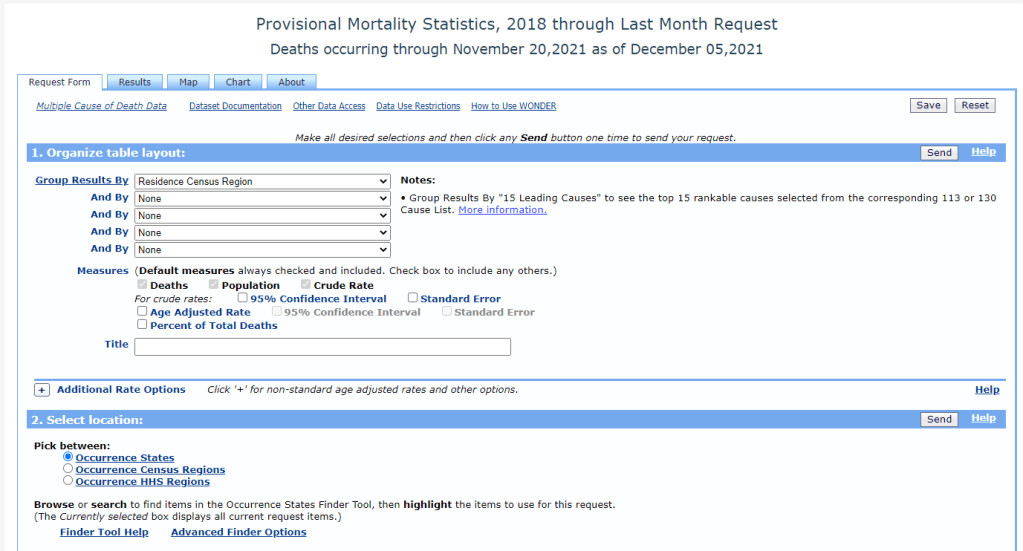
    The CDC’s new data release is unique because, in a typical year, the CDC reports mortality data with a huge lag. Deaths from 2019 were reported in early 2021, for example. But now, the CDC has adapted its reporting system to provide the same level of detail that we’d typically get with that huge lag—now with a lag of just a few weeks. The CDC has also improved its WONDER query system, allowing researchers to search the data with more detail than before.

    “I would describe this new release as more real-time surveillance at more specific detail than any journalists, or epidemiologists, or any other kind of researcher even knows what to do with,” said Dillon Bergin, an investigative reporter and my colleague at the Documenting COVID-19 project, at the Brown Institute for Media Innovation and MuckRock.

    Along with Dillon and other Documenting COVID-19 reporters, I worked on a story explaining why these CDC data are such a big deal—along with what we’re seeing in the numbers so far. The story was published this week at USA Today and at MuckRock. Our team also compiled a data repository with state-level information from the new CDC release, combined with death data from 2019 and excess deaths.

    If you’re a reporter who’d like to learn more about the new CDC data, you can sign up for a webinar with the Documenting COVID-19 team—taking place next Wednesday, December 15, at 12 PM Eastern time. It’s free and will go for about an hour, with lots of time for questions. Sign up here!

    Editor’s note, December 27: This webinar was recorded; you can watch the recording here.

    Also, as our initial story is part of a larger investigation (in collaboration with USA Today), the team has put together a callout form for people to share their stories around COVID-19 deaths in their communities. If you have a story to share, you can fill out the form here.

    To provide some more information on why this new CDC release is so exciting—and what you can do with the data—I asked Dillon a few questions about it. As the lead reporter on our team’s excess deaths investigation, he’s spent more time with these data than anyone else. This interview has been lightly edited and condensed for clarity.


    Betsy Ladyzhets: How would you summarize this new release? What is it?

    Dillon Bergin: I would describe this new release as more real-time surveillance at more specific detail than any journalists, or epidemiologists, or any other kind of researcher even knows what to do with. It’s unfathomably detailed, and the fact that we’re going to be able to see updates in almost real time is really critical at this stage of the pandemic, or at any stage in a public health crisis. I think it’s a huge, huge step forward.

    BL: Specifically in the realm of COVID deaths, but also, all deaths during the pandemic.

    DB: Exactly, yes. In the realm of COVID deaths, we do know that there is a large gap between the total amount of excess deaths and the excess deaths that COVID accounts for. So it’s interesting from that angle, understanding what COVID might have been misclassified. But the data can also be used for a broad range of other types of deaths that have happened during the pandemic or possibly increased during the pandemic.

    BL: So why are researchers excited about this data release?

    DB: Previously, for something to go up on the WONDER website, or to become WONDER data, has to be finalized in the year after. So, data from 2020 would just be finalized now. Typically, we might not see that data until, probably, early in the new year [2022].

    But with the new tool, we’re getting that 2020 and 2021 WONDER data now. And the CDC does a great job of providing a lot of granular details about causes of death, and racial demographics… Those are things that general CDC [mortality] data gives you, but the WONDER data is even more detailed. So, the fact that researchers don’t have to wait anymore for that data to be finalized, that the CDC is providing provisional data at such a detailed level—that’s what researchers are excited about.

    BL: It’s the provisional data that’s being released, like, a year earlier than you would normally expect it to be published, right?

    DB: Yeah, a year earlier than you would expect it to be published. Which means it’s almost real-time, because it has, I think, a three- or four- week lag. This data is real-time public health surveillance at a highly granular level—which is what people have been asking for. It’s what epidemiologists have been asking for, researchers, advocates of all kinds, journalists, lots of people have been saying, “We need this type of surveillance.”

    BL: When you say a three- or four-week lag—the CDC is going to update it every couple of weeks, right?

    DB: Yes, that’s correct.

    BL: Do you have a sense of what the update schedule is going to be, or is the CDC not sure yet?

    DB: I’m not sure. I know it was a big haul for them to just get this out, I’m not sure what the next update will be…

    BL: Yeah, well, I’m sure we [Documenting COVID-19] will keep an eye on it. And we’ll tell everybody when it updates. (Editor’s note: As of December 12, it has already been updated! Data now go through November 20, 2021.) So, what are some of the things that you’ve seen in the data from the preliminary analysis that you’ve done so far?

    DB: One of the specific things that I’ve seen, that’s been really important for the work that I’m doing right now, is increases of different types of deaths at home. When people die, they don’t always die in a hospital—they could die in an outpatient clinic, or in an ER, or they could come to the hospital dead on arrival, they could die in hospice, or a nursing home, or at home.

    And one of the awesome things about the CDC data is that you can see, actually, where people have died, and what specific causes of death that those people had when they died. Or, to be precise, you can’t see specific people—but you can see, say, 50 people died of heart attacks in a specific county at home. You would be able to see [in the data] that those people not only died of a heart attack, but they died at home. 

    The takeaway for me has been that respiratory and cardiovascular deaths have increased at home in specific states and counties. Louisiana is one example: it looks like Louisiana has the highest increase of deaths at home from [the CDC designation] “other forms of heart disease,” of any state, at like a 60% increase from previous years. So then we have to ask ourselves, what could lead to that increase? Are people really dying more of heart disease at home, by that much higher of a rate? Or is something else going on here?

    BL: If you were talking to local reporters about this, what would they recommend that they do with the data?

    DB: I would recommend that they take a look at the most recent data, the data from 2020 and 2021, for their area. And also pull some previous years, probably five years [of data], and start looking at causes of death, ages of the people who died, racial and demographic makeup, and place of death. I think different combinations of those data will start to provide some interesting avenues that can lead you to do actual human reporting—asking, what was happening? And why was that happening at this scale?

    The new WONDER data, you can kind-of stretch it and bend it in so many different ways, it can be a little bit intimidating at first. So maybe, it would also be useful to start with a more specific question. If you’re wondering about, let’s say, certain types of deaths in a very specific county. Say you’re wondering if that’s from unintentional drug overdoses, or deaths from respiratory diseases in your county. Then you can start looking at the more granular level of details within those types of deaths—whether it’s racial and demographic makeup, or whether or not the body was autopsied. You can even see the day of the week [that people died]. There’s a lot of different places you can zoom in.

    My overall advice would be: Start with a general question and then explore, then reform that question and explore, then reform that question. The data is both so extensive and so granular that you can get lost in it very quickly.

    BL: You mentioned that it’s very intimidating, which I would second. The first time I looked at the WONDER data, I was like, “What is going on here?” So, what would be your recommendations for working with that data tool? Or any major caveats that you think people should know before they dive into this?

    DB: That’s a great question, because with WONDER, you have to use their querying tool through their website. You can’t really easily and quickly export things or work with an API, though you can export data once you do a query.

    My first caveat would be, keep in mind the suppression of any values under 10. So, that means you can zoom in on certain things, but then you may also have to zoom out. For example, if you wanted to know the leading causes of death for someone, when a body is dead on arrival—if you do that search at a state level, you’ll probably be able to see the first five or so causes before you reach causes that have only happened between one and 10 times, and then that value is oppressed and you can’t see the information. But if you were to do the same search on a national level, you would have a lot more causes for those types of deaths.

    So, I would keep in mind the suppression, when zooming in and out. And also keep in mind, if, say, you’re looking at “dead on arrival” deaths for every county in a specific state, so many causes of death for those [county-level searches] will be suppressed, that your totals from the counties would not match the actual totals [at the state level]. Because you may not be aware that the CDC is not showing you the values that were suppressed if you didn’t click a specific button—or if you’re quickly adding things.

    BL: Another thing that [our team ran into] is occurrence versus residence—that’s something people need to know about. “Residence” means sorting by where people lived, “occurrence” means sorting by where they died. Those don’t always match up.

    DB: Yes, I would say residence versus occurrence is very important to keep in mind, especially because, when you’re redoing a search and scrolling very fast, you can accidentally fill out a state for occurrence instead of residence. Which actually did happen to me, and then I was confused by my own numbers. Then I noticed that there were a bunch of states coming up that I hadn’t meant to search for, because I, like, filtered by residence and then searched by occurrence.

    So yeah, keeping in mind the difference between residence and occurrence is definitely important. Though if you go back in the historical data [before 2018], it’s just residence—just a single state for each death.

    Also, just clear some extra time to get used to working with the WONDER interface. Because, unlike the CDC data updates that are just on the data.cdc.gov website, that you can just quickly download and open up in your technical took of choice—for WONDER, you do have to use the WONDER query site, and it can be difficult to get used to searching and importing. 

    BL: I will say one more thing, while we’re on this topic, that I’ve been doing and that might be helpful for other people: make sure that, if you export data from WONDER, that you always save that notes section it gives you at the bottom [of the exported file]. Because that will tell you exactly what you searched for. So, if you want to replicate something later, you can just go back and look at the notes. I feel like my instinct, often, when I’m looking at a dataset, is to delete all the notes and anything I don’t need—so I have to remind myself, like, “No, you should keep this.”

    DB: That’s actually a really good tip, because I do that… I import the data [to my computer] and then I delete all the notes. That’s a great point.

    BL: Also, what recommendations do you have if people are looking for, like, experts to interview about these data? Say a local reporter wants to search for experts in their area, what should they do?

    DB: I can speak about that, because that’s been really useful for me in my reporting. Once you have this data, or once you’ve researched excess deaths in your area, you should talk with an epidemiologist or a social epidemiologist—someone who would know your state, or maybe even your more local area—about the broader mortality trends in your community. That will really give you a deep understanding of, what were the reasons that people were dying before the pandemic? And what has this expert thought about during the pandemic? And what have they heard, or read, or researched about why deaths are increasing? For example, I talked to two epidemiologists in Mississippi while working on our investigation, and they really helped me understand what I was looking at and looking for.

    BL: Awesome. And then, my last, kind-of big picture question is, why does this matter for people who aren’t epidemiologists or COVID reporters?

    DB: That is also a good question. I think the thing that I have been thinking about over and over again—and it’s something that an epidemiologist told me—which is that, if we understand how people die, then we might know what’s making them sick. And if we know what’s making them sick, then we have a shot at stopping that from happening.

    This data is a very important step in that process, which is learning, in real-time, why people are dying. If we know that, we know what’s making them sick, whether it’s unintentional drug overdoses, or an increase of deaths because of lung cancer or heart disease. Any of those things are important to know, especially in a public health crisis like the one we’re in right now.

    BL: I know we’ve talked before about this sort-of cycle of, what happens when COVID deaths are maybe undercounted in a certain community, and then that contributes to people maybe being less aware of COVID in their community. And then [that lack of awareness] contributes back to the same process.

    DB: Yeah, exactly. I think that’s an important thing as well. Throughout this process—reporting on this topic, and working with this data, and thinking more about death certificates and the information on them—I’ve been increasingly… Not evangelized, exactly, but I’ve seen the light on the importance of that final piece of information of people’s lives. And what it means not only to their families and to the local area and communities, but also what it means when we start pulling that data up to larger and larger groups, and trying to understand: what does this person’s death mean at the level of the county, or the state, or in their racial demographic, or in their age demographic, or by gender?

    All of this is critically important. And it sounds kind-of corny, but in a way, [the death certificate] is like, one really last piece of information that you leave behind for humans after you.
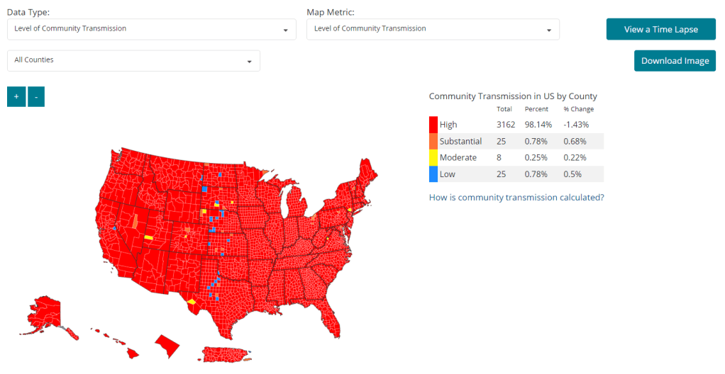
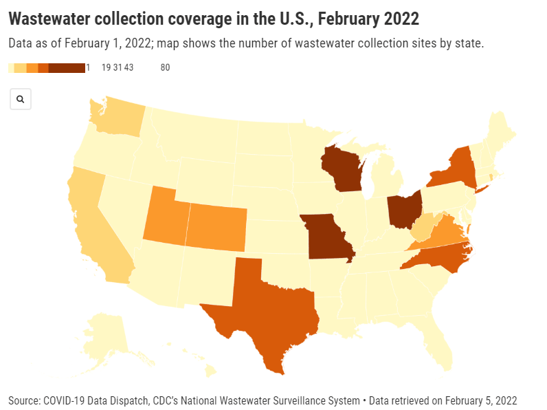
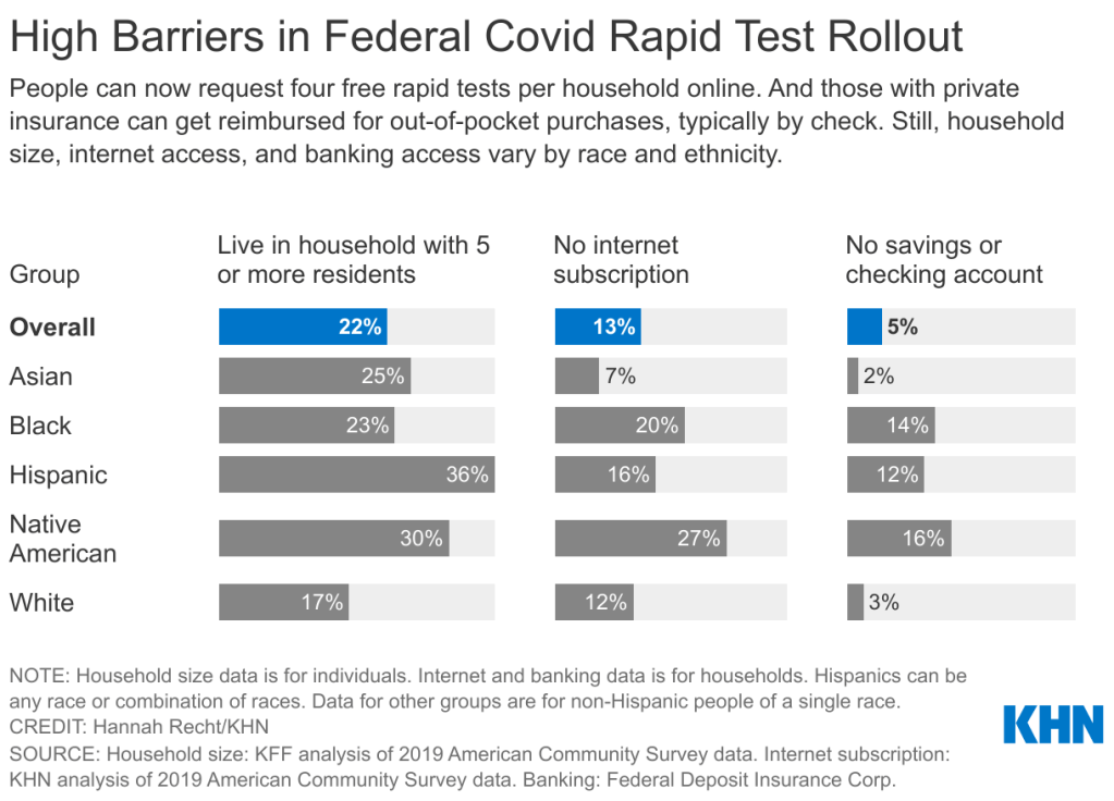
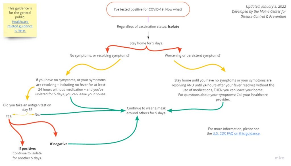

    More national data

  • Vaccines aren’t enough: What Biden can do about Omicron

    Vaccines aren’t enough: What Biden can do about Omicron

    This past Monday, President Biden gave a speech about the Omicron variant. He told America that Omicron is “cause for concern, not a cause for panic,” and thanked the South African scientists who alerted the world to this variant. (Though a travel ban is not a great way to thank those scientists!)

    Towards the end of the speech, he said: “We’re throwing everything we can at this virus, tracking it from every angle.” Which I, personally, found laughable. As I’ve pointed out in a previous post about booster shots, the U.S.’s anti-COVID strategy basically revolves around vaccines, and has for most of 2021.

    My Tweet about Biden’s vaccine-only strategy got more attention than I’m used to receiving on the platform, so I thought it was a worthwhile topic to expand upon in the COVID-19 Data Dispatch. Why aren’t vaccines enough to address Omicron—or our current surge, for that matter—and what else could the Biden administration be doing to slow the coronavirus’ spread?

    Why aren’t vaccines enough?

    Prior to Delta’s spread, there was some talk of reaching herd immunity: perhaps if 70% or 80% of Americans got fully vaccinated, it would be sufficient to tamp down on the coronavirus. But Delta’s increased capacity to spread quickly, combined with the vaccines’ decreased capacity to protect against infection and transmission, have shown that vaccines are not enough to eradicate the virus.

    In thinking about this question, I returned to an article that Ed Yong wrote for The Atlantic back in August:

    Here, then, is the current pandemic dilemma: Vaccines remain the best way for individuals to protect themselves, but societies cannot treat vaccines as their only defense. And for now, unvaccinated pockets are still large enough to sustain Delta surges, which can overwhelm hospitals, shut down schools, and create more chances for even worse variants to emerge. To prevent those outcomes, “we need to take advantage of every single tool we have at our disposal,” [Shweta Bansal of Georgetown University] said. These should include better ventilation to reduce the spread of the virus, rapid tests to catch early infections, and forms of social support such as paid sick leave, eviction moratoriums, and free isolation sites that allow infected people to stay away from others.

    Remember that Swiss cheese model of pandemic interventions? Vaccines may be the best protection we have against the coronavirus, but they’re still just one layer of protection. All the other layers—masks, testing, ventilation, etc.—are still necessary, too. Especially when we’re dealing with a new variant that might not respond as well to our vaccines.

    What we could do: better masks

    One strategy that we could employ against Omicron, as well as against the current Delta surge, is better masks. While cloth masks certainly make it less likely for the coronavirus to spread from one person to another, their efficacy varies greatly depending on the type of material, the number of layers, and the mask’s fit.

    N95 masks do the best job at stopping the coronavirus from spreading, followed by KN95 masks. Surgical masks do a better job than cloth masks, but making sure these masks fit properly can be a challenge for some people (including yours truly, who has a very narrow face!). Layering a surgical mask and cloth mask may be a safer option to get both good fit and protection, though two layers of mask can be challenging to wear for long periods of time.

    Some experts have recommended that the U.S. mail N95 or KN95 masks to all Americans, or at least require these masks in high-risk areas, such as on flights. Germany and other European countries established similar requirements last summer.

    What we could do: more widely available testing

    In many countries—including the U.K., Germany, India, and others—rapid tests are freely available. Here in the U.S., on the other hand, the tests are quite expensive (often upwards of $10 for one test) and difficult to find, with pharmacies often limiting the number of packages that people can buy at once.

    Biden has attempted to increase rapid testing access as part of his latest COVID-19 plan: in January, private insurance companies will be required to cover the cost of rapid tests. But this doesn’t solve the supply issue, and it doesn’t really make the tests more accessible, either. The measure would still require people to buy tests out of pocket, then fill out insurance reimbursement forms to maybe get their money back. Can you imagine anyone actually doing this?

    In addition, as some experts have pointed out, the people most likely to need rapid tests—essential workers and others in high-risk environments—are also those less likely to have insurance. Biden is also distributing some rapid tests to community health centers, but that’s not enough to meet the need here.

    Ideally, the Biden administration would mail every American a pack of, like, 20 rapid tests, along with that pack of N95 or KN95 masks I mentioned above. Free of charge.

    And at the same time, of course, we need more readily available PCR testing. Even in New York City, which has a better testing infrastructure than most other parts of the country, the lines at free testing sites are getting long again as cases go up. Any American who wants to get tested should be able to easily make an appointment within a day or two, and get their results within another day after that.

    Increased testing is not only important for identifying Omicron cases (and cases of any other new variant); it’s also key for the Merck and Pfizer antiviral treatments due to be approved in the U.S. soon. Without efficient testing, patients won’t be able to start these treatments within days of their symptoms starting.

    What we could do: improve genetic surveillance

    The U.S. is doing a lot more coronavirus sequencing than we were in early 2021: we’ve gone from under 5,000 cases sequenced a week to over 80,000. The CDC worked with state and local health agencies, as well as research organizations and private companies, to increase sequencing capacity across the country.

    But that capacity is still concentrated in specific states and cities, as I noted in the previous post. In a recent STAT News story on sequencing, Megan Molteni writes: 

    Urban centers close to large academic centers tend to be well covered, while rural areas are less so. That means public health departments in large parts of the country are still flying blind, even as they are figuring out ways to prioritize Omicron-suspicious samples.

    A lack of testing compounds this problem. If someone doesn’t confirm their COVID-19 case with a PCR test, their genetic information will never make it to a testing lab, much less a sequencing lab. While rapid tests are very useful for quickly finding out if you’re infected with the coronavirus, you need a PCR test for your information to actually be entered into the public health system.

    In addition, even where the U.S. is sequencing a lot of samples, the process can take weeks. Vox’s Umair Irfan writes:

    Still, it takes the US a median time of 28 days to sequence these genomes and upload the results to international databases. Contrast that with the United Kingdom, which sequences 112 genomes per 1,000 cases, taking a median of 10 days to deposit their results. A delay of only a few days in detection can give variants time to silently spread within communities and across borders.

    Despite sequencing shortfalls in the U.S., we’re still doing much more surveillance than the majority of countries. Many nations in Africa, Asia, South America, and other parts of the world are sequencing fewer than 10 cases per 1,000, Irfan reports. As the U.S. should be doing more to get the world vaccinated, the U.S. should also do more to help other countries increase their sequencing capacity—monitoring for the variants that will inevitably follow Omicron.

    What we could do: stricter domestic travel requirements

    Starting on Monday, all international travelers coming into the U.S. by air will need to show a negative COVID-19 test, taken no more than one day before their flight. This includes all travelers regardless of nationality or vaccination status. At the same time, any non-U.S. citizens traveling into the country must provide proof of their vaccination against COVID-19.

    But travelers flying domestically don’t face any such requirements. There are mask mandates on airplanes, true, but people can wear cloth masks, often pulled down below their noses, and airports tend to have limited enforcement of any mask rules.

    Both experts and polls have supported requiring vaccination for domestic air travel, though the Biden administration seems very hesitant to put this requirement in place. Speaking for myself, I felt very unsafe the last time I flew domestically. A vaccine mandate for air travel would make me much more likely to fly again.

    What we could do: more social support

    In the U.S., a positive COVID-19 test usually means that you’re in isolation for 10 to 14 days, along with everyone else in your household. This can pull kids out of school, and pull income from families. As has been the case throughout the pandemic, support is needed for people who test positive, whether that’s a safe place to isolate for two weeks, grocery delivery, or rapid tests for the rest of the household.

    This type of support could make people actually want to get tested when they have symptoms or an exposure risk, rather than avoiding the public health system entirely.

    More variant reporting

  • Cases are rising on Thanksgiving again, but we’re better protected this year

    Cases are rising on Thanksgiving again, but we’re better protected this year

    Before the Omicron news hit on Thursday, I was planning to write a big post about how the state of the pandemic in the U.S. at Thanksgiving this year compares to the state of the pandemic at Thanksgiving last year. But, well, Omicron happened—so here’s a small post about Thanksgiving, instead.

    Remember: last year, Thanksgiving was a turning point in the winter 2020 surge. While cases had already been going up prior to the holiday, the convergence of travel, indoor gatherings, and cold weather helped the coronavirus spread further. Christmas did the same thing, one month later.

    This year, we saw cases increase once again in the weeks prior to Thanksgiving. But we’re better protected this time, thanks to vaccines and better knowledge of the virus.

    Let’s look at the national metrics:

    • On November 23, 2021 (two days before Thanksgiving), the seven-day average of new COVID-19 cases was about 94,000 new cases a day. That’s about 45% lower than last year’s number, 170,000 new cases a day (on November 26, 2020, Thanksgiving itself).
    • On November 23, 2021, the seven-day average of new COVID-19 deaths was about 1,000 new deaths a day. That’s about 45% lower than last year’s number, 1,800 new deaths a day.
    • On November 25, 2021 (Thanksgiving day), 43,000 people were hospitalized with COVID-19 in facilities across the U.S. That’s just under half as many as the number of patients hospitalized last year, 84,000 people.
    • As of November 24, 2021, 196 million Americans are fully vaccinated against COVID-19—and an additional 35 million have received at least one dose, while more than 37 million have received booster shots.

    Clearly, while the trajectory of cases (and other metrics) may be the same as they were last year, the numbers are way lower. But the national metrics obscure local patterns. In some parts of the country, particularly some northern states, case numbers are actually higher at Thanksgiving this year than they were last year. 

    You can see how your county is faring on this map, which I put together for a DailyMail.com story on this topic. Use the drop-down menu at the top to click between Thanksgiving 2020 and Thanksgiving 2021.

    For that DailyMail.com story, I asked several COVID-19 experts for their thoughts on this winter’s oncoming surge, as well as their advice for staying safe while gathering for the holidays. Key pieces of advice included:

    • Get vaccinated, including a booster shot if you’re eligible.
    • Get tested prior to travel or large gatherings.
    • Use high-quality masks (especially N95s and KN95s) while traveling.
    • Be aware of case rates at both your point of origin and your destination.
    • If you’re gathering indoors with others, make sure everyone is on the same page about safety.

  • Boosters for all adults: Why eligibility expanded, and what it means for you

    Boosters for all adults: Why eligibility expanded, and what it means for you

    As of November 20, almost 35 million Americans have received a booster shot. That number is likely to shoot up in the coming weeks with expanded eligibility. Chart via the CDC.

    On Friday morning, the FDA authorized booster shots of Pfizer’s and Moderna’s COVID-19 vaccines for all adults in the U.S., six months after their first two doses. The CDC’s vaccine advisory committee voted to support this expanded booster eligibility that afternoon, and CDC leadership signed off on it a few hours later.

    Although the Biden administration has supported boosters for all adults since August, this specific federal eligibility expansion was preceded by several state and local leaders. Prior to Friday, the governors of Colorado, New Mexico, California, and other states said that any adult living in their jurisdictions could go get a booster, even if they didn’t fit the current national criteria. New York City leaders made a similar announcement this past Monday.

    Perhaps spurred on by these state decisions, the FDA and CDC moved quite quickly to authorize booster shots for a larger group of Americans. The FDA was originally just considering the move for Pfizer’s vaccine, then added Moderna to the mix just this week (when Moderna sent in a formal application).

    And the CDC’s vaccine advisory committee meeting had somewhat less time for deliberation than this committee typically tends to take. As Helen Branswell wrote in STAT News:

    The meeting was called on such short notice — it was announced Tuesday — that only 13 of the committee’s members were able to attend. When the meeting went longer than scheduled, two members had to leave without voting.

    I discussed expanded booster shot eligibility this week in a FiveThirtyEight Chat with editor Chadwick Matlin and science writer Maggie Koerth. Today at the COVID-19 Data Dispatch, I’d like to expand on the ideas in that chat piece, and attempt to answer a couple of other questions.


    Why expand booster eligibility to all adults?

    The short answer here is 1) more compelling evidence that boosters provide additional protection against coronavirus infection and 2) cases are rising in the U.S., and boosters might help make the surge less severe. Also, so far, very few cases of severe side effects have been reported following booster shots.

    Since the last FDA and CDC booster shot deliberations, more evidence has rolled in showing their efficacy. One notable study, from the Imperial College of London, was published this past Wednesday; the report suggests that people who’ve received two COVID-19 vaccine doses are more than twice as likely to test positive than those who’ve received three doses.

    While the study hasn’t yet been peer-reviewed, it’s part of a long-running surveillance project in the U.K. that examines COVID-19 prevalence in the entire population—including all age groups and comparing those who received Pfizer and AstraZeneca vaccines. “What they found is very, very strong data showing that as soon as 7 days after a third COVID-19 vaccine dose, the risk of infection is cut in half when you look at the entire population,” wrote Dr. Jorge Caballero in a Twitter thread summarizing the study. 

    At the same time, cases are going up in the U.S.—appearing to indicate a new winter surge. It’s no coincidence that Colorado and New Mexico, two of the states that were among the first to expand booster eligibility to all adults, are also among the states with the highest COVID-19 case rates.

    When Delta hit Israel this past summer, the country started administering booster shots: first to seniors at the end of July, then for younger and younger age groups until all adults were able to get the shots. Data from the country’s national health agency suggest that these booster shots played a key role in driving down case numbers among both vaccinated and unvaccinated Israelis.

    Personally, I am still a bit skeptical that Israel’s drop in cases was thanks to booster shots alone, as the data don’t necessarily show causation. But for a lot of U.S. leaders, the Israeli data provide a compelling model: it seems like booster shots can potentially drive down a case surge. This fits nicely into the national strategy that the Biden administration has already been preaching for months, which I call “vaccinate out of the pandemic.”

    Here’s how I explained it in the FiveThirtyEight chat piece:

    Listening to the advisory-committee meetings, I noticed that there seems to be this tension between the scientific experts who want to make robust evidence-based decisions — and the sense that, here in the U.S., our overall pandemic strategy is basically “vaccinate our way out of the pandemic.” If we had better masking, distancing, contact tracing, ventilation, rapid tests and everything else, we would not need boosters to stop people’s mild cases. But we’re not doing a great job at any of those other things, so … we kinda need boosters.

    Maggie Koerth also pointed out that booster shots are also politically easier for a lot of leaders than some of the other COVID-19 strategies I mentioned. We already have the shots stockpiled, so it’s just a matter of telling people to go get them—unlike, say, expanding contact tracing, which would take a huge investment in hiring and training people.

    In addition, the eligibility expansion solves communication and logistics challenges: now, every adult in the U.S. can just go get a booster shot, once enough time has passed from their first two doses. Almost 90% of vaccinated Americans were eligible already, but a lot of people were confused about whether they fit the criteria; the situation became much simpler after Friday.

    Should you get a booster shot?

    If you’re over 65 or you have a health condition that makes you particularly vulnerable to severe COVID-19 symptoms, answering this question is easy: YES. Go get a booster shot, as soon as you’re able to do so.

    If you live or work in a setting that puts you at risk of contracting the coronavirus—or if you live or work in a setting with other people who are more vulnerable than you—then you also have a pretty solid argument towards getting a booster shot.

    Even if you’re very unlikely to have a severe case of COVID-19 thanks to your initial vaccination, a mild case could still disrupt your work, your household, and others in your community. A teacher with breakthrough COVID-19 might cause their classroom to shut down for a week, for example, while a parent with breakthrough COVID-19 may interrupt their kids’ lives if those kids are too young to be vaccinated themselves.

    For those who don’t fall into these categories (like me!), the situation is a bit more complicated. But after following all of the news this week, I’ve decided that it does make sense for me to get my booster shot.

    Here’s why: much as I wish that national leadership and my own local leaders in NYC were investing in other measures to control COVID-19 cases, I don’t foresee widespread mask mandates, rapid tests, contact tracing, or any other safety overhauls anytime soon. Instead, my public health leaders are asking me (and those around me) to get booster shots in order to potentially lower case rates. So, I’ll do my part to contribute to that “vaccinate out of the pandemic” strategy, though I don’t necessarily agree with it.

    It’s also important to note here that vaccinating the people who are still unvaccinated is much more important for lowering overall case counts—and for keeping people out of the hospital—than boosters. That includes kids in the 5 to 11 age group. As Maggie Koerth said in our chat:

    If you’re under 65 and you’re not immune compromised, it almost certainly matters more to get your kiddos vaxxed the first time than to get yourself a booster. That’s my parent-centric takeaway from all this reading.

    And, of course, to end the pandemic on a global scale, we need to get first and second doses to everyone in the world. Right now, booster shots are hindering global vaccination: according to the WHO, there are about six times more boosters administered daily in wealthy nations right now than there are first and second doses administered in low-income nations.

    The U.S. has already chosen to stockpile millions of doses for boosters, so refusing a booster shot on an individual level doesn’t have any impact on the global situation. But there are other options for people who want to take action about vaccine inequality: for example, you can contact your congressional representatives about the issue.

    What happens after a lot of Americans get booster shots?

    Someone asked me this question on Twitter earlier this week. Do booster shots lead to other loosening COVID-19 restrictions, or something else?

    It’s difficult to answer that right now, because the U.S. is still close to the beginning of our booster shot rollout. Within a couple of months—and millions more doses—we’ll have some data on whether booster shots here lead to a drop in cases, like what we saw in Israel. At the same time, many European countries are similarly offering booster shots to wide swaths of their populations; we can also watch what happens in those nations.

    The U.S. is still likely to face a case surge this holiday season, I think, simply due to cold weather combined with travel and gatherings. But perhaps booster shots will mean that hospitalizations don’t rise as much as cases do, or that a higher share of the cases are mild. We’ll have to see.

    Looking beyond this winter, we could see three shots become standard for COVID-19 vaccines. (Several other vaccines, such as HPV, are three-shot series.) We could also see annual boosters for COVID-19, similar to flu shots. More study of the booster shots’ effectiveness and of long-term COVID-19 immunity in general will help scientists figure this out.

    Finally, I couldn’t end this post without pointing out the continued data gaps here. The U.S. is still not tracking breakthrough cases in any kind of comprehensive manner, and a lot of information is missing on who’s getting booster shots—the CDC and most states are not reporting demographic data on booster recipients.

    To quote Dr. Katelyn Jetelina from her recap of Friday’s CDC advisory committee meeting:

    And this is it. This [three small studies] is all the data the CDC presented today. Which is insane— the United States does not have a real-time, comprehensive picture of our vaccines, nor the number of breakthrough cases, nor who’s more likely to have a breakthrough case or not. I cannot emphasize enough of how detrimental this is to our public health response. Bad data produces (potentially) bad policy. We are flying blind.


    More vaccine reporting