In the past week (March 5 through 11), the U.S. reported about 260,000 new COVID-19 cases, according to the CDC. This amounts to:
An average of 37,000 new cases each day
79 total new cases for every 100,000 Americans
29% fewer new cases than last week (February 26-March 4)
In the past week, the U.S. also reported about 22,000 new COVID-19 patients admitted to hospitals. This amounts to:
An average of 3,100 new admissions each day
6.6 total admissions for every 100,000 Americans
28% fewer new admissions than last week
Additionally, the U.S. reported:
8,200 new COVID-19 deaths (2.5 for every 100,000 people)
100% of new cases are Omicron-caused; 12% BA.2-caused (as of March 5)
An average of 100,000 vaccinations per day (per Bloomberg)
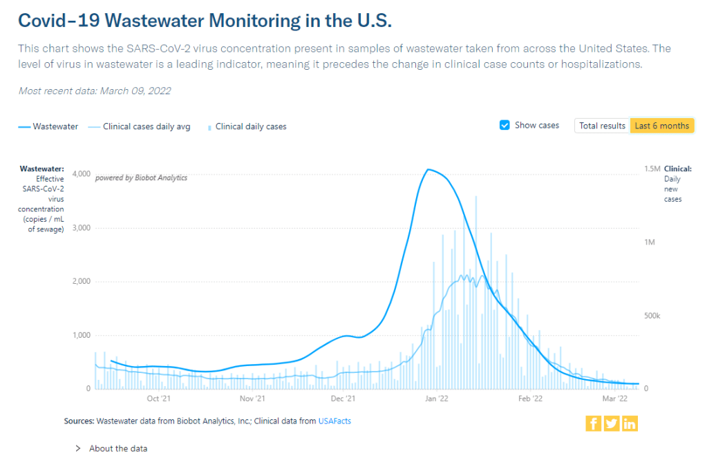
Note: I’m shifting the format of these National Numbers posts to focus more on hospitalizations and wastewater, as case data become both less reliable and less available in many parts of the U.S.
Overall, new COVID-19 cases are continuing to fall across the U.S. The country reported about 37,000 new cases a day last week, according to the CDC, compared to ten times that number in early February.
Case numbers have become less reliable lately as testing sites close and people are redirected to use at-home rapid tests, which are generally not reported. Still, we’re seeing a similar trend in new COVID-19 patients admitted to hospitals: both new cases and new admissions dropped almost 30% last week from the week prior.
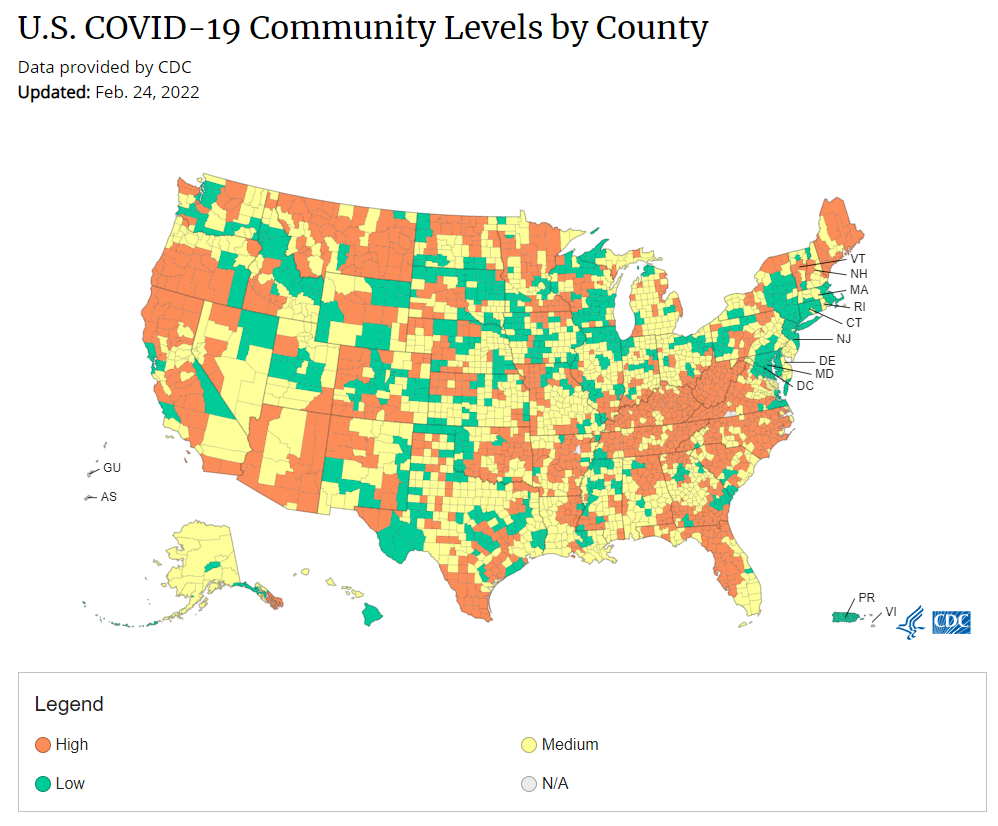
More than 98% of the U.S. population now lives in a location with a low or medium COVID-19 Community Level, according to the CDC. But a few places did see case increases last week: these include Nebraska, Kentucky, Alaska, and Delaware, according to the March 10 Community Profile Report.
BA.2, the Omicron sister variant that is even more transmissible than the original version of this strain, is slowly gaining ground in the U.S.: it’s gone from causing an estimated 1% of cases in the first week of February to 12% in the first week of March, according to the CDC’s modeling.
It hasn’t impacted case trends here yet, but deserves close attention in the coming weeks and months. Gothamist has a helpful article about BA.2’s potential impact in New York, where the variant’s prevalence in wastewater is doubling statewide every two weeks.
Meanwhile, several European countries—including the U.K., Germany, the Netherlands, and others—reported case increases this week. This is likely due to ending pandemic safety measures, Omicron gaining its second wind, or some combination of the two; regardless, it doesn’t bode well for the U.S., which is also ending pretty much all pandemic safety measures.
A couple of data sources, a couple of data-related updates:
State plans for utilizing COVID-19 relief funding: The federal Office of Elementary and Secondary Education has posted every state’s plan for utilizing ESSER funding, a $13-billion fund set aside to help schools address the impact of COVID-19. Money can be utilized for academic assistance, improving ventilation in schools, testing, and more. State plans were due to the federal government last June, though some materials are still pending on the website.
New GAO report on Long COVID: Between 8 and 23 million Americans may have developed Long COVID in the last two years—and an estimated one million are out of work because of this condition—according to a new report from the U.S. Government Accountability Office. The report discusses medical and economic impacts of Long COVID, including current efforts by the federal government to study the condition.
KFF COVID-19 Vaccine Monitor update: This week, the Kaiser Family Foundation published a new report detailing America’s sentiments on COVID-19 vaccines and other pandemic issues. Key findings include: COVID-19 vaccine uptake “remains relatively unchanged since January” for both adults and children; a majority of parents with children under five say they “don’t have enough information” about vaccines for that age group; and “most adults believe that the worst of the COVID-19 pandemic is over but there are disagreements about what returning to normal means and when it should happen.”
Vaccination disparities between urban and rural counties: Here’s a CDC MMWR study that caught my eye this week: researchers compared vaccination rates in urban and rural U.S. counties, finding that the rate of people in urban counties who have received at least one dose (75.4%) is much higher than the rate in rural counties (58.5%). Moreover, the gap between urban and rural counties has more than doubled between April 2021 and January 2022, the researchers found.
CDC updates seroprevalence data: The CDC recently updated a dashboard showing data from seroprevalence surveys, which use information from labs across the country to estimate how many Americans have resolving or recent coronavirus infections. (This does not include vaccinations, unlike other seroprevalence estimates.) According to this new update, about 43% of the country had antibodies from a recent infection as of late January. In some parts of the country that were harder-hit by Omicron, the esimate is over 50%.
While Ukraine’s COVID-19 cases appear to have gone down in recent days, the country is (obviously) not prioritizing COVID-19 reporting during an invasion. Chart via Our World in Data.
When Russian troops began attacking Ukraine, the country was just recovering from its worst COVID-19 surge of the pandemic. To state the terrifying obvious: war makes it much harder to control a pandemic.
Here are a few reports on this situation from the past week:
In addition to COVID-19, Ukraine “has been trying to control a polio outbreak since October,” reports Dana Varinsky at NBC News. About 13% of Ukrainian children under age six had not received their polio shots as of 2020, and are vulnerable to a re-emergence of this disease. Global health experts are highly concerned about the potential impacts of both COVID-19 and polio on Ukraine and neighboring countries.
While data on Ukraine’s cases show a decrease in recent weeks, these numbers are pretty unreliable.Our World in Data reports a steep decline from 860 new cases per million on February 12 to zero new cases in the last couple of days. This is unsurprising for a country with pressing issues to deal with than data reporting. “These numbers are going to have to be taken with some sort of salt, understanding it may be underreported, or in many ways not reported at all,” public health expert Sonny Patel told NBC.
Meanwhile in the U.S., hospitals are considering a potential increase in Russian cyber threats, POLITICO reports. Earlier in March, the U.S. Cybersecurity and Infrastructure Security Agency issued a warning to hospitals and other healthcare organizations saying they should prepare for Russian cyberattacks. “No “specific or credible” threats have been made yet, but health care organizations are concerned, given Russia’s cyber warfare history,” according to reporter Ben Leonard. (The full story is paywalled, but a summary is available in POLITICO’s newsletter.)
Over the past year, we’ve seen more and more examples of COVID-19 surges intersecting with other disasters. This includes violence in Palestine last summer, as well as hurricanes, wildfires, and the Texas winter storm here in the U.S. To me, these horrible convergences make it clear that healthcare systems in the U.S. and around the world need a lot more investment to be resilient in these times of crisis.
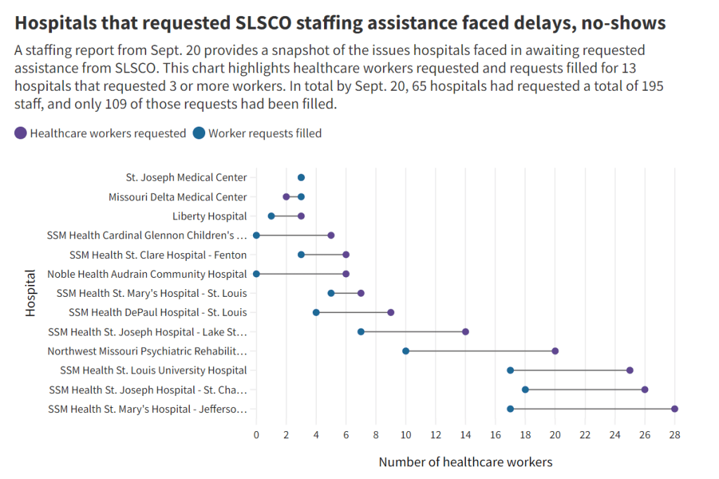
Early this week, I had a big story published in The Missouri Independent, as part of the Documenting COVID-19 project’s ongoing collaboration with that nonprofit newsroom. This piece goes in-depth on the Missouri health department’s contract with SLSCO, a Texas-based construction company that expanded to provide healthcare support during the pandemic.
While this was a local story, to me, the piece provides important insights about the type of support that is actually needed in U.S. hospitals right now: not temporary assistance, but long-term, structural change.
The Missouri agency hired SLSCO to provide two services, with a total contract of $30 million:
Provide staffing support (nurses, technicians, etc.) to hospitals across the state struggling in the wake of the Delta surge.
Set up, staff, and operate six monoclonal antibody infusion sites where Missourians infected with the coronavirus could easily access the treatment.
SLSCO made lofty promises to the Missouri health department, citing its ability to quickly send hundreds of workers to facilities that required assistance. But in fact, the hospital staffing assistance was marred by delays, no-shows, and high rates.
Here are a few paragraphs from the story:
Fewer hospitals signed on to receive staff than the Department of Health and Senior Services anticipated. Within the first few weeks, some hospitals faced no-shows, while the company’s hourly rates — up to $215 an hour for some nurses and $550 an hour for doctors — were too high for other hospitals to afford after state funds ran out, according to emails obtained by The Independent and the Documenting COVID-19 project through records requests. (Copies of SLS’ contract and emails between state agencies can be found here.)
“153 staff requested and only 10 deployed,” wrote Alex Tuttle, the governor’s legislative budget director, after receiving a staffing report early in the contract period. “Am I reading that right?”
From mid-August through November, just 206 staff were ultimately sent to 53 hospitals, said Lisa Cox, a spokeswoman for DHSS. The healthcare support had left by the time omicron hit in the winter.
The monoclonal antibody infusion sites were more successful; in fact, the Missouri health department ended up redirecting funding from the staffing support to the infusion sites. The six sites served a total of 3,688 patients over a two-month period.
However, the sites could have served a lot more patients: these clinics could have treated up to 136 patients each day but peaked at about 90, with numbers often much lower, according to my analysis of data from the health department. Due to these low numbers, the state of Missouri ended up spending more than $5,600 for each patient. One monoclonal antibody expert I talked to for the piece called this an “exorbitant” cost.
Now, I don’t mean to hate on monoclonal antibody treatments here—these drugs are truly a great way to boost the immune systems of COVID-19 patients who may be at higher risk for severe symptoms. Maggie Schaffer, a case management nurse who helped set up one of the infusion sites, told me that people who had this treatment typically are “feeling like a whole new person” within a day or two.
However, the treatments are very expensive and inefficient; one patient’s infusion appointment can take hours. The drugs themselves cost around $2,100 per dose, about 100 times as much as one vaccine. Health departments and facilities that offer monoclonal antibodies need to focus on getting the word out to patients so that these expensive supplies aren’t wasted.
At the same time, temporary healthcare staff can be great to help a facility out a surge—but they are not a long-term solution. In particular, nurses at a hospital may be frustrated by watching new staff come in from out of town and receive much higher pay rates; the “traveling nurse phenomenon,” as this is called, may contribute to burnout and staff leaving to go become traveling workers themselves.
What do hospitals actually need to do to address their staffing crisis? Here are a few ideas from Tener Veenema, a nursing expert focused on health systems a professor of nursing who researches health systems and emergency preparedness at Johns Hopkins’ Bloomberg School of Public Health:
Higher pay and assistance with education bills.
Regulations on things like work hours, the number of patients one nurse can be responsible for at once.
Mental health assistance that nurses are actually given time and space to access.
I’ll end the post with this quote from Veenema, which is also the last line of the story:
“If we don’t fix the toxic work environment, this issue of mandatory overtime, inadequate staffing levels, lack of time to access mental health resources,” Veenema said, “then you’re simply shooting more new nurses out of the cannon, but into the lake where they’re going to drown.”
About 90% of the U.S. population now lives in a medium- or low-level COVID-19 “Community Level,” according to the CDC.
In the past week (February 26 through March 4), the U.S. reported about 371,000 new COVID-19 cases, according to the CDC. This amounts to:
An average of 53,000 new cases each day
113 total new cases for every 100,000 Americans
29% fewer new cases than last week (February 19-25)
Last week, America also saw:
30,000 new COVID-19 patients admitted to hospitals (9 for every 100,000 people)
11,000 new COVID-19 deaths (3.3 for every 100,000 people)
100% of new cases are Omicron-caused (as of February 26)
An average of 140,000 vaccinations per day (per Bloomberg)
New COVID-19 cases continue falling in the U.S. as the Omicron wave fizzles out. This week, the CDC reported an average of 53,000 new cases a day—less than one-tenth the cases reported at the peak of this surge.
Hospitalization metrics also continue falling. About 30,000 new COVID-19 patients were admitted to U.S. hospitals this week, compared to almost 150,000 at the peak of the surge. According to the Hospital Circuit Breaker dashboard, only two states are currently at or over hospital capacity: Nebraska and Vermont.
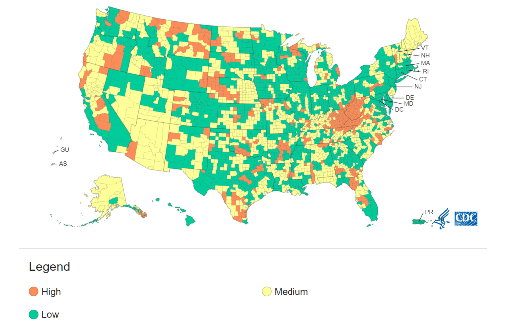
We’re now in the second week of the CDC’s new “Community Level” guidance for safety precautions tied to regional COVID-19 metrics. As of this week, “more than 90% of the U.S. population is in a location with low or medium COVID-19 Community Level,” according to the agency.
Of course, the agency’s old guidance—still available on its COVID-19 dashboard—is less generous. According to these metrics, almost half of the country is still seeing “high community transmission,” with more than 100 new cases per 100,000 people in the last week. Remember, even though case numbers are much lower now than they were in early January, the Omicron surge warped our whole sense of COVID-19 proportion.
Meanwhile, some parts of the country where Omicron arrived and peaked earlier are now in distinct plateaus. This includes Washington, D.C. and New York City; in NYC, case rates have actually started ticking back up very slightly in the last week.
I personally trust NYC case numbers more than that metric in other places because the city still has widely available public testing. But as other cities and states close testing sites and redirect people to at-home tests, case numbers will continue becoming less reliable over the coming weeks. So, I am thinking about shifting these national updates to focus more on other metrics, like hospitalizations and wastewater.
Readers, what do you think? Any recommendations for metrics you’d like to read more about here? Comment below or email me and let me know.
As state leaders drop COVID-19 safety measures right and left, I wanted to give a shout-out to Hawaii: the one state that has kept its indoor mask mandate in place during this time. Gov. David Ige currently intends to keep the measure in place despite the CDC’s new guidance, according to local reports.
Hawaii faces unique challenges during COVID-19 surges, since its island location makes it difficult for healthcare staff support to come in—or for patients to be transferred out of the state. These challenges have previously led Gov. Ige to call for tourists to avoid traveling to Hawaii, and to me, seem like good motivation for this state to keep cases low.
Hawaii also has the second-lowest COVID-19 death rate, after Vermont—likely in part because of the state’s mask requirement and other safety measures.
CDC Museum COVID-19 Timeline: I recently learned that the CDC museum, which is part of the Smithsonian, has produced a detailed timeline of the COVID-19 pandemic in the U.S. It starts with the first cluster of COVID-19 patients in Wuhan, China, then include milestones in cases, treatments and vaccines, guidance changes, and more. The timeline currently ends in late 2021.
COVID-19 Data Dispatch resources: In absence of other outside sources this week, I wanted to send a reminder that the COVID-19 Data Dispatch maintains detailed annotations describing how states report vaccination data and COVID-19 cases in K-12 schools. Both sets of annotations are overdue for updates, which I’m planning to do in the next week!
The CDC is not publicly releasing a lot of its COVID-19 data. Last weekend, New York Times reporter Apoorva Mandavilli broke the news that the CDC has withheld a lot of its COVID-19 data from the public, including information on breakthrough cases, demographic data, and wastewater data. This news was honestly not surprising to me because it follows a pattern: the CDC doesn’t like to share information unless it can control the interpretations. But I appreciated the conversation brought on by this article, with public health experts saying they’d rather have imperfect data than a complete data void. (I agree!)
BA.2 is definitely more transmissible than the original Omicron strain, but it does not appear to be significantly more severe or more capable of evading vaccines. Two recent posts, one in the New York Times COVID-19 updates page and one from Your Local Epidemiologist, share some updates on what scientists have learned about BA.2 in the past couple of weeks. In the U.S. and other countries with BA.2, this sublineage doesn’t seem to be causing a major rise in cases—at least so far.
New CDC study shows the utility of rapid testing out of isolation. More than half of patients infected with the coronavirus tested positive on rapid antigen tests between five and nine days after their initial diagnosis or symptom onset, a new CDC report found. The report includes over 700 patients at a rural healthcare network in Alaska. These findings suggest that rapid testing out of isolation is a good way to avoid transmitting the virus to others, if one has the tests available.
January saw record-high coronavirus infections in hospitals.POLITICO reporters analyzed hospitalization data from the Department of Health and Human Services (HHS), finding that: “More than 3,000 hospitalized patients each week in January had caught Covid sometime during their stay, more than any point of the pandemic.” This high number demonstrates Omicron’s high capacity to infect other people.
Hong Kong’s surge shows the value of vaccinations. Hong Kong has been a global leader in keeping COVID-19 cases low throughout the pandemic, yet Omicron has tested this territory’s strategy—causing record cases and overwhelming hospitals. One major issue for Hong Kong has been low vaccination rates, particularly among the elderly, as people did not see the need to get vaccinated when cases in the territory were practically nonexistent.
This time next week, I’ll be at NICAR 2022—the Investigative Reporters and Editors’ annual data journalism conference. And I do mean “at”: though the conference this year will be held in a hybrid format with both in-person and virtual options, I’ve chosen to travel for the in-person sessions in Atlanta, Georgia.
It will be my first in-person conference and my second time traveling via airplane since February 2020. While I’m nervous about the travel and the gathering, I feel confident in the conference’s COVID-19 protocols (requiring full vaccination and boosters, plus indoor masking), in low transmission levels at both my origin and destination, and in my own ability to wear high-quality masks and utilize rapid tests as I go. (I wrote about precautions that I took on my first pandemic-era airplane trip in a post last summer.)
I chose to attend NICAR in-person to better take advantage of data journalism skills sessions—and, of course, in-person networking! If you’re planning to attend and would like to meet up, please reach out: email me, hit me up on Twitter, etc.
Also, for folks attending in-person or tuning in virtually, I’m excited to share that I’ll be a panelist at a conference session discussing the use of data for solutions journalism. The session’s moderator is Matt Kauffman, who leads data reporting at the Solutions Journalism Network. Dedicated readers might remember that the Solutions Journalism Network supported my Opening project last summer; I’ll be discussing my work on that project (which provided lessons from public schools that safely reopened during the 2020-2021 school year) and other solutions-related reporting at this session.
The session is scheduled for next Saturday, March 5, from 3:45 to 5 PM Eastern time, and will be livestreamed for virtual attendees. Here’s the full description:
Solutions journalism is rigorous, evidence-based reporting on responses to social problems. And data make for a great partner in solutions reporting, because when the impact of a response can be measured in numbers, it’s easy to discover the places that stand out and are worth a deeper look.
This session will explore the use of “positive deviants” – outliers in data that might point to a place or a program that has found a better way: the school district that cut the achievement gap by implementing specific policies; the state that applied new protocols in hospitals that significantly reduced the number of women who die in childbirth; the neighborhoods that have reversed environmental injustices and greatly improved urban tree canopy. Stories like these attract readers and viewers, who are increasingly turned off by news coverage focused exclusively on failure.
Adding a solutions lens to traditional investigative reporting leads to better accountability journalism, and data can play a key role in that. This session will present an overview of solutions journalism and positive deviance, followed by tips from a reporter explaining how they used data in pursuit of a timely and critical solutions story: identifying school districts around the country that found ways to safely reopen schools during the pandemic.
Under the new CDC guidance, about 70% of Americans live in counties where they can go unmasked in public. Chart via CDC.gov.
This past Friday, the CDC announced a major shift to its guidance for determining COVID-19 safety measures based on county-level community metrics. The new guidance is intended to replace COVID-19 thresholds that the agency developed last summer, during the Delta wave; here, the CDC is promoting a shift from using cases and test positivity for local decision-making to using metrics tied directly to the healthcare system.
This shift away from cases isn’t new: state health departments have been moving in this direction recently, as I wrote last week. Similarly, the CDC’s recommendation for when Americans should feel safe in taking off their masks aligns with recent guidance changes from state leaders.
The new guidance is essentially a lot more lenient when it comes to mask removal. Overnight, the U.S. goes from under 5% of counties in “low” or “moderate” transmission (under the old guidance) to over 60% of counties, representing 70% of the population, in a “low” or “medium” COVID-19 community level.
🚨🚨 the CDC has updated its guidance on using county-level COVID-19 metrics to drive recommended safety measures.
with the new guidance, we go from 82% of U.S. counties in "high" transmission (on the left) to only 37% of counties in high transmission (on the right). pic.twitter.com/Xz1Xj6FHDN
This shift will embolden more states, local health departments, and individual organizations to lift safety measures and change how they track COVID-19. In this post, I’ll unpack why I believe the CDC made certain choices with this new guidance, what critiques I’m seeing from public health experts, and some recommendations for thinking about your COVID-19 risk during this highly confusing pandemic era.
Rationale for the CDC’s new guidance
With this new framework, the CDC is essentially telling Americans to watch hospitalization numbers—not case numbers—as the most important metric to inform how hard COVID-19 is hitting their community. One piece of their logic is, I suspect, that case numbers are less reliable in this pandemic era than they have been since March 2020.
That lack of reliability largely stems from the rise of at-home rapid antigen tests, which gained popularity during the Omicron surge and are now largely unconstrained by supply issues. (For example: iHealth Labs, one major at-home test provider, now allows shoppers to buy up to 50 test kits per person, up from a limit of 10 during Omicron’s peak.)
Unlike PCR test results, which are systematically processed in labs and reported to public health agencies, at-home test results typically do not travel beyond a patient’s trash can. And while a few local jurisdictions (like D.C.) have given residents options to self-report their antigen tests, the majority have opted not to take on this challenge. As a result, current case numbers for almost everywhere in the U.S. are not very reflective of actual infections in the community.
In previous pandemic eras, researchers could use PCR test positivity as an indicator of how reliable case numbers might be for a particular jurisdiction: higher test positivity usually means that more cases are going unreported. But in the era of widespread rapid tests, test positivity is also less reliable, because rapid tests aren’t accounted for in the test positivity calculations either.
Case numbers do still have some utility, because people who have COVID-19 symptoms or need a test result to travel will continue seeking out PCR tests. The CDC guidance reflects this by keeping cases as one factor of its COVID-19 community level calculation. But cases are no longer the star of the show here.
Instead, the CDC is focusing on hospitalizations: specifically, new COVID-19 admissions per 100,000 people and the share of inpatient beds occupied by COVID-19 patients. New hospital admissions are a more reliable—and more timely—metric than the total number of patients hospitalized with COVID-19, because admissions reflect only the people coming in with symptoms that recently started, not the people who have been hospitalized for days or weeks.
The share of inpatient beds occupied by COVID-19 patients, meanwhile, reflects the strain that this disease is currently putting on a hospital system. The CDC is choosing to include all COVID-19 patients here, not only those who are hospitalized for COVID-specific symptoms (the correct choice, in my view). Agency director Dr. Rochelle Walensky gave a good explanation for this at a media briefing on Friday:
We are considering anybody in a hospital bed with COVID, regardless of the reason for admission, and the reason that we landed there is multifold. First, many jurisdictions can’t differentiate, so that was important for us to recognize and realize. Second, whether or not a patient is admitted with COVID or for COVID, they increase the hospital capacity and they’re resource intensive. They require an isolation bed. They require PPE. They probably require a higher staff ratio. And so they are more resource intensive and they do take a COVID bed potentially from someone else.
Interestingly, as well, as we have less and less COVID in certain communities, the amount of people who are coming into the hospital with COVID will necessarily decrease. We will not have as many people walking around asymptomatically because there will just be less disease out there. So increasingly, as we have less disease in the community, we anticipate that more of the people who are coming into the hospital are going to be coming in because of COVID.
And then finally, as we have even less disease in the community, we anticipate that not every hospital is going to screen every patient for COVID as they walk in the door, especially if we have less and less disease in the community. And when that happens, we won’t actually be able to differentiate. In fact, people who are coming in, who are tested will necessarily be coming in for COVID. So for all of those reasons, comprehensively, we decided to stay with anybody coming in with a COVID diagnosis.
Also, a note on wastewater: I’ve seen some commentators express surprise that the CDC didn’t include wastewater in its new guidance, as this sewage surveillance can be a useful leading indicator for COVID-19 that’s more reliable than cases. The problem here is, wastewater surveillance is not available in much of the country—just look at all the empty space on this map. To use wastewater for decisionmaking, a county or state needs to have enough wastewater collection sites actually collecting these data, and most states are not there yet.
Critiques of the new guidance
While hospitalizations are a more reliable COVID-19 metric than cases, especially in our rapid testing era, they come with a few major issues. First, hospitalizations are a lagging indicator, meaning that they start to rise a couple of weeks after a new surge has started. If we rely on hospitalizations as a signal to put mask requirements or other safety measures in place, those changes will come weeks delayed.
As Boston University epidemiologist Dr. Ellie Murray put it in a recent Twitter thread: “Using lagging indicators like hospitalizations could be okay for turning *off* precautions IF we are sure that no new surge has begun. But that means we need leading indicators, like infection surveillance to guide turning *on* precautions.”
The CDC seems to have forgotten the basics of infectious disease in making these new risk categories.
People infected with SARS-CoV-2 can transmit for days before they show symptoms, and for a week or more before they develop “severe disease”.
Another issue with relying heavily on this lagging indicator is, new COVID-19 safety measures may come too late to protect essential workers, children in schools, and others who face high risk of coronavirus exposure. “These high exposure populations get COVID first and most,” writes health policy expert Julia Raifman.
In other words, by the time case and hospitalization rates are high enough for a community to institute new safety measures under this new CDC guidance, those high-risk people are likely to be the ones already in the hospital. Raifman points to data from the U.S. Census’ Household Pulse Survey, showing that low-income workers were most likely to miss work for COVID-19 throughout last year.
Beyond this lagging indicator issue, another challenge with relying on hospitalizations is that, for many Americans, the hospitals that they might go to if they come down with severe COVID-19 are not located in their county. Plenty of counties, particularly in rural areas, don’t have hospitals! To deal with this, the CDC is actually using regional hospitalization figures, compiling statistics from multiple counties that rely on the same healthcare facilities.
University of South Florida epidemiologist Jason Salemi lays out this calculation in an excellent Twitter thread, linked below. While it makes sense that the CDC would need to use regional instead of local figures here, the agency is being pretty misleading by labeling this new guidance as county-level metrics when really, the metrics are not that localized.
The numerator is based on WHERE PEOPLE ARE ADMITTED.
The denominator is based on WHERE PEOPLE LIVE.
If you just look at FL, there are many counties that either do not report hospitalizations (NO HOSPITAL) or reported 0 in the past 7d.
There are more equity concerns embedded in the new CDC guidance as well. For counties with “low” or “medium” community COVID-19 levels, the CDC recommends that most Americans do not need to wear masks in public. But people who are immunocompromised or at high risk for severe disease should “talk to a healthcare provider” about the potential need to wear a mask indoors, stock up on rapid tests, or consider COVID-19 treatments.
For one thing, telling people, “talk to your doctor” is not a great public health strategy when one in four Americans do not have a primary care physician, and one in ten do not even have health insurance! For another thing, one-way masking among immunocompromised and otherwise high-risk people is also not a great strategy, because masks protect the people around a mask-wearer more than they protect the mask-wearer themselves. (I recommend this recent Slate piece on one-way masking for more on this topic.)
Many of my colleagues on here have eloquently explained their concerns with the new CDC guidelines, so I’ll just add that any guidelines that include “Talk with your provider.” when 25% of Americans don’t have a PCP and 10% are uninsured is inherently problematic.
It is also pretty unclear how the CDC landed on a case threshold for “low transmission” that is much higher in this new guidance than in the old guidance, as Dr. Katelyn Jetelina points out in a recent Your Local Epidemiologist post. If anything, honestly, I would expect that the CDC needs to lower its case threshold, given that current case numbers are not accounting for millions of rapid tests done across the country.
Finally, the new CDC guidance completely fails to account for Long COVID. Of course, it would be very difficult for the CDC to do this, since the U.S. basically isn’t tracking Long COVID in any comprehensive way. Still, overly focusing this new guidance on hospitalizations essentially ignores the fact that a “mild” COVID-19 case which does not lead to hospitalization can still cause major, long-term damage.
Which metrics you should follow right now
Here are my recommendations of COVID-19 metrics to watch in your area as you navigate risk in this confusing pandemic era.
Both the old and new CDC thresholds. While the CDC pushes its new guidance with a brand-new page on CDC.gov, community transmission metrics calculated under the old guidance are still available on the CDC’s COVID-19 dashboard. If you’re not feeling comfortable taking off your mask in public and want to wait until transmission is seriously low in your area, you can look at the old thresholds; though keep in mind that case data are seriously unreliable these days, for the reasons I explained above.
Remember that masks are useful beyond COVID-19. Not a metric, but an additional note about thinking through risk: masks reduce risk of infection for a lot of respiratory diseases! We had a record-low flu season last winter and many Americans have avoided colds for much of the pandemic, thanks in part to masking. Helen Branswell has a great article in STAT News that unpacks this further.
Wastewater data, if available to you. As I mentioned above, wastewater surveillance data are not available in much of the country. But if you live somewhere that this surveillance is happening, I highly recommend keeping an eye on those trends to watch for early warnings of future surges. You can look at the CDC dashboard or Biobot’s dashboard to see if your county is reporting wastewater data.
Vaccination levels. It makes sense that vaccination was not included in the CDC guidance, because vaccinated people can still spread highly contagious variants like Omicron. Still, more highly-vaccinated counties—particularly those with high vaccination rates for seniors—are likely to have less burden on their healthcare systems when a surge arises, so knowing the vaccination rate in your county can still be useful when thinking about your risk tolerance.
Rapid test availability. This is a bit more anecdotal rather than an actual data source, but: looking at rapid test availability in your local pharmacies may be another way to get a sense of community transmission in your area. Right now, these tests are easy to find in many places as case numbers drop; if finding these tests becomes more competitive again, it could be a signal that more people are getting sick or having exposures.
As always, if you have any questions or topics that you’d like me to tackle in this area, please reach out.