The CDC has archived a couple of major datasets providing COVID-19 cases and deaths by state and county.
The CDC is now updating its COVID-19 cases and deaths data weekly, instead of daily, as I covered last week. This shift goes beyond the agency’s public dashboard: the CDC has also archived datasets with state-and county-level data providing COVID-19 cases and deaths, which were previously updated daily on data.cdc.gov.
These datasets previously included the underlying numbers behind the CDC’s dashboard, allowing data-savvy Americans to produce their own analysis and visualizations. I learned about the archiving via a Twitter thread by Iowa data expert Sara Anne Willette, who uses the CDC’s data to update an independent dashboard tracking COVID-19 in her state.
To replace these daily datasets, the CDC has posted a new dataset, “Weekly COVID-19 County Level of Community Transmission Historical Changes.” It appears to provide COVID-19 cases and test positivity rates by county, by week—but the data aren’t actually available yet. This dataset currently includes zero rows while the CDC resolves a “processing issue.”
None of this is particularly surprising, considering that the CDC is clearly deprioritizing COVID-19 tracking and allocating its data analysis resources elsewhere. But it remains frustrating for those of us who still want to know what’s going on with COVID-19 in our communities.
More detailed bivalent booster data: As of this week, the CDC is reporting some demographic data for the bivalent, Omicron-specific booster shots. The new data suggest that these boosters have had higher uptake among seniors, with about 11 million people over age 65 receiving a shot (compared to just 60,000 in the 5 to 11 age group). White and Asian Americans have higher booster rates than Black, Hispanic, and Native Americans, suggesting that the new doses are following a similar equity pattern to what we’ve seen with prior vaccines.
COVID-19 mortality by occupation: A new report by the CDC’s National Vital Statistics System provides a rare area of data we don’t usually get in the U.S.: occupational data. CDC researchers used mortality data from 46 states and New York City to examine risk of death by occupation. People working in protective services, accommodation and food services, and other essential jobs that couldn’t be done remotely had the highest death rates—confirming what many public health experts have suspected throughout the pandemic.
Life expectancy changes during the pandemic: A new study published in Nature, by researchers at the University of Oxford and other European institutions, estimated how life expectancy changed in 29 countries since the start of the pandemic. After a universal life expectancy decline in 2020, the researchers found, some western European countries “bounced back” in 2021 while the U.S. and eastern European countries did not. The results show the impacts of lower vaccination uptake in the U.S., particularly among younger adults.
Disparities in Paxlovid prescriptions: Another CDC study that caught my attention this week was this analysis in Morbidity and Mortality Weekly Report (MMWR), describing racial and ethnic disparities in prescriptions of Paxlovid—the antiviral COVID-19 treatment which reduces risk of severe symptoms. Between April and July 2022, the researchers found, the share of COVID-19 patients over age 20 who received a Paxlovid prescription was 36% lower among Black patients than among White patients, and 30% lower among Hispanic patients. More work is needed to make Paxlovid availability more equitable.
New estimates of Long COVID prevalence: One more notable paper published this week: researchers at Massachusetts General Hospital, Harvard, and collaborators conducted an online survey of about 16,000 U.S. adults who tested positive for COVID-19 in the last two months. Of those survey respondents, 15% reported current symptoms of Long COVID. The survey found that older adults and women were more likely to report Long COVID, while those who were fully vaccinated prior to infection had a somewhat lower risk of long-term symptoms. All of these findings are in line with results from other studies, but it’s helpful to see continued validation of these known trends.
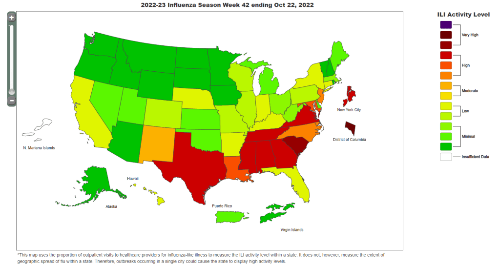
The CDC’s FluView dashboard does not provide precise case numbers, only an approximation of “activity level.”
I recently received a question from a reader, asking how to follow both COVID-19 and the flu in the county where she lives. For COVID-19, county-level data sources aren’t too hard to find: the CDC still provides some clinical data—though case numbers are now updated weekly, instead of daily—and many counties have wastewater surveillance available. (See last week’s post for more details.)
But following flu transmission is much harder: there’s no county-level tracking of this virus. The same thing goes for respiratory syncytial virus (RSV), a virus currently sending record cases to children’s hospitals across the country. There are a few data sources available, which I’ll list later in this post, though nothing as comprehensive as what we’ve come to expect for COVID-19.
As I’ve previously written, the COVID-19 pandemic inspired nationwide disease surveillance at a level the U.S. has never seen before. The healthcare and public health systems had not previously attempted to count up every case of a widely-spreading virus and share that information back to the public in close-to-real-time.
It’s unlikely that flu, RSV, and other diseases will get the same resources as COVID-19 did for intensive tracking—at least not in the near future. But the scale of data we’ve had during the pandemic reveals that our current surveillance for these diseases is pretty inadequate, even for such basic purposes as giving hospitals advanced warning about new surges.
Insufficient RSV data
A recent CNN story by Deidre McPhillips and Jacqueline Howard explains how data gaps have hindered preparation for the current RSV surge. The reporters explain that the CDC’s RSV data are “based on voluntary reporting from a few dozen labs that represent about a tenth of the population.” The CDC uses these reports to provide weekly estimates about RSV cases, though recent data tend to be incomplete due to reporting delays.
Here’s a helpful quote from the story (though I recommend reading the whole piece):
“For hospitals [using CDC data], it’s a little like looking through the rearview mirror. They’ve already begun to experience that uptick in cases themselves before it’s noticeable in the federal data,” said Nancy Foster, vice president for quality and patient safety with the American Hospital Association.
“We’re talking about data that are collected inside hospitals, transmitted through a data trail to get to the federal government, analyzed there and then fed back to hospitals.”
In other words, it’s not surprising that we saw plenty of stories about higher-than-normal RSV cases in children’s hospitals before national data actually picked up the surge. For more details on why RSV is spreading this fall and how it’s impacting children’s hospitals, I recommend this piece by Jonathan Lambert at Grid.
Insufficient flu data
Meanwhile, this year’s flu season is clearly starting earlier than normal; but current data aren’t able to tell us how severe the season might get or who, exactly, is being hit the hardest. According to the CDC’s flu surveillance report for this week, the agency estimates that the U.S. has seen “at least 880,000 flu illnesses, 6,900 hospitalizations, and 360 deaths from flu” so far this fall.
The CDC’s estimates come from networks of testing labs, hospitals, and outpatient healthcare providers that participate in the agency’s flu surveillance networks. National flu data tend to be imprecise estimates, clearly labeled as “preliminary” by the CDC, while state-by-state data are estimates reported with delays. Note, for example, that the CDC’s map of “influenza-like-activity” by state and by metro area provides only general categories of activity (ranging from “minimal” to “very high”) rather than actual case numbers.
The flu data we have so far aren’t sufficient for making predictions about how the rest of this fall and winter will go, explains STAT’s Helen Branswell in a recent story. “The virus is maddeningly unpredictable,” she writes. U.S. experts often look to the flu season in the Southern Hemisphere, which precedes ours, for clues, but this can be unreliable (just as the U.S. shouldn’t rely on other countries for all its vaccine effectiveness data).
For both flu and RSV, one major problem with our surveillance methods is that our systems overly rely on healthcare centers. When public health agencies have to wait for hospitals and clinics to report cases of these viruses before starting to analyze data, they miss the opportunity to warn healthcare providers at the very beginning of a surge—and give them time to prepare.
In the future, expanding non-clinical surveillance methods like wastewater and population surveys to these diseases would provide more data, more quickly; both for healthcare providers and for the general public. (I provided some more specific ideas here.)
Existing sources
With all the above caveats in mind, here are a few sources you can look at to track flu and RSV:
CDC’s weekly flu surveillance report: This page is updated once a week with national estimates of flu activity, hospitalizations, flu virus variants, and more. Data tend to be preliminary.
CDC’s FluView dashboard: Information from the CDC’s flu surveillance system also appears on this dashboard in a more interactive format; for example, you can see how flu activity by state has changed over time.
CDC’s RSV trends report: Similar to its flu reports, the CDC provides weekly updates of estimated RSV tests and cases, including national, regional, and state-by-state trends.
Walgreens flu index: Walgreens tracks prescriptions for antiviral medications at its pharmacies as a proxy for flu activity, by state and for select metro areas. For more information on the index, see this press release.
WastewaterSCAN: The SCAN network, run by researchers at Stanford University and Emory University, tests wastewater for flu, RSV, and monkeypox in addition to COVID-19 in select counties across the U.S. So far, this network is the first I know of to publicly share flu and RSV wastewater data, though other researchers are working in this area.
Please let me know if I missed any data sources! (You can email me or comment below.)
BA.5 caused just under half of new COVID-19 cases nationwide in the last week, according to CDC estimates. But we have yet to see a new subvariant clearly take over.
In the past week (October 20 through 26), the U.S. reported about 270,000 new COVID-19 cases, according to the CDC. This amounts to:
An average of 38,000 new cases each day
81 total new cases for every 100,000 Americans
2% more new cases than last week (October 13-19)
In the past week, the U.S. also reported about 23,000 new COVID-19 patients admitted to hospitals. This amounts to:
An average of 3,200 new admissions each day
6.9 total admissions for every 100,000 Americans
1% more new admissions than last week
Additionally, the U.S. reported:
2,600 new COVID-19 deaths (380 per day)
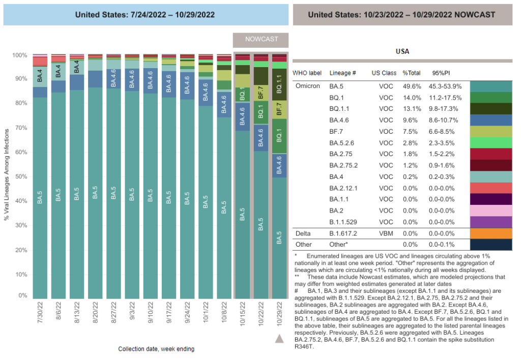
27% of new cases are caused by Omicron BQ.1 and BQ.1.1; 8% by BF.7; 3% by BA.2.75 and BA.2.75.2 (as of October 29)
An average of 400,000 vaccinations per day
The national COVID-19 picture continues to be somewhat murky, thanks in part to poor-quality data. Both nationwide cases and new hospital admissions trended slightly upward in the last week (by 2% and 1%, respectively); this could reflect the beginnings of fall surges in some places, but it’s hard to say for sure.
Wastewater data from Biobot continue to suggest the Northeast is seeing more COVID-19 transmission than other parts of the country, though this region reported a decrease in viral levels over the last two weeks. Other regions are reporting plateaus in transmission, according to Biobot.
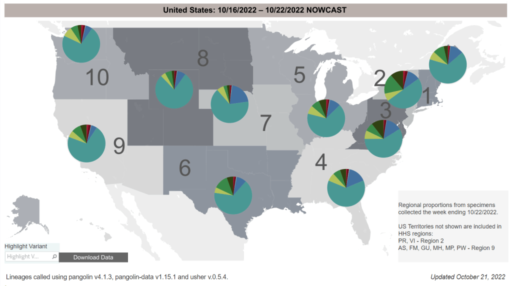
One reason we’re not seeing a definitive national surge yet could be that the newest iterations of Omicron have yet to fully dominate the country. BA.5 caused just under half of new COVID-19 cases nationwide last week, according to the CDC’s latest estimates, but the remaining half of cases were driven by a variety of new lineages: BQ.1, BQ.1.1, BA.4.6, and BF.7 all contributed over 5%.
When one of these subvariants (likely BQ.1.1) outcompetes the others, we will likely see a clearer picture of its impact on transmission. Also worth noting: XBB, the subvariant spreading quickly in Singapore and other Asian countries, has been identified in the U.S.—though its prevalence is too minimal to show up in the CDC’s estimates, at this point.
The BQ.1.1 variant is now at >20% prevalence in the US and XBB is officially here!
New York is a hotspot again: the state has a higher prevalence of BQ.1 and BQ.1.1 than other parts of the country, and some experts are concerned about rising COVID-19 hospitalizations here. In New York City, official cases have remained relatively stable for the last few weeks even as hospitalizations are going up, suggesting how continued low testing may make cases even less useful as a metric to watch.
This isn’t the only region seeing the start of a fall surge, though. The Twin Cities area in Minnesota reported a major spike in wastewater this week, with viral prevalence the highest it’s been since the original Omicron surge. Some counties in the South and West coast are showing similar warnings, according to Biobot’s dashboard.
And COVID-19 isn’t the only respiratory virus wreaking havoc right now, as we’ll discuss more in this issue. Places like NYC are seeing rising hospitalizations from the flu and RSV, placing additional strain on an already-overburdened healthcare system. Even if the coronavirus doesn’t have a drastic surge this winter, we could still see a lot of respiratory infections.
This weekend, I’m attending the Science Writers conference in Memphis, Tennessee. I’ve been to a few journalism conferences in 2022, along with other larger events (theater performances, concerts, etc.), and Science Writers has the best COVID-19 safety protocols I have encountered so far.
The event’s safety protocols include:
A vaccine requirement (which includes boosters);
Masks required indoors unless one is actively eating or drinking;
No eating or drinking in conference rooms (in other words, masks stay on);
Outdoor space for all meals and networking events;
Virtual options for people who did not wish to attend in person.
I have really appreciated the COVID safety protocols at #SciWri22, especially the outdoor seating for meals and networking breaks. wish all conferences did this! pic.twitter.com/jejtBZLz1k
I have particularly appreciated the outdoor space for meals. For me, it really takes the stress out of the networking to not worry about constantly keeping on a high-quality mask—because I know I’m in a well-ventilated, outdoor location.
From talking to a couple of people in leadership of the National Association of Science Writers and Council for the Advancement of Science Writing (which jointly organize the conference), I’ve learned that committing to these safety measures wasn’t easy—so I wanted to convey my deep appreciation. Measures like these make it possible for higher-risk people to attend the event, while also demonstrating the values of our organizations.
Genomic surveillance from international travelers: A new CDC dashboard page provides data from the agency’s program sequencing COVID-19 test samples from people arriving in the U.S. on international flights, aiming to identify and track new variants. This program—a partnership between the agency, Ginkgo Bioworks, and XpresSpa Group—started during the Delta wave in 2021 with flights from India, but has since expanded to include over 1,000 volunteers a week at four major airports. The CDC’s new page reports test positivity for travelers’ samples and variants detected through sequencing.
Implications of commercializing COVID-19 vaccines, treatments, tests: Researchers at the Kaiser Family Foundation analyzed how the federal government’s decreasing support for key COVID-19 products (vaccines, treatments, and tests) could impact Americans’ access. The government’s supply of these products has been depleted through 2022, and researchers anticipate the national Public Health Emergency will end in early 2023. As a result, Americans will soon likely need to rely on commercial products, leading to major challenges for low-income and uninsured people. (I wrote more about data implications of the PHE ending here.)
Disparities in flu hospitalizations and vaccinations: Much COVID-19 coverage, including in this publication, has focused on inequitable vaccine uptake. In early 2021, more white Americans were getting vaccinated than minority groups, potentially contributing to higher rates of severe disease in those groups through the second year of the pandemic. A new CDC study in the agency’s Morbidity and Mortality Weekly Report (MMWR) finds that a similar trend has occurred for flu over the last ten years: Black, Hispanic, and Native Americans had lower flu vaccine coverage than white Americans from 2009-10 through 2021-22 seasons, and the same groups had higher flu hospitalization rates. The study suggests equitable vaccination is a problem that goes beyond the pandemic.
Vaccine coverage among healthcare workers: Another CDC MMWR study that caught my attention this week provides results from a survey of healthcare workers, conducted in spring 2022. Among about 3,700 workers who responded to the survey, about four in five reported receiving a flu shot and two in three reported receiving a COVID-19 booster (during the 2021-22 flu season). Workers with vaccine mandates at their jobs had higher coverage than these averages, while long-term care workers had lower coverage. The results indicate more effort is needed to protect healthcare workers and their patients.
HospitalFinances.org is revamped, newly available: In 2018, the Association of Health Care Journalists (AHCJ) first launched HospitalFinances.org, a database of financial information on nonprofit hospitals pulling from 990 tax forms. The site has been offline for the past year due to a hosting issue, but is now back thanks to researchers at the University of Missouri (which hosts AHCJ). While this resource isn’t specifically COVID-related, it could be useful to reporters investigating hospitals in their areas.
As of this week, the CDC has switched to reporting COVID-19 cases and deaths on a weekly basis.
As of this Thursday, the CDC is updating COVID-19 case and death data every week instead of every day. Here are some thoughts on interpreting COVID-19 data in the wake of this change, citing an article I recently wrote for The Atlantic.
To me, the CDC’s shift to weekly updates feels like the end of an era for tracking COVID-19. While I understand the change, considering both our less-complete case information and other data analysis needs for the agency, I can’t help but wish we had a national public health agency with enough resources to continue providing us with frequent, reliable information on this ongoing pandemic. After all, shouldn’t that be the CDC’s job?
The CDC has clearly deprioritized two major metrics (cases and deaths) that used to be the first places people looked to see the pandemic’s impact on their communities. Instead, the agency now points us to hospitalization metrics, variant surveillance, and wastewater—all metrics that are certainly useful, but may be harder for the average user to interpret.
And even the case data we do have are quite unreliable at this point, as PCR tests become less and less accessible compared to rapid tests. Case numbers may be underreported by twenty times or more; it’s difficult to even get a good estimate of how far off the numbers are. Public communications like the CDC’s “Weekly Review” report fail to acknowledge this problem, and the agency does not appear to be making any effort to determine the true infection rates right now.
Through its current data communication choices, the CDC seems to be saying, “If you still care about keeping track of COVID-19, you’re on your own.” Even though we are likely heading for a fall surge and many people need to keep track of this disease in order to keep their communities safe.
In absence of useful information from our public health leaders, it falls on us to survey the best available data sources and help others interpret them. My article in The Atlantic takes on this question, focusing on wastewater surveillance and population surveys as particularly useful sources we should consider right now.
Interpreting wastewater data
Wastewater data, unlike case data, don’t require people to actively go out and get tested: if their public sewer system is getting sampled for COVID-19, they will automatically be included in the data. You can look for wastewater surveillance in your area on Biobot’s dashboard, the CDC’s dashboard, or other state and local dashboards, depending on where you live. (I have a list of state dashboards here.)
But interpreting wastewater data can be pretty different from interpreting case data. Here are a couple of key tips for approaching this source, based on my interview with Biobot president and cofounder Newsha Ghaeli:
Look at “directionality” and “magnitude.” “Directionality” means whether viral levels are going up or down, and “magnitude” means how they compare with earlier points in the pandemic. To quote from the story: “A 10 percent uptick when levels are low is less concerning than a 10 percent uptick when the virus is already spreading widely.”
If you do not have public wastewater data for your county, data from a neighboring county still provides useful info. When we talked, Ghaeli gave the example of a New York City resident looking at data from New Jersey or Connecticut counties neighboring the city: as people from these areas commute into NYC, a surge in one place could quickly drive a surge in the other.
Wastewater data are not a perfect proxy for infections. Scientists are still learning about how to best use this newer surveillance tool. Unlike clinical metrics (like cases), wastewater data can differ based on local environmental factors, and it often takes a long time for researchers to build useful interpretations of their communities. (See my past FiveThirtyEight story for more detail on this.)
These data can’t tell you who is getting sick. To comprehensively answer demographic questions, we need to actively survey people in our communities and ask them about their experiences with COVID-19. (See the story for more about how this works.)
Other interpretation tips
Beyond looking at wastewater data, here are a couple of tips I received from experts for readers seeking to watch their local COVID-19 numbers this fall:
“Look as local as you can,” said Pandemic Prevention Initiative expert Sam Scarpino. In other words, if you can find data for your individual county or even ZIP code, go there.
Consider local events and behavior, Scarpino said. Quoting from the story: “If a popular community event or holiday happened recently, low case numbers might need to be taken with a grain of salt.”
I also wanted to give a quick shout-out here to the People’s CDC, a volunteer science communication and advocacy organization. If you’re looking for more thoughtful analysis of national COVID-19 data, their weekly “weather reports” are a really helpful and accessible source. The organization also provides resources to help people push for more COVID-19 safety measures in their communities.
“People do want layers of protection, they do want to keep themselves in each other safe from COVID,” said Mary Jirmanus Saba, a geographer and volunteer with the People’s CDC whom I interviewed (with a couple of other volunteers) for my story. The weather reports and other similar initiatives help the organization’s followers “see that we really are there for each other,” she said.
New Omicron subvariants are spreading across the U.S. BQ.1 (medium green) and BQ.1.1 (dark green) are particularly prevalent in the Northeast. Chart via the CDC.
In the past week (October 13 through 19), the U.S. reported about 260,000 new COVID-19 cases, according to the CDC. This amounts to:
An average of 37,000 new cases each day
79 total new cases for every 100,000 Americans
2% fewer new cases than last week (October 6-12)
In the past week, the U.S. also reported about 22,000 new COVID-19 patients admitted to hospitals. This amounts to:
An average of 3,200 new admissions each day
6.7 total admissions for every 100,000 Americans
4% fewer new admissions than last week
Additionally, the U.S. reported:
2,600 new COVID-19 deaths (390 per day)
11% of new cases are caused by Omicron BA.4.6; 17% by BQ.1 and BQ.1.1; 7% by BF.7; 3% by BA.2.75 and BA.2.75.2 (as of October 22)
An average of 400,000 vaccinations per day (CDC link)
Official COVID-19 case numbers continue to drop nationwide, according to the CDC, but I remain concerned that a fall surge is coming soon—if it isn’t already here.
As the CDC transitioned this week from daily to weekly case reporting (more on that later in the issue), the agency’s “COVID Data Tracker Weekly Review” report, which I use to write these posts, is now using three-week rolling averages for its trends instead of one-week averages. The three-week average suggests reported cases are down 30% in the last month. But the actual case numbers report a dip of just 1% from last week to this week, suggesting a plateau in cases.
Data from Biobot’s dashboard similarly suggest a plateau in nationwide transmission trends, with the Northeast reporting more viral transmission than other regions. The wastewater data suggest that, nationwide, coronavirus transmission is on a similar level to what it was in early fall last year, before Omicron arrived. But the case numbers are now much lower thanks to limited testing access.
Consider this: recent estimates from the Institute for Health Metrics and Evaluation suggest only 4% to 5% of actual coronavirus infections make it into the public health system now. If this is correct, actual infection numbers in the U.S. are 20 times higher than our actual count, amounting to 740,000 true cases a day.
The Northeast remains a hotspot, as the first region to note signs of a new surge. Some New England cities and counties—including Boston—are seeing spikes or high plateaus in their coronavirus levels in wastewater, Biobot reports. States in this region, especially New York and New Jersey, report more BQ.1 and BQ.1.1 than other parts of the country; if new variants aren’t contributing yet to a surge, they will be soon.
Overall, BQ.1 and BQ.1.1 are now causing about one in six new cases in the U.S. and are anticipated to become dominant subvariants within a few weeks. This could have implications for treatments such as Evusheld, a monoclonal antibody drug for immunocompromised people. While the bivalent/Omicron-specific booster shots should still work against BQ.1 and BQ.1.1, uptake of these vaccines remains very low. (See last week’s post for more subvariant details.)
As discussed earlier in this issue, the CDC’s variant prevalence estimates now include BQ.1 and BQ1.1—two newer sublineages that have evolved from BA.5. The agency started breaking out these subvariants in Friday’s variant data update; their presence was previously included in the overall BA.5 category.
Throughout 2022, as Omicron has continually mutated and produced further lineages, the CDC’s policy has generally been to break out subvariants when they cause at least 1% of all cases in the U.S. Sometimes, though, it can be tricky to distinguish between subvariants, leading to bigger updates like the one we saw this Friday (with BQ.1 and BQ.1.1 both causing more than 5% of cases nationwide).
Again, the CDC’s behavior here is pretty reasonable, in my opinion—especially when one considers that more limited PCR testing these days is making it harder to track new variants. But you might have gotten a different impression if you follow a certain sensationalist personality on Twitter, Eric Feigl-Ding.
I’m not linking to Feigl-Ding’s Tweet, because I don’t want to give him attention. His tweet, which started with “Scoop—MOTHER OF GOD,” painted the CDC’s fairly normal data update as some kind of conspiracy by the agency to prevent Americans from learning the truth about circulating variants.
For more details on why Feigl-Ding’s Tweet here was dangerous, please see this helpful thread by actual genomics expert Duncan MacCannell:
I hate to amplify this nonsense, but this is dangerous misinformation. Sadly not surprising, given the source.
Reminder that the Data Tracker is a high-level view of circulating variants meant for a general audience. Underlying data are ALL public and it is updated every FRIDAY. https://t.co/QMmDx1Vrdw
It’s also worth noting that Feigl-Ding has done this kind of thing before, to the point where he has a reputation among legitimate experts for sensationalizing COVID-19 news and misleading his audience. (See this profile for more details.) I have personally had him blocked on Twitter for a while. Basically, do not follow this guy, and be skeptical if you see any of his posts on your timeline.
New paper outlines the CDC’s COVID-19 data failures: A new study by researchers at Johns Hopkins and Stanford, published this week in PLOS One, outlines missing and poor-quality epidemiological data that hindered the U.S.’s response to COVID-19. The researchers reviewed hundreds of reports by the CDC and other health agencies, finding that public data couldn’t answer key questions ranging from how long immune system protection lasts after an infection to which occupations and settings face the highest COVID-19 risk. (H/t Amy Maxmen.)
White House pushes for improvements to indoor air quality: This week, the White House hosted a summit event on indoor air quality while launching new resources to help building owners improve their air. The summit featured talks by government officials and leading experts, discussing why indoor air quality is important—especially in public facilities like schools—and providing recommendations. (For more details, see this Twitter thread by Jon Levy.) Biden officials are calling on building owners to participate in the “Clean Air in Buildings Challenge,” which includes bringing in more clean outdoor air and enhancing filtration. While these are important steps for health improvements, some experts would like to see the federal government go further by mandating clean air.
Voters do actually support safety measures, poll shows: New polling data from the left-wing think tank Data for Progress suggests that, contrary to popular narratives, a majority of Americans understand that COVID-19 still poses risks and support safety measures. For example, 74% of likely voters support the federal government requiring schools and workplaces to improve indoor air quality, and 70% of likely voters understand that certain groups (disabled people, seniors, etc.) remain at high risk from COVID-19.
New study demonstrates long-term risks of infection: Another notable new paper from this week: researchers in Scotland used health records and surveys to follow about 33,000 people who tested positive for COVID-19, compared to 63,000 who did not. The patients were all surveyed at six, 12, and 18 months post-infection; between the six- and 18-month surveys, about 6% of the cohort had not recovered while 42% reported only partial recovery. As one of the biggest studies to date that doesn’t rely solely on health records, this paper shows how Long COVID can be devastating long-term for patients.
Further research backs up testing out of isolation: And one more study I wanted to highlight this week: researchers at the University of California San Francisco examined how long people remained contagious after a coronavirus infection. The study included over 60,000 people who were tested at community sites in San Francisco. Five days after symptoms started, the researchers found, about 80% of patients infected during the Omicron BA.1 period were still positive on rapid tests—suggesting that, as other studies have found in the past, five days is an inadequate isolation period. Rapid testing out of isolation is the way to go.