
In some states, if you would like to see the numbers of COVID-19 cases and deaths for different racial and ethnic groups, you can simply look at tables clearly presented on the state’s public health dashboard.
In Missouri, it is not so easy. Missouri presents its race and ethnicity data in pie charts, showing the percents of cases and deaths that are reported in each category. A lot of states use this type of pie chart presentation, as it draws attention to the most impacted groups. But pie charts have a significant drawback: smaller demographic groups, such as Native American/Alaska Native and Native Hawaiian/Pacific Islander, are relegated to tiny slices that are nearly impossible to see. These groups may be disproportionately impacted by COVID-19, but the pie chart makes them seem unimportant.
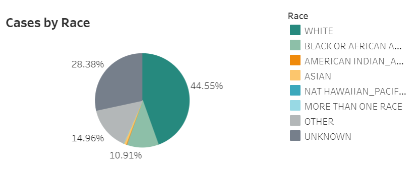
It takes several rounds of hovering, recording percentages, and running calculations to determine COVID-19 case and death numbers for those smaller racial groups in Missouri. Demographic data should not be this complicated.

Leave a comment